10,000 search results
(0.015 seconds)
- Jabberwub by Sentinel Type,
$30.00A fresh new decorative display face bubbling with life & spontaneity, Jabberwub belongs to a rare genus of creature fonts that time forgotócasual animated. A fun & bouncy eye-catcher that crosses into the land of the zany, dancing a whacky line between discord & rhyme, Jabberwub packs tons of fun into a state-of-the-art OpenType font loaded with 270 extra glyphs, including stylistic alternates, discretionary ligatures, word ligatures and capitalized ligatures, allowing creative typographers to achieve a custom hand-lettered look without all the mess & spilt glue of a manual paste-up job. Just like using rub-down type but it never cracks or splits, and it never runs out. The moment you start using Jabberwub you'll be laffing! Jabberwub is ideal for whatever zany stuff springs to mind. It takes an outline with no problem-o, and you can squish & squoosh it as the occasion takes your fancy. Optimal results are achieved by hand setting each individual glyph. Available in OpenType only. - Morgan Font Duo by Silverdav,
$15.00 Introduce “Morgan” is a duo font, consisting of Serif and Script fonts, a very fitting combination, of course making your design more elegant and very charming Morgan was created to fulfill your need to create a charming and cool design. Equipped with many unique ligatures in serif fonts that will make your designs different from other designs, and also equipped with many Alternates in Script Fonts that will add a luxurious impression to your designs. How to use special characters in serif fonts for the letters “A, I, U, E, O” please select one of the letters above then use the dot 2 times (A..), then you get a special character, and to get a special character on letters K, R & L, use one of the letters above, then add a hyphen (-) once or twice. What's Includes: Morgan Serif Morgan Script Special Ligatures in Serif Font Special Alternates in Script Font Multilingual Support If you have any questions, please contact us
 - Kis Antiqua Now TH Pro by Elsner+Flake,
$99.00 In the course of the re-vitalization of its Typoart typeface inventory, Elsner+Flake decided in 2006 to offer the “Kis Antiqua” by Hildegard Korger, in a re-worked form and with an extended sortiment, as an OpenType Pro-version. After consultation with Hildegard Korger, Elsner+Flake tasked the Leipzig type designer Erhard Kaiser with the execution of the re-design and expansion of the sortiment. Detlef Schäfer writes in “Fotosatzschriften Type-Design+Schrifthersteller”, VEB Fachbuchverlag Leipzig, 1989: No other printing type has ever generated as far-reaching a controversy as this typeface which Jan Tschichold called the most beautiful of all the old Antiqua types. For a long time, it was thought to have been designed by Anton Janson. In 1720 a large number of the original types were displayed in the catalog of the „Ehrhardische Gycery“ (Ehrhardt Typefoundry) in Leipzig. Recently, thanks to the research performed by Beatrice Warde and especially György Haimann, it has been proven unambiguously that the originator of this typeface was Miklós (Nicholas) Tótfalusi Kis (pronounced Kisch) who was born in 1650 in the Hungarian town of Tótfal. His calvinistic church had sent him to the Netherlands to oversee the printing of a Hungarian language bible. He studied printing and punch cutting and earned special recognition for his Armenian and Hebrew types. Upon his return to Hungary, an emergency situation forced him to sell several of his matrice sets to the Ehrhardt Typefoundry in Leipzig. In Hungary he printed from his own typefaces, but religious tensions arose between him and one of his church elders. He died at an early age in 1702. The significant characteristics of the “Dutch Antiqua” by Kis are the larger body size, relatively small lower case letters and strong upper case letters, which show clearly defined contrasts in the stroke widths. The “Kis Antiqua” is less elegant than the Garamond, rather somewhat austere in a calvinistic way, but its expression is unique and full of tension. The upper and lower case serifs are only slightly concave, and the upper case O as well as the lower case o have, for the first time, a vertical axis. In the replica, sensitively and respectfully (responsibly) drawn by Hildegard Korger, these characteristics of this pleasantly readable and beautiful face have been well met. For Typoart it was clear that this typeface has to appear under its only true name “Kis Antiqua.” It will be used primarily in book design. Elsner+Flake added these two headline weights, which are available besides a separate font family Kis Antiqua Now TB Pro. Designer: Miklós (Nicholas) Tótfalusi Kis, 1686 Hildegard Korger, 1986-1988 Erhard Kaiser, 2008
 - Morris Sans by Linotype,
$40.99 Morris Sans is a newly revised and extended version of a small geometric family of typefaces originally produced by Morris Fuller Benton in 1930 for ATF. His initial design consisted of an alphabet of squared capital letters with a unique twist that characterized its appearance: corners with rounded exteriors and right-angle interiors. The types were intended for use in the fine print found on business cards, banking or financial forms, and contracts. But over the ensuing decades, this design became a popular element in all sorts of design environments, and several foundries revived the typeface in digital form. Since digital fonts are bicameral, with slots for both upper and lowercase letters, new cuts of the type opted filled the lowercase slots with small caps. In 2006, Linotype commissioned its own version of the typeface-an extension for 21st century use. Under the advisement of Linotype's type director Akira Kobayashi, Dan Reynolds redrew the uppercase and added an original lowercase for the first time. Additionally, a number of extras were brought into the fonts, including six figure styles (tabular and proportional lining figures, tabular and proportional oldstyle figures, and special tabular and proportional small cap" figures). Small caps, which have become an iconic element over time, are accessible in each font as an OpenType feature. To differentiate this version from the original, Linotype's new family is named Morris Sans, in honor of Morris Fuller Benton. All fonts in the Morris Sans family are OpenType Com fonts; they include a character set capable of setting 48 European languages that employ the Roman alphabet, including all Central and Eastern Europe languages, those from the Baltics, and Turkish. This glyph coverage extends to the small caps as well. Morris Sans is a wide typeface, especially in its regular widths; the condensed faces set a more conventional line of text. The new lowercase letters are less geometric than the uppercase, except for those that share the same basic forms (e.g., c, o, and s). Instead of following this geometric trend, the new lowercase tends to strengthen the humanist elements that were present in several characters from the original type, including the uppercase D and the figures 5, 6, and 9. Morris Sans also sports a number of glyphic flares, like the stroke found on the original uppercase Q. Morris Sans is a clean, modern design best suited for headlines, advertising, posters, expressive signage (especially on storefronts), and corporate identity work."
 - Meastro by Ferry Ardana Putra,
$39.00 It's been a while... more than three months we developed our brand new font. We call them "Meastro". Fun fact though, we want to call it "Maestro", but you know... we were afraid of the copyright thing. Meastro Script is a fun, bold, luscious, retro display script font. We crafted this font very carefully and make them very smoothly attach to each other. Especially, on the script version. You can see every character's tail beautifully connected one to another without using ligatures' help. This font takes full advantage of the Open Type format with several automatic ligatures that occur as you type for your preferred design. Moreover, the manual stylistic alternates allow you to choose the letters you prefer. Alternates occur automatically as you type in supported programs when you have "Ligatures" or "Stylistic Alternates" turned on. Meastro is Created with a ton of stylistic alternates, swashes, and ligatures, and also comes with layerable fonts to recreate the effect without uncomfortable overlaps of the extruded shadow effect. On this pro pack, you will also get the Meastro Display font! On this font you will meet the unique blocky and squared design, making your design feel classic and retro-like. Combine them and “boom”, you will be the “Maestro” of the vintage design! This retro typeface is perfect for logotypes, t-shirts, vintage badges, retro quotes, branding, packaging, posters, signboards, social media needs, etc. ——— Meastro features: A full set of uppercase and lowercase characters Layered Style Numbers and punctuation Multilingual language support PUA Encoded Characters OpenType Features +553 Total Glyphs (Script) +235 Total Glyphs (Display) +238 Stylistic Alternates +30 Ligatures +69 Swashes and more (Shiny and Graffiti Spray Effect Included!) ——— ⚠️To enable the OpenType Stylistic alternates, you need a program that supports OpenType features such as Adobe Illustrator CS, Adobe InDesign & CorelDraw X6-X7, Microsoft Word 2010, or later versions. There are additional ways to access alternates/swashes, using Character Map (Windows), Nexus Font (Windows), Font Book (Mac), or a software program such as Pop Char (for Windows and Mac).
 - Robert Moore by Harvester Type,
$15.00 Robert Moore is a font that was specially designed for comics. A lot of work has been done. At first, glyphs were drawn manually using different markers, then they were transferred to the font. The font was tested on real printing and digital comics. The world of fonts for comics is big and I wanted to create even more variability for authors with one family, which is why a variable version was created containing two axes: weight and italics. This gives you more options. A large number of glyphs, multilingualism, ligatures, and a capital give even more scope for work and creativity. The name was created from the names of the authors of the comics Robert Kirkman and Alana Moore, so the Robert Moore font turned out. Although the font was made for comics, it is not limited to them. Posters, logos, covers, text, headings, prints, product design, web, interfaces are not all options for using the font.
 - Sathseed by Zamjump,
$17.00 Sathseed is a fun, lively, handwritten brush script created with the utmost care, love, and attention to detail. It's ideal for logos, titles, product packaging, merchandise, quotes... Try it for yourself in the preview section - what you see is what you get! To achieve an authentic handwritten feel, Sathseed comes with a full set of lowercase substitutions and ligatures to play with, giving you lots of variety. If you use software that supports OpenType, they are included in the main font that will be active as you type. If not, I've also included Alternate and Ligature as separate fonts for you to use. Your download will include the following files in TTF & OTF format. Litagure as well as alternate and extra swash. For web font use, a web font kit consisting of Awesomespill Regular fonts in WOFF, WOFF2 formats is also provided. Any question? Drop me a line and I'll be happy to answer!
 - Our Infinity Love by Putracetol,
$28.00 Our Infinity Love - Monoline Wedding Font. Our Infinity Love wedding script fresh & modern script with handmade calligraphy style. This font is inspired by monoline the character's style which shows the romance of a relationship through hand strokes with the added "love" symbol at the end of the line. This font is perfect for a professional touch making this font more elegant and suitable for all types of projects you are working on, especially for romantic-themed work. But this font is also suitable for logos, branding, greeting cards, invitation cards, advertisements, titles, healines, book titles, stickers, packaging, quotes, posters, t-shirts/apparel, billboards and others. The alternative characters were divided into several Open Type features such as Swash, Stylistic Sets, Stylistic Alternates, Contextual Alternates, and Ligature. The Open Type features can be accessed by using Open Type savvy programs such as Adobe Illustrator, Adobe InDesign, Adobe Photoshop Corel Draw X version, And Microsoft Word. This font is also support multi language.
 - Showboat by Canada Type,
$25.00You are looking at the friendliest, happiest and most faithful of puppies. It comes to greet you as soon as your eyes see it, radiates its joy, wags its tail, jumps in circles, and begs to be played with. Showboat is a very unique bragger of a font. Its bouncy metrics and whimsical shapes are a sure formula for attention. People will soak it in and feel happy while they do. How can anyone greet such happy letters with anything other than a smile? No matter how many fonts your design box has, you can be sure that none of them is this radiant, lively or cute. This happy camper comes in four fonts: two weights and a large number of corresponding ligatures and alternates. Showboat can be used in a vast number of design applications; flyers and webs for parties, pre-teen and teen events, scrapbooking, candy branding, posters, children's publications and web sites, pet stores and products, toys, and many many other things. - Bold Pressing Pack by Fontscafe,
$39.00 Fonts Café is offering a brand new pack of fonts and elements; The Bold Pressing Pack, full of bold, strong, powerful, vintage fonts which really stand out to make a strong impact. These fonts bring us back to a time when ink was placed onto wooden blocks, which were then pressed down onto the paper, creating big, bold letters, with the beautiful flaws of a time when things of import were given the due attention they deserved. This pack is designed to quickly capture the attention of anyone who sees it, while making a statement that says you mean business. It includes five different font styles, as well as two different element styles. There's everything from a standard letterpress font, to a font which truly emulates the imperfections of those days, as well as one that stands out above the rest to make a truly bold statement, and more. Check below these powerful fonts in more detail.
 - High Summer Cyrillic by Ira Dvilyuk,
$16.00 High Summer Cyrillic playful script font is a pretty hand-drawn monoline font that will look gorgeous on all your designs, wedding stationery, love stories, branding materials, monoline logos, pretty teenage stickers, business and wedding cards, calligraphy Insta quotes, elegant fashion sketches, calligraphy love monograms and much more. High Summer playful script font contains the Cyrillic glyphs too. High Summer playful script font contains a full set of uppercase and lowercase letters and can be used to create a handwritten calligraphy look. Multilingual Support for 31 languages: Latin glyphs for Afrikaans, Albanian, Basque, Bosnian, Catalan, Danish, Dutch, English, Estonian, Faroese, Filipino, Finnish, French, Galician, Indonesian, Irish, Italian, Malay, Norwegian Bokmål, Portuguese, Slovenian, Spanish, Swahili, Swedish, Turkish, Welsh, Zulu. And Cyrillic glyphs support Ukrainian, Belorussian, Bulgarian, and Russian languages. (Does font support more Cyrillic languages just type a message in the text box below and see if all characters you’ll need are there.) Works perfectly on the Canva platform. For Cricut & Silhouette recommended. Thanks!
 - Daysha by Putracetol,
$14.00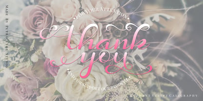 Daysha is a beautiful modern calligraphy wedding font. This font is feminime, elegant, messy and modern. Daysha perfect for wedding event, anniversary, birthday,greeting cards, logotype, branding, wedding invite and card, elegant logo, poster, packaging, stationery, website, and any other projects requiring a handwritten and luxurious touch.
 - Garden by Los Andes,
$18.00 Last year, we visited Brazil and we were totally captivated by its cheerful and warm people. Its wild nature is absolutely amazing and very noticeable in textile printing as well as in floral design. That was precisely what inspired us to create some ornaments and dingbats, which we then turned into a single typographic work. The resulting typeface was called Garden , a serif display handmade font with a playful and spontaneous feel. The Garden family offers a font with a set of original “catchwords” (‘Garden Catchwords’, based on brush calligraphy), floral dingbats and botanical ornaments. Please be aware, “Garden Catchwords” is a ‘Catchwords’ font, and does not offer standard AlphaNumeric characters. The OpenType version provides a wide range of creative options. Garden is well-suited for text composition, posters, headlines, label design and handmade-style items. Garden is inspiration, nature and joy!
 - Graviola Soft by Harbor Type,
$30.00 🏆 Selected for the 12th Biennial of Brazilian Graphic Design. Graviola Soft is a juicy type family. It is based on our Graviola typeface, but we didn’t just round its corners. We redrew every stem and terminal so they would look just right. Combined with curved diagonal strokes and alternate glyphs, Graviola Soft makes for a super friendly typeface. The family consists of 16 fonts, from Thin to Black and matching italics. While the intermediate ones work for body text, the extreme weights look specially beautiful at display sizes. Each font contains 530+ glyphs, supporting more than 90 languages. Stylistic sets provide alternates in two groupings (a, v, w, y and G, g, &). We think Graviola Soft works best on packaging, logotypes and headlines, but we’re eager to see what else you can do with it.
 - Codswallop by Hanoded,
$20.00 The origin of the word Codswallop is uncertain, but it might have something to do with a 19th century English soft drink brewer named Hiram Codd. Codswallop is a beautiful hand drawn font. A little weird, a tad grotesque and a wee bit over the top, but fun and useful nonetheless.
 - FS Lucas by Fontsmith,
$80.00 Pure and not-so-simple Maybe it’s the air of purity, openness and transparency that they transmit, but geometric typefaces are more popular than ever among leading brands. Based on near-perfect circles, triangles and squares, geometric letterforms look uncomplicated, even though making them readable is anything but – something the designers of the first wave of geometric fonts discovered nearly a century ago. Many of the world’s most recognisable brands in technology, retail, travel, food, manufacturing and other industries continue to be drawn to the straightforward, honest character that geometric fonts convey. Fontsmith set out in 2015 to develop a typeface in the same tradition, but optimised for the demands of modern brands – online and offline usage, readability and accessibility. And, of course, with the all-important Fontsmith x-factor built in. FS Lucas is the bold and deceptively simple result. Handle with care The letterforms of FS Lucas are round and generous, along the lines of Trajan Column lettering stripped of its serifs. But beware their thorns. Their designer, Stuart de Rozario, who also crafted the award-winning FS Millbank, wanted a contrast between spiky and soft, giving sharp apexes to the more angular letterforms, such as A, M, N, v, w and z. Among his inspirations were the colourful, geometric compositions of Frank Stella, the 1920s art deco poster designs of AM Cassandre, and the triangular cosmic element symbol, which led him to tackle the capital A first, instead of the usual H. The proportions and angles of the triangular form would set the template for many of the other characters. It was this form, and the light-scattering effects of triangular prisms, that lit the path to a name for the typeface: Lucas is derived from lux, the Latin word for light. Recommended reading Early geometric typefaces were accused of putting mathematical integrity before readability. FS Lucas achieves the trick of appearing geometric, while taking the edge off elements that make reading difficult. Perfectly circlular shapes don’t read well. The way around that is to slightly thicken the vertical strokes, and pull out the curves at the corners to compensate; the O and o of FS Lucas are optical illusions. Pointed apexes aren’t as sharp as they look; the flattened tips are an essential design feature. And distinctive details such as the open terminals of the c, e, f, g, j, r and s, and the x-height bar on the i and j, aid legibility, especially on-screen. These and many other features, the product of sketching the letterforms in the first instance by hand rather than mapping them out mechanically by computer, give FS Lucas the built-in humanity and character that make it a better, easier read all-round. Marks of distinction Unlike some of its more buttoned-up geometric bedfellows, FS Lucas can’t contain its natural personality and quirks: the flick of the foot of the l, for example, and the flattish tail on the g and j. The unusual bar on the J improves character recognition, and the G is circular, without a straight stem. There’s a touch of Fontsmith about the t, too, with the curve across the left cross section in the lighter weights, and the ampersand is one of a kind. There’s a lot to like about Lucas. With its 9 weights, perfect proportions and soft but spiky take on the classic geometric font, it’s a typeface that could light up any brand.
 - FS Lucas Paneureopean by Fontsmith,
$90.00Pure and not-so-simple Maybe it’s the air of purity, openness and transparency that they transmit, but geometric typefaces are more popular than ever among leading brands. Based on near-perfect circles, triangles and squares, geometric letterforms look uncomplicated, even though making them readable is anything but – something the designers of the first wave of geometric fonts discovered nearly a century ago. Many of the world’s most recognisable brands in technology, retail, travel, food, manufacturing and other industries continue to be drawn to the straightforward, honest character that geometric fonts convey. Fontsmith set out in 2015 to develop a typeface in the same tradition, but optimised for the demands of modern brands – online and offline usage, readability and accessibility. And, of course, with the all-important Fontsmith x-factor built in. FS Lucas is the bold and deceptively simple result. Handle with care The letterforms of FS Lucas are round and generous, along the lines of Trajan Column lettering stripped of its serifs. But beware their thorns. Their designer, Stuart de Rozario, who also crafted the award-winning FS Millbank, wanted a contrast between spiky and soft, giving sharp apexes to the more angular letterforms, such as A, M, N, v, w and z. Among his inspirations were the colourful, geometric compositions of Frank Stella, the 1920s art deco poster designs of AM Cassandre, and the triangular cosmic element symbol, which led him to tackle the capital A first, instead of the usual H. The proportions and angles of the triangular form would set the template for many of the other characters. It was this form, and the light-scattering effects of triangular prisms, that lit the path to a name for the typeface: Lucas is derived from lux, the Latin word for light. Recommended reading Early geometric typefaces were accused of putting mathematical integrity before readability. FS Lucas achieves the trick of appearing geometric, while taking the edge off elements that make reading difficult. Perfectly circlular shapes don’t read well. The way around that is to slightly thicken the vertical strokes, and pull out the curves at the corners to compensate; the O and o of FS Lucas are optical illusions. Pointed apexes aren’t as sharp as they look; the flattened tips are an essential design feature. And distinctive details such as the open terminals of the c, e, f, g, j, r and s, and the x-height bar on the i and j, aid legibility, especially on-screen. These and many other features, the product of sketching the letterforms in the first instance by hand rather than mapping them out mechanically by computer, give FS Lucas the built-in humanity and character that make it a better, easier read all-round. Marks of distinction Unlike some of its more buttoned-up geometric bedfellows, FS Lucas can’t contain its natural personality and quirks: the flick of the foot of the l, for example, and the flattish tail on the g and j. The unusual bar on the J improves character recognition, and the G is circular, without a straight stem. There’s a touch of Fontsmith about the t, too, with the curve across the left cross section in the lighter weights, and the ampersand is one of a kind. There’s a lot to like about Lucas. With its 9 weights, perfect proportions and soft but spiky take on the classic geometric font, it’s a typeface that could light up any brand. - Black Stable by Letterhend,
$17.00 Introducing, Black Stable - A modern blackletter typeface. This type of font perfectly made to be applied especially in logo, and the other various formal forms such as Logo, Clothing, Fashion, Headline, or any type of advertising purpose. Features : uppercase & lowercase numbers and punctuation stylistic alternate multilingual PUA encoded We highly recommend using a program that supports OpenType features and Glyphs panels like many of Adobe apps and Corel Draw, so you can see and access all Glyph variations.
 - Metch Bright by Zeenesia Studio,
$16.00 Bright Diamond - Handwritten Font Bright Diamond is a script and regular handwritten font with a simple and classy style, this font is great for your next creative projects such as watermark on photography, logo design, wedding, invitation, quotes, book cover, business card, and many other design project. From business cards to photo watermarks. We hope you enjoy the font, please feel free to comment if you have any thoughts or feedback. Thanks for purchasing and glad to help you!
 - Chaviera Pro by Handpik,
$10.00 Hello, this time we would like to introduce a new product. namely "Chaviera pro ", a Sans-serif display font that has a classic, feminine, and elegant style wrapped with a beautiful Alternate stylist. The Chaviera font is perfect for various projects like logos & branding, invitations, stationery, wedding designs, social media posts, advertisements, printed quotes, product packaging, product designs, labels, photography, watermarks, special events or anything else. Feature Uppercase Lowercase Numeral Functional Ligature Stylistic Multilingual INCLUDE WITH 6 VARIATION WEIGHT
 - Antums Brush by Siwox Studios,
$11.00 Introducing Antums Brush Fonts! A hand drawn brush font style, designed especially for you. Every creative love something new. Thats why We love handmade and freestyle designs, because it will make us look Unique and Fresh. Antums Brush Fonts ready to make your design shining and sparkling.. Antums Brush Fonts suitable for any modern design such as for ad banner, modern card, invitation, announcement, seasonal design, social media promotion, web design, branding and logo stylist and many more.
 - Da Maria by Scratch Design,
$9.00 Da Maria is a handmade brush font designed to perfectly combine a romantic script and hand drawn design elements. Da Maria is perfect for wedding invitations, greeting cards, stationery design, social media, quotes and more. This font can also be useful for signature design and logos. Features: Uppercase & Lowercase Numbers Punctuation Ligatures Alternates Multilingual Support (ÀÁÂÃÄÅÇDÐEÈÉÊËIÌÍÎÏNÑOØÒÓÔÕÖUÙÜÚÛWYÝŸỲŸÆŒßÞþ) Support in Mac and Windows OS, easy to install We hope you like it and thank you so much for purchase.
 - Alecto by Scriptorium,
$12.00For our modern/futuristic fonts collection we wanted something truly science fictional, so Dave Nalle designed the Alecto font, an original design with a futuristic look, but some echoes of the type designs and lettering of the Arts & Crafts period. It looks much more modern, but you can see echoes of some of our other fonts like Semiramis in the design. Alecto features multiple versions of many of the characters to make it ideal for designing logos and titles. - Adigussto by Twinletter,
$14.00 Adigussto is a signature font that we created with dramatic hand strokes paying attention to the aesthetic appearance in every curve that is so elegant and fun. This font is designed with a natural touch of handwriting refined to create portions and compositions that suit your needs. So this font is perfect for crafts, kids writing, adventure posters, food banner titles, wedding invitations, product packaging logos, quotes, social media page covers, furniture banner headers, book covers, and more.
 - Isabella by Monotype,
$29.99Isabella was designed by Hermann Ihlenburg in 1892 for MacKellar, Smiths and Jordan, one of many type houses that were later amalgamated into American Type Founders. As testimony to its long-lived appeal, Isabella was one of the first PostScript® language typeface releases (in 1988) of Agfa Compugraphic. With its unmistakable 19th-century characteristics - swirls, loops, and surprising letter shapes - Isabella is a natural for display situations that demand high drama or, dare we say, melodrama. - 1479 Caxton Initials by GLC,
$20.00 This family was created inspired from the two sets of rough initials fonts used by the famous William Caxton in Westminster (GB) in the late 1400’s. As it was normal for the time, there were not any differences between I and J, U and V. It is not a mistake. We have reconstructed the few other missing characters. This font was conceived as a supplement for our 1479 Caxton but may be used with all our Blackletters fonts.
 - Ramsey by Associated Typographics,
$39.00 Ramsey is stout and warm, rectangular with rounded edges, and dynamic with swift cuts. Ranging from thin and condensed to extended and black, Ramsey has seen applications in sports teams to movie titles and even art magazines. Through the years, Ramsey has proven itself to be a true workhorse of a font. This version has a lot of minor updates to the form and spacing, and we now see an extended family to complete it’s legacy. A true workhorse.
 - Gargamoth by Letterhend,
$17.00 Introducing, Gargamoth - A modern blackletter typeface. This type of font perfectly made to be applied especially in logo, and the other various formal forms such as Logo, Clothing, Fashion, Headline, or any type of advertising purpose. Features : uppercase & lowercase layered fonts numbers and punctuation stylistic alternate multilingual PUA encoded We highly recommend using a program that supports OpenType features and Glyphs panels like many of Adobe apps and Corel Draw, so you can see and access all Glyph variations.
 - Fountencil by Letterhend,
$19.00 Introducing, Fountencil - A blackletter stencil typeface. This type of font perfectly made to be applied especially in logo, and the other various formal forms such as Logo, Clothing, Fashion, Headline, or any type of advertising purpose. Features : uppercase & lowercase numbers and punctuation stylistic alternate multilingual PUA encoded We highly recommend using a program that supports OpenType features and Glyphs panels like many of Adobe apps and Corel Draw, so you can see and access all Glyph variations.
 - Matty Salde by Negara Studio,
$19.00 Introducing Matty Salde! Is a script font. Written with a marker dipped in ink. With 33 ligatures. We write at a moderate speed so as to produce a solid brush effect. Matty Salde Features: Upper & lowercase characters, numerals, a large range of punctuation and Language Support. 33 ligatures are included for lowercase letters (see image). Matty Salde great for use on larger sizes. I just wanted to let you know that Matty Salde is our first script font. ~ Anugerah
 - Bright Diamond by Zeenesia Studio,
$15.00 Bright Diamond - Handwritten Font Bright Diamond is a script and regular handwritten font with a simple and classy style, this font is great for your next creative projects such as watermark on photography, logo design, wedding, invitation, quotes, book cover, business card, and many other design project. From business cards to photo watermarks. We hope you enjoy the font, please feel free to comment if you have any thoughts or feedback. Thanks for purchasing and glad to help you!
 - Lundoon by Mazkicibe,
$11.00 Description Hello gaes! How are you guys ? I'm sure it's very good. Introducing, this is our newest product, we call this produc Lundoon Font.. Lundoon Font is Handwritten and modern font combined with a sweet touch and beautifully curved each letter. using a touch of soft curves so that it is pleasing to the eye Lundoon Font Spirit is great for: Wedding invitations, fashion magazines, logos, signatures, and suitable for watermark photography. Features: -Uppercase, -Lowercase, -Numeral, -Punctuation,
 - Kento by Graphicfresh,
$18.00 This time we present a font with a bit of a classic touch. The font is slightly stretched to the sides. The font is simple and luxurious, so it leaves a deep memory impression when used on a brand. Simple and powerful. This is an overview of the font as a whole. Kento will be perfect for many projects: fashion, magazines, logos, branding, photography, invitations, wedding invitation, quotes, blog headers, posters, advertisements, postcards, books, websites, etc.
 - Killviners by Letterhend,
$19.00 Introducing, Killviners - A modern blackletter typeface. This type of font perfectly made to be applied especially in logo, and the other various formal forms such as Logo, Clothing, Fashion, Headline, or any type of advertising purpose. Features : uppercase & lowercase numbers and punctuation stylistic alternate multilingual PUA encoded We highly recommend using a program that supports OpenType features and Glyphs panels like many of Adobe apps and Corel Draw, so you can see and access all Glyph variations.
 - Losta Masta by Creativemedialab,
$15.00 Losta Masta - fun and playful serif family. Unique, playful and versatile serif family with 40+ ligatures and 100+ alternates that you can combine to get curves and beautiful shapes just in seconds. Play with the ornaments to create a more stunning display. This font is suitable for use in many design forms, for example magazines, postcards, logos, vintage look, old classic ,60s, 70s, 80s era, wedding projects and many more. We recommend using Adobe Illustrator or Photoshop.
 - Bilgosia by Subqi Studio,
$29.99 Introducing Bilgosia, a Display Family typeface. It contains a Main Serif with Sans and Script as companion. If the whole three combined, it will suitable for any your projects. Each font could be standalone font either. The main serif contains Swashes Alternates , Ligatures and Discretionary Ligatures for your display purposes. Made it from scracth node by node for the best flow. Anyhow we wouldn't talk much here. You could see our display images as references to your projects.
 - Zalea by Eurotypo,
$42.00 Zalea script is an expressive and dynamic font. It has an appealing "punch" characteristic that gives it its charm and strong visual impact. Zalea was specially thought for labelling and packaging design. It has also good legibility for body text, useful in magazines and web pages. We recommended it for headlines, logos or where a friendly script is needed. Zalea font includes a full international character compliment, alternate characters, swash and ligatures to allow flawless typesetting in OpenType format.
 - Abeille by Hanoded,
$15.00 Abeille means bee in French. I am a little worried about the world's bee populations, as whole colonies collapse due to monoculture and pesticides. I have planted many bee-attracting plants in my garden and even put up a 'bee hotel' (which is full of tenants right now). Abeille is a hand drawn didone-ish font, kind of cute and happy, very legible and full of character. Abeille comes with a swarm of diacritics.
 - As of my last update in 2023, "Omicron Zeta" is not a widely recognized or standard font within the extensive libraries of typography that are commonly used across graphic and web design, advertising...
- Motoya Cedar by Motoya,
$229.00 ?????????????????????????????????????????????????????????????????????????????????????????????????????????????????????????????????????????????????????????????????????????????????????????????????Web??????????????????????