10,000 search results (0.04 seconds)
  1. Kuma Rounded by L'île Foundry, $35.00
    In Ancient Greek, Kuma means wave. This wavy, dynamic and poetic all-caps display typeface is useful for headlines or short texts. Kuma is the result of a graphic and perceptual game that, using experimentation as a working method, explores the possibilities of writing as an image. This grid-based typeface creates different shapes and directions, never predictable. There are different types of waves created by the wind. That's why there are three different versions of Kuma: Kuma, Kuma Rounded and Kuma Square. Each version is available in seven weights which can be combined together. In their black and white rhythm, they guarantee global readability and balance. Kuma Rounded was designed by Jérémy Ruiz. Supported languages: Afrikaans, Albanian, Basque, Bosnian, Breton, Catalan, Croatian, Czech, Danish, Dutch, English, Esperanto, Estonian, Faroese, Fijian, Finnish, Flemish, French, Frisian, German, Greenlandic, Hawaiian, Hungarian, Icelandic, Indonesian, Irish, Italian, Latin, Latvian, Lithuanian, Malay, Maltese, Maori, Moldavian, Norwegian, Polish, Portuguese, Provençal, Romanian, Romany, Sámi (Inari), Sámi (Luli), Sámi (Northern), Sámi (Southern), Samoan, Scottish Gaelic, Slovak, Slovenian, Sorbian, Spanish, Swahili, Swedish, Tagalog, Turkish, Welsh.
  2. Johnny by Canada Type, $24.95
    Johnny is the latest addition to the long line of popular psychedelic/hippy/funky art nouveau fonts representing the retro side of the Canada Type library. It is the digitization of a popular 1969 Phil Martin typeface that was known by two different names: Harem and Margit. The film type version had plenty of irregularities and quirks that made it seem like it was done in a hurry. In this digital version the errors have been corrected and the character set expanded to include international characters with built-in alternates, to be on par with what today's layout artists expect from a high quality font. This font saw a lot of use on record sleeves and music posters throughout the pre-disco part of the 1970s, which makes it a veteran of both the psychedelic and funk periods. This makes it the sharper, sturdier art nouveau contemporary personality of Canada Type's Tomato font. This font contains a very expanded character set that includes full support for Central, Eastern and Western European languages, as well as Baltic, Turkish, Esperanto, Greek, Cyrillic and Vietnamese.
  3. Mingo Gothic SG by Spiece Graphics, $39.00
    This typeface appears to be straight out of a science fiction movie thriller. Mingo is a slightly condensed, somewhat vain gothic with thick vertical strokes proudly tapering downward. Capitals which are normally completely round are now square inside with curving outside corners. Lowercase letters carry the same design traits. And, in the capital A and H, crossbars extend on both sides helping give the face a pronounced retro look. Mingo Gothic is a close cousin to Raleigh Gothic and is an excellent choice for book covers and large display settings. Small caps, fractions, and alternate characters have also been developed for greater layout versatility. Mingo Gothic Bold is now available in the OpenType format. Some new characters have been added to this OpenType version as stylistic alternates, historical forms, small caps, oldstyle figures, ornaments, and f-ligatures. These advanced features work in current versions of Adobe Creative Suite InDesign, Creative Suite Illustrator, and Quark XPress. Check for OpenType advanced feature support in other applications as it gradually becomes available with upgrades.
  4. PF DIN Stencil B by Parachute, $43.00
    This is a new version of our popular DIN Stencil family designed with a wider cut than the original. This overcomes the diminishing effect of the stencil at smaller sizes where the cuts tend to disappear, whereas it makes a bold statement at display sizes. Traditionally, stencils have been used extensively for military equipment, goods packaging, transportation, shop signs, seed sacks and prison uniforms. In the old days, stencilled markings of ownership were printed on personal possessions, while stencilled signatures on shirts were typical of 19th century stencilling. DIN Stencil B manages to preserve several traditional stencil features, but introduces additional modernities which enhance its pleasing characteristics and make it an ideal choice for a large number of contemporary projects. It consists of 7 diverse weights from Extra Thin to Black. This version supports Latin, Cyrillic, Eastern European, Turkish and Baltic. DIN Stencil B includes several additions such the recently unicode encoded character of the German uppercase Eszett (ẞ), the Russian currency symbol for Rouble (₽), Ukrainian Hryvnia (₴), Azeri and Kazakh letterforms.
  5. Ringtown by Fargun Studio, $12.00
    Ringtown is handwritten font with a signature style. perfect for branding projects, homeware designs, product packaging or simply as a stylish text overlay to any background image. Ringtown has an entire 2 alternate font set and marker style font. This is accessible simply by their own separate font file - just install this as normal and select Ringtown Alt 1, Ringtown Alt 2, Ringtown Marker and Ringtown Swash in your text-tool Fonts are provided in .otf formats Ringtown incudes 6 Font files: Ringtown -- A handwritten script font containing upper & lowercase characters, numerals and a large range of punctuation. Ringtown Alt 1– the second version of Ringtown, with a completely new set of both lower and uppercase characters. Ringtown Alt 2– the thirth version of Ringtown, with a completely new set of both lower and uppercase characters. Ringtown Swash -- A set of 36 hand-drawn swashes, with cool touch to underline you’re Ringtown text. Need help? If you need help or advice, please contact me by e-mail "fargunstudio@gmail.com" Thank you for your purchase!
  6. Swift 2.0 Cyrillic by ParaType, $100.00
    Gerard Unger developed this newspaper font between 1984 and 1987 for Dr.-Ing. Rudolf Hell GmbH, Kiel. He was mainly influenced by William A. Dwiggins (1880-1956), the typographic consultant of Mergenthaler Linotype, who started to develop more legible, alternative fonts for newspaper printing as early as 1930. Swift was named after the fast flying bird. Austere and concise, firm and original, Swift is suited for almost any purpose. Swift has been specially developed to sustain a maximum of quality and readability when used in unfavorable print and display processes, e.g. newspapers, laser printing and low resolution screens. Its robust, yet elegant serifs and its large x-height provide an undeniable distinction to the typeface, making it suitable for corporate ID and advertising purposes as well. Swift 2.0 family was designed in 1995. It's an improved version with technical and aesthetic enhancements and new family members. The Cyrillic version was developed for ParaType in 2003 by Tagir Safayev. Please note that this family includes only basic latin characters; it does not include accented characters required for western and central Europe.
  7. Abdo Salem by Abdo Fonts, $29.50
    Abdo Salem is the second version of the font FS_Salem which was designed by the type designer Abdulsamie Rajab Salem for Future Soft company fonts. It is a leading company in Arabization field and producing the Arabic and Islamic programs beside the children programs. This font appeared between 1998 and 2000. In this version there were a lot of adjustments to keep the font in its spirit and uniformity between the various characters. Also added some new characters, which gave him another beautiful addition to be used in both title and text designs. Three weights (Light, bold and black) have been created. Then the font was converted to OpenType to support Arabic, Persian and Urdu to be compatible with the various operation systems and modern software. The combination of modern Kufi and Naskh styles and varying between straight and curved parts made it a beautiful typeface appropriate to the titles and text, and able to meet the desire of the user in the design of ads and modern designs of various types of audio and visual.
  8. Maris by insigne, $25.00
    Maris is a rich, elegant script, subtly characterized by a whimsical handwritten calligraphy. The family is composed of six different weights, each one bolder than the last but all equally as filling. The lighter weights move delicately through each line, showing a gentle strength in their smaller frame. The six weights from these lighter forms to the bold include some textured versions such as jean, wood, print, rough and halftones. The Maris family performs superbly in custom headlines and logotypes. Turn on Swash, Stylistic or Contextual Alternates for even greater emphasis. Opentype lets you "auto-magically" swap out letter sets with alternate versions and creates the visual diversity that gives you the one-of-a-kind look of custom lettering. It also uses OpenType features to assist with letter flow. When you choose to make use of its open-type decorative glyphs, your headlines will dazzle. For the greatest benefit, grab the entire Maris family. Thanks to its variety of styles, Maris makes it easier for you to design. With this large font family, solve your design problem with just one typeface.
  9. Blacker Pro by Zetafonts, $39.00
    Blacker Pro is the revised and extended version of the original wedge serif type family designed by Cosimo Lorenzo Pancini and Andrea Tartarelli in 2017. Blacker was developed as a take on the style that Jeremiah Shoaf has defined as the "evil serif" genre: typefaces with high contrast, oldstyle or modern serif proportions and sharp, blade-like triangular serifs. Due to the high contrast in the design - slightly reminescent of didone typefaces - Blacker has been developed in two optical subfamilies. The display version offers tighter tracking, higher contrast and sharper corners for maximum effect at big sizes, while the text variant offers better readability and screen rendering at smaller sizes, with lower contrast and looser spacing. In the pro version, two additional condensed variant families have been added (condensed display and condensed text) allowing for more freedom and versatility in typesetting where space constraints are present. Also, three titling uppercase-only variants have been added, with a slightly extended feel, and two decorative subfamilies (inline and diamond). Each of these seven variants has been developed in six weights from light to heavy, with matching italics, for a total of 69 styles covering a wide range of editorial and advertising uses. All Blacker Pro feature a revised and extended character set covering over two hundred languages using the latin, cyrillic and greek alphabets. Open type features include small caps, positional numerals, fractions, superior & inferior figures, alternate forms, and an extended set of standard and discretionary ligatures. With its bold personality, Blacker aims to be a modern classic used for bold statements and self-conscious brands, making your text look great both on paper and on the screens.
  10. Bones Stone by Azetype, $19.00
    Presenting Bones Stone! A Bold Script Font with more than 9 Alternates and Extra. This font made with the perfect combination of each character. You can type by Mix & Match with an alternate version and extra swashes to get a unique combining. It looks original and can be used for all your project needs. Each glyph has its own uniqueness and when meeting with others will provide dynamic and pleasing proximity. This font can be used at any time and any project. You can see in the presentation picture above, Bones Stone looks Authentic on design projects. So, Bones Stone Font can't wait to give its touch to all your design projects such as quotes, poster design, personal branding, promotional materials, logotype, product packaging, etc. Besides that, Bones Stone also has some ligature that gives a surprise when you type certain characters combining. The ligatures are ff, tt, and ll. WHAT'S INCLUDED? 1. Bones Stone Basic • The first version comes with uppercase, lowercase, ligatures, numeral, punctuation, symbols, and Standard Latin Multilingual Support (Afrikaans, Albanian, Catalan, Danish, Dutch, English, French, German, Icelandic, Indonesian, Italian, Malay, Norwegian, Portuguese, Spanisch, Swedish, Zulu, and More). 2. Bones Stone Stylistic Alternate • The Second version comes with uppercase, lowercase, ligatures, numeral, punctuation, symbols, and Standard Latin Multilingual Support (Afrikaans, Albanian, Catalan, Danish, Dutch, English, French, German, Icelandic, Indonesian, Italian, Malay, Norwegian, Portuguese, Spanisch, Swedish, Zulu, and More). 3. Bones Stone Stylistic Set • It comes with 12 stylistic glyphs. Just access using Opentype Tools. 5. Bones Stone Swash • It comes with 47 underline swashes. Just type c_1 until c_47 to feature all. Enjoy the Font and Happy Creating! Thank You Azetype Studio
  11. Merrymakers JNL by Jeff Levine, $29.00
    A throwback design reminiscent of 1950s signage and print ads, Merrymakers JNL takes a previous release (Bluesman JNL) and places the letters and numbers inside parallelograms with ‘TV screen’ openings. Merrymakers JNL is available in both regular and oblique versions. The upper case A-Z characters have the taller side of the shape to the left, while the lower case a-z has the taller side to the right. To make a ‘fan fold’ or zig-zag message, simply alternate upper and lower cases as in this example: C-a-R D-e-A-l-E-r-S You can type spaces between words, but if you prefer blank connectors, use the following: Upper case solid black connector – left bracket key Lower case solid black connector – right bracket key Upper case ‘TV screen’ connector – left brace key Lower case ‘TV screen’ connector – right brace key There is a very limited set of punctuation available. The upper case ampersand, question mark, exclamation point, period, comma, single quote and double quote are all on their respective key positions, but to accommodate the lower case [smaller side] versions, those glyphs have been reassigned to other standard keyboard positions: Type @ to get & Type # to get ? Type $ to get ! Type ^ to get . Type * to get , Type - to get ’ Type = to get ” Additionally, to access the lower case [smaller side] versions of the numerals, type the following keys: Type % to get 0 Type ( to get 1 Type ) to get 2 Type + to get 3 Type / to get 4 Type : to get 5 Type ; to get 6 Type < to get 7 Type > to get 8 Type \ to get 9
  12. Dederon Serif by Suitcase Type Foundry, $75.00
    Dederon Serif has been specifically designed for book setting. Preliminary sketches were drawn in 2004. Its inspiration – particularly its weight and width proportions – can be traced to the Liberta typeface from the TypoArt type foundry in former Eastern Germany. After a careful study of the model, the design of Dederon branched off into its own direction, finding its distinctive voice and becoming a wholly original type family. Dederon Serif kept most of the elements typical for the Old Style Roman lettering, such as the angle of the stress, the medium x-height, and lower contrast. In large sizes, the typical shapes of the letters stand out – the calligraphic feel characteristic for the Czech typefaces by Oldrich Menhart, the unusual serifs hinting at the angle of the pen, the shapes of the stems, or the terminals of dots and ears. Upon finishing the serif version, a Serif-serif variant called Dederon Serif was added. The construction principles are also derived from the Old Style Roman model, which lends the lettering its open, humanist feel. Yet the design also conforms to the rules of the modern Serif serif. Most characteristics of Dederon Serif match the serif version – the weight of individual cuts, the width proportions, x-height, ascenders' and descenders' length, and the slope of the italics. Each version of Dederon Open Type Std contains the standard Western Latin character set and the Central European characters; a number of basic and accented ligatures, small caps; old style, small caps and caps, table, fraction and superscript numerals; expert glyphs and alternative characters. This brings the total to a comfortable 820 glyphs per weight, permitting truly professional use in the most demanding projects.
  13. Dederon Sans by Suitcase Type Foundry, $75.00
    Dederon Serif has been specifically designed for book setting. Preliminary sketches were drawn in 2004. Its inspiration — particularly its weight and width proportions — can be traced to the Liberta typeface from the TypoArt type foundry in former Eastern Germany. After a careful study of the model, the design of Dederon branched off into its own direction, finding its distinctive voice and becoming a wholly original type family. Dederon Serif kept most of the elements typical for the Old Style Roman lettering, such as the angle of the stress, the medium x-height, and lower contrast. In large sizes, the typical shapes of the letters stand out — the calligraphic feel characteristic for the Czech typefaces by Oldrich Menhart, the unusual serifs hinting at the angle of the pen, the shapes of the stems, or the terminals of dots and ears. Upon finishing the serif version, a sans-serif variant called Dederon Sans was added. The construction principles are also derived from the Old Style Roman model, which lends the lettering its open, humanist feel. Yet the design also conforms to the rules of the modern sans serif. Most characteristics of Dederon Sans match the serif version — the weight of individual cuts, the width proportions, x-height, ascenders' and descenders' length, and the slope of the italics. Each version of Dederon Open Type Std contains the standard Western Latin character set and the Central European characters; a number of basic and accented ligatures, small caps; old style, small caps and caps, table, fraction and superscript numerals; expert glyphs and alternative characters. This brings the total to a comfortable 820 glyphs per weight
  14. Neue Haas Grotesk Display by Linotype, $33.99
    The first weights of Neue Haas Grotesk were designed in 1957-1958 by Max Miedinger for the Haas’sche Schriftgiesserei in Switzerland, with art direction by the company’s principal, Eduard Hoffmann. Neue Haas Grotesk was to be the answer to the British and German grotesques that had become hugely popular thanks to the success of functionalist Swiss typography. The typeface was soon revised and released as Helvetica by Linotype AG. As Neue Haas Grotesk had to be adapted to work on Linotype’s hot metal linecasters, Linotype Helvetica was in some ways a radically transformed version of the original. For instance, the matrices for Regular and Bold had to be of equal widths, and therefore the Bold was redrawn at a considerably narrower proportion. During the transition from metal to phototypesetting, Helvetica underwent additional modifications. In the 1980s Neue Helvetica was produced as a rationalized, standardized version. For Christian Schwartz, the assignment to design a digital revival of Neue Haas Grotesk was an occasion to set history straight. “Much of the warm personality of Miedinger’s shapes was lost along the way. So rather than trying to rethink Helvetica or improve on current digital versions, this was more of a restoration project: bringing Miedinger’s original Neue Haas Grotesk back to life with as much fidelity to his original shapes and spacing as possible (albeit with the addition of kerning, an expensive luxury in handset type).” Schwartz’s revival was originally commissioned in 2004 by Mark Porter for the redesign of The Guardian, but not used. Schwartz completed the family in 2010 for Richard Turley at Bloomberg Businessweek. Its thinnest weight was designed by Berton Hasebe.
  15. Senella Script by Aktab Studio, $16.00
    Senella is a script font with more than 350 characters and covers several languages based on the Latin alphabet; the whole font design has also been completed with extensive alternates, ligatures and swashes sets. Senella is suitable for any design project, vintage, fashion, branding, print design and whatever design you want Thank you for visits and happy branding !
  16. Jasson Gillen by Din Studio, $29.00
    Introducing Jasson Gillen Font. Made with naturally handwritten, it will make your design project more beautiful. This font is suitable for any design like branding, quotes, t-shirt printing and etc. Features: Accents (Multilingual characters) Beautiful ligatures Stylistics set PUA encoded Numerals and Punctuations Customer support I hope you enjoy it !!Thanks for visiting and purchasing my font.
  17. Meritoriously by Haksen, $14.00
    Introduce my New Product "Meritoriously" a cute quirky handwritten font. Very suitable for greeting cards, branding materials, business cards, quotes, posters, and more! These fonts are perfect for all brand :) Features : - UpperCase & Lowercase Numerals & Punctuations - Ligatures Multilingual characters (AÀÁÂÃÄÅCÇDÐEÈÉÊËIÌÍÎÏNÑOØÒÓÔÕÖUÙÜÚÛWYÝŸŸÆßÞàáâãäåæçèéêëìíîïðñòóôõöøùúûüýÿ) PUA ENCODEDZIP INCLUDED: Thanks for visited and Please contact me if you have any questions. My Best, Haksen
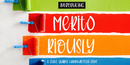
  18. Gellatio by Din Studio, $25.00
    Gellatio is a chic Brush Font. It will make your design project more beautiful. This font is suitable for any design like branding, fashion, print templates, quotes, wedding and more. Features : 88 Beautiful Alternates 6 Beautiful Ligatures 52 Swashes PUA encoded Multi-lingual Support Numerals and Punctuation (OpenType Standard) Full Support Thanks for visiting and purchasing my font.
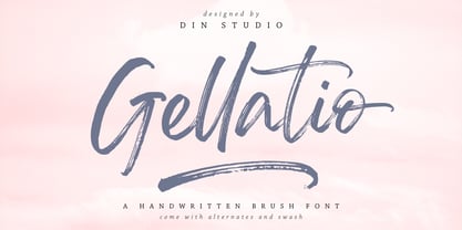
  19. Quitgan Script by FallenGraphic, $16.00
    Introducing Quitgan, an amazing handwritten font . This font will make your design more beautiful and powerful. Quitgan is suitable for any design like branding, quotes and much more. I hope you enjoy it. Quitgan is multi-lingual, PUA encoded and contains Numerals and Punctuations (OpenType Standard) and many alternates. Thanks for visiting and downloading my font.
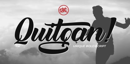
  20. Mostly Bonny by Haksen, $12.00
    Introduce my New Product "Bonny" The new fresh handmade script font. Very suitable for greeting cards, branding materials, business cards, quotes, posters, and more! These fonts are perfect for all brand :) Features : - UpperCase & Lowercase Numerals & Punctuations - Ligatures Multilingual characters (AÀÁÂÃÄÅCÇDÐEÈÉÊËIÌÍÎÏNÑOØÒÓÔÕÖUÙÜÚÛWYÝŸŸÆŒßÞàáâãäåæçèéêëìíîïðñòóôõöøùúûüýÿ) PUA ENCODEDZIP INCLUDED Thanks for visited and Please contact me if you have any questions. My Best, Haksen
  21. Brown Sunflower by Din Studio, $22.00
    Introducing Brown Sunflower Font - Font Duo. Brown Sunflower font is an elegant font. Combined from light modern serif and decorative sans serif. It will make your design more modern and more beautiful. Visit our best-selling products Features : Accents (Multilingual characters) Many Alternates PUA encoded Numerals and Punctuation (OpenType Standard) Full Support Please Note its All Caps.
  22. Feeling Passionate by Din Studio, $25.00
    Feeling Passionate is a casual and beautiful brush font. It will make your design project more beautiful. This font is suitable for any design like branding, fashion, print templates, quotes, wedding and more. Features : 78 Beautiful Alternates 15 Beautiful Ligatures 52 Swashes PUA encoded Multi-lingual Support Numerals and Punctuation (OpenType Standard) Thanks for visiting and purchasing my font.
  23. Alige by Unforma Club, $20.00
    Alige is a humanist sans serif typefaces made for body text and display. Carried classic roman proportion in higher letterform for better reading experence. Inspired by Optima Nova which designed by Hermann Zaph in early 50's, alige contains 28 cuts which 14 style in text and 14 in display. Kindly visit Alige Playground for more detail presentation.
  24. Monarqy by Alit Design, $20.00
    Discover Monarqy - The Funky Retro Font with Dynamic Flair Get ready to transport your projects back to the rad era of the 1980s with Monarqy, a font that encapsulates the funky, retro style of the era while adding a contemporary twist. This font will infuse your designs with a vibrant, nostalgic energy that captures the essence of the 80s like no other. Why Monarqy Stands Out: Cool Dynamic Characteristics: Monarqy oozes character with its funky, dynamic design. Each letter exudes a sense of movement and excitement, making it the perfect choice for projects that demand a playful and energetic vibe. Ligatures for That Perfect Flow: Monarqy offers an extensive range of ligatures, ensuring that your text flows seamlessly, delivering a polished and professional appearance. This feature is a game-changer for designers who demand precision in their typography. Rich Character Set: With an impressive repertoire of 610 characters, Monarqy accommodates a wide array of design applications. Whether you're crafting headlines, branding, or body text, you'll find all the characters you need to bring your vision to life. Alternatives for Creative Freedom: Monarqy doesn't hold back when it comes to creative freedom. The font provides alternative characters that let you experiment and find the perfect fit for your design. Customize your text to match your unique style and vision effortlessly. Multilingual Support: Monarqy is your passport to the global design landscape. With comprehensive multilingual support, it effortlessly adapts to various languages and ensures your message resonates across borders. PUA Unicode: Monarqy is PUA (Private Use Area) encoded, allowing you to unlock even more creative potential. Access special characters and ornaments that will set your designs apart from the rest. Monarqy is Perfect for: Retro-themed designs 80s-inspired branding Party invitations and posters Apparel design Album covers Packaging and labels Editorial layouts And so much more! Reignite the spirit of the 80s with Monarqy and let your creativity shine. Whether you're working on a fun project or a professional design, this font will add that extra touch of style and nostalgia. Get your copy of Monarqy today and embark on a typographic journey back to the funky, retro world of the 80s!
  25. As of my last update, the "SF Chrome Fenders Condensed" font from ShyFoundry Fonts (formerly known as ShyFonts) stands as a distinctive, attention-grabbing typeface that captures the essence of retro...
  26. The font id-Kaze2OT-Light, crafted by Inoue Masaru, is a distinct and refined typeface that stands out for its delicate elegance and gentle grace. Masaru, known for his meticulous attention to detail...
  27. The Red October Stencil font, masterfully designed by Ivan Filipov, stands as a bold and commanding tribute to typography that demands attention. This font finds its roots deeply embedded in the visu...
  28. As of my last update in early 2023, the font named "Ptarmigan" is not one of the widely recognized or mainstream fonts, such as Helvetica, Times New Roman, or Arial, which have broad applications and...
  29. As of my last update in April 2023, there is no widely recognized font named "Switzerland" by a foundry or designer known as "2 The Left Typefaces." However, let's explore a speculative description b...
  30. As of my last update, I don't have direct access to databases or the internet to provide real-time or highly specific descriptions of lesser-known or proprietary fonts, such as "PetalGlyph" by Essqué...
  31. As of my last update in April 2023, there is no widely recognized font specifically named "Jetmix" in the mainstream typographic or design communities. However, the concept of a font named "Jetmix" p...
  32. The font ETIAW v3 is an intriguing and dynamic typeface that stands out for its unique style and character. It is a font that seems to transcend traditional typographic boundaries, offering a fresh p...
  33. As of my last knowledge update in April 2023, there is no widely recognized, specific font named "Zar" that has established itself prominently within the global design community or among popular font...
  34. "Kozmik Vibez" is a distinctive font designed by Darrell Flood, embodying a fusion of retro and futuristic aesthetics. Its design reflects an imaginative journey through space and time, appealing to ...
  35. *Reacting to Reactor Sans!* In an imaginary world where fonts are not just mere letters but beings with personality and purpose, Reactor Sans would surely be the cool, energetic, and slightly edgy ...
  36. As of my last update in April 2023, the font named "Sevil alias Esra Lite" is not widely recognized in mainstream typographic resources or popular font directories. That said, we can still explore an...
  37. As of my last update in April 2023, "13_Roshi" is not recognized as a standard or widely-known font in mainstream typographic resources or font libraries. However, the naming itself suggests a unique...
  38. As of my last update in April 2023, PORT118 isn't a widely recognized or popular font within mainstream typography communities or databases. However, let's imagine and describe what PORT118 could be ...
  39. As of my last update in 2023, the font named "Avatar" could refer to one specifically designed or inspired by the visual and textual elements associated with the media franchise of the same name, suc...
  40. Quake & Shake, a vibrant and dynamic font created by the renowned type foundry Iconian Fonts, embodies an incredible blend of creative quirks and a noticeable energy that is as captivating as it is f...
Looking for more fonts? Check out our New, Sans, Script, Handwriting fonts or Categories
abstract fontscontact usprivacy policyweb font generator
Processing