10,000 search results
(0.015 seconds)
- TA Bankslab Art Nouveau by Tural Alisoy,
$40.00 TA Bankslab graphic presentation at Behance The building of the Northern Bank of St. Petersburg's Baku branch was built in 1903-1905. It was the first Art Nouveau-style building in Baku, Azerbaijan. Later the bank was transformed into the Russian-Asian Bank. After the oil boom in Baku in the 19th century, branches of many banks and new banks were opened in the city. The branch of the Northern Bank of St. Petersburg was among the first banks that was opened in Baku. N.Bayev was the architect of the building for the branch of the Northern Bank of St. Petersburg located at Gorchakovskaya 3 in 1903-1905. The building currently houses the Central Branch of the International Bank of Azerbaijan. My purpose in writing this is not to copy and paste the information from Wikipedia. What attracted me to the building was the word "Банкъ" (Bank) written in Cyrillic letters, which was also used in Azerbaijan during the Soviet era. The exact date of the writing is not known. Every time I pass by this building, I always thought of creating a font of this writing someday. I had taken a photo of the building and saved it on my phone. I did a lot of research on the font and asked a lot of people. However, some did not provide information at all and some said they did not have any information. I was interested in the history of this font but I do not know if this font really existed or it was created by the architect out of nowhere. If there was such a history of this font, I wanted to recreate this font and make it available. If not, I had to create it from scratch in the same way, using only existing letters on the building. Finally, I made up my mind and decided to develop the font with all letters I have got. It was difficult to create a font based on the word, Банкъ. Because in the appearance of the letters, the midline of the letters on A, H, K was very distinct, both in the form of inclination and in more precise degrees. The serif part of the letters, the height of the upper and lower sides, differed from each other. I don't know whether it was done this way when the building was constructed or it happened over time. I prepared and kept the initial version of the font. I took a break for a while. I started digging on the story of the font again. Meanwhile, I was researching and got inspired by similar fonts. Unfortunately, my research on the font's history did not yield any results. I decided to continue finishing up the font. After developing the demo, I created the font by keeping certain parts of these differences in the letters. In addition, I had to consider the development of letters in the Cyrillic, as well as the Latin alphabet, over the past period. Thus, I began to look at the appearance of slab-serif or serif fonts of that time. In general, as I gain more experience in developing fonts, I try to focus on the precision of the design for each font. In recent years, I specifically paid attention to this matter. YouTube channel and articles by Alexandra K.'s of ParaType, as well as, information and samples from TypeType and Fontfabric studios on the Cyrillic alphabet were quite useful. I gathered data regarding the Latin alphabet from various credible sources. I do not know if I could accomplish what I aimed at but I know one thing that I could develop the font. Maybe someday I'll have to revise this font. For now, I share it with you. I created the font in 10 styles. 7 weight from Thin to Extra Black, an Outline, Shadow, and Art Nouveau. The Art Nouveau style was inspired by the texture in the background used for the text on the building. The texture I applied to capital letters adds beauty to the font. If you like the font feel free to use it or simply let me know if your current alphabet doesn't support this font.
 - Flat10 Arts And Crafts by Dharma Type,
$9.99 This 8-bit pixel font is designed with respect for 80s game designers and the pixel font pioneers in middle 90s. Use at size 10 pixels or multiples of 10 and anti-alias off is recommended. List of our Pixel Font Project. ·Flat10 Antique ·Flat10 Artdeco ·Flat10 Arts&Crafts ·Flat10 fraktur ·Flat10 Holy ·Flat10 Holly ·Flat10 Segments ·Flat10 Stencil ·Flat20 Gothic ·Flat20 Headline ·Flat20 Hippies ·Flat20 Streamer ·Behrensmeyer Vigesimals ·Civilite Vigesimals
 - KG Sorry Not Sorry by Kimberly Geswein,
$5.00 A neat blocky solid font for headlines. In two weights.
 - Plinc Beaux Arts Didot by House Industries,
$33.00 Firmin Didot is credited with establishing the Modern genre of serif typefaces, of which Beaux Arts Didots stands as an exemplary model. Like the French neoclassical architecture of its namesake, Beaux Arts has all the hallmarks of the early nineteenth-century style: a clear and confident construction consisting of simple yet strong lines. Use it for elegant and formal settings, or when a direct typographic tone is desired. Mix it with styles of similar sensibilities such as Plinc Hanover and Davison Spencerian. Digitized from the original Photo-Lettering film matrix in 2014 by Jean-Baptiste Levée. BEAUX ARTS DIDOT CREDITS: Typeface Design: Photo-Lettering Staff Typeface Digitization: Jean-Baptiste Levée Typeface Production: Ben Kiel Typeface Direction: Ken Barber Like all good subversives, House Industries hides in plain sight while amplifying the look, feel and style of the world’s most interesting brands, products and people. Based in Delaware, visually influencing the world.
 - Futura Black Art Deco by URW Type Foundry,
$39.99 - Not So Grotesk JNL by Jeff Levine,
$29.00 A circa-1920s book on lettering entitled "Book of Alphabets" by Regan Publishing displayed an example of a Grotesk typeface (a popular style of sans serif of the time). This design was re-drawn digitally as Not So Grotesk JNL and is available in four varieties - regular, oblique, condensed and condensed oblique. Not So Grotesk JNL is the perfect companion font family to use alongside Simply Grotesk JNL.
 - Arts And Crafts-GS by Bannigan Artworks,
$19.95The Arts And Crafts-GS font is loosely inspired by the lettering of Charles Rennie Mackintosh (1868 - 1928) of the Glasgow School, from which Jessie receive her training. - French Art Initials JNL by Jeff Levine,
$29.00The source for these hand-drawn initials was an early 20th Century French alphabet book whose pages were displayed online at an image sharing site. This style typifies the Art Nouveau period, and makes a wonderful paragraph starter or "drop cap" for your printed projects. Some users may still want to compose headlines with this font, but be aware there are no punctuation marks, accents or kerning - just the twenty-six initials. - Art Deco Monograms JNL by Jeff Levine,
$29.00 The same monograms found on a 1930s-era business card that inspired Golden Beach JNL are reproduced as Art Deco Monograms JNL. Left-side monograms are on the upper case A-Z, while the lower case a-z are the right side monograms. A vertical bar is on the period key for a centerpiece between the two initials.
 - Vintage Stencil Art JNL by Jeff Levine,
$29.00 Vintage Stencil Art JNL collects another twenty-six charming designs, all re-drawn from antique and vintage stencil sources. These images make for the perfect embellishment to typographic projects which utilize stencil type, or the designs can be applied as decorative thematic backgrounds (such as a flower show, nature walks and so forth). For reproduction as saleable commercial products such as stencils, decals, stickers, transfers, etc. please refer to the terms and conditions which are clearly stated in the font's End User License Agreement regarding specialized licensing.
 - Art And Design JNL by Jeff Levine,
$29.00 A 1930s-era WPA (Works Progress Administration) poster advertising a Federal Art Project exhibit entitled "Index of American Design" was the basis for Art and Design JNL.
 - Art Deco Flowery Initials by Celebrity Fontz,
$19.99Art Deco Flowery Initials is a collection of richly decorated Art Deco letters set on a background of vines and blooming flowers. Includes one set of A-Z ornamental initials conveniently assigned to both the upper and lower case alphabet characters. Perfect for starting off the beginning of paragraphs in artistic publications, storybooks, fairy tales, and texts conveying the feel of the Art Deco period. - Line Art Eclectrice Aligned by DJ THINK,
$95.00 Thanks for checking out LineArt ECLECTRICE (pronounced EHCK-LEHCK-TREES) Light Aligned font by Rene Toussaint (otherwise known as DJ THINK) of LineArt Foundry and Brand. This font is designed in the vein of graffiti art with stylings of hip-hop and hieroglyphic appearance. Try it in a preview window and check out if it will meet your needs for something cool and hip for your next flyer design or other type of graphic art image. Keep in mind that this is a light design and may require extra thickening in your vector program of choice with outline thickness options.
 - Art Nouveau 2 BA by Bannigan Artworks,
$19.95This is an original font designed in the Art Nouveau style. - Eleme S Sans HBold - Unknown license

- Stocks and Bonds JNL by Jeff Levine,
$29.00 The hand lettered opening title for the 1935 movie “Thanks a Million” is rendered in a condensed, thick and thin Art Deco sans serif design. It is now available as the digital typeface Stocks and Bonds JNL – in both regular and oblique versions.
 - HKF Gold Queen DLC by Harry Kasyanov,
$5.00 Gold Queen is a vintage font family with features opentype with extension svg. Perfect for the vintage tattoo studio logos, barbershops, alcohol labels and many other. Includes a full set of character A-Z, numerals, and punctuation. Product content: HKF Gold Queen Regular - (OTF) HKF Gold Queen Drop line - (OTF) HKF Gold Queen Drop shadow (B&W) - (OTF) Color fonts (available only with Adobe illustrator CC 2018 and Photoshop CC from 2017) HKF Gold Queen Drop line (color) - (OTF SVG) HKF Gold Queen Drop shadow (color) - (OTF SVG)
 - M Gothic Gold HK by Monotype HK,
$523.99 M Gothic Gold HK is a modulated style Traditional Chinese typeface. Modulated font designs have apparent thick-thin contrast at the strokes, and often include special design characteristics at entry, finial and transitional points of the strokes. Modulated Traditional Chinese font design category includes traditional Song, Ming or Fang Song style typefaces which are popular for continuous reading.
 - M Gothic Gold PRC by Monotype HK,
$523.99 M Gothic Gold PRC is a modulated style Simplified Chinese typeface. Modulated font designs have apparent thick-thin contrast at the strokes, and often include special design characteristics at entry, finial and transitional points of the strokes. Modulated Simplified Chinese font design category includes traditional Song, Ming or Fang Song style typefaces which are popular for continuous reading.
 - Gold Year Personal Use - Personal use only

- the EV$NT - Personal use only

- NT Louis Douze by Novo Typo,
$26.00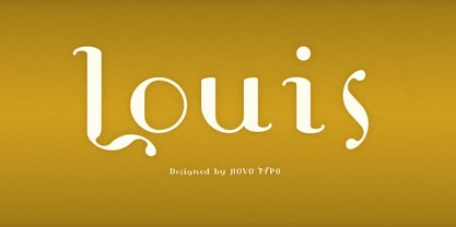
- NT Brick Sans by Nurrontype,
$17.00 Back to the future! NT Brick Sans is a pixelated sans serif. Inspired by the Pixel Art phenomenon and Lego bricks, bringing back the good old 16-bit era with open-type features. It's bold, soft rounded, supports multi-language, featuring low caps option. Brick Sans will make your project special. Grab it now.
 - NT Tonight Show by Nurrontype,
$21.00 I was watching last episode of Tonight Show with Letterman when I develop NT Tonight Show. My idea, I want to make a font that represent showbiz industry. Voila, here's Tonight Show. A contrast, bold, versatile. With swash and alternate option.
 - Adhesive Nr. Seven by phospho,
$25.00 This sticky blackletter font owes its street credibility to the texture of torn adhesive tape. Designed to support rehabilitation of the historically tainted Fraktur, its pragmatically shaped majuscules guarantee legibility to a 21st-century readership. They even forgive all-caps usage - a thing you better not try with most blackletter types around. It contains a range of diacritics and ligatures, as well as open type features that substitute alternate glyphs for often repeating characters. With its fine tape strip details you may best use it at poster and headline sizes; at small sizes you interestingly get a nice woodcut appearance. Connoisseurs use it with style, while true blackmetal grimlords curse it for its fashionability!
 - Bonnet Grotesque Nr by astype,
$42.00 Since the release of Wood Bonnet Grotesque No.4 the font became popular for packaging and adverts. But the font styles were limited to one worn and one clean font in a medium weight only. Bonnet Grotesque Nr [Narrow] will fill this gap. It’s based on Wood Bonnet Grotesque No.4 but slightly modernized with sharp corners. Some letters need more space now – so tracking is not the same. The Medium family style shares the same weight as the wood font version.
 - Core Sans NR by S-Core,
$15.00 The Core Sans NR Family is a part of the Core Sans Series, such as Core Sans N, Core Sans N SC, Core Sans M, and Core Sans G. This family is the rounded version of Core Sans N family. Letters in the Core Sans NR Family are designed with genuine neo-grotesque and neutral shapes without any decorative distractions. The spaces between individual letter forms are precisely adjusted to create the perfect typesetting. The Core Sans NR Family consists of 3 widths (Condensed, Normal, Extended), 9 weights (Thin, ExtraLight, Light, Regular, Medium, Bold, ExtraBold, Heavy, Black), and Italics for each format. It also supports WGL4, which provides a wide range of character sets (CE, Greek, Cyrillic and Eastern European characters). Each font includes support for Tabular numbers, Arrows, Box drawings, Geometric shapes, Block elements, Mathematical operators, Miscellaneous symbols and Opentype Features such as Proportional Figures, Numerators, Denominators, Superscript, Scientific Inferiors, Subscript, Fractions and Standard Ligatures. The Core Sans NR Family provides both OpenType (.OTF) and TrueType (.TTF) versions in the same package. We highly recommend it for use in books, web pages, screen displays, and so on.
 - RT Austin Plain by Estudio Calderon,
$19.00 Austin Plain is derived from the union between Melts Script and Deftone Stylus, the result is a friendly typeface that mixes old American styles with modern design concepts.
 - NT Therese Quatorze by Novo Typo,
$26.00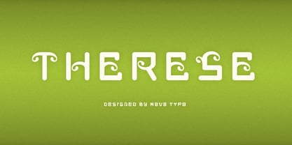
- KG This Is Not Goodbye - Personal use only

- Do not eat this Italic - Unknown license

- Do not eat this Skew - Unknown license

- Do not eat this Fat - Unknown license

- KG This Is Not Goodbye by Kimberly Geswein,
$5.00 Neat, calligraphy-style handwriting using a chisel-tipped marker.
 - I am not a robot by PizzaDude.dk,
$15.00 The other day I had to login to a page several times, and as security I had to check the "I am not a robot" box. Actually, I think I did a login at that particular page like 30 times that day...and in the end I was thinking "Come on, you should know by now that I am not a robot" And even though I thought it was a repetitious hassle I figured that I needed to name a font "I am not a robot" - and not a robotic-like one, but a sweet and funny cartoonish one! :)
 - Arts And Crafts Ornaments BA by Bannigan Artworks,
$19.95 This is a picture font of Arts And Crafts style and Art Nouveau style ornaments.
 - Arts And Crafts Hand BA by Bannigan Artworks,
$19.95This is an original typeface designed in the Arts And Crafts style. It is similar to Arts And Crafts GS, but with a more organic hand lettering style true to the Arts and Crafts movement. It is loosely inspired by the decorative lettering of Jessie Marion King, and the Scottish style of Charles Rennie Mackintosh of the Glasgow School, from which Jessie received her training. - Is Not A Brazilian Font by Intellecta Design,
$17.95 an art deco font based on brazilian Rio's lettering old publish lettering style
 - Arts And Crafts Sans BA by Bannigan Artworks,
$19.95 This is the sans serif version of my Arts and Crafts family of typefaces.
 - Grayson 1940s Art Deco Typeface by Hipfonts,
$18.00 Grayson is a 1940s art deco typeface. The inspiration came from vintage store signs in London, New York, and other major cities. The font is clean, easy to read, and its letterforms are memorable which makes it perfect for branding. You can use this font for a wide variety of projects, possibilities are endless. The downloads comes with OTF and TTF versions of the font. Enjoy!


