10,000 search results
(0.164 seconds)
- David Hadash Formal by Monotype,
$50.99Monotype Imaging is pleased to present David Hadash (New" David), the full family of typefaces by Ismar David, in its intended authentic form. The Estate of Ismar David has sought to revive this jewel of Twentieth-Century design by granting an exclusive license to Monotype Imaging to implement it in industry-standard format. Never before has the typeface in its full set of sub-styles been made available to the design community. David Hadash consists of three style families, Formal, Script, and Sans. Each of these appears in three weigths: regular, medium, and bold. Originally devised as a companion to the upright Formal style, the Script style has a beauty and grace all its own that allows it to be used for full-page settings also. While it is forward-leaning and dynamic, it does not match any of the existing cursive styles of Hebrew script. Ismar David created an eminently readable hybrid style which is like no other by inclining the forms of the upright while blending in some features of Rashi style softened with gentle curves. One can say that the Script style is the first truly italic, not just oblique, typeface for Hebrew script. Although the proportions of the Sans style are very similar to those of the Formal style, its visual impression is stunningly different. If the Formal style is believably written with a broad-point pen, the Sans is chiseled in stone. Rounded angles turn angular and stark. The end result is an informal style that evokes both ancient and contemporary impressions. David Hadash (Modern) supports the writing conventions of Modern Hebrew (including fully vocalized text) in addition to Yiddish and Ladino. David Hadash Biblical is a version of the Formal style that supports all the complexities of Biblical Hebrew, including vocalization and cantillation marks. " - Otoboke by Typodermic,
$11.95 Far out, fellow psychonauts, have you checked out the trippy typeface called Otoboke? Let me tell you, this font is not from this world—it’s straight from the cosmos! With its mind-bending letter pair thingamajigs, even repeating letters are otherworldly. Take a closer look at Otoboke, and you’ll notice the fur texture—it’s like the letters are alive and ready to party! But where did this font’s tripped-out, letterforms come from, you ask? Well, they were inspired by none other than Louis Minott’s 1965 classic, Davida, channeling the vibes, and taking it to a whole new level. So, if you’re ready to take your graphic design to a whole new dimension, look no further than Otoboke. This typeface is not for the faint of heart—it’s for the true freakazoids. Most Latin-based European writing systems are supported, including the following languages. Afaan Oromo, Afar, Afrikaans, Albanian, Alsatian, Aromanian, Aymara, Bashkir (Latin), Basque, Belarusian (Latin), Bemba, Bikol, Bosnian, Breton, Cape Verdean, Creole, Catalan, Cebuano, Chamorro, Chavacano, Chichewa, Crimean Tatar (Latin), Croatian, Czech, Danish, Dawan, Dholuo, Dutch, English, Estonian, Faroese, Fijian, Filipino, Finnish, French, Frisian, Friulian, Gagauz (Latin), Galician, Ganda, Genoese, German, Greenlandic, Guadeloupean Creole, Haitian Creole, Hawaiian, Hiligaynon, Hungarian, Icelandic, Ilocano, Indonesian, Irish, Italian, Jamaican, Kaqchikel, Karakalpak (Latin), Kashubian, Kikongo, Kinyarwanda, Kirundi, Kurdish (Latin), Latvian, Lithuanian, Lombard, Low Saxon, Luxembourgish, Maasai, Makhuwa, Malay, Maltese, Māori, Moldovan, Montenegrin, Ndebele, Neapolitan, Norwegian, Novial, Occitan, Ossetian (Latin), Papiamento, Piedmontese, Polish, Portuguese, Quechua, Rarotongan, Romanian, Romansh, Sami, Sango, Saramaccan, Sardinian, Scottish Gaelic, Serbian (Latin), Shona, Sicilian, Silesian, Slovak, Slovenian, Somali, Sorbian, Sotho, Spanish, Swahili, Swazi, Swedish, Tagalog, Tahitian, Tetum, Tongan, Tshiluba, Tsonga, Tswana, Tumbuka, Turkish, Turkmen (Latin), Tuvaluan, Uzbek (Latin), Venetian, Vepsian, Võro, Walloon, Waray-Waray, Wayuu, Welsh, Wolof, Xhosa, Yapese, Zapotec Zulu and Zuni.
 - 99 Names of ALLAH Minimal by Islamic Calligraphy75,
$12.00 We have transformed the “99 names of ALLAH” into a font. That means each key on your keyboard represents 1 of the 99 names of ALLAH Aaza Wajal. The fonts work with both the English and Arabic Keyboards. We call this Calligraphy "Minimal" because of the minimal decoration and simplistic design. The first "Alef" has a "hamzit wasel", this indicates that the name can be pronounced both as "AR-RAHMAAN" or "R-RAHMAN" (in the zip file you will find a pdf file explaining the differences in the "harakat", pronunciation and spelling according to the Holy Quran). This calligraphy is not only minimal in its design but easy to read, very few letters overlaps and the decorative symbols are at minimum. Decorative letters used in this calligraphy: "Mim, Aain, Sin, HHe, He & Saad". Purpose & use: - Writers: Highlight the names in your texts in beautiful Islamic calligraphy. - Editors: Use with kinetic typography templates (AE) & editing software. - Designers: The very small details in the names does not affect the quality. Rest assured it is flawless. The MOST IMPORTANT THING about this list is that all the names are 100% ERROR FREE, and you can USE THEM WITH YOUR EYES CLOSED. All the “Tachkilat” are 100% ERROR FREE, all the "Spelling" is 100% ERROR FREE, and they all have been written in accordance with the Holy Quran. No names are missing and no names are duplicated. The list is complete "99 names +1". The +1 is the name “ALLAH” 'Aza wajal. Another important thing is how we use the decorative letters. In every font you will see small decorative letters, these letters are used only in accordance with their respective letters to indicate pronunciation & we don't include them randomly. That means "mim" on top or below the letter "mim", "sin" on top or below the letter "sin", and so on and so forth. Included: Pdf file telling you which key is associated with which name. In that same file we have included the transliteration and explication of all 99 names. Pdf file explaining the differences in the harakat and pronunciation according to the Holy Quran. Here is a link to all the extra files you will need: https://drive.google.com/drive/folders/1Xj2Q8hhmfKD7stY6RILhKPiPfePpI9U4?usp=sharing ---------------------------------------------------------------------------------------------------------------------------
 - TT Fors by TypeType,
$39.00 TT Fors useful links: Specimen | Graphic presentation | Customization options TT Fors is a modern geometric sans serif with characters and shapes contrasting in width, as close as possible to the basic geometric shapes (circle, square, triangle). TT Fors is a great addition to TypeType's line of functional sans serifs, which already includes such fonts as TT Norms Pro, TT Commons, TT Hoves and TT Interphases. The main inspiration for the creation of TT Fors was the study of geometric grotesques of the early to mid-20th century (Futura, Neuzeit Grotesk, Twentieth Century, Avantgarde Gothic, etc.), and the analysis of the contribution they made to the visual environment of that time. We gave ourselves the task to create the most versatile functional typeface that draws inspiration from the visual environment of the early to mid-20th century, but at the same time is aimed at uninterrupted use in all modern media, from branding and packaging design to work in interfaces and applications. This versatility is reflected in the title TT Fors (for), a typeface for a wide range of uses. The rounded characters in the font family tend to be shaped as the correct circle as much as possible, while the rest of the characters have narrower proportions. For more functionality, the typeface has rather high lowercase characters. Thanks to the correct and precisely selected geometric shapes and uniform construction rules, TT Fors works great both in the format of large headings and in very small text sizes used in book printing and in web design. In addition, the TT Fors family has a display subfamily TT Fors Display, which is a trendy pair for the text fonts. The main feature of the display subfamily is high contrast in horizontal or vertical strokes. When choosing a contrasting stroke, we paid attention that the shape of the letter would not go into reverse contrast and become a stressed sans serif. The subtle strokes in TT Fors Display have added sufficient display vibe to give the font a vibrant character, while remaining intelligent and serious. In total, TT Fors family includes 34 fonts: 9 weights and 9 italic styles in the text subfamily, 6 weights and 6 italic styles in the display subfamily, 2 outline styles and 2 variable fonts for both subfamilies. TT Fors has stylistic alternatives, ligatures, small caps (text family only), numbers in circles, arrows and a set of alternative round full stops and punctuation marks (text family only), slashed zero, and other useful features. More details about all OpenType features can be found in the font specimen. And, by good tradition, TT Fors has two variable fonts, for each of the subfamilies. Each variable font supports two axes of variability—thickness and slant. An important clarification—not all programs support variable technologies yet, you can check the support status here: https://v-fonts.com/support/. To use the variable font with two variable axes on Mac you will need MacOS 10.14 or higher. TT Fors supports more than 180+ languages, such as: Acehnese, Afar, Albanian+, Aleut (lat), Alsatian, Aragonese, Arumanian+, Asu, Aymara, Azerbaijani+, Banjar, Basque+, Belarusian (lat), Bemba, Bena, Betawi, Bislama+, Boholano+, Bosnian (lat), Breton+, Catalan+, Cebuano+, Chamorro+, Chichewa, Chiga, Colognian+, Cornish, Corsican+, Cree, Croatian, Czech+, Danish, Dutch+, Embu, English+, Esperanto, Estonian+, Faroese+, Fijian, Filipino+, Finnish, French, Frisian, Friulian+, Gaelic, Gagauz (lat), Galician+, Ganda, German+, Gusii, Haitian Creole, Hawaiian, Hiri Motu, Hungarian+, Icelandic+, Ilocano, Indonesian+, Innu-aimun, Interlingua, Irish, Italian+, Javanese, Jola-Fonyi, Judaeo-Spanish, Kabuverdianu, Kalenjin, Karachay-Balkar (lat), Karaim (lat), Karakalpak (lat), Karelian, Kashubian, Kazakh (lat), Khasi, Kinyarwanda, Kirundi, Kongo, Kurdish (lat), Ladin, Latvian, Leonese, Lithuanian, Livvi-Karelian, Luba-Kasai, Ludic, Luganda+, Luo, Luxembourgish+, Luyia, Machame, Makhuwa-Meetto, Makonde, Malagasy, Malay+, Maltese, Manx, Maori, Marshallese, Mauritian Creole, Minangkabau+, Moldavian (lat), Montenegrin (lat), Morisyen, Nahuatl, Nauruan, Ndebele, Nias, Norwegian, Nyankole, Occitan, Oromo, Palauan, Polish+, Portuguese+, Quechua+, Rheto-Romance, Rohingya, Romanian +, Romansh+, Rombo, Rundi, Rwa, Salar, Samburu, Samoan, Sango, Sangu, Sasak, Scots, Sena, Serbian (lat)+, Seychellois Creole, Shambala, Shona, Silesian, Slovak+, Slovenian+, Soga, Somali, Sorbian, Sotho+, Spanish+, Sundanese, Swahili, Swazi, Swedish+, Swiss German+, Tagalog+, Tahitian, Taita, Talysh (lat), Tatar+, Teso, Tetum, Tok Pisin, Tongan+, Tsakhur (Azerbaijan), Tsonga, Tswana+, Turkish+, Turkmen (lat), Uyghur, Valencian+, Vastese, Vepsian, Volapük, Võro, Vunjo, Walloon, Welsh+, Wolof, Xhosa, Zaza, Zulu+, Belarusian (cyr), Bosnian (cyr), Bulgarian (not localization), Erzya, Karachay-Balkar (cyr), Khvarshi, Kumyk, Macedonian, Montenegrin (cyr), Mordvin-moksha, Nogai, Russian+, Rusyn, Serbian (cyr)+, Ukrainian
 - Shilia by Linotype,
$103.99 SHILIA – AN ARABIC FONT THAT LIVES HAND IN HAND WITH LATIN TEXT CHARACTERS A special design principle underlies the Arabic font Shilia created by Mamoun Sakkal: the form of the characters means that they harmonise happily with sans serif Latin fonts, such as Univers. Because of this, Shilia is the ideal choice for any bilingual project and for use in international corporate branding. Shilia™ had its beginnings in the 1970s. Taking one of the oldest variants of Arabic script, the minimalist Kufic, as his inspiration, Mamoun Sakkal fashioned simple stroke shapes that are combined according to a geometric grid. Shilia is at home in both worlds, that of the East and that of the West. And although Shilia has been primarily designed to be used as a display font, it is also ideal for setting shorter texts. Before being published by Linotype, Shilia underwent major adaptation and updating, and is now available in the modern OpenType format. Mamoun Sakkal increased the characters available per individual typeface variant to over 1,800, and his daughter, Aida Sakkal, worked on programming the extensive OpenType features for the font. There are numerous ligatures that can be used to provide suitable variation and avoid repetition within a given context, and many special features such as the dots under the initial and final segments of words being automatically centralised. Shilia not only supports Arabic, but also Persian and Urdu. Special character combinations for setting texts in these languages, particularly Urdu, are provided through OpenType. And there are a total of 19 stylistic sets with additional character variants available to the user. An example of Urdu text Shilia is available in eight weights, from UltraLight to Black. The corresponding condensed versions are in the course of preparation. Along with the Arabic characters, all of the typeface versions include matching Latin alphabet letters of Adrian Frutiger’s Linotype Univers® family, making Shilia intrinsically suitable for setting bilingual texts. A set of ornaments carefully designed to allow for numerous compositions of bands and decorative patterns rounds off the range of characters on offer. With its 21 weights, Shilia is one of the most extensive of Arabic typeface families that is currently on the market. Its clear and well-balanced forms emphasise the linear nature of the font without allowing it to appear sterile or artificial. Shilia not only cuts a good figure as a display font for signage or in artistic projects, thanks to its substantial range of features, the font family can also be used to set texts, such as corporate and administrative documents. In addition, but the full compatibility between the Arabic and Latin characters makes Shilia the perfect choice for international and multilingual design projects.
 - Penmanship Print - Unknown license

- Dynascript by Alphabet Soup,
$60.00 Typography enters the Space Age! Dynascript brings the ease of “Pushbutton Automatic” to your typesetting experience. Dynascript is actually Two fonts in One–without switching fonts you can instantly change from Dynascript’s connecting font to the non-connecting italic with the simple push of a button. For more details download “The Dynascript Manual” from the Gallery Section. What is Dynascript? Dynascript is the slanted script cousin of Dynatype. It shares many of the characteristics of it’s sibling, but is drawn entirely from scratch and has it’s own unique character. To some it may be reminiscent of various mid-century neon signage, and of sign writing, Speedball alphabets and even baseball scripts. The design of Dynascript also takes some cues from a historical typographic curiosity that began in Germany in the ‘20s and which lasted into the ‘60s—when Photo-Lettering gave it the name "Zip-Top". Basically it was believed to be the wave of the future—that by weighting an alphabet heavier in its top half, one could increase legibility and reading speed. The jury’s still out on whether or not there’s any validity to this claim, but I think you’ll agree that in the context of this design, the heavier weighting at the top of the letters helps to create some uniquely pleasing forms, and a script unlike any other. Typesetters across the planet will also be able to set copy in their language of choice. Dynascript’s 694 glyphs can be used to set copy in: Albanian, Basque, Catalan, Cornish, Croatian, Czech, Danish, Dutch, Esperanto, Estonian, Faroese, Finnish, French, Galician, German, Hungarian, Icelandic, Indonesian, Irish, Italian, Kalaallisut, Latvian, Lithuanian, Malay, Maltese, Manx, Norwegian Bokmål, Norwegian Nynorsk, Oromo, Polish, Portuguese, Slovak, Slovenian, Somali, Spanish, Swahili, Swedish, Turkish, and Welsh—and of course English. Sorry! Off-world languages not yet supported. PLEASE NOTE: When setting Dynascript one should ALWAYS select the “Standard Ligatures" and “Contextual Alternates” buttons in your OpenType palette. See the “Read Me First!” file in the Gallery section.
 - TA Film Fiction Semi X by Tural Alisoy,
$25.00 Film Fiction Semi Expanded has been updated and will now beautify your designs under the name TA Film Fiction Semi-X. We've already updated and revitalized TA Film Fiction Semi-X to ensure it perfectly matches your evolving creative vision. The inclusion of tabular figures, old-style figures and alternative glyphs expands your design palette and allows you to adapt the font to your unique style. TA Film Fiction Semi-X has been updated experience the appeal – this can be your font of choice to enhance your brand identity, cinematic efforts and editorial design. This brilliant typeface is not just a typographic tool, but a creative catalyst for headlines, logos, web elements, signage, posters and fashion apparel, packaging. TA Film Fiction Semi-X does not follow trends, it defines them, imbuing each project with a true modern essence. Embrace the possibilities with 9 different styles, each boasting a large set of 758 glyphs. Discover OpenType features: Access All Alternates, Case-Sensitive Forms, Glyph Composition / Decomposition, Denominators, Fractions, Kerning, Standard Ligatures, Lining Figures, Localized Forms, Mark Positioning, Mark to Mark Positioning, Numerators, Oldstyle Figures, Ordinals, Proportional Figures, Stylistic Alternates, Scientific Inferiors, Stylistic Set 1, Stylistic Set 2, Stylistic Set 3, Stylistic Set 4, Stylistic Set 5, Stylistic Set 6, Stylistic Set 7, Subscript, Superscript, Tabular Figures TA Film Fiction Semi-X supports Khinalyg (Xınalıq) alphabet Test your alphabet, explore the nuances and witness the transformation. And if you're at any creative crossroads, I'm here for you. If you want to customize TA Film Fiction Semi-X, need font files or have any other questions, please reach out to me at t@taft.work. TA Film Fiction Semi-X be the cornerstone of your creative journey. Elevate your designs, embrace innovation and redefine possibilities with TA Film Fiction Semi-X, where each character tells a story. Questions? Contact us at t@taft.work Instagram @taft.work or @tural_a Visit us https://taft.work/
 - Bellas Artes by Sudtipos,
$59.00 Bellas Artes is what happens when the brush of Angel Koziupa and the technical expertise of Alejandro Paul go face to face with the Art Deco aesthetic. The recognizable Koziupa curves become players of a game of halves, where there is no such thing as a better half, but both sides complete each other like in that perfect romance you will never forget. Bellas Artes is an excellent choice not only for packaging design, but also for book and music covers meant for the feminine demographic, collateral of classical taste, and of course pre-WWII visuals.
 - Racers Energy by Din Studio,
$29.00 Do you want energetic designs? Racer energy is a font created in capital letters with the racing theme producing courageous strong impressions in no time making it worth adding to your design list. Letters are made similar to firm rectangle blocks with sharp-angles. Enjoy other incredible features available on this font. Features: Multilingual Supports PUA Encoded Numerals and Punctuation This font looks great on any design projects such as posters, banners, logos, book covers, headings, printed products, merchandise, social media, etc. Find out more ways to use this font by taking a look at the font preview. Purchase it now. Happy designing.
 - Solasta by VP Creative Shop,
$20.00 Introducing Solasta - organic script Solasta is organic and modern script loaded with ligature glyphs and multilingual support. It's a very versatile font that works great in large and small sizes. This font is perfect for branding projects, home-ware designs, product packaging, magazine headers - or simply as a stylish text overlay to any background image. FEATURES Uppercase, lowercase, numeral, punctuation & Symbol ligature glyphs Multilingual support No special software is required to type out the standard characters of the Typeface. Canva friendly Feel free to contact me if you have any questions! Mock ups and backgrounds used are not included. Thank you! Enjoy!
 - Breadcrumbs by Hanoded,
$15.00 Every morning, after the kids have gone to school, I vacuum the floor and remove about half a kilo of breadcrumbs… No, not really have a kilo, but any given bird could probably survive on the leftovers. When it was time to name this font, Breadcrumbs was all I could think of! Breadcrumbs and children seem to go together well, as they are featured in Hansel & Gretel and Hop-o'-My-Thumb. Breadcrumbs font is a happy, sloppy fairytale font, which you can use for your book covers, your party posters and maybe crumbly bread packaging. But that is entirely up to you.
 - Zzzap by Comicraft,
$19.00 Run your hand under the tap and then thrust your fingers in the electrical outlet nearest to you* and you'll get the same effect that our latest release, ZZZAP will have on comic book readers everywhere when Electro, The Shocker, Black Lightning, Storm and Darth Sidious turn the dark side of the force on them. *The management accepts no responsibility for any adverse effects experienced by comic book font users who stick moistened digits into the power supply after installing this font for the purposes of comparison (it's probably best to just take our word for it). Batteries not included, void where prohibited.
 - J Scott Campbell by Comicraft,
$29.00 Cliffhanger's top-selling DANGER GIRL creator and artist, Jeff Campbell, also topped our first MASTERS OF COMIC BOOK ART poll. Originally Jeff wanted his font to be wholly exclusive to the DANGER GIRL book, but we begged him, we pleaded with him and, eventually, we took photographs of him (in compromising positions with his "models") and he relented. Now, at long last we are making this slick and stylish font available as a part of our catalog, and you no longer need be a stranger to danger. See these families related to J Scott Campbell: J Scott Campbell Lower & J Scott Campbell Sketchbook .
 - Stolid by VP Creative Shop,
$20.00 Introducing Stolid - modern script Stolid is organic and casual script loaded with ligature glyphs and multilingual support. It's a very versatile font that works great in large and small sizes. This font is perfect for branding projects, home-ware designs, product packaging, magazine headers - or simply as a stylish text overlay to any background image. FEATURES Uppercase, lowercase, numeral, punctuation & Symbol ligature glyphs Multilingual support No special software is required to type out the standard characters of the Typeface. Canva friendly Feel free to contact me if you have any questions! Mock ups and backgrounds used are not included. Thank you! Enjoy!
 - Ferly by VP Creative Shop,
$20.00 Introducing Ferly - Elegant serif font Ferly is luxury and fragile font with multilingual support. It's a very versatile font that works great in large and small sizes. This font is perfect for branding projects, home-ware designs, product packaging, magazine headers - or simply as a stylish text overlay to any background image. FEATURES Uppercase, numeral, punctuation & Symbol Multilingual support No special software is required to type out the standard characters of the Typeface. Canva friendly Feel free to contact me if you have any questions! Mock ups and backgrounds used are not included. Thank you! Enjoy!
 - Kith by VP Creative Shop,
$20.00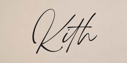 Introducing Kith - handmade script Kith is handmade and organic script loaded with ligature glyphs and multilingual support. It's a very versatile font that works great in large and small sizes. This font is perfect for branding projects, home-ware designs, product packaging, magazine headers - or simply as a stylish text overlay to any background image. FEATURES Uppercase, lowercase, numeral, punctuation & Symbol ligature glyphs Multilingual support No special software is required to type out the standard characters of the Typeface. Canva friendly Feel free to contact me if you have any questions! Mock ups and backgrounds used are not included. Thank you! Enjoy!
 - Day And Collins Logotypes by Jeremia Adatte,
$20.00 Please Note: as this is a picture-only font, there are no latin alpha/numeric glyphs. Each wood type manufacturer had their own selection of original Logotypes or Catchwords designs. These are taken right from the original source material, an extremely rare 1910 catalog of an English wood type maker called Day & Collins in London. As the name says it, these words are intended to attract attention, to spice up posters, packaging or advertisement designs. I made these available for the digital age, leaving the original texture of printed wood type at the highest detail possible.
 - Boldfire by VP Creative Shop,
$15.00 Introducing Boldfire - creative font duo Boldfire is elegant and organic typeface with multilingual support. It's a very versatile font that works great in large and small sizes. This font duo is perfect for branding projects, home-ware designs, product packaging, magazine headers - or simply as a stylish text overlay to any background image. FEATURES Uppercase, lowercase, numeral, punctuation & Symbol Regular Script Multilingual support No special software is required to type out the standard characters of the Typeface. Canva friendly Feel free to contact me if you have any questions! Mock ups and backgrounds used are not included. Thank you! Enjoy!
 - The Billates by Letterhend,
$14.00 Looking for a script font with a casual flair? Look no further than Billates! With its natural and free-flowing style, this font exudes a relaxed and informal look that is perfect for capturing a laid-back atmosphere. From handwritten notes to product packaging, Billates brings a touch of casual elegance to your design projects. Features : Uppercase & lowercase Numbers and punctuation Alternates & Ligatures Multilingual PUA encoded We highly recommend using a program that supports OpenType features and Glyphs panels like many of Adobe apps and Corel Draw, so you can see and access all Glyph variations.
 - Hyperspace Race by Swell Type,
$20.00 It had to happen: we reached into the future and returned with the ultimate hyper-wide hyper-condensed hyper-thin hyper-bold font: HYPERSPACE RACE! It boldly goes where no sci-fi font has gone before, with WARP SPEED MODE (149 custom connecting letter pairs), alternate letters without connections, Variable Font for unlimited adjustment of Weight, Width & Slant, and character support for 211 European and Asian languages, including Russian, Serbian/Macedonian, Ukranian & Vietnamese. See the Variable and Opentype features in action as I re-create 15 familiar sci-fi logos in under two minutes with the Variable Font!
 - Big Chuck by Proportional Lime,
$1.99 Charlemagne, one of the great rulers of the Middle Ages, was instrumental in the reestablishment of formal education in the West. This font was inspired by the notion that he felt the need to protect his communications from people with the ability to read; a rare skill then. Did he really command such a script to exist? He did instigate the development Carolingian minuscule script. Here are two different systems that are both attributed to him. Does it provide any real security? No, but it is fun to think about how such a system might have been used.
 - Obviate by VP Creative Shop,
$20.00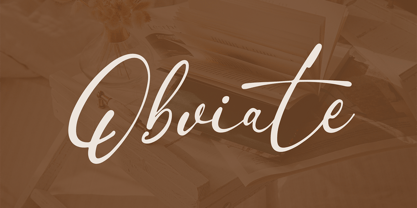 Introducing Obviate - organic script Obviate is organic and modern script loaded with ligature glyphs and multilingual support. It's a very versatile font that works great in large and small sizes. This font is perfect for branding projects, home-ware designs, product packaging, magazine headers - or simply as a stylish text overlay to any background image. FEATURES Uppercase, lowercase, numeral, punctuation & Symbol ligature glyphs Multilingual support No special software is required to type out the standard characters of the Typeface. Canva friendly Feel free to contact me if you have any questions! Mock ups and backgrounds used are not included. Thank you! Enjoy!
 - Polymath by VP Creative Shop,
$20.00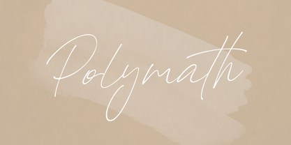 Introducing Polymath - organic script Polymath is organic and modern script loaded with ligature glyphs and multilingual support. It's a very versatile font that works great in large and small sizes. This font is perfect for branding projects, home-ware designs, product packaging, magazine headers - or simply as a stylish text overlay to any background image. FEATURES Uppercase, lowercase, numeral, punctuation & Symbol ligature glyphs Multilingual support No special software is required to type out the standard characters of the Typeface. Canva friendly Feel free to contact me if you have any questions! Mock ups and backgrounds used are not included. Thank you! Enjoy!
 - The overthinkers by Joanne Marie,
$26.00 The overthinkers is a semi script hand lettering font for all of your hand lettering designs! With two sets of uppercase glyphs, three sets of lowercase and over 230 ligatures no two words will be same! So your designs will truly look hand lettered. With so much choice be careful not to overthink your designs ;). This font is perfect on it’s own or you may like to use it with your existing hand lettering fonts. Go ahead and try it out - it’ll compliment any design! It’s perfect for merchandise and food packaging, book designs, logos and much more.
 - Special Elite Pro by Stiggy & Sands,
$29.00 Our Special Elite Pro brings the unique individuality of the Special Elite Type No. NR6 vintage typewriter keyset to the digital age. Antique typewriters would type with a warmth and appeal to them, primarily because of their unpredictable “grunge” results from force of keystrokes to ribbon and paper. The SmallCaps and extensive figure sets add a more serious note to the nature of the typeface. OpenType features include: - SmallCaps. - Full set of Inferiors and Superiors for limitless fractions. - Tabular, Proportional, and Oldstyle figure sets (along with SmallCaps versions of the figures). - Stylistic Alternates for Caps to SmallCaps conversion.
 - Bryan Talbot by Comicraft,
$39.00 The lettering style of Lancashire's finest comic book artist, graphic novelist and NEMESIS deviant Bryan Talbot is finally at your beck and call thanks to the good graces of those awfully nice chaps at Comicraft. Created for Bryan's magnum opus, Alice in Sunderland, the Bryan Talbot font will take you on a journey into delirium, through the looking glass of British underground comix into the complex world of experimental narrative techniques and bestow upon you semi-legendary cult status and prestigious awards from no less than the New York Times.* *Results may differ if you are not actually Bryan Talbot.
 - Maracatu by Bruno de Aviz,
$5.00 The family of Tipografia Maracatu was born in 2020 when we could not leave the house because of the coronavirus epidemic. I had no idea how it would turn out. I just wanted to draw letters. When I finished the regular version, I thought it looked a lot like the art and music from the Northeast of Brazil, and that is why I came up with the name Maracatu. Maracatu is a musical-style original from the Northeast of Brazil. After I had the font style and the Regular version, I thought it would be nice to have Bold and Light.
 - FeggoliteHatched by Ingrimayne Type,
$4.95 The name FeggoliteHatched comes from the fact that it was created with the help of an old font manipulation program called Incubator Pro. It was an attempt to create a more conventional typeface from the odd monospaced font, FeggoliteMono. As a monospaced font, FeggoliteHatched could be considered a typewriter face, but no typewriter ever produced letters like these. The original version from 1994 is now the italic style and it has a leftward or back slant. The upright or plain version was added much later, in 2018. There is also a choppy upright version included in this family.
 - Arkaedos by Prioritype,
$15.00 Here is a script font with a bold and cool style. Can be applied in various media such as vintage logos / logos, clothing, food packaging, brand names, posters, broadcasts or youtube thumbnails, even album covers! No, you can also execute and explore easily for your project because it contains lots of very cool alternative characters! see details of some preview above for reference. Features: -Uppercase -Lowercase -Numeral -Punctuation -Multilingual -Alternate -Swash Note : Open with a program that supports the Opentype feature and an glyphs panel is available to see more alternative characters. Sample programs like Adobe Illustrator and the like!
 - LoveYaHoney by Typadelic,
$14.95 Aw, aren't they sweet? This lettering is based on a 1950s note a husband wrote to his wife shortly after they were married. His beautifully controlled and strong handwriting knows no lowercase characters; he gets his point across in uppercase only. In today's world of email and internet writings, we know that uppercase means shouting and is considered quite rude, but he didn't know that when he wrote this letter to his lovely wife! Love Ya Honey is very legible and looks beautiful when used for headlines, titling or even long expanses of body copy. Perfect for scrapbooking too!
 - Madiffure by Ridtype,
$25.00 Madiffure is a modified neo-grotesk gothic font; this font basically has no consistency in several letter styles, so this font looks unique and bolder in its application of letter development. And this font is suitable for bolder and more modern design themes to apply to certain design uses. On the other hand, we also paid attention to making this font more pleasing to the eye so that it is more comfortable to read even at the smallest size. The Madiffure font is also equipped with Cyrillic as an addition to the basic language style, namely Latin 1 and 2.
 - Sirenik by VP Creative Shop,
$12.00 Introducing Sirenik - Elegant serif font Sirenik is creative and sophisticated font with multilingual support. It's a very versatile font that works great in large and small sizes. This font is perfect for branding projects, home-ware designs, product packaging, magazine headers - or simply as a stylish text overlay to any background image. FEATURES Uppercase, lowercase, numeral, punctuation & Symbol regular and italic versions Multilingual support No special software is required to type out the standard characters of the Typeface. Canva friendly Feel free to contact me if you have any questions! Mock ups and backgrounds used are not included. Thank you! Enjoy!
 - Franklin Gothic Raw Semi Serif by Wiescher Design,
$19.50 When drawing a new font, there is a time when the final form is found – almost – but the curves are not slick and clean yet, that's what I call the "raw" form. Raw – no sweeteners added! In this family I redefined this moment in type development for the eternally beautiful "Franklin Gothic". I call the design "Franklin Gothic Raw". This packet is the semi-serif addition. There never was a Franklin-Gothic with serifs but actually the font lends itself perfectly to a slab-serif. I started with adding a half serif and eventually add a full slab-serif later on.
 - Disposition by PizzaDude.dk,
$15.00 You may not know it, but you've been looking for a font like DISPOSITION! Yeah, it's a font...but it doesn't act or look like one! Why?! Because there are 6 different versions of each letter! Yes, SIX different versions! Enough to make your design look soooo cool and handmade! The font uses "contextual alternates" which makes the font cycle the different versions as you type! What can you use DISPOSITION for? There are almost no limits, but I would suggest designs such as invitations, headlines, posters, signs and other cases where a dry brush look is required.
 - Coma by Volcano Type,
$19.00 Originally designed by Alois Ganslmeier as a Billboard-Font, the Coma Font was later developed into a complete typeset with capitals and small letters, Cyrillic letters, Greek letters and Hebrew letters by Andy Jörder and Jörg Herz. The Coma Font is a massive constructed font which can be used for headlines. When only typed in capitals it gives the impression of blocks for there are no ascenders or descenders. The font comes alive because of its massive appearance, its edgy form and the opulence impression when used line-by-line. Not without reason, the font is named “dick und eckig”.
 - M Hei PRC by Monotype HK,
$523.99 Although traditional Heiti typefaces may not be as lively as Songti, the modesty of M Hei makes is enduring and stand out from other similar typefaces. M Hei’s design is based on the hallmarks of traditional Heiti typefaces: it has little to no thick-thin contrast in strokes and has square cut terminals. Its dots (點), ticks (剔) and downstrokes (撇、捺) are subtly curved and longer than usual; all stems (豎) and crossbars (橫) remain simple and clear; and hooks (勾) appear rounded. Together they make a harmonious form which is clean but pure, classy but contemporary.
 - Snarf by VP Creative Shop,
$20.00 Introducing Snarf - modern script Snarf is organic and casual script loaded with ligature glyphs and multilingual support. It's a very versatile font that works great in large and small sizes. This font is perfect for branding projects, home-ware designs, product packaging, magazine headers - or simply as a stylish text overlay to any background image. FEATURES Uppercase, lowercase, numeral, punctuation & Symbol ligature glyphs Multilingual support No special software is required to type out the standard characters of the Typeface. Canva friendly Feel free to contact me if you have any questions! Mock ups and backgrounds used are not included. Thank you! Enjoy!
 - Alpas by VP Creative Shop,
$12.00 ntroducing Alpas - soft serif typeface Alpas is rounded and soft font with multilingual support. It's a very versatile font that works great in large and small sizes. This font is perfect for branding projects, home-ware designs, product packaging, magazine headers - or simply as a stylish text overlay to any background image. FEATURES Uppercase, lowercase, numeral, punctuation & Symbol regular and italic versions Multilingual support No special software is required to type out the standard characters of the Typeface. Canva friendly Feel free to contact me if you have any questions! Mock ups and backgrounds used are not included. Thank you! Enjoy!
 - Lovely May by VP Creative Shop,
$12.00 Introducing Lovely May - Creative Font duo Lovely May is elegant and organic font duo with multilingual support. It's a very versatile font that works great in large and small sizes. This typeface is perfect for branding projects, home-ware designs, product packaging, magazine headers - or simply as a stylish text overlay to any background image. FEATURES Uppercase, lowercase, numeral, punctuation & Symbol Regular Italic Script Multilingual support No special software is required to type out the standard characters of the Typeface. Canva friendly Feel free to contact me if you have any questions! Mock ups and backgrounds used are not included. Thank you! Enjoy!
