6,770 search results
(0.011 seconds)
- Art-Nouveau 1895 - Unknown license

- Argithea by pentagonistudio,
$19.00 Argithea Is An Modern Stylish Font Inspired By Bold Modern Stylish Serif and Vintage Curves. SOFTWARE REQUIREMENTS : Fonts and alternate : No special software required they may be used in any basic program /website apps that allows standard fonts That's it folks! You can go ahead and get cracking :) Follow My Shop For Upcoming Updates Including Additional Glyphs And Language Support. And Please Message Me If You Want Your Language Included or If There Are Any Features or Glyph Requests, Feel Free to Send me A Message. Have a Good Day !
 - Pittsbrook by Fontdation,
$15.00 Pittsbrook Family, a pack of classic typefaces that inspired by the letters used in old advertisement and packagings. Its rigid shape gives you strong, sharp and blocky feelings, no curves were harmed in the making of these typefaces. Comes in three styles; Sans, Serif and Outline, all of them are consistently mouse-crafted characters, we spent a lot of attention to every details. Suits best for any classic/vintage design project, such as E-Sport logo, liquor/food label, packaging, headline, space-filler, logotype, typographic quote writings, etc.
 - Saki by Thinkdust,
$10.00 Saki is big and bold, presenting messages in an easy to understand, pleasant to read manner. Simple straight edges, shallow curves and sans-serif, Saki was created with legibility and minimalism in mind and its thick weight gives it great scalability. It is admirable for maintaining such close attention to form, each character fitting neatly into the space provided and slotting together smoothly for undistracted reading. For use in headlines and similar large text, Saki is the font you need to get your message across loud and clear, no ifs, ands or buts.
 - Kindest Reality by pentagonistudio,
$19.00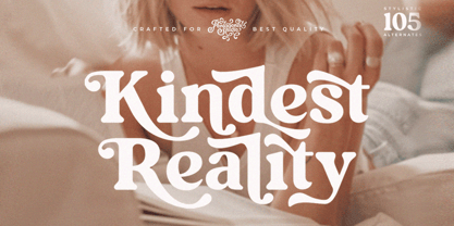 Kindest Reality Is A Nostalgic Serif Font Inspired By Classy and Curve Character. SOFTWARE REQUIREMENTS : Fonts and alternate : No special software required they may be used in any basic program /website apps that allows standard fonts That's it folks! You can go ahead and get cracking :) Follow My Shop For Upcoming Updates Including Additional Glyphs And Language Support. And Please Message Me If You Want Your Language Included or If There Are Any Features or Glyph Requests, Feel Free to Send me A Message. Have a Good Day !
 - M Stiff Hei PRC by Monotype HK,
$523.99 Stems (豎) and crossbars (橫) are direct and simple, dots (點) are short but authoritative, downstrokes (撇、捺) are no longer curvy but straight and sharp, thus, a smart and straightforward typeface. Bold in this family is rough and tough, demonstrating a high extent of muscularity. Meanwhile Light is neatly, naturally and nicely crafted, aiming to achieve high legibility. A popular choice for advertising with diverse usages.
 - 1462 Bamberg by GLC,
$38.00 Font designed from that used in Bamberg by Albrecht Pfister, in early years of printing, exactly for a book titled "Ackermann Von Böhmen" writen in old German by Johannes Von Tepl, and decorated by a lot of splendid colored carved woods. This font include "long s", naturelly, as typically medieval, but any abbreviated characters, and, curiously no german "ß", no more than "W". (The only one I did found where a hand drawn one.) In addition, the "k" have not a German gothic form. Added, the accented characters, no longer existing on this time, and capitals when was a lack. A render sheet, in the font file, makes all easy to identify on a keyboard. This font is used as variously as web-site titles, posters and fliers design, editing ancient texts... This font supports as easily enlargement as small size, remaining readable, original and beautiful, especially in capitals.
 - Effloresce - Unknown license

- Nature Stencils JNL by Jeff Levine,
$29.00 Nature Stencils JNL brings together a number of vintage decorator stencils with bird and flower motifs (along with individualized elements from the original designs). These home decor stencils were manufactured by the Huntington Oil Cured Stencil Company somewhere around the early 1950s. Originally located in Huntington, New York, the company later relocated to the South Florida area, but there is no additional information found about the company's background.
 - Etienne by ParaType,
$30.00 Designed for ParaType in 2002 by Tagir Safayev. Inspired by the letterforms of Antique No. 8 typeface and other similar fonts of the 19th century (Latin Antique, Wide Latin, Etienne Condensed, Wide Renaissance). A face of so-called Latin type has stout triangular serifs and rather unusual curls on several letters in the lower case. Nevertheless it is eminently suitable for a wide variety of settings in advertising and display typography.
 - ITC Mithras by ITC,
$29.99ITC Mithras was designed by Bob Anderton and finds its foundation in the worn yet elegant letters carved into stones of a Mithraic temple in Scotland. The capitals are narrow and complemented by a wide, full bodied lowercase. The proportions of the curves vary slightly between characters and this subtle contrast gives the face a mellow appearance while still attracting attention. ITC Mithras is a very legible typeface and hence applicable to a wide range of display uses. - Whiskey Tango by Missy Meyer,
$15.00 I've been in a vintage-meets-modern mood in my most recent font construction, and this is no exception. Whiskey Tango is a fun retro-style tall and narrow sans-serif font with a scoop of variety: it includes over 110 items in the Private Use Area, including small caps, alternates, ligatures, and ordinal indicators. There's just enough imbalance in stroke widths to make this font a little goofy and quirky, and really charming. All of the lines and curves are clean and sharp, making it great for text that's large, medium, or small. And it's great for crafting as well! As usual for me, this font contains over 300 extended Latin characters for language support, as well as full uppercase and lowercase sets of Greek and Cyrillic characters. And everything, as always, is fully PUA-encoded so all characters are easy to access, no matter what method you use.
 - Bellas Artes by Sudtipos,
$59.00 Bellas Artes is what happens when the brush of Angel Koziupa and the technical expertise of Alejandro Paul go face to face with the Art Deco aesthetic. The recognizable Koziupa curves become players of a game of halves, where there is no such thing as a better half, but both sides complete each other like in that perfect romance you will never forget. Bellas Artes is an excellent choice not only for packaging design, but also for book and music covers meant for the feminine demographic, collateral of classical taste, and of course pre-WWII visuals.
 - Wildcat by K-Type,
$20.00 The starting point for Wildcat was the 3×5 squared grid popular for tiled lettering and American sportswear typefaces. However, Wildcat breaks free of the net whenever necessary. This typeface comes across as tough, it has no soft curves, and evokes strength and confidence. Unlike other collegiate-style fonts, Wildcat includes a real lowercase which makes the face particularly usable and adaptable. Wildcat also contains a full complement of Latin Extended-A characters. Three fonts are included in the download; Regular, College and Outline. The College and Outline fonts share identical spacing and kerning, so can be overlapped to create bicolor artwork.
 - New Daily by URW Type Foundry,
$39.99 Marit Otto about New Daily: This typeface design has a modern but yet classic appearance. That is why she listens to the name New Daily. I took some elements from the Art Nouveau and Art Deco (type) styles. And modernized it by cultivating the beautiful curved features of both styles and playing with the stylish fluid lines and open structures. By adding a bit of the no-nonsense office look of a typeface like Nimbus Sans a new but familiar look occurs. This typeface is very readable and useful for many purposes. It has a playful distinguished character.
 - HU Handserif KR by Heummdesign,
$25.00 HU Handserif KR contains KOREAN words and Latin alphabets. HU Handserif KR expresses the heart written down by hand in a font. Since there are no curved serifs, it is a handwritten typeface that is easy for children to follow correctly. It was produced using the order of strokes so that Hangeul can be written in the correct order, and the shape and size of the initial consonants, middle consonants, and final consonants were produced correctly. It also has an honest and correct form based on the basic principles of letters and the structure according to the form.
 - Franklin Gothic Raw Semi Serif by Wiescher Design,
$19.50 When drawing a new font, there is a time when the final form is found – almost – but the curves are not slick and clean yet, that's what I call the "raw" form. Raw – no sweeteners added! In this family I redefined this moment in type development for the eternally beautiful "Franklin Gothic". I call the design "Franklin Gothic Raw". This packet is the semi-serif addition. There never was a Franklin-Gothic with serifs but actually the font lends itself perfectly to a slab-serif. I started with adding a half serif and eventually add a full slab-serif later on.
 - Leenyx by ActiveSphere,
$30.00 Leenyx is a geometric display font family and works best in display applications, such as posters, signage, logos and label. The Leenyx family comes in 2 versions: Leenyx AX and Leenyx BX. Leenyx AX has lines of even width and no serifs. Leenyx BX has lines of even width with slight curve on the ends of the strokes. Each Leenyx font version has two weights: regular and bold, each available in italic, making a total of eight styles for. Each style has a full upper and lower-case, accents, punctuation and a selection of monetary symbols.
 - M Hei PRC by Monotype HK,
$523.99 Although traditional Heiti typefaces may not be as lively as Songti, the modesty of M Hei makes is enduring and stand out from other similar typefaces. M Hei’s design is based on the hallmarks of traditional Heiti typefaces: it has little to no thick-thin contrast in strokes and has square cut terminals. Its dots (點), ticks (剔) and downstrokes (撇、捺) are subtly curved and longer than usual; all stems (豎) and crossbars (橫) remain simple and clear; and hooks (勾) appear rounded. Together they make a harmonious form which is clean but pure, classy but contemporary.
 - Vtg Stencil Ornaments A by astype,
$24.00 Vtg Stencil Ornaments are designed to work with all the US stencil fonts from astype. Have a look at Vtg Stencil US No.2, No.51 and No.72.
 - Wilko by Device,
$39.00 Wilko is the carnival barker of typefaces. Bold, impactful yet friendly, with two decorative variants. No frills, no corners, no messing. When you want to say it loud and clear.
 - Mansard by Wooden Type Fonts,
$15.00 A revival of one of the popular wooden type fonts of the 19th century, suitable for display. It has curved sides, very short descenders, and curved, blocky serifs.
 - Bottle Fork by PizzaDude.dk,
$15.00 Here is my font with carved out letters, like a really bad stamp. Each lowercase letter has 3 different versions, and that makes your text more natural, organic and handmade. Normally I kern my fonts throughout, but this time there is no kerning at all...and that's odd, when we're not talking about monospaced fonts. Anyway, Bottle Fork has its flaws and jumpy x-height...but that's exactly the charm of it all! :)
 - Happy Easter by Trim Studio,
$15.00 **Happy Easter **A cute script font that's perfect for Easter-themed moments is whimsical and playful. It has flowing, organic lines that resemble the curves of an Easter egg or the curling petals of a spring flower. The letters are so airy, with a gentle bounce that gives them a sense of movement and liveliness. --- File Include: - Readme.pdf Thank you for let us be your design partner, If you have any questions please don't hesitate to drop me a message
 - Festivo Letters by Ahmet Altun,
$19.00 Festivo Font Family is a handmade layered font which includes several textures, shadows. Different font types can be created using various combinations of Festivo Fonts and colors. All fonts of Festivo letters are created as hand-drawn design based on F.L. NO:8 Font's Letters. The fonts No:16, No:17 and No:19 have the same metric and kerning structure than the other Festivo Fonts except No:18. So each one of these 3 fonts are a layer. But they can also be use as wide spaced fonts. No:18 is specific with its metric and kerning structure which was formed by No:17 but No:18 is its bold version. It was designed as a supplemental font. The fonts No:12 and No:15 can be used as shadows. This font family also includes a few ornaments. For your convenience, the files of the fonts were termed by their numbers. The various possibilities of the Festivo Font Family allows you to create a lot of great works such as posters, magazines, printings, t-shirts etc.
 - Honesty by Océane Moutot,
$32.99 Honesty is sans serif font with flared stems. As such, it belongs to the incise genre which is historically inspired by the roman civilisation and letters carved in granite or marble. One of the major example of it is the Trajan’s Column in Rome which inspired a font called Trajan, designed by Carol Twombly in 1989. Honesty is also inspired by more brutal font such as the Albertus, designed in 1938 by Berthed Wolpe, and its shape is highly influence by the work of the hammer. Despite this brutality and urgency due to the carving technique, the design of Honesty bring softness to it thanks to its low contrast and smooth curves. Honesty’s design include 16 styles, from thin to black in roman and italic.
 - Edison by HiH,
$12.00 Edison, is it Victorian or is it Art Nouveau? While this typeface may be found in Petzendorfer’s Treasury of Art Nouveau Alphabets, I believe the decorative spirals are more Victorian than “New Art.” To me, they looked tacked on, rather than organic -- with the industrial mechanics of a coiled spring, rather than the tendrils of a growing plant as the philosophical wellspring. Originally released by ATF in 1894 as Houghton, this typeface was re-released shortly thereafter by Bauer and Berthold in Germany as EDISON. Please do not make the mistake of thinking the font we offer here is no better than freeware fonts in cheap rip-off collections. This font has a set 218 characters and represents many hours manipulating the bezier curves to produce acceptable results. Available freeware fonts are often little more than raw scans with little accuracy of letterform. The muddy line intersections are a dead give-away. Frequently all you get is the alphabet itself. No numbers, no punctuation and don't even think about diacriticals. The font we offer represents a tremendous value. Considering the hours of work involved, I have no business charging so little. I could make better money cooking hamburgers or bagging groceries. But we want very much to encourage you to purchase and enjoy these fascinating historical typefaces and are making it as easy as possible for you to do so. So please encourage us and order Edison today.
 - Schuss News Poster by typic schuss,
$10.00 Schuss News Poster ist the very heavy headline font (titling/display/poster) of Schuss News. (No italic, no additional figures, no tabular figures, no small Caps, slyghtly different heights as the other font of the Schuss superfamily (Sans, Slab, News and Serif). The character set is different to the other styles. It is not developed for small text sizes.)
 - Ingenious by Heyfonts,
$18.00 Ingenious Groovy font is a type of display font that emerged in the 1960s and 1970s during the psychedelic era. It features bold, curvy lettering with an exaggerated cursive style, incorporating elements such as swirls, loops, and curves. The Groovy font is designed to give off a sense of retro vibrancy, and it is often used in advertising, music covers, and other whimsical design projects. The font is available in a variety of colors, including bright yellow, orange, and pink, adding to its playfulness and funkiness.
 - Black Damon by Zeptonn,
$5.00 Looking for a big, bold and curvy font? Here’s Black Damon! She is a hand-drawn typeface with explicit curves and angles that still retains softness and has a handcrafted feel. All glyphs are handcrafted by illustrative designer Zeptonn. She might not be your best friend for body text, but still, she won't hesitate to perform well under pressure. She will make an interesting yet unusual partner for headlines. Awesome and distinctive in use for titles, displays and fresh illustrations. Prepare to make a statement!
 - Near Myth by Comicraft,
$19.00 The Norse Gods of Asgard, the Titans of Olympus and the Elders of Middle Earth have spoken! Their pronouncements have been carved in the solid rock across the mountains of Midgard and their Legend will now be known to many... 'cause JG --- our very own Mr Fontastic -- signed a license for comicbookfonts.com to make the typestyles of the gods commercially available. No really, he made a deal with Loki. Dipped his pen in his own blood and everything.
 - Francker by Linotype,
$29.99 Francker is a sans-serif, based on clean and simple design principles that betray its Danish origin. Its curves are based on the “super ellipse”, a mathematical shape about half-way between an ellipse and a rectangle. Francker’s lowercase lettershapes a, b, n, and u, have no spurs, emphasizing the simplicity of their construction. The Francker family is available in two widths, normal and condensed, each in nine weights, from extra light to extra black. Use Francker for signage, posters, magazines, advertisements, or corporate identity projects—wherever an industrial, contemporary look is needed. The Francker type was developed and designed by Anders Francker, an engineer and designer living in Denmark.
 - Schuss Sans CG Poster Black by typic schuss,
$33.00 Schuss Sans CG Poster 1 upright OTF Font Latin extended, Cyrillic and Greek. Specially developed for headline poster display sizes. A Sans Black Headline-Font in addition to the Schuss superfamily. The heights are optimized for big sizes, different to the text fonts of the Superfamily Schuss. The character set is slightly different to the non poster styles too. No italic, no additional figures, no tabular figures, no small Caps. But with maximum manual kerning. Ligatures: fi, fl, ff, ffi, ffl. No special OpenType features.
 - Moonshadow by Curvature Creations,
$10.00 My font Shadowmoon was created with the PowerPoint shape moon and just like the real moon, my font has amazing curves that brightly standout. The curves take on a flowing action that visibly attracts an amazing style.
 - CG Gothic by Monotype,
$29.99This is a family of "Gothic" types from the Monotype Design Studio. The faces named "Gothic No. 1 through 4" were produced by Compugraphic. Gothic No. 1 is a condensed, late 19th century American-style sans serif typeface. Gothic No. 2 and Gothic No. 3 are based on the Metro #2 series, designed by W.A. Dwiggins for Mergenthaler Linotype during the 1920s and 30s. Gothic No. 4 looks vaguely like Gothic number one, but is heavier and smaller on the body. Gothic Extra Light Extended is a very light and wide design. - Schuss Sans CG Poster Extrabold by typic schuss,
$33.00 Schuss Sans CG Poster Extrabold 1 upright OTF Font Latin extended, Cyrillic and Greek. Specially developed for headline poster display sizes. A Sans Serif Extrabold Headline-Font in addition to the Schuss superfamily. The heights are optimized for big sizes, different to the text fonts of the Superfamily Schuss. The character set is slightly different to the non poster styles too, but comparable to Schuss Sans CG Poster Black. No italic, no additional figures, no tabular figures, no small Caps. But with maximum manual kerning. Ligatures: fi, fl, ff, ffi, ffl. No special OpenType features.
 - Oceania by Hipfonts,
$17.00 Prepare to be swept away by the mesmerizing allure of Oceania, the font that will transport your designs to a world of elegance and beauty. Say goodbye to dull and uninspiring typography because Oceania is here to revolutionize your creative endeavors. With its graceful curves and enchanting letterforms, this gorgeous curvy typeface exudes sophistication and charm. Each letter is meticulously crafted to perfection, forming a harmonious dance of curves that will captivate the eyes of your audience. Whether you're designing wedding invitations, crafting stunning logos, or adding a touch of class to your branding materials, Oceania is the secret weapon that will make your designs shine. Dive into the depths of this exquisite font and let its timeless elegance elevate your creations to a whole new level of visual splendor. Get ready to make waves in the design world with the irresistible allure of Oceania!
 - Holy Grail by Comicraft,
$29.00 GOOD GOD! You have circumnavigated the globe and chosen wisely...The Grail is FOUND! Oh... no, Zoot set light to our beacon, which I've just remembered is Grail-shaped. But wait, look! There! Carved in the wall... a Legend: "Here may be found the last words of Joseph of Aramathia: He who finds the Grail must face three, maybe four, challenges. First, the path of God; Second, the word of God; Third, the breath of God, and fourth is the Font of God. Only a font that is valiant, pure of spirit and includes international characters, both European AND Cyrillic -- may find the Holy Grail... in the Castle of AARRGGGHHH… That's all it says; the guy carving it must have died before he could finish.
 - KG A Thousand Years by Kimberly Geswein,
$5.00 This handwriting is soft and feminine with gentle curves.
 - Steel Grrrder by ULGA Type,
$9.00 Steel Grrrder is a robust, industrial-style stencil typeface family consisting of six weights, from light to black, with corresponding italics. Suitable for all kinds of display purposes including posters, film titles, book covers, magazines, advertising, logos, packaging, signage and games design, Steel Grrrder is especially useful where the message needs some serious geometric bite behind it. Steel Grrrder is best categorised as a constructivist sans family. The character shapes are sharp, angular and slightly condensed - it’s a rigid, no-frills, no-curves, mega-metallic design. Legible? Not really. Readable? I think not. In your faceable? Absolutely! This is a tough display typeface, designed to work in the most demanding typographic situations. It won’t buckle under pressure or wilt when the heat’s turned up. Forged from carbon steel and wrapped in a layer of Graphene, Steel Grrrder is unashamedly rugged, a rock-hard pound-for-pound boxer specialising in thumping knockouts. The Steel Grrrrder extended family also includes a six-weight joining script and two display fonts, Groove & Nutjob - all designed to work with each other.

