10,000 search results
(0.032 seconds)
- Knockdown by Hanoded,
$15.00 Finding my long-lost inkwell was a lucky moment for me and it resulted in a whole bunch of brushy/inky fonts. The latest font to leak out of this well is Knockdown. It is a bold and wild brushface, but very legible. Use if for your posters, book covers and T-shirts! Or, whatever else you like. Comes with a KO of diacritics.
 - Munrolane by madeDeduk,
$14.00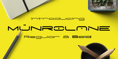 Hello I'm really excited to introduce Munrolane. It is a minimal modern and clean font family. suitable to create any branding, product packaging, invitation, t-shirt, label, poster, logo etc. Whats Included? - Munrolane.otf - Munrolane Italic.otf - Munrolane bold.otf - Munrolane bold Italic.otf Features - UPPERCASE - lowercase - Number & Symbol - International Glyphs - Alternative UPPERCASE and lowercase If you need anything else just shoot me an email at: dedukvic@gmail.com
 - Cracks by Grewfont Studio,
$13.00 Cracks is a display font inspired for fun image and playful taste. Although initially made for comical use, this fantastic typeface is also best suited for headlines of all sizes, as well as for blocks of text that have both maximum and minimum variations. Whether it’s for web, digital crafts, logotype, wordmark, print, moving images or anything else, it fits for every young and playful design.
 - Marchello by madeDeduk,
$17.00 Marchello simply amazing with Regular, Extrude & Shadow styles, so you can save much time for create design. Marchello inspired from retro style 70's and perfect for poster design, book covers, merchandise, fashion campaigns, newsletters, branding, advertising, magazines, greeting cards, album covers, and quote designs and more. Feature - UPPERCASE - lowercase - Number & Symbol - International Glyphs - Alternative lowercase - Ligature - Swash If you need anything else please contact : dedukvic@gmail.com
 - Murisa Paula by Murisa Studio,
$10.00 Do you want a unique and attractive display font?. Murisa Paula is the answer. This very attractive font will make you happy and excited. It has a unique shape with the edges of the letters torn to shreds, like torn paper. This type of lettering will make it easier for you to design a display product with a cracked effect or something else. Get it now.
 - Mosscave by Dora Typefoundry,
$15.00 Mosscave is designed to crate an impactful and stylish visual impression, combining attractive curves. Mosscave provides a style that is guaranteed to add a compelling appeal to your logo design, brand image, quotes, product packaging, merchandise, social media posts, and more! It also supports multilingual and PUA encoded! If you need anything else, just shoot me at the email at: doratypefoundry@gmail.com Hope you enjoy it.
 - Challista by madeDeduk,
$15.00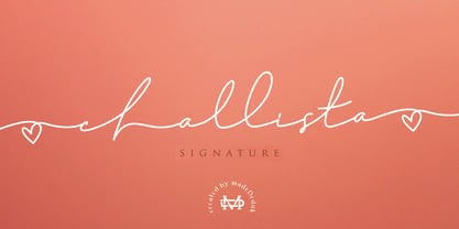 Challista is a luxurious handmade signature font. Challista Signature includes more than 30 ligatures to make everything look like a natural handmade signature.This font is perfect for poster design, book covers, merchandise, fashion campaigns, newsletters, branding, advertising, magazines, greeting cards, album covers, and quote designs and more. Features - Uppercase - lowercase - Numbers and Symbols - International Glyphs - Ligatures If you need anything else please contact me by dedukvic@gmail.com
 - H-AND-S by AND,
$89.00 A common creation: (to pass from one hand to the other): For the first time, various hand-signs from diverse sources are unified into one single visual style. This compendium is the result of 15 years of incubation and 7 years of creation. In his travels throughout the world, graphic designer Jean-Benoit Levy, principal of the visual studio AND, has collected pictures of multiple hand signage. Uncertain what to do with those signs, he kept them year after year until the idea came to unify almost 200 handsigns into one single family. In accordance with this entire collection, the name of the typeface is a mix: "h-and-s". A global collection: (To put in good hands): We all have one thing in common: Hand-signs are an international language, they are meant to be understood by all of us. Each of us regularly comes in contact with modern hieroglyphs such as the hand-sign-codes that are so prevalent in our daily life. This way of communication belongs to no one in particular and to all of us in general. Even if the sense of certain signs varies from one culture to the other, there is a common hand-sign language. We are surrounded by this language of handsigns each time we step in a store, we eat, open a container of milk, we clean up, use package of wash-powder, by shaving, when we work, use tools, at home, by tearing the envelope of a condom, by traveling, etc. When we encounter these signs, we all understand them easily. A visual connection: (To go hand in hand): This typeface is a global visual statement. Collecting, ordering, redrawing, unifying. Reconstructed and assembled into one original alphabet, H-AND-S is a unique and complex signs program. Our choice is based on daily gestures and global hand-codes. Logically this typeface starts with the "American Sign Language" and expands on two type-variations, each on two levels of keyboard. The international team of H-AND-S would like to send his special thanks to all of the anonymous graphic designers throughout the world who designed different hand-signage and who influenced and inspired to create such a sign collection into one unified family. We, the global nomad team of AND, hope that you will enjoy our H-AND-S. Additional Credits Production: Studio AND. www.and.ch. Concept, Idea & Creative Direction: Jean-Benoît Lévy, Switzerland / USA. Research & Sketches: Eva Schubert, Germany. Illustration, Graphic Design & Visual Fusion: Diana Stoen, USA. Transfer, Adaptation & Refining: Moonkyung Choi, Korea. Finalization & Checking: Sylvestre Lucia, Switzerland. Coaching & Technical Advice: Mike Kohnke, USA. Creative Energy & Implementation: Joachim Müller-Lancé, Germany / USA.
 - SirClive - Unknown license

- Black Hearts Graffiti by Ferry Ardana Putra,
$24.00 Introducing "Black Hearts," a cutting-edge freestyle graffiti font that brings an urban edge to your design projects. This font is a testament to the rebellious spirit and creative expression found in street art. With its bold strokes and dynamic letterforms, "Black Hearts" captures the essence of graffiti culture, delivering a raw and authentic feel to your designs. Freestyle Graffiti Design: "Black Hearts" is crafted with a freestyle approach, emulating the spontaneous and expressive nature of graffiti art. The characters showcase a mix of intricate details and bold lines, creating a visually striking and edgy aesthetic. Regular and Extruded Versions: Take your designs to the next level with the 3D flair of "Black Hearts." The font comes with both regular and extruded versions, providing you the flexibility to experiment with depth and dimensionality in your typographic compositions. Graffiti Swashes: Add an extra layer of creativity to your designs with the included graffiti swashes. These unique elements complement the font's style, allowing you to embellish your text with expressive strokes and energetic curves. Ornamental Elements: Elevate your design projects with the diverse range of ornamental elements included in "Black Hearts." From spray-paint-inspired accents to urban motifs, these ornaments provide additional creative options for making your designs truly distinctive. "Black Hearts" is perfect for projects that demand an authentic urban vibe. Whether you're working on street art posters, album covers, clothing designs, or any project that requires a rebellious and contemporary feel, this font is your go-to choice. Versatile Applications: Streetwear Branding Music Album Artwork Graffiti Art Exhibitions Skateboard Deck Designs Edgy Advertising Campaigns Contemporary Logo Design "Black Hearts" is more than just a font; it's a statement. Embrace the rebellious energy of the streets and infuse your designs with the raw, unapologetic style of urban graffiti culture. Unleash your creativity and make a bold impact with "Black Hearts." ——— Black Hearts features: A full set of uppercase and lowercase Numbers and punctuation Multilingual language support PUA Encoded Characters OpenType Features Layered Style +425 Total Glyphs +200 Graffiti Swashes and Ornaments included!
 - Catchy Mager by Sensatype Studio,
$19.00 Catchy Mager is a unique and very elegant font for brand and logo design. Based on our experience as a graphic designer who works for a lot of companies, we often are requested to design a logo in a unique style but with an elegant shape. So, we try to brainstorming and create this font to make the idea is going out. This is perfect for BRANDING and LOGO DESIGN. You will get classy, elegant, and certainly unique logos with this font. To make it look more unique, here we prepared some ligatures: ab ah am an ar ap at cb ch cm cn cr eb eh em en ep er ub uh um un up ur fl fi ff ft ga gi it ai Include Fancy Style on Every Uppercase and Some Lowercase
 - SK Nomerok by Shriftovik,
$48.00 SK Nomerok is an elegant geometric font with a minimalistic design. A unique pattern of symbols in a compartment with a strict classical design creates a strong and reliable structure, ideal for modern design. The sharp and angular letters of SK Nomerok are easy to read both on the screen and when printing. The geometric elements of the font are complemented with unique details, which adds to its originality and attractiveness. This font is perfect for branding, headlines and decorative text, adding modernity to any project. The font is multilingual and supports both extended Latin and Cyrillic character set.
 - White Mint by Innire,
$20.00 White Mint - is an elegant serif font that combines strict, refined forms and playful elements inspired by natural motifs. This versatile, easy-to-use font is perfect for branding, business card design, wedding invitations, social network pages, and much more. Ligatures will help you create original text that is easy to read at the same time. Multilingual support allows you to use the font not only on Latin glyphs -— Features : - Uppercase and Lowercase - Numerals - Punctuations (OpenType Standard) - Multilingual Characters - Ligatures - Stylistic Alternates for glyphs "I" :) -— If you have any questions, suggestions, or adjustments, be sure to write to me! Thanks for your attention
 - ND Raster by NeueDeutsche,
$20.00 Transport yourself back to the year 1994, a time when MS DOS games ignited the imagination of an impressionable young boy. Enchanted by the pixelated wonders of that era, he embarks on a journey that will shape his creative destiny. As the boy loses himself in the captivating landscapes of Commander Keen, the strategic depths of Warcraft: Orcs & Humans, and the mysterious quests of The Secret of Monkey Island, a seed is planted in his mind. The beauty of these games' typography, crafted pixel by pixel, captivates his young heart and fuels a passion for design.
 - Victoria Park by kapitza,
$99.00 Inspired by the diverse and dynamic neighborhoods around their studio, kapitza’s most recent work is about observing and recording the transient nature of inner-city populations. This visual research results in vibrant sets of silhouettes with site-specific names like ‘Liverpool Street’, ‘Victoria Park’ and ‘Brick Lane’. This ongoing project charts the visual component of local transformation, managing to reflect something that is deeper, invisible and beyond the surface. These fresh, creative typologies make sense of sensory overload. Though stark and simple, these silhouettes make the increasingly complex connections between people (s) and place(s). Somehow identities are represented in the absence of context and locations are curiously referenced without surroundings. By focusing on an area’s inhabitants, their work highlights distinct subtleties regarding the interplay time and place.
 - Thorowgood Sans by HiH,
$8.00 A three-dimensional all-cap font for title use, Thorowgood Sans Shaded was released by the Fann Street Foundry of W. Thorowgood & Co. in 1839. Interestingly, it more closely resembles Figgins' Four-Line Emerald Sans-Serif Shaded of 1833 than Fann Street’s own Grotesque Shaded of 1834 (with light and shadow reversed). The idea of a shaded font is of an outline font whose letters have each been extruded through a die and then viewed from the lower right to reveal the third dimension. That third dimension has also been referred to as a shadow. Vincent Figgins' 1815-release of a shaded serif typeface was the first known of many shaded faces, as the other foundries rushed to bring out their own versions. Thorowgood Sans Shaded may be gainfully used today as a eye-catching headline font, just as it was so popularly used in the early nineteenth century. To assist with the usual all-cap letter-spacing problem, the following pre-kerned pairs are included: AT, AV, AW and AY. Be sure to download the Type Specimen showing the full character set, as well as a sample text. Live large - use it boldly.
 - Lingua by JOEBOB graphics,
$30.00 Lingua is the unlikely offspring of our CAPUT font. Wondering what the undercast characters of this font would look like, I started writing. I was pleased with the first results and this encouraged me to pursue the process. The final font still has some slight resemblance to its predecessor, but stands completely on its own. This bold, sturdy typeface is very suitable for headers, posters and other designs where large sizes are needed. It comes with both a western and a cyrillic character set.
 - Clever by 1871 Project,
$9.00 Introducing Clever, our first serif family! Featuring 5 weights making it super versatile for almost any project! I started creating this at the beginning of quarantine and just recently finished up! Clever is inspired by timeless packaging from a forgotten era. It has a beautiful range of stylistic alternates with unique characters making it a powerhouse for logos, headlines, posters, shirts, you name it! More ligatures/alternates on the way in the coming weeks/months! What do you get? Clever in 5 weights 109 Alternates + 27 Ligatures
 - Bohy by wkklee,
$25.00Bohy was a candidate when it was felt there was a need for a "house font" to start a design service. Its readability can be relied on to clearly display the most creative or obscured names, yet the adherence to a chosen system of construction to achieve this consistency also make the Bohy characters stubbornly distinguishable from most other font sets if you were to group it under geometric, or technical typeface, or some other categories it should belong (it is considered more constructivist, not humanist, etc...). - Shelf Numbers JNL by Jeff Levine,
$29.00Shelf Numbers JNL recreates the small plastic pricing tags that were used on grocery, drug, variety and liquor stores shelves for many years. The number keys have alternates in the shift position with a cent sign alongside the numbers. Also included are various phrases such as "for", "each", "lb." in the A-L/a-l keystrokes, and there is an additional set of numbers in the M-V/m-v keystrokes with a decimal point to the right of each numeral for dollar amounts. - Quarion by René Bieder,
$39.00 Quarion is a clean, neo-humanist sans with a contemporary geometric approach. Its design started as an exploration of geometric fonts from the early 20th century, like Futura, Neuzeit Grotesk or Recta which allows the typeface to generate an inviting but sophisticated feel on the page. Although, less contrasting, geometric designs have been quite popular around type designers until today, Quarion finds its niche by combining circular elements with a medium stroke contrast, resulting in a versatile and robust workhorse for any analog or digital application.
 - Ballomont by HansCo,
$15.00 Ballomont is a Bold Luxury Handwriten that is luxurious in a casual and distinctive style. With each letter having been carefully designed to make your text look beautiful. With its modern script style, this font will be suitable for various projects, for example: quotes, blog titles, branding, logos, fashion, invitations, greeting cards, posters, business cards, clothing, letters, stationery, and more. This one should make your designs instantly professional and amazingly! Be a perfect professional in a minute and start creating with this font today! Enjoy
 - Toews by Blank Is The New Black,
$10.00 Toews is a continuation of the work started with Versteeg, Huet, and Niemi. It combines the elements of the letterforms found in Huet and Niemi and uses the letterform outlines to create shapes that intersect with themselves. While Huet and Niemi can easily be outlined in most design programs, Toews outlining would not work smoothly in most programs, which is why an outlined version is available. The two styles are carefully designed to be able to transition from one to another smoothly within the same type field.
 - Roca by My Creative Land,
$29.00 Initially started as an extension to Praline MCL, Roca transformed into a new font family - influenced by the same fonts as Praline - Windsor and Cooper Black - the hits of 60s and 70s – with a hint of Bookman. Created in 2 styles and 6 weights that can be mixed and match, it contains 24 fonts including alternates and true italics . It is full of OpenType features – stylistic alternates and ligatures. This multilingual font family supports most of the European languages as well as Cyrillic ones (Russian and Ukrainian).
 - Encorpada Essential by dooType,
$15.00 Encorpada Essential is part of Encorpada Project. It started in 2011 with Encorpada Black. Encorparda Pro was released in 2012 with 14 weight - being seven uprights and seven italics. The Pro version brought a lot of opentype features and a extended character set. The Encorpada Essential has the basic character set with 455 glyphs, that supports more than 50 languages and opentype’s basic features such as: allcaps, standard and discretionary ligatures, numerator, denominator, superior, inferior and fractions. Check out the details on Encorpada Project website.
 - Robolt by Typesketchbook,
$39.00 It starts with the idea that different things can be mixed infinitely. Robolt comprises four designs with multiple options to add variety and playfulness. Battery and Machine have a retro touch which reminds one of toy labels from the '80s, while Vintage is rendered a Didot style with different textures to choose. Streamlined Handdrawn style is nicely put in contrast with the solid types. Elements are also available to complement the letters. The set is made up of 29 letters of four families to serve your creativity.
 - ITC Zinzinnati by ITC,
$29.99ITC Zinzinnati is based on a font called Ohio, released in 1924 by Die Schriftguss A.G. Typical of the Plakatstil letterforms of the time, the original font had a rough outline, as if drawn with a brush. Nick Curtis has smoothed the rough edges, which enhances the design's playful curves and engaging charm. As for the name: it's the punchline to an old vaudeville routine that starts with the question, Name a city in Ohio that begins with a 'Z.'" Pie in the face, comin' atcha!" - Upscale JNL by Jeff Levine,
$29.00 A page from an "ideas booklet" that was copyrighted in 1939 by the Sanford Ink Company displayed a hand lettered variation on the counter-less [or solid] alphabet that so typified the Art Deco style of the times. Bold, brash and beautiful, Upscale JNL evokes high-end department stores, fine millinery shops, cafeterias, night clubs and other business establishments from the Streamline era. This type of lettering style was a workhorse, and could (and still can) tackle any message with strength, clean lines and class.
 - Yesterday by Thomas Käding,
$5.00 This is a geometric uncial font with a retro/art-deco feel. It comes in four weights, each in upright and oblique styles. It has Unicode coverage for Latin, Greek (modern diacritics only), and Cyrillic, plus the Euro and peace signs. This font began as part of a project to design a local currency. Sadly, the municipality canceled the endeavor before the design competition had started. I'm including one of the prototypes in the gallery section as an example of this font’s many uses.
 - Brunette by DearType,
$29.00 The Brunette font was created with the sole purpose to serve companies that want to express character, emotion, and personal touch through their logotypes (think Bakeries, Juice Bars, Cafes, Jewelry stores, etc.) Brunette was made entirely from scratch (handwritten letters on paper), which were then vectorized and tweaked to gain consistency. The charm of the font is in its irregularity and resemblance to real handwriting. Brunette is perfect for businesses that want to convey a casual and organic image while making their products more human and approachable.
 - Jules by DSType,
$45.00 At first glance, Jules, appears to be just one more Didonic variation, but a closer look starts revealing all the extraordinary features of this type family, specially designed for use in extremely big sizes. Jules reflect the last of the late 18th century and was inspired by several plates from a portuguese calligrapher named Antonio Jacintho de Araujo. Available in three different optical sizes: Big, Colossal and Epic, Jules has a plethora of ligatures and stylistic alternates, plus refined Italics and a super elegant Swashes version.
 - Spaghetti Western by Comicraft,
$19.00 If you're a man with no name and you like your Westerns a little more continental, we've got a Fistful of Fonts for you! Load up your guns with our dynamite new offering, SpaghettiWestern. Lip synch the Good, the Bad AND the Ugly scripts you're presented with and we guarantee that Spaghetti Western will make Spanish lettering look a little bit more Mexican. Don't try to understand 'em, just rope and throw and grab 'em!
 - Magnum Sans by FontMesa,
$19.00 Magnum Sans is a strong neutral sans serif consisting of eleven weights with true Italic, Oblique and an alt upright set called Alfa. The definition of Magnum is a large wine bottle that's twice the capacity of one 750ml bottle, today the name is used in any product offering double the capacity, Magnum Sans achieves this by offering two slanted and two upright versions plus a standard and pro set. Designed to be highly readable Magnum Sans is ideal for text, signage, headlines and media broadcasting or anywhere else quick readable lettering is needed. This standard version supports characters sets for central and eastern European countries with code-pages of 1252 Latin1, 1250 Latin 2, 1257 Baltic and 1254 Turkish. Note: for additional language support, please see our Magnum Sans Pro family, which includes Vietnamese, PinYin and Greek.
 - Mastura by Aqeela Studio,
$15.00 WELCOME ! New Mastura Script Font. This is modern sleek typography with a delicious flow. Mastura Script features alternative characters, including a start, end, and terminal binding, and International support for most Western languages is included. This one will instantly make your designs professional and jaw-dropping! Become the perfect professional in a minute and start creating modern designs like ads, sales, logos, brands, posters, social media text overlays today! To activate the Stylistic OpenType alternative, you need a program that supports OpenType features such as Adobe Illustrator CS, Adobe Indesign & CorelDraw X6-X7, Microsoft Word 2010 or later. and there are additional ways to alternate / swash, using Character Map (Windows), Nexus Fonts (Windows), Font Book (Mac) or a software program such as PopChar (for Windows and Mac). How to access all alternative characters using Adobe Illustrator: https://www.youtube.com/watch?v=XzwjMkbB-wQ Thank you for your purchase!
 - Servus Slab by Dada Studio,
$29.00 This family is very special to me. I started working on it right after my first son was born. I decided to name the typeface "Servus" which means "Hello" in my country. The whole idea of the family symbolizes a child’s growth. It starts with Thin and Narrow weights - just like a newborn baby - then it slowly grows to Black and Wide. As You can guess, my son is quite chubby now! And I can assure You that I put all my love into details. Servus consists of 9 weights which gives us 18 fonts with matching italics. Lights and Bolds, due to their strong personality, are perfect for display uses. At the same time, Regulars create a harmonious structure that provides good legibility in long texts. Servus covers all latin languages. It contains a wide set of numerals, small capitals, fractions, ligatures and other OpenType goodies.
 - Bodoni Classic by Wiescher Design,
$55.00 I became interested in designing Bodoni Classic because of a lazy graphic designer at Jacques Damase publishing house. He had to change a single letter on a bookcover about J. B. BODONI. The French call him Jean Baptiste instead of Giambattista! And that unknown graphic designer just took any old “J” from some newly cut Bodoni. All the new Bodoni cuts have square serifs, whereas the originals had rounded serifs and slightly concave feet. The single letter “J” with the squared off serif was for me like a road sign to start redesigning the entire Bodoni family. That’s exactly what I started in 1993 and a dozen years later I am finished. Okay, I am still adding new Bodoni Classics, but those are my personal additions. Recently I designed a family of seven »Bodonian Script« fonts, that can be mixed with most of my Bodonis. Yours very retro, Gert Wiescher
 - Bright by Ahmad Jamaludin,
$19.00 Start good day for new font! present to you, Bright! Bright is a stylish font It has both modern and retro look - clear, modern and fun. Helps to create layout design in 60s or 70s design projects. This font have more than 50 unique alternate and ligature that to give your logo,business card and another project to a unique vintage look. It has Italic version too so what a perfect vintage font! What's you get? Unique letterforms Works on PC & Mac Simple Installations Accessible in the Adobe Illustrator, Adobe Photoshop, Microsoft Word even work on Canva! PUA Encoded Characters Fully accessible without additional design software. I really hope you'll get pleasure using Bright font and it will be perfect addition to your font collection! If you have some questions, please write me a letter! Come and say hello over on Instagram! https://www.instagram.com/dharmas.studio/
 - Garibaldi by Harbor Type,
$50.00 🏆 Selected for Tipos Latinos 6. 🏆 Selected for the 12th Biennial of Brazilian Graphic Design. 🏆 Typographica Favorite Typefaces of 2015. Garibaldi is a text typeface based on humanist calligraphy. It has an organic look and feel, while preserves the traditional construction of roman typography. It all started with a desire to learn more about the origin of the strokes on humanist typefaces. To accomplish that, Garibaldi features a 20° axis, medium contrast based on translation and expansion, asymmetric serifs, and terminals related to the broad nib stroke. Garibaldi Regular was nominated for Tipos Latinos 2014. Since then, the family was expanded with more weights and matching italics, making it a solid choice for setting books, magazines and documents. Among many OpenType features, each font contains small caps, ligatures and contextual alternates, totalling more than 750 glyphs and supporting at least 80 languages.
 - Pickled Limes by Missy Meyer,
$15.00 It all started with the letter S. I drew it, I liked it, I based a font around it! This is Pickled Limes, a tall and narrow single-case font. It's built clean from the ground up, for ultra-sharp lines and corners, as well as super-smooth curves. The slightly flared ends and quirky character mix make this font a ton of fun to use on its own, but it will also pair well with tons of hand-written styles! I've branched out on this one; in addition to over 300 Extended Latin characters, I've also included Unicode's 256 Cyrillic and 121 Greek characters for even more language support. Add in the 90+ alternates, ligatures, and catchwords, and Pickled Limes clocks in at just over 1000 characters. I hope you enjoy using my tasty Pickled Limes for your branding project, logo, crafting work, or design project. Happy fonting, MyFonts fans! :)
 - Chapman by James Todd,
$40.00 Chapman is the result of spending too many hours staring at the often all-capital engraver typefaces from long-gone foundries. The wide serifs, high contrast, and various widths seem to have so much character but also remain so neutral. From these references, Chapman began to emerge. It seemed natural that the lowercase would be based on a Scotch Roman model, much like the original all-capital faces. Chapman does not pull directly from any one source but from the genres themselves. It was, from the beginning, the goal to create a typeface that would be relatively neutral but not boring; an adaptable solution that works anywhere and, depending on the chosen width, can be squeezed or stretched to fit anywhere. The idiosyncrasies of the original designs are tamed in some places and turned up in others. The result is something familiar but unique and contemporary.
