10,000 search results
(0.058 seconds)
- Song Crafter JNL by Jeff Levine,
$29.00 Song Crafter JNL was modeled from the writer credits on the cover of the 1943 sheet music for "This Love of Mine", a tune popularized by Frank Sinatra. The typeface is available in both regular and oblique versions.
 - Compendium by Sudtipos,
$99.00 Compendium is a sequel to my Burgues font from 2007. Actually it is more like a prequel to Burgues. Before Louis Madarasz awed the American Southeast with his disciplined corners and wild hairlines, Platt Rogers Spencer, up in Ohio, had laid down a style all his own, a style that would eventually become the groundwork for the veering calligraphic method that was later defined and developed by Madarasz. After I wrote the above paragraph, I was so surprised by it, particularly by the first two sentences, that I stopped and had to think about it for a week. Why a sequel/prequel? Am I subconsciously joining the ranks of typeface-as-brand designers? Are the tools I build finally taking control of me? Am I having to resort to “milking it” now? Not exactly. Even though the current trend of extending older popular typefaces can play tricks with a type designer’s mind, and maybe even send him into strange directions of planning, my purpose is not the extension of something popular. My purpose is presenting a more comprehensive picture as I keep coming to terms with my obsession with 19th century American penmanship. Those who already know my work probably have an idea about how obsessive I can be about presenting a complete and detailed image of the past through today’s eyes. So it is not hard to understand my need to expand on the Burgues concept in order to reach a fuller picture of how American calligraphy evolved in the 19th century. Burgues was really all about Madarasz, so much so that it bypasses the genius of those who came before him. Compendium seeks to put Madarasz’s work in a better chronological perspective, to show the rounds that led to the sharps, so to speak. And it is nearly criminal to ignore Spencer’s work, simply because it had a much wider influence on the scope of calligraphy in general. While Madarasz’s work managed to survive only through a handful of his students, Spencer’s work was disseminated throughout America by his children after he died in 1867. The Spencer sons were taught by their father and were great calligraphers themselves. They would pass the elegant Spencerian method on to thousands of American penmen and sign painters. Though Compendium has a naturally more normalized, Spencerian flow, its elegance, expressiveness, movement and precision are no less adventurous than Burgues. Nearing 700 glyphs, its character set contains plenty of variation in each letter, and many ornaments for letter beginnings, endings, and some that can even serve to envelope entire words with swashy calligraphic wonder. Those who love to explore typefaces in detail will be rewarded, thanks to OpenType. I am so in love with the technology now that it’s becoming harder for me to let go of a typeface and call it finished. You probably have noticed by now that my fascination with old calligraphy has not excluded my being influenced by modern design trends. This booklet is an example of this fusion of influences. I am living 150 years after the Spencers, so different contextualization and usage perspectives are inevitable. Here the photography of Gonzalo Aguilar join the digital branchings of Compendium to form visuals that dance and wave like the arms of humanity have been doing since time eternal. I hope you like Compendium and find it useful. I'm all Spencered out for now, but at one point, for history’s sake, I will make this a trilogy. When the hairline-and-swash bug visits me again, you will be the first to know. The PDF specimen was designed with the wonderful photography of Gonzalo Aguilar from Mexico. Please download it here http://new.myfonts.com/artwork?id=47049&subdir=original
 - kitten meat - Personal use only

- Rameau by Linotype,
$29.99Rameau for classic elegance The type family Rameau™ was designed by Sarah Lazarevic She started with the italics; these she derived from the manuscript of the opera Les fêtes de l´hymen et de l´amour", the music for which was composed by Jean-Philippe Rameau in 1747. In the 18th century, musical compositions were published in the form of impressions from copper plates that had been hand-engraved in contrast with books and other texts, which were printed from moveable lead type. The italic letters of Rameau include many ligatures and are thus typical of the engraving style of the period. Rameau exhibits much of the harmonious rhythm associated with genuine manuscript. The marked Antiqua contrasts make the pages on which the font is used quite literally sparkle. This effect is enhanced by the excessively sharp terminals and the prominent serifs of the upper case letters. This highly legible and stylish type family can be used for printing high quality books, invitations, menus and all kinds of texts - anywhere the grace and elegance of France in the 18th century is to be invoked." - Rolloglide - Personal use only

- GauFontExpositionR - Unknown license

- Talie - Unknown license

- Janda Hide And Seek - Personal use only

- 79 - Unknown license

- DavysRibbons - Unknown license

- KR Katlings - Unknown license

- Neue Haas Grotesk Text by Linotype,
$33.99The original metal Neue Haas Grotesk™ would, in the late 1950s become Helvetica®. But, over the years, Helvetica would move away from its roots. Some of the features that made Neue Haas Grotesk so good were expunged or altered owing to comprimises dictated by technological changes. Christian Schwartz says Neue Haas Grotesk was originally produced for typesetting by hand in a range of sizes from 5 to 72 points, but digital Helvetica has always been one-size-fits-all, which leads to unfortunate compromises."""" Schwartz's digital revival sets the record straight, so to speak. What was lost in Neue Haas Grotesk's transition to the digital Helvetica of today, has been resurrected in this faithful digital revival. The Regular and Bold weights of Helvetica were redesigned for the Linotype machine; those alterations remained when Helvetica was adapted for phototypesetting. During the 1980s, the family was redrawn and released as Neue Helvetica. Schwartz's revival of the original Helvetica, his new Neue Haas Grotesk, comes complete with a number of Max Miedinger's alternates, including a flat-legged R. Eight display weights, from Thin to Black, plus a further three weights drawn specifically for text make this much more than a revival - it's a versatile, well-drawn grot with all the right ingredients. The Thin weight (originally requested by Bloomberg Businessweek) is very fine, very thin indeed, and reveals the true skeleton of these iconic letterforms. Available as a family of OpenType fonts with a very large Pro character set, Neue Haas Grotesk supports most Central European and many Eastern European languages. - Avenir Next by Linotype,
$97.99 Avenir Next Pro is a new take on a classic face—it’s the result of a project whose goal was to take a beautifully designed sans and update it so that its technical standards surpass the status quo, leaving us with a truly superior sans family. This family is not only an update though, in fact it is the expansion of the original concept that takes the Avenir Next design to the next level. In addition to the standard styles ranging from UltraLight to Heavy, this 32-font collection offers condensed faces that rival any other sans on the market in on and off—screen readability at any size alongside heavy weights that would make excellent display faces in their own right and have the ability to pair well with so many contemporary serif body types. Overall, the family’s design is clean, straightforward and works brilliantly for blocks of copy and headlines alike. Akira Kobayashi worked alongside Avenir’s esteemed creator Adrian Frutiger to bring Avenir Next Pro to life. It was Akira’s ability to bring his own finesse and ideas for expansion into the project while remaining true to Frutiger’s original intent, that makes this not just a modern typeface, but one ahead of its time. Complete your designs with these perfect pairings: Dante™, Joanna® Nova, Kairos™, Menhart™, Soho® and ITC New Veljovic®. Avenir Next Variables are font files which are featuring two axis, weight and width. They have a preset instance from UltraLight to Heavy and Condensed to Roman width. The preset instances are: Condensed UltraLight, Condensed UltraLight Italic, Condensed Thin, Condensed Thin Italic, Condensed Light, Condensed Light Italic, Condensed, Condensed Italic, Condensed Demi, Condensed Demi Italic, Condensed Medium, Condensed Medium Italic, Condensed Bold, Condensed Bold Italic, Condensed Heavy, Condensed Heavy Italic, UltraLight, UltraLight Italic, Thin, Thin Italic, Light, Light Italic, Regular, Italic, Demi, Demi Italic, Medium, Medium Italic, Bold, Bold Italic, Heavy, Heavy Italic. Featured in: Best Fonts for PowerPoints
 - Slice by Superfried,
$32.50 Slice is an experimental, circular, display typeface designed by Superfried. Slice, like its big brother Slash, also features key incisions to form the glyphs. Unlike Slash, Slice is much simpler in design based on basic geometric forms and features both upper and lowercase. Slice has a very retro feel and its chunky structure leads to a distinct, high-impact display font. Slice has been featured on the Behance curated typographic gallery TypographyServed.com.
 - Athlone by Fontdation,
$15.00 Athlone, a display font that inspired by the vintage/classic letterforms. Mouse-crafted with high attention to details; clean lines, sharp edges and tempting curves. Available in slanted version too, gives you more options too play with. Suits best for title/headline, logo/logotype, packaging/label designs, etc.Packed with 300+ glyphs, Athlone gives you standard upper/lower case characters, numerals, punctuations, some multilingual letters, alternate characters, stylistic sets, ligatures, etc. This font is a must have item for your designing arsenal.
 - Bunyan Pro by Canada Type,
$39.95 Bunyan Pro is the synthesis of Bunyan, the last face Eric Gill designed for hand setting in 1934 and Pilgrim, the machine face based on it, issued by British Linotype in the early 1950s — the most popular Gill text face in Britain from its release until well into the 1980s. Gill’s last face doesn't date itself anywhere near as obviously as Gill’s other serif faces, which were all really products of their time, heavily influenced by the richly ornamental and constantly changing aesthetic trends of the interwar period. When compared to Gill’s previous work, Bunyan seems like a revolution in the way he thought and drew. It’s as if he was shrugging off all heavy burden of what was popular, and going back to the basics of older standards. Bunyan had no bells and whistles, doesn't risk functionality with contrasts that are too high or too low, and didn't venture far outside the comfortable oldstyle rhythm Gill grew up with. By interbellum standards, this was utter austerity, a veritable denial of deco excess. Surprisingly, even without all the cloying trivialities, Bunyan still stood indisputably as an aesthetically pleasing, space saving design that could have been made only by Eric Gill. Bunyan Pro comes in three weights and their italics. The main font is intended for use between 8 and 14 points. The medium and the bold are great for emphasis but also have good merit in larger sizes, so can make effective display types as well. All six fonts include small caps, ligatures, alternates, six sets of figures, and three original Gill manicules. We tried to keep the best features of the handset (Bunyan) and machine (Pilgrim) versions while building a text face that can function in today’s immersive reading media. Deciding on which useful letterpress features to preserve for aesthetic importance was hell on our eyeballs — which lead to complex and painstaking ways of ironing out irregularities and inconsistencies related to metal technologies, in order to provide something with authenticity. The result is a unique typeface based on a Gill design that, to a much greater extent than any of his other faces, works well as a text face that can be used for entire books and magazines. For more information on Bunyan Pro’s character set, features, development process and some print tests, please consult the PDF in the gallery section of this page.
 - BD Gitalona Variable by Balibilly Design,
$139.00 We introduce our Variable Font from the high-complex BD Gitalona font family. Consisting of 3 axes; weight, optical size, and serif, that will give you a different experience extending the family of BD Gitalona. We don't want to mention how many families can be generated from this variable font. During the development process, we got up to more than 50 families and stopped to allow you to continue to play with the slide buttons. And again, BD Gitalona is filled with an explorative and experimental decorative version that we present separately. Figure out the decorative version BD Gitalona Moxa to make the aesthetic appeal of this whole typeface here! Inspiration The world of entertainment moves non-stop. One by one, figures appeared and left. We expect to create something to entertain previous trends with packaging more relevant to the present. More specifically, we admire and are inspired by some of the world's leading and top singers with a segmented nature. We imagine so many figures that can affect every viewer. However, each artist or singer has a segment because almost all of them have characteristics. The Design The basic design of this typeface begins with a transitional serif shape with sharp, shapeless corners. Then in the middle of the invention, there was an opportunity to explore it further from the readability side by adding an optical variable that can adjust the serif thickness when used together between large, medium to paragraph text sizes for editorials. The shift from serif to sans-serif with the contrast initiated by the shift of the serif family form as a different variable also makes this font richer in terms of the features it contains. Parts are expected to add to the user satisfaction with the complexity of this font. The Features BD Gitalona consists of one sub-family intended for body text with nine weights from Thin(100) to Black(900) and four other display sub-families such as Display serif, Flick, Harmony Sans and Contrast Sans. Each consists of four weights Thin(100), Regular Weight(400), Bold(700), and Black(900). And again, there are also retailed separately; the BD Gitalona Variable font, which is designed to accommodate all Subfamily in 1 font file, and BD Gitalona Moxa, an experimental typeface. A total of 700+ glyphs in each style. Advanced OpenType features functionally and aesthetically, such as Case-sensitive forms, small caps, standard and discretionary ligatures, stylistic alternates, ordinals, fractions, numerator, denominator, superscript, subscript, circled number, slashed zero, old-style figure, tabular and lining figure. Supports multi-languages including Western Europe, Central Europe, Southeast Europe, South America, and Oceania.
 - ATF Garamond by ATF Collection,
$59.00 The Garamond family tree has many branches. There are probably more different typefaces bearing the name Garamond than the name of any other type designer. Not only did the punchcutter Claude Garamond set a standard for elegance and excellence in type founding in 16th-century Paris, but a successor, Jean Jannon, some eighty years later, cut typefaces inspired by Garamond that later came to bear Garamond’s name. Revivals of both designs have been popular and various over the course of the last 100 years. When ATF Garamond was designed in 1917, it was one of the first revivals of a truly classic typeface. Based on Jannon’s types, which had been preserved in the French Imprimerie Nationale as the “caractères de l’Université,” ATF Garamond brought distinctive elegance and liveliness to text type for books and display type for advertising. It was both the inspiration and the model for many of the later “Garamond” revivals, notably Linotype’s very popular Garamond No. 3. ATF Garamond was released ca. 1918, first in Roman and Italic, drawn by Morris Fuller Benton, the head of the American Type Founders design department. In 1922, Thomas M. Cleland designed a set of swash italics and ornaments for the typeface. The Bold and Bold Italic were released in 1920 and 1923, respectively. The new digital ATF Garamond expands upon this legacy, while bringing back some of the robustness of metal type and letterpress printing that is sometimes lost in digital adaptations. The graceful, almost lacy form of some of the letters is complemented by a solid, sturdy outline that holds up in text even at small sizes. The 18 fonts comprise three optical sizes (Subhead, Text, Micro) and three weights, including a new Medium weight that did not exist in metal. ATF Garamond also includes unusual alternates and swash characters from the original metal typeface. The character of ATF Garamond is lively, reflecting the spirit of the French Renaissance as interpreted in the 1920s. Its Roman has more verve than later old-style faces like Caslon, and its Italic is outright sprightly, yet remarkably readable.
 - ITC Freemouse by ITC,
$29.99ITC Freemouse was designed by Slobodan Miladinov in 1998. It is a fresh font, with the look of a chancery italic. ITC Freemouse's design displays a lively contrast of stroke and curve, which captures the expressiveness of calligraphic writing, combining it with the modern look of a digital typeface. - Ellington MT by Monotype,
$29.99 Ellington was designed by jazz lover, Michael Harvey for Monotype in 1990, and named after the great band leader, Duke Ellington. From experience gained carving letters in stone and drawing them for book jacket designs, Michael Harvey has created a condensed typeface combining the clear-cut sparkle of a modern face with some of the lively features of the broad-edged pen. Ellington has a fresh elegance that is particularly effective in display, while its compressed forms will prove economical in text settings. The Ellington font family has narrow characters with strong vertical strokes and angular calligraphic traits. Ellington is a lively face and an appropriate font choice for advertising and book work. Ellington has a sans serif companion family, Strayhorn.
 - Caminata One - Personal use only

- Yerbaluisa - Personal use only

- Mynor by The Northern Block,
$49.50 A modern squarish sans inspired by machine-readable typefaces of the 1950s, including OCR-A and B. Smooth curved contours with a humanist touch sit in harmony alongside pure straight lines. Contrasting shapes create a modern aesthetic pleasing to the eye and pixel perfect execution for modern-day scenarios. Details include seven weights with matching italics, six variable widths and 445 characters per style. Opentype features consist of five variations of numerals with stylistic zero’s, inferiors, superiors, fractions, case sensitive forms, ligatures, arrows and language support covering Western, South and Central Europe.
 - Bartdeng by Doeltype,
$15.00 Bartdeng is a luxury Handwritten Font with a new stylish, a perfection style of the letters you want to use, modern handwriting with many alternatives. Now this is an OpenType! It's smart and in line with your wishes! You are welcome to use it, suitable for various purposes: logo, signatures, corporate symbol, wedding invitation, title, creative, t-shirt, business card, letterhead, nameplate, headings, label, poster, news, badge, letterhead, cutting, hot stamping, quotation, etc. Bartdeng Features 535 glyphs and alternative characters. Includes the initial letter to terminal, alternative, ligature and multiple language support. Programs that support OpenType features such as Adobe Photoshop CC, Adobe Illustrator CS, Adobe Indesign, Corel Draw, and Microsoft Office.
 - Kelpo by Ahmad Jamaludin,
$15.00 Please welcome our new Groovy Retro Typeface, Kelpo! Kelpo - Created from our explorations which were inspired by 70's retro style and pop culture visual design like old comics, cartoons, and posters. The strong bold character with groovy style makes us feel retro vibes and takes us to the 70's era Kelpo - Comes with 59 beautiful alternates which consist of 4 stylistic sets. Contains 2 styles regular and italic, this font is best used for headings, logotype, quotes, apparel design, posters, flyers, packaging, book cover, and many more. What you get : Letters, numbers, punctuation, multilingual support Has 59 beautiful alternates Come and say hello over on Instagram! https://www.instagram.com/dharmas.studio/ Dharmas Studio
 - Macho Moustache by CAST,
$45.00 Macho Moustache is closely related to Macho Modular , the parent type with which it shares modular widths and most letterforms. The difference is that Macho Moustache follows the ‘Grotesque' tradition of tight apertures for a, c, e and s as well as some of the numerals. Original design work started together with Macho Modular in 2008. Now the range and communication potential of the Macho family has been developed with five weights. Since the Macho family was designed bearing in mind the idea of Themerson's semantic typography, Macho Moustache features all sets of modular brackets and underlinings.
 - Price Didone by Eclectotype,
$25.00 PUBLIC SERVICE ANNOUNCEMENT: Price Didone has inspired a full alphabetic font - Mastadoni, so if you're after more than numerals, head over there! Price Didone is a font with a singular purpose: The setting of elegant, stylish price tags. As such it is non-alphabetic, featuring instead numerals, a large array of currency symbols, and a smattering of typographic niceties such as quotes, brackets, pilcrow, daggers and a very curvaceous ampersand. Certain currency symbols that are not independent glyphs (Q, Ft, kr etc.) are included as their constituent letters, some of which also have automatic ligatures for that little something extra. There are currency symbols included which have not (yet) been accepted to unicode, such as the Russian Ruble and Bitcoin symbols. For ease of access, these can be typed using the standard ligatures feature. See features below for the full list. Features: Automatic Fractions - with fractions feature engaged, arbitrary fractions are a doddle. Stylistic Sets: SS01 - an alternate look for 4 SS02 - a double stroked dollar symbol SS03- the # sign becomes a stylish numero Stylistic Alternates - for software that doesn't support stylistic sets, the above three features are grouped into the one SALT feature. Standard Ligatures - certain typed combinations automatically change to different glyphs: B|| = Bitcoin symbol P- = Russian Ruble RM = Malaysian Rimgit symbol Rp = Indonesian Rupiah Rs = Rupees Ft = Hungarian Forint kr = Kroner symbol % off;%off;%ff = Special percent off ligature Discretionary Ligatures - this feature sets decimal prices like $5.95 with the numerals after the period smaller and raised from the baseline, underlined by a nice swoosh. It also shrinks the dollar, sterling, and Euro symbols for a more authentic look. While intended for one sole purpose, Price Didone could nevertheless be quite versatile. Quote marks and typographic symbols can be used for decoration. Everybody loves a nice ampersand and this is one I'm really proud of. Or you might just want some pretty numbers for your house, or sports jersey, or just to stand out a little from the rest of your text. Whatever use you may have in mind, go for it. And do let me know if your currency symbol isn't included, and I'll quickly add it to the glyph set in future versions.
 - DIN 2014 Rounded by ParaType,
$40.00 DIN 2014 Rounded is an extension of the industrial sans serif DIN 2014. It combines the softness and friendliness of the rounded endings with the seriousness and stability of the original typeface. Not a typical childish rounded font. DIN 2014 Rounded works well for medical or architectural topics, headings on the web or in periodicals, brand identity, packaging, and, thanks to the DIN proportions, for signage. DIN 2014 Rounded includes six styles ranging from extra light to extra bold, corresponding to the upright styles of DIN 2014, as well as a variable version. The typeface supports all European languages based on Latin, Cyrillic, and Asian Cyrillic (Tatar, Kazakh, Kyrgyz and other languages). Isabella Chaeva and Alexander Lubovenko worked on the rounded version. The typeface was released by Paratype in 2021.
 - Snappy Fingers by Kitchen Table Type Foundry,
$11.00 Description: Snappy Fingers is a remake of a really old font, called Joe Schmoe, which I made for my other foundry years ago. I really like this font, but it needed a lower case and some serious tweaking. Snappy Fingers is a fun, handwritten font. I (now) comes with fantastic language support and a new lease on life!
 - Good Robot by Haiku Monkey,
$10.00If a guitar-playing, hipster robot created a font, it might look like this. Perhaps you're charged with designing a poster for a guitar-playing, hipster robot. We recommend using this font. And alerting the media. Because a guitar-playing, hipster robot is pretty big news. - Brew House by Vozzy,
$15.00 Introducing a vintage look label font named "Brew House". All available characters you can see at the screenshot. This font have 5 basic styles - Regular, Full, Shadow, Light and Aged. This font will good viewed on any retro design like poster, t-shirt, label, logo etc.
 - Awesome Fonta by Meutuwah,
$20.00 Hello Font Lovers... Awesome Fonta is another lovely modern calligraphy typefaces, which is combining the style of classic calligraphy with an modern style. combines from copperplate to contemporary typeface with a dancing baseline, modern and elegant touch. including initial and terminal letters, alternates, and ligatures. Can be used for various purposes.such as headings, logos, wedding invitation, t-shirt, letterhead, signage, lable, news, posters, badges etc. To enable the OpenType Stylistic alternates, you need a program that supports OpenType features such as Adobe Photoshop, Adobe Illustrator, Adobe Indesign, Corel Draw, and More!!! Thank you for your purchase...
 - Orlando Smith by Meutuwah,
$20.00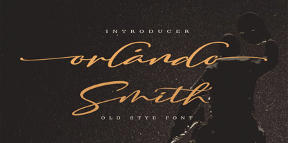 Hello Font Lovers... Orlando Smith is another lovely modern calligraphy typefaces, which is combining the style of classic calligraphy with an modern style. combines from copperplate to contemporary typeface with a dancing baseline, modern and elegant touch. including initial and terminal letters, alternates, and ligatures. Can be used for various purposes.such as headings, logos, wedding invitation, t-shirt, letterhead, signage, lable, news, posters, badges etc. To enable the OpenType Stylistic alternates, you need a program that supports OpenType features such as Adobe Photoshop, Adobe Illustrator, Adobe Indesign, Corel Draw, and More!!! Thank you for your purchase...
 - Beauties by Meutuwah,
$20.00 Hello Font Lovers... Beauties Script is another lovely modern calligraphy typefaces, which is combining the style of classic calligraphy with an modern style. combines from copperplate to contemporary typeface with a dancing baseline, modern and elegant touch. including initial and terminal letters, alternates, and ligatures. Can be used for various purposes.such as headings, logos, wedding invitation, t-shirt, letterhead, signage, lable, news, posters, badges etc. To enable the OpenType Stylistic alternates, you need a program that supports OpenType features such as Adobe Photoshop, Adobe Illustrator, Adobe Indesign, Corel Draw, and More!!! Thank you for your purchase...
 - BIFASER by Twinletter,
$17.00 Get to know Bifaser, the classic Victorian font that will bring the era’s mesmerizing beauty to your design projects! With an elegant and classy classic Victorian theme, this font is the perfect choice to bring a strong and alluring black letter feel to each creation. Biphaser perfectly describes the elegance and splendor of the classic Victorian typography style. Each letter has exquisite detailing and well-proportioned composition, creating a sophisticated and classy impression. In every project, Bifaser is able to exude the enchanting power and charm of black letters. Not only that but Bifaser is also equipped with great features such as ligatures and alternative characters that provide flexibility in creating unique and interesting letter combinations. With ease, you can explore creative and attractive design variations. Bifaser also supports multilingualism, allowing you to easily and broadly reach an international audience. Whatever language you use, Bifaser will be a loyal partner who is ready to give beauty and excellence to each of your designs. With Bifaser, you can create works that reflect the power and luxury of black letters. Show a strong, classy, and stunning style in every touch of your design. Don’t miss the chance to own this eye-catching classic Victorian font. Biphaser will be the right choice to give beauty and charm to your design project. What’s Included : File font All glyphs Iso Latin 1 Alternate, Ligature Simple installations We highly recommend using a program that supports OpenType features and Glyphs panels like many Adobe apps and Corel Draw so that you can see and access all Glyph variations. PUA Encoded Characters – Fully accessible without additional design software. Fonts include Multilingual support
 - Quiverleaf CF by Connary Fagen,
$35.00 Like the graceful movement of a ribbon, Quiverleaf® CF glides effortlessly from letter to letter. Five weights – from a delicate, yearning thin to a hearty extra bold – combine with striking italics and wide language support for a well-rounded and expressive typeface. Quiverleaf's versatile design allows for both beautiful text and airy headlines. Quiverleaf® CF pairs well with itself at contrasting sizes and weights; it can also be used effectively alongside both sans typefaces like Greycliff® CF, and simple humanist designs like Artifex Hand CF. Quiverleaf is also available in an Arabic version, Quiverleaf Arabic CF, which pairs perfectly with the original Quiverleaf for multi-script visual design. All typefaces from Connary Fagen include free updates, including new features, and free technical support.
 - Alaturka by Bülent Yüksel,
$19.00 ABOUT FAMILY: What makes "Alaturka" elegant, friendly and contemporary is its very rounded curves with very open terminals. "Alaturka" has been designed with a higher "x-height" than other fonts in its class to make tiny readability more obvious in any use situation. It will be ideal for use in small sizes such as business cards or mobile applications. This typeface is also equipped with powerful OpenType features to satisfy the most demanding professionals. It has solid features like case sensitivity, small, true capitals, full ligatures, tabular figures for tables, old-style figures to elegantly insert numbers into your sentences, and more alternative characters to give personality to your projects. FEATURE SUMMARY: - 2 style: 1From 1923 To 2023 - 8 weights: Thin, Extra Light, Light, Regular, Medium, Bold, Extra Bold, and Black. - 3widths: Normal, Narrow, and Condensed. - Matching italics (12º) for all weights and widths. - Matching small caps for all weights and widths. - Lining and old-style figures (proportional and tabular). - Some alternate characters - Unlimited fractions. - Automatic ordinals (1st, 2nd, 3rd, etc.). - Extended language support: Most Latin-based scripts - Extended currency support. You can enjoy using it.
 - Apres RE by Font Bureau,
$40.00 Apres is a clear and comfortable typeface from David Berlow, originally designed for the Palm Pre smart phone. This humanist geometric design projects a friendly and forthright familiarity, without being static or mechanical. This version of the family is part of the Reading Edge series of fonts specifically designed for small text onscreen, having been adjusted to provide more generous proportions and roomier spacing, and having been hinted in TrueType for optimal rendering in low resolution environments.
 - Aremic by Graptail,
$15.00 Aremic is a bold display font created to be used for bold headings coming in 2 shapes Regular and Rounded including Oblique. This font is inspired by the shape of the letters on sports posters. This type of font perfectly made to be applied especially in logo, headline, signage and the other various formal forms such as invitations, labels, logos, magazines, books, greeting / wedding cards, packaging, fashion, make up, stationery, novels, labels or any type of advertising purpose.
 - PF Occula by Parachute,
$33.00 Occula on Behance. Occula: Specimen Manual PDF. Occula is an exploration into high-legibility type although it’s not an effort to design the ultimate typeface in terms of economy and legibility. Instead, the goal has been to strike a balance between modern curves and lively old-style rhythm – using a rational design approach without becoming monotone. Or from another point of view: being humanistic and lively without looking old-fashioned and quirky.


