2,834 search results
(0.018 seconds)
- Potter Alaska by Aldedesign,
$18.00 Potter Alaska is Nice Bold Script Font - A stylish and quirky new bold script. Potter Alaska font was created to look as close to a readable bold script as possible by including a couple ligatures.
 - Revla Slab by Eclectotype,
$40.00 The Revla family just keeps expanding! This is Revla Slab. It has the same exuberant charm as its siblings ( Revla Sans and Revla Serif ) with a touch more chunk. OpenType contextual alternates make for text that is lively and bouncy, without the monotony of obviously repeating letterforms. It’s shamelessly fun, but pretty serious at the same time. The range of weights can be used to maintain an even colour across different sizes - use lighter weights for bigger sizes and vice versa. OpenType features include automatic fractions, ordinals, contextual alternates (which along with the pseudo-randomness, help maintain a nice tight fit with minimal glyph collisions), standard and discretionary ligatures (OK, only one discretionary ligature, but it’s a belter!), and case-sensitve forms. Obviously, in sharing a common skeleton, it will work well with other members of the Revla Superfamily, particularly Revla Sans.
 - Trollkatt by Hanoded,
$15.00 A Trollkatt in Norwegian myth, is the cat associated with witches. The last few days a stray ginger cat seems to have adopted us - she comes into the house, lies down on the carpet and loves the cat food we bought her. We have posted some ‘found a cat’ messages online and hung op some flyers - just in case someone is missing a cat. Because of the stray, I decided that I should name this font something cattish, so Trollkatt is what popped up. The font is quite nice; I made it with my Chinese ink and a brush, from which I cut most of the hairs. This font won’t catch mice, but it will put some magic into your designs! And the stray cat… well, if she isn’t chipped and no one comes to fetch her, we will keep her. #happyending
 - TOYZARUX - Personal use only

- Bleeding Freaks - Unknown license

- Throwupz - Personal use only

- Ozone - Unknown license

- Pungen - Unknown license

- Respexable by PizzaDude.dk,
$20.00 Going retro with Respexable - an all caps font with a funky mixture of grafitti and my own retro handwriting!
 - Vagabundo by Juraj Chrastina,
$39.00 Vagabundo is a hand brushed family with three styles and some extra goodies. You can combine different weights with icons, ornaments and banners to get a nice original design. You can download the instruction PDF here.
 - Shorthalt by Brittney Murphy Design,
$8.00 Shorthalt is a dashingly handsome upright script- all dressed up, but not too stuffy, with lots of ligatures and contextual alternates. Shorthalt works great for headlines or bylines paired with a nice simple sans or serif.
 - Spring#7 by Joey Maul,
$12.00 Spring#7 is a 1900s-style font based on text on postcards found after the turn of the century. Italic in nature, it works nicely for text and graphics that need a humble old-timey look.
 - Love Flowers by Epiclinez,
$15.00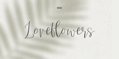 Love Flowers is a lovely and timeless handwritten font. It is a nice choice for creating eye-catching logos, branding, and quotes. Every letter has a unique and beautiful touch, to make your design come alive.
 - Blood Scratch by Creaditive Design,
$12.00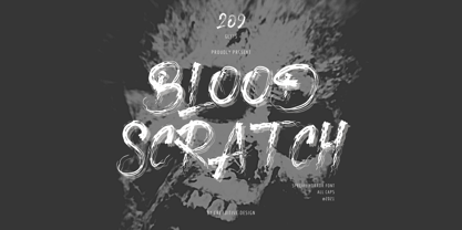 Blood Scratch is a creepy and brushed display font. It is perfectly suitable for any Halloween-related project or crafty idea, creepy film project and horror themes will be nice! The only limit is your imagination.
 - DB Doodledeedoo by Illustration Ink,
$3.00DB Doodledeedoo is great for adorning a scrapbook page or adding a nice to touch to a card or invitation. Adds child like art to to give all your creations that fun home and family touch. - Souplesse by Hanoded,
$15.00 Souplesse (flexibility in French) is a nice, uncomplicated typeface; happy beyond words, yet with a bit of a bite. The glyphs have a rough edge, yet remain very legible. Souplesse comes with a bagful of diacritics.
 - Trees Of Africa by Okaycat,
$24.50 Very nice assorted African trees silhouetted, including baobab, palm trees, & more. Great for making shadow picture graphics. Also outlines are included. Illustrations are included for letters A-Z, a-z, numbers 1-9, and some punctuations.
 - Bell Gothic by Linotype,
$40.99C.H. Griffith was commissioned by the American telephone company, Bell, to design a typeface which would be particularly suited to small, compressed sentences and inferior paper quality. The font was intended for use in the company’s telephone books. Griffith had already had experience with the conception of newsprint fonts and was interested in legibility issues. In 1922 Griffith created the Legibility Group, which contained particularly legible fonts predestined for newspapers. Bell Gothic has all the typical characteristics which optimize a font’s legibility. The modern heir of Bell Gothic is Bell Centennial, designed by Matthew Carter in 1974 in celebration of the Bell Company’s 100th birthday. - Maduki by Hanoded,
$15.00 This time the font's name is meaningless. Maduki doesn't mean 'cool' in Swahili, nor does it mean 'cup cake' in Sranantongo. It is just a nice name. Maduki is a playful font, created with one of my 2 year old son's marker pens (the 'no stain, wash-out' variety), a couple of cups of coffee and a whole bunch of 'speculaas' cookies. Now you're wondering what speculaas is, right? I'll tell you later - in a couple of fonts... Anyway, there's not much meaningful to say about Maduki font. It is nice, it is cute and it comes with alternates!
 - Mundo DemiBold by Type-Ø-Tones,
$40.00 Mundo DemiBold is the perfect counterpart of the Hannover Modern, the other Javier Mariscal typeface in our catalogue. This nice font belongs to a series of drawings used in the Señor Mundo comic strip of the nineties.
 - Petit Oiseau by Hanoded,
$15.00 Petit Oiseau (Little Bird in French) is a very nice and very legible 'back-to-school' kind of typeface. It is thin, elegant and stylish, yet retains a certain youthfulness. Petit Oiseau comes with Babylonian language support!
 - Dangerfield by Solotype,
$19.95The Barnhart Bros. & Spindler foundry put out a caps-only face called Dante. We liked it, but felt it needed a lowercase. The result here is a rather nice square design, which has become a personal favorite. - New Way by Khalid Jassim,
$27.00 This font is good to use for any modern style magazine/posters etc. The letters in this font will give writing a nice look. It will be a perfect use for anything that needs to look fancy.
 - Shirin by Ahmet Altun,
$- With this nice, rounded-corner handwriting font that is like comic, slab style; sweet and radiant logos, texts and every kind of graphics, editions and printings like magazines, brochures can be created. Text printouts look pretty smart.
 - Desyrel - Unknown license

- Shibe by Linecreative,
$16.00 Shibe - Bold italic font, has a strong, sharp character, and is combined with the font graffiti styles, To make a beautiful combination, simply mix upper and lower case and mix with alternative glyphs Shibe offers you: Shibe- A clean Bold italic font including Upper & Lowercase characters(ALL CAPS), Stylistic alternates Character (2 Character) Supports Multi linguage (Latin Western Europe), Numbers and Punctuation
 - Maxhild by ahweproject,
$9.00 Maxhild is a cool, graffiti-style display font. Add this font to your urban and casual creations, and you will love the outcome. Whatever the topic, this font will be a wonderful asset to your font library, as it has the potential to enhance any creation. This font is suitable for designs such as t-shirts, sportswear, logos, advertisements, clothing, and more.
 - Winter Swash by Illushvara,
$14.00 Hello, Introducing a new font Winter Swash inspired by graffiti style. It's bold, dramatic, urban styled display font. Add this font to your favorite creative ideas and notice how it makes them come alive like a poster, kids flyer, merchandise, quotes, branding, cartoon, comic and more. If you have any question, don’t hesitate to contact me. Happy Designing !!! Thank You, Bayu Suwirya
 - Cal Fraktur Brush by Posterizer KG,
$19.00 Cal Fraktur Brush is one more font from the PKG “Cal” (Calligraphic) group. This time, we used a wide brush instead of the calligraphic pen for the sketches. This font is widely used in the typographic creation of shorter text forms such as headlines, tattoo and graffiti quotes, book covers, t-shirt designs, logos, posters, movie spots, banners, labels... Enjoy!
 - Queen Mestalla by ZetDesign,
$17.00 Queen Mestalla is a sherif font in gothic style with a good thickness making this font look bold and eye catching. This font is perfect for designing t-shirts, posters, music albums, magazines, billboards, and graffiti. This font is available in 2 style options, regular and italic, also comes with many alternative style options making it easy to create more awesome designs.
 - Fearless Queen by Gassstype,
$25.00 Introduce, New Font in Fearless Queen Inspired from old skool graffiti Sketch and street art, we created this Typeface. Drawn in Procreate app, then vectorized and crafted carefully with passion, love and Prides :). Fearless Queen Typeface Suitable for many design project, branding, packaging, logo, wall art, headline, template, banner, poster, and many more projects. These include all caps, punctuation, and numerals.
 - Adrenalina by BRtype,
$25.00 Adrenalina was created in 2003-2007. In 2014 the project was revised and became a font family. The character set was drawn through digital manipulation from photos of pichações taken in São Paulo - Brazil. Pixação is a form of tagging that comes from Brazilian graffiti writers. This style of pichação (or pixação) is also known as tag reto (straight tag).
 - Big Ballpen by Simonkoba,
$18.00 Big Ballpen is a modern, slightly naive handwriting typeface, which has the feel of graffiti with its rough lines. The font lines are basically fat and the thickness is not regular from letter to letter. Some numbers are inspired from Tony Buzan concept of picture-number. For example, the number 2 resembles a swan. Some special characters like €$*#@&{Ç~• are available.
 - Cluisher Brush by Ergibi Studio,
$19.00 PROUDLY PRESENT CLUISHER BRUSH is a brush type font which includes an outline style that you can adjust the color to make this font look more perfect. Cluisher Brush is ideal for logos, apparel, T-shirt, Hoodie, graffiti, quotes, product packaging, or anything which needs a typographic turbo-boost. if you have any Question please Message Me. Thank you ERGIBI STUDIO
 - Street Smart by Fontysia,
$9.00 Introducing: Street Smart is a fun and bold graffiti font, which includes six versions of each letter which can be used separately or on top of one another for a different look. This font is PUA coded which means you can access all the glyphs and replace them easily! (please type preview to see if I have what you need!)
 - Latos Vocos by James White,
$12.00 This font style is commonly seen in traditional tattoo artist portfolios all over the world. Inspired by graffiti seen in bathroom stalls, taco stand tables, public transportation windows, and brick walls in the suburbs of East LA. This font will go great on a banner for a tattoo design, and even on a t-shirt design for all your urban clothing lines.
 - Sokinz by Aliptype,
$10.00 Introducing Sokinz. Sokinz was round shapes, funky and playfull fonts, made carefully with handdrawn by combining two concepts of graffity style and groovy styles, you can use this font for your creative design, this font was suitable to make posters, pamflets, t-shirt, merch, apparels, brand names, gift cards, products tags, and many more can be discovered by using this fonts.
 - Marins Perdus by Biroakakarati,
$9.00 This font is inspired by graffiti calligraphy, it's only block letters in a modern style and more readable. The name "Marins Perdus" is from a novel by Jean-Claude Izzo "Les Marins Perdus", set in Marseille. The letters of "Marins Perdus" have a light inclination to the left, slim letters in a cool style, perfect for a title or a street event.
 - Rameyon by ahweproject,
$9.00 Rameyon is a cool, graffiti-style display font. Add this font to your urban and casual creations, and you will love the outcome. Whatever the topic, this font will be a wonderful asset to your font library, as it has the potential to enhance any creation. This font is suitable for designs such as t-shirts, sportswear, logos, advertisements, clothing, and more.
 - Rase Grimm by Graffiti Fonts,
$24.99 The Grimm family is a blackletter inspired graffiti style built for headline and display. The family includes 3 variants: Grimm Regular & Grimm Curves both utilize traditional upper & lowercase letters while the Grimm Fat variation is an all-caps style. All 3 styles include initial, terminal & isolated letter variations as contextual alternates as well as a number of stylistic alternates, ligatures & other embellishments.


