10,000 search results
(0.043 seconds)
- Ki by Mint Type,
$29.00 Ki is a monospaced display typeface inspired by older VCR / camcorder OSD (on-screen display) fonts. It is peculiar for its diagonal angles being restricted to 45°, which results in a specific textural effect perfectly legible in small type sizes. Ki comes in 7 weights with corresponding italics, and features extensive language support with over 500 glyphs, including Cyrillic.
 - Zan Zan by Pitt's Hand,
$20.00 A fun font to create pop and young graphics, with a non-obvious font created starting from a handcrafted line. For an urban, snappy and fresh result.
 - Neue Haas Grotesk Text by Linotype,
$33.99The original metal Neue Haas Grotesk™ would, in the late 1950s become Helvetica®. But, over the years, Helvetica would move away from its roots. Some of the features that made Neue Haas Grotesk so good were expunged or altered owing to comprimises dictated by technological changes. Christian Schwartz says Neue Haas Grotesk was originally produced for typesetting by hand in a range of sizes from 5 to 72 points, but digital Helvetica has always been one-size-fits-all, which leads to unfortunate compromises."""" Schwartz's digital revival sets the record straight, so to speak. What was lost in Neue Haas Grotesk's transition to the digital Helvetica of today, has been resurrected in this faithful digital revival. The Regular and Bold weights of Helvetica were redesigned for the Linotype machine; those alterations remained when Helvetica was adapted for phototypesetting. During the 1980s, the family was redrawn and released as Neue Helvetica. Schwartz's revival of the original Helvetica, his new Neue Haas Grotesk, comes complete with a number of Max Miedinger's alternates, including a flat-legged R. Eight display weights, from Thin to Black, plus a further three weights drawn specifically for text make this much more than a revival - it's a versatile, well-drawn grot with all the right ingredients. The Thin weight (originally requested by Bloomberg Businessweek) is very fine, very thin indeed, and reveals the true skeleton of these iconic letterforms. Available as a family of OpenType fonts with a very large Pro character set, Neue Haas Grotesk supports most Central European and many Eastern European languages. - PF Haus Square Pro by Parachute,
$79.00The minimal character of this typeface with its direct reference to Bauhaus, manages to keep the balance between strict geometric structure and elegance. It strays from monotonous repetitions and works equally well with Latin and Greek, while it really hits home with Cyrillic. Now, in its 3rd major upgrade comes equipped with all that’s needed for an international career. In total 602 characters offer support for all European languages in six different variations. Finally, five special OpenType features offer typographic solutions which includes a stylistic alternate set for Greek and Cyrillic. - Our Pal Hal NF by Nick's Fonts,
$10.00Of the many lettering gurus who published chapbooks on handlettering during its heyday, one of the most prolific was H. C. Martin. This quirky poster face was offered in one of his many Idea Books, and it remains as fresh and frolicsome today, some seventy years later, as when it first appeared. Both versions of this font include the complete Unicode Latin 1252 and Central European 1250 character sets. - Neue Haas Unica Paneuropean by Linotype,
$65.00Neue Haas Unica by Toshi Omagari: The original purpose behind the creation of the typeface Haas Unica was to provide a sympathetic update of Helvetica. But now the font designer Toshi Omagari has decided to make this typeface his own and has thus significantly supplemented and extended it. In the late 1970s, at the same time at which hot metal typesetting was being replaced by phototypesetting, the Haas Type Foundry commissioned a group of specialists known as "Team '77" consists of Andre Gurtler, Christian Mengelt and Erich Gschwind to adapt Max Miedinger's font The characters of Haas Unica are somewhat narrower than those of Helvetica so that the larger bowls, such as those of the "b" and "d", appear more delicate and have a slightly more pleasing effect. In general, the spacing of Haas Unica was increased to provide for improved kerning and thus enhance the legibility of the typeface in smaller point sizes. Major changes were made to the lowercase "a", in that the curve of the upper bowl became rounder and its spur was eliminated. The form of the "k" was additionally modified to remove the offset leg so that both diagonals originate from the main stem. The outstroke of the uppercase "J" was also significantly curtailed. In addition to many minor alterations, such as to the length of the horizontal bars of the "E", "F" and "G" and to the angle of the tail of the "Q", the leg of the "R" was extended and made more diagonal. In the case of the numerals, the upper curve of the "2" was reduced and the lower loops of the "5" and "6" were correspondingly adapted. The sweep of the diagonal of the "7" was also reduced. Several decades later, Toshi Omagari returned to the original sketches with the objective of reinvigorating this almost totally forgotten typeface. First, however, he needed to revise the drafts prepared by Team '77 to adapt them for digital typesetting. So Omagari carefully adjusted the proportions of the glyphs, achieving a more uniform overall effect across all line weights and removed details that had become redundant for contemporary typefaces. It was also apparent from the old drafts that it had been the case that the original plan was to create more than the four weights that were published. Omagari has added five additional styles, giving his Neue Haas Unica? a total of nine weights, from Ultra Light to Extra Black. He has also greatly extended the range of glyphs. Providing as it does typographic support for Central and European languages, Greek and Cyrillic texts, Neue Haas Unica is now ready to be used for major international projects. In addition, it has been supplied with small caps and various sets of numerals. With its resolute clarity and excellent typographic support, Neue Haas Unica is suitable for use in a wide range of new contexts. The light and elegant characters can be employed in the large point sizes to create, for example, titling and logos while the very bold styles come into their own where the typography needs to be powerful and expressive. The medium weights can be used anywhere, for setting block text and headlines. - Hem And Haw SRF by Stella Roberts Fonts,
$25.00 Hem and Haw SRF is another Ray Larabie original for Stella Roberts Fonts. Rebuilt from Ray's former freeware design "Stitchen", the lettering looks as if it were stitched into fabric. The font now is more complete with foreign characters and additional accents, punctuation and currency symbols. The net profits from my font sales help defer medical expenses for my siblings, who both suffer with Cystic Fibrosis and diabetes. Thank you.
 - Neue Haas Grotesk Display by Linotype,
$33.99 The first weights of Neue Haas Grotesk were designed in 1957-1958 by Max Miedinger for the Haas’sche Schriftgiesserei in Switzerland, with art direction by the company’s principal, Eduard Hoffmann. Neue Haas Grotesk was to be the answer to the British and German grotesques that had become hugely popular thanks to the success of functionalist Swiss typography. The typeface was soon revised and released as Helvetica by Linotype AG. As Neue Haas Grotesk had to be adapted to work on Linotype’s hot metal linecasters, Linotype Helvetica was in some ways a radically transformed version of the original. For instance, the matrices for Regular and Bold had to be of equal widths, and therefore the Bold was redrawn at a considerably narrower proportion. During the transition from metal to phototypesetting, Helvetica underwent additional modifications. In the 1980s Neue Helvetica was produced as a rationalized, standardized version. For Christian Schwartz, the assignment to design a digital revival of Neue Haas Grotesk was an occasion to set history straight. “Much of the warm personality of Miedinger’s shapes was lost along the way. So rather than trying to rethink Helvetica or improve on current digital versions, this was more of a restoration project: bringing Miedinger’s original Neue Haas Grotesk back to life with as much fidelity to his original shapes and spacing as possible (albeit with the addition of kerning, an expensive luxury in handset type).” Schwartz’s revival was originally commissioned in 2004 by Mark Porter for the redesign of The Guardian, but not used. Schwartz completed the family in 2010 for Richard Turley at Bloomberg Businessweek. Its thinnest weight was designed by Berton Hasebe.
 - Ian - Unknown license

- RAN by URW Type Foundry,
$35.99 RAN Reformed Typeface for Beginners by Georg Salden - a headstrong and courageous approach to an improved handling of handwriting. Diverse and sometimes irreconcilable theories exist about how beginners are supposed to learn writing and reading. This has led to fierce discussions among experts already. We don’t want to pour more oil on the fire, but hope to create a new awareness for this topic, which is important to everyone of us. For beginners the combination of single characters (sounds) to whole words is essential during the acquirement of reading and writing. In this process they develop the skill to recall entire terms from memory. Therefore, after current practice, every word shall be written in a single stroke without lifting the pen in between. Georg Salden contradicts this postulate and warns, that coercively holding the pen down within a word can easily lead to exaggerated loop formations and a general meandering of the written text. The intellectual process in connecting single sounds to words while writing would happen anyway and the prohibition to lift the pen would often lead to tensions. To still support the necessary connections in general and to simplify the connecting, he teaches to write all round letters like a, e, g, o with inclusion of the connecting stroke, so that the spacing and combining with the next character arise by themselves. By settling the stroke at certain points and with a clear and logical writing method, a conscious and careful contact with the various strokes arises. All this automatically leads, together with a certain deceleration, to an increase of beauty and readability in the handwriting. The repeatedly discussed topic »connected or unconnected« appears to be solved in the most comfortable way as, depending on the particular character combination, both solutions are possible.
 - Jan by Linotype,
$29.99Jan Regular combines an experimental, bold, mono-weight geometric sans serif with the Arabic writing system's means of joining letters. Adding in script-like letter connections, a feature that is found in both western cursive and Arabic type, as well as distinctly Arabic-like accents above and below certain letters, Michael Parsons has created a cross cultural typographic statement. Jan Regular is best used for headlines, and small strings of text, in sizes large enough to view and appreciate the unique counter forms within the letters. This font is one of 10 creations from the young Swiss designer Michael Parson included in the Take Type 5 collection, from Linotype GmbH." - Lanz by Nine Font,
$29.00 Lanz Family is a clean & warm sans serif family with 7 weights - 7 uprights and matching italics. Its open apertures and large x-heights make text more legible and readable at small sizes. Recommended for editorial design, a header for an article and a various range of typography.
 - Clans by T-26,
$19.00 - Plans by Graphicxell,
$19.00 inspired by the famous minimalist logo perfect for the purposes of designing templates, brochures, videos, advertising branding, logos, invitation, layout design, elegant crafting, beauty design and other
 - Lam by Produce,
$29.00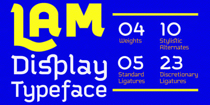
- Plan by Characters Font Foundry,
$17.50 Plan is a corporate typeface made for 'Plan A Ontwerp', a graphic design studio based in Eindhoven, The Netherlands. Based on the rough sketches of the founder of Plan A Ontwerp, Frank Vogt, Characters constructed, mastered and finetuned the complete Plan Family. Plan comes in three versions; Plan A, Plan B and Plan C. All versions can be mixed because they share the same metrics, spacing and kerning. Where Plan A is a strong display type, Plan B has more details and is therefore better suited for longer and smaller texts. Plan C is a decorative stencil version with an own personality and dynamic.
 - Xan by Autographis,
$39.50 Xan is a very expressive script, that was written with a brush on rough Japanese paper and then digitized taking care not to destroy that Japanese touch.
 - Lean by Ogle Studio,
$11.00 Lean is a solid must-have for anyone's font collection. With its plump weight and dynamic poise, Lean offers an eye-catching solution for any project. Handcrafted and informal, the style adds a real statement, whether it's for a logo, video artwork, business card, or presentation. The impact of the uppercase characters, married with the gentle roundness of the lowercase strokes, present a unique result for titling, sure to get you noticed. Lean's dynamic 'lean' makes strings come alive, giving a feeling of movement and excitement. The character set contains 190 glyphs, with latin and western language support.
 - Spring Has Come by Stefani Letter,
$12.00 Spring has come is a stylish modern handwritten script. It has an unique, striking look which can be used to make any design stand out. Incredibly versatile, this font fits a wide pool of designs, elevating them to the highest levels. Add this font to your favorite creative ideas and notice how it makes them come alive! This font is PUA encoded which means you can access all of the glyphs.
 - Key Tab Metal - 100% free

- Janda Happy Day - Personal use only

- Red Nose Day - Personal use only

- Komika Text Kaps - Unknown license

- 28 Days Later - Unknown license

- Pea Katie Shea - Unknown license

- 7 days fat - Unknown license

- Komika Text Kaps - Unknown license

- Celebrate the Day - Personal use only

- KR Career Day - Unknown license

- KR Krazy Kat - Unknown license

- Elliot's Bad Day - Unknown license

- 7 days oblique - Unknown license

- Komika Text Kaps - Unknown license

- KR Black Kat - Unknown license

- Komika Text Kaps - Unknown license

- Mail Ray Stuff - Unknown license

- KR Valentine Kat - Unknown license

- KR Moving Day - Unknown license

- Field Day Filter - Unknown license

- BN-Blurry Day - Unknown license