10,000 search results
(0.042 seconds)
- Spiffily NF by Nick's Fonts,
$10.00Here's a workmanlike interpretation of John Pistilli's eponymous extreme Didone, originally designed for VGC in the 1970s. The typeface's strong contrasts and graceful nuances guarantee that your headlines will get noticed. Both versions of this font include the complete Unicode Latin 1252, Central European 1250 and Turkish 1254 character sets. - Beautiful Victoria by Letterena Studios,
$9.00 Beautiful Victoria is a lovely script font featuring charming, playful characters that seem to dance along the baseline. Add this font to your most creative ideas, and notice how it makes them stand out! Beautiful Victoria is PUA encoded which means you can access all glyphs and swashes with ease!
 - Gridder - Unknown license

- Shout Out by Comicraft,
$19.00 Here's a big shout out to all our Loud and Proud font homies -- If you've got a good set of lungs on you -- fill 'em up and get ready to Shout, SHOUT! Yes, let it all out because this is a font you can't do without -- It will make you wanna SHOUT! Throw your hands up, SHOUT! Kick your heels back, SHOUT! Throw your head back, SHOUT! Come on now, SHOUT! And don't forget to say you will... Don't forget to SHOUT! Yeah yeah yeah yeah, SHOUT! A little bit softer now, (Shout) A little bit softer now, (Shout) A little bit softer now, (Shout) A little bit louder now, SHOUT! A little bit louder now, SHOUT! A LITTLE BIT LOUDER NOW! SHOUT! SHOUT! SHOUT! SHOUT! PHEW -- Who says Comicraft doesn't know how to Pump it Up AND Get Down?!
 - Genie by Canada Type,
$24.95The flower children of Canada Type are at it again. This time we went above and beyond the call of duty and right into the land of reconstruction in order to make this font. When we saw a few letters from an early 1970s film type called Jefferson Aeroplane, we had the sudden urge to bring their beauty to digital life. But since further research revealed no more letters or information, we just had to "wing" the rest of this Aeroplane. Now this Genie is out of the lava lamp, and it's nothing short of groovy. A few symbols and alternates come within the font, so make sure to check out the very full character set. We love this font so much that we couldn't help but play with it for a week. Some of the Wes Wilson-inspired results are in this page's gallery, so check them out for a flashback. Keep on trucking! - Berndal by Linotype,
$29.99Bo Berndal, the master Swedish typographer, is the eponymous designer of Berndal, a contemporary text family with five different styles. This family represents a new achievement for Bo Berndal, who has spent many years working to optimize text legibility in the printed media. Several small tricks make the Berndal family an interesting milestone in legibility. Berndal's letterforms contain large x-heights. Large x-heights open up the counterforms of letters, making text appear lighter on a page, but their correspondingly shorter ascenders and descenders can hinder legibility. This does not occur in Berndal at all! Coupled with this experiment, Berndal's various font weights display a certain softness and roundness. The letterforms themselves are relatively wide, with an overall consistency in width. The calligraphic nature of the strokes has been minimized, yet a contrast stroke-thickness is still to be noticed within the alphabet. Berndal's five styles offer almost everything that one could want from a good text family. The Regular weight may be paired with Small Caps, Italic, Bold, and Bold Italic. All styles ship in the OpenType format, and include tabular and old style figures. The two italic weights are made up of true italics, not obliques. The Berndal family is a part of the Take Type 5 collection from Linotype GmbH." - Aukim by AukimVisuel,
$20.00 Aukim is an exceptional, unique and ligature-rich font that gives a new look to your texts. It is a more text-oriented font and thanks to its OpenType features, it becomes versatile. It is available in 3 sub-families (condensed, normal and extended) for a total of 54 fonts. There are 9 weights with their real italics. It has 886 glyphs, 107 uppercase and 65 lowercase ligatures per font. It also offers a wide range of languages, from Latin to Cyrillic, as well as powerful OpenType features such as meticulously and professionally maintained kerning, stylistic variations, swashes, highly distinctive ligatures, old-fashioned tabular figures, fractions, denominators, superscripts, unlimited subscripts, arrows and much more to satisfy the most demanding professionals. On the one hand, it has rounded curves with very open endings that make this font family noble, friendly and contemporary and on the other hand very useful for writing titles on any medium. Perfectly suitable for graphic design and any display use. It could easily work for web, signage, corporate design as well as editorial design. Aukim is a cool, wonderful, elegant, bold and fun display font. It can easily be paired with an incredibly wide range of projects, so add it to your creative ideas and notice how it makes them stand out!
 - The Kingthings Annex font is an intriguing typeface developed by the talented font designer Kevin King, who operates under the name Kingthings. This font is part of the larger Kingthings font family,...
- Alright, imagine it's a cozy night, and you decide to dive into a world where every letter tells a story of mystery and magic. That's where Midnight Hour, crafted by the talented David Kerkhoff, come...
- Qilin by Hanoded,
$15.00 A Qilin is a mythical hooved creature, looking a bit like a cow with a lion's head, reptilian scales and deer antlers. The Qilin features in Chinese lore, where it is often associated with good luck and prosperity. Qilin font is a rather messy typeface, created with a steel pen and Chinese ink. It might not be a classy font, but it will bring the buyer good luck! ;-)
 - PR Hydra by PR Fonts,
$15.00 A sequel to my own Herakles font, with multiple faces, and more to come, so the name refers to his second labor, slaying the Hydra. The straight lines and sharp angles make it suitable for evoking the feel of many ancient civilizations where writing was cut into stone. Whether your heroic deeds include slaying mythical monsters, or making the best spanakopita in the city, this font is for you.
 - FranklinGothicHandCond by Wiescher Design,
$39.50 FranklinGothicHandCond is another part of a series of hand-drawn fonts from way back in time – before computers changed the way we worked in advertising. When I was in advertising – before computers – a very time consuming part of my daily work was sketching headlines. I used to be able to sketch headlines in Franklin Gothic, Times, Futura, Helvetica and several scripts. We had a kind of huge inverted camera – which we called Lucy. We projected the alphabet onto a sheet of transparent paper, outlined the letters with a fineliner and then filled them in. It was very tedious work, but the resulting headline had its own charm and we had a permanent race going on who was best and fastest. I won most of the time! They used to call me the fastest "Magic Marker" this side of the Atlantic. Great days, just like today! Your sentimental type designer from the past, Gert Wiescher.
 - Aptifer Slab by Linotype,
$39.00 Aptifer Sans and Aptifer Slab are two 21st century typeface families created by Mårten Thavenius. Each family has seven weights, in roman and italic respectively, making 28 font styles in total. A heritage from two design traditions can be seen in Aptifer. One is the robust American gothic typefaces, like M. F. Benton’s, from around 1900. This is combined with the openness and legibility that comes from the humanist tradition. The sans serif part of the family, Aptifer Sans, is designed without excessive details disturbing the reading. Its sibling Aptifer Slab with its wedge slab serifs is more eye-catching but still suited for text settings. The italics fit well into the text flow of the roman. They are a bit narrower than the roman and have cursive characteristics. Both Aptifer Sans and Aptifer Slab are highly legible typefaces and can be used both in print and on screen. Featured in: Best Fonts for PowerPoints
 - Lumiere by Latinotype,
$25.00 The main source of inspiration for this project was Herb Lubalin's Serif Gothic font. This and other fonts of similar style provided the basis for developing a unique display typeface with a strong personality yet neutral enough to be used in a variety of applications. In order to make the font more versatile, we included a number of layered fonts, like inline and shadow styles, which, along with the core styles, provide users with a wide range of choices for any design project. The Lumiere Family comes in 14 styles and includes 2 different variants: multi-layered fonts that make Lumiere easier to use and single layer fonts which allow experimented designers to create their own combinations. Lumiere is highly influenced by retro designs but it features a modern and simplified style that brings great value to your design work. The font is well suited for album covers, movie posters and book cover designs, among other uses.
 - Frock by Wahyu and Sani Co.,
$28.00 Please welcome Frock! It is a sans serif typeface for broad range of usage. It is designed with a slightly slanted oval shaped counters, medium contrast and based on American gothic typefaces with "not so formal" feel. The italic styles are flowy and almost true italic. Swash alternates for some uppercases and lowercases are useful for logo, display and poster. This family comes with 16 styles, uprights and matching italics, consisting of 8 weights from thin to ultra. It is also equipped with useful OpenType features such as Ordinals, Superiors, Stylistic Sets, Proportional Lining Figures, Standard Ligatures, Discretionary Ligatures, Fractions, Numerators & Denominators. Each font has 770+ glyphs including swash alternates which covers Western & Eastern Europe, and other Latin based languages – over 200 languages supported! Frock will be suitable for many creative projects. This typeface will be perfect for logos, packaging, greeting cards, presentations, headlines, lettering, posters, branding, quotes, titles, magazines, headings, web layouts, mobile applications, art quotes, advertising, invitations, packaging design, books, book title, and more!
 - ArTarumianBehrensInitialen by Tarumian,
$100.00 Behrens Initialen is based on the type graphics of the German architect and type designer Peter Behrens (1868-1940). The drawing of the original typeface is in tune with the Art Nouveau (Jugendstil) style in which Behrens worked. This is a light, delicate, somewhat theatrical typeface, the forms of which bear at the same time a certain shade of Gothic and modernity, and can be used, in particular, when there is a need to make a reference to medieval graphics while maintaining the modern style of composition. In the proposed version, the original initial graphics are used not only for uppercase letters, but also for Arabic figures, while for lowercase letters and for the base of other characters are used the letters themselves - without decorative framing. This feature can be useful for obtaining various effects when using both lower and upper cases in parallel, including when they are overlaid. The font includes the Latin, Cyrillic and Armenian ranges. Created by Ruben Tarumian in 2020.
 - House of the Dragon by Mans Greback,
$59.00 House of the Dragon is a gothic blackletter typeface, drawn and created by Mans Greback. Its large, decorative fraktur initials contrasts against the clear, minimalist medieval lowercase, as thrones amongst chairs. With more than one thousand high-quality glyphs, House of the Dragon supports all languages. It is provided in four beautiful styles: Regular, Bold, Outlined and Deco. In addition, the complementary House of the Dragon Color font, with an amazing, classical gold/red effect. This Middle Age typeface is perfect for an Olde English/German logotype, a fantasy game or a poster for a historic battle. The font is built with advanced OpenType functionality and has a guaranteed top-notch quality, containing stylistic and contextual alternates, ligatures and more features; all to give you full control and customizability. It has extensive lingual support, covering all Latin-based languages, from North Europe to South Africa, from America to South-East Asia. It contains all characters and symbols you'll ever need, including all punctuation and numbers.
 - Hadron by Veil of Perception,
$20.00 Hadron is a fusion of gothic black letter and foundational letter forms. It has a heavy flat pen influence but is combined with more modern letter forms for increased legibility over that offered by black letter fonts. Unlike most black letter fonts, Hadron can be set all caps using the first level of caps. A basic design kernel based on the caps “O” and “H” was created first. These letter forms consist of an interplay between curves and straight lines with abrupt transitions and also possess some of the geometric crispness of a modern sans serif. The rest of the Hadron font was developed around this “O” and “H” kernel. This font could be used for any application requiring a formal black letter or foundational lettering look. Hadron could also be used for invitations, brochures and posters. The first level of caps and lower case is basic enough to set a large body of text. It could also be set all caps at that level.
 - Seol Sans by Monotype,
$187.99 The Seol Sans design offers a fresh palette for designers working with the Korean alphabet, particularly those looking to pair Latin and Korean alphabet (or Hangul) forms without creating typographic friction. The choices for Hangul fonts that work well with humanist Latin typefaces are limited. As Monotype’s first original Korean design, the Seol Sans typeface is a humanist take on the traditional rigid and hard designs of Hangul characters. The Seol Sans design more closely resembles the natural curve of hand-written characters. Seol Sans features Neue Frutiger for its Latin glyphs, and works harmoniously with Neue Frutiger World and Monotype’s CJK typefaces: Tazugane Gothic (Japanese) and M XiangHe Hei (Chinese). Seol Sans is a great choice for global brands using a Sans Serif design looking to maintain their visual identity, and communicate with a consistent tone of voice in the Korean market. Seol Sans has over 18,000 glyphs, and supports the Adobe-Korea1-2 and KS X 1001:2004 character sets.
 - Interzone by MYSTERIAN,
$9.00 This type crept up the sense that it was made in Eastern Europe by poorly trained urbanites from a crippled nation, or that it is the remains of a contemporary gothic (like Eckmann) stencil. The choice of what this type signifies is up to the public. Lately I like the idea of 'putting on' (in McLuhan's sense) a genre of idea that is somewhat different from my tradition's beliefs, and fitting a core category of that toward a teleological/eschatological advantage. Therefore postmodernist/apocalyptic carelessness (which I may 'put on' by using this type) is how I abstain from the cravings of immortality, or more so that wanting it is pointless. It’s stands as memento morí; that I will have to die someday. I have to become less, He must become more. Of course, Interzone may signify a classic Joy Division track from Unknown Pleasures as well as the Cold Warish ongoings of conflicted eastern European life. I considered naming this Lunik 9.
 - FranklinGothicHandBold by Wiescher Design,
$39.50 FranklinGothicHandBold is another part of a series of hand-drawn fonts from way back in time – before computers changed the way we worked in advertising. When I was in advertising – before computers – a very time consuming part of my daily work was sketching headlines. I used to be able to sketch headlines in Franklin Gothic, Times, Futura, Helvetica and several scripts. We had a kind of huge inverted camera – which we called Lucy. We projected the alphabet onto a sheet of transparent paper, outlined the letters with a fineliner and then filled them in. It was very tedious work, but the resulting headline had its own charm and we had a permanent race going on who was best and fastest. I won most of the time! They used to call me the fastest "Magic Marker" this side of the Atlantic. Great days, just like today! Your sentimental type designer from the past Gert Wiescher
 - Ascender Uni by Ascender,
$197.99Ascender™ Uni is a proportionally spaced comprehensive Unicode-compatible font with support for the Unicode Standard, v2.1 (supporting most major code pages and character sets in modern use). Ascender Uni is a 39MB TrueType (TTF) font with approximately 53,000 glyphs. The Latin and related glyphs (designed by Steve Matteson) are Sans Serif, with Gothic ideographs drawn in Japanese style, and complementary styles for other scripts. There are also versions of Ascender Uni that provide localized support for Korean, Simplified Chinese and Traditional Chinese. OpenType layout support is included for Arabic (initial, medial, final, isolate, and required ligature forms, as well as basic mark positioning), and vertical writing for CJK locales (consisting mostly of Latin, symbol, punctuation, and kana glyph variants). Character Set: Latin-1, WGL Pan-European (Eastern Europe, Cyrillic, Greek and Turkish), Chinese, Japanese, Korean, Thai, Vietnamese, Hebrew, Arabic. NOTE: Not all applications provide complete support for all the glyphs in this Unicode font. - Hyper Turfu by Bisou,
$10.00 Made in La Chaux-de-Fonds (Switzerland), HyperTurfu was born during the shooting of “The Return of Hyperturfu Xpress 2”. A GoPro on a lego electric train, meters and meters of rails, an empty industrial space, loads of puppets, paper, cardboard, pizza boxes, lights, hot glue and a bunch of friends preparing a one shot scene for a month. The title of the movie was made out of lego pieces, painted with golden spray and hanged over the rails. It was the first inspiration for this awsome superbold font. HyperTurfu is thought from ground up to give a strong impact. It’s gothic retro science fiction 80’s style makes it best suitable for metal music albums or posters. As the “Banco” font it works perfectly with short texts for advertisement, bar, cofee shops concert places or even fancy hairdresser. Just hang it over a pet shop and see what cool animals will come in.
 - 1557 Italique by GLC,
$38.00 Italic type was invented by Aldus Manutius in 1499 or 1501, first, before to be a style name, it was a plain font familly name. This Italique style font was inspired from these who was used by Jean de Tournes in Lyon (France) to print La mÈtamorphose d'Ovide figurÈe, a splendid book with numerous gothic style wood carved pictures. The original font contains almost all modern usual characters except accented ones, no longer in use on that time. They have been added, with some others, with respect for the original design. . A render sheet, enclosed in file, help to identify various others unusual letters on keyboard. It is used as successfuly as web-site titles, posters and fliers design, editing ancien texts or greeting cards, invitations, gastronomic menus... and much more, as a very decorative and elegant font... It supports easily as enlargement as small size, remaining clear and easy to read from 8 or 9 points to 72 and more, particularly on prints.
 - Screwball - Unknown license

- Violeta by Larin Type Co,
$15.00 Violeta script- a new modern calligraphy font. This font is ideal for branding and to decorate your projects, perfect for wedding invitations or your blog. You can also create a logo or beautiful frames for your home. Or just use for your small business, book covers, stationery, marketing, magazines and more.
 - TOMO Tosca by TOMO Fonts,
$15.00 Tosca is a new face designed by TOMO FONTS. Is a massive all-caps font with a stone age feel. Good-humoured shapes ideal strong messages. Very useful for kids related stuff, like books, posters, or websites. Lowercases are a slightly different from uppercases for a more natural look. Enjoy!
 - Shirah 25 by LightHouse,
$49.00Shirah 25 started as a freehand study, while experimenting with ink and new nibs. Later on, when David decided to have a digital version, he drew it merely with the tablet, trying to keep the spirit of the ink and the nib. Shirah 25 is an OpenType/TTF Unicode font. - Wild Thing by ITC,
$29.99Wild Thing was created by British designer Martin Wait and appeared in the ITC library in 1995. The forms look as though they are normal alphabet figures viewed through swirling water, wavy and irregular. Wild Thing is a font which is always moving and is perfect for fresh new designs. - Noma by Spinturnix,
$15.00 Noma is a new wide-set display font with a minimal geometric style. I designed Noma because I wanted a tech-inspired font that has plenty of character while remaining legible. Noma is a great choice for high-impact headings and logotypes. I hope you enjoy, thanks for checking it out!
 - Spinach by Larin Type Co,
$12.00 Spinach - a new fun display font. This is a fun font that is perfect for creating your project, it can be used to create a beautiful inscription for t-shirts, children's books, branding, small business, book covers, stationery, marketing, blog, magazines and more. All characters of this font support PUA encoded.
 - Quadrus by ITC,
$29.99Quadrus is the work of New York graphic designer Peter Fahrni, a condensed open slab serif typeface. Fahrni was inspired by the lettering styles typical of baseball, basketball and American football sportswear. Quadrus is an all caps alphabet ideal for a variety of applications, particularly for those related to sports. - Pathways by Aestherica Studio,
$12.00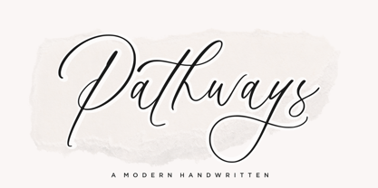 Introducing the new Fun Handwritten Font by Aestherica Studio. Proudly Present, Pathways Pathways is perfect for product packaging, branding project, megazine, social media, wedding, or just used to express words above the background. Pathways also multilingual support. Enjoy the font, feel free to comment or feedback, send me PM or email.
 - Bitsaylen by Aqeela Studio,
$20.00 Bitsaylen is a new script full of elegance and quirk with a playful demeanor and a playful side. Perfect for adding a unique yet relaxed feel, this bag comes with a wide selection of natural looking ligatures. This font is perfect for logos, invitations, wedding designs, social media posts, and more!
 - Matteus by Epiclinez,
$18.00 Matteus is a new, fresh, and beautifully crafted signature script font. It's suitable for branding, logos, social media posts, and everywhere else you're looking for an awesome signature style. So what’s included : Basic Latin Uppercase and Lowercase Numbers, symbols, and punctuations Ligatures Multilingual Support Simple Installations Works on PC & Mac
 - Omarbig by Dhan Studio,
$27.00 Omarbig is a beautiful hand-painted font that looks more natural, fun and combines a mixture of small and large letters, making it look attractive and unique. This fonts can be used for various purposes such as headings, signature, logos, wedding invitations, t-shirts, letterhead, signage, labels, news, posters, badges etc.
 - The Lord Of Bronze by Rockboys Studio,
$23.00 The Lord Of Bronze is a unique handwritten font. It includes elegant swashes which can be used to give a luxurious look to your designs. It can be used for various purposes such as logos, wedding invitations, headings, t-shirts, letterhead, signage, labels, news, posters, badges and so much more.
 - Autelan by Aqeela Studio,
$20.00 Autelan Script is a contemporary calligraphy typeface. It's a mix of retro and modern sans serif script. With Autelan, your designs will get a classic and elegant touch. Autelan can be used for various purposes such as logos, wedding invitations, T-shirts, letterheads, signage, labels, news, posters, badges etc. Thank You
 - F2F Shakkarakk by Linotype,
$29.99The Techno sound of the 1990s, a personal computer, a font creation software and some inspiration had been the sources to the F2F (Face2Face) font series. Thomas Nagel and his friends had the demand to create new unusual faces that should be used in the leading german techno magazine Frontpage"." - Symbol by Adobe,
$35.00The Symbol PS font contains Times New Roman Greek capitals and lowercase, figures and basic punctuation together with a collection of mathematical signs and general purpose Pi characters. Use the Symbol PS font for setting mathematical and scientific work and as a complement to the symbols found in standard fonts.

