10,000 search results
(0.027 seconds)
- Paper Candy by Forberas Club,
$16.00 Use this font for your party or cute moment. Do your magic ! :D
 - Prat Parpar MF by Masterfont,
$59.00 Your next annual report or your next tattoo or embossing - just choose one.
 - FF DIN Paneuropean Variable by FontFont,
$629.99 FF DIN: the famous, faithful and first revival of DIN 1451. FF DIN originates in the lettering models from the German standard DIN 1451, and is considered the perfect standard typeface due to methodical and engineered design. FF DIN Variable offers you more FF DIN than ever before. Pushing font technology to its limits, Variable fonts provide creatives a tool to dial in hyper specific variations which thrive in any design space. FF DIN Variable take bold steps in engineering, which the typefaces behaviour which brings in FF DIN’s technical look-and-feel into the smooth and almost organic world of Variable Fonts. Available in both upright and italic styles, there is a lot more FF DIN to discover with new era of type technology. FF DIN Italic is a sloped roman style, however it is optically corrected – slightly thinner, slightly narrower. As a result, FF DIN Italic stands out subtly. FF DIN Variable stays faithful to its parent’s DNA, the utmost care was taken to ensure that the new instances of FF DIN Variable remained consistent with all the well-known weights. Precision is the mantra of FF DIN, the FF DIN Variable is no exception to this design philosophy. Produce exquisitely fine-tuned typography and expressive animated headlines for any design. Infinite styles, intelligent, and powerful.
 - Brahma by Tall Chai,
$15.00 Brahma V2 is here. The new version has been three years in the making. It has multiple new updates and improvements based on user feedback. The focus for this version has been improved readability while maintaining the unique, modern identity of Brahma type family that has received so much love since V1 was launched in Dec 2020. Brahma is a modern geometric sans-serif font family with weights ranging from Thin (100) to Black (900). Features: Available in 9 weights Over 550 glyphs supporting extended Latin Ideal for display texts: Titles, Logos and Headlines etc. Perfect for branding and rebranding Supports OpenTypes features like Ligatures and Stylistic Alternates Tabular Numerals included Symbols for 10 major currencies including Bitcoin provided in all weights Description: The name comes from Brahmā who is known as the god of creation. And manifesting the same spirit, the Brahma font family focuses on modern creativity. Every character effortlessly integrates with current design standards and interfaces. The fonts are professional yet have a hint of informal personality in them. This makes Brahma perfect for use in modern apps and websites. Brahma is built for the designing and marketing squads. It has a trendy geometric characteristic which is ideal for any branding and rebranding. Brahma has lot of OpenType features (like ligatures and tabular numerals) and the Extended Latin character set supports over a hundred languages. Start Creating!
 - FS Benjamin by Fontsmith,
$80.00 Stone and steel FS Benjamin is a flared serif typeface designed by Stuart de Rozario. Consisting of 12 styles ranging from Light, Book, Regular, Medium, SemiBold and Bold with Italics it has clear, delicate letterforms, punctuated with brutal chiselled angles. With a pure and crafted feel to the forms the typeface has traditional roots but has been designed to work in a contemporary setting. Archetypal proportions in terms of x-height to cap height and ascender to descender ratio, allow the typeface to feel familiar and be legible in all platforms. Delicate brutalism Inspired by the contrasts of London and named after Big Ben, FS Benjamin was designed by Stuart de Rozario and founder, Jason Smith. Walking around London Jason was inspired by the juxtaposition of the old and the new. Glass and steel architecture can often be found amongst traditional signage and coats of arms seen around the City. These surroundings sparked an idea to create a modern design based on an alphabet that would traditionally be carved from stone. “Much of the typography we see today is so similar. I thought what if we created a typeface with traditional roots but modernised it to sit amongst the punk and noise of the streets of London? Old with new. Business with busyness. This is what London is all about.” Jason Smith
 - Farao by Storm Type Foundry,
$21.00Originally designed in 1998 as a 3-font family, updated in 2016 by new italics, small caps and many OpenType functions, resulting in a set of highly visible poster typefaces. If a text is set in a good Egyptienne, we can observe a kind of sparkle in the lines. Slab-serifs are cheerful typefaces, possibly due to the fact that they developed simultaneously with Grotesque typefaces. The design principle originating from the first half of the 19th century does not have such firm and long-established roots as for example, the Venetian Roman typefaces, hence it’s much more prone to a “decline”. We know of Egyptiennes with uneven color, with letters falling backwards (this often happens in the case of “S”), and especially with slightly bizarre modeling of details. In the course of time, however, it was realized that such things could be quite pleasant and tempting. After a century and a half, we find that such Egyptiennes could refresh uniform computer typography. The forms of many twisted letters resemble the gestures of a juggler: others, rectangularly static ones, reflect the profile of a rail or a steel girder – things which, in their times, were new and were observed by the first creators of Egyptiennes. These typefaces are ideal for circus posters and programs for theatre performances, just as for printing on cement sacks. - Anabolic Spheroid Pro by CheapProFonts,
$10.00 A funny looking font with circular shapes and cutouts - both hippie and futuristic at the same time. I have completely redrawn all the glyphs, and introduced a lot of alternate and new letterforms to make a little more variety between upper- and lowercase (the original layout with all the "old" letterforms can easily be accessed by using the OpenType menus "stylistic Alternates" or "Stylistic Set SS01"). All diacritics and accents are totally new, and made large - in the style of the original dotted i. ALL fonts from CheapProFonts have very extensive language support: They contain some unusual diacritic letters (some of which are contained in the Latin Extended-B Unicode block) supporting: Cornish, Filipino (Tagalog), Guarani, Luxembourgian, Malagasy, Romanian, Ulithian and Welsh. They also contain all glyphs in the Latin Extended-A Unicode block (which among others cover the Central European and Baltic areas) supporting: Afrikaans, Belarusian (Lacinka), Bosnian, Catalan, Chichewa, Croatian, Czech, Dutch, Esperanto, Greenlandic, Hungarian, Kashubian, Kurdish (Kurmanji), Latvian, Lithuanian, Maltese, Maori, Polish, Saami (Inari), Saami (North), Serbian (latin), Slovak(ian), Slovene, Sorbian (Lower), Sorbian (Upper), Turkish and Turkmen. And they of course contain all the usual "western" glyphs supporting: Albanian, Basque, Breton, Chamorro, Danish, Estonian, Faroese, Finnish, French, Frisian, Galican, German, Icelandic, Indonesian, Irish (Gaelic), Italian, Northern Sotho, Norwegian, Occitan, Portuguese, Rhaeto-Romance, Sami (Lule), Sami (South), Scots (Gaelic), Spanish, Swedish, Tswana, Walloon and Yapese.
 - FF DIN Paneuropean by FontFont,
$92.99FF DIN: the famous, faithful and first revival of DIN 1451. FF DIN originates in the lettering models from the German standard DIN 1451, and is considered the perfect standard typeface due to methodical and engineered design. FF DIN Variable offers you more FF DIN than ever before. Pushing font technology to its limits, Variable fonts provide creatives a tool to dial in hyper specific variations which thrive in any design space. FF DIN Variable take bold steps in engineering, which the typefaces behaviour which brings in FF DIN’s technical look-and-feel into the smooth and almost organic world of Variable Fonts. Available in both upright and italic styles, there is a lot more FF DIN to discover with new era of type technology. FF DIN Italic is a sloped roman style, however it is optically corrected – slightly thinner, slightly narrower. As a result, FF DIN Italic stands out subtly. FF DIN Variable stays faithful to its parent’s DNA, the utmost care was taken to ensure that the new instances of FF DIN Variable remained consistent with all the well-known weights. Precision is the mantra of FF DIN, the FF DIN Variable is no exception to this design philosophy. Produce exquisitely fine-tuned typography and expressive animated headlines for any design. Infinite styles, intelligent, and powerful. - Metro Office by Linotype,
$50.99The Metro Office family is designed after the model of the original sans serif family – Metro No.1 – produced by W.A. Dwiggins and Mergenthaler Linotype’s design studio during the late 1920s and 1930s. A distinctly new interpretation of the sans serif idea, Metro was a thoroughly “American” sans serif when it was released. However, over the ensuing decades, it became a favorite the world over. Moreover, it is one of the first “humanist” sans serif typefaces designed. While redesigning Metro in 2006, Linotype’s Type Director Akira Kobayashi drew from his own knowledge of humanistic letterforms. The result is a redefined Metro; a typeface that is finally ready for heavy text setting. The original Linotype Metro No.1 never had italic variants. Kobayashi has created oblique variants, extending its use in document setting. A double-storey a and g, as well as a wider w were features of Dwiggins’ original Metro design that were filtered out by Mergenthaler Linotype in the 1930s. Kobayashi remedied this historical slight, retooling Dwiggins’ original forms and optimizing their legibility. Kobayashi has additionally retooled some of Metro’s more troublesome letters, which has black elements that became too dense. By opening up the troublesome joins (like that on the Q), Kobayashi has given his new Metro a more even color in text, improving its legibility while retaining its original spirit. - Ah, COM (sRB) by sRB-Powers, a true enigma wrapped in a digital font file. Imagine if a group of pixels woke up one day, decided to become fonts, and then went on a wild, adventurous spree guided by ...
- Picture this: you’re on a nostalgic trip down memory lane, or perhaps a whimsical wander through the alleys of typographic treats. There, in the neon glow of creativity and cheekiness, stands a font ...
- Van Den Velde Script Pro by Intellecta Design,
$59.95 Van den Velde Script Pro is the definitive edition of the original Van den Velde Script, by Intellecta Design, a free interpretation of the work of the famous master penman Jan van den Velde, to be found in the “Spieghel der schrijfkonste, in den welcken ghesien worden veelderhande gheschrifften met hare fondementen ende onderrichtinghe. ” (Haarlen, 1605). This font has evocative ancient ligature forms from the XVII Century Dutch master penman Jan van den Velde. Your indescritible writing-book was important not only with regard to the specific period it represents, but also in relationship to the entire history of calligraphy as an art: Van den Velde is rightly credited with having introduced and perfected a new trend in Dutch calligraphy. Our font, Van den Velde Script, merges modern necessities or better legibility without loosing the taste of his archaic origins. This enhanced OpenType version is a complete solution for producing documents and artworks whith an evocative and voluptuous style of calligraphic script: Van den Velde Script PRO has - more glyphs than the original Van den Velde Script. We created hundred of new glyphs, deactivated old non-representative glyphs and redesign the remaining library of original glyphs. Van den Velde Pro is more functional, soft and beauty than the original. - to keep the powerful of this unusual kind of script we make a tour-de-force kerning work: 771 glyphs in this font was adjusted in 5400 kerning pairs handly. - hundreds of contextual alternates combinations, some of them with three or more letters, - historical ornaments and fleurons in the typical style (and motifs) from the XVII century at the Lower Countryes accessed with the glyph palette using the Ornaments feature); - an extensive set of ligatures (100s of contextual alternates plus discretionary ligatures) providing letterform variations that make your designs really special, resembling real handwriting on the page; .... and, much better, Van den Velde Scriopt PRO is plus cheap than the original font !!! In non-OpenType-savvy applications it works well as an unusual and beautiful script style font. Because of its high number of alternate letters and combinations (over 700 glyphs), we suggest the use of the glyph palette to find ideal solutions to specific designs. The sample illustrations will give you an idea of the possibilities. You have full access to this amazing stuff using InDesign, Illustrator, QuarkXpress and similar software. However, we still recommend exploring what this font has to offer using the glyphs palette: principally to get all the power of the Contextual Alternates feature. Van den Velde Script PRO has original letters designed by Iza W and overall creative direction plus core programming by Paulo W.
 - Geomatrix by Type Innovations,
$39.00 The font Geomatrix is an original design by Alex Kaczun. It is a dynamic stencil interpretation based on his extremely successful Contax Pro family of geometric sans typefaces. Geomatrix is a contemporary stencil typeface based on generous proportions and clean, crisp lines.The stencil treatment is balanced visually with the stem weight of the font which creates a uniformity and harmony within the design. Geomatrix makes for easy reading and is ideal for long lines of copy. It exudes a strong sense of sophistication for a true stencil design. However, this is no ordinary stencil typeface. That's putting it mildly. Geomatrix is a font on STEROIDS! This unique OpenType font incorporates hundreds of CAPITAL alternate letter forms and glyph substitutions, automatically and on the fly, within InDesign and other Open Type applications. To turn this feature on, just typeset ALL CAPS and go into InDesign's OpenType>Stylistic Sets and select Set 1 from the menu. Turn character kerning from Metrics to Optical, adjust tracking to minus 20-30, and start typing to create some visually interesting letter substitutions and unique word combinations. Geomatrix was specifically designed to take advantage of the OpenType format, allowing the Graphic Designer a unique tool to achieve the desired degree of possible visual typographic effects. And finally, the character sets in Geomatrix have been expanded to include old-style figures and all Eastern European accented glyphs. Strap in and hold on to your seats. A revolution in new font technologies has begun! GEOMATRIX IMPORTANT PLEASE READ HOW TO ACCESS "ALTERNATE" STYLISTIC "SET 1" LETTER FORMS: Geomatrix is a unique OpenType font which incorporates hundreds of CAPITAL alternate letter forms and glyph substitutions, automatically and on the fly, within InDesign and other OpenType applications. To turn this feature on, just typeset ALL CAPS and go into InDesign\'d5s OpenType>Stylistic Sets and select "Set 1" from the menu. Turn character kerning from Metrics to Optical, adjust tracking to minus 20-30, and start typing to create some visually interesting letter substitutions and unique word combinations. This feature "stylistic set 1" can be toggled "on" or "off" anytime, allowing you to go back and forth, or select only the letters that you want to change. Geomatrix was specifically designed to take advantage of the OpenType format, allowing the Graphic Designer a unique tool to achieve the desired degree of possible visual typographic effects. And finally, the character sets in Geomatrix have been expanded to include old-style figures and all Eastern European accented glyphs. Strap in and hold on to your seats. A revolution in new font technologies has begun!
 - Boncaire Titling by insigne,
$22.00 Inspired by the type elements of 17th century Dutch mapmaking, Boncaire Titling provides you with a historic yet adventurous look for your library. This addition from insigne found its muse in a map of Curacao by Dutch cartographer Gerard Van Keulen, a member of the prosperous Van Keulen family from Amsterdam, who were engaged in the manufacture of maps for seafaring. Much thanks on this project goes to The Norman B. Leventhal Map Center, housed at the Boston Public Library. Through the centers kindness, I was able to view a number of period maps in person and to meet with curators, who explained more about the Van Keulen family and the way maps of the period were created. While I studied the maps, I narrowed in on some of the original types unique idiosyncrasies. For instance, the long, exaggerated serifs, which give the forms a sense of stability, aid in the faces legibility--largely a byproduct of the engraving method that was used to create the metal plates for manufacturing these maps. In creating Boncaire Titling, I decided to capture these unique idiosyncrasies, embracing the character of the engravings rather than removing them entirely through over-refining the forms. The result is an elegant family with far more than seafaring potential. This font has a full range of six weights, from thin to black. It also includes a wide variety of OpenType alternates. All insigne fonts are fully loaded with OpenType features. Boncaire Titling is also equipped for complex professional typography, including alternates, smaller titling caps and plenty of alts, including normalized capitals and lowercase letters. There are over 30 autoreplacing ligatures, and the face includes a number of numeral sets, including fractions, old-style and lining figures with superiors and inferiors. OpenType capable applications such as Quark or the Adobe suite can take full advantage of automatically replacing ligatures and alternates. You can find these features demonstrated in the .pdf brochure. Boncaire Titling also includes the glyphs to support a wide range of languages, including Central, Eastern and Western European languages. In all, Boncaire Titling supports over 40 languages that use the extended Latin script, making the new addition a great choice for multi-lingual publications and packaging. Maps are fascinating; they come with the promise of treasure to be uncovered. Examining the map itself, too, you can find great wealth in the details so artfully condensed to that single piece of paper--details carried over into this new insigne font. For your next project, explore the imagination potential in Boncaire Titling.
 - The Mage 1999 font, designed by Dieter Schumacher, is a captivating typeface that transports its audience back to the edge of the 20th and the dawn of the 21st century, encapsulating the essence of a...
- Kiberul by Twinletter,
$13.00 Introducing “KIBERUL Font” – Where Playfulness Meets Typography! Unleash your creativity with KIBERUL Font, a playful display typeface that adds a whimsical touch to your designs. KIBERUL Font is your go-to choice for projects that demand a sense of fun and lightheartedness. Its unique characters and charming style make it perfect for everything from children’s books to vibrant posters and playful branding. With KIBERUL Font, your designs will exude a sense of playfulness that captivates your audience instantly. Whether you’re crafting a cheerful invitation or a captivating logo, this font is your ticket to creating designs that stand out. Elevate your creative projects and let your imagination run wild with KIBERUL Font. Add a touch of joy and humor to your designs, and watch as they come to life with this delightful typeface. Embrace the playful spirit of KIBERUL Font today! – PUA Encoded Characters – Fully accessible without additional design software.
 - Prosaic Std by Typofonderie,
$59.00 A Postmodern vernacular sanserif in 8 fonts Prosaic designed by Aurélien Vret is a Postmodern typographic tribute to the french vernacular signs created by local producers in order to directly market their products visible along the roads. These signs drawn with a brush on artisanal billboards do not respect any typographic rules. The construction of these letterforms is hybrid and does not respect any ductus. Nevertheless the use of certain tools provokes a certain mechanism in the development of letter shapes. It’s after many experiments with a flat brush, that’s these letterforms have been reconstructed and perfected by Aurélien Vret. This is the starting point for the development of an easily reproducible sanserif with different contemporary writing tools. From non-typographical references of Prosaic towards readability innovation The influence of the tool is revealed in the letterforms: angular counterforms contrasting to the smoothed external shapes. This formal contrast gives to Prosaic a good legibility in small sizes. These internal angles indirectly influenced by the tool, open the counterforms. In the past, to deal with phototype limitations in typeface production, some foundries modified the final design by adding ink traps. In our high resolution digital world, these ink traps — now fashionable among some designers — have little or no effect when literally added to any design. Should one see in it a tribute to the previous limitations? Difficult to say. Meanwhile, there are typeface designers such as Ladislas Mandel, Roger Excoffon, and Gerard Unger who have long tried to push the limits of readability by opening the counters of their typefaces. Whatever the technology, such design research for a large counters have a positive impact on visual perception of typefaces in a small body text. The innovative design of counter-forms of the Prosaic appears in this second approach. Itself reinforced by an exaggerated x-height as if attempting to go beyond the formal limits of the Latin typography. It is interesting to note how the analysis of a non-typographical letters process has led to the development of a new typographic concept by improving legibility in small sizes. Disconnected to typical typographic roots in its elaboration, Prosaic is somewhat unclassifiable. The formal result could easily be described as a sturdy Postmodern humanistic sanserif! Humanistic sanserif because of its open endings. Sturdy because of its monumental x-height, featuring a “finish” mixing structured endings details. The visual interplay of angles and roundness produces a design without concessions. Finally, Prosaic is Postmodern in the sense it is a skeptical interpretation of vernacular sign paintings. Starting from a reconstruction of them in order to re-structure new forms with the objective of designing a new typeface. Referring to typographic analogy, the Prosaic Black is comparable to the Antique Olive Nord, while the thinner versions can refer to Frutiger or some versions of the Ladislas Mandel typefaces intended for telephone directories. Prosaic, a Postmodern vernacular sanserif Prosaic is radical, because it comes from a long artistic reflection of its designer, Aurélien Vret, as well a multidisciplinary artist. The Prosaic is also a dual tone typeface because it helps to serve the readability in very small sizes and brings a sturdy typographic power to large sizes. Prosaic, a Postmodern vernacular sanserif
 - Fucked Olympia J - Unknown license

- DiaBolo by Volcano Type,
$19.00 DiaBolo is the result of a few broken slide frames glued together. It is no problem to build any letter with a simple slide frame. DiaBolo is a digitally and organic font.
 - Facebuster by TypeTrust,
$30.00Facebuster is a no-nonsense block serif display typeface with hard geometry and minimal negative space. It's ideal for making a strong yet playful statement. It comes equipped with OpenType Small Caps. - Zimple by Ingrimayne Type,
$9.95 Zimple is a very simple blackletter face with few if any curves. The Zimple Extrude Overlay font is spaced so that it can be layered with Zimple Shadow to produce bicolored lettering.
 - Mainline JNL by Jeff Levine,
$29.00 With virtually no characters containing negative space to kern, Mainline JNL is an experimental typeface with a monospaced, fixed width design, utilizing a retro-techno-1980s look for a clean headline feel.
 - Print Promoters JNL by Jeff Levine,
$29.00 Print Promoters JNL is another batch of classic dingbats re-drawn from vintage source material. This collection features stock words and phrases with a few decorative embellishments thrown in for good measure.
 - S6 Sans by S6 Foundry,
$29.00 S6 sans is a contemporary neo-grotesque sans serif typeface with strong stylistic geometric contrasts. Its distinctive wide-open stance was designed to give the right visual consistency for branding and communications.
 - Rough Tongue by Comicraft,
$19.00 Here's The Thing -- it can be loosened, twisted, tied, tripped over, wagged, bitten, forked, stuck out or kept in your cheek. You need your tongue to talk, taste, chew, swallow and sing. You can keep a civil tongue in your head or you can give someone the rough side of your tongue...
 - Waradala by Differentialtype,
$10.00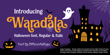 Waradala is a Halloween display font. Perfect for any of your October craft ideas. Which will make your design look mysterious, horror and spooky. Add it to your font library, and it will enhance your creativity! This font is PUA coded, which means you can access all the glyphs and swashes easily!
 - Jatukiy by Twinletter,
$13.00 Introducing “JATUKIY Font” – Unleash Playful Creativity! Meet JATUKIY Font, your passport to a world of playful design possibilities. Designed with a whimsical touch, this display font brings a burst of fun to your projects. JATUKIY Font is your go-to choice when you want to infuse energy and a hint of cheekiness into your designs. Whether it’s children’s books, party invitations, or anything that needs a playful twist, this font is your creative ally. The distinctive style of JATUKIY Font is a visual treat. Its playful, bouncy characters instantly grab attention and leave a lasting impression. Let your designs speak volumes with the lighthearted charm of JATUKIY Font. Crafted with precision, this font’s unique design ensures that your message is delivered with a delightful twist. It adds a touch of humor and personality, making your content unforgettable. With JATUKIY Font, you have the power to create designs that stand out from the crowd. Infuse your projects with creativity, laughter, and a dash of whimsy, all with the help of JATUKIY Font. Elevate your design game and let your imagination run wild with this playful typeface. – PUA Encoded Characters – Fully accessible without additional design software.
 - Khakoy by Twinletter,
$13.00 Introducing “Khakoy Font” – Unleash Playful Creativity! Dive into a world of limitless imagination with Khakoy Font, your ultimate tool for injecting a playful spirit into your designs. Khakoy Font is the embodiment of joy and whimsy in typography. Crafted to spark delight, it’s your go-to choice for projects that demand a dash of fun and a pinch of mischief. With its lively and distinct characters, Khakoy Font invites you to explore the playful side of design. It’s a font that ensures your message is conveyed with a contagious sense of playfulness, captivating your audience instantly. Designed to ignite creativity, Khakoy Font adds a touch of amusement to your projects. From cheerful posters to charming children’s books, this font is your partner in crafting designs that leave a lasting, joyful impression. Let your designs break free from the ordinary and embrace the vibrant spirit of Khakoy Font. Elevate your creative game, infuse humor and light-heartedness into your work, and watch your designs come alive with this delightful typeface. Discover the magic of Khakoy Font today! – PUA Encoded Characters – Fully accessible without additional design software.
 - Kirshaw by Kirk Font Studio,
$24.00 Kirshaw is not your grandfather's sans serif from the 1950s and 1960s. All those old classics like Helvetica, Futura, Franklin Gothic, and Univers are showing their age like an old Elvis Presley song. Kirshaw is a clean, rounded design with sharp contrasting edges. Like those classics, Kirshaw is easy to read in small body copy and captions, plus it's delightfully modern and stylish for headlines and logos. I designed Kirshaw and Kirkly while undergoing cancer treatment at Stanford Medical Center. Font design was always in the back of my mind and now I had extra time. Kirshaw is a distinctive, modern, easy-to-read sans serif family consists of 14 weights (including italics). It’s an Adobe Latin 3 Character Set containing 350 glyphs per style (including special characters).
 - Apron by Hurufatfont,
$29.00 The genesis of Apron font type family is inspired by soft-vertical structure of airplane window. On the other hand Apron is making a reference to technological design mentality of early 2000's. In short texts it has stable view and also humanist effect. Very suitable for mobile apps, web designs, sportive & technological product packs and ads designs. Especially Narrow Bold and Condensed Bold Italic weights have fluid and strong expression for striking headlines. User friendly Apron serves rich opentype properties; small capitals, alternative letters (a, c, e, g, k, l, q, s, y, A, C, G, K, M, N, R, S, 3, 6, 9), stylistic sets, standart and optional ligatures, oldstyle figures, tabular linings, arrows, bullets and wide money currencies, fractions and math symbols. Now please fasten your seat belts and enjoy it.
 - Luba Luft by Julia Bausenhardt,
$29.00 Luba Luft is a semi-connected script font that has an airy and casual look to it. Smooth letters with upright curves flow effortlessly over the page, the letterforms vary slightly to emphasize the light, flowing characteristics of the typeface. One of the unique features of Luba Luft are these subtle variations, letterforms flowing and curling around each other as if written by hand - contextual alternates. Dress your designs up with over 200 swashes, ligatures and alternates in just a few clicks in the OpenType menu. When used in longer texts you?ll get a very readable script typeface that’s very natural looking due to the inbuilt OT functionality. Luba Luft comes in two variants (Regular and Bold) and is the ideal typeface for packaging, menus, labels, cards and invitations.
 - Abnormal by Jan Buble,
$20.00 Are you getting bored by the growing number of sans-serif fonts that absolutely lack character? Do clean typography and sleek curves repulse you? Maybe it’s time to forget the normal and set sail into the murky waters of abnormality. Abnormal features four styles, ranging from an almost monolinear Light to a reverse-contrast Bold. The design pays homage to 19th century poster typefaces, with their crude character and unconventional means of catching the eye. It is one of the few typefaces out there that features reversed contrast and no serifs. These properties make it an ideal choice for large headlines, posters, flyers and essentially all applications where getting attention is a paramount. Abnormal offers extended language support, standard ligatures, alternative lowercase “a”, fractions, ordinals and a plethora of quirkiness at your disposal.
 - Saratoga Slim AOE by Astigmatic,
$19.95He's rough around the edges, but he's an outlaw from the Old West, what did you expect? He's Saratoga Slim, a playful shaken up dust devil of a typeface. With a shaken appearance and rough hewn letters, he steps onto the scene, yet is clearly legible to read. He's alot like a one of those ruffigans that is crude around the edges, but when he looks at you and says, "Get what I'm saying partner?", you know exactly what he means. Put some rough and tumble type into your designs with Saratoga Slim. He's been through the ringer a few times but keeps coming back for more. Isn't that what you look for when you create a design...durability...? Here it is, Saratoga Slim, looking at you! Get it today! - Shaky Kane by Comicraft,
$39.00 He sees you! He can see everything YOU do! He wears X-Ray Spex! He glows in the dark! Top Pop Cult Comic Artist Shaky Kane pushes at the limits of taste, dragging a scalpel down the veil of your illusions to make you see the world as it really is, as HE sees it. You've wondered at his work in the pages of ELEPHANTMEN! THE BULLETPROOF COFFIN! CAP'N DINOSAUR! THAT'S BECAUSE YOU'RE A ROBOT! MONSTER TRUCK and DEADLINE! You've worn the HATEFUL DEAD t-shirt and drawn blood with the SHAKY KANE FAN CLUB pins. Now Shaky Kane isn't just a disaffected punk rock way of looking at the world, it's a font too. A little Shaky, a little Stirred, best served with a purple eyeball spiked on a cocktail stick.
 - Klutz AOE Pro by Astigmatic,
$19.00 The Klutz AOE Pro Family was inspired by the plethora of naive hand drawn lettering becoming commonplace in modern advertising. What I hadn't seen was a family of hand drawn typefaces, in a range of widths and weights, with both alternate capitals as well as small caps character sets...and so Klutz Pro was born. The letterforms started with a few letters my daughter had drawn which I expanded on from there. Pulling from inspirations in retro cartoon titling and modern hand lettering playfulness, the full font was born, with weights and width to follow. Quirky, eclectic, and just a bit ridiculous, it lends itself to a range of design typesetting - although I must confess, even though it all began with the Regular width, the Extra Condensed styles are my personal favorites. What's your favorite?
 - Carpenter Script by GroupType,
$19.95 Carpenter® is a beautiful script perfectly suited for invitations and announcements. Created by James West, the design was a facsimile of the penmanship of Mr. Carpenter of R. Hoe & Co. and released by the Cleveland Type Foundry as one weight in 1882. It is now also available in SemiBold and Bold. The style of this script is very reminiscent of formal handwriting popular in the late 19 and early 20th centuries. It is graceful with formal structure. Its x-height is very small, with unusually long ascenders and descenders. Although there are many script fonts available, Carpenter is a historical design with a truly unique personality that will add a truly unique look and feel to your design. From GroupType™, Carpenter is available in TrueType and OpenType.
 - Cacao by Wiescher Design,
$39.50 Cacao is another one of my "found fonts". I found this one in an old advertising for a French cocoa drink. Since I am a vervent lover of cocoa, I will give you my recipe for a normal coffee mug full of delicious hot cocoa. Mix three heaped teaspoons of sugar with one and a half to two teaspoons of finest cocoa powder. Then add a little cold milk, stir, add a little cold milk, stir, and so on until you have a mushy creamy consistency. Now slowly add - always stirring - boiling hot water til the cup is almost full. Top with a little liquid cream and enjoy! If you have a package design job, use my Cacao font and stir in some creativity. Your sweet-tooth designer, Gert Wiescher.
 - Tropical by Sudtipos,
$49.00 The single-named, multi-talented designer Joluvian now lives in Madrid. But he grew up in the “Caribe” of Venezuela, where thick jungles meet endless beaches, and fecund trees bear juicy fruit – a tropical paradise where music and dance vibrate in the humid air. The Tropical pack, designed by Joluvian and digitized by Ale Paul, echoes the spirit of his birthplace. Its three faces are casually stylish – a bold, wet-looking display script, an inky, textured brush script, and hand-penned capitals with a felt-tip look. Like a fruit cocktail, each ingredient is tasty on its own, but they combine even more deliciously. Sprinkle the included catchwords, shapes, and bursts in your layout to complete the easygoing, Carribbean vibe. Each face includes alternates and support for multiple Latin languages.
 - Hyundai, a font devised by the talented designer Samuel Park, presents a captivating blend of modernity and practicality, echoing the innovative spirit and aesthetic principles of the brand it is ali...
- The Rudelsberg font, crafted by the talented type designer David Rakowski, embodies a fascinating blend of traditional charm and modern flair. This distinctive typeface carries within its letterforms...
