10,000 search results
(0.057 seconds)
- Zosimo Std by Delicious Type,
$39.00 Zosimo is a neo-grotesque typeface created by designer Ron Gilad (Delicious Type) in cooperation with renowned typographer Oded Ezer based on his ubiquitous Alchemist typeface. Carefully drawn curves, robust shapes and a range of OpenType features make Zosimo a great choice for designing logotypes, signage, titling, texts and more. Zosimo now comes in three families: Standard (full Latin support), Cyrillic (basic Latin and Cyrillic) and Pro (all included). Totalling in 9 weights, roman and italic, Zosimo can accommodate all your type-related design needs in one big happy family.
 - RePublic by Suitcase Type Foundry,
$75.00In 1955 the Czech State Department of Culture, which was then in charge of all the publishing houses, organised a competition amongst printing houses and generally all book businesses for the design of a newspaper typeface. The motivation for this contest was obvious: the situation in the printing presses was appalling, with very little quality fonts existing and financial resources being too scarce to permit the purchase of type abroad. The conditions to be met by the typeface were strictly defined, and far more constrained than the ones applied to regular typefaces designed for books. A number of parameters needed to be considered, including the pressure of the printing presses and the quality of the thin newspaper ink that would have smothered any delicate strokes. Rough drafts of type designs for the competition were submitted by Vratislav Hejzl, Stanislav Marso, Frantisek Novak, Frantisek Panek, Jiri Petr, Jindrich Posekany, and the team of Stanislav Duda, Karel Misek and Josef Tyfa. The committee published its comments and corrections of the designs, and asked the designers to draw the final drafts. The winner was unambiguous — the members of the committee unanimously agreed to award Stanislav Marso’s design the first prize. His typeface was cast by Grafotechna (a state-owned enterprise) for setting with line-composing machines and also in larger sizes for hand-setting. Regular, bold, and bold condensed cuts were produced, and the face was named Public. In 2003 we decided to digitise the typeface. Drawings of the regular and italic cuts at the size of approximatively 3,5 cicero (43 pt) were used as templates for scanning. Those originals covered the complete set of caps except for the U, the lowercase, numerals, and sloped ampersand. The bold and condensed bold cuts were found in an original specimen book of the Rude Pravo newspaper printing press. These specimens included a dot, acute, colon, semicolon, hyphens, exclamation and question marks, asterisk, parentheses, square brackets, cross, section sign, and ampersand. After the regular cut was drafted, we began to modify it. All the uppercase letters were fine-tuned, the crossbar of the A was raised, E, F, and H were narrowed, L and R were significantly broadened, and the angle of the leg and arm of the K were adjusted. The vertex of the M now rests on the baseline, making the glyph broader. The apex of the N is narrower, resulting in a more regular glyph. The tail of Q was made more decorative; the uppercase S lost its implied serifs. The lowercase ascenders and descenders were slightly extended. Corrections on the lower case a were more significant, its waist being lowered in order to improve its colour and light. The top of the f was redrawn, the loop of lowercase g now has a squarer character. The diagonals of the lowercase k were harmonised with the uppercase K. The t has a more open and longer terminal, and the tail of the y matches its overall construction. Numerals are generally better proportioned. Italics have been thoroughly redrawn, and in general their slope is lessened by approximatively 2–3 degrees. The italic upper case is more consistent with the regular cut. Unlike the original, the tail of the K is not curved, and the Z is not calligraphic. The italic lower case is even further removed from the original. This concerns specifically the bottom finials of the c and e, the top of the f, the descender of the j, the serif of the k, a heavier ear on the r, a more open t, a broader v and w, a different x, and, again, a non-calligraphic z. Originally the bold cut conformed even more to the superellipse shape than the regular one, since all the glyphs had to be fitted to the same width. We have redrawn the bold cut to provide a better match with the regular. This means its shapes have become generally broader, also noticeably darker. Medium and Semibold weights were also interpolated, with a colour similar to the original bold cut. The condensed variants’ width is 85 percent of the original. The design of the Bold Condensed weights was optimised for the setting of headlines, while the lighter ones are suited for normal condensed settings. All the OpenType fonts include small caps, numerals, fractions, ligatures, and expert glyphs, conforming to the Suitcase Standard set. Over half a century of consistent quality ensures perfect legibility even in adverse printing conditions and on poor quality paper. RePublic is an exquisite newspaper and magazine type, which is equally well suited as a contemporary book face. - Hooking by Canden Meutuah,
$20.00 is a beautiful handwritten font. this font is so simple that i write very carefully. Even though it looks simple, this font still looks cool and stylish. Handwritten script font. This Fonts are perfect for: logos, branding, wedding invitations, business cards, greeting cards, posters, magazines, social media, proliferate fonts, planner prints and websites. Get creative with their unique fun, and use them to brighten up any craft project! Get this font now and boost your creativity with it! If you have any questions, before or after your purchase, don't hesitate to contact us. Thank You
 - Shifters by Arendxstudio,
$17.00 Shifters Handwritten Script is a font with distinctive handwritten characters and is perfect for branding projects, logos, wedding designs, media posts, advertisements, product packaging, product designs, labels, photography, watermarks, invitations, stationery, and any project that needs a handwritten touch. Features Character Set A-Z , Numerals & Punctuations (OpenType Standard), Accents (Multi-lingual characters), Ligatures. There it is! I really hope you enjoy it. Comments and likes are always welcome and accepted. More importantly, don't hesitate to send a message if you have a problem or question. Now just read this, go there and make it happen.
 - Peanut Square Layer by PizzaDude.dk,
$19.00 This is a font that will fit in the "hard to read section" because it may not be super legible at first sight - that is because of the negative space. But when you combine the two layers (Layer and Box) the letter suddenly appears very legible! Play around with your favourite colour palette while adjusting the transparency in order for the colours to blend, giving a really nice handcrafted look! You have 4 different versions of each letter to play around with and of course there is multilingual support!
 - 1917 Stencil by GLC,
$38.00 We have created this family inspired by the old-fashioned stencil letters like those the French army used during the WWI to write on soldiers' clothes, blankets, signals, ammunition, supplies and so on. This is a Didone-style font. We offer two variants for the same font: monospaced or proportionally spaced. Our Open Type specification allows automatic substitution of letters to avoid repeating the same glyph when a letter is repeated (for example “ee” or “bb”)(Not available with accented characters and a few others like “Q” that are never repeated in common use).
 - HGB Bluesband Two by HGB fonts,
$23.00 The roots of this font go back to 1967. A book title in trendy letters was created in a completely ingenuous way as a film prop for a Super 8 fun film. I drew the letters with felt-tip pen and poster paint without thinking too much about it. It wasn't until a good 50 years later that I realized, this was a first awkward typeface draft. The flower power vibe was captured here subconsciously. In 2019 I completed the few glyphs and created variants that I would not have thought of at the time.
 - Mighty Mouth by Comicraft,
$39.00 Trouble never hangs around, when it hears this Mighty sound, These letters come to save the day -- Mighty Mouth is on the way! When there's Danger, never Despair; The Sound of Mighty Mouth is in the air! Now YOU TOO can shoot your mouth off with the Mouth Almighty of Mighty Mouth. Comicraft’s latest offering utilizes variable type technology, for user-adjustable bold, italic and BOUNCE in illustrator (or any other program that handles variable fonts)! CAUTION: You may wish you’d never opened it, this font has no control over your tongue!
 - Arthury by HandletterYean,
$15.00 Arthury is a simple font with unique ligatures that makes you design more attractive and eye-catching. Feel free to use it on your creative projects such as quotations, decoration texts, prints, packaging, business cards, invitations, posters, labels, and any kind of design. Get this font now, have fun! This also includes multi-lingual support. To access the alternate glyphs, you need a program that supports OpenType features such as Adobe Illustrator CS, Adobe Photoshop CC, Adobe Indesign, and CorelDraw. More information about how to access alternate glyphs, check out this link: http://goo.gl/ZT7PqK
 - Classroom Stencil JNL by Jeff Levine,
$29.00 Roman-style stencil fonts have been around for much longer than most people realize - from the interlocking brass stencils of the 1880s to the laser-cut plastic stencils of today. A 1 inch Roman lettering guide [die-cut from oil board with spacing holes for correct alignment] made by the now-defunct Zipatone Corporation in the 1970s was a clone of an existing design of another company; but with variations in certain character shapes. This then became the working model for Classroom Stencil JNL, which is available in both regular and oblique versions.
 - Munky by It's me Simon,
$15.00 Munky, a big bowl full of slab serif goodness. It's got a cheeky, playful look with large, heavy serifs. Its shapes have a few kinks here and there. I would say that adds to its charm—and it does. It's great for headlines and titles but is also very legible in sentence case. It works great for branding and packaging, books, invitations and anything where you want a laid-back vibe—without being too childish. If the font were a celebrity, it would be more John Candy than John Malkovich.
 - Phoen by Canden Meutuah,
$15.00 Phoen is a beautiful handwritten font. this font is so simple that i write very carefully. Even though it looks simple, this font still looks cool and stylish. This Fonts are perfect for: logos, branding, wedding invitations, business cards, greeting cards, posters, magazines, social media, proliferate fonts, planner prints and websites. Get creative with their unique fun, and use them to brighten up any craft project! Get this font now and boost your creativity with it! If you have any questions, before or after your purchase, don't hesitate to contact us. Thank You
 - Waxaw by Canden Meutuah,
$20.00 Waxaw is a beautiful handwritten font. this font is so simple that i write very carefully. Even though it looks simple, this font still looks cool and stylish. This Fonts are perfect for: logos, branding, wedding invitations, business cards, greeting cards, posters, magazines, social media, proliferate fonts, planner prints and websites. Get creative with their unique fun, and use them to brighten up any craft project! Get this font now and boost your creativity with it! If you have any questions, before or after your purchase, don't hesitate to contact us. Thank You
 - Ultra Thin Stencil JNL by Jeff Levine,
$29.00 Online auctions offer a treasure trove of lost or forgotten merchandise, and many items pertaining to lettering just beg to be digitized into a typeface. Case in point is a partial set of brass stencils that were the visual model for Ultra Thin Stencil JNL. While most of the brass interlocking stencils available now and in the past have bold lettering for easy readability, this particular set consisted of condensed letters with thin lines. Available in both regular and oblique versions, they join a long list of stencil designs available from Jeff Levine Fonts.
 - Klasted by Arendxstudio,
$18.00 Klasted Brush Script Font is a font with distinctive handwritten characters perfect for branding projects, logos, wedding designs, media posts, advertisements, product packaging, product designs, labels, photography, watermarks, invitations, stationery, and any project that needs a handwritten feel. Features : • Character Set A-Z • Numerals & Punctuations (OpenType Standard) • Accents (Multilingual characters) • Ligature • Swash There it is! I really hope you enjoy it - comments & likes are always welcome and accepted. And more importantly, don't hesitate to send a message if you have a problem or question. Now just read this, go there and make it happen!
 - Garlando by Arendxstudio,
$16.00 Garlando comes with 2 elegant and distinctive weights. It is perfect for branding projects, logos, wedding designs, media posts, advertisements, product packaging, product designs, labels, photography, watermarks, invitations, stationery, and any project who need handwritten script. Features : • Character Set A-Z • Numerals & Punctuations (OpenType Standard) • Accents (Multilingual characters) • Ligature • Alternate •Swash There it is! I really hope you enjoy it - comments & likes are always welcome and accepted. More importantly, don't hesitate to send a message if you have a problem or question. Now just read this, go there and make it happen :)
 - RM Whiteletter by Ray Meadows,
$19.00 It is reasonable to assume that a majority of people interested in typography will attempt some variation on the blackletter theme at some time or another. However, there seems to be a paucity of open-faced designs in this style and, having played around with a few thoughts, eventually I came up with RM Whiteletter. Light in appearance but classical in design, this clean looking open-face font provides a good counterpoint to more traditional blackletter designs. This font includes both the full Latin-1 Supplement & Latin Extended-A sets.
 - Longle by Canden Meutuah,
$15.00 Longle is a beautiful handwritten font. this font is so simple that i write very carefully. Even though it looks simple, this font still looks cool and stylish. This Fonts are perfect for: logos, branding, wedding invitations, business cards, greeting cards, posters, magazines, social media, proliferate fonts, planner prints and websites. Get creative with their unique fun, and use them to brighten up any craft project! Get this font now and boost your creativity with it! If you have any questions, before or after your purchase, don't hesitate to contact us. Thank You
 - Beautification by Arendxstudio,
$15.00 Introducing Beautification Signature, a handwritten font which is very elegant and modern and for you to use may your design interests be in logos, branding names, posters, podcasts and so on. This is perfect for you all. Featuring upper- and lowercase, numbers and punctuation, multi-lingual support and ligatures. There it is! I really hope you enjoy it - comments & likes are always welcome and accepted. More importantly, don't hesitate to send a message if you have a problem or question. Now just read this, go there and make it happen.
 - Ossuary by Wundes,
$13.00Ossuary is a font in which each letter is formed using a uniquely arranged pile of skulls. The font was originally designed to be caps only, but small caps were added for convenience. There is now a character for each typeable letter of the American English keyboard. The font was inspired by images from the Kostnice ossuary in Sedlec, Kutna Hora near Prague. (Google it.) Whether you are fascinated or repulsed, such images have a mystery about them. They demand your attention. That is the feel this font was intended to capture. - Overly Sweet by Bogstav,
$16.00 Usually I prefer desserts that aren't overly sweet, but a week ago I lost my sense of tasting - due to Corona, and when I wanted something sweet...I preferred it overly sweet...of course because I hardly could taste the overwhelming sweetness! But now, I have my sense of tasting (and smelling!) back, and everything is back to normal. And since I completed this easy-recipe-inspired handmade font while suffering from Corona, I thought I'd name it Overly Sweet. And...well. because, the font is somewhat overly sweet (without being over the top sweet!)
 - Winter Winds by Arendxstudio,
$14.00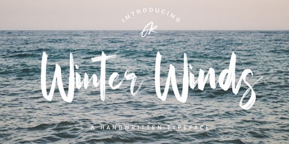 Winter Winds Handwritten Typeface is a font with distinctive handwritten characters, perfect for branding projects, logos, wedding designs, media posts, advertisements, product packaging, product designs, labels, photography, watermarks, invitations, stationery, and any project who need handwritten feel. Features : • Character Set A-Z • Numerals & Punctuations (OpenType Standard) • Accents (Multilingual characters) • Ligature • Alternate There it is! I really hope you enjoy it - comments and likes are always welcome and accepted. More importantly, don't hesitate to send a message if you have a problem or question. Now just read this, go there and make it happen.
 - Squidrock by Arendxstudio,
$18.00 Squidrock is a brush script with a distinctive handwritten character, perfect for branding projects, logos, wedding designs, media posts, advertisements, product packaging, product designs, labels, photography, watermarks, invitations, stationery, and any project which need a handwritten style. Features : • Character Set A-Z • Numerals & Punctuations (OpenType Standard) • Accents (Multilingual characters) • Ligatures • Swashes There it is! I really hope you enjoy it - comments & likes are always welcome and accepted. More importantly, don't hesitate to send a message if you have a problem or question. Now just read this, go there and make it happen :)
 - Fruitcake Fanatics by Bogstav,
$18.00 I have had the name "Fruitcake Fanatics" in my mind for quite some time now...but I needed a font that suited the name...then one day...actually last Wednesday, I was playing around with some letters (which eventually would turn out to be this font!) and suddenly it struck me: I got the letters for my Fruitcake Fanatics font! Another story could be - what does the name mean?! Well, to tell you the truth, I don't know - but what I do know is that the font is playful and unpredictable and loads of fun!
 - Untitled Artwork by Arendxstudio,
$16.00 Introducing our newest Signature font Untitled Artwork. Untitled Artwork Signature is made as elegant as possible for the use of your design project. It is suitable for a variety of design projects, including logos & amps, branding, wedding designs, social media posts, advertisements, product designs, magazines and more. There it is! I really hope you enjoy it - comments & likes are always welcome and accepted. More importantly, don't hesitate to send a message if you have a problem or question. Now just read this, go there and make it happen.
 - Play Kids by Canden Meutuah,
$20.00 is a beautiful handwritten font. this font is so simple that i write very carefully. Even though it looks simple, this font still looks cool and stylish. Handwritten script font. This Fonts are perfect for: logos, branding, wedding invitations, business cards, greeting cards, posters, magazines, social media, proliferate fonts, planner prints and websites. Get creative with their unique fun, and use them to brighten up any craft project! Get this font now and boost your creativity with it! If you have any questions, before or after your purchase, don't hesitate to contact us. Thank You
 - Antiquarian Scribe by Three Islands Press,
$39.00 Henri Abraham Chatelain was a cartographer and publisher of the famous Atlas Historique, ou Nouvelle Introduction a L'Histoire, a world atlas released between 1705 and 1732 in Amsterdam. A few years ago, at an antique book shop in London, I bought a page from Chatelain's atlas—a page covering the Near East, India, the Indian Ocean—that had a particularly alluring, oblique handlettering style. The text is in French, which gave me plenty of samples of diacritics and accented characters. The overall effect is neat and legible, with a distinctly historical flair.
 - HGB Bluesband One by HGB fonts,
$23.00 The roots of this font go back to 1967. A book title in trendy letters was created in a completely ingenuous way as a film prop for a Super 8 fun film. I drew the letters with felt-tip pen and poster paint without thinking too much about it. It wasn't until a good 50 years later that I realized, this was a first awkward typeface draft. The flower power vibe was captured here subconsciously. In 2019 I completed the few glyphs and created variants that I would not have thought of at the time.
 - Matthias by Arendxstudio,
$16.00 Matthias is a brush script font with distinctive handwritten characters perfect for branding projects, logos, wedding designs, media posts, advertisements, product packaging, product designs, labels, photography, watermarks, invitations, stationery, and any project who need handwritten dishes. Features : • Character Set A-Z • Numerals & Punctuations (OpenType Standard) • Accents (Multilingual characters) • Ligature • Swash There it is! I really hope you enjoy it - comments & likes are always welcome and accepted. More importantly, don't hesitate to send a message if you have a problem or question. Now just read this, go there and make it happen :)
 - Big Jim Roberts SRF by Stella Roberts Fonts,
$25.00 Big Jim Roberts was my dad. A dedicated family man who taught us about faith, values and love is missed by our family. Jim just about did it all. He was a military man, a police officer, a power company engineer and a photographer. This typeface (which is comprised of a bold lower-case alphabet) has a 70s retro feel. Jim might have like it. The net profits from my font sales help defer medical expenses for my siblings, who both suffer with Cystic Fibrosis and diabetes. Thank you.
 - Hollister by Arendxstudio,
$18.00 Hollister is a modern script font created with a natural brush. This font is very beautiful when combined with era now design concepts. Hollister comes with OpenType features such stylistic alternates, stylistic sets & ligatures which are good for logotype, poster, badge, book cover, t-shirt design, packaging and much more. Features : Character Set A-Z, Numerals & Punctuations (OpenType Standard), Accents (Multilingual characters), Ligatures, Swashes. There it is! I really hope you enjoy it - comments & likes are always welcome and accepted. More importantly, don't hesitate to send a message if you have a problem or question.
 - 1848 Barricades by GLC,
$38.00 This family was inspired from a lot of 1848-1850 French engraved documents reproducing handwritten texts talking about the Paris' insurrection days in June 1848 (described by Victor Hugo in Les misérables) . It seems that all were first written using quill pens, as the strokes are too much heavy and bold for metal pens and even though the engraver work is very fine. We have added only a few characters, most of them were present in the originals. The TTF and OTF versions are enriched with more than 50 ligatures or alternate characters.
 - Qibtiyah by Arendxstudio,
$16.00 Qibtiyah is a brush script font with distinctive handwritten characters perfect for branding projects, logos, wedding designs, media posts, advertisements, product packaging, product designs, labels, photography, watermarks, invitations, stationery, and any project who need handwritten designs. Features : • Character Set A-Z • Numerals & Punctuations (OpenType Standard) • Accents (Multilingual characters) • Ligature • Swash There it is! I really hope you enjoy it - comments & likes are always welcome and accepted. More importantly, don't hesitate to send a message if you have a problem or question. Now just read this, go there and make it happen :)
 - Golvin Six by Khaiuns,
$15.00 Golvin Six is a fun, cool and retro style. Comes with 4 unique bold and outline serif styles, a regular style with consistent thickness and stability, another with a wavy style that makes your design project more unique. Golvin Six can easily fit into a very large range of projects such as posters, book covers, logotypes, stickers and much more, so add it to your creative ideas and watch how it makes it stand out! I hope you have a blast using Golvin Six Thanks for use this font ~ Khaiuns X zelowtype
 - Mochaik by Say Studio,
$15.00 Mochaik - Psychedelic Display Font Here's a lettering style that just might be exactly on your wavelength. Add just the right dose of vintage freak-a-delia to your retro graphics with this original psychedelic-style design. Great for music posters, album graphics, book titles, etc. Evoke a warpy, wavy, whimsical vibe that harks back to the carefree 1960s or early 1970s era with Sixties Flashback; it's pure hippie, trippy fun! Whats Includes : - Mochaik Regular, Outline, Italic - Multilingual Support If you want any Question, let me know Have a wonderful Day, Saystudio
 - Monumental Gothic by Scriptorium,
$18.00For Monumental Gothic, we delved into the archives and found some old rubbings and photos of monumental brasses from British tombs of the 12th and 13th centuries. The sources included famous monuments like the tomb of Richard II and less well known inscriptions with similar style lettering. The rubbings were made by Dave Nalle in the 1970s (when they still let you have access to the the brasses). Monumental Gothic includes some alternate characters, plus upper and lower case characters, numbers and a selection of very interesting decorative emblems to complement the text. - Guilty Pleasure by Hanoded,
$15.00 Some time ago, my kids asked me what kind of sweets I really liked. To be honest, I don’t actually like sweets at all - never have, never will. BUT… you can wake me up for chocolate and ice cream! Those are my guilty pleasures! Guilty Pleasure is a handmade font. I used China Ink and a brush to create all the glyphs. Guilty Pleasure is a very distinct display font. I recommend you use it for your ice cream or chocolate packaging… but that, of course, is entirely up to you!
 - Stonetype by Kustomtype,
$20.00 Stonetype is a typeface that was used by stonemasons in the 70s & 80s of the last century. When I was starting as a stonemason, these were the first characters I had to draw, by hand, back then on grave monuments and memorial plaques. The idea was born to digitize all the material, to be saved for eternity. By digitizing all and fine tuning, plus the addition of some main characters, Stonetype has now grown into a user-friendly typeface that can, now still, be used by stonemasons, to improve their creation process times. But Stonetype can also easily be used in modern and contemporary designs. Stonetype is the perfect fit for graphic design, editorial design, magazines, posters, logotypes, brands and corporate design. Stonetype is designed by Coert De Decker in 2019 and published by Kustomtype Font Foundry.
 - Secession by HiH,
$14.00 Secession is a very readable typeface, suitable for short blocks of text. If you have grown weary of the standard sans-serif faces one sees all the time, you may want to use Secession as a fresh and distinctive substitute. Like Kunstler Grotesk, Secession is one of a number of typeface designs that attempts to reconcile Germany’s blackletter tradition with the international familiarity of roman letterforms in a simple, robust design suitable for meeting the demands of a modern industrial economy, while rejecting the extraneous ornamentation of the departing Victorian era. Unlike Kunstler Grotesk, Secession was designed with a lower case. Secession Bold was originally jointly released as Halbfette Secession by Bauer & Company of Stuttgart and H. Berthold AG of Berlin around 1898. The rest of the family was designed by HiH. The basic family of four: Text, Oblique, Bold and BoldOblique are available in two versions: one set with the standard contemporary lining or ranging numerals for spreadsheets and tables and one set of old-style figures (with OSF in font name) for use with text. The two versions of the basic family, Secession and Secession OSF were released in July 2006. Cousins include ExtraBold, SCOSF Text, and two multi-lingual versions of the text weight. Secession ML includes the Latin Extended-A character set in unicode format plus 17 ligatures and a few strays. Secession GreekML has all the characters of the ML version plus the unicode Greek set and 17 Greek ligatures. Release of the cousins took place in August and October of 2006. Click on BUYING CHOICES. Click on GLYPHS and use drop-down menus and slider to see the all the glyphs for the various fonts. Similar: Birmingham (Ref 100 Ornamental Alphabets, Solo); Spartana (Art Nouveau Display Alphabets, Solo)
 - ITC Bolthole by ITC,
$29.99I fell in love at the age of twelve in Wales, recalls Bernard Philpot. "My father brought me to a small graveyard in the Welsh hills to show me two headstones carved by the great Eric Gill. I instantly fell in love with the beauty of the carving and the perfection of the letterforms. I still go back to marvel at these works of art." However, the ITC Bolthole™ design, Philpot's first commercial typographic endeavor, is quite unlike the works of Eric Gill that first captured his heart. Bolthole is a craggy sans serif with a definite grumpy attitude. It's not terribly legible, and, if more than a few words are set in the design, it's not very readable. To round out its cranky personality, Bolthole does not like to be set in small sizes. Like Cheez Whiz® and bullfights, you either love or hate this typeface. But whichever emotion dominates, there is no denying that Bolthole has a personality to be reckoned with - one with ample magnetism to ensure reader attraction. If used to set brief blocks of display copy, the typeface makes a powerful statement. Bolthole was originally designed to complement a whimsical ad for the Royal Society for the Prevention of Cruelty to Animals. As Philpot recalls, "although the ad didn't win any awards, the type attracted some very positive comments for its original look and feel." Philpot studied graphic design and typography at the London School of Printing, and soon after graduation found himself working in a large advertising agency in London. According to Philpot, "After designing type for everything from packaging to ads, I thought it time to convert one of my designs into a complete font - and Bolthole was born." ITC Bolthole could very well be the Shrek™ of typeface design - which might not be such a bad thing."