10,000 search results
(0.049 seconds)
- Gamory by Alit Design,
$21.00 🌿 Embrace the beauty of the natural world and the sophistication of elegant design with the Garmony Typeface. This exquisite font is a harmonious blend of nature-inspired decorative leaf illustrations and a versatile typeface that effortlessly combines two styles: Serif and Elegant Script. Whether you're working on a project for your wedding, branding, or any creative endeavor, Garmony brings the perfect balance of organic charm and refined aesthetics. ✒️ Serif Meets Script: Garmony Typeface seamlessly marries two distinct design styles. The serif characters exude a timeless and classical feel, while the elegant script elements add a touch of fluidity and grace. This dynamic fusion makes Garmony Typeface exceptionally versatile, suitable for various applications and themes. 🌱 Nature-Inspired Decorative Leaves: Each character within Garmony Typeface is adorned with delicate decorative leaf illustrations, reminiscent of lush foliage. These charming details infuse your text with a touch of nature, making it ideal for eco-friendly, organic, or natural-themed projects. 🎨 Dynamic Ligatures and Alternatives: Garmony Typeface includes an array of dynamic ligatures and alternative characters, enhancing the fluidity and elegance of your designs. With these options at your disposal, you can create text that appears hand-crafted and truly unique. 🌐 PUA Unicode and Multilingual Support: No matter where your project takes you, Garmony Typeface is fully equipped to meet your linguistic needs. It includes PUA (Private Use Area) Unicode, ensuring compatibility with various design software and providing support for multiple languages. This international versatility ensures your message reaches a global audience with style. 🌾 Swash and Swirl Delight: Elevate your design with Garmony's swash and swirl elements, perfect for adding an extra dash of sophistication to headlines, titles, and logos. These intricate details showcase the font's elegance, making it stand out in any context. 🌏 Versatility and Style: From wedding invitations to logos, product packaging to blog headers, Garmony Typeface brings unparalleled versatility and style to your creative projects. It's the perfect choice for designers, creatives, and individuals seeking a font that combines the beauty of the natural world with the grace of elegant design. Embrace the harmony of nature and elegance with Garmony Typeface. Unleash your creativity and let your designs flourish with the timeless charm and artistic sophistication that only Garmony can provide. Experience the magic of Garmony Typeface today and elevate your projects to a new level of style and allure.
 - FF Good by FontFont,
$72.99 FF Good is a straight-sided sans serif in the American Gothic tradition, designed by Warsaw-based Łukasz Dziedzic. Despite having something of an “old-fashioned” heritage, FF Good feels new. Many customers agree: the sturdy, legible forms of FF Good have been put to good use in the Polish-language magazine ‘Komputer Swiat,’ the German and Russian edition of the celebrity tabloid OK!, and the new corporate design for the Associated Press. Although initially released as a family of modest size, the typeface was fully overhauled in 2010, increasing it from nine styles to 30 styles, with an additional 30-style sibling for larger sizes, FF Good Headline. In 2014, the type system underwent additional expansion to become FontFont’s largest family ever with an incredible 196 total styles. This includes seven weights ranging from Light to Ultra, and an astonishing seven widths from Compressed to Extended for both FF Good and FF Good Headline, all with companion italics and small caps in both roman and italic. With its subtle weight and width graduation, it is the perfect companion for interface, editorial, and web designers. This allows the typographer to pick the style best suited to their layout. As a contemporary competitor to classic American Gothic style typefaces—like Franklin Gothic, News Gothic, or Trade Gothic—it was necessary that an expanded FF Good also offers customers both Text and Display versions. The base FF Good fonts are mastered for text use, while FF Good Headline aims for maximum compactness. Its low cap height together with trimmed ascenders and descenders give punch to headlines and larger-sized copy in publications such as newspapers, magazines, and blogs. There is even more good news about FF Good: it has something of a serif companion. Łukasz Dziedzic built FF Good to work together with FF More, creating in a powerhouse superfamily that is versatile in both its function and aesthetic.
 - Seatyio by Twinletter,
$14.00 Introducing our new Font named Seatyio This font is designed with a script model that is suitable for writing for outdoor and indoor events, such as traveling or for the title of any particular event. and to be sure this font is not only limited to that purpose but also very special for every need of your project, be it a formal or non-formal project, this font is still beautiful and elegant. start creating awesome designs with this font! This charming font also offers the beauty of abstract typography harmony for a wide variety of design projects, including digital natural handwriting for designs, quote designs, for social media business designs, advertisements, trademarks, food and beverage promotion banners, text, posters, a signature, and all designs require handwriting or whatever design you want. This font is equipped with uppercase, lowercase, numbers, punctuation marks, swhases and several variations on each character including multi-language. ================================================== This font is best suited for open type friendly applications. How to get alternative glyphs from open type fonts: http://adobe.ly/1m1fn4Y PUA Character Code - Fully accessible without additional design software. do not hesitate anymore start using this font. and Feel free to send any message you want to convey.
 - November Starlight by Set Sail Studios,
$14.00 Thanks for checking out November Starlight! A lovingly hand-painted script font, fantastically elegant & eccentric with a sprinkle of carefree fun. November Starlight doesn't play by the rules - with extra bouncy characters, long vertical brush strokes and authentic hand-painted edges, it's bound to make a bold statement on anything from greeting cards and invitations, to personalised logos and handwritten quotes. November Starlight consists of 4 fonts; November Starlight • A cursive font containing upper & lowercase characters, numerals and a large range of punctuation. November Starlight Alt • This is a second version of November Starlight, with a completely new set of lowercase characters. If you wanted to avoid letters looking the same each time to recreate a custom-made style, or try a different word shape, simply switch to this font for an additional layout option. November Starlight Clean & Clean Alt • Totally clean versions of each of the November Starlight fonts, with all rough brush textures removed. Perfect for specialised printing techniques such as laser & vinyl cutting, or simply for a silky smooth finish to your text. Special Characters are also available for several lowercase letters, with added beginning & end swashes - please see the character map image for a full list. These characters are accessible via software with a glyphs panel, e.g. Photoshop CC, Adobe Illustrator.
 - MMC Grafik by MMC-TypEngine,
$37.00 Modular Matrix «Calligraffiti» Robotic Letterform Typeface! New Edition. Redesigned with Obliques and OT Features! This Typeface was inspired by Graffiti Calligraphic Broad Markers and Underground Lettering Technic and Style, grid based by squares perpendiculars and Diagonals… Is Part of a juxtaposed “Type-Game” based on inversions and rotations… Type cool legible digital manuscript Aesthetics body text, scripts, lyrics, articles; Plus, Create Fancy Display’s Branding designs, Packaging, Publishing, Advertisement, Posters, Art Support, Motion, Games, tastes good to text on everything! Experiment Automatic and Responsive OpenType Features, like Fractions, Ordinals, Nominators, Denominators, Scientific Inferiors, Numerators, Localized forms and Kerning. Previous Released by MMC-Typo* 2020. Post Released by MMC-TypEngine 2022. Tip 1: Combine styles into infinite possibilities of Digital Monochromatic or Color Typesetting, by ‘central pasting’ or you may dislocate layers for improvisations! TIP 2: *BLIND BLOCKS ‘FREE-STYLES’ Use Block «Free Styles» 1 & 2 also to add 3D, change 3D directions by switching Block 1 to Block 2, that way you can Zig-Zag words and lines. *Also shift the block layer up to bottom limit, it makes the 3D direction turn upside down. *All Styles have 917 Glyphs. Follow the Groove!! & Power to The Pixel!! Greetings !! André, MMC-TypEngine.
 - Brightlight by Mercurial,
$10.00 Dazzling Brightlight family typeface is a versatile, modern and classy display serif font with oblique and script also. Gives a wow effect to big titles, headlines. Use it big to enjoy it’s full potential.This font is ideal for design, logo design, blog graphics, stylizing quotes, wedding stationery, art prints, collateral design, packaging, social media, magazine, fashion, creative branding, editorial design and web design. come with elegant style but still has a modern feel, with features an extended latin character set of glyphs by covering various languages in Europe and others, and includes advanced open type features like standard and discretionary ligatures, positional numerals and so on. The Open Type features can be accessed by using Open Type savvy programs such as Adobe Illustrator, Adobe InDesign, Adobe Photoshop Corel Draw X version, And Microsoft Word. And this has given PUA Unicode Font (specially coded fonts). so that all the alternate characters Easily can be accessed in full by a craftsman or designer. Don't forget to check out other cool fonts on our store and wait for new fonts. Follow our shop for upcoming updates including additional glyphs and language support. feel free to send me a message, I would like to update it.
 - Bunday Slab by Buntype,
$22.50 The new Bunday™ Slab Font Family consist of three main states with different moods: the crisp and distinctive slab serif, the cute script styled italic and the matching upright italic. All states of Bunday™ Slab share the same contemporary, clear and open base forms and create a space-saving and pretty homogeneous text colour with good legibility. The font was manually hinted and contains extensive handcrafted kerning tables to ensure perfect appearance in all media. Bunday™ Slab ships with 9 standard, 9 upright italic and 8 italic styles from a considerable thin “Hair” to a pretty fat “Heavy” weight. It supports at least 99 languages and provides OpenType® features for ligatures, alternative glyphs, localised forms and more. Please take a look at the other members of the Bunday superfamily: Bunday™ Clean Bunday™ Slab Further information: Bunday Slab Specimen PDF Feature Summary: 9 weights: Hair, Light, Thin, SemiLight, Regular, SemiBold, Bold, ExtraBold and Heavy 3 Moods: Sans, Upright and Upright Italic Overall width: Narrow or Space-Saving Advanced “f” ligature set* “s” and “c” ligatures* Alternates Characters: a, ç, e, f, g, l, t, y and more* Capital German Esszett* Supports at least 99 Languages * Only available applications with advanced OpenType® support
 - Anordighos by Kotak Kuning Studio,
$15.00 Introducing my new font Anordighos, a casual script font to give your design a more personal touch and makes the font looks being customized. This font is suitable to use for logotypes, product design, labels, watermark, social media posts, apparel, invitations, signboards, sport club, motor/car, special events or anything that need handwriting feeling. What you get: - Anordighos includes capital and lowercase letters, Alternates, and Ligatures - Numbers + punctuation - Foreign language support I highly recommend using a program that supports OpenType features and Glyphs panels such as Adobe Illustrator, Adobe Photoshop CC, Adobe InDesign, or CorelDraw, so you can see and access all Glyph variations. Anordighos is encoded with Unicode PUA, which allows full access to all additional characters without having special design software. Mac users can use Font Book, and Windows users can use Character Map to view and copy one of the extra characters to paste into your favorite text editor / application. We hope you enjoy the font, please feel free to comment if you have any thoughts or feedback. Or simply send a PM or email to kotakkuningstudio@gmail.com. Thanks for purchasing and have fun! Note: The shadow effect is not included in the font, it's only for this presentation purpose.
 - Thalweg Poetica by Ani Dimitrova,
$29.00 Thalweg Poetica is a revival font that comes with a story created in 1993 by the Bulgarian artist Ivan Kyosev. It is a sequel to the Thalweg font family completed in 2020. The construction of characters combines the upright character of the Thalweg font and the handwritten character of Thalweg Italic. The font partners perfectly with the Talweg font family and gives designers a new opportunity for expression. Thalweg Poetica contains 4 widths / Normal, Semi Condensed, Condensed & Extra Condensed / and 8 weights ranging from Thin to Black with small caps versions, each style containing more than 1100 glyphs. The font comes with extended coverage of the Latin, Cyrillic, and Greek Scripts. All of the weights are specifically equipped for complex, professional typography with Open Type Features. These features include Small Caps, Ligatures, Discretionary Ligatures, Superscript, Subscript, Tabular Figures, Old-Style Figures, Circled Figures, Arrows, Matching currency symbols, and fraction. The Thalweg Poetica family is ideally suited for small text, books and magazines, branding, posters, as well as web and screen design, headlines, and more. The Regular and Medium weights are perfect for body text and they give an interesting texture to the text. The range of styles gives good flexibility to this family.
 - Gianduja by Resistenza,
$39.00 This delicious font family takes its name from the tastiest of Piemonte’s specialities. It has been designed in collaboration with Turin-based calligrapher and artisan Andrea Tardivo. Piemonte soil provides the most delectable hazelnuts, which are the key to creating a mouth-watering chocolate spread called Gianduja. This popular delicacy has a rich graphic history, with lavishly designed packaging. We sought to infuse the sweetness and tradition of Turin’s confectionary into a new font family, reinterpreting Italian models from the first quarter of the last century. All fonts were crafted by hand on paper first and then digitised in a way that retains the handmade quality and aesthetic. This family blends the Turinese touch from the old chocolatiers and the beautifully printed foils they use to wrap each exquisite creation. The extensive display family contains; Gianduja Sans a geometric font based on examples found in Italian art deco era artworks. Gianduja Script has been handwritten with a speedball pen following the standards of “Bella Scrittura” and Gianduja Capitals is a decorative font inspired by the “liberty” lettering signs from Piemonte. To complete the suite we developed an inline Capitals version, a set of icons and decorative elements all with the same handmade characters to perfect partner with each character set.
 - Virgin, as a hypothetical font, is not known in my list of documented fonts up to my last update in 2023. However, let's imagine what Virgin might encapsulate as a typeface design concept, given its ...
- Minuet by Canada Type,
$24.95 Minuet, an informal script with crossover deco elements giving it an unmistakable 1940s flavor, is a revival and expansion of the Rondo family, the last typeface drawn by Stefan Schlesinger before his death. This family was initially supposed to be a typeface based on the strong, flowing script Schlesinger liked to use in the ads he designed, particularly the ones he did for Van Houten’s cocoa products. But for technical reasons the Lettergieterij Amsterdam mandated the face to be made from unattached letters, rather than the original connected script. Schlesinger and Dooijes finished the lowercase and the first drawings of the uppercase just before Schlesinger was sent to a prison camp in 1942. Dooijes completed the design on his own, and drew the bold according to Schlesigner’s instructions. The typeface family was finished in February of 1944, and Schlesinger was killed in October of that same year. Though he did see and approve the final proofs, he never actually saw his letters in use. It took almost four more years for the Lettergieterij Amsterdam to produce the fonts. The typeface was officially announced in November of 1948, and immediately became a bestseller. By 1966, according to a memo from the foundry, the typeface had become “almost too popular”. This digital version of Schlesigner’s and Dooijes’s work greatly expands on the metal fonts. Both weights include a complete set of lowercase alternates — based on Schlesinger’s own drawings, as well as alternative variations for some of the capitals, a few ligatures, and extended language support covering Western, Eastern and Central European languages, plus Baltic, Celtic/Welsh, Esperanto, Maltese and Turkish. Minuet is available in all popular formats. The OpenType version, Minuet Pro, takes advantage of internal font programming to combine the main and alternate fonts into a single file per weight, making all alternates and ligatures automatically available at the push of a button in OpenType supporting programs.
 - Calligraphy - Unknown license

- Commuter - Unknown license

- Scrapbooker by Sudtipos,
$29.00 After previously collaborating on the bestselling Distillery Set, Carolina Marando and Alejandro got together once again to create this Scrapbooker Set, a new series of fonts that multiply the possibilities. One reason scrapbookers became a kind of design demographic is the appeal of what they do. They make albums of memories, diaries composed of different elements that converge together to lead the viewer to a special moment in time. A paper, a photo, a letter, an event ticket, or a dry petal — everything ends up being part of a collage that tells a story. Words have a key role in such a collage. They use different shapes and forms and combinations to state what cannot otherwise be expressed. They make the collage stronger by clarifying a concept, defining an image, and solidifying a memory. These words for memory albums are the reason for this Scrapbooker Set, six different fonts with different impressions and different personalities — so each part of the memory can have its own identity. People tell you to write your own history. Now you can do that in style.
 - Plantin by Monotype,
$29.99 Plantin is a Renaissance Roman as seen through a late–industrial-revolution paradigm. Its forms aim to celebrate fine sixteenth century book typography with the requirements of mechanized typesetting and mass production in mind. How did this anomalous design come about? In 1912 Frank Hinman Pierpont of English Monotype visited the Plantin-Moretus Museum in Antwerp, returning home with “knowledge, hundreds of photographs, and a stack of antique typeset specimens including a few examples of Robert Granjon’s.” Together with Fritz Stelzer of the Monotype Drawing Office, Pierpont took one of these overinked proofs taken from worn type to use as the basis of a new text face for machine composition. Body text set in Plantin produces a dark, rich texture that’s suited to editorial and book work, though it also performs its tasks on screen with ease. Its historical roots lend the message it sets a sense of gravity and authenticity. The family covers four text weights complete with italics, with four condensed headline styles and a caps-only titling cut. Plantin font field guide including best practices, font pairings and alternatives.
 - Eurostile LT by Linotype,
$40.99Eurostile® is one of the most important designs from the Italian font designer Aldo Novarese. It was originally produced in 1962 by the Nebiolo foundry as a more complete version of the earlier Microgramma, a caps-only font designed by Novarese and A. Butti. Eurostile reflects the flavor and spirit of the 1950s and 1960s. It has big, squarish shapes with rounded corners that look like television sets from that era. Eurostile has sustained the ability to give text a dynamic, technological aura. It works well for headlines and small bodies of text. The Eurostile font family has 11 weights, from roman to bold and condensed to extended. In 2009 Linotype released a revised version in the Platinum Collection under the name , with three weights in all three different styles. And additionaly there are now new weights for the Eurostile family as , and ." - PF Fuel Pro by Parachute,
$79.00 This typeface was inspired by the rough surroundings of a modern city and reflects the contradicting nature of an emerging global youth culture. Ever since its first release—back in late 1999— it is constantly on our ‘most wanted’ list and has been part of numerous product campaigns. Music, mobile telephony, food and beverages, politics, you name it. Coca-Cola used it, José Cuervo used it for about 3 years. The new ‘Pro’ version goes one step ahead. You may now capture the essence of the younger generation in every major European language. PF Fuel has been extended with the full array of Cyrillic characters as well as matching frames for this extra stamped look. Furthermore there more alternate characters than ever. Create a custom look, when same characters sit close, or one next to the other. You may find these useful—alternate characters either in the lowercase positions, or access them through the ‘stylistic alternates’ OpenType Pro feature. If you need some extra fuel, this is where to get it!
 - Fabrizio by ARTypes,
$60.00 The new Fabrizio™ types, designed by Ari Rafaeli, have made their first appearance in Saggi di Letteratura Italiana: Da Dante per Pirandello a Orazio Costa, by Lucilla Bonavita, printed at Pisa in March 2016 by Fabrizio Serra Editore for whom the type was specially designed. The types are now offered for general sale. Each style (roman, small capitals, italic, semi-bold, bold) contains Cyrillic and ‘polytonic’ Greek letters and letters for many European languages (Czech, Hungarian, Icelandic, Lettish, Polish, Romanian, Serbian, Ukrainian, Welsh etc.), non-kerning fs, long ſ, ligatures and fractions. Alternative forms are supplied in ‘B’ versions of each style. A set of swash letters and sets of superiors, inferiors, fractions and phonetic letters are also offered. Two ‘Special’ fonts (roman and italic) containing special accents, letters for transliteration, Vietnamese letters, mathematics signs and symbols, arrows, commercial signs, pictograms, figures in circles, scansion marks, braces & benzene rings and the Rafaeli-Meruba Hebrew letters, as well as Latin, Cyrillic and Greek letters, are included in the Fabrizio family.
 - Pacific Clipper SG by Spiece Graphics,
$39.00 Pacific Clipper has its roots in an old 1930s showcard lettering style. An extra bold version of this sign painter’s relic is shown in Carl Holmes' wonderful book on lettering. It may be described as what happens when Rudolf Koch's Kabel Heavy meets ATF's Novel Gothic. Also known as Sam’s Tune, Pacific Clipper’s noteworthy features include wedged crossbars in the capital A, E, F, and H. Overcurving is present in the capital B, D, P, and R while vertical strokes in the lowercase b, d, h, k, l, and t are chopped off obliquely. Figures in Pacific Clipper are also refreshingly different, particularly the number 4. This lettering favorite turned retro typeface has been extended to include a variety of weights. Pacific Clipper is now available in the OpenType format. Some new characters have been added to this OpenType version as Stylistic Alternates and Historical Forms. These advanced features work in current versions of Adobe Creative Suite InDesign, Creative Suite Illustrator, and Quark XPress. Check for OpenType advanced feature support in other applications as it gradually becomes available with upgrades.
 - Manufaktur by Great Scott,
$12.00 MANUFAKTUR is a gas-pipe sans. A typeface influenced by an cast iron sign on an old Swedish industrial machine. The simple curves of the characters suited well for an 21st century update and the new and modern MANUFAKTUR is now a variable typeface with thousands of combinations of width and weight. MANUFAKTUR comes with stylistic alternates (smaller glyphs with underline) and small caps. The small caps also works as lowercase glyphs by default. With an OpenType-enabled app - or your website - you can control the width and weight of the typeface via a slider or with code. VARIABLE FONT SUPPORT: Currently Adobe only supports variable fonts in Photoshop and Illustrator. InDesign are still waiting on variable font support. This hardworking sans serif is perfect for display use, signage, poster, prints, editorial use, branding, logos, magazines, films and lots more. The variable weight and width makes MANUFAKTUR very versatile and flexible. If variable fonts isn't your bag MANUFAKTUR also comes predetermined weights and widths as a traditional font.
 - Tweed SG by Spiece Graphics,
$39.00 Tweed is a journey into the 1930s world of hand-lettering. The design looks very much like the personal scribblings of an old-fashioned cartoon animator. It’s the sort of sketch-style you might find describing a goofy caterpillar or laughing willyworm. Tweed is fun and light-hearted with open and rounded letters of a somewhat musical quality. Derived from old letterforms popularized by Carl Holmes in his wonderful book on the subject, Tweed is basically friendly in nature. This typeface is great for personal greeting cards and stationery - any kind of casual correspondence. It works well in display situations, too. And yes, there is an alternate to the funny-looking “w” character. Just press option l (el) on Mac. Or Alt 0172 on Windows. Tweed is now available in the OpenType Std format. Some new stylistic alternates have been added to this OpenType version. Advanced features work in current versions of Adobe Creative Suite InDesign, Creative Suite Illustrator, and Quark XPress. Check for OpenType advanced feature support in other applications as it gradually becomes available with upgrades.
 - PF Isotext Pro by Parachute,
$79.00 This typeface is based on ISO 3098, a technical documentation issued in 1974 by ISO (International Organization for Standardization), which proposed a set of characters for use on technical drawings and associated documents. Isotext is based on the original standards but is completely redesigned to fit typographic requirements. This new ‘Pro’ version is further improved and now comes with a complete set of redesigned true-italics. Furthermore, the width of the glyphs has increased in order to establish a more balanced and readable text. The result is a contemporary font which works well in small sentences as well as long texts. Isotext Pro is loaded with all the good stuff a designer needs to create documents with attitude. It supports 19 special OpenType features like small caps, fractions, ordinals, etc. and offers multilingual support for all European languages including Greek and Cyrillic. Finally, every font in this family has been completed with 270 copyright-free symbols, some of which have been proposed by several international organizations for packaging, public areas, environment, transportation, computers, fabric care and urban life.
 - Apadana by Naghi Naghachian,
$100.00 Apadana is a new creation of Naghi Naghashian. Apadana design fulfills the following needs: A. Explicitly crafted for use in electronic media fulfills the demands of electronic communication. Apadana is not based on any pre-digital typefaces. It is not a revival. Rather, its forms were created with today's technology in mind. B. Suitability for multiple applications. Gives the widest potential acceptability. C. Extreme legibility not only in small sizes, but also when the type is filtered or skewed, e.g., in Photoshop or Illustrator. Apadana's simplified forms may be artificial obliqued in InDesign or Illustrator, without any loss in quality for the effected text. D. An attractive typographic image. Apadana was developed for multiple languages and writing conventions. Apadana supports Arabic, Persian, and Urdu. It also includes proportional and tabular numerals for the supported languages. E. The highest degree of geometric clarity and the necessary amount of calligraphic references. This typeface offers a fine balance between calligraphic tradition and the contemporary sans serif aesthetic now common in Latin typography.
 - English Garden SG by Spiece Graphics,
$39.00 Here is a wonderfully charming typeface similar in style to the folklore lettering created by Walter Crane, the prolific children’s book illustrator. This English artist created many beautiful, flower-decorated works during the Arts and Crafts movement that flourished between 1860 and 1910. English Garden SG Regular contains many of Crane’s original whimsical and quirky characters. Note the inclusion of a spurred capital G, a squat lowercase g, a bending floral lowercase d, and the quaint old style figures. All of which are a delight to use when casting a medieval storybook tone to your project. You might also take advantage of the enchanting small capitals when setting logos, headlines, and decks. English Garden SG Regular is now available in the OpenType format. Some new characters have been added to this OpenType version including stylistic alternates, discretionary ligatures, historical forms, and petite figures. Advanced features currently work in Adobe Creative Suite InDesign, Creative Suite Illustrator, and Quark XPress 8. Check for OpenType advanced feature support in other applications as it gradually becomes available with upgrades.
 - Ekbatana by Naghi Naghachian,
$75.00 Ekbatana is a new creation of Naghi Naghashian. Ekbatan design fulfills the following needs: A. Explicitly crafted for use in electronic media fulfills the demands of electronic communication. Ekbatana is not based on any pre-digital typefaces. It is not a revival. Rather, its forms were created with today's technology in mind. B. Suitability for multiple applications. Gives the widest potential acceptability. C. Extreme legibility not only in small sizes, but also when the type is filtered or skewed, e.g., in Photoshop or Illustrator. Ekbatana's simplified forms may be artificial obliqued in InDesign or Illustrator, without any loss in quality for the effected text. D. An attractive typographic image. Ekbatana was developed for multiple languages and writing conventions. Ekbatana supports Arabic, Persian, and Urdu. It also includes proportional and tabular numerals for the supported languages. E. The highest degree of geometric clarity and the necessary amount of calligraphic references. This typeface offers a fine balance between calligraphic tradition and the contemporary sans serif aesthetic now common in Latin typography.
 - Bayside Tavern by FontMesa,
$25.00 Bayside Tavern is a weathered version of our Tavern Alt font family. With its straight sides Bayside Tavern fits better in tight spaces and reads better at smaller point sizes than the regular Bay Tavern version. With three weights, open faced and outline versions to choose from you're sure to find the right style for your new project, restaurant menu, logo, t-shirt design or Pirate costume party. While our original Tavern Alt font has been increased to include five weights additional weights for Bay Tavern will have to wait for now, adding the notched cut in's were all done by hand which causes a lot of cramping so a long break is needed before creating the extra weights. The Fill fonts in the Bayside Tavern family are meant to be layered behind the Bayside Open fonts, if you're using Bayside Open select Bayside Fill, if you're using Bayside Open L select Bayside Fill L, if you're using Bayside Open S select Bayside Fill S and so on.
 - Plumcake by PintassilgoPrints,
$20.00 A bittersweet hand-drawn face, pleasing and assertive. Available in two weights, both all caps, with alternates for each letter. Comes with some ligatures and handy swash alternates to sweeten things up every now and again. Starting… Now!
 - Belisha by Nissa Nana,
$20.00 Belisha is a beautiful script with a modern vibe. It has a classy, elegant, and modern look which can be used for logos, branding, invitations, stationary, wedding designs, social media posts, and any other design in need of a handwritten touch.
 - Zhikharev by ParaType,
$30.00Designed at Polygraphmash in 1953 by Igor Zhikharev, based on his handwriting. The digital version was developed in 1989 by Gennady Baryshnikov, with the assistance of Vladimir Yefimov. An informal monoline script. For use in both text and display matter. - Crestwood by Ascender,
$29.99Crestwood is an updated version of an elegant semi-formal script typeface originally released by the Ludlow Type Foundry in 1937. Crestwood is best used at larger sizes, and is wonderful for invitations and greeting cards. Character Set: Latin-1 - Quintton by TypoBureau Studio,
$15.00 Quintton script is a casual clean brush stroke font, perfect for logo design, branding, invitations, t-shirts print, mock up, magazines, signage and so much more. With its handmade feel, Quintton is perfect for your upcoming projects so don't miss out.
 - Radens by Almarkha Type,
$33.00 Introducing Radens Vintage Bold Script, Inspired by Modern Vintage & Retro style and combination with old american traditional style. that will fulfill your design needs for quotes,sporty theme, logotype, wordmark, etc. This has many opentype features and support multi language.
 - Unholy by Natural Ink,
$12.00 Unholy Script is a modern calligraphy design, including Regular. This font is casual and beautiful with swash. Can be used for various purposes. such as logos, product packaging, wedding invitations, branding, headlines, signage, labels, signatures, book covers, posters, quotes, and more.
 - Salamander by Fenotype,
$35.00 Salamander is a playful and agile script family of two weights and matching ornament sets. Click on Swash, Contextual or Stylistic alternates in any Open type savvy application for vivid alternate characters and combine with Salamander Ornaments to perfect your designs.
 - Lakeland JNL by Jeff Levine,
$29.00 Lakeland JNL was inspired by lettering seen on a vintage container of Yankee brand motor oil. Originally all-caps on the package, the remaining characters were developed to expand on this casual semi-script design which was popular during the 1940s.
 - Mantilda by Letterena Studios,
$9.00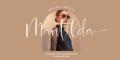 Mantilda is a stylish, refined script font that emanates sophistication and elegance. Its stylish alternates and ligatures make this font the perfect match for any project. Mantilda is PUA encoded which means you can access all glyphs and swashes with ease!
 - Estonia Nouveau Pro by TypeSETit,
$39.95 Estonia Nouveau is based on the calligraphic style found in the East European country of Estonia. The traditional lowercase forms are combined with the more non-traditional script uppercase alternates to give a truly up-to-date, yet traditional look.
 - Hurley 1967 by Tyfomono,
$16.00 Hurley 1967 is a bold script, with clean lines and smooth curve combined with beautiful features! Simply amazing fonts, comes with 7 styles. Hurley 1967 has a bunch of styles as a families to designed lettering style logotype using the fonts.
 - Azebra by Okaycat,
$29.95 Azebra is an elegant connected letter cursive script arriving with a family of detailed & artistic styles. Azebra features diagonal hatched texture, in extruded & shadow variations. Azebra is extended, containing West European diacritics & ligatures, making it suitable for multilingual environments & publications.

