10,000 search results
(0.056 seconds)
- Hockleys by Maulana Creative,
$11.00 Hockleys is a Cursive script font. With light mono-line stroke, slant and fun character with a bit of ligatures and a bit lower alternates. To give you an extra creative work. Hockleys font support multilingual more than 100+ language. This font is good for logo design, Social media, Movie Titles, Books Titles, a short text even a long text letter and good for your secondary text font with sans or serif. Make a stunning work with Hockleys font. Cheers, MaulanaCreative
 - Marseillette NB by No Bodoni,
$39.00 These four typefaces, Berlinette NB, Lyonette NB, Marseillette NB and Parisette NB, were designed from the same basic shape, a fanciful geometric form that avoids strict horizontals and uses more offbeat triangular shapes. Marseillette is the nasty one, with sharp hook terminations that require careful use. Don�t slip and accidentally stick one in your hand � it will hurt pretty bad and make you blubber like a baby. It�s good for surreal warning signs on dark, forbidding docks where gooey monsters live.
 - Fallen City by Maulana Creative,
$15.00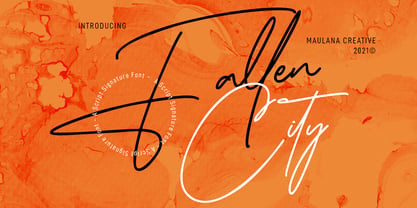 Fallen City is a Casual Expressive Signature font. With light mono-line stroke, slanted and fun character with a bit of ligatures and lowercase alternates. To give you an extra creative work. Fallen City font support multilingual more than 100+ language. This font is good for logo design, Social media, Movie Titles, Books Titles, a short text even a long text letter and good for your secondary text font with sans or serif. Make a stunning work with Fallen City font. Cheers, MaulanaCreative
 - Farloxy by Maulana Creative,
$14.00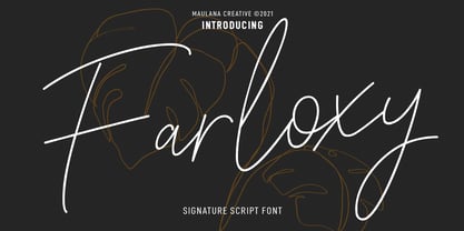 Farloxy is a Casual Signature script font. With light mono-line stroke, slant, Condensed and fun character with a bit of ligatures and lowercase alternate. To give you an extra creative work. Farloxy font support multilingual more than 100+ language. This font is good for logo design, Social media, Movie Titles, Books Titles, a short text even a long text letter and good for your secondary text font with sans or serif. Make a stunning work with Farloxy font. Cheers, MaulanaCreative
 - Tudor Perpendicular by Greater Albion Typefounders,
$12.00 Tudor Perpendicular is Greater Albion's seasonal Black letter release (not that we rule out the possibility of non-seasonal ones...) for 2012. As the name suggests, it is a design which emphasises, and yes, exaggerates for effect, the perpendicular up and down nature of Black Letter typefaces. There's no particular historical basis for this one - straight out of our own minds, just as a lot of Black letter 'revivals' have been over the years. Come and visit 'Ye Olde' world today...
 - Andora by Letterara,
$12.00 Introducing Andora, a beautiful, full-featured modern calligraphic font with tons of alternate characters and OpenType features. Andora hand-lettered is particularly well-suited for invitations, branding and editorial design. Perhaps the most fun thing about Andora is that it includes multiple versions of all ascending and descending letters, making it lots of fun to play with layouts and compositions. The OpenType features can be very easily accessed by using OpenType-savvy programs such as Adobe Illustrator and Adobe InDesign.
 - Brotherline by Hendra Pratama,
$25.00 Brotherline is a connected script built from a single bold mono-line, inspired by hand-lettering style and various calligraphy letterforms.The first idea with this font is to create a font for Logotypes. Curves are smooth and flow with very nice circle shapes. This font is great for logos, logotypes, packaging, and store-front or signboard. NOTE: To access the alternate glyphs, you will need a program that supports OpenType Features. Activate the Ligature (liga) and Contextual Alternates (calt) for better experience.
 - Honey Rain by Maulana Creative,
$14.00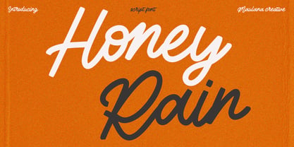 Honey Rain is a fancy handwritten script font. With regular mono-line stroke, fun character with a bit of ligatures and alternates. To give you an extra creative work. Honey Rain font support multilingual more than 100+ language. This font is good for logo design, Social media, Movie Titles, Books Titles, a short text even a long text letter and good for your secondary text font with sans or serif. Make a stunning work with Honey Rain font. Cheers, Maulana Creative
 - Quench by Linotype,
$29.99 Quench is a fun and unique typeface from designer Hannes von Döhren. It is unmistakably characterized by its strong contrast of inside and outside forms. The counters are nearly straight and have many right angles. Conversely, the outside curves are smooth and rounded making them soft and almost bubbly. The italics have juicy curves reminiscent of brush lettering. Used together or individually, the four weights and styles can be used for a wide variety of projects including magazines, advertising, logos, and branding.
 - Another Christmas by Maulana Creative,
$12.00 Another Christmas is an annual Christmas font with slanted style clean mono-line stroke, fun character with a bit of ligatures. To give you an extra creative work. Another Christmas font support multilingual more than 100+ language. This font is good for logo design, Social media, Movie Titles, Books Titles, a short text even a long text letter and good for your secondary text font with sans or serif. Make a stunning work with Another Christmas font. Cheers, Maulana Creative
 - Spiral Ornaments by Gerald Gallo,
$20.00 Spiral Ornaments are of varying complexity with positive and negative variations. There are a total of 48 ornaments.
 - Xiphoid by The Type Fetish,
$10.00 Xiphoid is the "unofficial" typeface of the Raelians. Download it now, or suffer the consequences on their return.
 - Rotis II Sans by Monotype,
$50.99 Developed over several years by the late Otl Aicher and first released in the late 1980s, the Rotis® typeface has become a timeless classic. ROTIS II SANS HISTORY Aicher was a renowned German designer and corporate image consultant. He created the four basic designs of Rotis – sans serif, semi sans, semi seif and serif – within an extended typeface family concept, wherein all designs share a common cap height, lowercase x-height, basic stem weight and general proportions. While each version is part of the large, integrated family, each was also designed to function on its own as a distinctive typestyle. The result is that all members of the Rotis family combine smoothly with each other. Aicher, however, did not design the Rotis family with the weights and proportions normal for more contemporary releases. Rotis Sans Serif, for example, was drawn with just six weights and only two italics. Starting in 2010, Robin Nicholas, senior designer for Monotype Imaging in the UK, and freelance designer Alice Savoie collaborated to bring Rotis Sans Serif up to current standards. The result is Rotis II Sans, a completely new addition to the Rotis family. “We devised our approach together,” recalls Savoie, “deciding which weights to start with, what kind of alterations to make to the original Rotis, etc. I went to work on the typefaces, regularly submitting proofs to Robin. We would then decide in tandem on the next steps to take.” Nicholas elaborates, “We revisited the range of weights and added matching italics so that the new additions to the family offer increased versatility. We optimized the outlines, corrected the weight of several letters and re-examined overall spacing and kerning. In addition to a new set of numerals, with a height similar to the capitals, we also drew case-sensitive punctuation.” ROTIS II SANS USAGE The new Rotis II Sans suite comprises 14 typefaces: seven weights, ranging from extra light to black, each with a companion italic. The designs are available as OpenType® Pro fonts, allowing for automatic insertion of ligatures and fractions. Pro fonts also offer an extended character set supporting most Central European and many Eastern European languages. Aicher’s original Rotis designs were widely used for branding and advertising. With the addition of Rotis II Sans, the family is again poised to become a powerful communicator.
 - PF DIN Stencil by Parachute,
$39.00 DIN Stencil on Behance. DIN Stencil: Specimen Manual PDF. Despite the fact that over the years several designers have manually created stencil lettering based on DIN for various projects, there has never been a professional digital stencil version of a DIN-based typeface. After the successful introduction of DIN Monospace a few months earlier, PF DIN Stencil now completes Parachute’s extensive library of DIN superfamilies. It was based on its original counterpart DIN Text Pro and was particularly designed to address contemporary projects, by incorporating elements and weights which are akin to industries such as fashion, music, video, architecture, sports and communications. Traditionally, stencils have been used extensively for military equipment, goods packaging, transportation, shop signs, seed sacks and prison uniforms. In the old days, stencilled markings of ownership were printed on personal possessions, while stencilled signatures on shirts were typical of 19th century stencilling. Two companies dominated the market in the mid-twentieth century: the Marsh Stencil Machine Company in the United States and the Sächsische Metall Schablonen Fabrik in Germany. Ever since the late 1930s, it was the German Sächsische Metall Schablonen Fabrik which used heavily the new DIN 1451 standard font (introduced in 1936), attempting to overthrow the reign of the Didot-style modern roman which was at the time the most common stencil letter in Germany. These letters were manufactured mainly as individual zinc stencils which could be ordered in sizes between 10 and 100mm. The DIN Stencil family manages to preserve several traditional stencil features, but introduces additional modernities which enhance its pleasing characteristics and make it an ideal choice for a large number of contemporary projects. Furthermore, the spacing attributes of the glyphs were redefined and legibility was improved by revising the shape of the letterforms. The DIN Stencil family consists of 8 diverse weights from the elegant Hairline to the muscular Black. Currently, it supports Latin, Eastern European, Turkish and Baltic.
 - Ah, "Derail," the font that decided to be the life of the graphic design party, where it loudly proclaims, "Who needs the straight and narrow path?". Imagine if a typeface had a rebellious teenage ph...
- Pines by Piñata,
$9.00 Imagine you've decided to cut letters out of paper thereby creating a modern sans-serif for a broad application range. What result would you get? We already know the answer! Pines is a font family that we've carefully cut out of paper and then added lots of emotions and a few bright natural accidental details. Now you can create any text layouts and contemporary design with special warmth and friendliness that was inspired by paper. Pines font family is great for any ecological design theme. Use if for websites, hand-made items, and eco-friendly products packaging. Our font family is also great for ecological brand identity and navigation. We've named the font family Pines since it perfectly integrates into the natural environment and looks authentic and harmonious as if it came from the pine forest itself.
 - Abominio by Unio Creative Solutions,
$9.00 Abominio is a captivating display typeface featuring an innovative design of recurring chiseled forms. This font aims to capture the spirit of maximalism culture, offering a valuable asset for consumer-oriented designs, allowing them to stand out in a in a sea of competitors. With its bold and experimental appearance, Abominio remains true to the letters of the Latin alphabet. This unique characteristic is well-suited to capture and hold the attention of easily distracted viewers, extending their focus for a few more vital seconds. Designers now have the opportunity to explore their creativity, creating both refined and daring combinations for eye-catching headlines, titles, or graphic design projects that aim to convey strength and artistic innovation. Specifications: - Included: Abominio Regular, Abominio Oblique, Abominio Variable - Multi language support (Central, Eastern, Western European Languages) - OpenType Features Thanks for viewing, Unio.
 - Saylove by Sinfa,
$18.00 Something beautiful does require extra energy to realize it !!! This Saylove font is very tiring in its work but now you only need a few minutes in an instant to make various crafts that you are working on, which allows you to work on various types of typography you need to get beautiful hands made in a short time. With some interesting initial and final forms, the Saylove font suits your needs in creating logos, invitations, cards, product packaging, headers, and whatever you want. You will be very satisfied with the presence of attractive replacement letters, where you can make according to the shape you expect, Saylove is equipped with a number of small letters including swash that you can use to realize a hand job that suits your imagination. I really hope you will get special satisfaction in using this font.
 - Lotto by Canada Type,
$24.95 Designed by expert ad artist Herbert Thannhaeuser for East German foundry Typoart in 1955, Lotto was until now one of the long lost gems of European sign and brush lettering faces. Unlike in Kurier (Thannhaeuser’s other brush face digitized by Canada Type as Puma), the forms’ brush construct uses a series of strokes that are mostly sudden, whimsical, and at times even look like great genius being born out of simple afterthought or straight-forward idiosyncracy. For instance, check out the simple brush pause that is the top of the f, the confident yet welcoming serifs on the T, the similarly-themed C/E and O/Q relationship, and much more. Lotto comes with over 400 glyphs, contains a few alternates and ligatures sprinkled throughout the character set, and includes support for the majority of Latin languages.
 - Thorben by Studio Buchanan,
$18.00 The old Norse legend of Thorben Odinson is a cautionary tale. And this typeface, like the nebulous kingdom he ruled, is something of a cloudy concoction. Thorben the typeface is something of an inspiration-hybrid, pulling aspects from multiple sources and combining them into a typeface that strangely seems to work (or not – depending on your point of view). What started as a redrawing of some old carvings (on a castle wall in deepest, darkest Suffolk), is now something entirely different. Part Nouveau curves and Celtic script, topped with a few sprinkles of modernism, darkness and some quirky ideas – Thorben absorbs it all, creating a display face that feels antiquated and current at the same time. Each style also comes pre-loaded with a handful of pictograms and icons perfect for adorning your designs with extra Thorben-ness.
 - Vinyle by Lián Types,
$37.00 Bold, rounded and super cool. Those are the attributes of my latest font “Vinyle”, french for vinyl. In this epoque where all fields of Design are giving a lot of importance and attention to Typography and Lettering, I felt it was my duty to contribute with something that could really stand alone and ‘say something else’ that just words to be read. I've found that lately in the world, regarding a finished piece of design, the role of Typography (and of letters in general) went from being secondary, (like a minor player or a supporting actor) to the most important one. People are starting to understand the beauty of a well-done letter: they want their storefronts with unique scripts, they want to drink coffee surrounded by lettered blackboards, they want to buy books with astonishing covers with swashes ‘por doquier’. I'm more than happy to be alive in a present where even the most unimaginable friends of mine, (who couldn't spot differences between comic sans and helvetica before) are now conscious of the importance of a letter, or let’s say: Of the ‘voice’ of Typography. With Vinyle I tried to make a font with power. Following the nowadays trend of, let me say, “the vintage sans renaissance”. This time I put my brushes and nibs aside and experimented with something new. It wasn't easy, if you will pardon, for me to see swashes all over the place withouth the classic calligraphic ‘thick and thins’, but with after some weeks of work I started to love them. Like I already showed you in other creations (1) let me finish with the phrase: GEOMETRY IS SEXY! TIPS Vinyle has a lot of attitude, it shouts “here I am!” it really can ‘design an entire piece’ for you with just a word or two: It was designed with a 10 degree slant on purpose so the user may rotate it (like on the posters) that amount of degrees in order to see better results. Use Vinyle with the ‘fi’ standard ligatures activates for better kerning and ligatures! NOTES (1) See my font Selfie , the ‘little sister’ of Vinyle.
 - Gutenberg B by Alter Littera,
$25.00 A clean, smooth rendition of the magnificent B42-type used by Johann Gutenberg in his famous 42-line Bible. In addition to the usual standard characters for typesetting modern texts, the font includes a comprehensive set of special characters, alternates and ligatures, plus Opentype features, that can be used for typesetting (almost) exactly as in Gutenberg’s Bible and later incunabula. Also available as The Oldtype “Gutenberg C” Font in a slightly roughened style simulating irregularities and ink spreads associated with old metal types, papers and parchments. The main historical sources used during the font design process were high-resolution scans from several printings of Gutenberg’s Bible. Other sources were as follows: Kapr, A. (1996), Johann Gutenberg - The Man and his Invention, Aldershot: Scolar Press (ch. 7); De Hamel, C. (2001), The Book - A History of The Bible, London: Phaidon Press (ch. 8); Füssel, S. (2005), Gutenberg and the impact of printing, Burlington: Ashgate (ch. 1); and Man, J. (2009), The Gutenberg Revolution, London: Bantam (ch. 7). Specimen, detailed character map, OpenType features, and font samples available at Alter Littera’s The Oldtype “Gutenberg B” Font Page.
 - Hellschreiber by Jörg Schmitt,
$35.00 The birth of the monospaced types dates back to the past. There was a need for the creation of typesets for typewriters. The difficulty was to align the different glyphs in the same width. This led to particular problems with letters like “M” and “l”; the former seemed to be squeezed into the same width of all letters and the second one appeared way too streched. Despite – or perhaps because of – the impression of the typewriter is still popular with Graphic Designers. Nowadays there are even monospaced versions of primarily proportional types; for example the the Sans Mono designed by Lucas de Groot or the DIN Mono. Then again, why not the other way round?! In the first half of the Nineties, Erik Spiekermann developed a proportional type named ITC Officina based on the Letter Gothic. According to a survey on the 100 best fonts of all time conducted by FontShop, ITC Officina is in an eighth place, far ahead of its forerunner. This was the reason for me to create a wider design with a Serif and a Sans Serif based on the queen of all monospaced types – the Courier.
 - Gotika by Mans Greback,
$69.00 Gotika, designed by Mans Greback, is a collection of blackletter fonts that masterfully blend Gothic influences with modern sensibilities. Comprising Gotika Black, Gotika Strict, and Gotika Ornament, this font family showcases the craftsmanship of calligraphy and the elegance of the medieval era. Gotika Black is a bold, street-inspired typeface, while Gotika Strict combines the historic charm of blackletter calligraphy with geometric precision. Gotika Ornament is a decorative font with Middle Ages-inspired floral designs, perfect for creating intricate and eye-catching visuals. Each font within the Gotika family is built with advanced OpenType functionality and has a guaranteed top-notch quality, containing stylistic and contextual alternates, ligatures, and more features; all to give you full control and customizability. The family has extensive lingual support, covering all Latin-based languages, from Northern Europe to South Africa, from America to South-East Asia. It contains all characters and symbols you'll ever need, including all punctuation and numbers. Mans Greback is a Swedish typeface designer, dedicated to crafting diverse and versatile fonts. With a passion for design and typography, he has developed a broad range of fonts that are utilized by designers around the world.
 - Rondana by Sudtipos,
$39.00 Crafted in the best tradition of the geometric sans-serif, Rondana is a typographic tribute to the the retro-futuristic aesthetics of the 1960s and 70s, as well as an exercise in purity of line. However, its spirit is decidedly non-bauhausian, since its strokes intentionally deviate from the dull, obvious, ruler-and-compass construction; its arcs and curves being much more complex, tending towards a slightly square shape, imbued with subtle modulations. This sums up to a more organic, flowing, extroverted personality than the one just expected from the use of plain, simple geometry. Another feature is the conscious use of non-standard shapes for many signs, that are quite legible but somewhat unexpected, such as the E, the g and the ampersand; making Rondana an excellent display face and also giving a particular flavor to the text composed in it, especially in its italic variants —which are, by the way, designer italics in their own right and not just an oblique version of the roman. Rondana comes in twelve variants comprising a wide spectrum of weights, allowing for an extremely diverse range of expression.
 - Rogue Sans Nova by Device,
$39.00 Originally commissioned by magazine publisher IPC, Rogue has proved to be one of the most popular Device releases. Now extended and updated as Rogue Nova, it sports additional weights, East European language support and reengineered spacing and kerning. It is now a versatile 30-font family, with five weights and three widths, all with italics. Powerful and authoritative, sharp-edged and contemporary.
 - 1475 Bastarde Manual by GLC,
$38.00 This script font was inspired by the type called “Bastarde Flamande”, a much appreciated one in the Duke of Burgundy’s court at the end of 1400s for handwritten books. A book titled Histoire Romaine (Roman history), from Roman author Tite Live, translated in French by Pierre Bersuire, circa 1475, was our main source for drawing the lower case characters and many of the upper case. Each character was written by hand with a quill pen on rough paper so as to look like the originals as much as possible. This font includes “long s”, naturally, as typically medieval , also a few ligatures, final and initial characters but there aren't any abbreviations because the text was written in French rather than Latin. Instructions for use are enclosed in the file and identify how to keyboard these special characters. This font can be used for web-site titles, posters, fliers, ancient looking texts, greeting cards, indeed for many types of presentations as it is a very decorative, elegant and luxurious font. Large type size shows this font at its best.
 - Mareka Japanese Style by Twinletter,
$15.00 Mareka, our newest font, is now released. Beautiful, tidy, and elegant font with a distinctive shape. If you employ this typeface, your once-good project will become something truly unique. This typeface is appropriate since the shape of each letter may be used in a variety of ways, including serious, relaxed, and natural. Because everyone does not necessarily understand Japanese letters, we supply fonts with letters that can be utilized for your project. We produced this display font with a Japanese theme or an Asian font, which we designed to fulfill the needs of your Japanese-themed project. Of sure, your initiative will be understood by people all around the world. Logotypes, food banners, branding, brochure, posters, movie titles, book titles, quotes, and more may all benefit from this font. Of course, using this font in your various design projects will make them excellent and outstanding; many viewers are drawn to the striking and unusual graphic display. Start utilizing this typeface in your projects to make them stand out.
 - 1420 Gothic Script by GLC,
$38.00 This script font was inspired by the type most commonly used during the period 1300s to 1500s. It is a compromise between historic truth and contemporary use. We particularly thank very much the Paris Sorbonne University professor who gave us freely and patiently numerous and valuable advice and criticism for this work. This font includes “long s”, naturally, as typically medieval, a lot of ligatures as “ff, ffi, fi, ft, sd, pp...”, some special glyphs frequently used as abbreviation in Latin texts during the medieval era for replacing letter groups such as “qui, qua, que, quia, quam, per, pri, pre...”, but also a few final and initial characters and final addable loops. Instructions for use, added, helps to identify them on keyboard. It can be used for web-site titles, posters and fliers design, editing ancient texts or greeting cards, all various sorts of presentations, as a very decorative, elegant and luxurious font... This font remains clear and easy to read over a wide range of sizes. Its original medieval size is about 18/24 points.
 - ITC Magnifico by ITC,
$29.99ITC Magnifico Daytime and ITC Magnifico Nighttime are inspired by nineteenth-century decorated types and letterings. “Although they are designed as display typefaces, their use is not limited to large headings. Usually three-dimensional types are employed in gigantic headings in large posters, but I thought it would be interesting if such decorative types were used as well in small sizes, say at 12 point,” says designer Akira Kobayashi. “There were a few examples of small three-dimensional types used in cards printed in the nineteenth-century. I studied their letterforms carefully and became more and more interested in those small three-dimensional types. The outlines of ITC Magnifico are robust enough to endure use at small sizes. Sometimes the angle or the shape of the 'shadow' had to be slightly modified or even illogical, because the letterforms ought to look as simple as possible. The resulting types are fairly easy to read at small sizes, and I hope that at large sizes those occasional oddities will appear charming.” - Festivo Letters by Ahmet Altun,
$19.00 Festivo Font Family is a handmade layered font which includes several textures, shadows. Different font types can be created using various combinations of Festivo Fonts and colors. All fonts of Festivo letters are created as hand-drawn design based on F.L. NO:8 Font's Letters. The fonts No:16, No:17 and No:19 have the same metric and kerning structure than the other Festivo Fonts except No:18. So each one of these 3 fonts are a layer. But they can also be use as wide spaced fonts. No:18 is specific with its metric and kerning structure which was formed by No:17 but No:18 is its bold version. It was designed as a supplemental font. The fonts No:12 and No:15 can be used as shadows. This font family also includes a few ornaments. For your convenience, the files of the fonts were termed by their numbers. The various possibilities of the Festivo Font Family allows you to create a lot of great works such as posters, magazines, printings, t-shirts etc.
 - Achtung by Mikołaj Grabowski,
$39.00 This is an extension of Mikolaj's Grabowski first typeface. Formerly known as EPILEPSJA, now coming as ACHTUNG. Adding lowercase and small caps, as well as additional language support including Cyrillic script and some dingbats. ACHTUNG Color Type Family has a range of application from warnings and safety signage to propaganda posters and anarchist graffiti. Every place where you need an indisputable message, be it in headlines or titles, this font comes in handy. It’s a stencil, it’s layered and impossibly dimensional. Download the specimen HERE. I advise you to do so in order to being aware of how the layers work and how to use color fonts. Total of 1020 glyphs. Languages: Afrikaans, Albanian, Bosnian, Bulgarian, Catalan, Croatian, Czech, Danish, Dutch, English, Estonian, Finnish, French, German, Hungarian, Icelandic, Italian, Latvian, Lithuanian, Macedonian, Maltese, Norwegian, Polish, Portuguese, Romanian, Russian, Serbian, Slovak, Slovenian, Spanish, Swedish, Turkish, Ukrainian, Vietnamese, Zulu. OpenType features: small caps, localizations, superscript, fractions, ordinals, proportional and tabular figures, case sensitive forms, stylistic alternates, contextual alternates, and proper mark attachment.
 - Bellamind by LetterStock,
$23.00 Bellamind This pair was inspired by vintage poster at music store that i saw few weeks ago, it was crafted by hand specially to add natural handmade feeling in its brand identity than i make it clean with pentool. Opentype features Bellamind font has 219 character set included. This font is very good for design logo, labels, packaging product, invitations, advertising and others. This font will make your design authentic, unique and good looking with modern calligraphy style. If you're looking for unique serif decorative font, this item is a great choice to make your design looks great and unique. This fonts works with following languages: Afrikaans, Albanian, Asu, Basque, Bemba, Bena, Chiga, Cornish, Danish, English, Estonian, Filipino, Finnish, French, Friulian, Galician, German, Gusii, Indonesian, Irish, Italian, Kabuverdianu, Kalenjin, Kinyarwanda, Low German, Luo, Luxembourgish, Luyia, Machame, Makhuwa-Meetto, Makonde, Malagasy, Malay, Manx, Morisyen, North Ndebele, Norwegian Bokmål, Norwegian Nynorsk, Nyankole, Oromo, Portuguese, Romansh, Rombo, Rundi, Rwa, Samburu, Sango, Sangu, Scottish Gaelic, Sena, Shambala, Shona, Soga, Somali, Spanish, Swahili, Swedish, Swiss German, Taita, Teso, Vunjo, Zulu Thank you for using this font. LS
 - Icons Dingbats Symbols Set by TypoGraphicDesign,
$9.00 The typeface “Icons Dingbats Smybols Set” is designed at 2019 for the font foundry Typo Graphic Design by Manuel Viergutz. The Basic Icons Set is a display typeface that inspired by the here and now. 426 glyphs / icons / decorative extras like icons, arrows, dingbats, emojis, symbols, ornaments, social media icons, sign of the zodiac, geometric shapes, catchwords, decorative ligatures (type the word #LOVE for or #SMILE for as OpenType-Feature dlig) and stylistic alternates (8 stylistic sets). For use in logos, magazines, posters, advertisement plus as webfont for decorative headlines. The font works best for display size. Have fun with this font & use the DEMO-FONT (with reduced glyph-set) FOR FREE! ■ Font Name: Icons Dingbats Smybols Set ■ Font Weights: Reg + DEMO (with reduced glyph-set) ■ Font Category: Display for headline size ■ Font Format: .otf (OpenType Font for Mac + Win) ■ Glyph Set: 436 glyphs / decorative extras like icons ■ Specials: Alternative letters, stylistic sets, automatic contextual alternates via OpenType Feature. Dingbats & Symbols, arrows, hearts, emojis/smileys, stars, further numbers, lines & geometric shapes ■ Design Date: 2019 ■ Type Designer: Manuel Viergutz
 - Gueton by Twinletter,
$17.00 Introducing Gueton, the retro condensed font that adds a classic touch to your designs. This font features a timeless and stylish retro look and comes with 20 alternate characters and 25 ligatures that beautifully complement its unique design. Whether you’re working on a vintage-inspired project or just want to add some nostalgic charm to your work, Gueton is a perfect choice. Not only does Gueton offer stunning design features, but it also supports multiple languages, making it a versatile font for a wide range of projects. Whether you’re designing a logo, poster, or website, Gueton’s classic and modern blend will give your work a standout and professional look. Check out our collection now and elevate your designs with this elegant and sophisticated font. What’s Included : - File font - All glyphs Iso Latin 1 - Alternate, Ligature - Simple installations - We highly recommend using a program that supports OpenType features and Glyphs panels like many Adobe apps and Corel Draw so that you can see and access all Glyph variations. - PUA Encoded Characters – Fully accessible without additional design software. - Fonts include Multilingual support
 - ITC Batak by ITC,
$29.99In Northern Sumatra, the crystal clear waters of Lake Toba lap gently against the surrounding mountains. In the middle of the lake sits the island of Samosir, for centuries the secluded home of the Batak people. Visitors arrive by ferry into the tiny town of Tuk Tuk, escaping the heat and humidity of the Sumatran jungle. Throughout the village, restaurants and guest houses are adorned with hand-painted signs in bright colors. Perhaps due to Sumatra's long history of European colonization, the letterforms are reminiscent of those used for posters and handbills in America and Europe at the end of the 19th century, but with a distinctly Southeast Asian flavor. Charles Nix, intrigued by the combination of Victorian fancy and Batak arabesque, photographed, sketched and translated the letterforms into a design that is now ITC Batak. Named for the proud ancestors of Samosir's inhabitants, it is a bold condensed letter with hexagonal serifs - a sort of properly dressed grotesque. Batak is available in either Condensed or Condensed Bold. - Ulga Grid Solid by ULGA Type,
$19.00 ULGA Grid Solid is the sharp, blockier sibling of ULGA Grid and ULGA Grid Rounded. The typeface consists of three weights, regular, medium and bold, with corresponding oblique styles. Every character in the extended ULGA Grid family shares the same width. Forged from a box full of ninja throwing stars – props from the now-forgotten 1976 Japanese film, Gridzilla, Revenge of King Gridorah – the solid shapes and sharp, chamfered corners give the characters a hard, cut-from-metal feel. A versatile display typeface that can be used for a wide range of purposes including CD covers, posters, packaging, advertising, nameplates for tractors, brochures and film titles. Mix and match with ULGA Grid and ULGA Grid Rounded, use the alternatives, sneak in an oblique style to spice things up, but most of all this is a fun typeface family. But, please, don’t use the characters as throwing stars. That’s just dangerous, someone will get hurt and you’ll regret it. The character set supports Western Europe, Vietnamese, Central/Eastern Europe, Baltic, Turkish and Romanian.
 - Favourite by Fidan Fonts,
$18.60 Favourite is a hand-lettered font. Mix it up with uppercase and lowercase and you'll get a different vibes from it. It's works perfectly for headlines, pull quotes, wordmark logos, posters and many more. Latin-based Language Support (You can check your language typing characters in text box below). Happy creating!
 - West Kingdom by Putracetol,
$22.00 West Kingdom is a modern script inspired by streetwear in combination with a hand lettering style. Ideal for logos, badge, label, apparel, club, event, handwritten quotes, product packaging, header, poster, merchandise, social media & greeting cards. West Kingdom has many opentype features like ligature, alternate, swash and also multi language support.
 - The Kallman by Sabrcreative,
$25.00 Introducing The Kallman Font, a captivating display brush typeface that effortlessly commands attention. With its bold and dynamic strokes, this font adds a striking impact to your design projects. Perfect for eye-catching headlines, posters, logos, and more, The Kallman Font infuses your creations with a powerful and contemporary vibe.