10,000 search results
(0.047 seconds)
- Tuberosa by Blankids,
$19.00 Introducing of our new product the name is Tuberosa a beauty font. Tuberosa inspired by modern calligraphy this font is a fun theme very good for display, valentine theme, wedding, logotype and etc
 - Monotype Bernard by Monotype,
$40.99In the early years of the twentieth century a number of romans with a soft and slightly script like quality were evolved. Although they did not represent the future in terms of the major design influences that were to appear after the First World War, they were a break with the past, and were developed further in the nineteen twenties and thirties. Monotype Bernard Condensed is closely associated with this period, a condensed roman evoking an easy charm. The Monotype Bernard Condensed font offers many display applications where warmth and friendliness is required. - LTC Goudy Initials by Lanston Type Co.,
$24.95LTC Goudy Initials has been a best-seller since it was reformatted to font format by P22 in 2005. We decided that while it works very well at medium sizes, when it was used extra large, the outlines were not as true to Frederic Goudy’s 1917 drawings as they could be. We decided to redraw from the ground up—and here we have the NEW LTC Goudy Initials! Meticulously redrawn by Miranda Roth, these ornaments referenced original proofs of large sizes of Cloister Initials. In our quest for artwork for this project, we even arranged a quickly sold out recasting of the 120 point size and have produced a limited edition letterpress print from this casting This new digital version features two additional layers to allow for quick colorizing of the central letter and/or the floriated background. Registered users of the previous version of LTC Goudy Initials may upgrade to the set at a discount. - Garuda by Campotype,
$49.00 Garuda typeface, featuring the shape and style based on "Garuda Pancasila", the state symbol of the Republic of Indonesia. Garuda is a mythical bird in the Javanese puppet stories, is very similar to the eagle. At the typeface we can find more ligatures beside than the standard. Within Garuda at least encoded 792 glyphs per weight onto major codepage: win 1252, 1250, 1254, 1257 including Mac OS Roman. It is containing more OpenType features such as swash, contextual alternate, stylistic, figures/number, and a few bit ornaments. The typeface has a pretty good readability and legibility even in small sizes. So it is useful for short texts (text length? Whom fear) for print and screen material. Usage on headlines, posters, titles, or something like that, can utilize ornament lines as a sweetener. Please find more information about the OpenType Manual of this typeface on the gallery page (pdf).
 - Nietos by Melvastype,
$22.00 Nietos is a geometric sans serif type family of 16 fonts. Nietos is a clean and classy font but still full of character and warmth. It has open apertures to improve the legibility at small sizes. Terminals are angled and the contrast is low. Nietos has double-storey lowercase a to enhance the legibility but there is also one-strorey lowercase a included as a Stylistic Alternate. Nietos OpenType features: Stylistic Alternates for lowercase a and uppercase I, Case Sensitive Forms, Arrows, Circled and Black Circled Figures, Proportional Old Style figures, Tabular Lining figures, Slashed Zero, Fractions, Superscript and Subscript figures.
 - Grandiose by Ahmad Jamaludin,
$13.00 Say hello to New Stylish Script, Grandiose! This font combines stylish letter shapes with contemporary twist. It's the perfect fit for all luxury projects, such as elegant logos, printed quotes, lovely wedding invitation cards, social media headers, product packaging and a lot more! It includes full set of elegant uppercase and lowercase letters, multilingual symbols, numerals, punctuation. The font has smooth wet ink texture, so would be perfect for all types of printing techniques+you can do embroidery, laser cut, gold foil etc. What's Included? - Grandiose OTF - More than 100 of glyphs - Ligatures - Works on PC & Mac - Simple Installations - Accessible in the Adobe Illustrator, Adobe Photoshop, Adobe InDesign, even work on Microsoft Word. - PUA Encoded Characters - Fully accessible without additional design software. - Multilingual Support Let me know if you have any other questions. Thanks and have a wonderful day, dharmas
 - Puppy Love Brush by Letterara,
$14.00 Puppy Love Brush is a new font inspired by a couple who is in love, and it illustrates the power of love that radiates strongly. It is completely perfect for Valentine’s Day designs, and more! What’s included: 1. Works both on Mac & PC 2. Simple installations 3. With Extras 4. Accessible in the Adobe Illustrator, Adobe Photoshop, Adobe InDesign, CorelDraw, even work on Microsoft Word. 5. Support multilingual; ä ö ü Ä Ö Ü ß ¿ ¡ 6. To access the alternate glyphs, you need a program that supports OpenType features such as Adobe Illustrator CS, Adobe Photoshop CC, Adobe Indesign, and CorelDraw. More information about how to access alternate glyphs, check out this link (http://goo.gl/ZT7PqK) To stay up to date for my latest job, follow me and let’s be friends because there will be many promos.
 - Uniser by Almarkha Type,
$29.00 Hello Everyone, Introduce our new collection, Uniser Font is inspired by famous logos of shoes and brands that have very strong characteristics, Uniser has 4 styles that allow you to get a job with satisfying results. very suitable for posters, tshirt, packaging, branding, logotype and more. Uniser font with strong and challenging nuances. very suitable for the title, typography, clothes, Poster, magazines, brochures, packaging,Websites and much more for your design needs, making your designs more modern and professional What’s Included : Standard glyphs Web Font Works on PC & Mac Simple installations Accessible in the Adobe Illustrator, Adobe Photoshop, Adobe InDesign, even work on Microsoft Word. PUA Encoded Characters – Fully accessible without additional design software. Fonts include multilingual support Image used : All photographs/pictures/vector used in the preview are not included, they are intended for illustration purpose only. Cheers! Thank You
 - Panorama SG by Spiece Graphics,
$39.00 Here is a profoundly delicate and graceful design that has its roots in art deco fashion. This elegant typeface is based on an old 1930s lettering style popularized by Carl Holmes in his wonderful book on the subject. Somewhat condensed with a very tall lowercase, Panorama carries itself beautifully. It is similar to such classics as Stellar and Optima with stems flaring slightly at the ends. Panorama has a great number of alternate capital, small capital, and lowercase characters including two sets of alternate figures. Panorama, Panorama Alts, and Panorama SC are also available in the OpenType Std format. Some new characters have been added to these OpenType versions. Advanced features currently work in Adobe Creative Suite InDesign, Creative Suite Illustrator, and Quark XPress 7. Check for OpenType advanced feature support in other applications as it gradually becomes available with upgrades.
 - Technovier by Almarkha Type,
$29.00 Hello Everyone, Introduce our new collection, Technovier – Techno Sans Family famous logos of Technology and brands that have very strong characteristics, Technovier has 5 Fonts that allow you to get a job with satisfying results. very suitable for posters, t-shirt, packaging, branding, logotype and more. Technovier font with strong and challenging nuances. very suitable for the title, typography, clothes, Poster, magazines, brochures, packaging,Websites and much more for your design needs, making your designs more modern and professional What’s Included : Standard glyphs Web Font Works on PC & Mac Accessible in the Adobe Illustrator, Adobe Photoshop, Adobe InDesign, even work on Microsoft Word. PUA Encoded Characters – Fully accessible without additional design software. Fonts include multilingual support Image used : All photographs/pictures/vector used in the preview are not included, they are intended for illustration purpose only. Cheers! Thank You
 - Da Bronx Sans by Good Gravy Type Co,
$9.00 DaBronx is an downright nifty condensed grotesque font family. It comes with 12 righteous weights. DaBronx is ready for a wide range of uses. It would look great scrolling across a screen and would give extra presence to titles and headlines in a number of different applications. DaBronx is like a finely tailored suit for your content, upright, spiffy and slick. It has been painstakingly tweaked to perfection in the Good Gravy lab to make it so easy on the eyes. It looks stellar in an ad campaign, logo design, apparel, or anything else that requires a sleek modern look. DaBronx would pair well with Koozie Script, another one-of-a-kind Good Gravy font!
 - Cat e Poultry by Proportional Lime,
$19.99 Love them or hate them Cats are one of the most successful animals on the planet. If they had thumbs we would all be in trouble. Fortunately for us these four legged sharks have managed to domesticate us and we are able to coexist peacefully. So this font is to share the joy of being blessed with the presence of such noble animals be it those of the Pantherinae Felidae or the not so humble Felis Catus (Domestic Cat). Why the Turkey? Well... you will have to buy the font to find out.
 - FF Infra by FontFont,
$50.99 FF Infra™ is a fresh take on the robust sans serif typefaces of the early 20th century. Drawn by Gabriel Richter, it’s a friendly, inviting – and multi-talented family. Whether long blocks of editorial text, or snackable copy in web pages and blog posts, FF Infra’s 20 typefaces are easy on the eyes in both print and digital environments. The design also performs as well at petite sizes, as it does at supersized display settings. Pair FF Infra with an old style or Didone serif design and you’ll have powerful and distinctive typographic pages! FF Infra is available in 10 weights, ranging from a delicate light to a commanding black, each with an italic companion. OpenType® Pro fonts of FF infra have an extended character set supporting most Central European and many Eastern European languages, in addition to providing for the automatic insertion of ligatures and fractions. Each font also contains four sets of figures and a bevy of arrows that are ideal for wayfinding and similar info-graphic projects. A generous lowercase x-height, open counters and subtle graduations between family weights, make for a family that is at home in a wide range of sizes, and comfortable in everything from large signage, content for mobile apps, product manuals and full-scale branding projects. In addition, to provide design diversity, Richter drew alternate designs for the a, G and ß. Richter first became interested in fonts and the art of creating typefaces while studying communication design at Düsseldorf University of Applied Sciences. His first designs were experimental, but these lead a position at FontShop International in 2013, where he developed his typeface design skills. A strong background in font production, hinting and font marketing were also part of his FontShop experience. Richter worked as freelance graphic and type designer until he founded übertype in 2017. He also invests back into the type community through the type design courses he teaches at his alma mater. FF Infra is Richter’s first commercial design for Monotype. We’re sure that you’ll find it as versatile and powerful as we do.
 - Roley Poley by Rometheme,
$18.00 Roley Poley font is a playful font. It fits for cartoon, kids, and is cute and bold. It’s a great font for fashion, apparel projects, signatures, album covers, logos, branding, magazines, social media, and advertisements, but also works great for other projects.
 - Rockbitz by Almarkha Type,
$25.00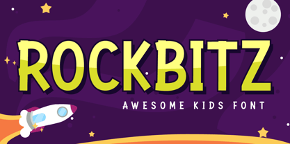 Rockbitz is a cute & playful font that will make your design looks modern, unique and fun. Perfect for labels, quotes, posters, DIY projects, branding, packaging, greeting cards, websites, photos, kids photography , signs, window art, scrapbooking, tags and so much more! Thank You
 - Bearish by Trim Studio,
$12.00 Bearish is a handwritten modern display font, inspired by kids handwriting. It's perfectly suited for crafters and graphic artists to complete their design such as invitations, advertisements, posters, logos, birthday carts, product signs, and many more. Bearish contains all standard glyphs and punctuations.
 - Bornholm Tejn Low by Trine Rask,
$25.00 Bornholm Tejn is named after a village »Tejn« on the only rocky island in Denmark »Bornholm« Bornholm Tejn Low is the lowercase variant of Bornholm Tejn, released in 2012, the first face in a series of rough stone cut typefaces, that shares proportions, but differs in any other aspect like different pieces of rock. It is a powerful face, but still very friendly. Good for very big sizes, but can be used for small texts, movie titles, cartoons … Bornholm Tejn Low has a large x-height which supports the heavy and black look of the typeface. It contains tabular and proportional old style and lining figures.
 - Blah Blah Blah by Comicraft,
$49.00 It Had to Happen! Here Comes The World's Greatest Comic Book Font! It's A Collector's Item Classic! It's One of Comicraft's Greatest! You Wanted Our Silver Age Style Font -- last seen in the Pulse Pounding Pages of DC's SUPERBOY and Marvel's FLASHBACK titles -- and Now You've Got It! Three Thrilling Feature-Length Fonts! They're the Strangest Sans Serif Fonts of All! Proof Yet Again That This is Indeed the Comicraft Age of Comics! Etcetera, etcetera, etcetera, Blah Blah Blah...
 - Sailor Gothic by Design is Culture,
$39.00A font by Christian Acker (2003), based upon the practice of the Americana folk art tradition of tattoo design. Throughout the late 19th and 20th Centuries sailors would popularize and spread motifs, designs and styles by carrying this art around the world on their sleeves. A family of four fonts representing traditional styles is now available as a digital font. An accompanying collection of over 60 eps illustrations of tattoo "flash" are also available at cubanica.com. - Kamerik 105 Cyrillic by Talbot Type,
$19.50 Based on the popular Talbot Type Kamerik 105 , this Cyrillic variation is now available for the first time. Kamerik 105 is inspired by the classic, geometric sans-serifs such as Futura and Avant Garde, but has shallower ascenders and descenders for a more compact look. It's a versatile, modern sans, highly legible as a text font and with a clean, elegant look as a display font at larger sizes. The Kamerik 105 Cyrillic family comprises of five weights.
 - Silver Raven by Ferry Ardana Putra,
$12.00 Hello there! We are introducing our new font - Silver Raven! This font is font created and inspired from the street writing of New York, and generated by creative hands of graffiti addictions. It has an incredibly unique design that can be perfect for a range of creative branding and packaging projects. Take your designs to the next level with this stunning font! You can apply this font to t-shirt designs, posters, covers, video thumbnails, merchandise, wall, and so on to make it look special. ——— Silver Raven features: A full set of uppercase and lowercase Numbers and punctuation Multilingual language support PUA Encoded Characters OpenType Features Layered Style +257 Total Glyphs Graffiti Swashes and Ornaments included! ——— Silver Raven Includes: Silver Raven (OTF/TTF) ——— ⚠️To enable the OpenType Stylistic alternates, you need a program that supports OpenType features such as Adobe Illustrator CS, Adobe InDesign & CorelDraw X6-X7, Microsoft Word 2010 or later versions. There are additional ways to access alternates/swashes, using Character Map (Windows), Nexus Font (Windows), Font Book (Mac) or a software program such as Pop Char (for Windows and Mac). ⚠️For more information about accessing alternative, you can see this link: http://adobe.ly/1m1fn4Y ———
 - An Electronic Display LED LCD LED7 Seg 3 by Fortune Fonts Ltd.,
$15.00 * For when you need the most realistic looking electronic display. * See User Manuals Main advantages: - Spacing between characters does not change when entering a decimal point or colon between them. - Custom characters can be produced by selecting any combination of segments to be displayed. Low cost electronic displays have a fixed number of segments that can be turned on or off to represent different symbols. A digital watch would be the most common example. Fonts typically available for depicting electronic displays are often in the artistic style of these common LED or LCD displays. They provide the look-and-feel, but fall short when technical accuracy is required. Failure to represent an accurate and consistent representation of the real thing can be a cringe-worthy experience for the product design and marketing team, or even the hobbyist for that matter. To solve this problem, Fortune Fonts has released a range of fonts that accurately depict the displays typically found on low cost electronic devices: watches, answering machines, car stereos, alarm clocks, microwaves and toys. These fonts come with numbers, letters and symbols predefined. However, they also allow you to create your own segment combinations for the custom symbols you need. When producing manuals, marketing material and user interfaces, accuracy is an all-or-nothing concept. Instructions in the user manual describe how to turn these fonts into realistic displays according to your own design, in the manner of the images above. If you cannot see a license option for your specific application, such a license may be purchased from here. By purchasing &/or using &/or distributing the fonts the buyer user and distributor (including Monotype Imaging Inc. & Monotype Imaging Hong Kong) agree to (1) indemnify & hold harmless the foundry, for any consequential, incidental, punitive or other damages of any kind resulting from the use of the deliverables including, but not limited to, loss of revenues, profits, goodwill, savings, due to; including, but not limited to, failure of the deliverables to perform it’s described function, or the deliverable’s infringement of patents, copyrights, trademarks, design rights, contract claims, trade secrets, or other proprietary rights of the foundry, distributor, buyer or other parties (2) not use the fonts to assist in design of, or be incorporated into, non-software displays
 - An Electronic Display LED LCD LED7 Seg 2 by Fortune Fonts Ltd.,
$15.00 * For when you need the most realistic looking electronic display. * See User Manuals Main advantages: - Spacing between characters does not change when entering a decimal point or colon between them. - Custom characters can be produced by selecting any combination of segments to be displayed. Low cost electronic displays have a fixed number of segments that can be turned on or off to represent different symbols. A digital watch would be the most common example. Fonts typically available for depicting electronic displays are often in the artistic style of these common LED or LCD displays. They provide the look-and-feel, but fall short when technical accuracy is required. Failure to represent an accurate and consistent representation of the real thing can be a cringe-worthy experience for the product design and marketing team, or even the hobbyist for that matter. To solve this problem, Fortune Fonts has released a range of fonts that accurately depict the displays typically found on low cost electronic devices: watches, answering machines, car stereos, alarm clocks, microwaves and toys. These fonts come with numbers, letters and symbols predefined. However, they also allow you to create your own segment combinations for the custom symbols you need. When producing manuals, marketing material and user interfaces, accuracy is an all-or-nothing concept. Instructions in the user manual describe how to turn these fonts into realistic displays according to your own design, in the manner of the images above. If you cannot see a license option for your specific application, such a license may be purchased from here. By purchasing &/or using &/or distributing the fonts the buyer user and distributor (including Monotype Imaging Inc. & Monotype Imaging Hong Kong) agree to (1) indemnify & hold harmless the foundry, for any consequential, incidental, punitive or other damages of any kind resulting from the use of the deliverables including, but not limited to, loss of revenues, profits, goodwill, savings, due to; including, but not limited to, failure of the deliverables to perform it’s described function, or the deliverable’s infringement of patents, copyrights, trademarks, design rights, contract claims, trade secrets, or other proprietary rights of the foundry, distributor, buyer or other parties (2) not use the fonts to assist in design of, or be incorporated into, non-software displays
 - An Electronic Display LED LCD LED7 Seg Platz by Fortune Fonts Ltd.,
$15.00 * For when you need the most realistic looking electronic display. * See User Manuals Main advantages: - Spacing between characters does not change when entering a decimal point or colon between them. - Custom characters can be produced by selecting any combination of segments to be displayed. Low cost electronic displays have a fixed number of segments that can be turned on or off to represent different symbols. A digital watch would be the most common example. Fonts typically available for depicting electronic displays are often in the artistic style of these common LED or LCD displays. They provide the look-and-feel, but fall short when technical accuracy is required. Failure to represent an accurate and consistent representation of the real thing can be a cringe-worthy experience for the product design and marketing team, or even the hobbyist for that matter. To solve this problem, Fortune Fonts has released a range of fonts that accurately depict the displays typically found on low cost electronic devices: watches, answering machines, car stereos, alarm clocks, microwaves and toys. These fonts come with numbers, letters and symbols predefined. However, they also allow you to create your own segment combinations for the custom symbols you need. When producing manuals, marketing material and user interfaces, accuracy is an all-or-nothing concept. Instructions in the user manual describe how to turn these fonts into realistic displays according to your own design, in the manner of the images above. If you cannot see a license option for your specific application, such a license may be purchased from here. By purchasing &/or using &/or distributing the fonts the buyer user and distributor (including Monotype Imaging Inc. & Monotype Imaging Hong Kong) agree to (1) indemnify & hold harmless the foundry, for any consequential, incidental, punitive or other damages of any kind resulting from the use of the deliverables including, but not limited to, loss of revenues, profits, goodwill, savings, due to; including, but not limited to, failure of the deliverables to perform it’s described function, or the deliverable’s infringement of patents, copyrights, trademarks, design rights, contract claims, trade secrets, or other proprietary rights of the foundry, distributor, buyer or other parties (2) not use the fonts to assist in design of, or be incorporated into, non-software displays
 - An Electronic Display LED LCD LED7 Seg dots 2 by Fortune Fonts Ltd.,
$15.00 * For when you need the most realistic looking electronic display. * See User Manuals Main advantages: - Spacing between characters does not change when entering a decimal point or colon between them. - Custom characters can be produced by selecting any combination of segments to be displayed. Low cost electronic displays have a fixed number of segments that can be turned on or off to represent different symbols. A digital watch would be the most common example. Fonts typically available for depicting electronic displays are often in the artistic style of these common LED or LCD displays. They provide the look-and-feel, but fall short when technical accuracy is required. Failure to represent an accurate and consistent representation of the real thing can be a cringe-worthy experience for the product design and marketing team, or even the hobbyist for that matter. To solve this problem, Fortune Fonts has released a range of fonts that accurately depict the displays typically found on low cost electronic devices: watches, answering machines, car stereos, alarm clocks, microwaves and toys. These fonts come with numbers, letters and symbols predefined. However, they also allow you to create your own segment combinations for the custom symbols you need. When producing manuals, marketing material and user interfaces, accuracy is an all-or-nothing concept. Instructions in the user manual describe how to turn these fonts into realistic displays according to your own design, in the manner of the images above. If you cannot see a license option for your specific application, such a license may be purchased from here. By purchasing &/or using &/or distributing the fonts the buyer user and distributor (including Monotype Imaging Inc. & Monotype Imaging Hong Kong) agree to (1) indemnify & hold harmless the foundry, for any consequential, incidental, punitive or other damages of any kind resulting from the use of the deliverables including, but not limited to, loss of revenues, profits, goodwill, savings, due to; including, but not limited to, failure of the deliverables to perform it’s described function, or the deliverable’s infringement of patents, copyrights, trademarks, design rights, contract claims, trade secrets, or other proprietary rights of the foundry, distributor, buyer or other parties (2) not use the fonts to assist in design of, or be incorporated into, non-software displays
 - An Electronic Display LED LCD LED7 Seg dots1 by Fortune Fonts Ltd.,
$15.00 * For when you need the most realistic looking electronic display. * See User Manuals Main advantages: - Spacing between characters does not change when entering a decimal point or colon between them. - Custom characters can be produced by selecting any combination of segments to be displayed. Low cost electronic displays have a fixed number of segments that can be turned on or off to represent different symbols. A digital watch would be the most common example. Fonts typically available for depicting electronic displays are often in the artistic style of these common LED or LCD displays. They provide the look-and-feel, but fall short when technical accuracy is required. Failure to represent an accurate and consistent representation of the real thing can be a cringe-worthy experience for the product design and marketing team, or even the hobbyist for that matter. To solve this problem, Fortune Fonts has released a range of fonts that accurately depict the displays typically found on low cost electronic devices: watches, answering machines, car stereos, alarm clocks, microwaves and toys. These fonts come with numbers, letters and symbols predefined. However, they also allow you to create your own segment combinations for the custom symbols you need. When producing manuals, marketing material and user interfaces, accuracy is an all-or-nothing concept. Instructions in the user manual describe how to turn these fonts into realistic displays according to your own design, in the manner of the images above. If you cannot see a license option for your specific application, such a license may be purchased from here. By purchasing &/or using &/or distributing the fonts the buyer user and distributor (including Monotype Imaging Inc. & Monotype Imaging Hong Kong) agree to (1) indemnify & hold harmless the foundry, for any consequential, incidental, punitive or other damages of any kind resulting from the use of the deliverables including, but not limited to, loss of revenues, profits, goodwill, savings, due to; including, but not limited to, failure of the deliverables to perform it’s described function, or the deliverable’s infringement of patents, copyrights, trademarks, design rights, contract claims, trade secrets, or other proprietary rights of the foundry, distributor, buyer or other parties (2) not use the fonts to assist in design of, or be incorporated into, non-software displays.
 - An Electronic Display LED LCD LED14 Seg 1 by Fortune Fonts Ltd.,
$15.00 * For when you need the most realistic looking electronic display. * See User Manuals Main advantages: - Spacing between characters does not change when entering a decimal point or colon between them. - Custom characters can be produced by selecting any combination of segments to be displayed. Low cost electronic displays have a fixed number of segments that can be turned on or off to represent different symbols. A digital watch would be the most common example. Fonts typically available for depicting electronic displays are often in the artistic style of these common LED or LCD displays. They provide the look-and-feel, but fall short when technical accuracy is required. Failure to represent an accurate and consistent representation of the real thing can be a cringe-worthy experience for the product design and marketing team, or even the hobbyist for that matter. To solve this problem, Fortune Fonts has released a range of fonts that accurately depict the displays typically found on low cost electronic devices: watches, answering machines, car stereos, alarm clocks, microwaves and toys. These fonts come with numbers, letters and symbols predefined. However, they also allow you to create your own segment combinations for the custom symbols you need. When producing manuals, marketing material and user interfaces, accuracy is an all-or-nothing concept. Instructions in the user manual describe how to turn these fonts into realistic displays according to your own design, in the manner of the images above. If you cannot see a license option for your specific application, such a license may be purchased from here. By purchasing &/or using &/or distributing the fonts the buyer user and distributor (including Monotype Imaging Inc. & Monotype Imaging Hong Kong) agree to (1) indemnify & hold harmless the foundry, for any consequential, incidental, punitive or other damages of any kind resulting from the use of the deliverables including, but not limited to, loss of revenues, profits, goodwill, savings, due to; including, but not limited to, failure of the deliverables to perform it’s described function, or the deliverable’s infringement of patents, copyrights, trademarks, design rights, contract claims, trade secrets, or other proprietary rights of the foundry, distributor, buyer or other parties (2) not use the fonts to assist in design of, or be incorporated into, non-software displays
 - EndlessShowroom - Unknown license

- Garamond Rough Pro by Elsner+Flake,
$59.00 With its animated contours, and set in an appropriate size, the Garamond Rough typeface attempts to simulate printed hot metal typesetting. Its roughened edges make it appear softer and less crisp, and, thus, takes the harshness out of the type image. The size of the offered type complement as well as the number of its affiliated symbols makes it ideal for differentiated text setting. Furthermore, its display types make surprising visual accents possible. The origins of the design of Garamond Rough go back to the middle of the 16th century. They are ascribed to Claude Garamond who was one of the first typographers who designed typefaces specifically for the setting of books. During the course of the past centuries and decades, many different variations and new design interpretations of the Garamond typeface were developed to accommodate the most diverse typesetting and printing practices in many different countries. As such, today’s designers can take advantage of a comprehensive digital repertoire for text and display applications. Translation Inga Wennik
 - Mister Rii PB by Pink Broccoli,
$19.00 A spunktastic offbeat latin typeface inspired by numerous Caribbean travel brochures & retro album covers from the mid 50’s. This font really dances off the page! Opentype features include Stylistic Alternates that change the scale of monetary symbols, and Contextual Alternates that modifies the second letter when typing double letters in lowercase.
 - SST Japanese by Monotype,
$236.99 Designed for global branding and supporting 93 languages, the SST® typefaces blend the organic readability and controlled structure of modern sans serif designs. In combining these attributes, the SST family is understated, versatile – and sure to be a timeless design. The SST Japanese Pro family has 6 fonts in total. It spans four weights from ultra light to bold, and has two condensed weights to further expand the family’s vast range of uses. SST’s subtle design traits provide a quietly handsome and consistently friendly typographic presence that can be used for just about any typographic application. Broad range branding applicability, combined with coverage for almost a hundred languages, makes SST one of the most widely accessible and usable typefaces available. Originally designed in partnership with the global consumer brand, Sony, the SST family is one of the most comprehensive type families available. Since extensive multi-lingual support was a critical design goal from the beginning, Akira Kobayashi, Monotype type director and primary designer on the project, turned to a network of local designers around the world for their individual language expertise. As a result, the details – which could be as subtle as stroke curvature and width – are consistent across Latin, Greek, Cyrillic, Arabic and multiple Asian languages. SST performs equally well in print and on-screen and the designs can be used at very small sizes in packaging and catalogs; while massive print headlines – even complicated wayfinding projects — pose no stumbling blocks to the family’s typographic dexterity.
 - LT Sweet Nothings - Personal use only

- Raindrop by Great Lakes Lettering,
$30.00 Raindrop is a fun and flirty typeface that pulls inspiration from editorial illustration. Each letter was carefully crafted to feel hand made and give the appearance of custom lettering. Through a variety of stylistic alternates and pairings, Raindrop is the perfect typeface choice for projects that aim for a one-of-a-kind feel when hiring a lettering artist isn't an option. Raindrop is made up of three separate styles being serif, sans, and script. The ability to pair styles together will add texture and personality to your design, leaving the viewer wondering: lettering or type?
 - Retro Head by 50Fox,
$20.00 “Everything old is new again,” as they say. Introducing "Retro Head" - A retro-modern inspired typeface with a bold, charming and versatile look. This font is also equipped with an opentype feature to support your creations. You will get : Retro Head Regular Retro Head Italic Ton of glyphs Ligatures & Alternates Works on PC & Mac Simple installations Accessible in Adobe Illustrator, Adobe Photoshop, Adobe InDesign, even work on Microsoft Word. PUA Encoded Characters – Fully accessible without additional design software. Language Support: Afrikaans, Albanian, Czech, Danish, Dutch, English, Estonian, Finnish, French, German, Hungarian, Italian, Latvian, Lithuanian, Norwegian, Polish, Portuguese, Slovak, Slovenian, Spanish, Swedish, & much more.. Thank you for looking.
 - Bill Corporate Medium by OGJ Type Design,
$35.00 Bill Corporate is a geometric typeface with generous capitals. A modern classic, based on Max Bill’s lettering work, its straightforward and uncompromising construction can be both edgy and sublime. With minimalist letterforms, pointy apexes instead of flat ones, and archetypal proportions, this font family doesn’t follow any trends but strives to achieve a timeless formal vocabulary. The skeleton of its letters is based heavily on the famous primary shapes of the Bauhaus: square, circle, and triangle. This makes for quite wide uppercase and much narrower lowercase letters. The contrast between uppercase and lowercase benefits inexperienced users, who will be able to get appealing results quickly. At the same time, it’s a powerful tool for seasoned designers, who can employ either case selectively to set the desired typographic course. Bill Corporate Medium’s 16 styles (including a set of eight lighter-than-light fonts from “Two” to “ExtraLight”) are an excellent choice for editorial design, branding, headlines, and even short to mid-length copy in a wide range of applications and industries. The uppercase letters in particular—with their varied widths and lavish dimensions—are suitable for cosmopolitan and stylish logotypes and wordmarks. Whenever a timeless, staid, and classy look is demanded, choose Bill Corporate.
 - Cally by Gleb Guralnyk,
$15.00 Cally is a classic looking typeface with decorative vintage elements. It is perfectly suited for label design and for various lettering postcards and invitations. Cally includes the English alphabet, punctuation, numbers and Western European multilingual characters (check out the screenshots with all available characters). Also there are few ligatures and swashes. To access swash glyphs, just type underscore character and number 1-5, like this _1. Using "standard ligature" feature this symbols will be automatically replaced with one of the swash symbols.
 - Garvo by BeJota,
$25.00 Garvo is based on old Hollywood movie posters, vintage film credit designs and pays homage to Herb Lubalin's Serif Gothic font & lettering. This is why Garvo is named after the acclaimed international actress Greta Garbo. The Garvo family comes in 6 weights (from Thin to Black) and includes 2 different subfamilies: Garvo and Garvo Poster. Garvo is perfect for short readable texts, such as advertising and packaging designs, while Garvo Poster brings a wide range of contextual alternatives which makes it perfect for high impact pieces. Both styles increase the overall family flavor with discretionary ligatures, small caps figures. The 12 styles of Garvo are perfectly well suited for branding projects, album covers, audiovisual related designs, magazines and layouts, among other uses.
 - Blabbermouth by Hanoded,
$15.00 Don’t ask me why I called this font Blabbermouth, as I really don’t know. I guess it reminded me of a person who talks too much, as Blabbermouth is kind of in your face, uneven and slightly crazy. Blabbermouth won’t keep your secrets, but I’m sure it’ll make your designs get the attention they deserve.
 - Macklin by Monotype,
$50.99 Designed by Malou Verlomme of the Monotype Studio, Macklin is a superfamily, which brings together several attention-grabbing styles. Macklin is an elegant, high contrast typeface that demands its own attention and has been designed purposely to enable brands to appeal more emotionally to modern consumers. Macklin comprises four sub-families —Sans, Slab, Text and Display— as well as a variable. The full superfamily includes 54 fonts with 9 weights ranging from hairline to black. The concept for Macklin began with research on historical material from Britain and Europe in the beginning of the 19th century, specifically the work of Vincent Figgins. This was a period of intense social change--the beginning of the industrial revolution. A time when manufacturers and advertisers were suddenly replacing traditional handwriting or calligraphy models and demanding bold, attention-grabbing typography. Typographers experimented with innovative new styles, like fat faces and Italians, and developed many styles that brands and designers continue to use today, such as slabs, serifs, and sans serifs. Verlomme pays respect to Figgins’s work with Macklin, but pushes the family to a more contemporary place. Each sub family has been designed from the same skeleton, giving designers a broad palette for visual representation and the ability to create with contrast without worrying about awkward pairings. With Macklin, Verlomme shows us it’s possible to create a superfamily that allows for complete visual expression without compromising fluidity. Macklin™ font field guide including best practices, font pairings and alternatives. Featured in: Best Fonts for Websites
 - Goldplay by Latinotype,
$26.00 Goldplay is based on Isidora Sans design yet features rounded shapes. Its rounded, soft terminals give it a friendly and expressive look, and its modern and contemporary style as well as its classic proportions make it an excellent choice for headlines, logotypes, branding, books, magazines, motion graphics, and use on web and Tv. One of its key features is a large x-height which make it look elegant and classy. Goldplay comes in 2 versions—each in 7 weights, from Thin to Black, and matching italics, resulting in a total of 28 fonts. The standard sans serif version—fresh, clean and contemporary—is a perfect choice for editorial and corporate design, headlines, books, magazines or any other piece of graphic design. The Alt semi-serif display version—more expressive and modern—is ideal for logotypes, branding, packaging, and use on web and Tv. Goldplay contains a set of 540 characters that support over 200 Latin-based languages.

