10,000 search results
(0.043 seconds)
- ITC Oldbook by ITC,
$29.99For some time, Eric de Berranger had wanted to create a distressed typeface design - one that gave the appearance of antique printing and showed signs of wear, yet was still highly readable. He was busy designing a new face called Maxime, when an idea struck: I realized that I could use these lettershapes as the basis for my antique typeface," he says. The two faces ended up being designed in tandem. While ITC Oldbook clearly captures the flavor of aged, uneven and imperfect printing, it also meets de Berranger's goal of being exceptionally readable in text sizes. Beginning with well-drawn characters was the key, and these were carefully modeled into the distressed forms. "The process was more difficult than I originally thought," says de Berranger. "The antique letters had to be tested and modified several times to work correctly." ITC Oldbook elegantly simulates antique printing in both text and display sizes. And while stroke weights are uneven and curves are irregular, the design has remarkably even color when set in blocks of text copy. Add to this the design's inherent legibility, and ITC Oldbook acquires a range far beyond replication of things old; it's suitable for any project that calls for warm and weathered typography. ITC Oldbook is available in roman and bold weights with complementary italic designs. Small caps, old style figures and a suite of alternate characters and ornaments provide additional flexibility and personality to the design." - Xcetera by Typogama,
$19.00 Work for the Xcetera typeface started with the desire to create a classical serif design but using the less contrasted stroke thickness found in a host of sans serif designs. My aim was to retain some of the clarity found in modern strokes yet use the serifs to aid in letter recognition and legibility. The result is a form of hybrid design that is surprising clear in small point sizes yet offer a lot of personality in larger formats. Suited for both display and text settings, Xcetera aims to be both functional and fun while looking to explore new possibilities for the classical typeface style.
 - Olap Metric by S6 Foundry,
$20.00 Olap Metric is a modern, one-of-a kind font that will make your designs stand out against the competition. With 9styles and Multi-languages support, this stylistic display type has what you need for all sorts of projects! The family has been developed as a modern playing system allowing the mixing of infinite combinations. Perfectly suited for headlines, large-format prints, brand identities, social media, advertising, editorial design, posters, magazines, logos, headings, digital and more.
 - Machete Pro by Sudtipos,
$39.00 Machete is the hulky, overfed distant cousin of Bayoneta. Enthusiastically in your face and full of humour, Machete is exactly the kind of big alphabet that takes a skinny actress camping at the top of a really tall building downtown. If you don't think this sort of date is interesting enough, try cramming these letters on your next tub of comfort food, road trip comedy, or assault rifle packaging and see. Machete don't text. Machete roars!
 - LTC Forum Title by Lanston Type Co.,
$24.95 Forum Title was originally designed by Frederic Goudy in 1911. It was intended to be the heading font used for a book set in Kennerley. Based on inscriptional Roman stone cut capitals, this face is true to the early Roman forms which did not have a lower case. Forum exemplifies the classic Roman letterform at its finest. If a lower case were desired, Forum Title can be paired with Goudy Oldstyle for a harmonious hybrid font.
 - Hugh Ultra Wide by Fateh.Lab,
$15.00 Hugh is the development of a wide type font, we create a work of art that combines a very strong spirit of wide type, for those of you artistic art lovers, this good news for you, because Hugh has a high artistic soul. This is the start of a happy year for you, get this font right away and develop your wild ideas, Hugh is the answer for you now. Its weight is superior in posters, social media, headlines, titles, large format print - and wherever you want to be noticed
 - Gothiks Round Compressed by Blackletra,
$50.00 Gothiks Round Compressed is the rounded version of Gothiks Compressed. It is a 6-weight display sans-serif influenced by Texturas. The rhythm and verticality of Texturas can be easily identified on the letters with diagonal strokes like A N M K k V v W w X x Y y Z z: here they are all vertical. This kind of morphology was chosen because it accepts condensation in a very natural way, giving to this sans-serif a very unique personality. It has an extensive character set—with extensive language support—and many OpenType features like fractions, small capitals and different figure sets. Default figures align with lowercase. The typeface’s name refers to the plural of the word Gothic, which in turn can refer to both sans-serifs or Blackletter, depending on geographic location. Use it BIG!
 - Gothiks Round Condensed by Blackletra,
$50.00 Gothiks Round Condensed is the rounded version of Gothiks Condensed. It is a 6-weight display sanserif influenced by Texturas. The rhythm and verticality of Texturas can be easily identified on the letters with diagonal strokes like A N M K k V v W w X x Y y Z z: here they are all vertical. This kind of morphology was chosen because it accepts condensation in a very natural way, giving to this sans-serif a very unique personality. It has an extensive character set—with extensive language support—and many OpenType features like fractions, small capitals and different figure sets. Default figures align with lowercase. The typeface’s name refers to the plural of the word Gothic, which in turn can refer to both san-serifs or Blackletter, depending on geographic location. Use it BIG!
 - Cohort by insigne,
$22.00 Cohort is a strong and crisp geometric sans serif. Cohort uses a rounded rectangle as its central motif. Although the geometric design is minimalistic, Cohort has a variety of unique letterforms that keep the design from being too predictable and maintains a bit of beautiful nuance with plenty of legibility. Cohort's six different weights give it a great deal of versatility, from its sharp and potent black weight to the fresh and razor sharp thin. Cohort can be used for logotypes, headlines or short blocks of text. Cohort includes many useful OpenType features, including a set of upright italic swash alternates, ligatures, small caps, fractions and old style figures, sharper and more unique counterforms and simplified characters for titling. OpenType-capable applications such as the Adobe suite or Quark can take full advantage of automatically replacing ligatures and alternates. This family also includes the glyphs to support a wide range of latin based languages.
 - Le Havre Rough by insigne,
$19.00 Le Havre Rough. It’s high-resolution, hand-crafted letterpress to the core. Based on insigne’s popular Le Havre typeface, this new heat-treated, weathered face of all caps joins the realism and appeal of the top-quality Le Havre family. Rough’s eroded, printed look is extremely customizable, offering eleven distressed choices that appear fantastic even at large output sizes. Go ahead. Try it on, say, a billboard. Maybe even Times Square. The font includes hand-printed texture and distinctive shadow choices, too. Options include three inline versions, two shadow layers, and a clean primary version. Combine and match the options easily as you need, layering normal and shadow variations to alter appearance and texture. You can activate Art Deco alternates by using OpenType contextual alternates. Rough has an extra-large character set for many languages. Additionally, the typeface offers 62 extra ornaments like arrows, emblems, numbers & lines. Use its full texture and grit to capture the classic, genuine print feel that you need in your project. A few suggestions for use: - In Photoshop, jigger with various 'anti-aliasing' options for best outcomes. Smooth or strong is generally best. - In Illustrator, the shadow layer occasionally doesn't align when using the regular layer. To fix the alignment, open the type drop-down menu and choose Area Type Options > Em Box Height. Learn more about the using layered type styles on this informative video.
 - Glitzy by Ingrimayne Type,
$9.95 Glitzy is a caps-only font with extreme contrast. It was inspired by Art Deco typefaces, especially Broadway by Morris Fuller Benton, but Glitzy is not an attempt to reproduce that typeface. The letters on the lower-case keys differ slightly from the letters on the upper-case keys. The large black interiors invite decoration and the family includes four faces with interior decoration. These four faces with interior decoration can be used in layers with the base font to add color to lettering. (OakPark is a another attempt to do high-contrast lettering with an Art Deco feel.)
 - Bargain Shopping by Jeff Levine,
$29.00 F.W. Woolworth was once one of the giants of the variety store chains, along with the likes of Kress, S.S. Kresge, McCrory’s, Neisner Brothers, Ben Franklin and others. In 1960, the company brought out a new corporate logo with a type design harking back to the Art Deco style of the 1930s and 1940s. A photo of one of their old store fronts (despite having only eight letters to work with) inspired the digital interpretation of the signage as Bargain Shopping JNL, which is available in both regular and oblique versions.
 - Sheridan Gothic SG by Spiece Graphics,
$39.00 Sheridan Gothic, also known as Grant Antique, is a quaint design produced in the late nineteenth century. Its proportions are in keeping with extra condensed faces of the times. Its uppercase letters are quite narrow. Its lowercase letters are equally narrow and tall. This pleasant and enduring design contains a touch of novelty, too. Swelled terminal flourishes on such characters as C, J, S, c, e, r, and s help add interest and warmth to what is basically a friendly old soul. Sheridan Gothic is now available in the OpenType Std format. Some new stylistic alternates have been added to this OpenType version. Advanced features work in current versions of Adobe Creative Suite InDesign, Creative Suite Illustrator, and Quark XPress. Check for OpenType advanced feature support in other applications as it gradually becomes available with upgrades.
 - Old Dreadful No. 7 by Bitstream,
$29.99Old Dreadful No. 7 is truly a unique typeface design. Bitstream’s designers and other employees all contributed individual letterforms to the character set. This typeface is definitely not recommended for long blocks of texts! David Robbins expanded his contribution of the capital I into a complete typeface, Eyeballs. - Config Rounded by Adam Ladd,
$25.00 Config Rounded is a condensed geometric sans with rounded corners. Config’s sibling, this typeface was influenced by geometric sans with circular forms on the tops and bottoms of characters, but the proportions have been condensed by incorporating straight sides for a design that is efficient yet friendly. Use it for a subtle softness that still looks modern and strong. With 10 weights, there are options to fit the need—black and thin for extreme uses and intermediates for more common needs.
 - East Village JNL by Jeff Levine,
$29.00 The Federal Art Project division of the WPA (Works Progress Administration) employed numerous artists, musicians, actors and other creative sorts in a effort to help many survive the Great Depression of the 1930s. One of the posters created by this project was for a "Card Party and Barter Benefit" with proceeds going toward the Nassau Art Teachers Benefit Fund - taking place at the Coca-Cola plant in Rockville Centre, New York. East Village JNL was derived from this poster, and is available in both regular and oblique versions.
 - BOMADHA by Twinletter,
$15.00 Bomadha is a one-of-a-kind display font with Asian elements. The typeface, which has been built with remarkable harmony in every phrase structure that arises, makes your complete project look luxury and gorgeous, causing your entire audience to fall in love with it. Logotypes, food banners, branding, brochure, posters, movie titles, book titles, quotes, and more may all benefit from this font. Of course, using this font in your various design projects will make them excellent and outstanding; many viewers are drawn to the striking and unusual graphic display. Start utilizing this typeface in your projects to make them stand out.Caps only fonts.
 - Cheerful Hilarious by ahweproject,
$14.00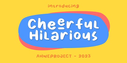 Cheerful Hilarious is a fun and quirky handwritten display font. Its whimsical vibe is perfect for creating unique, kid-friendly designs.
 - Chendolle by Rometheme,
$6.00 Chendolle is a bold display font, it has a fun and cute style and is perfect for creating playful kids designs.
 - My Home by Typefactory,
$14.00 My Home is a Fun Handwritten Font, Perfectly suitable for creating quotes, kids book, t-shirts, poster, mockup, and many more.
 - Hiragino Sans by SCREEN Graphic Solutions,
$210.00 Mindful that Hiragino Sans (Kaku Gothic) would be used in conjunction with Hiragino Serif (Mincho), SCREEN developed a font that anticipated today’s world where most people do their reading on displays and yet still has an orthodox letterform that does not blur when printed on paper. In short, our goal with this font was to create a new concept that responds to the demands of today’s times. This font offers weight variations from W0 to W9 and is extremely versatile. This makes it well-suited to all visual expression media including paper, metallic textures, resins, cloth, television, movies, broadcasting, websites, and electronic displays. One of the design’s strongpoints is that it elides serif on the right side of each stroke, thus delivering more spacious counters and a comfortable appearance. Thanks to this, the typeface not only delivers a contemporary, lively impression same as Latin sans serif typefaces, but also heightens the natural continuity and readability of text whether it is set vertically or horizontally. As a result, it makes it possible to bring a strong appealing power to text. Without a doubt, this is typeface that above else embodies the role of Sans Serif.
 - Flatstock - 100% free

- LOL! - Personal use only

- Sonrisa by CastleType,
$59.00 Sonrisa is a design that evolved from my sketches of the skeletal structure of Jakob Erbar’s Koloss, trying to discover its underlying essence without all the contrast and bulkiness of the original design. Sonrisa Thin was the resulting font, from which the other weights of the family were developed. Gentle curves, open counters, generous x-height, and sleekly tapered terminals give Sonrisa a very legible, modern, elegant appearance. When she saw the first draft of this typeface, the smile on my friend Jennifer’s face gave me the idea to call it “Sonrisa” (Spanish for “smile”). Jennifer, a clinical psychologist, described Sonrisa’s personality as: "happy, clean, clear, open, joyful, spacious, playful, calm. I can see it being used for body product lines such as oils and lotions. Can see it being used in home/travel magazines or even Architectural Digest. Yoga magazine, definitely." Sonrisa is what some foundries call a “Pro” typeface family with all the bells and whistles that provide typographic versatility: true small caps, oldstyle numerals, arbitrary fractions, discretionary ligatures, and other powerful OpenType features. All fonts in the family, except Sonrisa Titling, support most European languages, including modern Greek and languages that use the Cyrillic Alphabet. (Cyrillic glyphs designed in consultation with Ukrainian type designer, Sergiy S. Tkachenko.) Sonrisa is available in the original Thin, monoline version as well as six weights (Light, Regular, Medium, Bold, Extra Bold, Black), and a Titling font that is essentially a display font construction kit. If you enjoy using Sonrisa even half as much as I enjoyed creating it, then I know you will have a “sonrisa” (smile) on your face!
 - Gradl Max by Fresh Air Fonts,
$14.00 Max J. Gradl was a German jewelry designer. A Web search today turns up several examples of his work from the turn of the 20th century. He seemed to favor green stones in silver metalwork. Gradl also did advertising work and co-authored a book on architectural design. Most important for our purposes, though, are the incredible hand lettered alphabets and monograms the man left behind. I’ve digitized one of those delightful alphabets and tried to keep it true to the original. Beyond the base character set of letters, numerals and basic punctuation, I had to extrapolate forms that, I hope, hold true to Gradl’s design. Enjoy!
 - Bethlehem Ephrath by HiH,
$10.00 One menorah that I have long found particularly appealing was named The Tree of Life Menorah, a replica of which I gave as a gift one holiday to a kindly old couple who were neighbors and became friends. It had a simple, organic elegance that I see in the best of Art Nouveau sculpture. To me personally, Judeism is a celebration of life, like the triumph of the flower that blossoms in the crack of the city sidewalk. Just as Hanukkah celebrates the rededication of the temple and the miracle of the oil, it celebrates the victorious quest for freedom of the Hebrew people led by Judah Maccabee. Hanukkah represents determination and courage and faith — and it represents the presence of God in the lives of His people. It is interesting to note that the founding of the Albanian nation in the early twentieth century grew out of the resistance of the Albanian people to the imposition of Greek language and culture in the aftermath of the dissolution of the Ottoman Empire. The typeface, HADASSAH, designed by Henri Friedlander (1904-1996), is my favorite Hebrew typeface. Thirty years in the crafting, I believe it is unsurpassed for its shear beauty, combining a subtle modulation of stroke with a simplicity and clarity of form. No doubt, that is why it has become so popular. For me, the Sîyn/Shîyn characters are especially satisfying. For a Hanukkah message in Hebrew, I would choose HADASSAH LIGHT for a headline and print it as large as I could. If, however, you are looking for a friendly, warm face for a seasonal message in a roman-letter based language, may I suggest BETHLEHEM EPHRATH. It will be as comfortable as a bulky, hand-knit sweater on a frosty afternoon and reflects the solid, encompassing, family orientation of this holiday. It was on the way to Ephrath that Jacob’s beloved wife Rachel gave birth to Benjamin and then died from her labor. It was to Ephrath that Naomi and Ruth returned and in Ephrath that we have the wonderful, heart-warming story of the marriage between Ruth and her Redeemer-Kinsman, Boaz. And it was to Ephrath that prophet, Samuel, went to find a new king and there in Ephrath that the prophet annointed a small shepherd boy named David. The Proverbs tell us to seek wisdom. Never underestimate the impact you have on others. Words of kindness can change people’s lives. The Talmud says that the highest form of wisdom is kindness. Be wise this holiday season. The font BETHLEHEM EPHRATH is based on the typeface Accent with the permission of URW++ of Hamburg, Germany. Like most display fonts, it is most effective at 18 points and larger. Like most script fonts, it is most effective when set with both upper and lower case. Although this font is readable in all caps (many scripts are not), that does not make it a good idea. Do so only with caution.
 - ALS Heino by Art. Lebedev Studio,
$63.00 Heino is a decorative face with two font styles that was inspired by an old magazine lettering. Its original features include heavy serifs and tight spacing, particularly if you take the Black version. The bouncing letters create a cheerful impression, and would look nice in children’s books and magazines, on candy and food packages, holiday and circus posters and flyers.
 - Haboro by insigne,
$- Haboro is a powerful workhorse. It’s a neoclassical font developed for numerous uses, ranging from editorial and corporate to web pages and apps. This new face from insigne Design takes a modern twist on the high-contrast typeface genre known as the Didone. Recognized for their ability to convey clarity, the geometric simplification of the Didone genre adds a level-headed rationality to whichever work it’s applied. Didones are used to lend style and sophistication to a wide number of applications—everything from style or cosmetic labels to annual reports. With its unique take on this classic genre, Haboro—with its slight wedge-shaped serifs and unique terminals—is still defined by elegance, tradition and timelessness. Even more to its versatility, this multi-purpose text face features whimsical terminals, which liven up even the most serious texts. If you desire, you can also opt for the more usual ball terminals by activating OpenType alternates. The Haboro family consists of seven weights from a Thin to a Black along with matching italics. The contrast from the letters’ thick strokes and thin strokes draws the eye to your design, making Haboro a powerful visual tool for communicating your message. The typeface also contains numerous ligatures and alternates. Choose between serif variants such as ball terminals or standard serifs by utilizing OpenType alternates. We recommend using the default contextual alternates and discretionary ligatures in order to benefit from all members of this fantastic font family. In addition, Haboro has a sizable set of option glyphs and numerous other OpenType variables to give your text the unique touches it needs. Haboro has all of the attributes you need to undertake your next project. Use its modified elegance to shape and mold your next design, whether a web site, app, branding package, or magazine. You’ll find there’s no job Haboro can’t take on.
 - Mellanika by Arterfak Project,
$18.00 We've got something special for you today - the new Mellanika font! A natural script font, made with handwriting style. This font also has a signature touch that is versatile to apply for many purposes. Mellanika is feminine, lovable, and visualizes beauty! Recommended to be used on designs that require minimalist, elegant, or clean looks. The script font includes a full character set with alternates, ligatures, and swashes. Thank you!
 - Ondise by Magpie Paper Works,
$32.00 Ondise is a curvy and warm hand-lettered calligraphy script with a natural, dancing baseline. This Opentype font was created with a pointed pen & ink, and includes six different ampersands as well as a swash feature that automatically substitutes beginning & end of word letters. To enable alternate ampersands, simply turn on the contextual alternates feature and type &1, &2, &3, etc. Opentype coding automatically substitutes the new ‘and’.
 - Ka Gaytan by Karandash,
$26.00 Gaytan (Bulgarian for braid) is a fresh new insight on archaic letterforms. A family of two unicase typefaces - a modern looking sans and more classic looking serif, equipped with many alternates, so they can suit any typographic taste. Gaytan's unique design was inspired by Old Church Slavonic Cyrillic, Bulgarian Ustav and the Russian Vyaz stiles, as well as the avant-garde works of Bulgarian type designers in late 1970s.
 - Oh November by Supfonts,
$15.00 This new font was inspired by the game with different signature styles. I also added 102 ligatures to it. The result is a light and nice font that looks completely hand-drawn. Oh November will look beautiful on Christmas and holiday invitations, wedding invites and stationery, logos, and more. I love using it for emphasis words and pairing it with serifs Check out my blog: https://www.instagram.com/zloillev pinterest.com/dmitriychirkov7
 - Suffolk by Hemphill Type,
$30.00 Suffolk is a traditional yet modern font family that takes inspiration from the county of Suffolk and its rich coastal history. This handwritten style font is a modern rustic take on a traditional script font and comes with a joined up 'script' style and an individual 'print' style. Along with a 'serif' style that evokes a similar feeling of old meets new that works well alongside the two handwritten styles.
 - Azest by Pesotsky Victor,
$10.00 "AZEST" FONT — NEW, GROTESQUE This is a simple font, with a small number of accidental elements. The proportions are slightly stretched in width. One regular font. It can be put in interfaces or in communication materials, it will not be too active, but it will not slip into neutrality. Supports Cyrillic and some other scripts. Lowercase and uppercase characters, numbering, punctuation and diacritics, in general: all the necessary signs.
 - Grunt Grotesk by Tkachenko design,
$30.00 Grunt Grotesk is a modern Ukrainian sans-serif typeface with a number of distinct characteristics, which make it unboring but still great in the massive text blocks.
 - FP København by Fontpartners,
$35.00 Copenhagen has been in need of a typeface that unites the city’s many visual expressions. The three designers Morten Rostgaard Olsen, Henrik Birkvig and Ole Søndergaard have designed and developed the typeface FP København. Now available from MyFonts in 20 styles: Uprights & Italics, small caps, pictos-characters, stencils, sprayed style, OT-features, ligatures, contextual alternates etc. The shapes of the letters are inspired by the city’s culture and the visual environment and design in Denmark in the 20th century. It is relatively low and wide as the city itself and with rounded corners that give it a warm visual mood. “You can find examples of the use of a typeface with the same purpose in other parts of the world, for example, to identify local areas or urban tourism materials. FP København is our take on that kind of typeface” the designers add.
 - Loudine by PintassilgoPrints,
$19.00 Loudine is a striking decorative display typeface, great for posters, book covers and magazine headlines. It comes in two widths, each of them packed with a set of stylistic alternates: just turn on the feature in an OpenType savvy program to instantly get into a new mood, with filled counters and slightly different lettershapes. Be sure to play it loud!
 - Lust Stencil by Positype,
$39.00 When you hear that name, you likely ask yourself, ‘why?!’ I did too, but the number of requests could not be ignored. Once I finally decided to move forward with it, the only way to solve the offering would be to adhere to the same theme of indulgence, I planned for the same number of optical weights AND Italics. Yeah, italic stencils… ok, why not? It’s not a new concept. One thing to note and a creative liberty I assumed during the design. Lust Stencil would not be just a redaction or removal of stress to produce a quick stencil. To do that, would just be a cheap solution. Strokes had to resolve themselves correctly and/or uniquely to the concept of the stencil format. And, it had to be heftier. For it it to look correctly, it needed about 8% additional mass to the strokes for it to retain the effervescent flow of the curves and the resolute scalloped lachrymals. The Lust Collection is the culmination of 5 years of exploration and development, and I am very excited to share it with everyone. When the original Lust was first conceived in 2010 and released a year and half later, I had planned for a Script and a Sans to accompany it. The Script was released about a year later, but I paused the Sans. The primary reason was the amount of feedback and requests I was receiving for alternate versions, expansions, and ‘hey, have you considered making?’ and so on. I listen to my customers and what they are needing… and besides, I was stalling with the Sans. Like Optima and other earlier high-contrast sans, they are difficult to deliver responsibly without suffering from ill-conceived excess or timidity. The new Lust Collection aggregates all of that past customer feedback and distills it into 6 separate families, each adhering to the original Lust precept of exercises in indulgence and each based in large part on the original 2010 exemplars produced for Lust. I just hate that it took so long to deliver, but better right, than rushed, I imagine. It would have taken even longer if not for font engineer and designer, Potch Auacherdkul. Thanks Potch.
 - Vikive by Eurotypo,
$23.00 Vikive is a family of Sans Serif fonts, better known in its origins as "Gothic" in America or "Grotesque" in Europe. Some authors divide them into three categories: Grotesque, Geometric and Humanistic. Probably, it can be defined that Vikive has some characteristics of the first two: Grotesque and Geometric, high x-height, slight squareness of the curves, wide set, open tail, simple construction. The family concept provides several weights and widths for one face and its matching italics, therefore this family of types is more suitable for text settings, enriched with strong contrast fonts (condensed thin or expanded black) for headlines.
 - Superb by Resistenza,
$49.00 Superb is a new typeface based on real brush pen script and also influenced by lettering shapes from the sixties and seventies. The font includes various swashes with volume and curls.. Superb’s letters got high contrast and some psychedelic curves. This font includes negative figures and a full alphabet set with cut out shapes. Take a look at the Superb Video https://vimeo.com/94062611 It’s designed with high contrast and enhanced legibility regardless its artistic look. Superb’s original letterforms are a beautiful piece of art and elegance no matter you observe them as separate symbols or as words, text paragraphs etc. Their appropriate use could be found therefore in many different aspects – from decorative greeting card, fresh packaging or expressive headline, to artistic t-shirt design, poster or distinguished brand name. Superb has a lot more to show when you access its OpenType features.

