10,000 search results (0.035 seconds)
  1. ROTRING - Unknown license
  2. Strobo - 100% free
  3. Malgecito - Personal use only
  4. Outer Planet Janet - Personal use only
  5. Stasmic - Unknown license
  6. milky - Unknown license
  7. Annon - Unknown license
  8. Endor - Unknown license
  9. Denmark - Unknown license
  10. Commuter - Unknown license
  11. Rotondo - Unknown license
  12. Cheap Fire - Unknown license
  13. CORPOREA - Unknown license
  14. Pinda - Personal use only
  15. Red Circle - Unknown license
  16. Smartie CAPS - Personal use only
  17. PF Tempesta Five - Unknown license
  18. Gravicon - Unknown license
  19. Shredded for you - Unknown license
  20. Corporate HQ - Unknown license
  21. atthewindowPRO - Unknown license
  22. ARG219am - 100% free
  23. Back In The USSR DL - Personal use only
  24. GUNJU - Unknown license
  25. COnsume - Unknown license
  26. Torgny.. - Unknown license
  27. Glyphstream - 100% free
  28. Das Reicht Gut Regular - Unknown license
  29. Bubbleboy - Unknown license
  30. Imperfect font - Unknown license
  31. Tank Junior - Unknown license
  32. Lakmus - Unknown license
  33. RaveParty Offset - Unknown license
  34. Folk Solid - 100% free
  35. SF Espionage Light - Unknown license
  36. Street Humouresque - Personal use only
  37. Big Fat Ugly Cow - Unknown license
  38. OXIDO ExtBd ExtCond - Personal use only

  39. Oxona Caps - Personal use only
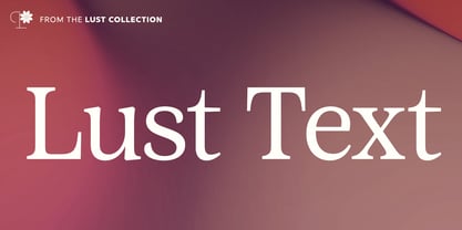
  40. Lust Text by Positype, $29.00
    Yes, finally. This one took the most time and the most restarting. Years went into imagining what Lust Text should look like and how it should structurally behave in order to truly improve upon a setting that includes any of the Lust typefaces. I approached it as much from the side of the type designer, as I did a potential user. The flow, the warmth, the personality needed to be there, but all of the excess had to be removed responsibly. In the process, and in need of inspiration, I looked backward to historical artifacts and precedent. In each early Lust Text approach, the solution was lackluster and/or vanilla and not actually a ‘Lust’ typeface. The exercise was not in vain though. By exploring past examples, I found my footing drawing for media now and how it might be used later—all the while, producing seamless, elegant curves and restrained indulgence (that sounds almost silly to say, but I like it). The Lust Collection is the culmination of 5 years of exploration and development, and I am very excited to share it with everyone. When the original Lust was first conceived in 2010 and released a year and half later, I had planned for a Script and a Sans to accompany it. The Script was released about a year later, but I paused the Sans. The primary reason was the amount of feedback and requests I was receiving for alternate versions, expansions, and ‘hey, have you considered making?’ and so on. I listen to my customers and what they are needing… and besides, I was stalling with the Sans. Like Optima and other earlier high-contrast sans, they are difficult to deliver responsibly without suffering from ill-conceived excess or timidity. The new Lust Collection aggregates all of that past customer feedback and distills it into 6 separate families, each adhering to the original Lust precept of exercises in indulgence and each based in large part on the original 2010 exemplars produced for Lust. I just hate that it took so long to deliver, but better right, than rushed, I imagine.
Looking for more fonts? Check out our New, Sans, Script, Handwriting fonts or Categories
abstract fontscontact usprivacy policyweb font generator
Processing