10,000 search results
(0.017 seconds)
- Brda by Linotype,
$29.99Brda originally designed by the Polish designer Franciszek Otto for the Powiat weekly newspaper. Powiat needed a new, dynamically drawn sans serif for its headlines, and Otto's Brda fit the bill. Combining traditional Grotesk letterforms with witty subtleties, like the notched-joint seen in the capital G, Brda displays a novel design that works best when set large. The typeface is named after the Brda river, which runs through Bydgoszcz, Poland, the city where Powiat is published. The Brda family includes three weights, each with a companion italic: Regular, Bold, and Extra Bold. The Brda family's Extra Bold weight was one of the winners selected in the 2003 International Type Design Contest, sponsored by Linotype GmbH. Franciszek Otto also teaches graphic design at the Secondary Art School in Bydgoszcz, where his typefaces rank among the students' favorites. - Didot LP by LetterPerfect,
$39.00 Didot LP is a very elegant rendition of the 18th-century French typeface -- Didot. This design took the earlier Italian neo-classical model (Bodoni) to a new level of refinement, with fully rationalized shapes and delicate hairlines. Didot LP accentuates these qualities, providing a classical text face with a clear and modern voice. The companion face -- Didot LP Display -- optimizes the proportions, spacing and hairlines for use at very large sizes.
 - Regal box - Unknown license

- North point - Unknown license

- West point - Unknown license

- Hooper dooper - Unknown license

- Royal box - Unknown license

- Changstein - Unknown license

- Vertigirl - Unknown license

- March Evoked by SilverStag,
$12.00 March Evoked is a brand new display font pack that includes regular and outlined version. march Evoked is inspired by an early spring in Spain, with flowers in full bloom all over the capital city - Madrid. With contrast lines & curves it will give your design that chic & modern appeal you are looking for. It is perfect for logos, branding, posters, social media & all other creative projects. I invite you to check out the preview images, and I hope you will be immersed in my vision for this creative typeface that, I am sure, will work for all kinds of interesting projects you might be working on this year. If you end up publishing your designs on Instagram, tag me - https://instagram.com/silverstagco and I will make sure to showcase your design and work to my audience as well! March Evoked - Creaive Display Font Includes: Numerals & punctuation Full language support Would you like to get 5 completely free fonts worth over $75? No tricks, no hidden words, terms or anything. Just subscribe to my newsletter, make sure to check your email to approve the subscription, add me to your contacts so that the emails don't end up in spam folder and you will get 5 fonts for free. The fonts are packed with alternates, ligatures and some even come with extra goodies. https://view.flodesk.com/pages/63594052b967a943dd6cc528 Happy creating everyone!
 - China Town - Unknown license

- Helveticrap - 100% free

- Viva Beautiful Collection by Cultivated Mind,
$19.00 Continue your branding with the ever popular Viva Beautiful font. A new hand-painted brush script collection by Cultivated Mind. Viva Beautiful is back with nine new fonts that include six scripts, a caps font, free words font, free extras and plenty of alternates/ligatures. There are five sets of alternates for every letter adding to the uniqueness of your designs. The new Viva Beautiful scripts are a much cleaner brush script than the original. All scripts come in pro and regular versions. Both versions are Latin Pro. Pro scripts include 260 alternates and 8 common ligatures. Ligatures are programmed to pop up when specific letter pairs are typed. Try the alternates and ligatures together to give your designs a realistic hand-painted look. The all caps font is a basic version that includes 5 common ligatures and looks great paired with the scripts. Regular versions include Latin Pro characters but do not include alternates and ligatures. Viva Beautiful Collection works best for beauty products, music branding, film, television, cookbooks, book covers, food marketing, magazines, and websites. Check out Cultivated Mind Type on Instagram for fun Viva design ideas. Bring beauty to your designs with Viva Beautiful! Fonts designed by Cindy Kinash. Poster designs by Corinne Alexandra.
 - pks-masry - 100% free

- Sanchez by Latinotype,
$- CHECK OUT Sánchez Niu (new, nova, neue, next) Sánchez, designed by Daniel Hernández, is a serif typeface belonging to the classification slab serif, or Egyptian, that bears a strong resemblance to the iconic Rockwell, but with rounded edges— offering contrast and balance to the square structure. Sánchez & Sánchez Condensed comprises 12 variants, ranging from extra light to black, each of the same x-height. Regular and Italic variants are available for free. Download specimen pdf
 - Sports Wave by Funk King,
$10.00Sports Wave is a specialty font that can be used for sports-themed projects. Previously available as a free version with only the pictograms, Sports Wave has been a popular download. Now we offer you the added usability of a full and extended character set. Some glyphs have been provided to extend the height of the shorter “banner” glyphs. These glyphs are negatively kerned and appear near the end of the set. - BAR SADY by Borutta Group,
$- BAR SADY is a revival of a typeface based on famous lettering from "BAR SADY". The project was implemented as part of the Warsaw Participatory Budget 2023. Mateusz Machalski & Małgorzata Bartosik were responsible for the new digital version of the typeface. In the first phase, the original lettering was lifted, then extended to a full set of characters (A-Z). Finally, the bold style was created. The whole family is available under a free license.
 - Mahendra by BBA Key,
$12.00 Mahendra Script is a new fresh and modern font in handmade calligraphy, with decorative characters and dancing lineage! So wonderful on invitations, greeting cards, branding material, business cards, quotes, posters, and more. If you do not have programs that support OpenType features like Adobe Illustrator and CorelDraw X Versions, you can access all alternates using Font Book (Mac) or Character Map (Windows). If you have any questions, please feel free to contact me via email.
 - Knightsbridge by ITC,
$29.00Knightsbridge is a robust, bold italic, which Alan Meeks designed in 1975. This typeface appears to be a wholly new interpretation of the alphabet, free from specific typographical/historical references. This courageous assertiveness extends into the very design of the letterforms, making them feel secure and assured on the page. Knightsbridge is the perfect typeface for newsletter and magazine headlines, and it may be used for various advertising typesetting purposes as well. - Joss Rilex by Rotterlab Studio,
$15.00 Introducing a new beautiful calligraphy font, Joos Rilex! Joos Rilex is perfect for elegant logos, high-end packaging, wedding stationery, websites and other projects that require a handwritten and luxurious touch. A wide variety of doodles and alternatives are included so you can give your logo or name a hand-drawn calligraphic look. Features: Joss Rilex (OTF) Thank you for visiting my shop, and feel free to contact if you have any questions!
 - Paper Cuts by Gustav & Brun,
$10.00 A pair of scissors and a bunch of papers; that is the foundation of Paper Cuts. It’s available in two different styles, Paper Cuts and Paper Cuts Black. The black version was the first stage in the progress and Paper Cuts is the second one where the negative space appears. Also, you get Paper Cuts Ornaments for free. It dilates your possibilities further. Buy them separately or in a “Nice Price” family set.
 - Silver Screen Deco JNL by Jeff Levine,
$29.00 A 1963 image of the New View Theater in Los Angeles with its marquee’s Art Deco neon lettering was the inspiration for Silver Screen Deco JNL, which is available in both regular and oblique versions.
 - Forgotten Futurist by Typodermic,
$11.95 Are you ready to travel back in time? To a world of neon lights, high-tech logos, and a retro-futuristic style that defined an era? Then you’re ready for Forgotten Futurist. This industrial typeface is the perfect blend of old and new, with a vintage feel that still looks cutting-edge. Its letterforms are inspired by the 1960s and 1970s, when technology was just starting to take off and the world was full of possibilities. But Forgotten Futurist is more than just a tribute to the past. Its rounded technical corners and sleek lines are timeless classics, just as relevant today as they were decades ago. And with ten different styles to choose from, including Ultra-Light, Extra-Light, Light, Book, Regular, Semi-Bold, Bold, Heavy, Black, and italics, you’ll have all the flexibility you need to create a truly unique design. So if you want to add some retro-futuristic flair to your next project, look no further than Forgotten Futurist. It’s the typeface of the future, inspired by the past. Most Latin-based European writing systems are supported, including the following languages. Afaan Oromo, Afar, Afrikaans, Albanian, Alsatian, Aromanian, Aymara, Bashkir (Latin), Basque, Belarusian (Latin), Bemba, Bikol, Bosnian, Breton, Cape Verdean, Creole, Catalan, Cebuano, Chamorro, Chavacano, Chichewa, Crimean Tatar (Latin), Croatian, Czech, Danish, Dawan, Dholuo, Dutch, English, Estonian, Faroese, Fijian, Filipino, Finnish, French, Frisian, Friulian, Gagauz (Latin), Galician, Ganda, Genoese, German, Greenlandic, Guadeloupean Creole, Haitian Creole, Hawaiian, Hiligaynon, Hungarian, Icelandic, Ilocano, Indonesian, Irish, Italian, Jamaican, Kaqchikel, Karakalpak (Latin), Kashubian, Kikongo, Kinyarwanda, Kirundi, Kurdish (Latin), Latvian, Lithuanian, Lombard, Low Saxon, Luxembourgish, Maasai, Makhuwa, Malay, Maltese, Māori, Moldovan, Montenegrin, Ndebele, Neapolitan, Norwegian, Novial, Occitan, Ossetian (Latin), Papiamento, Piedmontese, Polish, Portuguese, Quechua, Rarotongan, Romanian, Romansh, Sami, Sango, Saramaccan, Sardinian, Scottish Gaelic, Serbian (Latin), Shona, Sicilian, Silesian, Slovak, Slovenian, Somali, Sorbian, Sotho, Spanish, Swahili, Swazi, Swedish, Tagalog, Tahitian, Tetum, Tongan, Tshiluba, Tsonga, Tswana, Tumbuka, Turkish, Turkmen (Latin), Tuvaluan, Uzbek (Latin), Venetian, Vepsian, Võro, Walloon, Waray-Waray, Wayuu, Welsh, Wolof, Xhosa, Yapese, Zapotec Zulu and Zuni.
 - Divina Proportione by Intellecta Design,
$29.00 Divina Proportione is based from the original studies from Luca Pacioli. Luca Pacioli was born in 1446 or 1447 in Sansepolcro (Tuscany) where he received an abbaco education. Luca Pacioli was born in 1446 or 1447 in Sansepolcro (Tuscany) where he received an abbaco education. [This was education in the vernacular (i.e. the local tongue) rather than Latin and focused on the knowledge required of merchants.] He moved to Venice around 1464 where he continued his own education while working as a tutor to the three sons of a merchant. It was during this period that he wrote his first book -- a treatise on arithmetic for the three boys he was tutoring. Between 1472 and 1475, he became a Franciscan friar. In 1475, he started teaching in Perugia and wrote a comprehensive abbaco textbook in the vernacular for his students during 1477 and 1478. It is thought that he then started teaching university mathematics (rather than abbaco) and he did so in a number of Italian universities, including Perugia, holding the first chair in mathematics in two of them. He also continued to work as a private abbaco tutor of mathematics and was, in fact, instructed to stop teaching at this level in Sansepolcro in 1491. In 1494, his first book to be printed, Summa de arithmetica, geometria, proportioni et proportionalita, was published in Venice. In 1497, he accepted an invitation from Lodovico Sforza ("Il Moro") to work in Milan. There he met, collaborated with, lived with, and taught mathematics to Leonardo da Vinci. In 1499, Pacioli and Leonardo were forced to flee Milan when Louis XII of France seized the city and drove their patron out. Their paths appear to have finally separated around 1506. Pacioli died aged 70 in 1517, most likely in Sansepolcro where it is thought he had spent much of his final years. De divina proportione (written in Milan in 1496–98, published in Venice in 1509). Two versions of the original manuscript are extant, one in the Biblioteca Ambrosiana in Milan, the other in the Bibliothèque Publique et Universitaire in Geneva. The subject was mathematical and artistic proportion, especially the mathematics of the golden ratio and its application in architecture. Leonardo da Vinci drew the illustrations of the regular solids in De divina proportione while he lived with and took mathematics lessons from Pacioli. Leonardo's drawings are probably the first illustrations of skeletonic solids, an easy distinction between front and back. The work also discusses the use of perspective by painters such as Piero della Francesca, Melozzo da Forlì, and Marco Palmezzano. As a side note, the "M" logo used by the Metropolitan Museum of Art in New York City is taken from De divina proportione. “ The Ancients, having taken into consideration the rigorous construction of the human body, elaborated all their works, as especially their holy temples, according to these proportions; for they found here the two principal figures without which no project is possible: the perfection of the circle, the principle of all regular bodies, and the equilateral square. ” —De divina proportione
 - Tomatoes Cake by Balpirick,
$15.00 Tomatoes Cake is a Cute Handbrushed Font. Whether you’re using it for crafts, digital design, presentations, or making greeting cards, this font has the potential to become your favorite go-to font, no matter the occasion! This font only has allcaps letters. - also multilingual support Enjoy the font! Feel free to comment or feedback! Thank you!
 - Cupid Gummies by Balpirick,
$15.00 Cupid Gummies is a Sweet and Cute Handbrushed Font. Whether you’re using it for crafts, digital design, presentations, or making greeting cards, this font has the potential to become your favorite go-to font, no matter the occasion! This font only has allcaps letters. - also multilingual support Enjoy the font! Feel free to comment or feedback! Thank you!
 - Purple Bread by Balpirick,
$15.00 Purple Bread is a Tall Handwritten Font. Whether you’re using it for crafts, digital design, presentations, or making greeting cards, this font has the potential to become your favorite go-to font, no matter the occasion! This font only has allcaps letters. - also multilingual support Enjoy the font! Feel free to comment or feedback! Thank you!
 - Queens Burger by Balpirick,
$15.00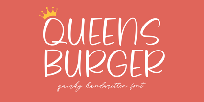 Queens Burger is a Quirky Handwritten Font. Whether you’re using it for crafts, digital design, presentations, or making greeting cards, this font has the potential to become your favorite go-to font, no matter the occasion! This font only has allcaps letters. - also multilingual support Enjoy the font! Feel free to comment or feedback! Thank you!
 - Almond Cookie by Balpirick,
$15.00 Almond Cookie is a Monoline Handwritten Font. Whether you’re using it for crafts, digital design, presentations, or making greeting cards, this font has the potential to become your favorite go-to font, no matter the occasion! This font only has allcaps letters. - also multilingual support Enjoy the font! Feel free to comment or feedback! Thank you!
 - Write Marker by Balpirick,
$15.00 Write Marker is a Bold Marker Font. Whether you’re using it for crafts, digital design, presentations, or making greeting cards, this font has the potential to become your favorite go-to font, no matter the occasion! This font only has allcaps letters. - also multilingual support Enjoy the font! Feel free to comment or feedback! Thank you!
 - Delgado by Gaslight,
$30.00 Delgado is a narrow elegant serif font with drops. Delgado is a good choice for large journal titles and small amounts of text. This font was made for one of the independent magazine - but it all went wrong and Delgado was freed from the shackles and went to the free swimming. A large number of both Latin and Cyrillic ligatures makes Delgado playful and at the same time it remains faithful. Delgado received a citation for excellence in type design the in international competition "Modern cyrillic 2014".
 - Plathorn by insigne,
$24.00 Vast and untamed, the American West once stretched as free and wild as imagination itself. Still beautiful, the Wild West of long ago and the new West of today is now to be found in insigne’s new face, Plathorn. That’s right, folks. When the West called, Jeremy Dooley reached up like Pecos Bill, grabbed it by the reins and pulled it in, then using its wide, roaming elements to design this functional font that still has an unbroken spirit burning deep inside. This down right, no-nonsense, orthodox face leaves off any of that extra fancy stuff that doesn't belong on a ride. Plathorn comes with a family of cowhands as wide as the Rockies, bringing specifically tailored condensed and extended sub-families along with it too. By design, it’s not very obtrusive like its unorthodox reversed tension brethren. Leave those for the next font rodeo. This mount features barely a hint of a serif that hearkens back a hundred years or so to sign painters and package lettering artists of early twentieth century. They're sure to put the sharpness, gumption and grit you need into your copy. So grab a tall glass of Plathorn and drink in the deep taste of America’s big country. Put it in your next magazine. Put it in your brand. This typeface’s offbeat appeal is bound to bring a bit of wild U.S. to your free-spirited work.
 - DBXLNightfever by VetteLetters,
$- DBXL Nightfever was originally designed by Donald Beekman in 2001 for the disco-techno-house record label of the same name, an imprint of United Recordings. Geometric and gridded, with a solid sci-fi techno feel, Nightfever still contains a lot of soul. Three additional wider weights were added for more design flexibility, as well as italics for all widths. After the record label was terminated the Nightfever fonts were used for many other DBXL design projects. It was put online for free download first in 2008, this year (2019) the design got more refined with additional accurate kerning and spacing. All fresh and new, ready for a new space age!
 - Linkus by João Henrique Lopes,
$25.00 The name ‘Linkus’ makes reference to the internet and its power to unite humanity, as well as to Linkus’ distinctive design, where the whole character is unified by a single, unbroken line – without sacrificing its elegance and readability. Linkus is based on the aesthetic decision of having a single, unsplit line forming every character, with a smooth transition of the different line directions, in order to strenghten the unity of form and create a singular fluxus throughout the glyph. Different from most other futuristic fonts (e.g. Slazer), who have an aggressive look, Linkus has a more sensible, refined aura. This display futuristic typeface is meant to be used whenever the subject is technology, cellphones, electronics, internet, computers or science in general, as Linkus creates a feeling of modernity, cleanness, efficiency and high-tech sophistication.
 - Gia by XO Type Co,
$40.00 Gia is 7 weights, true small caps and unicase options, designed after iconic letterforms of the 1960’s to 1980’s. In the early years of the American tech revolution, when Silicon Valley was more closely identified with Dallas, Texas, a curious type of letterform began to appear—strict in geometry, and curiously minimal in geometry and stroke, making it easier to be read by machine-readers, and people more used to reading machine-generated typography. Coders! As the years went on, this kind of sinewy, curved letterform began popping up in logotypes and music videos and upright video games: NASA, The Buggles, Atari, Pong, Sega, Namco, Stern, Devo, Apple. Gia pays homage to that letterform, and is named after Gia Carangi, the iconic face of early 1980’s pop fashion.
 - Space Throne by Mans Greback,
$59.00 Space Throne is a technological sci-fi typeface drawn and created by Mans Greback between 2018 and 2021. A rough digital typeface, this futuristic lettering has a high-tech look with a touch of apocalyptic decay. Space Throne is a LCD cyberpunk typeface family consisting of four styles: In addition to the eroded Regular style, it has the clean weights Thin, Medium and Bold. The font is built with advanced OpenType functionality and has a guaranteed top-notch quality, containing stylistic and contextual alternates, ligatures and more features; all to give you full control and customizability. It has extensive lingual support, covering all Latin-based languages, from North Europe to South Africa, from America to South-East Asia. It contains all characters and symbols you'll ever need, including all punctuation and numbers.
 - Hargloves by Heypentype,
$17.99 Hargloves is a modern sans serif font family. The overall design shapes taken from advance engineering technology themes in various industries like motorsports, biotech, games, architecture, robotics, and aerospace tech. A distinct visual characteristic of this font family can be found on 'G','O','P','Q', and 'R' letter. Each glyph design combined a geometric shapes and stylished ink-traps with parabolic curves. The design of the glyph curves taken from fast corner often found on motorsports circuit, when diagonal glyph shapes taken from aerodynamic in machine engineering and kinetic movement on sports. Hargloves consist of 12 font with 6 weight: From thin to Bold with each matching italics.It also contains extras 4 Icons designed specifically for sports entertainment. Hargloves support for most western languages and several opentype features.
 - Space Asia by Scoothtype,
$5.00 SPACE ASIA was born in the modern era which was inspired by the letters found in various print and digital media. Comes with a modern and futuristic style that will rock your great design! It is suitable for you to use in logotype designs, games, posters, movies, typography, t-shirts, tickets, and other modern designs. This is a very technical typeface and is great for use in projects related to sci-fi, science, and electronic music. This tech-savvy but fun-looking font will break between technology, science, fiction, and boundary art. The alternative characters in this font were divided into several OpenType features such as Stylistic Alternates, Stylistic Sets, and Ligature. The OpenType features can be accessed by using the OpenType program such as Adobe Illustrator, Adobe Photoshop, and Adobe InDesign.
 - Kicker FC by Arkitype,
$16.00 Kicker FC is a typeface created for the love of sport, it has all the right elements to make for a great sports display font to give your brand and art work the right look and feel in this genre. It has a great variation in weights, stylistic alternates to provide flexibility and to add more customisation a shadow version for each weight to give your typography a custom graphic look and feel. Kicker FC is perfect for use in various sports categories, college sports, baseball, basketball, football and as show in all the poster images and more specifically the name Kicker FC, soccer. Not only is the typeface a perfect fit for sport, it works just as well for beverage, tech and various other industries. Narrow in width provides great eye catching headlines.
 - Neonbox by Putracetol,
$22.00 Introducing a new Futuristic Display Typeface Called “Neonbox”. Inspired from Modern Style, Digital, Neon Light, Futuristic Neon Art. Neonbox best uses for Logo, cover, poster, branding, UI, Titles, and many more. Neonbox is also support multi language. To access the alternate glyphs, you need a program that supports OpenType features such as Adobe Illustrator CS, Adobe Photoshop CC, Adobe Indesign and Corel Draw.


