10,000 search results
(0.106 seconds)
- Redeye by Aboutype,
$24.99A decorative Sans Serif, mechanically drawn and intended for display use at 24 point and above. Complements a wide range of text typefaces. Redeye Sans requires subjective display kerning and compensation. - Mi Negra by Letritas,
$25.00 Mi negra is a funny and hilarious typography designed especially for children, thought and created by Isabel de Gregorio. It could be described as an original combination between a semi-handwright and semi sans-serif font. Thanks to its structure and nice endings "Mi Negra" is recommended for composing short texts (logotypes, packing, posters, etc.). It may similarly be used for illustrations and comics, as well as in printing press works for children from 6 to 13 years old for instance. Mi Negra has been conceived to be a useful support in all kinds of illustrations works (please note that Isabel, the type designer, considers herself primarily an illustrator). The font designer of Mi Negra tells that every time she needed to provide some text data (i.e. in children infographies) and needed to make them more understandable and suitable for children, she used this typography. The former idea was than to create a font who could be a second option to comic sans, but as the project started to reveal its forms, it was clear that it was revealing another connotation and its own character. In this way, Mi Negra went on modifying its forms and the more it developed, the more it was showing its new characteristics and concepts. The family is composed of three weighs: Light, regular and black. It provides also interesting functional ligatures. It also includes a dingbat with nice doggies. It has 434 characters and can work with 208 languages.
 - Capitolium 2 by TypeTogether,
$58.00 Capitolium was designed in 1998 at the request of the Agenzia romana per la preparatione del Giubileo for the Jubilee of the Roman Catholic Church in 2000. This type design was the central part of the project for a wayfinding and information system to guide pilgrims and tourists through Rome. Capitolium also continues Rome’s almost uninterrupted two-thousand-year-old tradition of public lettering . It is a modern typeface for the twenty-first century and strongly related to the traditions of Rome. Soon after the completion of this project Unger began contemplating the possibility of bringing the atmosphere of this design to newspapers. Though Capitolium works well in most modern production processes and also on screens, it is too fragile for newsprint. For newspapers sturdier shapes were required as well as more characters to a line of text, and Capitolium News has a bigger x-height than Capitolium. Capitolium News is a thoroughly modern newsface, with classic letterforms linked to a strong tradition. Capitolium News for running text comes in the variations regular, italic, semibold, semibold italic, bold and bold italic. As is possible with most of Unger’s type designs, Capitolium News can be condensed and expanded without any harm to the letterforms. The update to this beautiful font family, Capitolium News, includes the addition of over 250 glyphs featuring full Latin A language support, new ligatures, 4 sets of numerals, arbitrary fractions and superiors/inferiors. Furthermore, kerning was added and fine tuned for better performance.
 - Helvetica Hebrew by Linotype,
$65.00Helvetica is one of the most famous and popular typefaces in the world. It lends an air of lucid efficiency to any typographic message with its clean, no-nonsense shapes. The original typeface was called Neue Haas Grotesk, and was designed in 1957 by Max Miedinger for the Haas'sche Schriftgiesserei (Haas Type Foundry) in Switzerland. In 1960 the name was changed to Helvetica (an adaptation of Helvetia", the Latin name for Switzerland). Over the years, the Helvetica family was expanded to include many different weights, but these were not as well coordinated with each other as they might have been. In 1983, D. Stempel AG and Linotype re-designed and digitized Neue Helvetica and updated it into a cohesive font family. At the beginning of the 21st Century, Linotype again released an updated design of Helvetica, the Helvetica World typeface family. This family is much smaller in terms of its number of fonts, but each font makes up for this in terms of language support. Helvetica World supports a number of languages and writing systems from all over the globe. Today, the original Helvetica family consists of 34 different font weights. 20 weights are available in Central European versions, supporting the languages of Central and Eastern Europe. 20 weights are also available in Cyrillic versions, and four are available in Greek versions. Many customers ask us what good non-Latin typefaces can be mixed with Helvetica. Fortunately, Helvetica already has Greek and Cyrillic versions, and Helvetica World includes a specially-designed Hebrew Helvetica in its OpenType character set. Helvetica has also been extende to Georgian and a special "eText" version has been designed with larger xheight and opened counters for the use in small point sizes and on E-reader devices. But Linotype also offers a number of CJK fonts that can be matched with Helvetica. Chinese fonts that pair well with Helvetica: DF Hei (Simplified Chinese) DF Hei (Traditional Chinese) DF Li Hei (Traditional Chinese) DFP Hei (Simplified Chinese) Japanese fonts that pair well with Helvetica: DF Gothic DF Gothic P DFHS Gothic Korean fonts that pair well with Helvetica: DFK Gothic" - Helvetica Thai by Linotype,
$149.00Helvetica is one of the most famous and popular typefaces in the world. It lends an air of lucid efficiency to any typographic message with its clean, no-nonsense shapes. The original typeface was called Neue Haas Grotesk, and was designed in 1957 by Max Miedinger for the Haas'sche Schriftgiesserei (Haas Type Foundry) in Switzerland. In 1960 the name was changed to Helvetica (an adaptation of Helvetia", the Latin name for Switzerland). Over the years, the Helvetica family was expanded to include many different weights, but these were not as well coordinated with each other as they might have been. In 1983, D. Stempel AG and Linotype re-designed and digitized Neue Helvetica and updated it into a cohesive font family. At the beginning of the 21st Century, Linotype again released an updated design of Helvetica, the Helvetica World typeface family. This family is much smaller in terms of its number of fonts, but each font makes up for this in terms of language support. Helvetica World supports a number of languages and writing systems from all over the globe. Today, the original Helvetica family consists of 34 different font weights. 20 weights are available in Central European versions, supporting the languages of Central and Eastern Europe. 20 weights are also available in Cyrillic versions, and four are available in Greek versions. Many customers ask us what good non-Latin typefaces can be mixed with Helvetica. Fortunately, Helvetica already has Greek and Cyrillic versions, and Helvetica World includes a specially-designed Hebrew Helvetica in its OpenType character set. Helvetica has also been extende to Georgian and a special "eText" version has been designed with larger xheight and opened counters for the use in small point sizes and on E-reader devices. But Linotype also offers a number of CJK fonts that can be matched with Helvetica. Chinese fonts that pair well with Helvetica: DF Hei (Simplified Chinese) DF Hei (Traditional Chinese) DF Li Hei (Traditional Chinese) DFP Hei (Simplified Chinese) Japanese fonts that pair well with Helvetica: DF Gothic DF Gothic P DFHS Gothic Korean fonts that pair well with Helvetica: DFK Gothic" - Helvetica Monospaced Paneuropean by Linotype,
$89.00Helvetica is one of the most famous and popular typefaces in the world. It lends an air of lucid efficiency to any typographic message with its clean, no-nonsense shapes. The original typeface was called Neue Haas Grotesk, and was designed in 1957 by Max Miedinger for the Haas'sche Schriftgiesserei (Haas Type Foundry) in Switzerland. In 1960 the name was changed to Helvetica (an adaptation of Helvetia", the Latin name for Switzerland). Over the years, the Helvetica family was expanded to include many different weights, but these were not as well coordinated with each other as they might have been. In 1983, D. Stempel AG and Linotype re-designed and digitized Neue Helvetica and updated it into a cohesive font family. At the beginning of the 21st Century, Linotype again released an updated design of Helvetica, the Helvetica World typeface family. This family is much smaller in terms of its number of fonts, but each font makes up for this in terms of language support. Helvetica World supports a number of languages and writing systems from all over the globe. Today, the original Helvetica family consists of 34 different font weights. 20 weights are available in Central European versions, supporting the languages of Central and Eastern Europe. 20 weights are also available in Cyrillic versions, and four are available in Greek versions. Many customers ask us what good non-Latin typefaces can be mixed with Helvetica. Fortunately, Helvetica already has Greek and Cyrillic versions, and Helvetica World includes a specially-designed Hebrew Helvetica in its OpenType character set. Helvetica has also been extende to Georgian and a special "eText" version has been designed with larger xheight and opened counters for the use in small point sizes and on E-reader devices. But Linotype also offers a number of CJK fonts that can be matched with Helvetica. Chinese fonts that pair well with Helvetica: DF Hei (Simplified Chinese) DF Hei (Traditional Chinese) DF Li Hei (Traditional Chinese) DFP Hei (Simplified Chinese) Japanese fonts that pair well with Helvetica: DF Gothic DF Gothic P DFHS Gothic Korean fonts that pair well with Helvetica: DFK Gothic" - Hnm by Krown Creative Factory,
$5.00 Hnm is a Geometric Sans Typeface with some bold and round glyphs to give a sense of confidence but also not rigid or strictly its a jovial Happy Typeface It can be used to create a range of design projects like posters, advertising and marketing flyers and even to printed items. It just requires you to use your imaginative strength and your design projects will look more native and even better pass your message. With this typeface you can create a party poster, movie flyer, advertising and marketing posters, it can also be used on branding items, Craft design, book covers, music cover arts, or any purpose of your choice to make your designs have that bold and confident look without looking too serious, feel free to play with this typeface.
 - Boundar by Huruforia,
$8.00 Boundar is a sans serif font with a Geometric style, this font consists of 6 Weights and 208 Glyph. Boundar is taken from the Indonesian word "Bundar" which means circle because in this font there are so many circle elements in the manufacturing process. And I (Grapya) as the designer in this font hope, Boundar Typeface can be useful for you. If there is an error or anything that is less pleasing, you can contact us via our email, we will be happy to receive a review from you so that my team and I can be better in the future. and please note that every font that we upload in front of your monitor screen must have been tested by the curator of MyFonts. Thank You, Grapya & Suratoria Team
 - Parnas by Larin Type Co,
$20.00 Parnas is an amazing font that can be used in a classic style or in a more expressive and elegant with alternative and ligatures, of which there are many. Set the style and mood of your design, because just a few touches can absolutely change it. With it, you can easily realize all your ideas. Parnas family includes a serif and sans serif font Classical forms, smooth lines, sharp serifs, weightless style, various weaves, long tails, all this and much more will give you many options for creating your project and will not leave indifferent even the most demanding. This font is easy to use, has OpenType features. This font has 900 glyphs and includes: - 190 Alternates for Uppercase - 168 Alternates for Lowercase - 74 Ligatures for Uppercase - 70 Ligatures for Lowercase - 10 illustrations - Multilingual support
 - Narrow Way by Ingrimayne Type,
$9.00 NarrowWay is a family of 18 condensed and ultra-condensed sans-serif typefaces. The family started with the ultra-condensed widths, then the condensed and regular widths (the regular is still quite condensed) were added. All widths have three weights and each weight has an italics style. These 18 styles lack a true lowercase but rather have a set of alternative characters, some based on lower-case forms, on the lower-case keys. Some alternative letters can be reached with the OpenType feature of stylistic sets. The character spacing in most of the styles is quite loose and it can be tightened with an application's character spacing if needed. These typefaces are display faces that can be useful for squeezing tall lettering into tight spaces. They are not readable at small point sizes.
 - Block Marys by Kulokale,
$17.00 Block Marys is a blocky display sans font. Block Marys is well-suited for advertising, branding, logotypes, packaging, titles, headlines and editorial design. This font comes in 4 styles, Regular, Oblique, Outline, and Outline Oblique Version. This font is encoded with Unicode PUA, which allows full access to all additional characters without having special design software. Mac users can use Font Book, and Windows users can use Character Map to view and copy one of the extra characters to paste into your favorite text editor / application. We highly recommend using a program that supports OpenType features and Glyphs panels such as Adobe Illustrator, Adobe Photoshop CC, Adobe InDesign, or CorelDraw, so you can see and access all Glyph variations. We hope you enjoy the font. Thanks for purchasing and have fun!
 - Teimer Std by Suitcase Type Foundry,
$75.00Typographer and graphic designer Pavel Teimer (1935-1970) designed a modern serif roman with italics in 1967. For the drawing of Teimer he found inspiration in the types of Walbaum and Didot, rather than Bodoni. He re-evaluated these archetypes in an individual way, adjusting both height and width proportions and modifying details in the strokes, thus effectively breaking away from the historical models he used as a starting point. Teimer's antiqua has less contrast; the overall construction of the characters is softer and more lively. The proportions of the italics are rather wide, making them stand out by their calm and measured rhythm. This was defined by the purpose of the typeface, as it was to be utilised for two-character matrices. The long serifs are a typical feature noticeable throughout the complete family of fonts. In 1967, a full set of basic glyphs, numerals and diacritics of Teimer's antiqua was submitted to the Czechoslovak Grafotechna type foundry. However, the face was never cast. At the beginning of 2005 we decided to rehabilitate this hidden gem of Czech typography. We used the booklet "Teimer's antiqua - a design of modern type roman and italics", written by Jan Solpera and Kl‡ra Kv’zov‡ in 1992, as a template for digitisation. The specimen contains an elementary set of roman and italics, including numerals and ampersands. After studying the specimen, we decided to make certain adjustments to the construction of the character shapes. We slightly corrected the proportions of the typeface, cut and broadened the serifs, and slightly strengthened the hair strokes. In the upper case we made some significant changes in the end serifs of round strokes in C, G and S, and the J was redrawn from the scratch. The top diagonal arm of the K was made to connect with the vertical stem, while the tail of Q has received a more expressive tail. The stronger hairlines are yet more apparent in the lower case, which is why we needed to further intervene in the construction of the actual character shapes. The drawing of the f is new, with more tension at the top of the character, and the overall shape of the g is better balanced. We also added an ear to the j, and curves in the r have become more fluent. To emphasise the compact character of the family, the lining numerals were thoroughly redrawn, with the finials being replaced by vertical serifs. The original character of the numerals was preserved in the new set of old-style figures. To make the uppercase italics as compact as possible, they were based on the roman cut rather than on the original design. The slope of lowercase italics needed to be harmonised. The actual letter forms are still broader than the characters in the original design, and the changes in construction are more noticeable. The lower case b gained a bottom serif, the f has a more traditional shape as it is no longer constricted by the demands of two-matrice casting, the g was redrawn and is a single storey design now. The serifs on one side of the descenders of the p and q were removed, the r is broader and more open. The construction of s, v, w, x, y, and z is now more compact and better balanced. Because Teimer was designed to make optimal use of the OpenType format, it was deemed necessary to add a significant amount of new glyphs. The present character set of one font comprisess over 780 glyphs, including accented characters for typesetting of common Latin script languages, small caps and a set of ligatures, tabular, proportional, old style and lining, superscript and fraction numerals. It also contains a number of special characters, such as arrows, circles, squares, boxed numerals, and ornaments. Because of its fine and light construction, the original digitised design remained the lightest of the family. Several heavier weights were added, with the family now comprising Light, Light Italic, Medium, Medium Italic, Semibold, Semibold Italic, Bold, and Bold Italic. - Halogen Flare by Positype,
$29.00 When I released Halogen, I asked ‘Who doesn't want or need an expansive contemporary extended sans that has a sense of style and swagger… what if it had a lowercase, small caps and various numeral options… how could you say no?’ Go, click on the Halogen link and read on, if you're interested. Halogen was well-received, so I decided to take it further with Halogen Flare (the name kinda tips you off as to what kind of typeface it is, don't ya think?). As always, I prefer not to take short cuts and provide an anemic offering of glyphs — a modern typeface offered today must provide more than just the basics and this one does — lowercase, smallcaps, old style numerals, tabular forms, stylistic and titling alternates, fractions, case-sensitive features, and even an alternate uppercase ordinal set is included. Now, go make cool print and digital things with it.
 - Flink Neue by Identity Letters,
$45.00 Geometric typefaces are a staple in every typographer’s toolbox since the 1920s. It was a time when iconic faces such as Futura, Erbar, and Kabel appeared on the scene and turned the world of type upside-down. Inspired by those early giants as well as later epigones with a legacy of their own (such as 1970’s Avant Garde Gothic), Flink Neue is the Identity Letters take on this genre, characterized by a clean and focused appearance. With neat shapes and the look of pure geometry, Flink Neue adapts to a vast range of applications and topics, from the fine print in contract to website body copy to logo design to billboard-size slogans. Its x-height is considerably larger than in classic geometric sans-serif fonts; its proportions are harmonized as opposed to strictly constructed. This makes for a more contemporary look, setting it apart from the classics. With three different widths, Flink is a true all-rounder. Geometric fonts are usually quite wide, which often leads to text-settings problems with headlines or small print. The Condensed and Compressed variants of Flink Neue solve this problem easily. This font family comes along in 18 weights from Thin to Black with matching Italics. There are almost 1400 characters per style, including nine stylistic sets that offer variations to the look and feel of Flink Neue, making it even more versatile. Besides the default mood of Flink Neue, there is also a Text and Bauhaus variant, where different letters have been changed to create a new mood. In theory, you just need one single font file to change between all three moods, but to make it easier for you, we also exported each mood within a separate file. Plenty of additional Open Type Features like ligatures, small caps, case sensitive forms, old-style figures, tabular figures and symbols make Flink Neue a valuable tool for the discerning typographer. Flink Neue is the reimagination of a classic genre, designed to suit the needs of our time.
 - Two Turtle Doves - 100% free

- Tipo Metro CDMX by Ixipcalli,
$- La tipografía “Tipo Metro CDMX” fue desarrollada por Lance Wyman como parte del proyecto “Metro” desde los años setenta, y es uno de los elementos clave de la cultura visual del transporte del Sistema de Transporte Colectivo Metro (STC Metro). Este estilo se ha convertido en el icónico fundamental del trasporte público para los residentes de la Ciudad de México. En esta edición, los tipos minúsculas son una adaptación “no oficial” para el Tipo Metro CDMX, enriqueciendo la tipografía a un estilo visual de altas y bajas, por lo que se prescinde del diseño base como trabajo propio para enfatizar los tipos minúsculas exclusivamente, además de que se han añadido algunos caracteres de acentuación extendiendo su uso a otros lenguajes. Los tipos son una nueva propuesta por Ixipcalli en el presente año 2023. The “Tipo Metro CDMX” typeface was developed by Lance Wyman as part of the “Metro” project since the 1970s, and is one of the key elements of the visual culture of transportation of the Metro Collective Transportation System (STC Metro). This style has become the iconic fundamental of public transportation for the residents of Mexico City. In this edition, the lowercase types are an “unofficial” adaptation for the Tipo Metro CDMX, enriching the typography with a visual style of highs and lows, so the base design is dispensed with as my own work to emphasize the lowercase types exclusively, In addition, some accentuation characters have been added, extending their use to other languages. The types are a new proposal by Ixipcalli in the current year 2023.
 - Bipolar Decorative by VersusTwin,
$45.00 A bolder condensed version of the Bipolar family of fonts, Bipolar Decorative has a level of ornamental sophistication and balancing that is surprising for its narrow spiny appearance. It's a neo-blackletter typeface that screams for experimental as well as serious use.
 - Speechless by Gassstype,
$23.00 Hello Everyone, introduce our new product Speechless is a Playful Handwritten Font with a natural handwritten feel. This handmade font will make your design has a beautiful natural touch for each details. It is perfect for any design project as Invitation,logo, book cover, craft or any design purposes. That is why Speechless has authentic and strong characteristic more natural look. You can activate Ligatures OpenType panel.
 - Ancient History by Kaer,
$20.00 Hey guys! I'm happy to introduce you my new Ancient history based font. Recently I made an adventure to the North and visited a rock art attraction. This font based on pictograms I saw. The font may be used for creating ancient prints, logo design, clothing embroidery, product packaging, historical header, etc. What you will get: * Uppercase and lowercase * Multilingual support * Numbers * Symbols * Punctuation
 - Hazelle by Heypentype,
$20.00 Hazelle is a typeface suitable for elegant, upscale, classic, luxury editorial content as well as headlines, sub-headings, and logo designs. It can enhance the tone of your messages when used in headlines, and it also gives a unique character when used in logo designs. This updated version comes with variable fonts version and more discretional ligatures and new alternate despite a major glyph shape improvements.
 - Angry&Hungry by Haksen,
$12.00 Hello Everybody, I just want to introduce my new twin cute fonts in one. These are "Angry & Hungry". As the preview images, This font comes with funny, cute taste. These fonts can be used in everything your requirement. What's include : - Angry & Hungry otf - Angry &Hungry Shadow otf - Angry & Hungry Script otf - Angry & Hungry Script Shadow otf If any question, please contact me. Happy Designs, Haksen
 - Haberdines by Gassstype,
$23.00 Hello Everyone, introduce our new product font Haberdiness, inspired from Punk Music and street culture, recreated for modern branding. You can use and enjoy this Font for anything from promotional material and poster quotes, to product packaging, merchandise and branding projects And this font perfect for logo, packaging, magazine, sport, poster, apparel, title, social media post, ad banner, book cover, poster quotes, greeting cards and advertising.
 - Nightcap JNL by Jeff Levine,
$29.00 It's not a new idea - combining two typefaces into one design, but when it works, it makes for an interesting novelty font. Nightcap JNL is a fun typeface that can be used by itself, or along with the two original fonts that comprise it (Parkitecture JNL and Typesetter Oblique JNL) to create some wonderful retro headlines. Nightcap JNL contains only the alphabet, numbers and basic punctuation.
 - Ring Eyes by Ochakov,
$11.00 Now you can see... the new direction of the big family called Ring - Ring Eyes! That's a very unique Ring & truly devoted. There are only four styles, but they are all very important. Ring Eyes font like our eyes held a million stories. Ring Eyes font like other of the Ring Family is the perfect choice for headlines, logos, branding, packaging, publications, and much more.
 - Snow Atisen by Differentialtype,
$10.00 Snow Atisen is a festive and fun handwritten font. Perfect for adding a touch of holiday magic to Christmas cards, New Year's decorations, winter designs and other fun projects. Comes with 3 styles that you can mix and match. This font has the potential to become your favorite font of choice, whatever the occasion, spread the joy of the season with this unique font.
 - South Pacific by Nicky Laatz,
$26.00 Say hello to South Pacific Marker , a new bold inky font with a casual handwritten feel. South Pacific includes a large selection of natural-looking ligatures and extra alternate characters ( see previews) in it's Opentype Features - make sure you have your stylistic alternates switched on to enjoy all the extras. Four handy swashes are also included in the glyphset - accessible via your glyphs panel.
 - Matryoshka by Volcano Type,
$19.00 Matryoshka is a display layering type family which is inspired by the Russian wooden doll. The family contains eight different weights from XXS (thin) to XXL (fat) + Pregnant (all in one). The design is based on an elaborate and complex grid, so each font fits perfectly into the other. With the Matryoshka family the typographer can create millions of new solutions. Play with it!
 - Billguva by Zealab Fonts Division,
$14.00 Billguva is a new beautiful & unique typeface from Bagerich Type Foundry, designed by Reza Rasenda & Riska Candra Dewi. The capitals have a set of unique alternates that can be used to give more personality when needed. Create unique & beautiful logotype, use it as an elegant solution for your next magazine layout, or choose Billguva for any graphics that require a sleek look with a elegant flair.
 - St Friska by Stereotypes,
$34.00 St Friska, based on old movie title lettering, is made just for headlines. It comes with a slight touch and feeling of art deco but it’s designed to be contemporary in 2010 and beyond. Friska comes with a big bunch of OpenType features, so a designer can play with it like Lego, using it alongside old or new typefaces. It has stylistic sets and lots of ligatures.
 - Breakable by Gassstype,
$23.00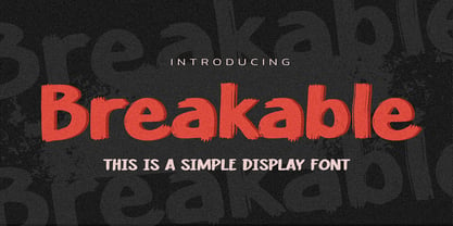 Hello Everyone, introduce our new product Breakable This Is a Simple Display Font with a natural feel. This handmade font will make your design has a beautiful natural touch for each details. It is perfect for any design project as Invitation,logo, book cover, craft or any design purposes. This font is PUA encoded which means you can access all of the magical glyphs with ease!
 - South East by Girinesia,
$17.00 South East is stylish handwritten font. South East looks original and can be used for all your project needs. South East would perfect for Youtube Cover or Thumbnails, sports flyers, mockup , tote bags, kids books, scrapbooks, logos, icons, phrases or quotes for winter greeting cards (Halloween, Christmas or New Year holidays), photo overlay, short phrases, gift shops tags, presentation in social media Pinterest, Instagram, Facebook and more.
 - Averago by Gassstype,
$22.00 Introducing of our new product Averago it is a Unique Handmade Font and also that will make your designs look modern, display font. Can make it easier to convey the message in your design. Use for awesome display, labeling, movie sceen, poster, movie title,quotes, posters, DIY projects, branding, packaging, greeting cards, websites, photos, photography overlays, signs, window art, tags and so much more!
 - Murisa Ulyana by Murisa Studio,
$10.00 we would like to introduce one new font which we have released in this march. Murisa Ulyana is our newest font. Still inspired by the oval shape, this font is very cute and eye-catching. It is very fitting if you use it for designs that are cheerful and happy. You can also use it for baby and children's product names. Get it right now.
 - Cabarga Cursiva by ITC,
$29.00Cabarga Cursiva is the work of the father and son team of Demetrio E. Cabarga and Leslie Cabarga, both New York designers. The details of the sharp strokes almost give the impression of a knife blade, whether straight or curved like a scimitar. The capitals should be used only as initials and are complemented by a robust lower case alphabet as well as alternate forms and ligatures. - Afjat Trends by Siwox Studios,
$65.00 Afjat Trends - Elegant & Humanist Display Font by Siwox Studios Introducing our new typeface project, Afjat Trends Light. High contrast with Modern Style this is perfect for branding, logos, invitation, sub-titles, phrases, text, and more. The narrow matrix can make it easy to customize and tracking space on long text use. Multi-Language Support Very Complete With Extended Latin, Cyrillic, and Greek glyphs, Symbols, Figures, Ligatures & Alternates.
 - Marquee by Design is Culture,
$39.00 In 1994 I took a picture of an old movie marquee in Times Square, New York City. 7 years later, I decided to design a typeface based on the big plastic letters found in those old marquees. I scanned in the picture I took and began to draw the letterforms. Like most of my font designs, the initial inspiration came from an urban environment.
 - Christmas Sheep by Stefani Letter,
$14.00 Christmas Sheep is a modern and relaxed display font. It embodies playfulness and authenticity and is the perfect choice for any children activity, school project, Christmas, New Year, Birthday and many more. Add this playful font to your designs and notice how it makes them come alive! This font is PUA encoded which means you can access all of the cute glyphs with ease!
 - Grayson 1940s Art Deco Typeface by Hipfonts,
$18.00 Grayson is a 1940s art deco typeface. The inspiration came from vintage store signs in London, New York, and other major cities. The font is clean, easy to read, and its letterforms are memorable which makes it perfect for branding. You can use this font for a wide variety of projects, possibilities are endless. The downloads comes with OTF and TTF versions of the font. Enjoy!
 - Rinse by Typodermic,
$11.95 Are you tired of stiff, uptight typefaces cramping your creative style? Introducing Rinse—the vintage t-shirt typeface that’s all about taking it easy. With its rough and ready look, Rinse is based on the classic Goudy Heavyface Italic, but with a far-out twist that’s perfect for all your laid-back messaging needs. The letter pair ligatures add some extra funk to break up the monotony of repeating letters, giving your text a natural and mellow feel. So why settle for boring, uptight fonts when you can let Rinse infuse your message with some classic retro style and fun-loving personality? Whether you’re designing a t-shirt, a poster, or just want to add a little vintage flair to your next project, Rinse is the typeface that will keep it cool. Most Latin-based European writing systems are supported, including the following languages. Afaan Oromo, Afar, Afrikaans, Albanian, Alsatian, Aromanian, Aymara, Bashkir (Latin), Basque, Belarusian (Latin), Bemba, Bikol, Bosnian, Breton, Cape Verdean, Creole, Catalan, Cebuano, Chamorro, Chavacano, Chichewa, Crimean Tatar (Latin), Croatian, Czech, Danish, Dawan, Dholuo, Dutch, English, Estonian, Faroese, Fijian, Filipino, Finnish, French, Frisian, Friulian, Gagauz (Latin), Galician, Ganda, Genoese, German, Greenlandic, Guadeloupean Creole, Haitian Creole, Hawaiian, Hiligaynon, Hungarian, Icelandic, Ilocano, Indonesian, Irish, Italian, Jamaican, Kaqchikel, Karakalpak (Latin), Kashubian, Kikongo, Kinyarwanda, Kirundi, Kurdish (Latin), Latvian, Lithuanian, Lombard, Low Saxon, Luxembourgish, Maasai, Makhuwa, Malay, Maltese, Māori, Moldovan, Montenegrin, Ndebele, Neapolitan, Norwegian, Novial, Occitan, Ossetian (Latin), Papiamento, Piedmontese, Polish, Portuguese, Quechua, Rarotongan, Romanian, Romansh, Sami, Sango, Saramaccan, Sardinian, Scottish Gaelic, Serbian (Latin), Shona, Sicilian, Silesian, Slovak, Slovenian, Somali, Sorbian, Sotho, Spanish, Swahili, Swazi, Swedish, Tagalog, Tahitian, Tetum, Tongan, Tshiluba, Tsonga, Tswana, Tumbuka, Turkish, Turkmen (Latin), Tuvaluan, Uzbek (Latin), Venetian, Vepsian, Võro, Walloon, Waray-Waray, Wayuu, Welsh, Wolof, Xhosa, Yapese, Zapotec Zulu and Zuni.
 - Koni by Anastasia Kuznetsova,
$17.00 Get to know the beautiful natural and neat font "Koni"! This beautiful neat retro sans-serif font with imperfect ink edges and a little sloppy shading is inspired by nature. This is a textured font in vintage style with capital letters. The letters here are clearly distinguishable, and interesting touches give it uniqueness. Eco-friendly fashion takes into account the health of consumers, the health of the planet. The font "Koni" is perfectly combined with any stylized graphics, watercolors, and also looks great on its own as part of a minimalist design. Play with letters to get different effects. Great for branding, invitation design, packaging design, quotes, label design and more. Font features: - A-Z; character set a-z; - 1 language (English); - numbers and punctuation marks, symbols. Fonts can be opened and used in any software that can read standard fonts, even in MS Word. No special software is required, and to get started. It is recommended to use it in Adobe Illustrator or Adobe Photoshop Made with love and magic ♡ Thank you for checking this out and feel free to write me a message if you have any questions! ~ Anastasia
