10,000 search results
(0.06 seconds)
- Gimmick Style by Sensatype Studio,
$15.00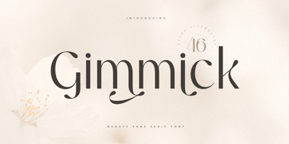 A Luxury Beauty Sans Serif font that we created special for elegant branding needs, with unique shape will be ready to add value of your brand. It so nice to leverage designer or product owner that need solutions to make their design look more stylish and modern. And specially for Gimmick font, We prepared any characters to help you create unlimited variations for your creative needs. Gimmick Luxury Beauty Sans Serif Font ready with: Unique Beauty Characters Preview as a inspirations that you can do with Gimmick font Ready with Lowercase and Uppercase characters Wish you enjoy our font. :)
 - Magnificent SS by Sensatype Studio,
$15.00 Magnificent is A Modern Feminine Vintage Font Magnificent font is a feminine retro modern vintage font with a fancy, playful, unique, and versatile vintage sans serif that you can combine to get a beautiful typography. It is a Sans Serif font with moderate contrast that perfect for branding projects, logo, wedding designs, social media posts, advertisements, product packaging, product designs, label, photography, watermark, invitation, stationery, and any projects, it makes with a high level of legibility. What's Included: Character set A-Z Uppercase & Lowercase Numerals & Punctuation Accented Characters (West Europe) Works on PC & Mac Wish you enjoy our font. :)
 - Daymore by Rillatype,
$15.00 Introducing, Daymore Font duo! Daymore is a duo font that complements each other. By using Daymore, you can simply use one font family without thinking about other fonts to complete the design you need. In the process of making this font, I was careful in choosing what font concept would be able to complement a bold sans serif font so that it could be balanced so that it would produce a blend of firm and strong sans serif fonts, as well as handwritten fonts that flowed naturally. The Daymore font duo is perfect for use as wedding invitations, branding, logos, etc.
 - HVD Comic Serif Pro by HVD Fonts,
$- So many designers hate Comic Sans. They think people who don't know design are overusing this funny little friendly font, which is nearly every time out of place. Some years ago, type designer Hannes von Döhren created a free alternative to Comic Sans. The difference: It has serifs and a much cooler look. The big success of the HVD Comic Serif pushed Von Döhren to create a Pro Version with an eastern, central and Western European language support. “The HVD Comic Serif should spread all over and make the world a little bit better.” says Hannes.
 - The Jakarta by XdCreative,
$29.00 Say hi to "The Jakarta" a stylish display sans typeface is the latest collection from @faldykudo "The Jakarta" basic technical and anatomy comes from the genetics of the "Magnify" family (Geometric classification of typefaces) with several stroke modifications and a combination smooth curves for a minimalist, elegant and modern sans serif. The Jakarta is perfect for the logo, product, headline or any of display design. The Jakarta has a complete characters A-Z, a-z (including stylistic Alternates), Numeral, Punctuations, and standard ligature. thanks, hope you would like and accept "The Jakarta" as part of your family. thank you in advance
 - Demiella by Keristyper Studio,
$14.00 Demiella is an elegant beauty sans serif. Simple letter shapes with playful swash & stylistic, keeping its legibility high. This font is good for logo design, Social media, Movie Titles, Books Titles, short text even long text letters, and good for your secondary text font with sans or serif. Featured: Standard Uppercase & Lowercase Numeral & Punctuation Multilingual : ä ö ü Ä Ö Ü ß ¿ ¡ Alternate & Ligature PUA encoded We recommend programs that support the OpenType feature and the Glyphs panel such as Adobe applications or Corel Draw. so you can use all the variations of the glyphs. Hope you enjoy our fonts!
 - Taronge by Sensatype Studio,
$15.00 Taronge - Urban Display Sans Serif that created special for Logo, Title and more stand out typography for sport and action. It's so perfect to add your style and headline overview for sport, technology, actions, and fighting theme. And specially for this font, we crafted for bold action style and modern feels so enjoy to create any project that will show your main idea out. Taronge - Urban Display Sans Seri ready with: Creative characters prepared to get best results Preview as a inspirations that you can do with Taronge font Ready with All Uppercase characters Wish you enjoy our font. :)
 - Lupio by Tour De Force,
$25.00 Lupio comes as 102nd family in our catalogue. It is geometric sans serif family with humanistic elements. Lupio family contains variable and classic versions, so you can pick which one suits better for you and your project. Classic version is additionally fine tunned to get overall character look more equalised and uniform. When it comes to distinction – in sea of dozen other sans serif famlies, we made Lupio decently recognizable. You won't mistaken him with others. Lupio is designed as working horse family, to be used in all possible situations – from websites to packages, editorial design and applications.
 - Arial Windows compatible by Monotype,A contemporary sans serif design, Arial contains more humanist characteristics than many of its predecessors and as such is more in tune with the mood of the last decades of the twentieth century. The overall treatment of curves is softer and fuller than in most industrial-style sans serif faces. Terminal strokes are cut on the diagonal which helps to give the face a less mechanical appearance. Arial is an extremely versatile family of typefaces which can be used with equal success for text setting in reports, presentations, magazines etc, and for display use in newspapers, advertising and promotions.
- Zirkel by Ondrej Kahanek,
$35.00 Zirkel is a geometric sans serif typeface which includes 16 fonts – eight weights and eight matching italics. Each character is geometrical, but optically corrected for better readability. Featuring austere lines, the font gains its strength in the final layout, which is created by the user. Zirkel Sans is suitable for headlines of all sizes, but it can be used in variety of long text as well. This font supports Western, Central and Eastern European languages, ligatures, alternate characters such as A, V, w, etc., and will find its place in the beginning, centre or end of any word. Geometry rulezz...
 - Halogen by Positype,
$29.00 Who doesn't want or need an expansive contemporary extended sans that has a sense of style and swagger… what if it had a lowercase, small caps and various numeral options… how could you say no? This was the foundational argument I made for myself when I drew the initial alphabet on my birthday last year (something I do each year, draw a new font, kind of a fun OCD thing). I wanted to see a wide, utilitarian sans that had more to it than just a basic character set and didn't resemble standard geometric models. As I continued sketching, the letterforms were being influenced more by my 'lettering tendencies' than the normal mechanical trappings of drawing flat, wide letters. The letters have retained aspects of letters created by hand — stresses, modulation, naturally ending terminals. Truncation and quick clipping of strokes became antithetical to the letterforms I drew, so I continued this once I brought the design into the computer. I kept it precise and dependable, but made every attempt to keep a conscientiously crafted typeface and not let it devolve into a grid-based drone. As such, it works just as well looking back in time as much as it does assuming a lead role in a sci-fi movie. Halogen does deliver and opts not to take a short cut and provide an anemic offering of glyphs — a modern typeface offered today must provide more than just the basics and this one does — lowercase, smallcaps, old style numerals, tabular forms, stylistic and titling alternates, fractions, case-sensitive features, and even an alternate uppercase ordinal set is included. So go make cool print and digital things with it, now.
 - Cloud - Personal use only

- Antagonist - Personal Use - Personal use only

- Syntha Nova - Personal use only

- Youtube Star - Personal use only

- HEX Font - Personal use only

- Plakative Grotesk - 100% free

- Gemina - Personal use only

- Eurofurence Modified - Unknown license

- Hyundai - Personal use only

- Signika - 100% free

- Comfortaa - 100% free

- St37k - 100% free

- Telegrafico - Unknown license

- Iso - Personal use only

- fresh - Personal use only

- PORT118 - Unknown license

- Alex - Unknown license

- VAL - Personal use only

- Magnum - Unknown license

- Pabellona (C) Tríplex - Personal use only

- Pungen - Unknown license

- Gear - Unknown license

- Planet Megapolis - Personal use only

- Vinyle by Lián Types,
$37.00 Bold, rounded and super cool. Those are the attributes of my latest font “Vinyle”, french for vinyl. In this epoque where all fields of Design are giving a lot of importance and attention to Typography and Lettering, I felt it was my duty to contribute with something that could really stand alone and ‘say something else’ that just words to be read. I've found that lately in the world, regarding a finished piece of design, the role of Typography (and of letters in general) went from being secondary, (like a minor player or a supporting actor) to the most important one. People are starting to understand the beauty of a well-done letter: they want their storefronts with unique scripts, they want to drink coffee surrounded by lettered blackboards, they want to buy books with astonishing covers with swashes ‘por doquier’. I'm more than happy to be alive in a present where even the most unimaginable friends of mine, (who couldn't spot differences between comic sans and helvetica before) are now conscious of the importance of a letter, or let’s say: Of the ‘voice’ of Typography. With Vinyle I tried to make a font with power. Following the nowadays trend of, let me say, “the vintage sans renaissance”. This time I put my brushes and nibs aside and experimented with something new. It wasn't easy, if you will pardon, for me to see swashes all over the place withouth the classic calligraphic ‘thick and thins’, but with after some weeks of work I started to love them. Like I already showed you in other creations (1) let me finish with the phrase: GEOMETRY IS SEXY! TIPS Vinyle has a lot of attitude, it shouts “here I am!” it really can ‘design an entire piece’ for you with just a word or two: It was designed with a 10 degree slant on purpose so the user may rotate it (like on the posters) that amount of degrees in order to see better results. Use Vinyle with the ‘fi’ standard ligatures activates for better kerning and ligatures! NOTES (1) See my font Selfie , the ‘little sister’ of Vinyle.
 - Galvantur by Ivangard Studios,
$12.00 Galvantur is a sans serif font, suitable for a wide range of applications. The main characteristic of this font is the slightly alien feel it can invoke, allowing it to really appear different and stand out, comparative to what other sans serifs may look like. The multiple styles included can further help customize your designs and projects, whether it's a body of text or an attention grabbing title. For example switching a block of text from regular style to oblique, can drastically change the overall appearance and feel of said text. Comes in 7 different styles - Regular, Oblique, Bold, Bold Oblique, Outlines, Bold Outlines and Oblique Outlines. To get an idea of the various styles, please check out the preview pictures or use the preview field to type in text. A full list of the glyphs included in this font can also be seen in the preview images. Galvantur supports Latin and Cyrillic based languages. The font includes a single alternative character for the letter "h". Because of the lack of ligatures and alternates, the font is rather standardized and will work with any and all software/applications.
 - Dirrrty by Hanoded,
$20.00 The Three Degrees had a song called 'Dirty Ol' Man'; Christina Aguilera danced around to the tune of 'Dirrrty' and my three kids leave everything that way after they have finished their meals, so I guess I really had no other option than to call this font: Dirrrty. Dirrrty is a brush font I painted in one go. It is quite dynamic, with some serious grunge in it. Dirrrty is all caps, but upper and lower case differ and can be interchanged. Comes with with a truly disgusting amount of diacritics.
 - Gravitational Pull by Hanoded,
$15.00 My 9-year old son Sam asks a lot (a LOT!) of questions. Like: ‘what killed the dinosaurs?’ (probably an asteroid), ‘what is the distance to Pluto’ (about 7.5 billion km), ‘how big is space’ (93 billion lightyears - give or take). I am pretty sure he asked me about gravity as well. Gravitational Pull is a messy pencil script font. It comes with a whole bunch of double-letter ligatures and some really wonky glyphs. And no, in its virtual form, this font is not subject to the Earth’s gravitational pull.
 - Deco Sketch JNL by Jeff Levine,
$29.00 An interesting hand lettered example of Art Deco lettering (minus the letter ‘L’) was spotted on Pinterest and served as the inspiration for Deco Sketch JNL. Because there was no attribution as to the age or source of the alphabet, it can only be surmised that it was a scan from a 1930s or 1940s source. The original showed many of the irregularities of pen lettering, and had rounded terminals. The digital version has been redrawn more uniformly with flat terminals. Deco Sketch JNL is available in both regular and oblique versions.
 - FF Nort by FontFont,
$72.99 FF Nort™ has all the design attributes that make for an exceptionally versatile print and web typeface – and it benefits from a distinct personality. Equally at home in long-form text copy or billboard size headlines, the family knows few boundaries. There is also a handcrafted neo-grotesque quality to the design, giving FF Nort a friendly mien and separating it from other industrial strength sans serif typefaces. Terminals are clipped at 90° angles to the stroke and counters are slightly condensed, saving space with no loss of legibility. The light weights have a subtle elegance, while the bold are commanding. All eight weights, and their italic companions, enjoy a large character set, with support for most Central and several Eastern European languages – including Cyrillic and Greek. Drawn by Jörg Hemker, the inspiration for FF Nort came from Transport, the typeface designed for Britain’s highway signage. Transport is formal, intellectual, and a model for modern street signage, but it was not intended for small sizes or continuous reading. Hemker took the basic structure of Transport and rebuilt it into a design that’s perfect for a wide range of contemporary hardcopy and digital imaging projects.


