7,173 search results
(0.011 seconds)
- Good Friday by Letterara,
$14.00 Good Friday is a Natural handwritten font. It was inspired by a brush pen, and is perfect for logos, t-shirts, branding, prints, Easter theme, Good Friday, Spring sale, and much more! This font is PUA encoded which means you can access all of the natural glyphs with ease! It also features a wealth of special features including ligatures.
 - Gold Empire by Rockboys Studio,
$23.00 Gold Empire is an incredibly unique and distinct blackletter font. It will add a unique touch to your designs. Use it for tattoo designs, logos, posters, book covers, albums and more!
 - Good Wish by Seemly Fonts,
$14.00 Good Wish is a striking display font. It can easily be matched to an incredibly large set of projects, so add it to your creative ideas and notice how it makes them stand out!
 - Gold Rush by FontMesa,
$25.00This old classic font has an interesting history, it was originally cut with lowercase by the Bruce Type Foundry in 1865 and listed as Ornamented No. 1514. Around 1903 the Bruce foundry was bought by ATF, in 1933 this font was revived by ATF as Caps only and was given the Gold Rush name but was sometimes called Klondike. A similar version of this font with lowercase and radiused serifs was produced by the James Conner's Sons Type Foundry around 1888. In the past other foundries such as the Carroll foundry, Type Founders of Phoenix and the Los Angeles Type Foundry have produced an all caps version of this font. After examining several printed sources of this font from more recent books I found that the original from Bruce's 1882 book was by far the best in design quality, it was also the only printed source that included the lowercase. New open faced, ornamented and distressed versions have been added to this old classic font, there are also many extended characters for Western, Central and Eastern European countries. The Gold Rush Trail OpenType version has alternate double letter pairs included in the font and will automatically be substituted when used in Adobe CS products or other software that takes advantage of OpenType features. Also available is a spurred version of this font listed under the name Gold Spur. - Gold Standard by FontMesa,
$30.00 Gold Standard got its start from a few letters found on an old Gold Certificate from 1882. From those few letters spelling out the word GOLD, the rest of the alphabet was designed to match. The lowercase design was based on lettering found on an old silver certificate from approximately the same year.
 - Good Sunset by Allouse Studio,
$16.00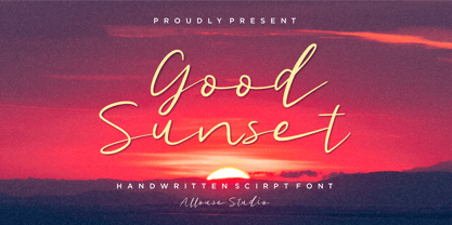 Good Sunset a Handwritten Script Font. Good Sunset come along with Multi-Lingual Support to fulfill your need. We highly recommend using a program that supports OpenType features and Glyphs panels like many of Adobe apps and Corel Draw, so you can see and access all Glyph variations. Good Sunset is perfect for any tittle, logo, product packaging, branding project, megazine, social media, wedding, or just used to express words above the background. Enjoy the font, feel free to comment or feedback, send me PM or email. Thank You!
 - Gold Brush by Illushvara,
$15.00 Gold Brush is a bold brushed display font. Its assertive and dramatic style makes this font a good fit for creating logos, branding, posters, and crafty DIY projects. What you get : Gold Brush. OTF If you have any question, don’t hesitate to contact me. Happy Designing !!! Thank You, Bayu Suwirya
 - HS Gold by Hiba Studio,
$69.00 HS Gold is based on some modern lines of Naskh calligraphy which supports Arabic, Persian and Latin with a Sans Serif with subtle round on stems and corners. The typeface has been optimized for corporate identity work, editorial design and modern projects when a contemporary and simple look with a similarity between Arabic and Latin is requested. It features swash, ligatures and swash ligatures. Its proportions allow high impact on the tightly set lines of big and small text alike. This font consists of two weights (regular and bold) which can constitute a striking addition to the library of Arabic and Latin contemporary fonts models that meet the purposes of various designs for all tastes and projects.
 - Good Butter by Twinletter,
$12.00 This font is created with original hand-drawn strokes for a relaxed, beautiful, and elegant feel, which is dazzling for a variety of food-themed design projects as well as other designs. also, beautiful abstract typography harmony in this font impression for a wide variety of design projects, including natural handwriting in digital form for designs, quote designs, for social media business designs, advertisements, trademarks, promotional banners, posts, posters, signatures, and all designs need handwriting or whatever design you want. This font is equipped with uppercase, lowercase, numbers, punctuation marks, swhases, and several variations on each character including multi-language.
 - African Gold by Scholtz Fonts,
$19.00 The name African Gold is associated with Johannesburg, the "City of Gold"; (the Zulu name for Johannesburg is eGoli). The font was so named for two reasons: the intricate African patterns within the characters of the font suggest the shafts and tunnels of a gold mine, and, as with a gold mine, the richness lies within. African Gold is a display font that is best used at larger sizes, however, it contains a full character set with all accents, special characters, diacritical marks and all the characters are carefully spaced and kerned. The numerals are mono-spaced so that they will line up correctly in columns of figures. The letters of the alphabet are spaced according to their width and are carefully kerned to create an attractive appearance.
 - Gold&Song by Letterena Studios,
$17.00 Gold&Song is a modern and classic serif font that has its own unique style. This typeface is perfect for luxury logos, books, fashion brands, magazines, apparel, quotes, and so much more.
 - Good Dog by Fonthead Design,
$- - FF Good by FontFont,
$72.99 FF Good is a straight-sided sans serif in the American Gothic tradition, designed by Warsaw-based Łukasz Dziedzic. Despite having something of an “old-fashioned” heritage, FF Good feels new. Many customers agree: the sturdy, legible forms of FF Good have been put to good use in the Polish-language magazine ‘Komputer Swiat,’ the German and Russian edition of the celebrity tabloid OK!, and the new corporate design for the Associated Press. Although initially released as a family of modest size, the typeface was fully overhauled in 2010, increasing it from nine styles to 30 styles, with an additional 30-style sibling for larger sizes, FF Good Headline. In 2014, the type system underwent additional expansion to become FontFont’s largest family ever with an incredible 196 total styles. This includes seven weights ranging from Light to Ultra, and an astonishing seven widths from Compressed to Extended for both FF Good and FF Good Headline, all with companion italics and small caps in both roman and italic. With its subtle weight and width graduation, it is the perfect companion for interface, editorial, and web designers. This allows the typographer to pick the style best suited to their layout. As a contemporary competitor to classic American Gothic style typefaces—like Franklin Gothic, News Gothic, or Trade Gothic—it was necessary that an expanded FF Good also offers customers both Text and Display versions. The base FF Good fonts are mastered for text use, while FF Good Headline aims for maximum compactness. Its low cap height together with trimmed ascenders and descenders give punch to headlines and larger-sized copy in publications such as newspapers, magazines, and blogs. There is even more good news about FF Good: it has something of a serif companion. Łukasz Dziedzic built FF Good to work together with FF More, creating in a powerhouse superfamily that is versatile in both its function and aesthetic.
 - Gold Spur by FontMesa,
$20.67 Gold Spur is a spurred version of the FontMesa Gold Rush set of fonts. Each version includes many extended characters for Western, Central and Eastern European countries. The Gold Spur Trail OpenType version has alternate double letter pairs included in the font and will automatically be substituted when used in Adobe CS products or other software that takes advantage of OpenType features. The $20.67 price of each font reflects the price of an ounce of gold in 1865 which was the year that the original Gold Rush font was created.
 - Good Faster by Mans Greback,
$59.00 Good Faster is a bold script typeface. In a quirky calligraphic style, this flowing font has a rustic look and soft lines. The Good Faster family consists of four styles: Regular, Bold, Italic and Bold Italic, complimenting each other for the greatest design possibilities. The font is built with advanced OpenType functionality and has a guaranteed top-notch quality, containing stylistic and contextual alternates, ligatures and more features; all to give you full control and customizability. It has extensive lingual support, covering all Latin-based languages, from Northern Europe to South Africa, from America to South-East Asia. It contains all characters and symbols you'll ever need, including all punctuation and numbers.
 - Good Friend by Senekaligrafika,
$12.00 “Good Friend” has hard strokes and signature style that speak to instant unique sensation. Take your creative projects to the highest level with this font. “Good Friend” will help you to create special and touching typographical design for your projects, for every day or the happiest day in life, greeting card, headings, flyer, product packaging, book cover, printed quotes, logos, and many more. It is really universal and modern font. The owner of endless possibilities!
 - Good Summer by Sipanji21,
$15.00 Good Summer is a handwritten font with playfull touch. It offers support of English Language. Standard punctuation glyphs are included. Great for crafters and graphics artist alike. Compatible with all operation systems. Its playfulness make it great for creative projects, be inspirational wall posters, logo, branding, and more.
 - Go by Canada Type,
$24.95 Five years into the 21st century and the promise of nanotechnology, high-end popular culture design seems to thrive on combining opposites and drawing a fine line between traditionally contradictory ideas. This is seen in modern society's usual cultural frontrunners - like consumer electronics, fashion items, music packaging and publications, where it is evident that traditionally complex marketing statements of fashionability and lifestyle are attempted with simple minimalism. But at the typographic end of this realm, the creative majority still uses old faces that help the modern statement only in passing. Some of the more adventurous creative professionals actively seek new elements to emphasize contemporary impact in their modern design. To those adventurous types (pun intended), Canada Type presents this new face called Go. It is very much a child of the new millennium, inspired by the unmistakable minimalist style of modern 21st century corporate logos, recent design shifts in electronic music and club-marketing collateral, and disc jockeys who have enthusiasm, energy, precision and total control of each and every vibration traveling from mixer to speakers. Go is an original modern techno-lounge face that offers the eyes pleasing collages of friendly minimal forms that give the words an impression of simplicity and depth at once. This is a font that prides itself on its precise grouping of elements and just enough original creativity in combining those elements. The precision builds the sharp edge sought for modern statements, while the creativity keeps the message rejuvenated, clear and interesting. Go's character set consists of a versatile and unexpected, yet mild mix of the uppercase and lowercase forms, with multiple variations on the majority of the letters. The e being a vertical mirror of G is only the first of the pleasant surprises. More than 30 alternates are inside the font. All the accented characters in Go have been meticulously (perhaps obsessively) drawn to be unusual for logos and short statements. Take a look at the character map and be ready for a space-age surprise. To borrow a Star Trek cliché, this font can Go where no font has gone before.
 - KG God Gave Me You - Personal use only

- KG God Gave Me You by Kimberly Geswein,
$5.00 This font is reminiscent of teen girl handwriting, with very round letters and a mixed-print-cursive style.
 - LT Aspirer Neue - 100% free

- LT Afficher Neue - 100% free

- Nike Combat Stencil - Unknown license

- Obti Sans Neue - 100% free

- Grandesign Neue Roman - Unknown license

- Grandesign Neue Serif - Unknown license

- Flower Sketch Neue by Okaycat,
$29.95 Okaycat presents "Flower Sketch Neue". Flower Sketch Neue contains beautiful illustrations of sunflowers, roses, tulips, olives, and leaves. You may also like our other fonts Flower Sketch and Orchids.
 - Neue Haas Unica by Linotype,
$53.99 The Neue Haas Unica™ family is an extended, reimagined version of the Haas Unica® design, a Helvetica® alternative that achieved near mythical status in the type community before it virtually disappeared. Originally released in 1980 by the Haas Type Foundry and designed by Team ’77 — André Gürtler, Erich Gschwind and Christian Mengelt— for phototypesetting technology of the day, the design was never successfully updated for today’s digital environments – until now. Toshi Omagari of Monotype Studio has given this classic a fresh, digital facelift with more weights, more languages and more letters to meet today’s digital and print needs. Available in 18 styles, the Neue Haas Unica family is remarkably appropriate for a wide range of applications, possessing a delicate gradation of weights and clear character shapes. The family's lighter weights are perfect for headlines and other large settings, as well as small blocks of copy at typical text sizes. The regular, medium and bold weights know no boundaries and the heavy and black designs are ideal for when typography needs to be powerful and commanding. Like the Neue Helvetica and Univers Next typefaces, the Neue Haas Unica family can be used just about anywhere – or for any project. In addition to its 9 tailored weights and complementary italics, the Neue Haas Unica family also possesses additional characters for Eastern and Central European, Greek and Cyrillic language support, which did not exist in the original design. A cosmopolitan typeface for today's modern, discerning design needs, the Neue Haas Unica collection is a new classic in the making—one that every designer should surely have at their disposal.
 - Neue Helvetica Arabic by Linotype,
$149.00Neue Helvetica® is a melding of aesthetic and technical refinements that result in superior design proportions, improved legibility and an expanded range of uses beyond the original Helvetica typefaces Neue Helvetica World fonts enable the setting of pan-European languages, in addition to Arabic, Armenian, Cyrillic, Georgian, Greek, Hebrew, Thai and Vietnamese. The Cyrillic fonts include full support of the Unicode block, including characters for Bulgarian, Mazedonian, Serbian and Ukrainian. Other Monotype global fonts can be paired with Neue Helvetica World to create a more comprehensive global typographic solution. A few examples follow: Devanagari: Saral Devanagari Japanese: Tazugane Gothic or Yu Gothic Korean: YD Gothic 100 or YD Gothic 700 Simplified Chinese: M Ying Hei PRC or M Hei PRC Traditional Chinese: M Ying HK or M Hei HK Click here to download a brochure with more information on Neue Helvetica World. - Neue Frutiger Paneuropean by Linotype,
$79.00During planning for the new Roissy Charles de Gaulle airport in Paris at the beginning of the 1970s, it was determined that the airport's signage system had to include the clearest and most legible lettering possible. The development of all signage was put into the hands of Adrian Frutiger and his studio. The team carried out their task so effectively that a huge demand for their typeface soon arose from customers who wanted to employ it in other signage systems, and in printed materials as well. The Frutiger® typeface not only established new standards for signage, but also for a range of other areas in which a clear and legible design would be required, especially for small point sizes and bread-and-butter type. The typeface family that which emerged as a result of this demand was added into the Linotype library as "Frutiger" in 1977. Frutiger Next, created in 1999, is a further development of Frutiger, not necessarily a rethinking of the design itself. It was based on a new concept, the most obvious visual characteristics of which is the larger x-height, as well as a more pronounced ascender height and descender depth for lower case letters in relation to capitals. This new design created a balanced image and included considerably narrower letterspacing. Frutiger Next meets the demand for a space-saving, modern humanist sans. 2009's Neue Frutiger is a rethink of the 1977 Frutiger family, now revised and improved by Akira Kobayashi in close collaboration with Adrian Frutiger. Despite the various changes, this "New Frutiger" still fits perfectly with the original Frutiger family, and serves to harmoniously enhance the weights and styles already in existence. The perfect mix, guaranteed Neue Frutiger has the same character height as Frutiger. As a result of this, already existing Frutiger styles can be mixed with Neue Frutiger where necessary. Likewise, Neue Frutiger is perfect for use alongside Frutiger Serif. Newly added are the "Neue Frutiger 1450" weights. Especially for the requirements of the newly released German DIN 1450 norm we have built together with Adrian Frutiger specific weights of the Neue Frutiger. The lowercase l" is curved at the baseline to better differentiate between the cap "I", additionally the number "0" has a dot inside to better differentiate between the cap "O", and the number "1" is now a serifed 1. The font contains additionally the origin letterforms from the regular Neue Frutiger font which can be accessed through an Opentype feature." - Armature Neue Sans by fontBoy,
$15.00 Armature Neue Sans is an extension of the original Armature Neue family released in 2010. Like Armature Neue, Armature Neue Sans consists of six weights with accompanying italics. Armature is one result of my interest in typefaces that are constructed, rather than drawn. Although it is basically a monoline design, there are subtle details throughout that compensate for a monoline’s evenness. As with all fontBoy fonts, there are dingbats hidden away in the dark recesses of the keyboard. When I first started designing this face in 1992, I called it Dino - I thought I would name all my fonts after famous pets, so the dingbats for Armature are dinosaurs. To access the alternate characters (closed counter B and R, and others) use Stylistic Set 1 or the glyphs palette in your OpenType-enabled application. Designed by Bob Aufuldish with editing and production by Psy/Ops.
 - Neue Reman Gt by Propertype,
$49.00 Neue Reman Grotesk It has 70 font styles in total family + 1 Variable. This typeface is designed to be used very practically. Each style can be changed easily. Has a variety of alternative letters that can be selected to make typography designs more attractive. The family comes in 7 weights with matching italics + Variable Font File and includes multilingual latin pro characters. 1. Extra Light - Condensed - Expanded - Slanted Italic 2. Light - Condensed - Expanded - Slanted Italic 3. Regular - Condensed - Expanded - Slanted Italic 4. Medium - Condensed - Expanded - Slanted Italic 5. Semi Bold - Condensed - Expanded - Slanted Italic 6. Bold - Condensed - Expanded - Slanted Italic 7. Heavy - Condensed - Expanded - Slanted Italic Neue Reman Grotesk contains 750 glyphs, a Latin Pro Fonts. This is the second version of Neue Reman Family. Complete with Stylistic Alternates, Stylistic Set, Caps Swashes Letter, Standard Ligatures, Discretionary Ligatures, Tabular Figures, Proportional Figures, Superscript, Subscript, Scientific Inferiors, Fractions, Ordinals, Arrows and a variety of figures and fractions. Neue Reman typeface suitable to use in multipurpose projects such as on websites, systems, printing, embedding, servers, screens, display, digital-ads, branding, logos, titles, headlines, teks, and everything else. Need something else? Get in touch with us on propertype.foundry@gmail.com Thank you
 - TT Firs Neue by TypeType,
$39.00 TT Firs Neue useful links: Specimen | Graphic presentation | Customization options TT Firs Neue is reborn! We have rethought the font to introduce the next-generation typeface. After analyzing each contour and graphic element, we rebuilt the font, preserving its best features while making any necessary adjustments. We have created a flawless and modern sans serif using the new technical capabilities of the studio. TT Firs Neue is a Scandinavian sans serif that combines expressive graphic elements with the versatility of use. In the latest 2023 edition, the font's display elements have become even more attractive, while the overall font balance has also been improved. This is the result of the visual research we did before working on the update. Here is what has changed. The visual elements of the font are now logically coherent. We got rid of the ones that did not suit the font's concept and kept the most attractive ones. The changes affected letters with diagonal strokes "M, N, И", and figures "2, 3, 6, 9". All round characters' shapes have been standardized for all font styles. In the previous version, all glyphs looked different: more square or oval, depending on the font's weight. We made the shapes consistent for the font to feel more integral. Glyphs containing bowls have also changed. We have worked on the balance, altering the height and shape of the bowls. Like rounded ones, we aspired to make the glyphs more balanced for all font styles. The shapes of the letters "J, M, N, S, W, З, И" and Black font style characters have changed. The individuality of these glyphs was slightly different from the whole set, which became apparent in larger sizes. We have improved the shapes and made them more suitable for the font's style. Letters with diagonal strokes and triangular glyphs, such as "A, V, Y, D". We have brought the characters to a consistent logic in their shapes by refining the angles and weight of diagonals in different font styles. The glyphs' terminals follow the same logic in the new version. We have preserved and perfected the old shapes. Ligatures and stylistic sets have been updated entirely and expanded. We have researched Scandinavian languages and designed ligatures and diacritical sets that would definitely be useful for designers. We have redesigned diacritical marks, figures, and punctuation marks. Now all characters follow the same logic and contribute to a well-balanced impression of the font. The character set in each font style has been increased from 934 to 1719, and the number of OpenType features—from 24 to 40. The new font includes 23 font styles: 11 roman, 11 italic, and 1 variable font. The variable font has also become a significant technological advancement for TT Firs Neue. We retained a warm sentiment towards TT Firs Neue's previous success while redesigning the font and implementing substantial alterations. The 2023 font has been developed according to new technical standards that have become significantly higher in the past 5 years. TT Firs Neue is a font well-suited for a wide range of contexts. It can be used for headings, text fragments, visual merchandising and building decoration, and the web. The font is visually aesthetic on podcast and video covers and is an ideal choice for packaging design and brand identity. TT Firs Neue OpenType features: aalt, ccmp, locl, subs, sinf, sups, numr, dnom, frac, ordn, tnum, onum, lnum, pnum, case, dlig, liga, c2sc, smcp, ss01, ss02, ss03, ss04, ss05, ss06, ss07, ss08, ss09, ss10, ss11, ss12, ss13, ss14, ss15, ss16, ss17, ss18, ss19, ss20, calt. TT Firs Neue language support: English, Albanian, Basque, Catalan, Croatian, Czech, Danish, Dutch, Estonian, Finnish, French, German, Hungarian, Icelandic, Irish, Italian, Latvian, Lithuanian, Luxembourgish, Maltese, Moldavian (lat), Montenegrin (lat), Norwegian, Polish, Portuguese, Romanian, Serbian (lat), Slovak, Slovenian, Spanish, Swedish, Swiss German, Valencian, Azerbaijani, Kazakh (lat), Turkish, Uzbek (lat), Acehnese, Banjar, Betawi, Bislama, Boholano, Cebuano, Chamorro, Fijian, Filipino, Hiri Motu, Ilocano, Indonesian, Javanese, Khasi, Malay, Marshallese, Minangkabau, Nauruan, Nias, Palauan, Rohingya, Salar, Samoan, Sasak, Sundanese, Tagalog, Tahitian, Tetum, Tok Pisin, Tongan, Uyghur, Afar, Asu, Aymara, Bemba, Bena, Chichewa, Chiga, Embu, Gikuyu, Gusii, Jola-Fonyi, Kabuverdianu, Kalenjin, Kamba, Kikuyu, Kinyarwanda, Kirundi, Kongo, Luba-Kasai, Luganda, Luo, Luyia, Machame, Makhuwa-Meetto, Makonde, Malagasy, Mauritian Creole, Meru, Morisyen, Ndebele, Nyankole, Oromo, Rombo, Rundi, Rwa, Samburu, Sango, Sangu, Sena, Seychellois Creole, Shambala, Shona, Soga, Somali, Sotho, Swahili, Swazi, Taita, Teso, Tsonga, Tswana, Vunjo, Wolof, Xhosa, Zulu, Ganda, Maori, Alsatian, Aragonese, Arumanian, Asturian, Belarusian (lat), Bosnian (lat), Breton, Bulgarian (lat), Colognian, Cornish, Corsican, Esperanto, Faroese, Frisian, Friulian, Gaelic, Gagauz (lat), Galician, Interlingua, Judaeo-Spanish, Karaim (lat), Kashubian, Ladin, Leonese, Manx, Occitan, Rheto-Romance, Romansh, Scots, Silesian, Sorbian, Vastese, Volapük, Võro, Walloon, Walser, Welsh, Karakalpak (lat), Kurdish (lat), Talysh (lat), Tsakhur (Azerbaijan), Turkmen (lat), Zaza, Aleut (lat), Cree, Haitian Creole, Hawaiian, Innu-aimun, Lakota, Karachay-Balkar (lat), Karelian, Livvi-Karelian, Ludic, Tatar, Vepsian, Guarani, Nahuatl, Quechua, Russian, Belarusian (cyr), Bosnian (cyr), Bulgarian (cyr), Macedonian, Serbian (cyr), Ukrainian, Kazakh (cyr), Kirghiz, Tadzhik, Turkmen (cyr), Uzbek (cyr), Lezgian, Abazin, Agul, Archi, Avar, Dargwa, Ingush, Kabardian, Kabardino-Cherkess, Karachay-Balkar (cyr), Khvarshi, Kumyk, Lak, Nogai, Rutul, Tabasaran, Tsakhur, Buryat, Komi-Permyak, Komi-Zyrian, Siberian Tatar, Tofalar, Touva, Bashkir, Chechen (cyr), Chuvash, Erzya, Kryashen Tatar, Mordvin-moksha, Tatar Volgaic, Udmurt, Uighur, Rusyn, Montenegrin (cyr), Romani (cyr), Dungan, Karakalpak (cyr), Shughni, Mongolian, Adyghe, Kalmyk.
 - VLNL Neue Sardines by VetteLetters,
$35.00 Sardines is a project by Jacques Le Bailly aka Baron von Fonthausen. It first saw the light as a student project for a monospaced font and eventually grew into Vette Letters’ largest font family. We saw its potential and expect it to be a million seller, just like our other typefaces. VLNL Sardines comes in 42 different variations, like rough and clean cuts, regular and condensed widths (condensed is the exactly half of the regular width). Sardines is an eclectic mash of classic curves and mathematical measurements, leaving a very distinct typographic flavor. While most of our type is market-fresh, this one comes out of the can, but it’s delicious nonetheless. And it’s great for adventurous BBQ-ing!
 - Torah Neue MF by Masterfont,
$59.00 - ST Remona Neue by Skinny Type,
$18.00 ST Remona Neue is a confident serif. Designed to reflect nature, it creates a sense of softness and natural expression. We pushed the concept in a usability-focused direction, to work as a bold tool and a beautiful communicator. ST Remona Neue allows for fluid designs in 3 styles. Regular, Italic, Outline and Latin based main language. The right slant advances aesthetics, brings energy and makes it suitable for modern design. The type family blends organic curves and soft repetition into strong and harmonious types. At large dot sizes you can appreciate the shape of the letters, while the same control and focus creates an even texture for small dot sizes and long reads. Fonts extend their use by providing a variety of unique language and style supports. The ST Remona Neue character set combines additional symbols, style alternatives, unique binding, and case sensitive punctuation - resulting in a stable, hardworking family ready to tackle projects of any size. Happy Designing
 - Neue Werner Paperclip by Funk King,
$5.00 Neue Werner Paperclip is inspired by the 70s classic.
 - TT Lakes Neue by TypeType,
$39.00 Introducing TT Lakes Neue in version 2.0! Please note that the TT Lakes font has been removed from platforms, but you can still order it by sending a request to the studio's commercial department: commercial@typetype.org We have released a continuation of the geometric sans serif inspired by Finnish functionalism. The new version provides more opportunities, because we not only increased the character set and improved the font technically, but also reworked its visual character. What changed? Font character. TT Lakes Neue 2.0 has become calmer, as we have removed the display details in the characters of the main set, making the font more versatile. New stylistic sets were created, thanks to which the nature of the font can be controlled, making it more expressive. Changed the forms of the characters "Кк", "ЖЖ", "Дд", "Лл", lowercase "b" and alternative "g". Added alternative forms for all types of the number "1", for the characters "Mm", "DD", "Ll". Added technological character sets, with which the font looks stylish and expressive. You may notice that in these sets, the forms of lowercase characters with arches (r, m, n) are changed, and there are gaps in the places of infusions and connections of all characters. Scope of application. The scope of TT Lakes Neue 2.0 have become even more diverse, because the sans serif has become more neutral in character and more functional. TT Lakes Neue 2.0 is the perfect font for the gaming industry. Suitable for game interfaces of different genres. Technological sets can be used in architectural projects, in the headlines of posters and magazines, on outdoor signs. The font is suitable for logo design, looks great in branding. Character set and technical characteristics. We have significantly improved the set of the font, increasing the number of characters from 736 to 921. The font has become more functional due to the updated technical stuffing and new features, of which there are now 36 instead of 24. Added characters of extended Latin, fractions, arrows. Created new kerning and hinting. Updated variable font. Added new OpenType features. The TT Lakes Neue font has 5 subfamilies: Compressed, Condensed, Regular, Extended, Expanded. In total, there are 91 styles in the font: 9 upright and 9 slanted in each subfamily and 1 variable font. Each style has 921 characters and 36 OpenType features.
 - Neue Frutiger Cyrillic by Linotype,
$89.00During planning for the new Roissy Charles de Gaulle airport in Paris at the beginning of the 1970s, it was determined that the airport's signage system had to include the clearest and most legible lettering possible. The development of all signage was put into the hands of Adrian Frutiger and his studio. The team carried out their task so effectively that a huge demand for their typeface soon arose from customers who wanted to employ it in other signage systems, and in printed materials as well. The Frutiger® typeface not only established new standards for signage, but also for a range of other areas in which a clear and legible design would be required, especially for small point sizes and bread-and-butter type. The typeface family that which emerged as a result of this demand was added into the Linotype library as "Frutiger" in 1977. Frutiger Next, created in 1999, is a further development of Frutiger, not necessarily a rethinking of the design itself. It was based on a new concept, the most obvious visual characteristics of which is the larger x-height, as well as a more pronounced ascender height and descender depth for lower case letters in relation to capitals. This new design created a balanced image and included considerably narrower letterspacing. Frutiger Next meets the demand for a space-saving, modern humanist sans. 2009's Neue Frutiger is a rethink of the 1977 Frutiger family, now revised and improved by Akira Kobayashi in close collaboration with Adrian Frutiger. Despite the various changes, this "New Frutiger" still fits perfectly with the original Frutiger family, and serves to harmoniously enhance the weights and styles already in existence. The perfect mix, guaranteed Neue Frutiger has the same character height as Frutiger. As a result of this, already existing Frutiger styles can be mixed with Neue Frutiger where necessary. Likewise, Neue Frutiger is perfect for use alongside Frutiger Serif. Newly added are the "Neue Frutiger 1450" weights. Especially for the requirements of the newly released German DIN 1450 norm we have built together with Adrian Frutiger specific weights of the Neue Frutiger. The lowercase l" is curved at the baseline to better differentiate between the cap "I", additionally the number "0" has a dot inside to better differentiate between the cap "O", and the number "1" is now a serifed 1. The font contains additionally the origin letterforms from the regular Neue Frutiger font which can be accessed through an Opentype feature." - TT Rounds Neue by TypeType,
$39.00 We have updated TT Rounds Neue! TT Rounds Neue was released as a logical continuation of the TT Rounds and TT Rounds Condensed fonts, more modern and technically advanced. In the update, we have preserved the visual nature of the font, the proportions of the letters and the balance between bold and thin faces. We have made the typeface even more functional and convenient by fixing technical flaws, expanding the character set and adding a full-fledged variable font. In the new version of TT Rounds Neue, you will find additional extended Latin and Cyrillic characters, updated kerning and hinting. The font can be used for headings or for text typesetting. The typeface is optimized for web, print and packaging design. Thanks to its soft character and rounded shapes, it is suitable for decorating baby food and eco-products. TT Rounds Neue consists of 3 subfamilies: Compressed, Condensed and Normal. There are 55 faces in the font: 27 upright, 27 italic, and 1 variable font. Variability is across all three axes, thickness, slope, and width. Each style has 684 glyphs. The font has 29 OpenType features, including ligatures, a set of alternative characters, old-style figures, and many others. ?Please note that we are removing the TT Rounds and TT Rounds Condensed fonts from the marketplace, but you can still get them by contacting TypeType's commercial department directly commercial@typetype.org TT Rounds Neue OpenType features: aalt, ccmp, locl, subs, sinf, sups, numr, dnom, frac, ordn, tnum, onum, lnum, pnum, case, salt, liga, dlig, calt, ss01, ss02, ss03, ss04, ss05, ss06, ss07, ss08, ss09, ss10 TT Rounds Neue language support: English, Albanian, Basque, Catalan, Croatian, Czech, Danish, Dutch, Estonian, Finnish, French, German, Hungarian, Icelandic, Irish, Italian, Latvian, Lithuanian, Luxembourgish, Moldavian (lat), Montenegrin (lat), Norwegian, Polish, Portuguese, Romanian, Serbian (lat), Slovak, Slovenian, Spanish, Swedish, Swiss German, Valencian, Azerbaijani, Kazakh (lat), Turkish, Acehnese, Banjar, Betawi, Bislama, Boholano, Cebuano, Chamorro, Fijian, Filipino, Hiri Motu, Ilocano, Indonesian, Javanese, Khasi, Malay, Marshallese, Minangkabau, Nauruan, Nias, Palauan, Rohingya, Salar, Samoan, Sasak, Sundanese, Tagalog, Tahitian, Tetum, Tok Pisin, Tongan, Uyghur, Afar, Asu, Aymara, Bemba, Bena, Chiga, Embu, Gikuyu, Gusii, Kabuverdianu, Kalenjin, Kamba, Kikuyu, Kinyarwanda, Kirundi, Kongo, Luganda, Luo, Luyia, Machame, Makhuwa-Meetto, Makonde, Malagasy, Mauritian Creole, Meru, Morisyen, Ndebele, Nyankole, Oromo, Rombo, Rundi, Rwa, Samburu, Sango, Sangu, Sena, Seychellois Creole, Shambala, Shona, Soga, Somali, Sotho, Swahili, Swazi, Taita, Tsonga, Tswana, Vunjo, Xhosa, Zulu, Maori, Alsatian, Aragonese, Arumanian, Belarusian (lat), Bosnian (lat), Breton, Colognian, Cornish, Corsican, Faroese, Frisian, Friulian, Gaelic, Gagauz (lat), Galician, Interlingua, Judaeo-Spanish, Karaim (lat), Kashubian, Ladin, Leonese, Manx, Occitan, Rheto-Romance, Romansh, Scots, Silesian, Sorbian, Vastese, Volapu?k, Vo?ro, Walloon, Walser, Karakalpak (lat), Kurdish (lat), Talysh (lat), Tsakhur (Azerbaijan), Turkmen (lat), Zaza, Aleut (lat), Cree, Haitian Creole, Hawaiian, Innu-aimun, Karachay-Balkar (lat), Karelian, Livvi-Karelian, Ludic, Tatar, Vepsian, Guarani, Nahuatl, Quechua,, Russian, Belarusian (cyr), Bosnian (cyr), Bulgarian (cyr), Macedonian, Serbian (cyr), Ukrainian, Gagauz (cyr), Moldavian (cyr), Kazakh (cyr), Kirghiz, Tadzhik, Turkmen (cyr), Uzbek (cyr), Lezgian, Abazin, Agul, Archi, Avar, Dargwa, Ingush, Kabardian, Kabardino-Cherkess, Karachay-Balkar (cyr), Khvarshi, Kumyk, Lak, Nogai, Ossetian, Rutul, Tabasaran, Tsakhur, Buryat, Komi-Permyak, Komi-Yazva, Komi-Zyrian, Shor, Siberian Tatar, Tofalar, Touva, Bashkir, Chechen (cyr), Chuvash, Erzya, Kryashen Tatar, Mordvin-moksha, Tatar Volgaic, Udmurt, Uighur, Rusyn, Karaim (cyr), Montenegrin (cyr), Romani (cyr), Dungan, Karakalpak (cyr), Shughni, Mongolian, Adyghe, Kalmykk


