7,956 search results (0.02 seconds)
  1. Pecot Couteir - Unknown license
  2. IngoFont1 - Personal use only
  3. Yukon Tech Expanded Italic - Unknown license
  4. Pecot Oblique - Unknown license
  5. Pecot Spacewarp - Unknown license
  6. Bionic Type Grad Italic - Personal use only
  7. IngoFontduenn - Personal use only
  8. Steepidien - Unknown license
  9. DornspitzGrotesk - 100% free
  10. Lastu # 1 - Unknown license
  11. testi - Unknown license
  12. Airacobra Leftalic - Personal use only
  13. Airacobra Alt - Unknown license
  14. Drid Herder Solid Italic - Unknown license
  15. URAL - Unknown license
  16. Yukon Tech Shadow Italic - Unknown license
  17. Geek a byte - Unknown license
  18. WizardSpeak - Personal use only
  19. Drunk Punk - Unknown license
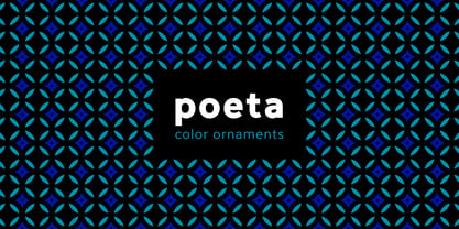
  20. Poeta Color by Tarallo Design, $14.99
    Poeta Color is an ornamental font for making patterns and decorating text. It contains floral and nature motifs. The symbols are versatile enough for simple decoration or thematic seasonal and holiday moods. Designers can use Poeta to make unique lines, fields, borders, or ornamentation within or around text. Try replacing a basic straight line with repeated symbols. Make a background to add visual interest to a design. Use the forms to decorate a chapter title or to mark the end of a magazine article. Replace a letter in a word with a symbol to create a memorable statement. This font began with sketches of patterns seen in ceramic tiles around Sicily. It is named Poeta because Sicily is an island rich in poetry traditions. Below is some helpful technical information. Using this font is simple. Install it and type. Symbols will appear instead of letters. Choose the precise symbols through a software’s glyph palette. Use the type/character menu controls to vary the spacing and density of patterns. All fonts are vector-based, OpenType, and fully scalable. Six of the fonts have different color or grey combinations. One of the fonts (solid) is a standard font. The font previews on this website will only display the font in black. See the slides to get an idea of the colors. Be assured that the colors are present in the files and will appear when loaded on the computer. The colors that are in each font: Primary: red, yellow, blue Secondary: orange, green, purple Tertiary: red-orange, yellow-orange, yellow-green, blue-green, blue-violet, red-violet Diverse: many different warm and cool colors Grey: three different greys from light to dark Gradient: a greyscale gradient Solid: standard font and can be colored normally Software that supports color SVG fonts: Photoshop, since 2017 llustrator, since 2018 InDesign, since 2019 QuarkXPress, since 2018 Pixelmator Sketch
  21. Beef'd - 100% free
  22. Nova SOLID - Personal use only
  23. Unquiet Spirits - 100% free
  24. Wazoo Outline - Unknown license
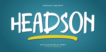
  25. Headson by Garisman Studio, $20.00
    Introducing Headson Headson combines attractive curves with a fresh urban edge; delivering a stylish script which is guaranteed to add an eye-catching appeal to your logo designs, brand imagery, quotes, product packaging, merchandise & social media posts. - Simple installation - Work for PC and MAC - Multilingual Support Thank You! GRSMN Std. 2012
  26. La Babaca - Personal use only
  27. Nyctophobia - Personal use only
  28. Weekend Warrior - 100% free
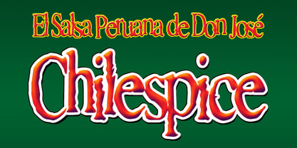
  29. Chilespice by Just My Type, $25.00
    Chilespice was originally designed to head a newspaper article on chiles. Use it when you need something verdant and organic.
  30. Bernhard Bold Condensed by Bitstream, $29.99
    A freely drawn heading face prepared in 1912 by Lucian Bernhard for Bauer. The typeface enjoys a vogue in Europe.
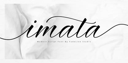
  31. Imata by FadeLine Studio, $15.00
    Imata Script is a new modern calligraphy script in an elegant italic style, and contains soft and neat glyph characters.
  32. Counterfact by Haiku Monkey, $10.00
    Counterfact is a bold, two-pronged, handwritten font that combines informality and neat imprecision. Especially effective at large point sizes.
  33. Taglio by Wilton Foundry, $29.00
    Taglio’s name is derived from intaglio, which means “incised carving” or “an impression from an engraving”. Indeed, Taglio looks like an incised engraving with a contemporary calligraphic interpretation. The down strokes start with a single horizontal line that curves into a dual vertical line and ends with the same single line at the base. The dual elongated strokes create a bold overall impression but is literally twice as sophisticated than if the two lines were solid. That was exactly the goal in creating this font. We managed to create a font that is distinctive, elegant, and crisp that is also intentionally stencilled for more flexibility. For instance, it is ideal for laser cutting signage. One of the unique features in using the capital glyphs is that they stack perfectly without losing legibility, primarily because of the slanted ends of the dual vertical lines - see the example “Miami Fashion Week” display ad. Taglio’s unusual style was carefully crafted to come to life at display sizes. It is therefore ideal for use in branding fashion, restaurants, buildings, packaging, museums, signage, etc. An ideal pairing font is our WERK family which can be seen on some of the display ads below. Taglio has a sparkling and sophisticated personality that will absolutely delight!
  34. Go To Town JNL by Jeff Levine, $29.00
    Vintage sheet music for a song from the 1941 animated feature "Mr. Bug Goes to Town" featured a casual, hand-lettered inline type style on its cover page. Recreated as the digital font Go to Town JNL, this design is presented in all the imperfect glory of pen and ink lettering. Go to Town JNL is available in the regular inline version as well as a solid version. A bit about the cartoon: The project was created by the legendary Fleischer Studios in Miami, Florida (they had relocated from New York City), after they could not obtain the rights to adapt Maurice Maeterlinck's "The Life of the Bee". Beset by the expenses of relocating to Florida, growing production costs on the full-length feature cartoon and other problems; mid-way through the making of "Mr. Bug Goes to Town" the Fleischer brothers were forced to sell their studio to their distributor (Paramount Pictures) in order to continue in operation. It was released on Dec. 5, 1941 - just two days before the Japanese attack on Pearl Harbor. The release [and subsequent re-release by Paramount as "Hoppity Goes to Town"] was a disappointing failure, earning [as late as 1946] only $241,000 of the initial cost of $713,511 it took to make the film.
  35. LT Funk - 100% free
  36. Multistrokes - Unknown license
  37. RememberReinerFS - 100% free
  38. SnowDream - Unknown license
  39. Naughts BRK - Unknown license
  40. Snotmaster V - Unknown license
Looking for more fonts? Check out our New, Sans, Script, Handwriting fonts or Categories
abstract fontscontact usprivacy policyweb font generator
Processing