10,000 search results
(0.04 seconds)
- Solidaritas Script by Rastype Studio,
$12.00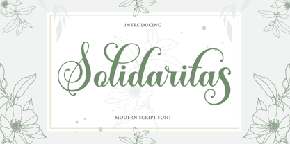 Solidaritas Script is a romantic and sweet calligraphy typeface with characters that dance along the baseline. It has a casual and yet elegant touch. It can be used for various purposes such as logos, wedding invitations, headings, t-shirts, letterhead, signage, lables, news, posters, badges etc. The fonts include OpenType features with stylistic alternates, ligatures and multiple language support. To enable the OpenType Stylistic alternates, you need a program that supports OpenType features such as Adobe Illustrator CS, Adobe Indesign & CorelDraw X6-X7, Microsoft Word 2010 or later versions. There are additional ways to access alternates/swashes, using Character Map (Windows), Nexus Font (Windows), Font Book (Mac) or a software program such as PopChar (for Windows and Mac). How to access all alternative characters, using Windows Character Map with Photoshop: https://www.youtube.com/watch?v=Go9vacoYmBw How to access all alternative characters using Adobe Illustrator: http://youtu.be/iptSFA7feQ0 How to use stylistic sets font in Microsoft Word 2010 or later versions: https://youtu.be/x1A_ilsBsGs
 - My Dream by Suza Studio,
$12.00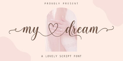 My dream is a romantic and sweet calligraphy typeface with characters that dance along the baseline. It has a casual and yet elegant touch. It can be used for various purposes such as logos, wedding invitations, headings, t-shirts, letterhead, signage, lables, news, posters, badges etc. The fonts include OpenType features with stylistic alternates, ligatures and multiple language support. To enable the OpenType Stylistic alternates, you need a program that supports OpenType features such as Adobe Illustrator CS, Adobe Indesign & CorelDraw X6-X7, Microsoft Word 2010 or later versions. There are additional ways to access alternates/swashes, using Character Map (Windows), Nexus Font (Windows), Font Book (Mac) or a software program such as PopChar (for Windows and Mac). How to access all alternative characters, using Windows Character Map with Photoshop: https://www.youtube.com/watch?v=Go9vacoYmBw How to access all alternative characters using Adobe Illustrator: http://youtu.be/iptSFA7feQ0 How to use stylistic sets font in Microsoft Word 2010 or later versions: https://youtu.be/x1A_ilsBsGs
 - Hello Cantika Script by madjack.font,
$18.00 Introduce, Hello Cantika Script with beautiful handwriting style. Equipped with a flying machine. Hello Cantika Script is perfect for branding projects, home appliance design, product packaging, use in business cards, invitation cards, etc. Simply as a stylish text overlay onto a background image or anything else that needs a touch of elegance. To enable the OpenType Stylistic alternative, you need a program that supports OpenType features such as Adobe Illustrator CS, Adobe Indesign & CorelDraw X6-X7, Microsoft Word 2010 or later. There are additional ways to swash, using the Character Map (Windows), Nexus Font (Windows), Font Book (Mac) or a software program such as PopChar (for Windows and Mac). How to access all alternative characters, using Windows Character Map with Photoshop: https://www.youtube.com/watch?v=Go9vacoYmBw How to access all alternative characters using Adobe Illustrator: http://youtu.be/iptSFA7feQ0 How to use the font style set in Microsoft Word 2010 or later versions: https://youtu.be/x1A_ilsBsGs Thanks for checking! I really hope you enjoy it. Thank you.
 - Kettiy Zalliya Script by Supotype Studio,
$16.00 Kettiy Zalliya Script with beautiful handwriting style. Equipped with a flying machine. Kettiy Zalliya Script is perfect for branding projects, home appliance design, product packaging, use in business cards, invitation cards, etc. Just as a stylish text overlay onto a wallpaper or anything else that needs a touch of elegance. To enable the OpenType Stylistic alternative, you need a program that supports OpenType features such as Adobe Illustrator CS, Adobe Indesign & CorelDraw X6-X7, Microsoft Word 2010 or later. There are additional ways to swash, using the Character Map (Windows), Nexus Font (Windows), Font Book (Mac) or a software program such as PopChar (for Windows and Mac). How to access all alternative characters, using Windows Character Map with Photoshop: https://www.youtube.com/watch?v=Go9vacoYmBw How to access all alternative characters using Adobe Illustrator: http://youtu.be/iptSFA7feQ0 How to use the font style set in Microsoft Word 2010 or later versions: https://youtu.be/x1A_ilsBsGs Thanks for checking! I really hope you enjoy it. Thank you.
 - Pretty Heart Script by Suza Studio,
$12.00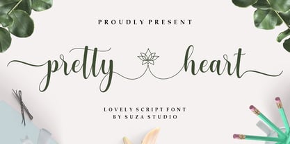 pretty heart script is a romantic and sweet calligraphy typeface with characters that dance along the baseline. It has a casual and yet elegant touch. It can be used for various purposes such as logos, wedding invitations, headings, t-shirts, letterhead, signage, lables, news, posters, badges etc. The fonts include OpenType features with stylistic alternates, ligatures and multiple language support. To enable the OpenType Stylistic alternates, you need a program that supports OpenType features such as Adobe Illustrator CS, Adobe Indesign & CorelDraw X6-X7, Microsoft Word 2010 or later versions. There are additional ways to access alternates/swashes, using Character Map (Windows), Nexus Font (Windows), Font Book (Mac) or a software program such as PopChar (for Windows and Mac). How to access all alternative characters, using Windows Character Map with Photoshop: https://www.youtube.com/watch?v=Go9vacoYmBw How to access all alternative characters using Adobe Illustrator: http://youtu.be/iptSFA7feQ0 How to use stylistic sets font in Microsoft Word 2010 or later versions: https://youtu.be/x1A_ilsBsGs
 - Hello Bestlady Duo by Rastype Studio,
$12.00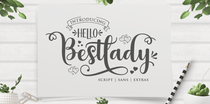 Hello Bestlady Duo is a romantic and sweet calligraphy typeface with characters that dance along the baseline. It has a casual and yet elegant touch. It can be used for various purposes such as logos, wedding invitations, headings, t-shirts, letterhead, signage, lables, news, posters, badges etc. The fonts include OpenType features with stylistic alternates, ligatures and multiple language support. To enable the OpenType Stylistic alternates, you need a program that supports OpenType features such as Adobe Illustrator CS, Adobe Indesign & CorelDraw X6-X7, Microsoft Word 2010 or later versions. There are additional ways to access alternates/swashes, using Character Map (Windows), Nexus Font (Windows), Font Book (Mac) or a software program such as PopChar (for Windows and Mac). How to access all alternative characters, using Windows Character Map with Photoshop: https://www.youtube.com/watch?v=Go9vacoYmBw How to access all alternative characters using Adobe Illustrator: http://youtu.be/iptSFA7feQ0 How to use stylistic sets font in Microsoft Word 2010 or later versions: https://youtu.be/x1A_ilsBsGs
 - September Rain Script by Letterday Studio,
$19.00 September Rain Script elegant Calligraphy font is a sweet and romantic calligraphy typeface with characters dancing along the baseline. It has a casual yet elegant touch. Can be used for various purposes such as logos, wedding invitations, titles, t-shirts, letterheads, signage, labels, news, posters, badges etc. This font includes OpenType features with alternative styles, ligatures, and multiple language support. To enable alternative OpenType Stylistic, you need a program that supports OpenType features such as Adobe Illustrator CS, Adobe Indesign & CorelDraw X6-X7, Microsoft Word 2010 or a later version. There are additional ways to swap/swap, using Character Map (Windows), Nexus Fonts (Windows), Font Book (Mac) or software programs like PopChar (for Windows and Mac). How to access all alternative characters, using Windows Character Map with Photoshop: https://www.youtube.com/watch?v=Go9vacoYmBw How to access all alternative characters using Adobe Illustrator: http://youtu.be/iptSFA7feQ0 How to use a stylish font set in Microsoft Word 2010 or later versions: https://youtu.be/x1A_ilsBsGs
 - Salsadila Script by Rastype Studio,
$10.00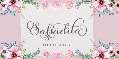 Salsadila Script is a romantic and sweet calligraphy typeface with characters that dance along the baseline. It has a casual and yet elegant touch. It can be used for various purposes such as logos, wedding invitations, headings, t-shirts, letterhead, signage, lables, news, posters, badges etc. The fonts include OpenType features with stylistic alternates, ligatures and multiple language support. To enable the OpenType Stylistic alternates, you need a program that supports OpenType features such as Adobe Illustrator CS, Adobe Indesign & CorelDraw X6-X7, Microsoft Word 2010 or later versions. There are additional ways to access alternates/swashes, using Character Map (Windows), Nexus Font (Windows), Font Book (Mac) or a software program such as PopChar (for Windows and Mac). How to access all alternative characters, using Windows Character Map with Photoshop: https://www.youtube.com/watch?v=Go9vacoYmBw How to access all alternative characters using Adobe Illustrator: http://youtu.be/iptSFA7feQ0 How to use stylistic sets font in Microsoft Word 2010 or later versions: https://youtu.be/x1A_ilsBsGs
 - Baby Honey by Rhd Studio,
$18.00 Baby honey - lovely script font is a sweet, romantic calligraphy typeface with characters dancing along baseline. It has a casual yet elegant touch. It can be used for various purposes such as logos, wedding invitations, titles, t-shirts, letterheads, name boards, labels, news, posters, badges etc. The font includes OpenType features with alternative styles, ligatures, and multiple language support. To enable OpenType Stylistic alternates, you need a program that supports OpenType features such as Adobe Illustrator CS, Adobe Indesign & CorelDraw X6-X7, Microsoft Word 2010 or a later version. There are additional ways to alternate / swash, using the Character Map (Windows), Nexus Font (Windows), Font Book (Mac) or a software program like PopChar (for Windows and Mac). How to access all alternative characters, using Windows Character Map with Photoshop: https://www.youtube.com/watch?v=Go9vacoYmBw How to access all alternative characters using Adobe Illustrator: http://youtu.be/iptSFA7feQ0 How to use a style font set in Microsoft Word 2010 or later versions: https://youtu.be/x1A_ilsBsGs
 - Magilova by Hrz Studio,
$15.00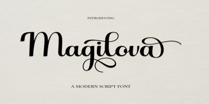 Magilova Script is a romantic and sweet calligraphy typeface with characters that dance along the baseline. It has a casual and yet elegant touch. It can be used for various purposes such as logos, wedding invitations, headings, t-shirts, letterhead, signage, lables, news, posters, badges etc. The fonts include OpenType features with stylistic alternates, ligatures and multiple language support. To enable the OpenType Stylistic alternates, you need a program that supports OpenType features such as Adobe Illustrator CS, Adobe Indesign & CorelDraw X6-X7, Microsoft Word 2010 or later versions. There are additional ways to access alternates/swashes, using Character Map (Windows), Nexus Font (Windows), Font Book (Mac) or a software program such as PopChar (for Windows and Mac). How to access all alternative characters, using Windows Character Map with Photoshop: https://www.youtube.com/watch?v=Go9vacoYmBw How to access all alternative characters using Adobe Illustrator: http://youtu.be/iptSFA7feQ0 How to use stylistic sets font in Microsoft Word 2010 or later versions: https://youtu.be/x1A_ilsBsGs
 - Glowing Shine by Nk Studio,
$18.00 introduce Glowing Shine with beautiful handwriting style. Equipped with 300+ glyphs. Glowing Shine is perfect for branding projects, home appliance design, product packaging, use in business cards, invitation cards, etc. Just like a stylish text overlay to a background image or anything else that needs a touch of elegance. To enable the OpenType Stylistic alternative, you need a program that supports OpenType features such as Adobe Illustrator CS, Adobe Indesign & CorelDraw X6-X7, Microsoft Word 2010 or a later version. There are additional ways to swash, using the Character Map (Windows), Nexus Font (Windows), Font Book (Mac) or a software program like PopChar (for Windows and Mac). How to access all alternative characters, using the Windows Character Map with Photoshop: https://www.youtube.com/watch?v=Go9vacoYmBw How to access all alternative characters using Adobe Illustrator: http://youtu.be/iptSFA7feQ0 How to use the font style set in Microsoft Word 2010 or later versions: https://youtu.be/x1A_ilsBsGs Thanks for checking! I really hope you enjoy it. Regards Nk Studio
 - Billy Betty by Romie Creative,
$13.00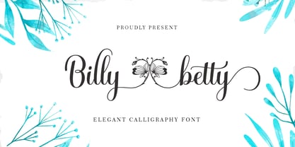 B illy betty - elegant Calligraphy font is a romantic and sweet calligraphy typeface with characters that dance along the baseline. It has a casual and yet elegant touch. It can be used for various purposes such as logos, wedding invitations, headings, t-shirts, letterhead, signage, lables, news, posters, badges etc. The fonts include OpenType features with stylistic alternates, ligatures and multiple language support. To enable the OpenType Stylistic alternates, you need a program that supports OpenType features such as Adobe Illustrator CS, Adobe Indesign & CorelDraw X6-X7, Microsoft Word 2010 or later versions. There are additional ways to access alternates/swashes, using Character Map (Windows), Nexus Font (Windows), Font Book (Mac) or a software program such as PopChar (for Windows and Mac). How to access all alternative characters, using Windows Character Map with Photoshop: https://www.youtube.com/watch?v=Go9vacoYmBw How to access all alternative characters using Adobe Illustrator: http://youtu.be/iptSFA7feQ0 How to use stylistic sets font in Microsoft Word 2010 or later versions: https://youtu.be/x1A_ilsBsGs
 - Berliona by TM Type,
$12.00 Introduce Berliona is a beautiful handwritten font with a touch of love. The Berliona is perfect for branding projects, home appliance design, product packaging, use in business cards, invitation cards, etc. Simply as a stylish text overlay onto a background image or anything else that needs a touch of elegance. To enable the OpenType Stylistic alternative, you need a program that supports OpenType features such as Adobe Illustrator CS, Adobe Indesign & CorelDraw X6-X7, Microsoft Word 2010 or later. There are additional ways to swash, using Character Map (Windows), Nexus Font (Windows), Font Book (Mac) or a software program such as PopChar (for Windows and Mac). How to access all alternative characters, using Windows Character Map with Photoshop: https://www.youtube.com/watch?v=Go9vacoYmBw How to access all the alternate characters using Adobe Illustrator: http://youtu.be/iptSFA7feQ0 How to use the font style set in Microsoft Word 2010 or later: https://youtu.be/x1A_ilsBsGs Thanks for checking! I really hope you enjoy it. Regards TM Type.
 - Arabelle Script by madjack.font,
$10.00 Arabelle Script is a sweet, romantic calligraphy typeface with characters dancing along the baseline. It has a casual yet elegant touch. Can be used for various purposes such as logos, wedding invitations, headers, t-shirts, letterheads, signboards, labels, news, posters, badges etc. The font includes OpenType features with alternative styles, ligatures, and multiple language support. To enable OpenType Stylistic alternates, you will need a program that supports OpenType features such as Adobe Illustrator CS, Adobe Indesign & CorelDraw X6-X7, Microsoft Word 2010 or later versions. There are additional ways to alternate / swash, using the Character Map (Windows), Nexus Font (Windows), Font Book (Mac) or a software program like PopChar (for Windows and Mac). How to access all alternative characters, using Windows Character Map with Photoshop: https://www.youtube.com/watch?v=Go9vacoYmBw How to access all alternative characters using Adobe Illustrator: http://youtu.be/iptSFA7feQ0 How to use a stylish font set in Microsoft Word 2010 or later versions: https://youtu.be/x1A_ilsBsGs
 - Guttever by Zane Studio,
$12.00 Introduce! Guttever is a beautiful handwritten font with a touch of love. Packed with 351 glyphs, it's perfect for branding projects, homewares design, product packaging, use in business cards, invitation cards, etc. Simply as a stylish text overlay onto a background image or anything else that needs a touch of elegance. To enable the OpenType Stylistic alternative, you need a program that supports OpenType features such as Adobe Illustrator CS, Adobe Indesign & CorelDraw X6-X7, Microsoft Word 2010 or later. There are additional ways to swash, using Character Map (Windows), Nexus Font (Windows), Font Book (Mac) or a software program such as PopChar (for Windows and Mac). How to access all alternative characters, using Windows Character Map with Photoshop: https://www.youtube.com/watch?v=Go9vacoYmBw How to access all the alternate characters using Adobe Illustrator: How to use the font style set in Microsoft Word 2010 or later: Thanks for checking! I really hope you enjoy it. Regards
 - Glowing Script by Suza Studio,
$12.00 Glowing Script is a romantic and sweet calligraphy typeface with characters that dance along the baseline. It has a casual and yet elegant touch. It can be used for various purposes such as logos, wedding invitations, headings, t-shirts, letterhead, signage, labels, news, posters, badges etc. The fonts include OpenType features with stylistic alternates, ligatures and multiple language support. To enable the OpenType Stylistic alternates, you need a program that supports OpenType features such as Adobe Illustrator CS, Adobe Indesign & CorelDraw X6-X7, Microsoft Word 2010 or later versions. There are additional ways to access alternates/swashes, using Character Map (Windows), Nexus Font (Windows), Font Book (Mac) or a software program such as PopChar (for Windows and Mac). How to access all alternative characters, using Windows Character Map with Photoshop: https://www.youtube.com/watch?v=Go9vacoYmBw How to access all alternative characters using Adobe Illustrator: http://youtu.be/iptSFA7feQ0 How to use stylistic sets font in Microsoft Word 2010 or later versions: https://youtu.be/x1A_ilsBsGs
 - Natalic Script by Rastype Studio,
$12.00 Natalic Script is a modern and sweet calligraphy typeface with characters that dance along the baseline. It has a casual and yet elegant touch. It can be used for various purposes such as logos, wedding invitations, headings, t-shirts, letterhead, signage, lables, news, posters, badges etc. The fonts include OpenType features with stylistic alternates, ligatures and multiple language support. To enable the OpenType Stylistic alternates, you need a program that supports OpenType features such as Adobe Illustrator CS, Adobe Indesign & CorelDraw X6-X7, Microsoft Word 2010 or later versions. There are additional ways to access alternates/swashes, using Character Map (Windows), Nexus Font (Windows), Font Book (Mac) or a software program such as PopChar (for Windows and Mac). How to access all alternative characters, using Windows Character Map with Photoshop: https://www.youtube.com/watch?v=Go9vacoYmBw How to access all alternative characters using Adobe Illustrator: http://youtu.be/iptSFA7feQ0 How to use stylistic sets font in Microsoft Word 2010 or later versions: https://youtu.be/x1A_ilsBsGs
 - Dragonwick is a typeface that seems to whisk you away to an era of fantasy and enchantment. With its distinctive personality, it calls to mind the majestic presence of dragons, embodying an aura of a...
- Bechamel by Andinistas,
$29.00 Hello! Do you need letters that look like they are drawn with a brush so that your creative work shines and stands out? We present Bechamel, a family of script fonts designed to be combinable with Bechamel Roman. BECHAMEL SCRIPT was hand drawn to design words and phrases in logos, packaging, posters, envelopes and greeting cards. BECHAMEL SCRIPT has high expressiveness because its energetic set of letters are meticulously drawn with calligraphy and lettering. In addition each of its incredible cursive letters give you the possibility to add a central vein to change the color, enhancing its impressive artisan splendor. These are the possibilities you receive by acquiring BECHAMEL: A) BECHAMEL-SCRIPT & VEIN: Cursive letters with carousel effect and OPENTYPE contained in: 26 Uppercase letters, 26 Small letters, 10 Numbers, 3 Fractions, 31 Punctuation marks, 77 Signs for languages belonging to Western Europe, 113 Signs for Central European languages. 20 Lowercase wipes, 13 uppercase alternatives for WORD START, 44 lowercase alternatives for HALF of word, 20 lowercase alternatives for WORD FINAL. NOTICE: Alternatives appear by clicking on glyph panel in Adobe Illustrator, Inkscape or Photoshop CC. B) BECHAMEL-WORDS: 57 words with capital letters underlined and combinable with BECHAMEL-SCRIPT 1, 2 and 3 ideal to connect and decorate your designs increasing expressiveness and authentic handwritten look of your ideas C) BECHAMEL-ORNAMENTS: 30 wonderful drawings made up of stars, borders, waves, hearts, dots, arrows, bow ties, etc., all specially coordinated to accompany your composite designs in BECHAMEL-SCRIPT and BECHAMEL-WORDS. Well, I hope that my work will be useful and above all that you have fun with it. If you have questions write to me that I will be happy to help you: • INTAGRAM: instagram.com/andinistas • BEHANCE: be.net/andinistas • FACEBOOK: fb.com/carlosfabiancamargoguerrero • TWITTER: twitter.com/andinistas
 - Cíclope by Andinistas,
$19.95 Cíclope is a typeface family designed by Carlos Fabián Camargo in 2012 and used to write the headlines. Its idea is based on an army of stone soldiers that with their size and strength cause earthquakes. Under this concept he obtained stencil and sans serif letters with monstrous shapes and torn counterforms. Its usefulness as well as readability consists in imitate rocks with scars and cracks. For that reason, Cíclope family has three sizes, each with their respective italics distributed at different levels of corrosion. In addition, each file contains 260 glyphs useful for designing words and phrases with systematically eroded treatments for advertisement material. Thus Cíclope works as a raw material in the exploration of new graphic design. Finally, Cíclope concept has grotesque, geometric and humanistics letters roots that seem disastrous but each and every detail has been planned with high definition drawing. Most importantly, it expresses a big amount of grunge style with cracked edges and medium contrast between thin and thick strokes. In that sense, the writing seems impaired and special for design of logos, posters, flyers, brochures and worn, crusty or demolished graphic design.
 - FS Dillon by Fontsmith,
$80.00 Bauhaus Geometric, economical, functional... The good, wholesome, modernist values that once fired up the tutors and students of the Bauhaus became the inspiration for FS Dillon after an exploration of the work of the pre-war art and design powerhouse in the Fontsmith studio. The font combines simplicity and directness with a characteristic Fontsmith warmth. Letterforms are compact, with a generous x-height, and built for maximum clarity and impact. The Bauhaus sought beauty through function. FS Dillon achieves it. Made for TV The weights of fonts for TV sometimes have to be adjusted so as not to “blow” on-screen. FS Dillon was originally drawn for the on-screen presentation branding of Film Four, whose primary colour was red. Black type on a red background looks heavier than white, so Dillon needed two weights that would allow white and black type to be used together, looking balanced and equal. Type design is an organic process. Years after developing FS Dillon, we revisited it, redrawing elements and adding italics to maintain consistency. Olympic You don’t get a much higher confirmation of the functional fitness of a typeface than to have it selected to guide visitors around an Olympic complex. FS Dillon was selected as the font for signage at some of the key venues at the London 2012 Olympic Park, helping to get spectators, athletes and officials from all over the world to their seats and starting blocks on time.
 - China Syndrome by Hanoded,
$15.00 A really, really long time ago, I watched a movie called ‘The China Syndrome’ (starring Jane Fonda, Jack Lemon and Michael Douglas). It was one of those disaster movies that were quite popular at the time (I also recall airports, alien viruses and skyscraper fires). Anyway, when I finished this font, I suddenly (and quite inexplicably) remembered that movie, so I named this font after it. China Syndrome is a legible brush font - ideal for your product packaging and halloween posters. Maybe use it for a metal album cover, a book about nuclear disasters or, dunno, the logo of your really strong coffee brand. Whatever. Just enjoy!
 - Disco Display by Cabeza Dura,
$40.00 Composed of compositional groups, with optical adjustments in the curves, Disco Display has been designed with special attention to kerning and tracking, allowing its use in both large and medium sizes, starring in large titles or filling entire covers with color. Inspired by the hippie movement, Disco Display provides sensuality, visual richness and compositional splendor, giving rise to the use of multiple colors or patterns in its forms, or rediscovering its counterforms.
 - Yuletide Doodles by Outside the Line,
$19.00 Yuletide Doodles is the perfect font for that quickie Christmas party flyer, menu, or invitation. Or make your own gift tags. The uses are endless. This font includes gifts, ornaments, snow globe, snow man, holly, olive branch, lots of trees and stars, a light bulb, deer, moose, wreaths, pine boughs, skate, stocking and crown. This font works well with Christmas Doodles and Christmas Doodles Too . Mix and match to your heart's desire.
 - Diamond Jim JNL by Jeff Levine,
$29.00Diamond Jim JNL was inspired [in part] by an image of a 1970s Letraset® dry transfer typeface made entirely of small stars. By creating his own layout using tiny diamond shapes, Jeff Levine has produced a font that takes on multiple appearances. At 24 point it resembles dot matrix printing; at 48 point the diamonds are clearly visible; and overall, the design has a distinctive 70s retro feel. Limited character set. - Decima Pro by TipografiaRamis,
$39.00 Decima – condensed geometric Sans Serif typeface, released back in 2009 and quite successful ever since (MyFonts Rising Star, February 2009). Decima Pro – an upgraded version of Decima, with careful refinements to glyph shapes and extension of glyph amounts, which enabled support of more Latin languages as well as support of Cyrillic. Six more alternate styles have been added to the original six styles. Typeface is released in OpenType format with some OpenType features.
 - ASTYPE Ornaments Christmas A2 by astype,
$28.00 Christmas A2 uses the following OpenType features to set up to four different color layers. - Superscript/Superior (Trees) - Subscript/Inferior (Stars) - Numerator (Candles) - Denominator (Light, Bells) Note: Due to the complexity of some parts of the font, some printers may have problems of rendering it smoothly. To avoid this problem you should always outline the font data for the final documents. On lower systems turn font antialiasing off for faster screen redrawings.
 - ASTYPE Ornaments Christmas A by astype,
$28.00 Christmas A uses the following OpenType features to set up to four different color layers. - Superscript/Superior (Trees) - Subscript/Inferior (Stars) - Numerator (Candles) - Denominator (Light, Bells) Note: Due to the complexity of some parts of the font, some printers may have problems of rendering it smoothly. To avoid this problem you should always outline the font data for the final documents. On lower systems turn font antialiasing off for faster screen redrawings.
 - FourJuly by Ingrimayne Type,
$7.95 FourJuly contains three patriotic fonts that might be fun to use in July. They are also very hard to read, but perhaps not as hard as the somewhat similar letters in the fonts of FlagDay. FourJuly A has square, blocky letters with star interiors. FourJuly G and FourJuly H add diagonal stripes. FourJuly G and FourJuly H can be layered on top of FourJuly A to create bicolored letters. See the example here.
 - Passeig B - Unknown license

- Squid - Unknown license

- AlphaSports - Unknown license

- Passeig A - Unknown license

- AlphaElfin - Unknown license

- Epoca Classic by Hoftype,
$39.00 Epoca-Classic, designed in 2012, is the contrasted sister of Epoca, also suited for text and display. As is the case with Epoca, Epoca-classic has economical proportions, a neutral appearance and a discreet elegance. It is fresh, crisp and distinguished. Its well-balanced proportions result in an even text flow which allows for pleasant reading even with large amounts of text. Epoca-Classic comes in twelve weights, in OpenType format and with extended language support for more than 40 languages. All weights contain small caps, standard ligatures, proportional lining figures, tabular lining figures, proportional old style figures, lining old style figures, matching currency symbols, fraction- and scientific numerals.
 - Zigarre by Canada Type,
$24.95 Though Zigarre can easily be categorized a brush script, Jim Rimmer actually drew it using a big marker. Jim’s original face, inspired by inter-war German poster lettering, was a rough one, with the marker’s juicy ink roughing it out all over the place. The smooth version, Zigarre Script, was produced as part of a major update and remastering the design underwent in 2012. Both Zigarre Script and Zigarre Rough come with extended Latin language support, as well as a few built-in stylistic alternates. 20% of this font’s revenues will be donated to a GDC scholarship fund, supporting higher typography education in Canada.
 - Northeast Railway by Fabio Ares,
$9.99 Northeast Railway is a product of argentine typographic archeology project called "Tipografía Histórica Ferroviaria" (Fabio Ares & Octavio Osores, since 2012). Is about the signboards of the stations of the line of the Argentine North Eastern Railway Company Limited (1987-1948). The letter of this signboards can be described as display type, with elementary geometric shapes and without line modulation. The principal font of the resultant family is the bold. The family is completed with complementary fonts of different styles. The proceeds from the sale of the fonts will be used to finance the project.
 - THE AMAZING SPIDER-MAN - Personal use only

- Stripelane - Personal use only

- Future Brake - 100% free


