3,876 search results
(0.009 seconds)
- Nova Hispane by Ixipcalli,
$30.00 NovaHispane typeface is a serif typeface with a clear, serious, elegant, old and modern touch at the same time. This typeface is perfectly suitable to be used in books, magazines or any printed media that requires showing a set of traditional or modern styles. Its four weights Light, Regular, Bold, and Heavy make a well-marked visual game for highlighting words from text; in addition to having the italic forms for each weight.
 - Gains by Graphicxell,
$19.00 This typeface encapsulates a rhythm that is symmetrical and balanced due to a unique mix of different sources of inspiration. Proportions are precisely adjusted with subtle contours and subtle contrasts. These shapes give the font an attractive look without compromising on elegance and minimalism, ensuring that any glyph will work well in any graphic design purpose such as brochures, videos, advertising branding, logos, magazines, layout designs, posters, post templates, games and others
 - Kefyla by Graphicxell,
$19.00 This typeface encapsulates a rhythm that is symmetrical and balanced due to a unique mix of different sources of inspiration. Proportions are precisely adjusted with subtle contours and subtle contrasts. These shapes give the font an attractive look without compromising on elegance and minimalism, ensuring that any glyph will work well in any graphic design purpose such as brochures, videos, advertising branding, logos, magazines, layout designs, posters, post templates, games and others
 - Hallo White by Attype Studio,
$12.00 Introducing Hallo White - Inspired by snowflakes on calligraphy, Hallo white perfect for winter events, making calligraphy merry christmas with snowflakes around it. Two style Font: Calligraphy & Display Hallo White is perfect for winter sale design, branding, logo, invitation, stationery, wedding, product packaging, merchandise, monogram, blog design, game titles, cute style design, Book/Cover Title and more. Features : - Hallo White.otf - Hallo White Display.otf - Ligatures - Multilingual Support --- Hope you enjoy with our font! Attype Studio
 - Siga Mono by Greentrik6789,
$21.00 Elevate your design game with Siga Mono, the ultimate font family for all your creative needs. Transform your digital and print projects into masterpieces with its remarkable monospace layout and distinctive style. The multiweight options of Siga Mono allow you to experiment with various typographic hierarchies, ensuring that your design stands out from the competition. Don't miss the opportunity to try Siga Mono's extraordinary capabilities – download our variable demo and witness its magic firsthand!
 - Hamada by Linotype,
$29.99 Hamada is a script typeface based on the powerful work of English calligrapher Gaynor Goffe. Hamada captures looseness and charming irregularities of the pen on the page, allowing ink to edge out from the contours and move across curves and letters. Thanks to OpenType, Hamada creates an impression very much like that of real calligraphy. Most of the letters in Hamada have alternate versions; the typeface comes with ligatures, ending swashes, and more.
 - Costly by Graphicxell,
$19.00 This typeface encapsulates a rhythm that is symmetrical and balanced due to a unique mix of different sources of inspiration. Proportions are precisely adjusted with subtle contours and subtle contrasts. These shapes give the font an attractive look without compromising on elegance and minimalism, ensuring that any glyph will work well in any graphic design purpose such as brochures, videos, advertising branding, logos, magazines, layout designs, posters, post templates, games and others
 - Blathe by Attype Studio,
$16.00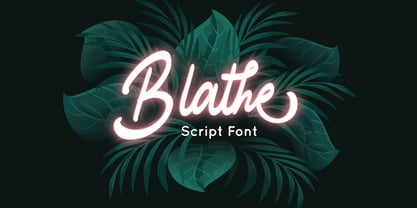 Blathe is a Modern Script Font. Perfect font for business brand. Combine Blathe stylistic set to create amazing script font! Fall in love with its incredibly versatile style and use it to create spectacular designs! Blathe is perfect for branding, logo, invitation, quotes, wedding invitation, cricut font, silhouette font, product packaging, merchandise, game titles, cute style design, Book/Cover Title and more. What's Included : - Ligatures - Multilingual Support --- Hope you enjoy with our font! Attype Studio
 - Bigwogs GT by Gartype Studio,
$15.00 Bigwogs is a Street Arts inspiration typeface with a touch of street artistic typeface with graffiti vibes. Bigwogs is an urban inspired typeface from us, that more come with touch of graffiti urban vibes and also comes with multilingual features and extra graffiti swashes to make graffiti vibes. This font look so cool when you using it for projects like text headlines, product packaging, poster, music purpose, game logo title, brands, and mascot logo designs.
 - The Last Shuriken by Arterfak Project,
$26.00 Konichiwa! Introducing our brand new font "The Last Shuriken" a Japanese-style typeface. Inspired by modern Japanese food branding and anime title. Designed in a bold stroke, this font is an all-caps font that has the same cap height and different shapes. The Last Shuriken is perfect for display, especially for Japanese food, title, logo, poster, short quote, movie, games, apparel. Complete with stylistic alternates and PUA Encoded with multilingual support! Thank you. Ramz.
 - Bedazzle by Pelavin Fonts,
$15.00 With a delicious twinkling in its eye, Bedazzle evokes a theatrical vibe. Filled with a pattern of glowing lights, it offers a festive journey for the eye as well as a tactile ambiance. Two fonts, an ornamented bright plus a solid version provide ample resources to create a variety of inlined, outlined, shadowed and multi-colored displays. Add in Illustrator’s 3D feature to take things beyond the mere surface of the page.
 - Pentaprism NF by Nick's Fonts,
$10.00In the Dynamic Seventies, "prismatic" typefaces were all the rage, and few were more popular than variants of Paul Renner's Futura and the Herbert Bayer-inspired Bauhaus. This family of fonts features Futura-like forms in the uppercase and Bauhaus-like forms in the lowercase, so you can mix or match to create just the perfect headline. As always, all versions contain the complete Latin 1252, Central European 1250 and Turkish 1254 character sets. - Doing by Graphicxell,
$19.00 This typeface encapsulates a rhythm that is symmetrical and balanced due to a unique mix of different sources of inspiration. Proportions are precisely adjusted with subtle contours and subtle contrasts. These shapes give the font an attractive look without compromising on elegance and minimalism, ensuring that any glyph will work well in any graphic design purpose such as brochures, videos, advertising branding, logos, magazines, layout designs, posters, post templates, games and others
 - Hugest by Graphicxell,
$19.00 This typeface encapsulates a rhythm that is symmetrical and balanced due to a unique mix of different sources of inspiration. Proportions are precisely adjusted with subtle contours and subtle contrasts. These shapes give the font an attractive look without compromising on elegance and minimalism, ensuring that any glyph will work well in any graphic design purpose such as brochures, videos, advertising branding, logos, magazines, layout designs, posters, post templates, games and others
 - Mithella by Lafontype,
$19.00 Mithella is a sans serif family with a pleasant touch. Some letters, especially linear ones, look normative like other rounded sans serifs, but the difference can be seen clearly in curved letters so that it gives a pleasant impression for each series of words. Mithella comes with eight weights ranging from thin to black to complement your design needs be it branding, blogging, logos, advertising, games, cooking, packaging, editorial and publishing, web and screen design.
 - Extrakt by Hof3,
$25.00 The font EXTRAKT references the grotesque fonts and elementary typography as developed at the Bauhaus (ITC Bauhaus, Futura). Extract originated from a child's game: How many matches are needed to write the word EXTRAKT? (https://hof3.com/arbeitsweise/extrahieren) In the development of the typeface "EXTRAKT", the design principle of reducing the letters to the most necessary strokes was central. In addition to the reference to Bauhaus, EXTRAKT also has a futuristic feel. ("The Expanse")
 - Headcorps by Almarkha Type,
$29.00 Headcorps is a Serif military style font, first conceptualize was inspired by the classic vintage military stencil design . I wanted a typeface that could be a solid base for any military inspired project Headcorps Fonts can be used for wallpaper, pattern fills, web page background, surface textures. Perfect for making army posters , scrapbooking,invitation cards, label stickers, stationary, gift wrap, packaging, clothes, buttons, pendants, holiday gifts, print on fabrics and so much more.
 - Cartoon Nouveau JNL by Jeff Levine,
$29.00 Most of the lettering on a piece of sheet music for a song from the 1921 George M. Cohan musical comedy entitled “The O’Brien Girl” was hand lettered in a playful, casual Art Nouveau design with rounded ends. The characters on that page took on a look reminiscent of cartoon or comic strip wording, and the result is a digital typeface named Cartoon Nouveau JNL, which is available in both regular and oblique versions.
 - MVB Emmascript by MVB,
$39.00Kanna Aoki drew the letters for MVB Emmascript while on a picnic near the Conservatory of Flowers in San Francisco’s Golden Gate Park. Mark van Bronkhorst adapted the writing as a font that maintains a very natural scrawl. Later a bold weight was added. MVB Emmascript has been used to add a lighthearted, human touch to everything from fiction paperbacks to potato chip packaging. The typeface is named for Aoki's 1968 Volkswagen, Emma. - Million Design by Graphicxell,
$19.00 This typeface encapsulates a rhythm that is symmetrical and balanced due to a unique mix of different sources of inspiration. Proportions are precisely adjusted with subtle contours and subtle contrasts. These shapes give the font an attractive look without compromising on elegance and minimalism, ensuring that any glyph will work well in any graphic design purpose such as brochures, videos, advertising branding, logos, magazines, layout designs, posters, post templates, games and others
 - Smelly Blood by Attype Studio,
$12.00 Smelly Blood is a bold and quirky display font. Add this font to your creative ideas and notice how it will make them stand out! Smelly Blood is perfect for branding, logo, invitation, stationery, social media post, product packaging, merchandise, blog design, game titles, cute style design, Book/Cover Title and more. What's Included : - Smelly Blood.otf - Multilingual Support (Afrikaans, Albanian, Catalan, Danish, Dutch, English, Estonian, Finnish, French, German, Icelandic, Italian, Norwegian, Portugese, Spanisch, Swedish, Zulu)
 - Pixel Promise by PizzaDude.dk,
$18.00 Pixel Promise is my wannabe pixel font. Yes, it is not a pixel font…but it is handmade and the “pixels” are deliberately off here and there. Nevertheless, when typing with Pixel Promise, you get that retro gaming feeling, and before you know it, you feel like you just want to insert another coin, press 1 or 2 players and complete that level! :) I have added 5 different versions of each letter and multilingual support
 - FF Cocon by FontFont,
$65.99 FF Cocon’s designer, Evert Bloemsma (1958—2005) described it as a “serious typeface”. Despite first impressions, the description holds up well. Since its 2001 release, FF Cocon has been used in an astoundingly wide variety of design applications. At large sizes, FF Cocon works as a display face, with beautiful detailing. And at small sizes, it remains surprisingly readable. The lowercase letters a, b, d, g, h, m, n, p, q, r and u, were drawn without spurs, as Bloemsma made an attempt to erase every trace of handwriting; even “normal,” neutral sans serif typefaces still retain elements in their letterforms like this. Bloemsma wanted none of it. Although a difficult starting point for a typeface, this proved successful. Bloemsma’s design is a family of rounded yet rather asymmetrical forms with details reminiscent of brush-strokes, but that were not made with a brush in hand. In spite of its claim to seriousness, FF Cocon is a family of seductive, voluptuous styles. The original FF Cocon had two widths—normal and condensed. Later, a more compact Extra Condensed version was introduced, as well as italics.
 - Cresta by James Todd,
$40.00 Loaded with personality and functionality, Cresta is built to look good while surviving the worst conditions. It is at home on screen and in a magazine. Its six weights are intended to be used everywhere. Unlike most typefaces, Cresta was built without a reference. For this project, everything design choice was based on what worked best for a workhorse sans serif family. Cresta was originally created as the primary typeface for this website. This meant it needed to work in copy, headlines, and navigation across all devices, browsers and operating systems. This meant it needed to be sturdy and have enough character to make it stand out from other UI typefaces. With its large x-height, ample counters, and giant apertures, Cresta is meant for easy utility in rough conditions. Even with all of this, that doesnít mean that its dull; as the weights increase, the style of Cresta becomes more appearant. This style is defined most apparently by the terminals on the lowercase r and the angle of the joins between the curved and straight strokes (such as in the connection on the n).
 - FM Bolyar Ornate Pro by The Fontmaker,
$29.00 FM Bolyar Ornate Pro is the latest member of our renowned Bolyar mega family and the perfect companion for our very successful FM Bolyar Pro . Developed to a new level of excellence this new improved ornate design is quite able to satisfy every typographic taste and meet the ever growing design requirements for high quality typefaces. If you are addicted to classic vintage style, then you could easily use Bolyar Pro Ornate for almost any project of desire - from letterheads, logos and catchy headlines to elegant packaging, book covers and wine labels. Alternates, Swashes and Ligatures will help you customize almost every single letter and fit perfectly to your artwork. Bolyar Ornate Pro provides a broad range of advanced typographical features such as: Five weights ranging from thin (100) to black (900) with full multilingual support of all Latin based languages as well as Cyrillic; 1000 glyphs per weight including three multilingual stylistic sets, swash designs and useful discretionary ligatures; Sub- and superscript basic Latin and Cyrillic glyphs as well as figures. Two positional models for lowercase accessed as OpenType case sensitive forms ñ base to base (default) and spur to spur (vertical center).
 - Mislab Std by Typofonderie,
$59.00 A brighter slab n’ sans in 18 styles Referred to as Egyptian’s in the early years of the nineteenth century, today slab serifs are primarily used in display sizes but seldom used in body text. With Mislab, Xavier Dupré has designed a brighter and more legible slab serif than most. Mislab aptly combines the strength of a slab serif with the lightness of a sans serif. Bold and thick serifs make for strong impact in display uses while performing extremely well under the most stressful body text conditions. A slight cursive feel adds spice to the text while its delicate rounded rectangular structure is naturally adapted to screen displays. The capitals have fully assumed serifs while the lowercases have more discreet versions. Notable features include sanserif endings on the lowercase a, c, e & s, inducing fluidity and enhanced readability. This highly versatile typeface brings clarity to headlines. Mislab will provide foolproof stability to your layouts. Mislab, a new design by Xavier Dupré Type Directors Club 2014 Tokyo TDC 2014 Communication Arts Typography Awards 2014 Club des directeurs artistiques, 45e palmarès Slanted: Contemporary Typefaces #25
 - Whiskey Sour by Fenotype,
$25.00 Whiskey Sour, a robust vintage serif that is as delightful as it is confident. With its soft and warm aesthetic, this typeface effortlessly captures the essence of approachable confidence, making it a tasteful choice for your typographic needs. Whiskey Sour is based on Tomato Ketchup, an earlier release of Fenotype. It has larger and taller uppercase and plenty of differences in lowercase characters, the most significant ones being letters a, h, m and n. Whiskey Sour is an excellent choice for modern graphic design, offering a distinctive touch of familiarity. Whether gracing logos, packaging, restaurant graphics, or any display application, this versatile typeface shines in headlines and shorter texts. Experiment with reduced tracking for a more compact visual impact, or, when using it in small sizes, add a touch of tracking to ensure legibility. Whiskey Sour is naturally equipped with lots of OpenType features: try spicing up your designs with Swash, Stylistic, or Titling Alternates or Discretionary Ligatures. In total Whiskey Sour has 134 Alternate glyphs that can be accessed from OpenType controls or Character Window. See the full selection of Alternates in the specimen posters.
 - Shelflife by Aah Yes,
$6.95 Shelflife is a display typeface with some extras under the lid. It features all the Standard Open-Type features you'd expect, like Class Kerning and Ligatures, plus some other useful additions and of course accented characters for most European languages and others. In essence it's an easy-to-read headline font with clean lines and a bit of character. There's an outline version that can be layered with the standard version to give the shadow effect seen in the accompanying graphics, simplicity itself to do. There's boxed headlines for SALE, SPECIAL, DISCOUNT (20 in total) all ready-made, plus some which can be tilted at an angle, and done automatically - just easily typed in; easy-to-do bullet numbers; a choice of square or rounded dots on j,ffi, and so on in Stylistic Alternatives; and shorter alternatives for U and N with accents. Details are included in the zip files. The zip file will contain both the OTF and TTF versions of the font. Install only one version, either the OTF or TTF, but not both - otherwise you will get all sorts of incompatibility issues and problems.
 - Presley Slab by Sudtipos,
$49.00 The lightest weight of Presley Slab takes inspiration from a late nineteenth-century type specimen, but what began as a decorative and delicate contrasted serif stirred Alejandro Paul’s imagination to conjure voluptuous reverse contrasted letterforms. These became the heaviest weight of Presley Slab, which nods to the lacquered hairstyles from the birth of rock ’n roll with its idiosyncratic ball terminals. Its playful allure and swagger remains visible in the weights that stand between these two extremes but as the curls loosened, many things happened in the design process including the appearance of swashes and alternates. Presley Slab’s personality has breadth; it is a fun, confident and contemporary palette of letters that will perfectly perform for any job, from editorial design to branding. The Extra Bold and Black weights are a powerful option at large sizes for use on posters and billboards; the graceful Thin and Extra Light weights are delicate options for packaging design or fashion branding. Despite it conjuring images of mid-century music halls, Presley Slab is also staunchly European in it’s aesthetic, offering everything from good-humour to elegance with its unique touches.
 - Kefir by ROHH,
$39.00 Kefir™ is charismatic, cheerful and full of character. It is inspired by such classics as Cooper and Windsor and serves as their modern alternative. It is a display font family with very strong personality and feels at home in editorial design, all kinds of headlines, posters, badges, websites and branding. Its light weights let you set friendly and legible paragraphs of text as well! Kefir has beautifully flowing lines, its nature is soft, rounded and elegant with charming retro vibes. The letterforms were crafted with much passion and love in order to send powerful positive message whenever used! Kefir has two additional stylistic sets to adjust the font to your liking and decide if you choose upright or sloping stems (in characters like h, m ,n , a) or go even more playful with some super-friendly letterforms. Kefir family consists of 7 styles + 1 variable font, letting you adjust the weight to your exact needs. It has extended latin language support as well as broad number of OpenType features, such as stylistic sets case sensitive forms, ligatures, swash caps, final forms, contextual alternates, lining & oldstyle figures, basic fractions, superscript and subscript, ordinals, currencies and symbols.
 - Fibra by Los Andes,
$26.00 The font is actually not a revival of ‘Avant Garde’—by Herb Lubalin—but it takes its spirit. Fibra is a geometric sans serif, yet without the typical structural strictness of these kind of fonts, that represents experimental type design. This can be seen in the contrast between curves and straight lines in some characters such as ’n’ and ‘h’ unlike rounded ones such as ‘a’ and ‘d’; details of some display characters (e.g. three upper terminals in ‘W’ and projection off the stem in ‘A’); and exaggerated terminal in ‘R’. All these features give Fibra a strong personality—a sans serif typeface that ‘gives you the chills’. Fibra was specially designed for display use. The font has a very generous x-height that allows for use in corporate text, thanks to its good readability. Fibra comes with 2 subfamilies—a more ’normal’ Basic family, with a smaller amount of stylistic features, for use in subheadings or any other type of text that requires formality, and an Alt family that shows off the true potential of the font, making it the perfect choice for magazine headlines, posters and logotypes.
 - Fungia by Ivan Petrov,
$30.00 Fungia is the result of an experiment to remelt loose natural forms to a coherent structure of a typeface. The idea appeared as a kind of joke: what letters look like if based on the shape of mushrooms. In a sense the structure of�mushroom has some affinity to the structure of�a letter: a cap and a stalk remind�a serif and a stem respectively. So it was pretty easy to design such straight letters like I, E, L, F. The captivating challenge was to apply the idea on round letters (O, C, D, G), letters with diagonal (N, M, Z) and signs without serifs (digits, @, &). The result exceeded expectations. The typeface turned sophisticated and vibrant but absolutely consistent. It became capital-only font in one weight. Because of its opulent forms Fungia performs best in large size and short inscriptions. However it provides readability in small size as well. Fungia is more likely thing-in-itself. Initially it wasn't intended to solve specific design challenges. But the alleged scope could include book covers, posters and billboards, street signs, magazin spreads and all situations that demand�expressive typography. Fungia supports extended latin and russian cyrillic script systems.
 - Axia by Kontour Type,
$50.00 Axia is a robust sans serif of concise letter forms. It comes in ten weights from Light to Black with extended language support, a host of OpenType features including Small Caps, multiple figure styles, and more. Each, the roman and italic weights harmonize perfectly in line width. Text set in Light or Black results in the same fit. Stencil display weights with a unique aesthetic and perfect for captivating type sizes add further distinctive options to the typographic palette. The stencil display weights consist of abstract floating parts that seduce the eye and form nicely proportioned type when united. Originally designed for the Rice University School of Architecture in 2011, this contemporary sans found some inspiration in the TwinCities™ typeface family created by Sibylle Hagmann for the University of Minnesota in 2003. Orchestrated from scratch, the inner arched strokes off the stem on the lowercases 'n' or 'd', for example, progressively open the letter forms and express conceptual clarity throughout the system. A feature doing double duty that contributes to great legibility in the heavier weights and attributes to the versatility of individual weights.
 - Heirloom Artcraft by Baseline Fonts,
$29.00 Presenting Heirloom Artcraft-- by Baseline Fonts within the Grit History B series. Like an auntie who insists on baking cookies from scratch every time you visit, Heirloom Artcraft is a beacon of tradition and consistent delight with every letterform. Gentleness and subtlety keep this font far away from kitsch. This font sincerely says "ma'am" and "sir" and is perfect for business cards, custom stamps, coffeetable books, letterhead, invitations and anywhere you or your client wish to make an extremely well mannered and charming statement. There are many alternate ligatures available within the font including capital alternates for T, A, P, B, D, and N. It also boasts a full symbol set and the most darling little swashes scattered tastefully throughout the character map you ever did key. Heirloom Artcraft is available in Thin, Thin Italic, Book, Book Italic, Demi Italic, Black, and Black Italic. It also features Metrics and Optical kerning - metrics displays characters with letterpress-traditional spacing that is pleasantly askew, or more rigid optical kerning which displays characters at identical distances for times when the importance of readability exceeds that of stylistic merit.
 - Petale by LomoHiber,
$15.00 Petale is my new elegant experimental typeface I'd love to present. At the beginning, I was intended to create a bold wide font, I started sketching options and came out with the letter 'M' design first. I thought it may be interesting and had continued developing the style with letters N, O, etc., spending hours on some letters to match the design and my vision. I liked how it looked (especially digits) and added different weighs. And it came out pretty stylish. You may like it to use in magazine designs, posters, websites, packaging, branding, logo, and so on. Petale can grant your work some graceful modern touch with a brutalist-feminine note. Works well with elegant and strict serif fonts. Also try to experiment with script fonts. I used my Stormy Youth font: https://www.myfonts.com/fonts/lomohiber/stormy-youth and Bodoni 72 Smallcaps If you have some issues or questions, please let me know: lhfonts@gmail.com Hope you'll enjoy using Petale! Language support: Afrikaans, Albanian, Bulgarian, Catalan, Croatian, Czech, Danish, Dutch, English, Estonian, Finnish, French, German, Hungarian, Icelandic, Italian, Latvian, Lithuanian, Maltese, Norwegian, Polish, Portuguese, Romanian, Russian (Русский), Slovak, Slovenian, Spanisch, Swedish, Turkish, Ukrainian (Украинский), Zulu
 - EDB Indians - Unknown license

- Vala by Monotype,
$29.99 Vala™ dances across printed pages and shines on screen. This is a high-energy design that blends the grace of an English Roundhand script with the gravitas of an extra bold Bodoni. There is even a bit of romance in the design. Vala speaks with a resonant voice – and knows few bounds. The typeface enhances print headlines, subheads, cover art and packaging. The design also brings its distinctive melding of verve and poise to banners, headings, navigational links and branding in web sites, blog posts, games and apps. Oscar Guerrero found inspiration for Vala in shop window lettering near his home in Bogotá, Colombia. “The capital A, R and V caught my attention and I photographed the window for future reference,” he explains. “Later I started to draw more letters inspired by the ones in the window.” Guerrero admits that he has always admired the work of Giambattista Bodoni and allowed his classic Didone designs to infuse Vala. Striking contrast in stroke weights, lively ball-terminals and a large x-height give Vala the grace and force of a Waikiki wave. Not satisfied with just a basic character set, Guerrero also took advantage of OpenType’s capabilities and drew a complete set of swash capitals, a bevy of fancy ligatures, and a suite of lowercase alternative designs. The result is that Vala easily emulates custom lettering in posters, headlines and logotypes. The “romantic” part of Vala? Guerrero dedicated the design to his girlfriend, Valentina, and named it after her.
 - JT Collect by OGJ Type Design,
$35.00 JT Collect is a hybrid sans-serif typeface for the 21st century that takes a playful approach to the type design heritages of Germany and Switzerland. Confidently built on a geometric structure and infused with elements from traditional grotesque typefaces, it hits the sweet spot between geo and grot. I developed JT Collect purely digitally, drawing from years of experience with analog type design. The letters aren’t based on one particular source but seek to merge different type genres from the first half of the 20th century and lift them to a contemporary quality level. JT Collect is less reserved than strictly geometric designs and brings some industrial workmanship and honesty into the game. The six weights plus three optical sizes of JT Collect offer what you need to make an impact. While cool and elegant in the Light weight, the fonts show more presence on the page as they grow bolder. To this end, I drew the letterforms with a slightly unrefined, brawny air in the bolder weights. This sets them apart from the perceived purity of more geometric designs. The Book weight is ideal for short texts and medium-length copy, and the forceful Bold makes wordmarks look crisp and lets headlines radiate cosmopolitan self-confidence. JT Collect is suitable as a primary typeface for branding, advertising, packaging, stationery, posters, documents, and websites from trades and industries as diverse as food & fashion, media & makers, culture & creators, games & gems, sports & startups. Use JT Collect for film titles or watch faces, for leaflets or store signs, for business cards or billboards: this font family is as adaptable as a chameleon (and like a chameleon, it’s never boring). Try it in different contexts. You won’t be disappointed. Its adaptability also makes JT Collect a great starting point for poised and persuasive font combinations. Even a sans/sans pairing is possible due to hybrid nature of JT Collect—something that’d be hard to achieve with most other sans-serif typefaces on the market. You can add to it a heavy slab from the OGJ library, like Temper Wide. You might go for a geometric or a grotesque typeface as secondary (text) typeface. Or you could set your body copy in a classic serif typeface such as Caslon, Sabon, or Plantin. That’s right: JT Collect is a true team player. Whether you need a grotesque or a geometric sans: try JT Collect. You can get the best of both worlds.
 - WANT SOME CANDY - Personal use only

- Lemon Press by Attype Studio,
$7.00 Lemon Press is display font of fresh lemon, come up with two font regular and display. It is suitable for any summer event! Lemon Press is perfect for branding, logo, invitation, stationery, social media post, product packaging, merchandise, blog design, game titles, cute style designs, Book/Cover Titles and more. Multilingual Support included for Afrikaans, Albanian, Catalan, Danish, Dutch, English, Estonian, Finnish, French, German, Icelandic, Italian, Norwegian, Portuguese, Spanish, Swedish, Zulu. Hope you enjoy with our font! Attype Studio

