7,939 search results
(0.031 seconds)
- Via Roma Display by Font&Co.,
$19.00 A font inspired by regime propaganda inscriptions found in Italian institutional and civic architecture of the 20’s and 30’s. Bold, severe lettering, suggestive of pre-war Italian Art Deco and American Depression Modern aesthetics.
 - Times New Roman PS Cyrillic by Monotype,
$67.99In 1931, The Times of London commissioned a new text type design from Stanley Morison and the Monotype Corporation, after Morison had written an article criticizing The Times for being badly printed and typographically behind the times. The new design was supervised by Stanley Morison and drawn by Victor Lardent, an artist from the advertising department of The Times. Morison used an older typeface, Plantin, as the basis for his design, but made revisions for legibility and economy of space (always important concerns for newspapers). As the old type used by the newspaper had been called Times Old Roman," Morison's revision became "Times New Roman." The Times of London debuted the new typeface in October 1932, and after one year the design was released for commercial sale. The Linotype version, called simply "Times," was optimized for line-casting technology, though the differences in the basic design are subtle. The typeface was very successful for the Times of London, which used a higher grade of newsprint than most newspapers. The better, whiter paper enhanced the new typeface's high degree of contrast and sharp serifs, and created a sparkling, modern look. In 1972, Walter Tracy designed Times Europa for The Times of London. This was a sturdier version, and it was needed to hold up to the newest demands of newspaper printing: faster presses and cheaper paper. In the United States, the Times font family has enjoyed popularity as a magazine and book type since the 1940s. Times continues to be very popular around the world because of its versatility and readability. And because it is a standard font on most computers and digital printers, it has become universally familiar as the office workhorse. Times?, Times? Europa, and Times New Roman? are sure bets for proposals, annual reports, office correspondence, magazines, and newspapers. Linotype offers many versions of this font: Times? is the universal version of Times, used formerly as the matrices for the Linotype hot metal line-casting machines. The basic four weights of roman, italic, bold and bold italic are standard fonts on most printers. There are also small caps, Old style Figures, phonetic characters, and Central European characters. Times? Ten is the version specially designed for smaller text (12 point and below); its characters are wider and the hairlines are a little stronger. Times Ten has many weights for Latin typography, as well as several weights for Central European, Cyrillic, and Greek typesetting. Times? Eighteen is the headline version, ideal for point sizes of 18 and larger. The characters are subtly condensed and the hairlines are finer." - Times New Roman Small Text by Monotype,
$67.99In 1931, The Times of London commissioned a new text type design from Stanley Morison and the Monotype Corporation, after Morison had written an article criticizing The Times for being badly printed and typographically behind the times. The new design was supervised by Stanley Morison and drawn by Victor Lardent, an artist from the advertising department of The Times. Morison used an older typeface, Plantin, as the basis for his design, but made revisions for legibility and economy of space (always important concerns for newspapers). As the old type used by the newspaper had been called Times Old Roman," Morison's revision became "Times New Roman." The Times of London debuted the new typeface in October 1932, and after one year the design was released for commercial sale. The Linotype version, called simply "Times," was optimized for line-casting technology, though the differences in the basic design are subtle. The typeface was very successful for the Times of London, which used a higher grade of newsprint than most newspapers. The better, whiter paper enhanced the new typeface's high degree of contrast and sharp serifs, and created a sparkling, modern look. In 1972, Walter Tracy designed Times Europa for The Times of London. This was a sturdier version, and it was needed to hold up to the newest demands of newspaper printing: faster presses and cheaper paper. In the United States, the Times font family has enjoyed popularity as a magazine and book type since the 1940s. Times continues to be very popular around the world because of its versatility and readability. And because it is a standard font on most computers and digital printers, it has become universally familiar as the office workhorse. Times?, Times? Europa, and Times New Roman? are sure bets for proposals, annual reports, office correspondence, magazines, and newspapers. Linotype offers many versions of this font: Times? is the universal version of Times, used formerly as the matrices for the Linotype hot metal line-casting machines. The basic four weights of roman, italic, bold and bold italic are standard fonts on most printers. There are also small caps, Old style Figures, phonetic characters, and Central European characters. Times? Ten is the version specially designed for smaller text (12 point and below); its characters are wider and the hairlines are a little stronger. Times Ten has many weights for Latin typography, as well as several weights for Central European, Cyrillic, and Greek typesetting. Times? Eighteen is the headline version, ideal for point sizes of 18 and larger. The characters are subtly condensed and the hairlines are finer." - Times New Roman Windows compatible by Monotype,In 1931, The Times of London commissioned a new text type design from Stanley Morison and the Monotype Corporation, after Morison had written an article criticizing The Times for being badly printed and typographically behind the times. The new design was supervised by Stanley Morison and drawn by Victor Lardent, an artist from the advertising department of The Times. Morison used an older typeface, Plantin, as the basis for his design, but made revisions for legibility and economy of space (always important concerns for newspapers). As the old type used by the newspaper had been called Times Old Roman," Morison's revision became "Times New Roman." The Times of London debuted the new typeface in October 1932, and after one year the design was released for commercial sale. The Times New Roman World Version is an extension of the original Times New Roman with several other scripts like with the Helvetica World fonts. It is part of the Windows Vista system. The following code pages are supported:1250 Latin 2: Eastern European 1251 Cyrillic 1253 Greek 1254 Turkish 1255 Hebrew 1256 Arabic Note: The Roman and Bold versions include the arabic scripts but they are not part in the corresponding italic versions. 1257 Windows Baltic 1258 Windows Vietnamese
- Nimbus Roman No. 9 L by URW Type Foundry,
$89.99 - Times New Roman PS Greek by Monotype,
$67.99In 1931, The Times of London commissioned a new text type design from Stanley Morison and the Monotype Corporation, after Morison had written an article criticizing The Times for being badly printed and typographically behind the times. The new design was supervised by Stanley Morison and drawn by Victor Lardent, an artist from the advertising department of The Times. Morison used an older typeface, Plantin, as the basis for his design, but made revisions for legibility and economy of space (always important concerns for newspapers). As the old type used by the newspaper had been called Times Old Roman," Morison's revision became "Times New Roman." The Times of London debuted the new typeface in October 1932, and after one year the design was released for commercial sale. The Linotype version, called simply "Times," was optimized for line-casting technology, though the differences in the basic design are subtle. The typeface was very successful for the Times of London, which used a higher grade of newsprint than most newspapers. The better, whiter paper enhanced the new typeface's high degree of contrast and sharp serifs, and created a sparkling, modern look. In 1972, Walter Tracy designed Times Europa for The Times of London. This was a sturdier version, and it was needed to hold up to the newest demands of newspaper printing: faster presses and cheaper paper. In the United States, the Times font family has enjoyed popularity as a magazine and book type since the 1940s. Times continues to be very popular around the world because of its versatility and readability. And because it is a standard font on most computers and digital printers, it has become universally familiar as the office workhorse. Times?, Times? Europa, and Times New Roman? are sure bets for proposals, annual reports, office correspondence, magazines, and newspapers. Linotype offers many versions of this font: Times? is the universal version of Times, used formerly as the matrices for the Linotype hot metal line-casting machines. The basic four weights of roman, italic, bold and bold italic are standard fonts on most printers. There are also small caps, Old style Figures, phonetic characters, and Central European characters. Times? Ten is the version specially designed for smaller text (12 point and below); its characters are wider and the hairlines are a little stronger. Times Ten has many weights for Latin typography, as well as several weights for Central European, Cyrillic, and Greek typesetting. Times? Eighteen is the headline version, ideal for point sizes of 18 and larger. The characters are subtly condensed and the hairlines are finer." - Formal Notice JNL by Jeff Levine,
$29.00 Samuel Welo’s “Studio Handbook for Artists and Advertisers” was a popular book of inspiration for sign painters, graphic artists and designers from the 1920s through the 1960s. Many digital revivals of Welo’s hand lettered typography have been made available. Formal Notice JNL is one such revival, and is available in both regular and oblique versions.
 - Dave Gibbons Journal by Comicraft,
$19.00 Get over the trauma of seeing that icky dog carcass in the alley this morning, you know, the one with the tire tread on the burst stomach? The city might be afraid of you, but now you can see its true typeface. Yes, when the gutters between YOUR comic book panels are full of blood, we here at ComicBookFonts.com recommend DaveGibbonsJournal for all your psychotic ramblings. Don't pose precariously on the precipice of a building without it. Artwork by Dave Gibbons from Elephantmen #25
 - Journal Sans New by ParaType,
$40.00 The Journal Sans typeface was developed in the Type Design Department of SPA of Printing Machinery in Moscow in 1940–1956 by the group of designers under Anatoly Schukin. It was based on Erbar Grotesk by Jacob Erbar and Metro Sans by William A. Dwiggins, the geometric sans-serifs of the 1920s with the pronounced industrial spirit. Journal Sans, Rublenaya (Sans-Serif), and Textbook typefaces were the main Soviet sans-serifs. So no wonder that it was digitized quite early, in the first half of 1990s. Until recently, Journal Sans consisted of three faces and retained all the problems of early digitization, such as inaccurate curves or side-bearings copied straight from metal-type version. The years of 2013 and 2014 made «irregular» geometric sans-serifs trendy, and that fact affected Journal Sans. In the old version curves were corrected and the character set was expanded by Olexa Volochay. In the new release, besides minor improvements, a substantial work has been carried out to make the old typeface work better in digital typography and contemporary design practice. Maria Selezeneva significantly worked over the design of some glyphs, expanded the character set, added some alternatives, completely changed the side-bearings and kerning. Also, the Journal Sans New has several new faces, such as true italic (the older font had slanted version for the italic), an Inline face based on the Bold, and the Display face with proportions close to the original Erbar Grotesk. The new version of Journal Sans, while keeping all peculiarities and the industrial spirit of 1920s-1950s, is indeed fully adapted to the modern digital reality. It can be useful either for bringing historical spirit into design or for modern and trendy typography, both in print and on screen. Designed by Maria Selezeneva with the participation of Alexandra Korolkova. Released by ParaType in 2014.
 - Cross Stitch Formal by Gerald Gallo,
$20.00 Cross Stitch Formal is based on upper case characters 20 stitches tall and contains upper case characters A-Z. All characters are linked by at least one stitch.
 - DB Journaling Boxes by Illustration Ink,
$3.00DoodleBat Journaling Boxes includes several journal squares, and includes several with inspirational words and phrases. - DB Journal Doodles by Illustration Ink,
$3.00DoodleBat Journal Doodles includes several boxes perfect for writing down a secret journals entry or scribbling down a favorite quote or idea. - Nouveau Formal JNL by Jeff Levine,
$29.00 Lettering found on the cover of 1915 textbook pamphlets from the Woman’s Institute of Domestic Arts and Sciences, Inc. [of Scranton, PA] inspired the creation of Nouveau Formal JNL. This attractive serif typeface is available in both regular and oblique versions.
 - Enge Journal Antiqua by RMU,
$30.00 Hermann Zehnpfundt’s Enge Journal Antiqua, released by the Emil Gursch Foundry, Berlin, in 1910, revived and redesigned. This font contains also a long s, which can be reached by typing option + b, or turning the round s into the long one by using the OT feature historical forms. It is recommended to also use the OT feature discretionary ligatures to get access to all ligatures in this font.
 - Trade Journal JNL by Jeff Levine,
$29.00Trade Journal JNL and its oblique counterpart are derived from a classic grotesk sans face from the 1800s. Despite the 'Grotesk' style name, the font design is actually quite pleasing to the eye and a nice alternative to many of the sterile sans serif faces of today. - Brian Bolland Journal by Comicraft,
$39.00 - Formal Dance JNL by Jeff Levine,
$29.00 A vintage Canadian-published music book circa the 1940s had the title "Strauss Waltzes" hand lettered in a bold Art Deco sans serif that featured block style letters with rounded corners. This was the working model for Formal Dance JNL, which is available in both regular and oblique versions.
 - H74 Norway Black by Hydro74,
$15.00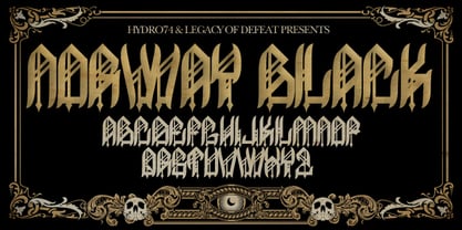
- Formal Invite JNL by Jeff Levine,
$29.00 The thin, condensed serif lettering found in a 1937 magazine ad for Chris Craft boats inspired Formal Invite JNL, which is available in both regular and oblique versions.
 - David Hadash Formal by Monotype,
$50.99Monotype Imaging is pleased to present David Hadash (New" David), the full family of typefaces by Ismar David, in its intended authentic form. The Estate of Ismar David has sought to revive this jewel of Twentieth-Century design by granting an exclusive license to Monotype Imaging to implement it in industry-standard format. Never before has the typeface in its full set of sub-styles been made available to the design community. David Hadash consists of three style families, Formal, Script, and Sans. Each of these appears in three weigths: regular, medium, and bold. Originally devised as a companion to the upright Formal style, the Script style has a beauty and grace all its own that allows it to be used for full-page settings also. While it is forward-leaning and dynamic, it does not match any of the existing cursive styles of Hebrew script. Ismar David created an eminently readable hybrid style which is like no other by inclining the forms of the upright while blending in some features of Rashi style softened with gentle curves. One can say that the Script style is the first truly italic, not just oblique, typeface for Hebrew script. Although the proportions of the Sans style are very similar to those of the Formal style, its visual impression is stunningly different. If the Formal style is believably written with a broad-point pen, the Sans is chiseled in stone. Rounded angles turn angular and stark. The end result is an informal style that evokes both ancient and contemporary impressions. David Hadash (Modern) supports the writing conventions of Modern Hebrew (including fully vocalized text) in addition to Yiddish and Ladino. David Hadash Biblical is a version of the Formal style that supports all the complexities of Biblical Hebrew, including vocalization and cantillation marks. " - Formal Event JNL by Jeff Levine,
$29.00 The hand lettered actors’ credits on a title card from the 1937 film “Shall We Dance” served as the model for Formal Event JNL – an Art Deco sans serif font available in both regular and oblique versions.
 - Romance Fatal Serif Std - Personal use only

- Romance Fatal Goth Premium - Personal use only

- Romance Fatal Goth Versal - Personal use only

- Alpha Romanie Outline G98 - Unknown license

- The Romantic Absolute Duo by Lettersams,
$12.00 The Romantic Absolute Script and Sans are a beautiful and romantic combination of two fonts that have a lot of lovely characters that are very interesting. This font has a beautiful and balanced character, making it suitable for a variety of purposes. such as posters, wedding invitations, logos, product packaging, branding, titles, signs, labels, mugs, book covers, quotes, and others. The Romantic Absolute Script Script features 700+ glyphs covering characters, alternatives and ligatures, including start and end letters, alternates, binders and multiple language support. The Romantic Absolute Sans features 190+ glyphs including binding characters and multiple language support. To access all OpenType Stylistic alternates, you need a program that supports OpenType features such as Adobe Illustrator, Adobe Photoshop, CorelDraw and Microsoft word. This font is PUA encoded which means you can access all glyphs and swashes with ease! Happy designing!
 - The King Of Romance by Creativework Studio,
$18.00 The King Of Romance is a classic and elegant handwritten font. It is enriched with alternative characters and ligatures that make this font even more beautiful. Add it to your favorite creative ideas and make them stand out!
 - ITC Nora by ITC,
$29.99ITC Nora was designed by James Montalbano when he was on a 1930s sign-lettering kick, poring over showcard manuals to find inspiration for new typeface designs. A few letters led him to create this informal, goofy" script, which falls between the many formal scripts and the completely extravagant. ITC Nora displays a free-flowing openness and elegance." - Noale MF by Masterfont,
$59.00 - Nora Art by vve.type,
$44.99 Nora Art is based on Nora Grotesque . It transformed with variations of every letter by using different styles. This amazing font family is based on layer combinations and gives endless possibilities to make various designs. Each style could be used separate or merged in order to create any kind of design you can imagine! It is the perfect solution for logos, headlines and posters that really stand out.
 - Noras Blooming by Slex Studio,
$18.00 Introducing, Nora's Blooming is a chic + modern sans serif font. Nora's font is perfect for branding, logos, social media, prints, stickers, shirts, svg files, and more! Nora's Blooming is unique in that it can be used for a variety of design styles. Me Great for free-spirited boho designs as well as for a classier editorial look! There are fun style alternatives available for use with this font. These letters are embedded in font files and easily accessible in programs such as Photoshop and Illustrator. thank you!
 - Nora Halim by Beary,
$12.00 Introducing the elegant Nora Halim! Nora Halim is a Scrip font, every single letters has been carefully crafted to make your text looks beautiful. With modern script style this font will be perfect for many different project ex: photography, watermark, quotes, blog header, poster, wedding, branding, logo, fashion, apparel, letter, invitation, stationery, etc.
 - Nora Grotesque by vve.type,
$34.99 Nora Grotesque is a modern sans serif type family of five weights plus true matching obliques, all completely equipped with opentype features, fractions, lining numbers, old style figures, capsular numbers, superscript and inferiors. It has been designed parallel within the neogrotesque universe of typefaces and is inspired by humanist proportions and humanist-grotesk features in multiple languages, support Central and Eastern European as well as Western European languages. Working on Nora Grotesque type family, we've aimed to create a modern geometric grotesk with the widest implementation range, a reliable workhorse. Nora Grotesque is equipped for complex, professional typography with a high x-height for maximum legibility and a powerful personality then other alternates. We've been especially careful working on the uniq geometry of each glyph, both from the point of view of visual correctness and forms continuity.
 - Sastica Nora by Aqeela Studio,
$20.00 Sastica Nora is a smooth and elegant handwritten font. Its distinctive, rounded font makes this font a masterpiece. Fall in love with its incredibly versatile style and use it to create spectacular designs! This font is PUA encoded which means you can access all glyphs and swashes with ease!
 - Nora Slab by vve.type,
$34.99 Nora Slab blends a geometric inspiration with warm humanist elements, making it the perfect choice for when you need a fresh, contemporary slab serif typeface. The companion Nora Grotesque makes the Nora family a real workhorse for any use, including web, digital, print, branding and signage. Nora Slab has a large x-height and open counterforms, making it easily readable. It supports multiple languages: Central and Eastern European as well as Western European languages. It has eight weights with related obliques.
 - Nona Manis by Gilar Studio,
$16.00 Nona Manis is a Handwritten Display Font With 3 Style (Regular,Outline and Shadow) You Can Mix And Match for Your Awesome Project This fonts is ideal for crafting, branding and decorate your any project. This fonts are perfect for wedding invitation or your blog. Also with their help, you can create a logo or beautiful frame for your home. Or just use for your business, book covers, stationery, marketing, magazines and more. FEATURES : Uppercase & Lowercase Number & Punctuation More than 244 of glyphs Support for 60+ Multilingual languages PUA Encode 12 Ligatures Alternate 7 OpenType features ( aalt dlig frac liga ordn sups kern ) The font Nona Manis contains 18 ligatures in 3 OpenType features The alternative characters were divided into several Open Type features can be accessed by using Open Type savvy programs such as Adobe Illustrator, Adobe InDesign, Adobe Photoshop Corel Draw X version, And Microsoft Word. And this Font has given PUA unicode (specially coded fonts). so that all the alternate characters can easily be accessed in full by a craftsman or designer. Check my other Font here https://gilarstudio.com/
 - Nora Notes by Gassstype,
$23.00 Hello Everyone, introduce our new product Nora Notes is All Caps Display Font with a natural feel. This handmade font will make your design has a beautiful natural touch for each details. It is perfect for any design project as Invitation,logo, book cover, craft or any design purposes. Nora Notes is Inspired by Food Logo style and combination with Unique Craft style. that will fulfill your design needs for quotes,sporty theme, logotype, wordmark, etc. This has many opentype features and support multi language. This font is PUA encoded which means you can access all of the magical glyphs with ease! You can activate Alternates glyphs OpenType panel.
 - Hotel Coral Essex - Personal use only

- Goudy Ornate MT by Monotype,
$29.99Over the course of 50 years, the charismatic and enterprising Frederic W. Goudy designed more than 100 typefaces; he was the American master of type design in the first half of the twentieth century. Goudy Old Style, designed for American Type Founders in 1915-1916, is the best known of his designs, and forms the basis for a large family of variants. Goudy said he was initially inspired by the cap lettering on a Renaissance painting, but most of the flavor of this design reflects Goudy's own individualistic style. Recognizable Goudy-isms include the upward pointing ear of the g, the diamond-shaped dots over the i and j, and the roundish upward swelling of the horizontal strokes at the base of the E and L. The italic was completed by Goudy in 1918, and is notable for its minimal slope. Goudy Bold (1916-1919) and Goudy Extra Bold (1927) were drawn not by Goudy, but by Morris Fuller Benton, who was ATF's skillful in-house designer. Goudy Catalogue was drawn by Benton in 1919-1921 and was meant to be a medium weight of Goudy Old Style. Goudy Heavyface was designed by Goudy for Monotype in 1925, and was intended to be a rival to the successful Cooper Black. Goudy Modern was designed by Goudy in 1918; its small x-height, tall ascenders and shorter caps impart a spacious and elegant feeling. Benton designed Goudy Handtooled, the shaded version that has just a hairline of white through its bold strokes. The Goudy faces, especially the bolder weights, have long been popular for display and advertising design. They continue to pop up all over the world, and still look reassuring to our modern eyes." - LTC Goudy Ornate by Lanston Type Co.,
$24.95 Goudy Ornate (also known as Ornate Title) was designed in 1931 by Frederic Goudy. He states "It is a simple, decorative face that has been used by some good presses for use on title-pages where size is more important than blackness of line." The new Lanston version includes a lower case and full character set designed in the style of Frederic Goudy.


