10,000 search results
(0.041 seconds)
- Patrilya Script by Mercurial,
$12.00 Patrilya Script A New Romantic Script Calligraphy made with a touch of lovely and charming attraction that adds to the impression of a beautiful and elegant. a charming typeface and So beautiful on invitation like greeting cards, wedding invitation, branding materials, business cards, quotes, posters, headings, signature, logos, t-shirt, letterhead, signage, label, news, posters, badges and more Patrilya Script has a script typeface and extra letters and included floral ornaments that allows you to be more fancy and more extraordinary in designing. Patrilya Script requires no special software to use or access the alternate letters. You can even use Patrilya Script in basic writing apps like Word For those with Opentype capable software ( Photoshop CC or any version of Illustrator/ Indesign), Patrilya Script also comes with Opentype features such as access to all the alternate letters and double letter ligatures. And this Font has given PUA unicode (specially coded fonts). so that all the alternate characters can easily be accessed in full by a craftsman or designer. Don't forget to check out other cool fonts on our store and wait for new fonts. Follow our shop for upcoming updates including additional glyphs and language support. feel free to send me a message, comment, like and share. Thanks
 - DearJoe 6 by JOEBOB graphics,
$29.00 The dearJoe series of fonts had it’s origin somewhere around 1999, the year I created dearJoe 1, which was a first (and half-assed) attempt at converting my own handwriting into a working font. Being able to type in my own handwriting had always been a childhood fantasy, and even though I only partly understood the software, a working font was generated and I decided to put it on the internet for people to use. And that’s what they did: at this moment the dearJoe 1 font has been downloaded millions of times and can be found on just about anything, ranging from Vietnamese riksjas, a Tasmanian gym to a fancy chocolate store on 5th Avenue. The font is not something I am particularly proud of, but it started me of in building what later became the JOEBOB graphics font foundry. Inbetween creating other fonts, the dearJoe series has become a theme I revisit every once in a while, trying to create an update on how my handwriting evolved, along with my abilities in creating fonts that mimic actual handwriting. In the last decade or so I started implementing ligatures and alternate characters, which helped a lot in making something that can almost pass for actual handwriting.
 - Staylucky by Nathatype,
$29.00 It can be a tough challenge to find a perfect font for your aesthetic projects to create an everlasting nuance. Handwriting fonts have prominent displays and nuances, but they often rely on old-fashioned script fonts. Therefore, Staylucky is here to give you the best. Staylucky is a script font created to be a visually attractive handwriting which is perfect to express modern, elegant nuances with personalized designs to amaze readers and to protrude your messages. It is made in cursive styles in which the letters are interconnected. Details on each letter show high contrast and curvy wipes on each edge. Its complicated forms made it more suitable to apply for big, short texts. You can also enjoy the available features here as well. Features: Ligatures Stylistic Sets Multilingual Supports PUA Encoded Numerals and Punctuations Staylucky fits best for various design projects, such as brandings, invitations, greeting cards, name cards, quotes, printed products, merchandise, social media, etc. Find out more ways to use this font by taking a look at the font preview. Thanks for purchasing our fonts. Hopefully, you have a great time using our font. Feel free to contact us anytime for further information or when you have trouble with the font. Thanks a lot and happy designing.
 - Lovely Morentia by Mercurial,
$19.00 Lovely Morentia is lovely script calligraphy made with a touch of sweet, lovely and charming attraction that adds to the impression of a beautiful and elegant. a charming typeface and So beautiful on invitation like greeting cards, sublimation, wedding invitation, branding materials, business cards, quotes, posters, aheadings, signature, logos, t-shirt, letterhead, signage, lable, news, posters, badges and more What is interesting? Imagine you get a beautiful and very charming font in the design you make. that would be the answer you wanted right now. Lovely Morentia has a script typeface and extra letters that allows you to be more free in designing. Lovely Morentia come as OTF Files, and requires no special software to use or access the alternate letters. You can even use Lovely Morentia in basic writing apps like Word For those with Opentype capable software ( Photoshop CC or any version of Illustrator/ Indesign), Lovely Morentia also comes with Opentype features such as access to all the alternate letters and double letter ligatures. And this Font has given PUA unicode (specially coded fonts). so that all the alternate characters can easily be accessed in full by a craftsman or designer. Don't forget to check out other cool fonts on our store and wait for new fonts.
 - ForestFire - 100% free

- Celticmd - Unknown license

- Monocolo by Kprojects,
$25.00 Monocolo is the result of a reflection on communication and of the language evolution in the new media. For this reason, some emoticons have been added to the usual glyphs and symbols and icons have been added to the regular. These glyphs, through the use of Discretionary Ligatures (DL) feature, can be recalled by using their name or idea associated with them (in the English language). This feature is designed to retrieve the icons quickly and not to be applied to a text, therefore you have to pay attention to compound words when used through DL.
 - High Fidelity by District 62 Studio,
$59.00 High Fidelity is our funky new variable font that was inspired by an incredible vintage poster we saw at the NYPL (sadly, the designer wasn't credited.) First we developed the ultra wide top-heavy style. Then, unable to resist the dynamics of variable type, we added the narrow width and violà our first variable font was born. We then added "drip" and "stretch" axes so you can play around and customize it to your heart's content. We think it works for anything from album covers, posters, social media, apparel - really anywhere you need a fun, expressive look.
 - AndrewAndreas by Ingrimayne Type,
$5.00 AndrewAndreas is a simple, clean, sans-serif font family that is highly legible and useful for both text and display purposes. The original three weights were designed in 1994 and three additional weights plus oblique styles were added in 2020. Also added were several OpenType features, including subscripts, superscripts, and fractions. The six oblique styles slant the upright styles but do not change the shape of the letters. However, three OpenType stylistic alternatives provide alternative letter forms for a, f, i, j, and l for five of the obliques and they can be used for a more traditional italics appearance.
 - Good Day by Fontop,
$11.00 Welcome my new hand lettered, cute and decorative font Good Day. The font family includes two fonts – Regular and Italic – both with Latin multilingual uppercase letters, lowercase letters, numbers and basic punctuation. With so many stylistic alternates and swashes it’s easy to create cute designs and signs for wedding branding, quotes, ads, logos, prints, social media texts, blogs, and so much more. Swashes are controlled by adding 0/1/2 before or after any letter while alternates can be chosen from the glyphs panel in Adobe apps. Really very easy to use! Both OTF and TTF are included for each font.
 - Dederon Serif by Suitcase Type Foundry,
$75.00Dederon Serif has been specifically designed for book setting. Preliminary sketches were drawn in 2004. Its inspiration – particularly its weight and width proportions – can be traced to the Liberta typeface from the TypoArt type foundry in former Eastern Germany. After a careful study of the model, the design of Dederon branched off into its own direction, finding its distinctive voice and becoming a wholly original type family. Dederon Serif kept most of the elements typical for the Old Style Roman lettering, such as the angle of the stress, the medium x-height, and lower contrast. In large sizes, the typical shapes of the letters stand out – the calligraphic feel characteristic for the Czech typefaces by Oldrich Menhart, the unusual serifs hinting at the angle of the pen, the shapes of the stems, or the terminals of dots and ears. Upon finishing the serif version, a Serif-serif variant called Dederon Serif was added. The construction principles are also derived from the Old Style Roman model, which lends the lettering its open, humanist feel. Yet the design also conforms to the rules of the modern Serif serif. Most characteristics of Dederon Serif match the serif version – the weight of individual cuts, the width proportions, x-height, ascenders' and descenders' length, and the slope of the italics. Each version of Dederon Open Type Std contains the standard Western Latin character set and the Central European characters; a number of basic and accented ligatures, small caps; old style, small caps and caps, table, fraction and superscript numerals; expert glyphs and alternative characters. This brings the total to a comfortable 820 glyphs per weight, permitting truly professional use in the most demanding projects. - Dederon Sans by Suitcase Type Foundry,
$75.00Dederon Serif has been specifically designed for book setting. Preliminary sketches were drawn in 2004. Its inspiration — particularly its weight and width proportions — can be traced to the Liberta typeface from the TypoArt type foundry in former Eastern Germany. After a careful study of the model, the design of Dederon branched off into its own direction, finding its distinctive voice and becoming a wholly original type family. Dederon Serif kept most of the elements typical for the Old Style Roman lettering, such as the angle of the stress, the medium x-height, and lower contrast. In large sizes, the typical shapes of the letters stand out — the calligraphic feel characteristic for the Czech typefaces by Oldrich Menhart, the unusual serifs hinting at the angle of the pen, the shapes of the stems, or the terminals of dots and ears. Upon finishing the serif version, a sans-serif variant called Dederon Sans was added. The construction principles are also derived from the Old Style Roman model, which lends the lettering its open, humanist feel. Yet the design also conforms to the rules of the modern sans serif. Most characteristics of Dederon Sans match the serif version — the weight of individual cuts, the width proportions, x-height, ascenders' and descenders' length, and the slope of the italics. Each version of Dederon Open Type Std contains the standard Western Latin character set and the Central European characters; a number of basic and accented ligatures, small caps; old style, small caps and caps, table, fraction and superscript numerals; expert glyphs and alternative characters. This brings the total to a comfortable 820 glyphs per weight - Saginaw is an elegant and versatile typeface that stands out for its classic yet contemporary feel. Its design is a harmonious blend of traditional serifs and modern design principles, making it a ve...
- Berdina by TM Type,
$12.00 Berdina feels equally charming and elegant. It looks stunning on wedding invitations, thank you cards, quotes, greeting cards, logos, business cards, and every other design which needs a handwritten touch.
 - HOME ROCK by Letterafandi Studio,
$16.00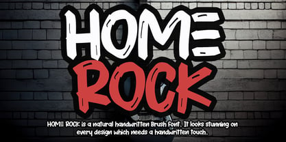 HOME ROCK is a natural handwritten brush font. It looks stunning on thank you cards, quotes, greeting cards, logos, business cards, and every other design which needs a handwritten touch.
 - Rocker Story by Letterafandi Studio,
$16.00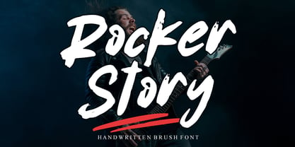 Rocker Story is a natural handwritten brush font. It looks stunning on thank you cards, quotes, greeting cards, logos, business cards, and every other design which needs a handwritten touch.
 - Phat Chance by Scholtz Fonts,
$21.00Phat Chance is a funky, in-your-face font that has strong overtones of modern rap and hip-hop culture. Its broad, fluid line evokes the beat of modern music, the rhythm of contemporary dance, and the power of videogame computer graphics. It is essential for marketing companies targeting: ⁃ the music scene: CD covers, posters, music videos, presentations ⁃ the movie scene: posters, ads, promotion material, copy, movie titles ⁃ the theatre scene: posters, programs, ads, promotions ⁃ the fashion scene: hangtags, posters, brochures, signage, ads ⁃ the fast food market: packaging, promotions, menus, signage ⁃ general packaging ⁃ general advertising - Nyfors by Linotype,
$29.99Nyfors was a sudden idea. I noticed an ad in a magazine, with some handtexted words. I don't recall what the ad was about, neither the words. When I later on tried to remember how the single characters looked like and began to draw them, the result wasn't bad at all. I am not longer sure that they resemble the characters in the ad, but it doesn't matter. Nyfors is a nice handtexted typeface, whatever its origin. There is a small stream in Tyresö where I live and work, called Nyfors. During some centuries there was a center of small scale industries along it, and they used its water to run their machinery. The typeface has its name from that stream. Nyfors was released in 1995. - 112 Hours by Device,
$9.00 Rian Hughes’ 15th collection of fonts, “112 Hours”, is entirely dedicated to numbers. Culled from a myriad of sources – clock faces, tickets, watches house numbers – it is an eclectic and wide-ranging set. Each font contains only numerals and related punctuation – no letters. A new book has been designed by Hughes to show the collection, and includes sample settings, complete character sets, source material and an introduction. This is available print-to-order on Blurb in paperback and hardback: http://www.blurb.com/b/5539073-112-hours-hardback http://www.blurb.com/b/5539045-112-hours-paperback From the introduction: The idea for this, the fifteenth Device Fonts collection, began when I came across an online auction site dedicated to antique clocks. I was mesmerized by the inventive and bizarre numerals on their faces. Shorn of the need to extend the internal logic of a typeface through the entire alphabet, the designers of these treasures were free to explore interesting forms and shapes that would otherwise be denied them. Given this horological starting point, I decided to produce 12 fonts, each featuring just the numbers from 1 to 12 and, where appropriate, a small set of supporting characters — in most cases, the international currency symbols, a colon, full stop, hyphen, slash and the number sign. 10, 11 and 12 I opted to place in the capital A, B and C slots. Each font is shown in its entirety here. I soon passed 12, so the next logical finish line was 24. Like a typographic Jack Bauer, I soon passed that too -— the more I researched, the more I came across interesting and unique examples that insisted on digitization, or that inspired me to explore some new design direction. The sources broadened to include tickets, numbering machines, ecclesiastical brass plates and more. Though not derived from clock faces, I opted to keep the 1-12 conceit for consistency, which allowed me to design what are effectively numerical ligatures. I finally concluded one hundred fonts over my original estimate at 112. Even though it’s not strictly divisible by 12, the number has a certain symmetry, I reasoned, and was as good a place as any to round off the project. An overview reveals a broad range that nonetheless fall into several loose categories. There are fairly faithful revivals, only diverging from their source material to even out inconsistencies and regularize weighting or shape to make them more functional in a modern context; designs taken directly from the source material, preserving all the inky grit and character of the original; designs that are loosely based on a couple of numbers from the source material but diverge dramatically for reasons of improved aesthetics or mere whim; and entirely new designs with no historical precedent. As projects like this evolve (and, to be frank, get out of hand), they can take you in directions and to places you didn’t envisage when you first set out. Along the way, I corresponded with experts in railway livery, and now know about the history of cab side and smokebox plates; I travelled to the Musée de l’imprimerie in Nantes, France, to examine their numbering machines; I photographed house numbers in Paris, Florence, Venice, Amsterdam and here in the UK; I delved into my collection of tickets, passes and printed ephemera; I visited the Science Museum in London, the Royal Signals Museum in Dorset, and the Museum of London to source early adding machines, war-time telegraphs and post-war ration books. I photographed watches at Worthing Museum, weighing scales large enough to stand on in a Brick Lane pub, and digital station clocks at Baker Street tube station. I went to the London Under-ground archive at Acton Depot, where you can see all manner of vintage enamel signs and woodblock type; I photographed grocer’s stalls in East End street markets; I dug out old clocks I recalled from childhood at my parents’ place, examined old manual typewriters and cash tills, and crouched down with a torch to look at my electricity meter. I found out that Jane Fonda kicked a policeman, and unusually for someone with a lifelong aversion to sport, picked up some horse-racing jargon. I share some of that research here. In many cases I have not been slavish about staying close to the source material if I didn’t think it warranted it, so a close comparison will reveal differences. These changes could be made for aesthetic reasons, functional reasons (the originals didn’t need to be set in any combination, for example), or just reasons of personal taste. Where reference for the additional characters were not available — which was always the case with fonts derived from clock faces — I have endeavored to design them in a sympathetic style. I may even extend some of these to the full alphabet in the future. If I do, these number-only fonts could be considered as experimental design exercises: forays into form to probe interesting new graphic possibilities.
 - Alaturka by Bülent Yüksel,
$19.00 ABOUT FAMILY: What makes "Alaturka" elegant, friendly and contemporary is its very rounded curves with very open terminals. "Alaturka" has been designed with a higher "x-height" than other fonts in its class to make tiny readability more obvious in any use situation. It will be ideal for use in small sizes such as business cards or mobile applications. This typeface is also equipped with powerful OpenType features to satisfy the most demanding professionals. It has solid features like case sensitivity, small, true capitals, full ligatures, tabular figures for tables, old-style figures to elegantly insert numbers into your sentences, and more alternative characters to give personality to your projects. FEATURE SUMMARY: - 2 style: 1From 1923 To 2023 - 8 weights: Thin, Extra Light, Light, Regular, Medium, Bold, Extra Bold, and Black. - 3widths: Normal, Narrow, and Condensed. - Matching italics (12º) for all weights and widths. - Matching small caps for all weights and widths. - Lining and old-style figures (proportional and tabular). - Some alternate characters - Unlimited fractions. - Automatic ordinals (1st, 2nd, 3rd, etc.). - Extended language support: Most Latin-based scripts - Extended currency support. You can enjoy using it.
 - Outside Voice by Molly Suber Thorpe,
$13.99 Outside Voice is a handwritten, all-caps typeface, created as an homage to the robust history of handwritten protest signs. It's a beautiful display font for a huge range of projects, from poster art to holiday cards. With contextual alternates enabled, this font will automatically cycle through three sets of handwritten alphabets as you type. The result is type that looks as imperfect and handmade as a digital font can get. This makes Outside Voice a wonderful choice for pairing with hand-drawn illustrations. Consider varying the size, slant, and/or color of each line in your layouts. These adjustments make Outside Voice look even more handmade and organic, which is great for fun designs like posters and quotes. This typeface is quirky and ligature-rich, with over 600 glyphs and icons. It supports Latin and Modern Greek alphabets, and includes all European language diacritical markings. It includes a set of decorated word ligatures comprised of common protest words like 'peace,' 'vote', and 'yes!'. Additionally, you'll get a full set of common protest icons, such as a raised fist, planet, dove, and peace sign.
 - Enzian by Polygraph,
$65.00 Enzian is the fruit of a yearlong German Chancellor Fellowship sponsored by the Alexander von Humboldt Foundation. Our hope was simple: to make something useful and beautiful out of something that most people consider to be neither. We were fascinated by the complex persona of Blackletter in Germany and drawn to its emotive ornament and its sensual, non-geometry. Two areas in particular, the long-standing rivalry and widely-believed inferiority that Blackletter had with Roman type and Blackletter’s relevance in contemporary culture, became the foundation of the project. The result is Enzian: an invigorated, original Blackletter of uncommon depth and hopefully, a bit of charm. It is warm and expressive, feminine and contemporary, while staying true to its hand-written, calligraphic roots. Enzian is a multi-language, workhorse typeface that can create hierarchy (with unconventional italic and small caps), and has numerals that fit the family. It is a display face that isn't afraid of handling longer text; one that is equally comfortable in headlines and in poetry. We are delighted to announce that Enzian has been awarded a Certificate of Excellence in Type Design by the Type Director’s Club.
 - Hey Sweety by Stringlabs Creative Studio,
$29.00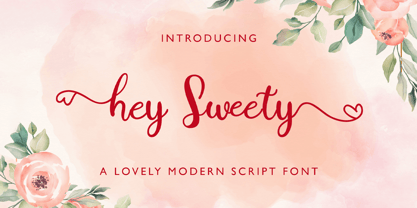 Hey Sweety feels equally charming and elegant. It looks stunning on wedding invitations, thank you cards, quotes, greeting cards, logos, business cards and every other design which needs a handwritten touch.
 - Jordan Smith by Letterafandi Studio,
$14.00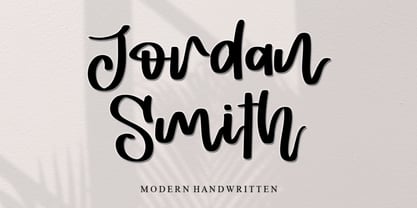 Jordan Smith is a natural handwritten font. It looks stunning on wedding invitations, thank you cards, quotes, greeting cards, logos, business cards, and every other design which needs a handwritten touch.
 - Cinthya Einzberg by Stringlabs Creative Studio,
$29.00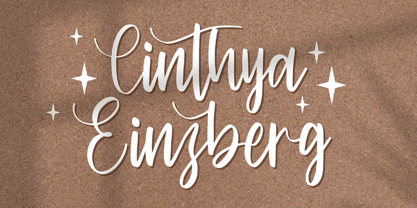 Cinthya Einzberg feels equally charming and elegant. It looks stunning on wedding invitations, thank you cards, quotes, greeting cards, logos, business cards and every other design which needs a handwritten touch.
 - Sellviny Queen by Stringlabs Creative Studio,
$29.00 Sellviny Queen feels equally charming and elegant. It looks stunning on wedding invitations, thank you cards, quotes, greeting cards, logos, business cards and every other design which needs a handwritten touch.
 - Severe by Gerald Gallo,
$20.00 Severe is a clean, contemporary, condensed, geometric font family. There are 2 fonts in the Severe family, Severe Lower Case and Severe Small Caps. The small caps versions has small caps in place of the lower case alphabet. The lower case and small caps versions have the same uppercase alphabet, numbers, punctuation, symbols and miscellaneous characters. In addition to the cap height numbers there are small cap height numbers in each. The Severe fonts are ideal for headlines, titles, branding, small blocks of text or wherever a fresh, contemporary, condensed font is desirable. Severe Lower Case and Severe Small Caps are sold only as a set priced at $20.
 - Good Times by Typodermic,
$11.95 Introducing Good Times, the techno-inspired typeface that will take your designs to the next level. With its wide, capsule-shaped design, Good Times is perfect for high-tech, sports, and scientific themes. The letterforms were inspired by the lettering used on Pontiac cars from 1989-1994 and is designed with straight lines, simple forms, and unconnected strokes. Whether you’re designing for a futuristic tech company or a cutting-edge sports brand, Good Times has you covered. The font comes in seven different weights, including oblique styles, so you can choose the perfect weight for your project. For a more edgy look, check out Good Times Bad Times, a rusty texture variant that adds a rugged feel to your designs. And with OpenType technology, you can automatically substitute common letter pairings with customized ones for a genuine chipped metal aesthetic. But that’s not all. If you’re looking for lowercase letters, be sure to check out Good Timing, the follow-up to Good Times. With its sleek, modern look, Good Timing is the perfect complement to Good Times, offering even more design possibilities. So whether you’re creating a high-tech ad campaign or a scientific presentation, Good Times is the font that will make your design stand out. With its distinctive capsule-shaped design and versatile weights, you can create designs that are both bold and sophisticated. So why wait? Try Good Times today and see the difference for yourself! Most Latin-based European writing systems are supported, including the following languages. Afaan Oromo, Afar, Afrikaans, Albanian, Alsatian, Aromanian, Aymara, Bashkir (Latin), Basque, Belarusian (Latin), Bemba, Bikol, Bosnian, Breton, Cape Verdean, Creole, Catalan, Cebuano, Chamorro, Chavacano, Chichewa, Crimean Tatar (Latin), Croatian, Czech, Danish, Dawan, Dholuo, Dutch, English, Estonian, Faroese, Fijian, Filipino, Finnish, French, Frisian, Friulian, Gagauz (Latin), Galician, Ganda, Genoese, German, Greenlandic, Guadeloupean Creole, Haitian Creole, Hawaiian, Hiligaynon, Hungarian, Icelandic, Ilocano, Indonesian, Irish, Italian, Jamaican, Kaqchikel, Karakalpak (Latin), Kashubian, Kikongo, Kinyarwanda, Kirundi, Kurdish (Latin), Latvian, Lithuanian, Lombard, Low Saxon, Luxembourgish, Maasai, Makhuwa, Malay, Maltese, Māori, Moldovan, Montenegrin, Ndebele, Neapolitan, Norwegian, Novial, Occitan, Ossetian (Latin), Papiamento, Piedmontese, Polish, Portuguese, Quechua, Rarotongan, Romanian, Romansh, Sami, Sango, Saramaccan, Sardinian, Scottish Gaelic, Serbian (Latin), Shona, Sicilian, Silesian, Slovak, Slovenian, Somali, Sorbian, Sotho, Spanish, Swahili, Swazi, Swedish, Tagalog, Tahitian, Tetum, Tongan, Tshiluba, Tsonga, Tswana, Tumbuka, Turkish, Turkmen (Latin), Tuvaluan, Uzbek (Latin), Venetian, Vepsian, Võro, Walloon, Waray-Waray, Wayuu, Welsh, Wolof, Xhosa, Yapese, Zapotec Zulu and Zuni.
 - Brobane by Letterniz,
$27.00 Brobane is a clean and lining brush script. It looks stunning on wedding invitations, thank you cards, quotes, greeting cards, logos, business cards and every other design which needs a handwritten touch.
 - TXT Brush Script by Illustration Ink,
$3.00Personalize your paper creations effortlessly with this brush stroke lettering font. Add unique titles and journaling to scrapbook pages, handmade greeting cards, business cards, name tags, place cards, programs, announcements, or awards. - Sevigne ST by Reserves,
$39.99 Sevigne [sey-vee-nyey] is a highly refined, contemporary geometric stencil, inspired by the ambience of high-end fashion and luxury combined with the raw, utilitarian nature of the stencil. The inclusion of over 130 unique ligatures expand it’s sensibility of alluring, well-balanced letterforms and distinctive style. The stencil marks are atypically placed and vary throughout, giving it a purposely forward presence. Stylistically, as an all-caps typeface, Sevigne exudes a greater sense of harmony and polish due to it’s unicase form where the interplay of a limited amount of characters is the focus. Subtle, considered details are found within individual letters, contrasted by the complex, intersecting forms that make up the various ligatures. With multiple stylistic sets added to the expanded ligatures, individual letters and ligature pairs can be carefully exchanged to fine-tune text settings for a unique custom type solution. Features include: Precision kerning- Expanded set of over 130 Ligatures, including alternates (ae, oe, fi, fl, ffi, ffl, ffj, ff, fh, fj, ft, tt, th, ct, st, oo, og, go, ogo, gog, la, ea, ev, ew, fy, ez, et, oc, ga, do, uv, vu, yu, uy, nn, mm, xy, yx, ao, oa, ac, da, aq, nt, aa, ll, ss, ut, tu, ka, ca, ag, of, off, co, ne, nr, nl, nd, nk, hn, mn, me, mp, al, an, af, ar, ak, ah, ad, ab, and, gg, all, co, ço, he, the, tl, tn, tf, tr, tk, td, tb, te, am, ame, amb, tm, ap, tp, wu, uw, kt, tz, ra, za, mk, xx, yy, vv, ww, ky, fu, oq, cc, cq) Alternate characters (A, G, R, Q, _, $, ®, •, ¶) Slashed zero Full set of numerators/denominators Automatic fraction feature (supports any fraction combination) Extended language support (Latin-1 and Latin Extended-A) *Requires an application with OpenType and/or Unicode support.
 - Sevigne by Reserves,
$39.99 Sevigne [sey-vee-nyey] is a highly refined, contemporary geometric sans, inspired by the ambience of high-end fashion and luxury. The inclusion of over 130 unique ligatures expand its sensibility of alluring, well-balanced letterforms and distinctive style. Stylistically, as an all-caps typeface, Sevigne exudes a greater sense of harmony and polish due to its unicase form where the interplay of a limited amount of characters is the focus. Subtle, considered details are found within individual letters, contrasted by the complex, intersecting forms that make up the various ligatures. With multiple stylistic sets added to the expanded ligatures, individual letters and ligature pairs can be carefully exchanged to fine-tune text settings for a unique custom type solution. Features include: Precision kerning- Expanded set of over 130 Ligatures, including alternates (ae, oe, fi, fl, ffi, ffl, ffj, ff, fh, fj, ft, tt, th, ct, st, oo, og, go, ogo, gog, la, ea, ev, ew, fy, ez, et, oc, ga, do, uv, vu, yu, uy, nn, mm, xy, yx, ao, oa, ac, da, aq, nt, aa, ll, ss, ut, tu, ka, ca, ag, of, off, co, ne, nr, nl, nd, nk, hn, mn, me, mp, al, an, af, ar, ak, ah, ad, ab, and, gg, all, co, ço, he, the, tl, tn, tf, tr, tk, td, tb, te, am, ame, amb, tm, ap, tp, wu, uw, kt, tz, ra, za, mk, xx, yy, vv, ww, ky, fu, oq, cc, cq) Alternate characters (A, G, R, Q, Z, _, $, ®, •, ¶) Slashed zero Full set of numerators/denominators Automatic fraction feature (supports any fraction combination) Extended language support (Latin-1 and Latin Extended-A) *Requires an application with OpenType and/or Unicode support.
 - Odisean SC - Personal use only

- Showcard - Unknown license

- AM Consist by Alexey Markin,
$50.00 This font I had, had only to wake up, sit down and draw it.
 - Sunny Sumo by Mix Fonts,
$13.00 Meet the MIX SUNNY SUMO, the perfect blend of playful and bold that’s sure to make your designs stand out. This three-piece font family includes SUNNY SUMO, SUNNY SUMO LINE, and SUNNY SUMO XOs, each with their own unique style. SUNNY SUMO and SUNNY SUMO LINE are layering fonts, which means you can use them separately or stack them to create dynamic designs. And for those fun finishing touches, SUNNY SUMO XOs offers a variety of doodles including X marks, circles, erase marks, and cross-offs that can be used alongside any graphic work. Designed as a bold handwritten sans serif, SUNNY SUMO is ideal for display fonts and headlines that require attention. This versatile font can be used by designers for logos, book covers, greeting cards, posters, packaging, and so much more. As a multilingual font, SUNNY SUMO supports multiple languages, including all the characters, glyphs, and accent marks needed for specific languages. With SUNNY SUMO, you can strike the perfect balance between relatable and professional, making it a great choice for anyone seeking a playful, bold, and fun layering font. MIX SUNNY SUMO and MIX SUNNY SUMO LINE come with the following glyphs: ABCDEFGHIJKLMNOPQRSTUVWXYZ abcdefghijklmnopqrstuvwxyz 0123456789 !@#$%^&*()`~♥✿•· .,:;'”\|/?{}[]<>“”‘’-–—_÷×+−±≈=≠≥≤ …‚„©®™‹›«»°¹²³¡¿₱¢€£¥½¼¾¶§№† ÁÀÂÃÄȦÅĂĀĄÆĆĈČĊÇÐĐĎÉÈÊĚËĖĒĘḞǴĜǦĠḠĤȞḦḢIÍÌÎÏĪĮĴḰǨĹĽŁḾṀŃŇÑ ÓÒÔÕÖŌŐØŒṔṖŔŘṘŚŜŠŞȘŤṪŢȚÚÙÛŨÜŮŬŪŰŲẂẀŴẄẆÝŶŸŹẐŽŻƵ áàâãäȧåăāąæćĉčċçðđďéèêěëėēęḟǵĝǧġḡĥȟḧḣıíìîïīįĵḱǩĺľłḿṁńňñ óòôõöōőøœṕṗŕřṙśŝšşșťṫţțúùûũüůŭūűųẃẁŵẅẇýŷÿźẑžżƶ MIX SUNNY SUMO XOs comes with the following glyphs: ABCDEFGHIJKLMNOPQRSTUVWXYZ
 - Abrect by Hackberry Font Foundry,
$24.95 My first font for the summer of 2009, Abrect is a new sans serif font where I try to maximize the x-height and keep the design fresh and personal. It fits in with my continuing objective of designing book fonts that I can really use. Abrect is a tangent for me just taking an idea out to its end. In particular, it is a radical modification of my first font in 1993, Nuevo Litho. The hand-drawn shapes vary a lot, many pushing the boundaries of the normal character. With many of the new releases I see, the digital perfection is getting pretty extreme. It’s looking like a Rococo stage of development for many with decoration taking over from function. I'm consciously trying to head a different direction. This is not a normal font for me in that it has caps, lowercase, with the appropriate figures for each case, no small caps. This is the first time I have skipped small caps in over a decade. This font has all the OpenType features in the display set for 2009 except for the small caps. There are several ligatures for your fun and enjoyment: bb gg ff fi fl ffi ffl ffy fj ft tt ty Wh Th and more and many of them are experimental in form. Enjoy!
 - Directa Serif Variable by Outras Fontes,
$170.00 Directa Serif Variable is a text type family in one single font file. It explores new possibilities for the original type family released by Outras Fontes some years earlier, which is designed to save space with the highest readability. The variable font is composed of two axes of variation: Weight (100–900) and Italic (0–1). It also contains 18 predefined styles between Thin and Heavy and their respective italics. So now you can adjust the weight of the type by interpolating it in real time using any variable font compatible app. There are hundreds of possibilities between the values of 100 (Thin) and 900 (Heavy). And if you're feeling adventurous, you can also use the Italic axis to interpolate instances between Roman (0) and Italic (1) and see what happens in the middle. This new technology can be very useful for web and video animations. Directa Serif Variable is also highly recommended for newspapers, magazines, corporate communication and so on. It has a large set of characters, including Western, Central European, Baltic, Scandinavian, Icelandic, Romanian and Turkish unicode ranges. The variable font also includes several ligatures, a complete set of small caps, sets of lining, old style and tabular figures, as well as fractions, superior and inferior numbers. These features can be easily accessed using any OpenType-compatible software.
 - Dunver by Putracetol,
$24.00 Introducing Dunver - a display typeface font inspired by vintage albums and posters from 1960s music bands. The classic typeface, combined with fun and groovy impressions, make Dunver a unique and distinct font choice. This font is perfect for any kind of display purpose, including album covers, posters, labels, t-shirts, apparel, signage, quotes, logos, greeting cards, and logotypes. Dunver is especially well-suited for music and party events. With its retro feel and bold design, it can help you create designs that perfectly capture the energy and excitement of the event. Whether you're designing posters, flyers, or social media graphics for your next gig or music festival, Dunver can help you make an impact. The font comes with a range of features, including alternate characters divided into several OpenType features such as Swash, Stylistic Sets, Stylistic Alternates, Contextual Alternates, and Ligature. These OpenType features can be accessed using OpenType savvy programs such as Adobe Illustrator, Adobe InDesign, Adobe Photoshop CorelDRAW X version, and Microsoft Word. In the zip package, you will find Dunver in otf, ttf, and woff formats. It comes with uppercase and lowercase letters, opentype alternates and ligatures, numbers, punctuation, and symbols, as well as multilanguage support. Dunver is not just a font - it's a versatile tool that can help you bring your creative vision to life.
 - Gadimon by Kotak Kuning Studio,
$12.00 Introducing Gadimon Layered Bold Script. This font is used with layers method, so it can generate interesting fonts to see, you no longer need to worry about how to make effects on the text. Use the Gadimon Basic style for purposes without shadow effect and when spacing is important for a project. Gadimon is suitable to use as a logotype, product designs, labels, watermark, social media posts, apparel, invitations, signboards, sports club, motor/car, special events or anything that need handwriting taste. What you get: - Gadimon includes capital and lowercase letters, Alternates, and Ligatures - Numbers + punctuation - Foreign language support I highly recommend using a program that supports OpenType features and Glyphs panels such as Adobe Illustrator, Adobe Photoshop CC, Adobe InDesign, or CorelDraw, so you can see and access all Glyph variations. This font is encoded with Unicode PUA, which allows full access to all additional characters without having special design software. Mac users can use Font Book, and Windows users can use Character Map to view and copy one of the extra characters to paste into your favorite text editor/application. We hope you enjoy the font, please feel free to comment if you have any thoughts or feedback. Or simply send me a PM or email me at kotakkuningstudio@gmail.com. Thanks for purchasing and have fun!


