10,000 search results
(0.03 seconds)
- Pseudonym by Monotype,
$20.99 Pseudonym is a low-contrast, subtly-flared serif available in four weights across three styles in both roman and italic. As with all of my typeface designs, I am creating fonts that I would use myself for branding purposes—typefaces with style and purpose that are intended for use in creating logos and distinctive branding typography. I wanted to create a typeface that had incisive flared serifs combined with the strength and solidity of modern grotesque faces. The result is Pseudonym, which I feel has great presence, style and legibility. Although I must admit, I had to tone down the flared serifs during the design process in order to achieve that :) I’m sure you will have great fun playing with some of the Open Type features that I’ve added to Pseudonym. There’s a full set of true small caps with their corresponding diacritics and figures. There are also a number of discretionary ligatures, these are chosen from the glyphs palette in your layout app to replace pairs of standard characters. You’ll also enjoy making use of the catchwords – these have been created to harmonise with each style, again, giving you more flexibility and scope to create some innovative typography. Finally, there are some alternate characters for /C/D/O/. You may wish to use these when creating logos that include standard contractions for limited, number, incorporated, etc. Key features: • Pseudonym is a low-contrast, subtly-flared serif that has great presence, style and legibility • 3 styles – Narrow, Regular and Wide • 4 weights in roman and italic: • Light | Regular | Medium | Bold • Full set of small caps with diacritics and figures • 30+ discretionary ligatures, catchwords and alternate characters • Full European character set • 600 glyphs per font
 - Culoare v.2 by Luxfont,
$19.00 Introducing Culoare V2.0 is the second version of the space bright color gradient font. (The first version is here - Culoare) This is a new set with completely new color combinations, bright and saturated like neon. 3 types of stylization in 9 different color gradient combinations with soft transitions. Letters seem to be backlit and it looks very original in addition to stylish minimalist glyphs. Lots of design use cases. Ideal for promotional illustrations, headlines and covers. Font family is based on the Regular font Boldini - which means that if necessary you can combine these two families and they will be absolutely stylistically identical and complement each other. Check the quality before purchasing and try the FREE DEMO version of the font to make sure your software supports color fonts. P.s. Have suggestions for color combinations? Write me an email with the subject "Culoare V2 Color" on: ld.luxfont@gmail.com Features: - Free Demo font to check it works. - Uppercase and lowercase the same size but different colors. - Transparency in letters. - Kerning. IMPORTANT: - Multicolor version of this font will show up only in apps that are compatible with color fonts, like Adobe Photoshop CC 2017.0.1 and above, Illustrator CC 2018. Learn more about color fonts & their support in third-party apps on www.colorfonts.wtf -Don't worry about what you can't see the preview of the font in the tab "Individual Styles" - all fonts are working and have passed technical inspection, but not displayed, they just because the website MyFonts is not yet able to show a preview of colored fonts. Then if you have software with support colored fonts - you can be sure that after installing fonts into the system you will be able to use them like every other classic font. Question/answer: How to install a font? The procedure for installing the font in the system has not changed. Install the font as you would install the classic fonts. How can I change the font color to my color? · Adobe Illustrator: Convert text to outline and easily change color to your taste as if you were repainting a simple vector shape. · Adobe Photoshop: You can easily repaint text layer with Layer effects and color overlay. ld.luxfont@gmail.com
 - Lust Stencil by Positype,
$39.00 When you hear that name, you likely ask yourself, ‘why?!’ I did too, but the number of requests could not be ignored. Once I finally decided to move forward with it, the only way to solve the offering would be to adhere to the same theme of indulgence, I planned for the same number of optical weights AND Italics. Yeah, italic stencils… ok, why not? It’s not a new concept. One thing to note and a creative liberty I assumed during the design. Lust Stencil would not be just a redaction or removal of stress to produce a quick stencil. To do that, would just be a cheap solution. Strokes had to resolve themselves correctly and/or uniquely to the concept of the stencil format. And, it had to be heftier. For it it to look correctly, it needed about 8% additional mass to the strokes for it to retain the effervescent flow of the curves and the resolute scalloped lachrymals. The Lust Collection is the culmination of 5 years of exploration and development, and I am very excited to share it with everyone. When the original Lust was first conceived in 2010 and released a year and half later, I had planned for a Script and a Sans to accompany it. The Script was released about a year later, but I paused the Sans. The primary reason was the amount of feedback and requests I was receiving for alternate versions, expansions, and ‘hey, have you considered making?’ and so on. I listen to my customers and what they are needing… and besides, I was stalling with the Sans. Like Optima and other earlier high-contrast sans, they are difficult to deliver responsibly without suffering from ill-conceived excess or timidity. The new Lust Collection aggregates all of that past customer feedback and distills it into 6 separate families, each adhering to the original Lust precept of exercises in indulgence and each based in large part on the original 2010 exemplars produced for Lust. I just hate that it took so long to deliver, but better right, than rushed, I imagine. It would have taken even longer if not for font engineer and designer, Potch Auacherdkul. Thanks Potch.
 - Baluno by Luxfont,
$22.00 Introducing is a fun and playful pouty Baluno font. Font has embodied the graphic trend of cartoon flat illustrations and will successfully complement modern designs. The font has 2 types of faces, which can be used both independently and together by alternating letters in one word to avoid repeating letters, creating a unique heading. Family is ideal for children's themes, because the font resembles inflated balloons. Creates a relaxed mood and has fun. Set comes in many different carefully selected colors and gradient color options. Check the quality before purchasing and try the FREE DEMO version of the font to make sure your software supports color fonts. P.s. Have suggestions for color combinations? Write me an email with the subject "Baluno Color" on: ld.luxfont@gmail.com Features: Free Demo font to check it works. 2 types of faces. Lots of ready-made matched colors. Gradient color variants. Kerning. IMPORTANT: - Multicolor OTF version of this font will show up only in apps that are compatible with color fonts, like Adobe Photoshop CC 2017.0.1 and above, Illustrator CC 2018. Learn more about color fonts & their support in third-party apps on www.colorfonts.wtf -Don't worry about what you can't see the preview of the font in the tab "Individual Styles" - all fonts are working and have passed technical inspection, but not displayed, they just because the website MyFonts is not yet able to show a preview of colored fonts. Then if you have software with support colored fonts - you can be sure that after installing fonts into the system you will be able to use them like every other classic font. Question/answer: How to install a font? The procedure for installing the font in the system has not changed. Install the font as you would install the other fonts. How can I change the font color to my color? · Adobe Illustrator: Convert text to outline and easily change color to your taste as if you were repainting a simple vector shape. · Adobe Photoshop: You can easily repaint text layer with Layer effects and color overlay. ld.luxfont@gmail.com
 - Charpentier Renaissance Pro by Ingo,
$42.00 A very legible Renaissance Antiqua This typeface is based on the desire to create an Antiqua like those which might have existed at the beginning of the »printing age« — the basic form oriented on the classical Roman and early Middle Ages models, the ductus defined completely by writing with a wide pen and much individual expression in detail. In the spring of 2005 I had the opportunity to closely examine a few pages in the famous book »Hypnerotomachia Poliphili« from 1499. The script used here from Aldus Manutius is exemplary. Most of the book, however, is not very carefully printed. The characters do not stay on the line; the print is at times too strong and at times much too weak. And on these imperfect pages the true character of the letters is recognizable; that is, that they are cut with lively detail which is a result of the patterns provided by full-time writers. After all, around 1499 script was written as a rule and the printed type was oriented on this pattern. I prefer the typeface on the lightly printed pages. The characters are not placed neatly on the line, but the distinct and emerging lively ductus of the individual characters automatically presents harmonious word formations in the eye of the beholder, with the non-perfect line stepping into the background. Also in Charpentier Renaissance, the strokes of the wide pen are still noticeable. The font has very defined softly bent serifs. The forms are powerful and stand solidly on the baseline. Charpentier Renaissance is very legible and yields a solid and yet still lively line formation. The accompanying italic, like its historical models, has almost no inclination. The lower case characters of Charpentier Renaissance Oblique have such idiosyncratic figures that they can also form a font of their own. Please visit www.ingofonts.com
 - The Boodas.de | My | Regular font is a distinctive typeface with a lively and engaging personality. At first glance, its characters capture the eye with their smooth and clean lines, suggesting it's ...
- Ginza Display Inline by Positype,
$22.00Sometimes you get an idea stuck in your head and the only way to get rid of that demon is to put something down on paper. A year later the doodles became a skeleton, and then the skeleton had a body, then the body had a name, then the name got a personality. What was left was a clean set of ten fonts that encompass a very simple skeleton with a lot of visual appeal. During the process, I saw ways to expand the typeface's display capabilities by producing inline styles as well as a down-and-dirty rough set. Each font has a full set of glyphs that include Central European and Small Cap characters. - Ginza by Positype,
$22.00Sometimes you get an idea stuck in your head and the only way to get rid of that demon is to put something down on paper. A year later the doodles became a skeleton, and then the skeleton had a body, then the body had a name, then the name got a personality. What was left was a clean set of ten fonts that encompass a very simple skeleton with a lot of visual appeal. During the process, I saw ways to expand the typeface’s display capabilities by producing inline styles as well as a down-and-dirty rough set. Each font has a full set of glyphs that include Central European and Small Cap characters. - Ginza Display Rough by Positype,
$22.00Sometimes you get an idea stuck in your head and the only way to get rid of that demon is to put something down on paper. A year later the doodles became a skeleton, and then the skeleton had a body, then the body had a name, then the name got a personality. What was left was a clean set of ten fonts that encompass a very simple skeleton with a lot of visual appeal. During the process, I saw ways to expand the typeface's display capabilities by producing inline styles as well as a down-and-dirty rough set. Each font has a full set of glyphs that include Central European and Small Cap characters. - Ridicule - Unknown license

- Donthank by Letterhend,
$19.00 Introducing, Donthank Script Typeface. Donthank is a script typeface with swash.This font is perfect for quotes, branding, packaging, etc. What will you get: Including number and symbol. Support Multi Language Ligatures Alternates This font also support PUA Encoded! So, grab your own. Thank You!
 - Caffe Lungo by Hanoded,
$15.00 Caffe Lungo is a beautiful set of handmade fonts. Lungo is very legible, very clear, but has that authentic ‘handmade’ look. Caffe Lungo comes in three weights, each with its own Italic style. I also added ligatures for the g_j and j_j letter combinations.
 - Celliqath by Letterena Studios,
$10.00 Proudly present Celliqath Typeface , created by Storytype, A serif modern and classic typeface that has own unique style & modern look. This typeface is perfect for an elegant & luxury logo, book or movie title design, fashion brand, magazine, clothes, lettering, quotes, and so much more.
 - Cellosia by Bluestudio,
$20.00 Cellosia is made to resemble hand scratches, so it looks like a natural style like your own hand scratches. Cellosia offer beautiful typographic harmony for a variety of design projects, including watermark, logos, branding, wedding designs, social media posts, advertisements, product designs, magazines and others.
 - Versatylo Rounded by Variatype,
$14.00 Versatylo is a very strong and outstanding branding font that is usable in any company that wants to make its image look modern and high technology. So, let's make your own logotype with this font. FONT FEATURES Additional Accents 66 Languages Kerning Alternates Ligatures
 - Zalcony by HandletterYean,
$16.00 Introducing Zalcony, a captivating handmade font exuding a simple yet alluringly distorted brush aesthetic. Every letter and character carries its own unique size, beautifully showcasing the authentic, natural flow of handwritten script. With Zalcony, add a touch of genuine, personalized charm to your designs.
 - Mallory by Letterena Studios,
$10.00 Proudly present Mallory Typeface , created by Storytype, A serif modern and classic typeface that has own unique style & modern look. This typeface is perfect for an elegant & luxury logo, book or movie title design, fashion brand, magazine, clothes, lettering, quotes, and so much more.
 - Mehriban by Michael Browers,
$25.00Mehriban is a deconstructivist revival inbred from Michael Browers' previous work: Formasi and Disjecta. Formasi characters were morphed with their Disjecta counterparts, and in some cases with previously unpublished letterforms from Disjecta's concepting stages, resulting in a grunge font with its own unique swagger. - Saritha by Bluestudio,
$20.00 Saritha is made to resemble hand scratches, so it looks like a natural style like your own hand scratches. Saritha offer beautiful typographic harmony for a variety of design projects, including watermark, logos,branding, wedding designs, social media posts, advertisements, product designs, magazines and others.
 - Merry Fleurons by Greater Albion Typefounders,
$3.95 Merry Fleurons is a bit of fun for Christmas, New Year and the holidays. It's ideal for decorating your own cards, party banners and any sort of Christmas publications. Need Holly? Christmas Trees? Baubles? Candy Canes? Angels? Merry Fleurons is just what you need.
 - Dragon Heroes by Letterara,
$16.00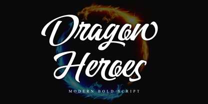 Dragon Heroes is a modern bold script font, carefully handcrafted to become a true favorite. Its casual charm makes it appear wonderfully down-to-earth, readable, and, ultimately, incredibly versatile. This font will look outstanding in any context, whether it’s being used on busy backgrounds or as a standalone headline! This font is PUA encoded which means you can access all of the glyphs and swashes with ease!
 - Horror Party by Ake,
$12.00 Horror Party is a spine-chilling Halloween display font designed to send shivers down your spine. With a ghoulish twist on traditional lettering, this font adds a touch of eerie enchantment to your designs. Perfect for t-shirt designs, party invitations, and all things spooky, Horror Party brings the thrill of the macabre to your creative projects. Unleash your dark side and let this font make a haunting impression!
 - Blacker Script by Letterara,
$14.00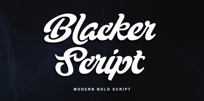 Blacker Script is a modern bold script font, carefully handcrafted to become a true favorite. Its casual charm makes it appear wonderfully down-to-earth, readable, and, ultimately, incredibly versatile. This font will look outstanding in any context, whether it’s being used on busy backgrounds or as a standalone headline! This font is PUA encoded which means you can access all of the glyphs and swashes with ease!
 - Hoosegow JNL by Jeff Levine,
$29.00Sagebrush John, your bank robbin' days are over. I'm throwin' you in the hoosegow! Hoosegow JNL isn't a small town jailhouse, but it is Jeff Levine's take on a classic wood type that brings out the Old West in any design layout. The beauty of many of these vintage wood type alphabets is their "imperfect" letter forms - giving your work a touch of the old days of letterpress printing. - Sunbreak by Olivetype,
$18.00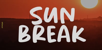 Sunbreak is a bold handwritten font, carefully handcrafted to become a true favorite. Its casual charm makes it appear wonderfully down-to-earth, readable, and ultimately, incredibly versatile. Sunbreak will look outstanding in any context, whether it’s being used on busy backgrounds or as a standalone headline! This font is supporting Multi-Languages, which includes: Afrikaans Albanian Catalan Danish Dutch English Estonian Finnish French German Italian Norwegian Portuguese Spanish Swedish Zulu.
 - Presser by Konstantine Studio,
$9.00 80s. , 90s, y2k, sometimes we just wonder, "what year is it today?" everything looks like we're going backward (in a good way though, calm down). Since luck is a form of preparation that meets a chance, again, we came up prepared. Introducing PRESSER. A new sans-serif family with the diverse vibes of nostalgia and modernism in one shot. ps: it's WIDE, like seriously wide, extended. We warned you.
 - Monogram kk sc - Personal use only

- monogram kk - Personal use only

- Breadley Serif by Ardyanatypes,
$10.00 Breadley Serif It was a continuation version of the previous one (Breadley Sans) that come up with Serif type look, surely including small decorative on the ends of some of the strokes that make it more expressive. Still stunning great with an elegant look and stands strongly on its own as a heading and brand logo. This Serif version of BREADLEY fancier within sexy touch for business utilities use like business card, name sign, uniform as brand elevation, and many more. This serif BRADLEY typeface, obviously fit to embossed as an exclusive brand tag or even decorating your enormous office corner. You can view all of the available characters in the screenshots above, and you can try out the brand new BRADLEY SERIF now for any design matter. Breadley Serif also has five weights, plus an extra superbold weight, Ligatures, small caps, old-style numerals, and other OpenType features Latin and multilingual support A guide to accessing all alternatives can be read at http://adobe.ly/1m1fn4Y Adobe Photoshop go to Window – glyphs Adobe Illustrator go to Type – glyphs Thank you and have a nice day
 - Anziano Pro by MAC Rhino Fonts,
$59.00 Anziano follows the direction staked out with Delicato. When creating traditional typefaces, it is inevitable to be influenced by earlier designs. Anziano does show touches of another classic typeface – Weiss (by Emil Rudolf Weiss, 1926). Weiss is often misjudged and overlooked. Perhaps the most well known Swedish typeface – Berling (by Karl-Erik Forsberg, 1914–1995) is actually based largely on Weiss. MRF have appreciated the design of Weiss uprights for a long time. When Stefan Hattenbach bought the first Swedish edition of The Lord of the Rings (1959–61), in 2004, he was amazed by the excellent flow of the text presented on each page. Despite the very original character that Weiss has, it was a pleasure to read a book set in such a typeface. MRF realized that several major foundries had already done interpretations of Weiss, more or less true to the original. MRF didn’t want to add on to that list! Instead Stefan tried to find his own path. Anziano consists of three core styles, Regular, Italic and Bold; each with small caps, ornaments, stylistic ligatures, and extended Latin accents. Lining, tabular, oldstyle and smallcap numerals help round out Anziano’s typographic range and function.
 - Typnic by Corradine Fonts,
$19.95 Everybody likes to have a picnic: some fresh fruits, cheese, ham, wine and so on. Like a “typographic picnic,” Typnic font system gathers many fonts with different flavors too, and you can enjoy them mixed or on their own. Typnic was drawn and calligraphed by hand and is made with eighteen typefaces, including three totally compatible yet different styles. It also has enhancement sets containing labels, dingbats, patterns and ornaments. The Headline style has six layered fonts that can be mixed in a wide variety of combinations to obtain powerful mastheads and headlines. It can be used to construct very nice advertising pieces. If you need to write informal texts, then use Typnic Script, which also comes in six variants and additionally has a complementary font with tails, double letters and ornamented ascenders. Finally, use Typnic Roman to add some secondary texts without losing the general appearance of your work. Typnic has a cool and natural feeling and could be used in all sorts of projects. Typnic is a very ambitious project and we will be working on it to further expand the whole system. Please check out our Typnic Headline Slab.
 - Stray by Tour De Force,
$25.00 Stray might be the lonesome cowboy in this big odd world, but it's his just public façade. Stray is handsome player that works well with any team or in any environment. He doesn't have a horse, but he can be the one, he can carry any weight. OK, let's talk serious now: Stray is distinctive geometric sans serif family in 9 weights and matching Italics. By it's design, Stray flirts with humanistic typefaces in some elements, while on the other side, we can see vintage letter forms as well. It is well balanced typeface, fully legible in any (reasonable) size, with power to present versatile tasks and situations. Specific joining of letter stem and bowl is one of design characteristics of Stray, so it is not just another geometric sans family, it really differs in it's own details. Contains extended Latin character map support and Cyrillic (no localizations, sorry). As any serious working horse family, it is equipped with decent OpenType features like Small Caps (for basic Latin only), Fractions, Tabular Figures, Denominator, Numerator, Ordinals and Ligatures. It also comes with small interesting set of dingbats. This Stray is not homeless, he just looks for the proper job :-)
 - Sweet Gothic by Sweet,
$39.00 Sweet Gothic is a 2009 addition to the Sweet Collection of engraved lettering styles from the 20th Century. Sweet Gothic Light is closely based on lettering from an engravers pattern from the early 1900s that was used for tracing letterforms with the engraving machine (pantograph) to make steel engraving plates. The design is related to many similar engravers gothics developed in the early 1900s, but as each engraving house created by hand their own patterns for popular styles of the time, there is variation among the models. Sweet Gothic offers contrast in stroke weight and its unique personality. The bolder weights are new designs, based on the characteristics of the Light. A serif variant (Sweet Gothic Serif) has also been developed to expand the usefulness of the family, offering an alternative to Copperplate Gothic. As such, most of the fonts are new designs, yet may seem familiar and ubiquitous given their model. The fonts offer two sizes of figures and monetary symbols: one set is intended for use with upper- and lowercase settings; the second set is the same height as the small caps.
 - Atomic Marker by Set Sail Studios,
$16.99 Inject some energy into your design with the ATOMIC Marker Font. This loud and proud all-caps font was hand-drawn with a real acrylic marker, maintaining the authentic high definition brush detail in each stroke. It’s an exhilarating font choice perfect for header text, poster designs, album covers, product designs, merchandise, logos & more. The Atomic Marker family includes 2 fonts; Atomic Marker • Includes 2 sets of uppercase characters, simply switch between upper & lowercase on your keyboard to access the 2 sets. Also included are 18 ligatures (double letter pairings), which can be accessed by turning on ‘Standard Ligatures’, and 6 Small Caps, which can be accessed by turning on Small Caps. (All characters can also be accessed via a Glyphs panel). Atomic Marker Extras • Includes 26 ‘doodles’ (see images), and 23 underlines, designed to perfectly pair with the Atomic Marker font letters. Simply install this as it’s own separate font, and type A-Z (doodles) or a-w (underlines) to access each design. Language Support; Atomic Marker supports the following languages; English, French, Italian, Spanish, Portuguese, German, Swedish, Norwegian, Danish, Dutch, Finnish, Indonesian, Malay, Hungarian, Polish, Croatian, Turkish, Romanian, Czech, Latvian, Lithuanian, Slovak, Slovenian
 - Sabon Next by Linotype,
$57.99 The design of Sabon® Next by Jean François Porchez, a revival of a revival, was a double challenge: to try to discern Jan Tschichold´s own schema for the original Sabon, and to interpret the complexity of a design originally made in two versions for different typecasting systems. The first was designed for use on Linotype and Monotype machines, and the second for Stempel hand composition. Because the Stempel version does not have the constraints necessary for types intended for machine composition, it seems closer to a pure interpretation of its Garamond ancestor. Naturally Porchez based Sabon Next on this second version and also referred to original Garamond models, carefully improving the proportions of the existing digital Sabon while matching its alignments. The new family is large and versatile - with Roman and italic in 6 weights from regular to black. Most weights also have small caps, Old style Figures, alternates (swashes, ligatures, etc); and there is one ornament font with many lovely fleurons. The standard versions include revised lining figures that are intentionally designed to be a little smaller than capitals. Featured in: Best Fonts for Resumes, Best Fonts for Websites, Best Fonts for PowerPoints
 - New Icon by Set Sail Studios,
$34.99 Introducing the New Icon Font Duo. This luxury script and timeless serif are perfectly designed for one another-not only are they strong standalone fonts, but will pair beautifully when placed side by side. Feeling creative? They can even be mixed together within the same word for a more eye-catching layout, giving you a versatile set of fonts which can be used & loved across a range of design projects. Included in this family; New Icon Serif • A classic, all caps serif font with nostalgic notes. Contains alternate large-width O,G,Q,C characters in the ‘uppercase’ set. New Icon Serif Condensed • A thinner version of the New Icon Serif. New Icon Script • A luxury, cursive script font containing upper & lowercase characters. A beautiful letter set inspired by traditional calligraphy, which can be used on it’s own or paired effortlessly with the serif font. Contains alternate lowercase y & g with elongated tails, accessible by turning on ‘Stylistic Alternates’ or via a Glyphs panel. Language Support • English, French, Italian, Spanish, Portuguese, German, Swedish, Norwegian, Danish, Dutch, Finnish, Indonesian, Malay, Hungarian, Polish, Croatian, Turkish, Romanian, Czech, Latvian, Lithuanian, Slovak, Slovenian.
 - Sweet Gothic Serif by Sweet,
$39.00Sweet Gothic Serif is a 2009 addition to the Sweet Collection of engraved lettering styles from the 20th Century. It is a serif variant of Sweet Gothic. Sweet Gothic Light (without serifs) is closely based on lettering from an engravers pattern from the early 1900s that was used for tracing letterforms with the engraving machine (pantograph) to make steel engraving plates. The design is related to many similar engravers gothics developed in the early 1900s, but as each engraving house created by hand their own patterns for popular styles of the time, there is variation among the models. Sweet Gothic offers contrast in stroke weight and its unique personality. The bolder weights are new designs, based on the characteristics of the Light. Sweet Gothic Serif has been developed to expand the usefulness of the Sweet Gothics, offering an alternative to Copperplate Gothic. As such, most of the fonts are new designs, yet may seem familiar and ubiquitous given their model. The fonts offer two sizes of figures and monetary symbols: one set is intended for use with upper- and lowercase settings; the second set is the same height as the small caps. - Bromello by Alit Design,
$10.00 Introducing Bromello modern script typeface, using style hand made with brushing. Bromello is beautiful for wedding card design, logotype, blog or website header, fashion design, YouTube video thumbnails and any more. Bromello uses classic handwriting techniques to create a beautiful, modern design. Bromello is very popular at the moment and unique for so many reasons. People use the font to create and express their own style, create beautiful projects, promote their brands and projects and more. Remember, be inspired with your own styles and ideas and have fun! Product Content : • bromello typeface (OTF & TTF Format) • bromello italic typeface (OTF & TTF Format) Features : • Character Set A-Z • Numerals & Punctuations (OpenType Standard) • Accents (Multilingual characters) • Contextual Alternates • Swash • Stylistic Alternates
 - Steagal by insigne,
$24.75 I love geometric sans serifs, their crispness and rationality. Le Havre taps into this style, but for a while, I've wanted to create a font recalling the printed Futura of the 1940s, which seems to have an elusive quality all its own. After seeing an old manual on a World War II ship, I developed a plan for "Le Havre Metal" but chose to shelve the project due to Le Havre's small x-height. That's where Steagal comes in. When Robbie de Villiers and I began the Chatype project in early 2012 (a project which led one publication to label me the Edward Johnston of Chattanooga!), we started closely studying the vernacular lettering of Chattanooga. During that time, I also visited Switzerland, where I saw how designers were using a new, handmade aesthetic with a geometric base. I was motivated to make a new face combining some of these same influences. The primary inspiration for the new design came from the hand-lettering of sign painters in the United States, circa 1930s through 1950s. My Chatype research turned up a poster from the Tennessee Valley Authority in Chattanooga, Tennessee, which exhibited a number of quirks from the unique hand and style of one of these sign artists. Completing the first draft of Steagal, however, I found that the face appeared somewhat European in character. I turned then to the work of Morris Fuller Benton for a distinctly American take and discovered a number of features that would help define Steagal as a "1930s American" vernacular typeface--features I later learned also inspired Morris Fuller Benton's Eagle. The overall development of Steagal was surprisingly difficult, knowing when to deliberately distort optical artifacts and when to keep them in place. Part of type design is correcting optical illusions, and I found myself absentmindedly adjusting the optical effects. In the end, though, I was able to draw inspiration from period signs, inscriptions, period posters, and architecture while retaining just enough of the naive sensibility. Steagal has softened edges, which simulate brush strokes and retain the feeling of the human hand. The standard version has unique quirks that are not too intrusive. Overshoots have almost been eliminated, and joins have minimal corrections. The rounded forms are mathematically perfect, geometric figures without optical corrections. As a variation to the standard, the “Rough” version stands as the "bad signpainter" version with plenty of character. Steagal Regular comes in five weights and is packed with OpenType features. Steagal includes three Art Deco Alternate sets, optically compensated rounded forms, a monospaced variant, and numerous other features. In all, there are over 200 alternate characters. To see these features in action, please see the informative .pdf brochure. OpenType capable applications such as Quark or the Adobe Creative suite can take full advantage of the automatically replacing ligatures and alternates. Steagal also includes support for all Western European languages. Steagal is a great way to subtly draw attention to your work. Its unique quirks grab the eye with a authority that few typefaces possess. Embrace its vernacular, hand-brushed look, and see what this geometric sans serif can do for you.
 - Gibon by Juraj Chrastina,
$29.00 Gibon draws inspiration from the fascinating comic book universe, inhabited not only by many legendary superheroes, monsters and superbadass antiheroes, but also by its own legendary typefaces. Every cartoonist and hand letterer needs a pencil, a T-square and on and on. For digital lettering, books Gibon is an option. This handy toolkit helps you easily letter your comic strips, but even if you have nothing to do with cartooning, this bundle can simply add some comic book feel to your design or make some noise with layered sound effects. The basic font for speech balloon inking is Gibon Lettering, while Gibon Bold and Heavy let you emphasize certain text. Gibon Bold is further developed as a multilayer type where different styles are designed to be overlaid on top of each other, letting you work with built-in shadows, 3D effects and outlines to create striking SFX. Gibon Balloons offers different types of layered speech balloons and a few halftone patterns. The OpenType contextual alternate feature is set to automatically apply the random effect using two sets of glyphs. Traditionally, comic books are lettered in caps only, which explains why Gibon is an all caps font. To easily access alternate characters they are encoded as lowercase letters. For example, type the uppercase “I” to access the crossbar “I” and the lowercase “i” to access the crossbar-less “I”. Turn on stylistic set number one to use only crossbar-less “I”.


