10,000 search results
(0.039 seconds)
- Jutta by Spirit & Bones,
$9.00 As the basis for this new font artist and designer Lena Schmidt used an old font design by her mother Jutta. At a young age, her mother drew and illustrated a lot with pen and ink. She made beautiful illustrations and many font designs. Schmidt chose one of these drafts - delicately drawn Donovan lyrics - as the basis for this digital handwritten stencil font. What emerged from it is a stencil text and display typeface that relates to Auriol's art nouveau typefaces and the era of impressionism. More weights will be published in soon. Published by Spirit & Bones www.spiritandbonesdesign.com Designed by Lena Schmidt www.lenaschmidt.com
 - Mantequilla JNL by Jeff Levine,
$29.00 Some unusual hand lettering was found on the cover of the 1924 edition of a Spanish language novel by Joaquin Belda entitled “La Hora del Abandono” ("The Time of Abandonment"). The title was created as all lower case characters in a semi-serif style reflecting the dawn of the Art Deco movement. A new set of capital letters was created for this digital revival, along with the numbers, punctuation and other necessary glyphs. Mantequilla JNL is available in both regular and oblique versions. For those unfamiliar with the Spanish language, Mantequilla (pronounced mon-tay-key-yuh) means butter.
 - ZionTrain Pro by AndrijType,
$39.00 Originally ZionTrain was built as a (probably first in Cyrillic!) navigation typeface for the Kharkiv identity project and Kharkiv subway and airport navigation systems. We wanted comprehensible, distinctive letterforms, that can help everybody on the way from Babylon to Zion. The project was used in Kharkiv promotion at homeland and abroad, but was rejected by the new government. As a corporate typeface it was used for a few cultural projects. Now it is equipped with Slavic Cyrillic and Monotonic Greek and has special Stencil faces especially for low-budget navigations (don't forget to get your own Stencil Medium for free!).
 - Planton Script by Genesislab,
$15.00 Planton Script is a new script calligraphy, hand lettered, modern variant font. There are more than 433 glyphs in the font including stylistic sets, Contextual Substitute & Special Unicode Code etc. OpenType features with the Stylistic Alternates, a few characters that allows you to mix and match pairs of letters according to your design. To access alternate glyphs, you need a program that supports OpenType features such as Adobe Illustrator CS and Adobe InDesign, Corel Draw, Microsoft Word 2010. Can be used for various purposes such as title, signature, logo, wedding invitations, t-shirts, letterhead, signage, labels, newsletters, posters, badges etc.
 - Minimalist by Ingrimayne Type,
$12.95 PostScript fonts are constructed by connecting dots, dots that have special attributes that control the shape of the connecting lines. In designing Minimalist, I wanted to see how few dots could be used to construct each letter. This is the source of the name--it is (or was) a minimum-point alphabet. I did not expect much from it, and was surprised that it turned out as well as it did. Since I originally drew it, I have added some points to some of the letters to get them to generate proper bitmaps, so it no longer has minimum points.
 - Karol by Type-Ø-Tones,
$60.00 Karol was designed in 2011 as a project in the MA in Advanced Typography from EINA/UAB, in Barcelona. It was born as text typeface inspired by the work of East European type designers. Two years later, Karol is ready for public release, in a collection of eight styles (four weights and matching italics) with high readability, strength and character. A few days before its publication, we received the news that Karol had been awarded the Certificate of Typographic Excellence (Judges’ Choice) of the Type Directors Club. Please check the ‘Read me’ file located in the gallery for more specifications.
 - The AndironOutline font by Nick Curtis is a distinctive typeface that draws its inspiration from vintage styles, blending them with contemporary flair to produce a fresh and engaging aesthetic. Its d...
- Morganhand by Morganismi,
$9.00 Morganhand is a very individual typeface based on the handwriting of Finnish outsider artist Heikki Morgan Hämäläinen. Its economical lines make it very serviceable for numerous uses like cards, notes, prints, comics and so on. Morganhand Outline is based on Morganhand Regular, a handwritten font imitating the writing of Finnish outsider artist Heikki Morgan Hämäläinen. Every drawn line of each glyph is outlined giving a fun expression. The two fonts can be used separately or mixed together. Mightly usable in cards, notes, prints, comics etc. Morganhand Outline supports many European languages. Morganhand supports many European languages. The font works fine with its sister Morganhand Outline which is kind of a modification of it.
 - Phatron by Fontron,
$35.00A very bold, rounded sans font with Open and Outline versions - LD Chaver by Illustration Ink,
$3.00LD Chaver is a creative, outlined font stylized after Hebrew script. - La Pejina ffp - Personal use only

- Sabandija ffp - Personal use only

- Gaslon by Canada Type,
$24.95 Gaslon is a slight reinterpretation and major expansion of a 1973 film type called Corvina Black, originally designed for VGC by A. Bihari. While the original typeface was popular in its own right, there were some things in it that were too quirky to work in the display applications it was intended for. Some of the letter combinations just didn't work to their visual optimum. For example the a and o were too similar, ditto the C and G, the E, F and J were too overwhelming to be set properly within certain display uses. Gaslon eliminates these problems by the inclusion of plenty of alternates for the vast majority of the original letters. In fact, the original a is itself now an alternate to a gorgeous new one. The Gaslon Alt font includes tremendous possibilities for both unicase use, and proper use in conjunction with the main font. This is our true homage to a typeface that had great potential more than three decades ago, but was overlooked by digitizers because of a few quirks it had in film type contexts. Full of curves and invitation, Gaslon ranks very high among the friendliest poster faces ever made. It is ideal for friendly store signs, children book covers, and plenty of other applications. In fact, if you're planning on contributing to a few protests around your neighborhood or city, you would probably be better off using Gaslon to help your sign/placard carry words and slogans that are big but friendly. Nothing beats "DOWN WITH GAS PRICES" set in a nice imaginative mix of the many Gaslon letters. The OpenType version of Gaslon is a single font that contains all the alternates and niceties programmed within features accessible by OT-friendly programs.
 - Linotype European Pi by Monotype,
$29.00These series of fonts contain numbers in circles and other characters that are useful for tabular setting and annotations. - Better Regards by SSI.Scraps,
$18.00 Better Regards is a very beautiful, simple and elegant signature font. It contains charming alternates. Enjoy its natural look!
 - Letterpress Cuts JNL by Jeff Levine,
$29.00 Here's another fun assortment of vintage cartoons, embellishments, ad cuts and topical illustrations; all contained within Letterpress Cuts JNL.
 - GG Dingbats by Gerald Gallo,
$20.00 Contains an assortment of ornaments from the other Gerald Gallo ornament fonts plus additional unique ornaments totaling 182 ornaments.
 - LiebeDoni by LiebeFonts,
$29.90 LiebeDoni is pure Italian art. A contemporary nod to Italian typographic heritage, LiebeDoni’s warm and friendly style is perfect for—literally—bold headlines and impressive invitations. Take a seat on LiebeDoni’s Vespa and enjoy the sweet curves of dolce far niente. But don’t let the relaxed hand-crafted appearance fool you: You’re dealing with a solid quality typeface that has received painstaking attention to detail. Round like the Colosseum, some lines are as colloquial as the Tower of Pisa—but all this with almost Teutonic obsession for technical perfection. Feature-wise, we went the full quattro stagioni: Variations and alternatives for many letters, swashy initials and swirly ligatures—plus language support that goes way beyond English and Italiano. Double-o ligature, anyone? Two different www ligatures? Check. (Please make sure your software supports OpenType if you wish to use the advanced features.) Get both the outline and the filled version and go crazy on creative layering and endless possibilities. Each font contains over 600 glyphs and both contain the full character set. Make a bold move to italy—treat yourself with this font. If you like LiebeDoni, you may also like its perfectly matching sisters LiebeErika and LiebeOrnaments—or any of our other 100% compatible LiebeFonts.
 - Dress by Typesenses,
$39.00 Influenced by the ornamented capitals found in late nineteenth century specimens, this layered font was designed to decorate publication covers, labels, stationery or any other piece that needs to be embellished. This family intends to dress any work. Started up by the author’s hand, Dress is a professional work, accurate, well spaced, with ligatures and alternates for uppercases, initials, endings and figures. Each variable contains more than 1200 glyphs with plenty of OpenType features and extensive Western, Central and Eastern European language support. Use professional software that widely support Open Type features. Otherwise, you may not have access to some glyphs. For further information about features and alternates, see the User Guide The main member of this family is the Base font which can be used alone or decorated with the layers: Shade One or Shade Two, Inline One or Inline Two and Outline. In this way, experienced designers will create their own combinations. On the other hand, there are multi-layered fonts that make Dress easier to use: Dress Combo One to Five. Additionally, Dress Deco adorns the beginning and the ending of the words, while the Ornaments decorates the whole design. The family package contains all this thirteen options. Dress matches very well with Limon Script Let’s Dress your work!
 - Top Speed - Unknown license

- Top Speed Heavy - Unknown license

- Dutch Mediaeval Book by Canada Type,
$29.95This is the elaborately expanded version of what is arguably the most classic and popular of all historic Dutch faces: Sjoerd Hendrik de Roos's Hollandse Mediaeval from 1912. Over the decades, many pressmen and typography connoisseurs have gushed loving prose about this typeface. An extended family of two weights, corresponding italics, small caps, four condensed fonts, four book fonts, a set of initials and some very Dutch ornaments, Dutch Mediaeval is a versatile workhorse that flows comfortably and artistically, with the elegance of the main weights nicely complemented by the sturdiness of the bolds. Very few text faces are this clean and inviting while being crafty as well. The Dutch Mediaeval family comes with quite a few OpenType features and extended Latin language support. - Dutch Mediaeval by Canada Type,
$29.95This is the elaborately expanded version of what is arguably the most classic and popular of all historic Dutch faces: Sjoerd Hendrik de Roos's Hollandse Mediaeval from 1912. Over the decades, many pressmen and typography connoisseurs have gushed loving prose about this typeface. An extended family of two weights, corresponding italics, small caps, four condensed fonts, four book fonts, a set of initials and some very Dutch ornaments, Dutch Mediaeval is a versatile workhorse that flows comfortably and artistically, with the elegance of the main weights nicely complemented by the sturdiness of the bolds. Very few text faces are this clean and inviting while being crafty as well. The Dutch Mediaeval family comes with quite a few OpenType features and extended Latin language support. - Sisters by Type-Ø-Tones,
$40.00 Sisters is a lively set of stencil display typefaces designed by Type-Ø-Tones’ co-founder Laura Meseguer. The family features four fresh fonts that share foundational principles of construction yet complement each other—as sisters do—by celebrating their differences. Variations in contrast, weight, and design characteristics result in four distinct styles dubbed One through Four. This cool quartet contains no lowercase, asserting the family’s rightful place in the titling typography space. Like many Type-Ø-Tones typefaces, Sisters was conceived as a custom lettering project—in this case, the design was crafted for the identity of an art exhibition. Laura initially drew only the limited character set the show required, but from the outset, she saw great potential for a fully developed type family based on her lettering concept. The first member of Laura’s new family was, naturally, Sisters One. She later added contrast to produce Sisters Two, then equalized the weight of Sisters Two to create Sisters Three. To round out the group, Laura added a deco touch to Sisters Two, resulting in the festive but retro-elegant Sisters Four. Each Sister shares DNA with the other members of the family, just as human siblings do :). Credit for the Sisters name goes to Eider Corral and we couldn’t imagine a more fitting moniker for this little family.
 - Leapfrog by Shapovalov Fonts,
$24.00 Leapfrog is a friendly and restless cursive font with no baseline containing 3 glyph variations per character. Each variant of the glyph is slightly different and is replaced randomly as you type, giving the impression of a unique handwriting. The font is suitable for logos, large headlines, posters, signs, children's books and comics. Its character is cheerful, kind and playful due to the random set and rounded stroke endings. Leapfrog contains extended latin, cyrillic, ligatures, peace sign and frog, the total number of characters is 1902. It contains OpenType functions: liga, numr, dnom, calt, ss01, ss02. The font is also case sensitive, has fractions, currency signs, and arrows.
 - Serial by TYPEHEIST,
$12.00 Serial: a killer font takes influence from the Son of Sam letters. Depicting an unstable mind and ill motives, this font is as erratic and discomforting as its author. Containing two similar but discernible font styles, you can mix and match to create your own story. Serial Regular is neater and more thoughtful. It is controlled and has an obvious flow. Serial Alternates illustrates a very different frame of mind - it is turbulent and rushed with little to no consistency. Serial Regular contains a secondary A-Z set, and a latin character set. Serial Alternates contains over 60+ ligatures (which gives it its natural handwriting style).
 - Marbellya by Namara Creative Studio,
$5.00 Marbellya an Condensed Sans Serif Font with luxurious style. Available in 6 styles : Regular, Italic, Outline, Bold, Bold Italic and Bold Outline. Included alternates, ligatures and multilingual support. It's perfect for headlines, logos, quotes, packaging, magazine covers, editorial design, and many more project with suitable purpose!
 - Seconda Round by Durotype,
$49.00 Seconda Round is a contemporary, legible, and versatile typeface. It is the round companion of Seconda. Unlike Seconda Soft, which has moderate rounding — the edges of Seconda Round’s characters are fully rounded. The Seconda Round family has been enriched by a collection of Outline and Shadow fonts, each with its own Fill font. Combine an Outline or Shadow font with its Fill font in an application that uses layers, to create a two-color version of the Outline or Shadow font. Seconda Round has 32 styles, extensive language support, eight different kinds of figures, sophisticated OpenType features — so it’s ready for advanced typographic projects. For text and display use. The Outline, Shadow, and Fill fonts are not suitable for small size texts. The Fill fonts are only to be used in combination with their Outline or Shadow font. Seconda Round can be combined with any other member of the Seconda superfamily, extending the wealth of design options the Seconda superfamily offers. Seconda Round is well suited for graphic design, editorial design, and corporate identity design. Seconda Round’s Outline and Shadow fonts will add flair to any design project. For more information about Seconda Round, download the PDF Specimen Manual.
 - Muisca by JVB Fonts,
$25.00 Muisca, that in its early edition was named as «Muisca Sans», was developed in mid-1997 and based on the graphic concept of pre-Columbian characteristics figures within some of the very few visual elements recovered from the Muisca culture. This ancient pre-Columbian tribe disappeared since the arrival of the Spanish 500 years ago, in what is now the center of Colombia. In fact, the name of the capital Bogotá goes back to Bacatá as primary or village downtown of what was once the imperial capital of the Muisca tribe. This typographic project was submitted as my work for the degree in Graphic Design, obtained in September of that year (at the Universidad Nacional de Colombia), under the creative concept of vindicating the ancient culture and identity through a functional typeface, into a fact without precedent in the country. Muisca was recently edited, arranged and completed, including multilingual diacritic glyphs to be versatile in several languages. Related and inspired by Latin America, Ethnic, Native, Tribal, Mysthical, Handmade, Aboriginal, Pre-Hispanic, Pre-Columbian, Textured, Fantasy. Ideal to be used in logos, display text & titles, games and other design applications that reminds of the Pre-Hispanic art.
 - Rotis II Sans by Monotype,
$50.99 Developed over several years by the late Otl Aicher and first released in the late 1980s, the Rotis® typeface has become a timeless classic. ROTIS II SANS HISTORY Aicher was a renowned German designer and corporate image consultant. He created the four basic designs of Rotis – sans serif, semi sans, semi seif and serif – within an extended typeface family concept, wherein all designs share a common cap height, lowercase x-height, basic stem weight and general proportions. While each version is part of the large, integrated family, each was also designed to function on its own as a distinctive typestyle. The result is that all members of the Rotis family combine smoothly with each other. Aicher, however, did not design the Rotis family with the weights and proportions normal for more contemporary releases. Rotis Sans Serif, for example, was drawn with just six weights and only two italics. Starting in 2010, Robin Nicholas, senior designer for Monotype Imaging in the UK, and freelance designer Alice Savoie collaborated to bring Rotis Sans Serif up to current standards. The result is Rotis II Sans, a completely new addition to the Rotis family. “We devised our approach together,” recalls Savoie, “deciding which weights to start with, what kind of alterations to make to the original Rotis, etc. I went to work on the typefaces, regularly submitting proofs to Robin. We would then decide in tandem on the next steps to take.” Nicholas elaborates, “We revisited the range of weights and added matching italics so that the new additions to the family offer increased versatility. We optimized the outlines, corrected the weight of several letters and re-examined overall spacing and kerning. In addition to a new set of numerals, with a height similar to the capitals, we also drew case-sensitive punctuation.” ROTIS II SANS USAGE The new Rotis II Sans suite comprises 14 typefaces: seven weights, ranging from extra light to black, each with a companion italic. The designs are available as OpenType® Pro fonts, allowing for automatic insertion of ligatures and fractions. Pro fonts also offer an extended character set supporting most Central European and many Eastern European languages. Aicher’s original Rotis designs were widely used for branding and advertising. With the addition of Rotis II Sans, the family is again poised to become a powerful communicator.
 - Distinct Style by Set Sail Studios,
$14.00 Get stylish with Distinct Style, a fashionable and contemporary pair of signature & sans fonts designed to perfectly compliment one another. With a fast-flowing script font and a two-weight modern sans serif, the Distinct Style duo offers typographic harmony for your professional design projects, including; logos, branding, magazines, blog posts, social media, advertisements & product designs. Distinct Style includes 4 font files, designed to work as perfect companions or simply as strong standalone typefaces; 1. Distinct Style Script • A classy fast-flowing signature font containing upper & lowercase characters, numerals and a large range of punctuation. 2. Distinct Style Script Alt • This is a second version of Distinct Style Script, with a completely new set of upper & lowercase characters. If you wanted to avoid letters looking the same each time to recreate a custom-made style, or try a different word shape, simply switch to this font for an additional layout option. 3. Distinct Style Sans Light • A stylish, modern sans-serif font containing uppercase only characters, numerals and a large range of punctuation. Creates a perfect pairing contrast with the Disticnt Style Script fonts. 3. Distinct Style Sans Bold • A bolder version of the Distinct Style Sans font. Add some contrast to your text by pairing this with the Sans Light version, or use at smaller sizes. Distinct Style Script contains 64 Ligatures, accessible by turning on 'Discretionary Ligatures' with any software supporting OpenType features. Fonts include multilingual support for; English, French, Italian, Spanish, Portuguese, German, Swedish, Norweigen, Danish, Dutch, Finnish, Indonesian, Filipino, Malay.
 - Puzzle Pieces - Unknown license

- Nourd by Hanken Design Co.,
$30.00 A sans serif with rounded features that softens its strong geometric outline.
 - Parakalein by FSD,
$50.00Outlined techno font designed on the 1990s. Perfect for true expressive artworks - Glimmer by Device,
$29.00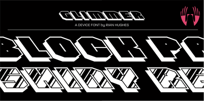 A backslanted outline font with a drop shadow and a glossy variant.
 - Blame by Haksen,
$15.00 Blame is a strong font family and sophisticated sans also serif Each font in the family can stand on its own, dynamic and authoritative in their own right. Bison includes ten all-caps fonts: a weight (clean and rough version), two outlines, four italics. - Blame Sans Clean and Rough Regular - Blame Serif Clean and Rough Regular - Blame Sans Clean and Rough Italic - Blame Serif Clean and Rough Italic - Blame Sans Outline Regular and Italic - Blame Serif Outline Regular and Italic FEATURES : a weight / Italics / Outlines / Numbers & Punctuation / Extensive Language Support USE Blame works great in any branding, logos, magazines, films. The different weights give you full range to explore a whole host of applications, while the outlined fonts give a real modern feel to any project. Thanks for having a peek at Blame. I hope you enjoy it and feel free to take it for a spin below! As always, if you have any questions just send me a message! I’m glad to help :) Haksen
 - LD Abe Lincoln by Illustration Ink,
$3.00LD Abe Lincoln font is based on actual documents containing President Lincoln's own handwriting. Enjoy this font rooted in history. - Sunitials JNL by Jeff Levine,
$29.00Sunitials JNL contains twenty-six initials inside of a sunburst pattern for monograms, page headers, stationery and other creative projects. - Santeli by Melvastype,
$35.00 Santeli is a big and bold script family containing three weights. It has a smooth feeling spiced with sharp edges.
 - Numbskull by The Type Fetish,
$25.00 Numbskull contains an expanded character set including: Central, Eastern and Western European languages, The Baltic, Cyrillic, Esperanto, Greek and Turkish.


