10,000 search results
(0.05 seconds)
- Pegyptienne - Unknown license

- Black Cow - Unknown license

- SchulVokalDotless - 100% free

- Jedi - Unknown license

- Bloody Stump - Unknown license

- Naratif Condensed by Akufadhl,
$25.00
- Goma Mono by Daniel Uzquiano,
$20.00
- MBF Taurian by Moonbandit,
$15.00
- Jasmine Daily by Stringlabs Creative Studio,
$25.00
- Meoowly by Stefani Letter,
$12.00
- Adelita by Type-Ø-Tones,
$40.00
- Yarikha by ActiveSphere,
$30.00
- Vermicello by ParaType,
$30.00
- Juby Rounded by Fontsphere,
$12.00
- Quartz MS by Microsoft Corporation,
$39.00 - Ambassador by Juraj Chrastina,
$39.00
- POP. 1280 - 100% free

- Siena by Monotype,
$29.99 - Cicero Series 2 by Alphabet Agency,
$15.00
- Beachday by RahagitaType,
$25.00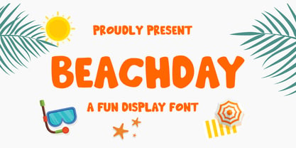
- Badwulf by Oleg Stepanov,
$11.00
- SiliusEngraved by Intellecta Design,
$30.90 - Dixie by Dieza Design,
$14.00
- Evening River by Letterhend,
$19.00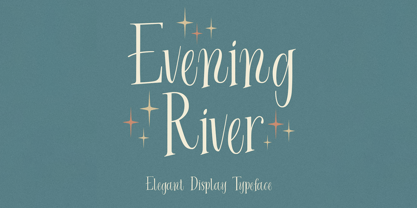
- Teutura by Maciej Świerczek,
$15.00
- Stana by Wirtu,
$9.00
- Vemanem Pro by ffeeaarr,
$11.00
- Boulette by RMU,
$30.00
- Flasher by BLV Supply,
$10.00
- Movie House JNL by Jeff Levine,
$29.00
- Fry's Baskerville by Bitstream,
$29.99 - Curbdog by MADType,
$21.00
- Designer Block by K-Type,
$20.00
- Dark Fox by Pedro Teixeira,
$16.00
- Matchbox by K-Type,
$20.00
- Penzance by TEKNIKE,
$45.00
- Originator by TEKNIKE,
$39.00
- Serid by Samuel Vicente Types,
$22.00
- Neon by Superfried,
$32.50
- PT Medievil by Paupe Type,
$10.00


