10,000 search results
(0.079 seconds)
- Sindelar by Willerstorfer,
$95.00 Please note: Sindelar webfonts are exclusively available at willerstorfer.com Sindelar is a capable, contemporary text face addressing today’s news design requirements. Its large x-height, low contrast and robust serifs grant a high legibility in small sizes. The balanced, well chosen proportions make the typeface economic (i.e. space saving) without giving it a too narrow appearance. These characteristics make it the ideal choice for extensive text setting in newspapers and magazines – on paper and on screen. Named after famous Austrian football (soccer) player Matthias Sindelar (1903–1939), one of the best players of his time, the typeface shares two major qualities with its namesake: their technical brilliance and their way of performing aesthetically to the last detail. The football player’s nickname »Der Papierene« (the Paper-man) elegantly refers to the media too. Although optimised for small sizes, Sindelar’s low contrast and robust serifs give the typeface a strong impact and an unmistakable personality in larger sizes. Sindelar’s calligraphic influences can be noticed in the Italics best. The italic letters are inclined by slightly different angles, respecting the letters’ shapes and proportions and resulting in a balanced, yet vivid appearance. Sindelar comes in 18 styles – nine weights in Roman and Italic each. Each font is equipped with a huge character set of about 980 glyphs and various OpenType features.
 - FS Ostro by Fontsmith,
$80.00 Cosmopolitan Elegance Named after a southerly wind that blows over the Mediterranean Sea, FS Ostro breathes warmth into letterforms with their roots in colder, stark Modern typefaces. FS Ostro is a typeface imbued with balanced and sophisticated elegance. It’s discerning and sensitive, self-assured but understated. One for the well-travelled reader. Thoughtful contrast FS Ostro draws inspiration from a wide range of sources, such as 19th century British Scotch Roman designs, Italian modern style typefaces and highly contrasted display Spanish examples. Its text version offers a consistent rhythm and robust texture that is easy on the eye. This elegant, cosmopolitan typeface is characterised by its thoughtfully modulated contrasts between thick and thin, sharp angles, and sophisticated curves. Exaggerated touches in display “What is more restrained and sober in text, becomes purposefully prominent and more detailed in display,” says Fontsmith designer Alessia Mazzarella. These exaggerated details for the display version can be seen in the letter terminals, such as those in the ‘a’ and ‘g’ and the tail of the ‘Q’, as well as in the set of numerals, fractions, arrows, borders and ornaments, which can be used to build decorative framing elements. Fluid italics The less rigid and curvaceous italics of modern style typefaces were the inspiration for FS Ostro’s own subtle, flowing italic styles. The letterforms are confident and fluid, creating an overall sense of refinement and modernity.
 - Haigrast Serif by Mans Greback,
$59.00 Haigrast Serif is a font that combines classic and modern design elements to create a look that is both tasteful and fashion-forward. This serif font is regular but with a very modern feel, making it the perfect choice for designers looking to add a touch of sophistication to their work. The sharp, crisp lines and swash alternates in addition to the decorative letterings add a unique touch, making Haigrast Serif a versatile font that can be used in a variety of projects. Whether you're creating a stylish magazine layout, a cool fashion logo, or a balanced design piece, Haigrast Serif is the perfect font to make your work stand out. Designed by Mans Greback in 2023, this font is the perfect choice for designers who want to make a bold statement in their design work. The Haigrast Script family consists of six high-quality fonts: Regular, Italic, Bold, Bold Italic, Black and Black Italic The font is built with advanced OpenType functionality and has a guaranteed top-notch quality, containing stylistic and contextual alternates, ligatures and more features; all to give you full control and customizability. It has extensive lingual support, covering all Latin-based languages, from Northern Europe to South Africa, from America to South-East Asia. It contains all characters and symbols you'll ever need, including all punctuation and numbers.
 - FF DIN Paneuropean Variable by FontFont,
$629.99 FF DIN: the famous, faithful and first revival of DIN 1451. FF DIN originates in the lettering models from the German standard DIN 1451, and is considered the perfect standard typeface due to methodical and engineered design. FF DIN Variable offers you more FF DIN than ever before. Pushing font technology to its limits, Variable fonts provide creatives a tool to dial in hyper specific variations which thrive in any design space. FF DIN Variable take bold steps in engineering, which the typefaces behaviour which brings in FF DIN’s technical look-and-feel into the smooth and almost organic world of Variable Fonts. Available in both upright and italic styles, there is a lot more FF DIN to discover with new era of type technology. FF DIN Italic is a sloped roman style, however it is optically corrected – slightly thinner, slightly narrower. As a result, FF DIN Italic stands out subtly. FF DIN Variable stays faithful to its parent’s DNA, the utmost care was taken to ensure that the new instances of FF DIN Variable remained consistent with all the well-known weights. Precision is the mantra of FF DIN, the FF DIN Variable is no exception to this design philosophy. Produce exquisitely fine-tuned typography and expressive animated headlines for any design. Infinite styles, intelligent, and powerful.
 - Torus Pro by Monotype,
$40.00 Torus Pro is a rounded monoline typeface. As its name suggests, this is a more professional version of my original Torus family released in 2017. Each glyph has been scrutinised and redrawn where necessary. In addition, there are now italics, small caps, old style figures, and numerous other improvements. Torus Pro includes many new decorative alternates and ligatures that will add distinctive flourishes to your typographic compositions. With up to nine alternates for some glyphs, these additional styles include stencilled, simple dots, looped and smooth swashes, plus a more aggressive angled option for those looking for something a little different. When used subtly, these alternates and glyph combinations will add flair and personality to your own creations. Perfect for titling and branding, Torus Pro also packs a punch without these features activated, as well as being a comfortable read in long runs of text. There are 12 fonts altogether, ranging from Thin to Heavy weights in both roman and italic. The variable font versions of the family allow you to define the weight exactly to your liking. Torus Pro has an extensive character set that covers all Latin European languages. Key features: 6 weights in both roman and italic Variable fonts included with full family 212 Alternates 20 Ligatures Small Caps Full European character set (Latin only) 1450+ glyphs per font.
 - Scrapyard Script by Mans Greback,
$69.00 Scrapyard Script is a bold, heavy font with a cool and funky vibe that captures the essence of street style and urban culture. Ideal for streetwear branding, concert posters, funky album covers, and other projects that require a cool, contemporary vibe, Scrapyard Script is a display font that adds an energetic, dynamic touch to your designs. Its unique style makes it a great choice for projects that need to stand out and make an impact. Use multiple _ ¤ # to make swashes of different lengths. Example: Rockstar____ (Download required.) The Scrapyard Script font family includes four high-quality styles to suit various design needs: Regular: A bold, paintbrush-inspired style with a youthful edge Italic: Adds a touch of movement and expressiveness to the regular style Bold: An even bolder and heavier presence for more impactful designs Bold Italic: Combines the assertiveness of bold with the energy of italic Built with advanced OpenType functionality, Scrapyard Script ensures top-notch quality and provides you with full control and customizability. It includes stylistic alternates, ligatures, and other features to make your designs truly unique. It has extensive lingual support, covering all Latin-based languages, from Northern Europe to South Africa, from America to South-East Asia. It contains all characters and symbols you'll ever need, including all punctuation and numbers.
 - FF DIN Paneuropean by FontFont,
$92.99FF DIN: the famous, faithful and first revival of DIN 1451. FF DIN originates in the lettering models from the German standard DIN 1451, and is considered the perfect standard typeface due to methodical and engineered design. FF DIN Variable offers you more FF DIN than ever before. Pushing font technology to its limits, Variable fonts provide creatives a tool to dial in hyper specific variations which thrive in any design space. FF DIN Variable take bold steps in engineering, which the typefaces behaviour which brings in FF DIN’s technical look-and-feel into the smooth and almost organic world of Variable Fonts. Available in both upright and italic styles, there is a lot more FF DIN to discover with new era of type technology. FF DIN Italic is a sloped roman style, however it is optically corrected – slightly thinner, slightly narrower. As a result, FF DIN Italic stands out subtly. FF DIN Variable stays faithful to its parent’s DNA, the utmost care was taken to ensure that the new instances of FF DIN Variable remained consistent with all the well-known weights. Precision is the mantra of FF DIN, the FF DIN Variable is no exception to this design philosophy. Produce exquisitely fine-tuned typography and expressive animated headlines for any design. Infinite styles, intelligent, and powerful. - Beachwood by Swell Type,
$25.00 Los Angeles’ distinctive “shotgun” style street signs were last produced over sixty years ago, but these durable porcelain and steel signs are still in use all over the city, by both humans and birds, who like to build their nests between the panels. The street names were drawn at wildly different widths to fit on panels which were manufactured in only one size. Beachwood faithfully re-creates the extreme range of widths & weights on these vintage signs, and adds a new matching lowercase. Use the Beachwood Variable font file to access any width, weight or italic angle between the presets — a technology 20th Century sign painters could only dream of! Each weight of Beachwood includes numbers based on the street signs, plus four alternate number sets based on the jerseys of Los Angeles' pro football teams. Beachwood is named for Beachwood Drive, the street which leads to the famous HOLLYWOOD sign, so we just had to include a bouncy HOLLYWOOD mode! FAMILY FEATURES: Five widths (from XTall to XWide), with eight Weights (from ExtraLight to UltraBold), each with matching italics Variable font to access any width, weight or italic slant EACH WEIGHT INCLUDES: 584 glyphs to support 223 languages in Western Europe, Central Europe, Vietnam and Oceania, plus Cyrillics Five styles of numbers, plus Tabular Lining for screen display Ordinals, Fractions and Arrows Hollywood mode!
 - FS Ostro Variable by Fontsmith,
$119.99Cosmopolitan Elegance Named after a southerly wind that blows over the Mediterranean Sea, FS Ostro breathes warmth into letterforms with their roots in colder, stark Modern typefaces. FS Ostro is a typeface imbued with balanced and sophisticated elegance. It’s discerning and sensitive, self-assured but understated. One for the well-travelled reader. Thoughtful contrast FS Ostro draws inspiration from a wide range of sources, such as 19th century British Scotch Roman designs, Italian modern style typefaces and highly contrasted display Spanish examples. Its text version offers a consistent rhythm and robust texture that is easy on the eye. This elegant, cosmopolitan typeface is characterised by its thoughtfully modulated contrasts between thick and thin, sharp angles, and sophisticated curves. Exaggerated touches in display “What is more restrained and sober in text, becomes purposefully prominent and more detailed in display,” says Fontsmith designer Alessia Mazzarella. These exaggerated details for the display version can be seen in the letter terminals, such as those in the ‘a’ and ‘g’ and the tail of the ‘Q’, as well as in the set of numerals, fractions, arrows, borders and ornaments, which can be used to build decorative framing elements. Fluid italics The less rigid and curvaceous italics of modern style typefaces were the inspiration for FS Ostro’s own subtle, flowing italic styles. The letterforms are confident and fluid, creating an overall sense of refinement and modernity. - Qualion by ROHH,
$39.00 Qualion™ is a modern geometric grotesk typeface with humanist and calligraphic inspirations. The base of design is a minimal geometric sans serif with subtle humanist touches. Letter shapes are crafted with the highest care for beautiful proportions and excellent legibility. Qualion™ is a sibling of Qualion Round™ & Qualion Text™ - type family adjusted to fit paragraph text and small sizes best (narrower width, greater contrast, larger ink traps and tapering, adjusted spacing and kerning & even more calligraphic, elegant true italics). This versatile sans serif is not only well suited to clean, minimal projects and text paragraphs, but it has lots of features making it perfect for branding, logo design and all kinds of display use. All fonts are packed with alternates, swashes, terminal forms and ligatures, which make Qualion™ a very original ornamental type great for posters and packaging design. Qualion™ family consists of 10 weights with corresponding oblique and true italic styles, that give total of 30 styles. Both Oblique and Italic styles were hand drawn to get sharp and fine letter shapes. It has extended language support, as well as broad number of OpenType features, such as small caps, case sensitive forms, standard and discretionary ligatures, swashes, terminal forms, stylistic sets, contextual alternates, lining, oldstyle, tabular and small cap figures, slashed zero, fractions, superscript and subscript, ordinals, currencies and symbols.
 - Jannon Pro by Storm Type Foundry,
$55.00 The engraver Jean Jannon ranks among the significant representatives of French typography of the first half of the 17th century. From 1610 he worked in the printing office of the Calvinist Academy in Sedan, where he was awarded the title "Imprimeur de son Excellence et de l'Academie Sédanoise". He began working on his own alphabet in 1615, so that he would not have to order type for his printing office from Paris, Holland and Germany, which at that time was rather difficult. The other reason was that not only the existing type faces, but also the respective punches were rapidly wearing out. Their restoration was extremely painstaking, not to mention the fact that the result would have been just a poor shadow of the original elegance. Thus a new type face came into existence, standing on a traditional basis, but with a life-giving sparkle from its creator. In 1621 Jannon published a Roman type face and italics, derived from the shapes of Garamond's type faces. As late as the start of the 20th century Jannon's type face was mistakenly called Garamond, because it looked like that type face at first sight. Jannon's Early Baroque Roman type face, however, differs from Garamond in contrast and in having grander forms. Jannon's italics rank among the most successful italics of all time – they are brilliantly cut and elegant.
 - Apolline Std by Typofonderie,
$59.00 A Venetian serif in 6 styles The Apolline typeface family was created by Jean François Porchez as a means to study the transition from Renaissance writing into the first printing types. Rather than sticking to the method commonly used these days for the creation of revivals of Jenson or Bembo types, it seemed more interesting to try and get in the same mindset as those exceptional designers during this pivotal period in the history of typography. Thus Apolline is an exploration of the design methods used by people like Nicolas Jenson and his contemporaries for adapting handwriting with its multiple occurrences (a, a, a, b, b, b…) into single, unique signs (a, b…). Initially Jean François made drawings modelled after his own calligraphy. They were done at a very small size on tracing paper (2 cm high for the capitals) to preserve the irregularity of human handwriting. Besides emphasising the horizontal parts of the letter forms, the serifs were designed asymmetrically to reinforce the rhythm of the writing. The final drawings were produced at a large size (10 cm high for the capitals) to allow for subtle optimisation of specific details. The very narrow and fluid Apolline italic Influenced by various concepts for an ideal italic by Van Krimpen, Gill, etc. Apolline italic was designed at 8° degrees. Although the structure of the letterforms were informed by chancery scripts, the italic has full serifs like the roman. Very narrow and fluid, its unique design creates a good contrast when used in combination with its upright counterparts. Thanks to the presence of the serifs similar to roman typefaces it sets very neatly in large sizes. The next step was digitising the drawings with Ikarus (the pre-Bézier-curves era) to create the final roman and italic fonts. Two years later, when the family was expanded to six series the same method was used, this time with Fontographer. This was necessary for correcting a few problems caused by the conversion to Bézier outlines, and to add intermediate weights. Before the advent of feature-rich OpenType, quality type families consisted of several separate fonts for each weight to provide users with various sets of numerals, an extended ligature set and alternates, ornaments, and so on. Introducing Apolline Morisawa Awards 1993
 - Flaminia by Andinistas,
$39.95 Flaminia is a typeface family of 4 members designed by Carlos Fabián Camargo G. The central idea started as Dingbats and titles labeled with fine-tipped brushes and flat tip for graphic design related restaurant menus, instructions, packaging, food containers and labels. Thus began the process of drawings and letters integrated by shapes and counterblocks that seem inaccurate yet but at the same time clean and attractive. For this reason each variable suggests fresh brushstrokes that combine ideas from Roman and italic calligraphy. Flaminia members work separately or together by solving needs in different scenarios. This will enhance its properties in order to control and diagram titles, subtitles and short paragraphs with an effusive and manuscript character. Flaminia is useful for generating a flavor of "hand lettered by skilled artists lettering." In conclusion, Flaminia Regular and Italic are used to write short paragraphs. His ascending and downs are lower that the X height. Its width is imperceptibly condensed to save horizontal space. Its smooth lines and finishes simulating a crescent moon have been made with fine-tipped brush. The contrast between thick and thin has medium intensity. Its complement is an ideal italic to emphasize words and phrases. Its conceptual characteristics are similar with foundation's handwriting, except for his companion who takes ideas from the ornamental italic calligraphy. Flaminia Black is compact and ideal for ranking information such as words and titles. Its personality is based on ornamental penmanship italics mixed with humanistic ideas outlined with contrast-type, flat-tipped brush thickness. Its overall width is slightly condensed, rising and falling are short compared to an exaggerated X height. Its smooth lines and terminations as in a crescent moon simulate the path of a broad brush. Its amount of contrast between strokes have average intensity. In brief, push to the limit parameters such as the type and amount of contrast, size, backward, forward, overall width, etc. And finally, Flaminia Dingbats offers three sets of different illustrations, a total of almost 90 drawings useful in communications related to: Food, Clothes and Sketchy. Each carefully wrought through research, testing, analytical design, visual strategy and high-definition of Bezier paths, optimizing time and work to their users. And in conclusion, I have plans to continue expanding the family with more complete versions in the future.
 - Maestrale by Catharsis Fonts,
$25.00 Maestrale is a paradigm-breaking new take on calligraphy, built around a compact, serif-style core and outrageously long, flamboyant extenders. At large sizes, its confident, charismatic lettershapes are ideally suited for branding and decorative uses, whereas longer texts at smaller sizes naturally weave themselves into a flowing texture. The font comprises 1299 glyphs, including many stylistic alternates, ligatures, small capitals, and initial, terminal, and linking forms, and offers extensive OpenType programming to support them. The calligraphic form of Maestrale is complemented by a matching text font (Maestrale Text) with short extenders, available in three cuts (a serif-style Roman, an upright Cursive, and a tilted Italic). Maestrale is all about the lowercase; its capitals are deliberately understated so as not to steal the limelight. In fact, the font works very well when set exclusively in lowercase. Maestrale�s small capitals are fitted into the core space of the lowercase, allowing them to be freely interspersed with lowercase characters. Alternately, an OpenType feature is available to replace a and e in small-caps text with their lowercase equivalents for a fresh unicase look. Since alternates and ligatures play such an important role, Maestrale offers three different modes of use. The most straightforward approach is simply to start typing using Maestrale Pro � the extensive OpenType programming will ensure that collisions between extenders are avoided and attractive ligatures are substituted for common glyph combinations. A more interactive approach is provided by the font Maestrale Manual, which allows the user to manually select alternate forms and ligatures even in typographically unsavvy applications, such as PowerPoint (as long as standard ligatures are supported). Stylistic alternates are simply represented as ligatures of their base forms with one or more instances of the rarely-used by easily-accessed characters "~" (ASCII tilde) and "`" (spacing grave accent); linking forms are built with �_� (underscore), multi-character ligatures with "|" (pipe), and initial and terminal forms with the �less than� and �greater than� characters. For instance, the Maestrale wordmark in the posters above was simply typeset with the string (`ma`est|r_a```l```e)| in Maestrale Manual (The parentheses represent �less than� and �greater than� characters here.) Feel free to type this string into the test line below and see what happens! Make sure Standard Ligatures are enabled. An instruction sheet listing all alternate forms and their accessibility is available from the Gallery tab on this page. The third mode of usage is aimed at professional designers, who make use of sophisticated software with extensive OpenType support. These power users are advised to use the font Maestrale Pro again, where all glyphs are accessible as stylistic alternates. Maestrale Text is a less extravagant but more versatile variation on the design of Maestrale, replacing Maestrale�s swashes with efficiently compact extenders. It is intended to serve as a perfectly matching text companion to Maestrale calligraphy, but constitutes a full-fledged typeface in its own right. It is equally at home at display sizes as it is in pull quotes, titles, and high-impact blocks of text. Maestrale Text comes in three complementary faces: A serif-style Roman, an upright Cursive, and a tilted Italic. Maestrale is the Italian word for �masterful�. It is also the traditional Italian name for the northwesterly mediterranean wind, better known by its French name, Mistral. Acknowledgements: I am grateful to the helpful souls on the Typophile forums for extensive feedback and encouragement on Maestrale, and to the TypeDrawers forum for feedback on Maestrale Text. This font is dedicated to Simone.
 - Wolf's Bane Expanded Italic by Iconian Fonts is not just a font; it's a voyage into the realm of the extraordinary and the distinctive, a perfect blend of the menacing and the elegant. As suggested b...
- Psiphoon BB - Personal use only

- Break Age Graffiti by Sipanji21,
$17.00 Break Age is an awesome display font with a graffiti style and break characters with bandages to make your design look awesome! It will elevate a wide range of design projects to the highest levels, be it branding, headings, wedding designs, invitations, signatures, logotypes, wall art illustrations, apparel, labels, and more!
 - Spiky Frog Graffiti by Sipanji21,
$18.00 Spiky Frog is a spectacular decorative font with a graffiti style and included some swash for your design look awesome. It will elevate a wide range of design projects to the highest level, be it branding, headings, wedding designs, invitations, signatures, logotype, wall art illustration, apparel, labels, and much more!
 - Blue Monsta Graffiti by Sipanji21,
$18.00 Blue Monsta is a spectacular decorative font with a graffiti style and included some swash for your design look awesome. It will elevate a wide range of design projects to the highest level, be it branding, headings, wedding designs, invitations, signatures, logotype, wall art illustration, apparel, labels, and much more!
 - Sabella by Arendxstudio,
$14.00 Sabella is luxurious and casual script with distinctive style that is perfect for your branding design, and will also be very beautiful in your wedding invitations and business cards and especially for your brand name logotype. Sabella has beautiful Uppercase and Lowercase, figures and ligature standards that are very realistic.
 - Display Art One by Gerald Gallo,
$20.00 Display Art One is a display font inspired by the art nouveau fonts popular at the turn of the 20th century. It is not intended for text use. It was designed specifically for display, headline, logotype, branding, and similar applications. Display Art One has upper and lowercase alphabets, numbers, and punctuation.
 - Noma by Spinturnix,
$15.00 Noma is a new wide-set display font with a minimal geometric style. I designed Noma because I wanted a tech-inspired font that has plenty of character while remaining legible. Noma is a great choice for high-impact headings and logotypes. I hope you enjoy, thanks for checking it out!
 - Brainoise by Ronny Studio,
$19.00 Punk-looking fonts usually embody the rebellious and edgy spirit of the punk subculture. It is characterized by its bold, jagged, and distorted letterforms, which often feature exaggerated or irregular shapes. This font is perfect for your design needs such as: for posters, magazines, covers, brands, logotypes, band logos, etc
 - Mister Bones NF by Nick's Fonts,
$10.00Alpha Midnight, reconstructed from an unnamed source by Dick Pape for Solotype, provided the pattern for this big, bold, unconventional stencil face, sure to grab your readers' attention. Both versions include the complete Latin 1252, Central European 1250 and Turkish 1254 character sets, as well as localization for Moldovan and Romanian. - Barbaros by MoodyType,
$49.00 An Art Deco condensed display sans font with 8 styles, +800 glyphs, +100 ligatures, +30 languages and many opentype features. It is perfect for poster designs, magazines, book covers, logotypes, headlines, newspapers and press. It's bold, daring, modern, geometric and covers a good range of weights from light to block.
 - Mister Slasher Halloween by Sipanji21,
$15.00 Hello, this is Mister Slasher, a Unique display font which is prepared to welcome Halloween. Mister Slasher comes with an awesome horror style, make it very perfect to use for quotes, logotypes, badges, labels, packaging, t-shirts, or simply use it in your next design project. Especially in Halloween celebrations.
 - Schwenk by Kostic,
$40.00 Schwenk is a wide reversed-contrast typeface made to be used in display settings – headlines, logotypes, store windows. The Regular style is adjusted for smaller point size while the Thin is made in a higher contrast for large headlines. An alternative (wide) capital letter I is available via the Stylistic Set.
 - LAKESTER by Decade Typefoundry,
$10.00 Lakester is a layered type family. It comes with 4 font systems that can be layered to create different effect (regular,shadow,inline,inline 2) . Inspired by vintage american west poster, it's loaded with 300 glyphs. This family works best for logotype, gig poster, letterhead, dropcap, titles, and any artworks.
 - Superbia by Rillatype,
$14.00 Superbia is a textured brush font! The natural hand writing script is suitable for you who needs a typeface for headline, logotype, apparel, branding, packaging, advertising and more. This typeface is comes with uppercase, lowercase, punctuation, symbols, numerals, stylistic set alternates as well as multi-lingual support. It is PUA Encoded.
 - Power Display by Power Type,
$15.00 Power Display Inspired by Fun cartoon style combined with modern style. This Playful Font Comes In Three Widths; Condensed, Normal, Expanded. This Font Can Be Used For Modern And Vintage Designs, Also Can Be Easily Paired With Some Graphic Elements (Illustration, Photography) This Font Perfect For, Logotype, Branding, Title, And Packaging.
 - Snakehead Graffiti by Sipanji21,
$18.00 Snake head is a script font with a graffiti look. cool to be use in various types of designs, with several choices of characters and various kinds of swashes, so that your design looks powerful, this font is sutable for branding, clothing, logotype, packaging, advertising, crafting, and various other designs.
 - Mattoa by Bombastype,
$35.00 Introduce Mattoa, a bold and sporty script. This font is very great for bold logotype . Comes with many swashes options that you can play with. Will works well for both modern and retro style. If you need a font for your display purposes, you defintely need to consider this font.
 - Netron by Linecreative,
$16.00 Netron is a futuristic typeface, designed with minimal lines to keep it simple and artistic. It gives your texts modern smart effects. This font is equipped with ligature and alternative letters will work very well for posters, logotypes, magazines, covers, banners, t-shirts and headers, or even large-scale artwork.
 - Alderlite by Ditatype,
$29.00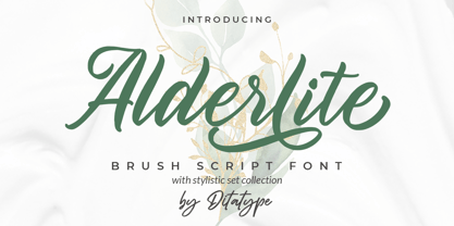 Alderlite is a elegant brush font. With a classy style, it brings a beautiful and chic typeface. Alderlite is best used for branding logotype, and quotes. Includes: Alderlite (OTF) Features: Standart Ligatures Stylistic Set Multilingual Support PUA Encoded Numerals and Punctuation Thank you for downloading premium fonts from Dita Type
 - Hayken Script by Lemonthe,
$10.00 Hayken Script is a brush script font with a dynamic and energetic style. There are two types of styles (clean and textured). It can used for various purposes such as titles, logotypes, t-shirt designs, letterheads, signage’s, labels, newsletters, posters, badges, and every other design which needs an unique, striking font.
 - Nicko by Zealab Fonts Division,
$14.00 Nicko is a bold and friendly typeface. Nicko has a unique style with stylistic, alternates, ligatures and supports multilingual languages. Create unique & beautiful logotype, use it as an elegant solution for your next magazine layout, or choose Nicko for any graphics that require a sleek look with a elegant flair.
 - Dusty Rose NF by Nick's Fonts,
$10.00Based on the logotype lettering for the Dutch magazine Geillustreerd Schildersblad in 1940, this devilishy different Deco font will add a bit of naive charm to any project it graces. This font contains the complete Latin language character set (Unicode 1252) plus support for Central European (Unicode 1250) languages as well. - Rusty Plate by Sign Studio,
$12.00 Rusty Plate is a font for display purposes that reflects creative and natural. It will be suitable for making a dramatic impression on posters, brochures, apparel, logotypes and many other types of print. This font is PUA encoded which means you can access all of the glyphs and alternates with ease.
 - Burba by Gassstype,
$23.00 Hello Everyone, introduce our new product Font BURBA This Is All Caps Display Font.This is a Textured Natural Style and classy style with a clear style and dramatic movement. This font BURBA is great for your next creative project such as logos, printed quotes, invitations, cards, product packaging, headers, Logotype.
 - Aerovias Brasil NF by Nick's Fonts,
$10.00Eponymous logotype lettering on an airline timetable from 1948 inspired this exercise in aerodynamics. This typeface’s streamlined design remains fresh, even sixty-plus years on. Both versions include the complete Unicode Latin 1252, Central European 1250 and Turkish 1254 character sets, as well as localization for Lithuanian, Moldovan and Romanian.
