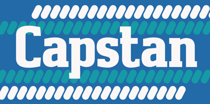
Bold yet distinctive, Capstan is a stand out slab serif ideal for signage, headlines, branding and other applications intended to convey strength and character
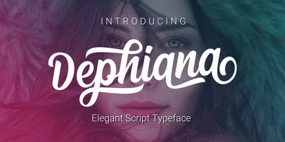
Dephiana is an elegant and bold stylish script font. Great for logos, wordmarks & signboard. Has several stylistic alternates that can be used as needed.
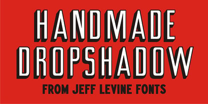
Handmade Dropshadow JNL was modeled from lettering found on a vintage silk screened metal sign used for point-of-sale marketing. Before the advent of computers and modern techniques, silk screens were hand cut using material called frisket and knife tools, and the lettering reflected the human inconsistencies of cutting these lettering into the template surface for transfer.
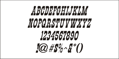
Instead of being directly based on classic wood or metal type examples, Mule Train JNL takes a roundabout route in its development. Images of a set of letters and numbers cut from plywood (which in turn were based on a vintage type design) served as the work models. Mule Train JNL is available in both regular and oblique versions.
Pontif is a typeface based on the inscriptional lettering work of Luca Horfei, the Vatican scribe who designed the major inscriptions for Pope Sixtus V's Baroque-makeover of Rome in the sixteenth century. Garrett Boge modeled the design on a Horfei manuscript and on-site research in Rome in 1996. Pontif is part of the LetterPerfect Baroque Set.
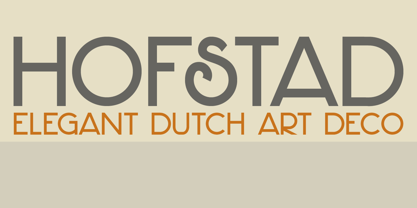
Hofstad is a font which was modeled on a poster designed by Dutch graphic artist Jan Lavies (1902 - 2005). Lavies became famous for the posters he designed for the Holland America Line of cruise ships. Hofstad font was named after the theatre group "Vereenigd Rotterdamsch - Hofstad Tooneel" for which Jan Lavies designed a poster. Hofstad comes with all diacritics.
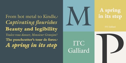
Galliard was originally designed for Mergenthaler Linotype in 1978 as a photocomposition typeface. It is modeled on the work of Robert Granjon, a sixteenth-century punchcutter whose typefaces are renowned for their beauty and legibility. ITC Galliard is a notable typeface for text; the italic is very distinctive in occasional pieces such as invitations and informal announcements.
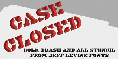
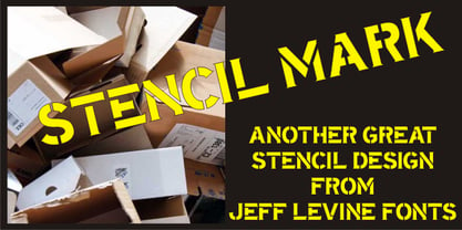
The set of vintage brass alphabet stencils that inspired Stencil Mark JNL was manufactured by the Chicago Firm of Meyer and Wenthe. Pete Skoglund of Unadilla, NY was selling a set of these stencils on Ebay, and was nice enough to provide Jeff Levine some images to use as models for the design of this typeface.
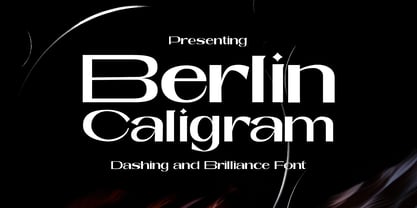
Berlin Caligram is a fancy yet elegant display font. characters that are suitable for today's style will be very interesting for you to create any design work with a classy model that maintains a calm and classy style to look at. you must already have the inspiration to be combined with the creativity you have! Multilingual Support.
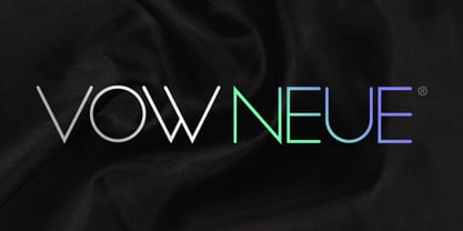
As glamorous as its name would suggest, Vow Neue is the new fashion model on the typeface scene. Vow Neue loves excess without losing style, containing itself in strict forms that belie a boundless desire. Sharp edges lead into enticing curves in all the right places, making this a font that draws the eye and keeps up interest.
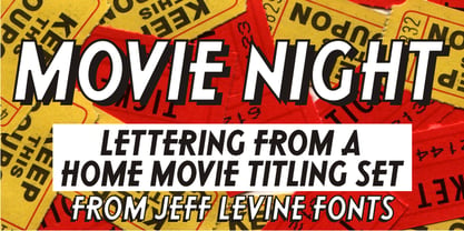
Movie Night JNL was modeled from one of a number of ceramic home movie titling kits on the market that were popular during the 1950s and 1960s. The camera buff would set up the letters against a colored background and photograph clever titles to describe their 8mm home movies of vacations, sightseeing or their darling children (or grandchildren).
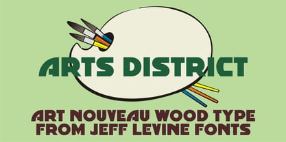
Although the model for Arts District JNL was a set of wood type, the design influence is clearly from the Art Nouveau era. Note the combination of unusual flat and curved sides on many letters. Decorative, yet legible; Arts District JNL works well with any period piece or as a pleasant alternative to traditional headline fonts.
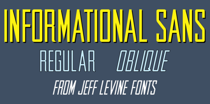
Featuring condensed, block hand lettering, Informational Sans JNL was modeled from a selection of water applied sign decals once made by the Duro Decal Company of Chicago and is available in both regular and oblique versions. About fifty different small decal signs covered a wide range of general purpose information such as “Open”, Closed”, “Please Pay When Served”, etc.
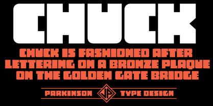
Chuck. Designed in 2004 by Jim Parkinson. Originally released as a Type 1 font, Chuck was refreshed (version2) and re-released as simple Open Type in 2012. The models for this massive Deco typeface appear on a bronze plaque on the South Tower of the Golden Gate Bridge. The plaque commemorates the builders of the bridge.
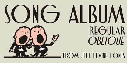
In the days when sheet music was as popular as phonograph records for home entertainment, a song album was a folio of collected works. The hand-lettering on the 1940s-era cover for "The Sigmund Romberg Song Album, Book II" served as the model for Song Album JNL. Romberg was a noted composer of Broadway show tunes.
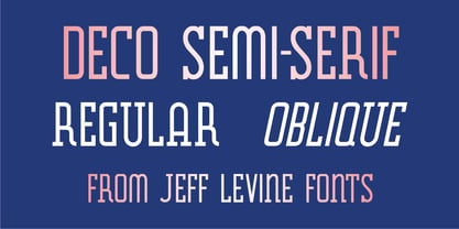
Deco Semi Serif JNL was modeled from the hand lettered title on the sheet music cover for the 1933 song "Another Perfect Day Has Passed Away". This interesting design blend of serif, sans serif and partial-serif characters commands attention with its eccentric mix of letter forms, and is available in both regular and oblique versions.
Otto Weisert was a German type founder who ran his own foundry in Stuttgart during the early years of the 20th Century. In 1902, he created Kalligraphia, a cursive Art Nouveau display script face. Kalligraphia has a unique stroke contrast model; the tops and bottoms of its letterforms are thicker than the verticals on its sides.
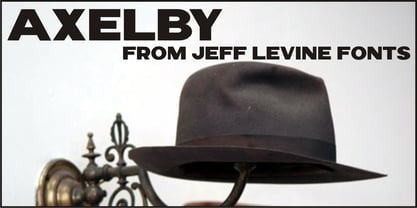
Axelby JNL was modeled from a set of die-cut, self-adhesive cardboard letters from the 1960s. The design is reminiscent of some early wood type in the way it has letters of varying widths that do not conform to any set standard. The font is perfect for plain, easy-to-read and attention-getting headlines.
Jimi is a tribute to classic rock posters of the sixties and seventies. It was inspired by and modeled after a 1969 sheet of dry transfer letters. Named after the famous American rock and blues guitarist Jimi Hendrix. Ideal for any design that intends to invoke or parody the era of classic rock, free love and mysticism.
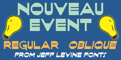
The 1920s film production company Tiffany-Stahl often used a hand lettered Art Nouveau novelty type design with thick horizontal lines in their various film release ads. One such ad was in the August 11, 1929 of “The Film Daily”. This served as the model for Nouveau Event JNL, and is available in both regular and oblique versions.