10,000 search results
(0.031 seconds)
- Extra Crunchy by Bogstav,
$18.00 Extra Crunchy is my handwriting when I am eating cookies while drawing! No, it's true! I did eat a whole box of cookies while drawing this font! :) The letters are a bit jumpy, and have no steady x-height, however, your text may look a bit off, but it is clear and legible. Fits perfect for a children's book, a postcard/poster design or something else that needs that extra crunch :)
 - Double Pivot by Trequartista Studio,
$25.00 Double Pivot , a condensed sport inspired Regular, Low, & Mix typeface. Double Pivot has six Style with sans serif and matching italics. This typeface has a clean and athletic look, glyphs and extensive Latin script support. Double Pivot is bold, vibrant with sharp sans serifs and competitive appearance, therefore excellent to use for headers, logos, captions and posters, especially for the sports branding industry, but just as good for any other projects.
 - Bambino by Mindburger Studio,
$29.00 Bambino Font Family is a typography project by Milos Mitrovic and affiliates. Bambino has an influence of 1920s Futura-like fonts and art deco look and feel. Combining its vintage character with clean geometric form and organic flow, Bambino is shaped to fit modern aesthetics. There are 12 fonts (six weights with italics) included in the family. Bambino weight range spreads from almost hairline lightness to extreme bold style.
 - Brodaers Expanded by Trustha,
$17.00 Brodaers Expanded is a display sans serif font. With the initial concept of the inner shape, made round. Comes in six styles, which makes it easier for the project you are working on, as well as alternative glyphs as an attractive option. Brodaers Expanded is an expanded version of Brodaers typeface. It comes with 400+ glyphs, which also include multilingual languages. Brodaers is perfect for headlines, branding, and many more.
 - Roaring Jungle by Ergibi Studio,
$20.00 "Roaring Jungle - Retro Font" attractive curved style with inspired box edges from stone-style writing that is guaranteed to add traction because this unique shape is perfect for vintage and poster designs as well as for your logo design, brand image, retro poster, handwritten quote, product packaging , merchandise and more equipped with 2 forms, namely regular and rough and multilinguang support don't hesitate to give me a message thank you
 - Kathleen Sans by ActiveSphere,
$30.00 Kathleen Sans is a geometric sans-serif display font and works best in text and display applications, such as posters, headline, magazine, logos, titles, product branding, corporate branding and publishing. The Kathleen Sans font family has three weights: Light, Regular, and Bold, each available in italic, making a total of six styles. Each style has a full upper and lower-case, accents, punctuation and a selection of monetary symbols.
 - LTC Obelysk Grotesk by Lanston Type Co.,
$24.95 Obelysk Grotesk was designed by the Lanston Drawing Office in the late 1980s. This face is a reconstruction of Spire (1937) drawn by Sol Hess. The skeleton of Spire Roman stands with the serifs removed. Like Spire, this font has no lower case, but does offer alternate cap styles in some of the lower case positions. Spire and Obelysk have both been used prominently in the fashion industry.
 - Polyline by Mårten Nettelbladt,
$- Polyline is based on a small 3x5 grid giving it a rather crude and technical look, further emphasized by the monospacing. ‘Polyline’ is a command often found in CAD-software that is used to create a series of connected lines. The typeface can also be installed as an AutoCAD .shx font, included in the download along with the .shp source file and the stroke shapes for all characters as .pdf
 - Spire by GroupType,
$19.00 Originally designed by Sol Hess for the Lanston Monotype Foundry in 1938, this revival was designed by Ann Pomeroy in the early 90s. Spire is a condensed serif with a very 1930s retro look. PLEASE NOTE: Each Spire font (Regular, Extra Light and Monoline) include a companion Expert font in the download. The Experts feature several alternate glyphs. The Family includes three Styles and three Expert styles. 6 fonts all together.
 - Theo Ballmer by URW Type Foundry,
$39.99 The Theo Ballmer font family is based on Theo’s design ideas which were completed by his son Theo Ballmer (Thierry’s father), and digitized by Thierry, with the help of URW++ and their Ikarus technology. Theo Ballmer is available in 3 x 5 variants: condensed, regular, expanded each in 5 weights. Theo Ballmer is a masterpiece, which fills a historical gap and provides a real font family from the Bauhaus era.
 - Noa by Linotype,
$29.99The Danish designer Nina Lee Storm designed Noa for use on television and computer screens during the late 1990s. She began her six-member type family with the creation of bitmap fonts, developing their print outlines only secondarily. Noa’s letters exhibit a tall x-height, coupled with very short ascenders and descenders. Storm is proud to report that her typeface also looks very “Danish.” Why don't you give it a try? - Cell Block 6 by Enrich Design,
$24.95The concept for Cell Block 6 is based on the rigid structure and design of modern architecture. It is a structural display font created by Enrich Design. Four of six versions of Cell Block 6 are designed to be used as display fonts in order to uphold their detail. The Solid and Solid Outline versions offer additional versatility and can be used at smaller sizes in a wide range of applications. - FF Dirty Three by FontFont,
$41.99 British type designer Neville Brody created this display FontFont in 1994. The font is ideally suited for music and nightlife and poster and billboards. FF Dirty Three provides advanced typographical support with features such as ligatures. It comes with proportional lining figures. This FontFont is a member of the FF Dirty super family, which also includes FF Dirty Four, FF Dirty One, FF Dirty Seven, and FF Dirty Six.
 - BOXDON Titling by TYDTYP,
$15.00 BOXDON is an extra heavy expanded typeface which was especially designed for VERTICAL layout. Each shape looks like a box and has minimum graphical treatment to distinguish each character. It means that the counter space is not enough to use this typeface for small font sizes, however, for titles this typeface should give incredible effects. I highly recommend using it with software that is compatible with vertical layout. (e.g. Adobe illustrator)
 - Stamp Of Approval JNL by Jeff Levine,
$29.00Back in the 20th Century B.C. (Before Computers) there was what was known as a "paper" office. Workers used typewriters, correction fluid and a drawer full of rubber stamps. Jeff Levine has taken twenty-six of the common phrases found on those old office stamps and created Stamp of Approval JNL. Use these images as they are, or run them through a filter for a worn or inked-up effect. - Mestizo by Volcano Type,
$35.00 Mestizo is a term traditionally used in Latin America and Spain for people of mixed heritage or descent. In some countries it has come to mean a mixture of European and Amerindian. The font Mestizo is based on a strict grid system – but combines it with ethnic symbolism. Six weights can be combined in various ways. Accius, Alerio & Amias display the basic geometric shapes, Balbo, Belus & Borba represent the playful icons.
 - Magr by Locomotype,
$18.00 Magr is a modern and powerful sans font designed to elevate your sports team and athletic designs. With its sleek and dynamic appeal, Magr brings a professional touch to your projects, leaving a lasting impression. Unlock your creativity with Magr's six styles and twelve fonts, including both upright and italic options. Stand out from the crowd and make a bold statement with this versatile font that complements your sports-themed materials.
 - Helena Handbasket NF by Nick's Fonts,
$10.00The 1888 edtion of James Conner's Sons United States Type Foundry specimen book listed this little gem simply as "Antique Light". Its original, rather anemic outlines have been beefed up and its serifs have been rounded, with the result that this face will get noticed wherever it goes. Both versions of this font include the complete Latin 1252 and CE 1250 character sets, with localization for Romanian and Moldovan. - Black Stanky by Artisan Studio,
$18.00 Black Stanky a work that is purely a result of handwriting, has a natural characteristic. this is perfect for invitations, signatures, blogs, social media, business cards, product brands. Black Stanky has Stylistic standard, Stylistic Initial, Stylistic Teminal and ligatures. and includes uppercase and lowercase letters, numbers and punctuation marks. Accessed by using : OpenType smart programs such as Adobe Photo Shop, Adobe Illustrator, Adobe Indesign, Corel Draw and Microsoft Office. A Total of 362 Glyphs: Multilingual Support : ŠŒŸÐÀÁÂÃÄÅÆÇÈÉÊËÌÍÎÏÑÒÓÔÕÖØÙÚÛÜÝ àñáâåäãçæìíîïòóôõöøùúûüýÿèéê뢚ߞ Ligature accesed :St dd th gg pp ff wh mm of ck on we are all wr en ex ee ve oo ox ax ss so rr ot al tt ch ll rl ct ol rt at cl az 4 alternative setst accesed : a b c d e f g h i j k l m n o p q r s t u v w x y z special greetings for all, all of us all smoothly in running the routinen
 - Once upon a time, in the enchanted lands of typography, nestled between the bold warriors of Arial and the elegant serifs of Times New Roman, there lived a whimsically charming font named TagettesPlu...
- Brie Light, as its name suggests, is a font that embodies a blend of lightness and elegance. This typeface falls into a sophisticated category of fonts that balance between formality and a touch of p...
- RomanticFont2, as its name suggests, is a font that breathes life into the essence of romance, elegance, and an exquisite touch of delicateness. Crafted with a keen eye for harmonizing the traditiona...
- Dipple KK S - Unknown license

- enen - Unknown license

- enen - Unknown license

- Mod Circle S - Unknown license

- Sueno by Mix Fonts,
$13.00 Looking for a font that's chic, stylish, and oh-so-slightly handwritten? Look no further than MIX SUENO! This monoline semi-script was crafted with care using an iPad Pro and Apple Pencil, and is the perfect addition to any design project. Whether you're creating invitations, social media graphics, or just sprucing up your website, MIX SUENO will bring a touch of sophistication and personality to your work. So don't hesitate - give MIX SUENO a try today!
 - Triat by Cuda Wianki,
$20.00 Triat is modern font suitable for sport and game related themes. It is perfect for headliners, titles etc. Thanks to its variations - full, fill and shadow you can create many color combinations. Triat fill and Triat shadow contains the same metrics so using them is so simple – just copy and paste in place in different layers and then play with colors, gradients, outlines as You like :) Triat full is combination of fill and outline in one color.
 - Brutal Honesty by Olivetype,
$18.00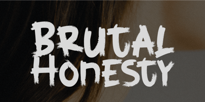 Brutal Honesty is a simple handwritten brush typeface. Carefully handcrafted to grab the attention of the viewers, this font is ideal for logos, posters, headlines, branding, apparel and so much more. This brush typeface is supporting Multi-Languages, which include: Afrikaans Albanian Catalan Danish Dutch English Estonian Finnish French German Italian Norwegian Portuguese Spanish Swedish Zulu. So what's included: Basic Latin A-Z & a-z. Numbers, symbols, and punctuations. Multilingual Support. Accented Characters : ÀÁÂÃÄÅÆÇÈÉÊËÌÍÎÏÑÒÓÔÕÖØŒŠÙÚÛÜŸÝŽàáâãäåæçèéêëìíîïñòóôõöøœšùúûüýÿžß Thank You.
 - Neue Jugend by Brave Lion Fonts,
$24.00 Neue Jugend is an art nouveau typeface orientated on letter shapes of original Jugendstil fonts. The shapes are reduced to a straight modern look, so one could say it is the 21st century art nouveau. Neue Jugend supports all latin languages and their is a little ligature to bring P and Y closer together, if wanted. It is an uppercase typeface, so it is suggested to be used in headlines. For example on a poster or a book.
 - Rouvin by Objectype,
$20.00 Font Rouvin is a serif font designed by Candi Erwanto and produced by Objectype. This font is suitable for minimalist, luxurious, feminine, and elegant designs. This font can be used for various types of designs, such as logo design, packaging design, poster design, and so on. This font has ligature and alternative glyph features that allow for more interesting and unique characters. In addition, this font is also multilingual, so it can be used in various languages.
 - Kufica by Artegra,
$29.00 Kufica is a geometric sans serif display family based on the kufic style, a 7th century calligraphic form of the Arabic script originates from Kufa, Iraq. It’s quite amazing that a historic Arabic calligraphic style can be implemented into a modern (even futuristic!) typeface that serves so well in modern advertising, branding, packaging, posters and so on. Kufica family comes in 2 weights with italics, each of the fonts has solid language support with over 430 glyphs.
 - Mr Dum Dum by Hipopotam Studio,
$60.00 Mr Dum Dum was designed for our game – Ba Ba Dum. In Ba Ba Dum players can learn words in different languages, so we needed a typeface that can support not only all latin characters but also Cyrillic, Greek and two Japanese syllabaries – Hiragana and Katakana. Eventually we wanted to add Chinese support so we designed 1314 Simplified Chinese characters – just enough to cover all words available in Ba Ba Dum plus necessary logograms to translate the games UI.
 - Mages by Graphicfresh,
$12.00 Magès is a modern and elegant font. This font is made with a shape that sticks out more to the classics. So you'll find this font emphasizes an artist's feelings for his work. Masculin and feminine flavors are contained in this font. We created a different character for each letter so that it is easy to stick to the mind. Modern and minimalist character! it's perfect for logos, name card, magazine layouts, invitations, headers, or even large-scale artwork.
 - Coppint by Ridtype,
$25.00 Coppint is a font formed with serenity and imagery in patterns that refer to warmth and harmony. Even so, this font also gives each letter an elegant and semi-modern impression. When this font was created, Ridwan Fadilah, the designer, said that this font must race in a contextual and basic fundamental hierarchy. Thus, this font also provides stylistic weight, from smallest to largest. So that it can become a unit that can be used in optical text.
 - Jackipur by HGB fonts,
$20.00 The motivation for Jackipur was: to achieve more openness and thus more clarity. That's why I created more clarity in the structure of the letters in order to avoid formal ambiguities that arise especially with small degrees. I found it important to open up the round letters so that they are straight and horizontal along the center and baselines so that the eye can connect the letters directly and quickly. A simple font, but neither plain nor without elegance.
 - Roxic by Thinkdust,
$10.00 Roxic doesn’t push boundaries, or break them; Roxic doesn’t recognise your pedestrian concept of boundaries. It doesn’t so much laugh in the face of convention as much as it refuses to acknowledge its very existence. Roxic is a font for the modern day, but without the layers of pretension so often associated with modernism. Elegantly conveying your message with its uniquely delicate sturdiness, Roxic is a font that people haven’t met before, but they can’t help but trust it.
 - Royalis by Julien Fincker,
$34.95 About Royalis: Royalis is an expressive and extravagant serif typeface family. It is characterized by a high contrast and dynamic features in the details, such as long terminals or deep inktraps. Royalis is available in three versions: a display version in six weights, a corresponding condensed version also for display applications, and a text version for body text in four weights. It also comes with all the corresponding italics. This makes Royalis versatile, especially for editorial, packaging, branding and advertising. The wide range of weights and possibilities allows Royalis to be used variably. The thinner weights are characterized by their elegance, while the thicker weights captivate with their powerful contrast. They complement each other like the three musketeers once did. Be it the charmingly elegant Aramis, the sober strategist Athos, the powerful ruffian Porthos or the charismatic d'Artagnan, who led the group. Features: The Royalis family has a total of 32 weights, from extralight to black with matching italics, as Display, Display Condensed and Text versions. With over 1027 characters, it covers more than 200 Latin-based languages, with a whole range of Open Type features. There are alternative characters as stylistic sets, small caps, automatic fractions - just to name a few. Arrows and numbers: In particular, the extensive selection of arrows and numbers should be mentioned here. Thanks to Open Type features and a simple system, the various designs of arrows and numbers can also be easily "written" without first having to select them in a glyph palette.
 - East by Tarallo Design,
$22.99 East is a simple and confident typeface. It is timeless and current, but with a subtle nostalgia of vintage Jazz albums, film credits, newspapers, and signage. The light weight has excellent legibility at small sizes. The Extra Bold weight will capture attention. Its condensed width allows a lot of text in little space. East is versatile, but would be a good choice for film titles, labels + packages, posters, publications or any design where space is limited. It has six weights between Light and Extra Bold. A variable font with weight and slant axes is available and included in a full family purchase. The OpenType features include; stylistic sets, a one story ‘a’, hooked letters, seriffed uppercase I and 1, a slashed zero, raised colon and punctuation (Spanish), several German eszetts, ligatures, diverse bullets, and vertically stacked pre-built fractions. It will support western and central European languages as well as other Latin-based written languages. Read on if you are not familiar with variable fonts. What makes a variable font special is that all font weights are inside of one file and you can incrementally control the width and italic slant between Light (300) and ExtraBold (800). These changes are commonly made with slide controls in the font/type palette of the software. Variable fonts are also smaller in file size, which benefit both web and software performance. Currently variable fonts are supported by Adobe, Sketch, Corel Draw, and most web browsers. Check for your software support here: www.v-fonts.com/support.
 - Aint Nothing Fancy - Personal use only


