10,000 search results
(0.348 seconds)
- Cyberglass JNL by Jeff Levine,
$29.00Cyberglass JNL is a throwback design to the Techno rage of the 1980s, when everything seemed to be typeset in lettering that represented something to do with computers, electronics or outer space. - Pipe Dream by Callout,
$14.00 PipeDream is a thick, slab-serif typeface. It is perfect for short, attention grabbing headlines. Inspired by 1990's computer games this bold face is a force that refuses to be ignored.
 - Black Wolves by Letterafandi Studio,
$14.00 Black Wolves is an all caps handwritten font. No matter the topic, this font will be an incredible asset to your fonts’ library, as it has the potential to elevate any creation.
 - Tabique by Yock Mercado,
$12.00 Tabique is a typeface inspired by architecture and construction, built from geometric planes with straight lines, his glyphs has been designed to be heavy and connect as if they were concrete blocks.
 - Almerita by Sakha Design,
$12.00 Almerita is a sweet and delicate handwritten font. Dainty and joyful, this font will be ideal for writing wedding invitations, cards, or any other design that may need a romantic, personalized touch!
 - Groupie by Resistenza,
$39.00 The idea was to mix liberty lettering with 70’s psychedelic posters and dedicate a font to Groupies. Check out the alternative glyphs and icons included. Have fun and be a Groupie
 - Safina Bralyn by Arendxstudio,
$21.00 Safina Bralyn is a handwritten signature font which is very elegant and modern for you to use and your design interests be it for logos, branding names, posters, podcasts and so on.
 - GHEA Zartonk by Edik Ghabuzyan,
$40.00 This Typeface family include 6 Uprights and 6 Italics. This font family can be used as Display as well as text font. The font family includes Armenian, Cyrillic and Latin alphabet systems.
 - Beatlove by Sakha Design,
$14.00 Beatlove is a sweet and delicate handwritten font. Dainty and joyful, this font will be ideal for writing wedding invitations, cards or any other design that may need a romantic, personalized touch!
 - Nathaly by Aestherica Studio,
$12.00 Nathaly is a sweet and delicate handwritten font. Dainty and joyful, this font will be ideal for writing wedding invitations, cards, or any other design that may need a romantic, personalized touch!
 - Sabrosa by JAM Type Design,
$16.00 This display type family was developed with large headlines in mind. While the fonts work will at large size, they are not overbearing and get the point across without being too “shouty”.
 - Usefully by Beary,
$15.00 Usefully is a quirky and laid-back handwritten font. Whatever the topic, this font will be a wonderful asset to your font library, as it has the potential to enhance any creation.
 - Boldscope by ahweproject,
$9.00 Boldscope is a fun, retro-psychedelic display font. No matter the topic, this font will be an incredible asset to your fonts’ library, as it has the potential to elevate any creation.
 - Soda Syrup by Kitchen Table Type Foundry,
$10.00 At home, we don’t drink soft drinks at all. Maybe sometimes, when one of the kids has a birthday party, but we normally don’t have a stash of the stuff. We have cordial, or, as wel call it in Holland: limonadesiroop (‘Lemonade Syrup’). There you go, another font name xplained! Today Syrup was made with a marker pen and a lot of paper! It comes with a frizzy, sticky goodness to give your designs that extra kick.
 - Last Midnight by The Ampersand Forest,
$45.00 Suggested by J.M.Bergling’s 1917 “New Romeo Initials, Last Midnight is a display face created in a distinctive pseudocalligraphic Belle Époque style that we’ve come to associate with beloved fairy tales. Rich in typographic goodies, with two additional stylistic sets and a host of standard ligatures, Last Midnight now even has a Roman small caps set in both smooth and rough varieties — great for all of your tale-telling, folkloric, swashbuckling, & spellcasting needs! Part of The Ampersand Forest's Sondheim Series.
 - Book Country by Pelavin Fonts,
$25.00 Book Country first appeared on a poster for "New York is Book Country". It was inspired by the lettering of Ben Shahn protesting the 1927 execution of Italian radicals Nicolo Sacco and Bartolomeo Vanzetti. The letterforms effected an urgent and powerful message. The font includes a derived lower case and an OpenType contextual feature which maintains the rhythm of the uneven baseline when characters repeat to mitigate the stiff, mechanical feeling that occurs when casual lettering is typeset.
 - Altrincham by URW Type Foundry,
$39.99 Back when shop window decoration was done with a brush, every window designer had his own style. In this vein the sans serif Altrincham was created. But even as a text font, it has stood the test of time, since it is very easy to read even in smaller point sizes, thanks to its relatively large x-height. With the Altrincham Condensed and Altrincham Wide Bold two other fonts have been created to perfectly complement the font family.
 - Variety Store JNL by Jeff Levine,
$29.00 Ben Harris' illustrated cover for the sheet music of "I Found A Million Dollar Baby (in a Five and Ten Cent Store)" from 1931's "Billy Rose's Crazy Quilt" lists the show's stars and other credits in a pen lettered monoline design with rounded terminals. This early Art Deco type style has now become the digital font Variety Store JNL (a reference to the Five and Ten Cent stores alluded to in the song title from the sheet music).
 - Home Sweet Home Dingbats by Outside the Line,
$19.00 I could dance with you until the cows come home. On second thought I'd rather dance with the cows until you come home. Groucho Marx. Home Sweet Home Dingbats is a 30 dingbat font of home things. Use them as dingbats or enlarge the small pictures and use them as clipart. Silhouettes include several lamps, clock, chaise, chairs, sofa, nightstand, chest, TV & remote, tables, stool, steps, beds, mirror, art, a fireplace and even a baby grand piano.
 - Geometrico Slab by FSdesign-Salmina,
$39.00 GeometricoSlab. Round with strong serifs. Should it express power? Geometric and Slabserifs: a relatively rare combination. GeometricoSlab takes its cue from Herb Lubalin’s typeface family of the same name, and by using optical corrections with restraint, it looks a touch more uncompromising. The flexible, partly asymmetrical arrangement of the serifs avoids an overly heavy effect. The typeface family is suitable for both headlines and small point sizes and is related Geometrico Sans Curious? Try GeometricSlab free of charge.
 - Springwood by Hanoded,
$12.00 Spring is in the air! At least, where I live. My two pear trees are in bloom, bees are buzzing and everything turns a brighter shade of green. Time for a new and fresh font package with a spring-inspired name! Springwood is a handmade set of fonts, ranging from a fat display font to a messy script font. Use it for your freshest ideas, your coolest designs or just anything that needs a bit of springtime.
 - Orbitens by Maulana Creative,
$11.00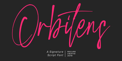 Orbitens is a fancy signature script font. With gel pen stroke, slanted and Unique Upper and lower characters with a bit of ligatures. To give you an extra creative work. Orbitens font support multilingual more than 100+ language. This font is good for logo design, Social media, Movie Titles, Books Titles, a short text even a long text letter and good for your secondary text font with sans or serif. Make a stunning work with Orbitens font. Cheers, MaulanaCreative
 - Grilock by Nathatype,
$29.00 Prepare to embark on a typographic journey through the past with Grilock, an uppercase display font that merges vintage looks. The thickness of each letter is uneven, giving them a reminiscent of vintage handcrafted signage. The relatively sharp corners of Grilock provide visual contrast against the uneven thickness, resulting in a font that is both striking and memorable. In addition, Grilock gives ornaments as a special bonus. Grilock fits in posters, logos, branding materials, and many more.
 - Wedding Doodles Too by Outside the Line,
$19.00Wedding Doodles Too is the follow-up font to the popular Wedding Doodles. This font gives you all you need to make your own invitations, announcements, RSVP cards, save your date cards and thank you notes. Font includes 3 sets of hand-lettered words… save our date, thank you and RSVP. Just add a wedding cake, flowers, top hat, wedding bell, heart or flower and you are done. Check out Wedding Doodles, you may need both. - Evita by ITC,
$29.99Gérard Mariscalchi is a self-made designer. Born in Southern France of a Spanish mother and an Italian father, he has worked as a mechanic, salesman, pilot, college teacher – even a poet (with poetry being the worst-paying of these professions, he reports.) “Throughout all this, the backbone of my career has always been design,” Mariscalchi says. “I’ve been drawing since I was five, but it wasn’t until I was twenty-four that I learned that my hobby could also help me earn a living.” It was about this same time that Mariscalchi fell in love with type. He studied the designs of masters like Excoffon, Usherwood and Frutiger, as well as the work of calligraphers and type designers such as Plantin, Cochin and Dürer. With such an eclectic background, it’s no surprise that Mariscalchi’s typeface designs are inspired by many sources. Baylac and Evita reflect the style of the art nouveau and art deco periods, while Marnie was created as an homage to the great Lithuanian calligrapher Villu Toots. However, the touch of French elegance and distinction Mariscalchi brings to his work is all his own. Baylac Who says thirteen is an unlucky number? Three capitals and ten lowercase letters from a poster by L. Baylac, a relatively obscure Art Nouveau designer, served as the foundation for this typeface. The finished design has lush curves that give the face drama without diminishing its versatility. On the practical side, Baylac’s condensed proportions make it perfect for those situations where there’s a lot to say and not much room in which to say it Evita Mariscalchi based the design of Evita on hand lettering he found in a restaurant menu, and considers this typeface one of his most difficult design challenges. “The main problem was to render the big weight difference between the thin and the thick strokes without creating printing problems at small point sizes,” he says. Unlike most scripts, Evita is upright, with the design characteristics of a serif typeface. Mariscalchi named the face for a close friend. The end result is a charming design that is light, airy, and slightly sassy. Marnie Based on Art Nouveau calligraphic lettering, Marnie is elegant, inviting, and absolutely charming. Mariscalchi paid special attention to letter shapes and proportions to guarantee high levels of character legibility. He also kept weight transition in character strokes to modest levels, enabling the face to be used at relatively small sizes – an unusual asset for a formal script. Marnie’s capital letters are expansive designs with flowing swash strokes that wrap affectionately around adjoining lowercase letters. The design easily captures the spontaneous qualities of hand-rendered brush lettering. - Baylac by ITC,
$29.99Gérard Mariscalchi is a self-made designer. Born in Southern France of a Spanish mother and an Italian father, he has worked as a mechanic, salesman, pilot, college teacher – even a poet (with poetry being the worst-paying of these professions, he reports.) “Throughout all this, the backbone of my career has always been design,” Mariscalchi says. “I’ve been drawing since I was five, but it wasn’t until I was twenty-four that I learned that my hobby could also help me earn a living.” It was about this same time that Mariscalchi fell in love with type. He studied the designs of masters like Excoffon, Usherwood and Frutiger, as well as the work of calligraphers and type designers such as Plantin, Cochin and Dürer. With such an eclectic background, it’s no surprise that Mariscalchi’s typeface designs are inspired by many sources. Baylac and Evita reflect the style of the art nouveau and art deco periods, while Marnie was created as an homage to the great Lithuanian calligrapher Villu Toots. However, the touch of French elegance and distinction Mariscalchi brings to his work is all his own. Baylac Who says thirteen is an unlucky number? Three capitals and ten lowercase letters from a poster by L. Baylac, a relatively obscure Art Nouveau designer, served as the foundation for this typeface. The finished design has lush curves that give the face drama without diminishing its versatility. On the practical side, Baylac’s condensed proportions make it perfect for those situations where there’s a lot to say and not much room in which to say it Evita Mariscalchi based the design of Evita on hand lettering he found in a restaurant menu, and considers this typeface one of his most difficult design challenges. “The main problem was to render the big weight difference between the thin and the thick strokes without creating printing problems at small point sizes,” he says. Unlike most scripts, Evita is upright, with the design characteristics of a serif typeface. Mariscalchi named the face for a close friend. The end result is a charming design that is light, airy, and slightly sassy. Marnie Based on Art Nouveau calligraphic lettering, Marnie is elegant, inviting, and absolutely charming. Mariscalchi paid special attention to letter shapes and proportions to guarantee high levels of character legibility. He also kept weight transition in character strokes to modest levels, enabling the face to be used at relatively small sizes – an unusual asset for a formal script. Marnie’s capital letters are expansive designs with flowing swash strokes that wrap affectionately around adjoining lowercase letters. The design easily captures the spontaneous qualities of hand-rendered brush lettering. - Marnie by ITC,
$29.99Gérard Mariscalchi is a self-made designer. Born in Southern France of a Spanish mother and an Italian father, he has worked as a mechanic, salesman, pilot, college teacher – even a poet (with poetry being the worst-paying of these professions, he reports.) “Throughout all this, the backbone of my career has always been design,” Mariscalchi says. “I’ve been drawing since I was five, but it wasn’t until I was twenty-four that I learned that my hobby could also help me earn a living.” It was about this same time that Mariscalchi fell in love with type. He studied the designs of masters like Excoffon, Usherwood and Frutiger, as well as the work of calligraphers and type designers such as Plantin, Cochin and Dürer. With such an eclectic background, it’s no surprise that Mariscalchi’s typeface designs are inspired by many sources. Baylac and Evita reflect the style of the art nouveau and art deco periods, while Marnie was created as an homage to the great Lithuanian calligrapher Villu Toots. However, the touch of French elegance and distinction Mariscalchi brings to his work is all his own. Baylac Who says thirteen is an unlucky number? Three capitals and ten lowercase letters from a poster by L. Baylac, a relatively obscure Art Nouveau designer, served as the foundation for this typeface. The finished design has lush curves that give the face drama without diminishing its versatility. On the practical side, Baylac’s condensed proportions make it perfect for those situations where there’s a lot to say and not much room in which to say it Evita Mariscalchi based the design of Evita on hand lettering he found in a restaurant menu, and considers this typeface one of his most difficult design challenges. “The main problem was to render the big weight difference between the thin and the thick strokes without creating printing problems at small point sizes,” he says. Unlike most scripts, Evita is upright, with the design characteristics of a serif typeface. Mariscalchi named the face for a close friend. The end result is a charming design that is light, airy, and slightly sassy. Marnie Based on Art Nouveau calligraphic lettering, Marnie is elegant, inviting, and absolutely charming. Mariscalchi paid special attention to letter shapes and proportions to guarantee high levels of character legibility. He also kept weight transition in character strokes to modest levels, enabling the face to be used at relatively small sizes – an unusual asset for a formal script. Marnie’s capital letters are expansive designs with flowing swash strokes that wrap affectionately around adjoining lowercase letters. The design easily captures the spontaneous qualities of hand-rendered brush lettering. - Back In The USSR DL - Personal use only

- Barkanon by wearecolt,
$29.00 Barkanon is not your ordinary humanist sans serif typeface. Blending modern styling with classic humanist flow creates a bold and captivating look. Designed to be expressive in the right places and legible where needed. Barkanon is great for headings, body copy, logos, etc. Barkanon was picked to be a part of the 2024 Typodarium and an early version of the font was featured on James Edmonson's (Oh No Type Co) YouTube channel Barkanon covers 96 languages, 9 styles plus italics, with stylistic alternates, ligatures, and other opentype features.
 - FF Kaytek Rounded by FontFont,
$50.99 Kaytek™ Rounded completes the Kaytek typeface family with seven carefully rounded weights. Every style of the typeface takes up exactly the same amount of space, thanks to the careful creation by Radek Łukasiewicz. This means designers can switch between styles without the text being reflowed, making it particularly useful in magazines, where space might be limited, and also on the internet, where hover links appear in a different style. Kaytek Rounded comes in seven weights, from Thin to Black. It pairs also with Kaytek Sans, Kaytek Slab, and Kaytek Headline.
 - Letterhack Sans by Comicraft,
$19.00 IT’S MAILBAG TIME! Dear Jolly JG Roshell and Rascally Richard Starkings, Comicraft Fonts are a thing of Beauty and a Joy Forever! You guys must be a Wild Bunch, and I roar with delight whenever a new comicbookfonts release appears in my emailbox. But I have to level with you daredevils...what about us Letterhacks? We need representation too! We haven’t spent years hammering away on our typewriters to be ignored! BRING BACK THE LETTER HACK! In fearless font form. You know it makes sense! Truly Yours, Forbush, Irving, senior.
 - RoundWhy by Ingrimayne Type,
$6.95 Font breeding is much like animal breeding, where stallion and mare, or bull and cow, or boar and sow are carefully matched in hopes of yielding a robust and useful offspring. When typefaces RoundUp with fat, rounded serifs and WyomingSpaghetti with fat, squarish serifs were chosen to be parents, it was clear that their offspring would inherit large serifs. But to discover exactly what the offspring would look like, the pairing needed to be consummated, which was done with the “Blend Fonts” commend in Fontographer. The two styles of RoundWhy are the result.
 - SF Droob7 by Sultan Fonts,
$19.99 Droob7 is An Arabic typeface for desktop applications, for websites and for digital ads. Currently prepared by the weight one has the alignment between the Arabic and Latin letters to serve the articles sites without resorting to other fonts in the page or article each. Droob7 font family contains two weights: normal and bold. This font supports Arabic and Latin, Persian and Urdu. The font (Droob7) is characterized by clarity and readability and ease of being a promising line very carefully to be used in Web sites (best size is 12-bit).
 - Hello Kartina by madjack.font,
$14.00 Hello Kartina Script is a beautiful, organic, and fun hand-painted script with different basics and handkerchiefs that can be applied at the beginning and end of all lowercase letters. International support for most Western languages is included. For separate font swash, type lowercase a-z for initial swash and final swash. This font can be used for various purposes. Such as titles, signatures, , wedding invitations, t-shirts, letterhead, signage, labels, news, posters, badges etc. Thank you very much for searching and letting me know if you have questions.
 - Admiral by Greater Albion Typefounders,
$12.00 Admiral was inspired by and extrapolated from the Art Nouveau lettering incised into the facade of a local hostelry. This gave us some inspiration for the capitals 'A', 'B', 'C', 'E', 'H', 'I', 'L', 'O', 'S', 'T' and 'U'; we then had great fun extrapolating the rest! The source of the name Admiral can be spotted if you look at characters such as 'A', 'H' and 'N'. Admiral's distinctive charm and humour lends it to projects with a 1900s Art Nouveau theme, be they book covers, posters, signage, invitations, cards, or anything else you enjoy!
 - Approach Mono by Emtype Foundry,
$69.00Approach Mono is the fixed width version of Approach. A utilitarian low contrast font, a bit mechanical but plenty of character. This version shares its main features with the original one, but it has a more prominent and visible punctuation. The more obvious use of a mono would be in tables, programming code or “in progress texts”, but not just that. Approach Mono can be used in the modern communication, bringing an aseptic voice to brochures, advertising, identities and any other piece of communication. For more details see the PDF. - Quickly Freehand by Cititype,
$12.00 Quickly Freehand is a sans serif font in a casual handwriting style, this is an alternative font for when you get bored with the formal atmosphere. Comes with two versions, regular and italic, to complement your design needs. You can use this font for product labels, taglines, children's craft, prints on t-shirts, paper bags, headlines, cheerful quotes and even long text writing. This font can be used in various graphics software, even in Microsoft Word. Supports 27 languages allowing Quickly Freehand to be used in the wider world.
 - Belgia Modern Classic by Lettertype Studio,
$20.00 Belgia Serif is a classic, glamorous and fancy font. This font will be perfect for logo design, branding, clothing, signage, posters, wedding invitations and so much more! My goal in creating this font was to create a mix of serif fonts with modern and classic styles, which will help your project to be more luxurious and elegant. Don't Miss Out! Belgia Comes With: Lowercase and Uppercase Stylistic Ligature Stylistic Alternate Numerals & Punctuation Accented characters Belgia Font Style (4 styles) Multiple Languages Supported I Hope You Enjoy it! Diki Pradipta Tri Atmojo ^ Pradipta Creative & Lettertype Studio
 - Congress by Monotype,
$29.99Congress from Adrian Williams was shown for the first time at the Association Typographique International Congress, which proved to be so popular in 1980 at Kiel; designed to present a style equally appealling in European languages. Many characters are more condensed than is usual, while others have had certain elements exagerated, bringing notice to new elements of certain letters. The concept being to bring an equality of importance to the whole, producing a collection of International characters working together in harmony on the page -- a common aim that Europeans wish of any Congress. - Afiche Script by Mysterylab,
$19.00 Afiche Script is an engaging vintage-flavored script font that features excellent legibility and versatility. It's equally suited for large logo and headline applications as it is for longer text passages, being very readable even at small sizes. The appealing curves and rounded finials give it a casual and fun vibe, and the subtle reverse stroke contrast makes it a standout choice to catch the eye as being something new and different. The capitals dip below the baseline, providing a lively bounce to each line of upper and lowercase type.
