1,983 search results
(0.009 seconds)
- MCF bad manners ww - 100% free

- MCF bad manners - 100% free

- AndironOutline - Unknown license

- PR8 London Ads - Unknown license

- LudwigHohlwein - 100% free

- Morning Waves by RahagitaType,
$19.00 Immerse your designs in the refreshing essence of the early morning with Morning Waves Font. Inspired by the gentle breeze preceding rainfall, this font effortlessly captures a cute and bold aesthetic. Made for versatility, it serves as the perfect choice for logos, packaging, brochures, cover titles, fashion statements, and enchanting wedding invitations. Elevate your design with the lively and beautiful touch of Morning Waves, infusing every project with a charming vibrancy that resonates with the tranquility of a misty morning.
 - Woodrow by Chank,
$49.00If Mister Frisky is a bit too kooky for your project, try Woodrow. The big floppy serifs and hand-drawn strokes give this font very "Chanky" characteristics. Woodrow is bold, bouncy, fun and legible like Mister Frisky, but it is also a little more traditional and structured. Chank created Woodrow in 1997. It was named in honor of The Chank Company's first office assistant, Scott "Woodrow" Macdonald. - Underwood1913 - Personal use only

- Misses Twiggs by Type Innovations,
$39.00 Misses Twiggs is a contemporary modern serif created by the American type designer Alex Kaczun. It compliments its partner Mister Twiggs and is a perfect marriage of two fonts. Mister Twiggs brings his tall good looks and Misses Twiggs bring her cute little serifs to the relationship. There are absolutely no curves in these elegant typefaces. Both fonts have sharp corners with extra tall capitals and narrow waistlines. Misses Twiggs also comes in 3 flavors: regular, thin and heavy.
 - Generisch Sans by Akufadhl,
$29.00 Generisch - a german equivalent of generic - sans serif typeface has gain its own place among designers and earn such popularity due to its "simple" design. Generisch is influenced by early grotesk typefaces from early 1900's when sans was starting to get popular and used as a body type. Some old ligatures such as ch ck and ng are present in generisch (not the ct and st tho), old style numeral for better typesetting experience and more.
 - Pilsen Plakat - Unknown license

- Generisch Mono by Akufadhl,
$29.00 Generisch Mono is a monospaced version of Generisch Sans. Generisch - a german equivalent of generic - sans serif typeface has gain its own place among designers and earn such popularity due to its "simple" design. Generisch is influenced by early grotesk typefaces from early 1900's when sans was starting to get popular and used as a body type. Some old ligatures such as ch ck and ng are present in generisch (not the ct and st tho), old style numeral for better typesetting experience and more.
 - Skippy Sharp by Chank,
$99.00 Skippy Sharp was drawn by Skippy McFadden in 1995 and faxed to Mister Chank Diesel. Chank completed the character set, added extensive kerning and created a very friendly, informal marker handwriting font. The font is also enhanced for OpenType use with Contextual Alternates for a more natural and organic handwriting style, and true Small Caps, too.
 - Josef K Paneuropean by Juliasys,
$38.95 With the Josef K *, Julia Sysmäläinen continues her artistic debate on Franz Kafka’s writing style. This time the designer of FF Mister K is not drawn to Kafka’s literary works created at night but to those the writer produced at daytime as a high-ranking, confident bureaucrat – Dr Franz Kafka. The typefaces Josef K “Paneuropean” and “Strong European” echoe Kafka’s prestigious status at the Workmen’s Accident Insurance Institute of the Austro-Hungarian Empire. Their ductus, originating from a broad-nibbed ink pen combines a clear, self-confident stroke with the calligraphic features so typical for Franz Kafka’s handwriting. While both typefaces are more straightforward and bolder than the wonderfully erratic fonts of the FF Mister K family Josef K Paneuropean is best characterized as a semibold handwriting textface. Josef K Strong European, Sysmäläinen’s latest “K”-accomplishment, provides an ideal complement to it as a distinctly bold display face – great for headlines, product names and branding. It combines perfectly not only with Josef K Paneuropean but also with all the FF Mister K textfaces. Both Josef K Paneuropean and Josef K Strong European have Western, Central European and Extended Cyrillic character sets. With more than 2500 glyphs they support over 100 languages. *Kafka’s persona Josef K is a leading bank officer – reminiscent of the author himself – in the novel The Trial.
 - Brinar by Hackberry Font Foundry,
$24.95 I've been working on a usable sans serif for body copy since the mid-1990s (though I certainly did not know it at the time). This one works well. It started life back in the mists of time as a scan of an old German font by Carl Fahrenwaldt. It was developed fully as a synergized serif with strong traditional roots and released as Bergsland Pro. Now it finally makes it to where I was headed all along as a sans text font. This is a well modulated humanist, sans serif font family with many OpenType features and over 600 characters: Caps, lower case, small caps, ligatures, swashes, small cap figures, old style figures, numerators, denominators, accents characters, ordinal numbers, and so on. It is designed for text use in body copy. But it also works very well for elegantly stylized display.
 - Vatican by Alan Meeks,
$45.00 Vatican is a calligraphic face. The lower case is influenced by the lettering of Arthur Baker but the caps are more formal, the shape of the Cap V reminded me of a Bishops Mitre which led eventually to the name. The lighter weight works particually well in small text pieces
 - Remontoire by MAC Rhino Fonts,
$36.00 The original sketches who formed the base for Remontoire is known as one of the first typefaces drawn by Karl-Erik Forsberg . It was a result of a competition set up by various typographic organizations in the early 1930. The typeface was never completed and sketches are only to be found on paper. Made only as a single font but some the character can later on be found in other of examples of his work; Carolus and Ericus. MRF developed and expanded the family into 5 weights.
 - Cirque De La Lune by Dawnland,
$9.00 Once a year Through mist and rain October soon to end Have no fear Beneath the full moon we gather. Welcome to the show! Now - Silence... Cirque de la Lune is an uppercase only poster/display/headline font in two variants - Eclipse (regular) & Fullmoon (outline). Alternate, nudged or slightly rotated uppercase letters are placed on the lower case keys!
 - Divine Right by Comicraft,
$29.00 When the Adventures of Max Faraday began in the pages of Wildstorm Comics' DIVINE RIGHT in the mid-'90s, this chapter title font materialized, eventually reappearing on the covers of WOLVERINE. Delicately crafted by Mister Fontastic himself, John Roshell claims this font was the product of Divine Inspiration. When told he'd been looking at the work of too many French Poster Artists, he dismissed such allegations as Mucha do about nothing.
 - Badoni by Chank,
$49.00"Grunge Typography? I invented it!" claims Chank Diesel. Badoni was created in 1993 for use in CAKE, a fanzine that reveled in grunge music. As creative director of CAKE, Chank wanted the magazine's design to reflect the music it glorified. Kurt Cobain was alive and miserable. Soundgarden had long hair. Seattle was everywhere. Chank's answer was Badoni, a gritty and distressed typeface that is a sign of the grunge glory years. - ZsaZsa Galore by Chank,
$39.95Chank created Zsazsa Galore as a fresh alternative to Mister Frisky, another jerky, hypercaffeinated interpretation of the traditional roman alphabet. The difference this time is that the new font has no descenders. Every letter comes to rest hard on the baseline. It sits there firmly rooted with branches wiggling around in the air. It was released as the Chank Font of the Month in October 1999 and it was named after Zsa Zsa Gabor because she is beautiful. - Stage Play JNL by Jeff Levine,
$29.00 Vintage sheet music for Earl Carroll's dramatic mystery-comedy production "Murder at the Vanities" has its title hand-lettered in the Art Deco style which served as the basis for Stage Play JNL.
 - Eleganta by Mans Greback,
$59.00 Eleganta is a beautiful calligraphic script typeface. It was drawn and created by Misti Hammers and Måns Grebäck in 2019. As the name implies, it is first and foremost an elegant letter style, but with its handcrafted shapes reserved, it is still down-to-earth and affectionate. Use it in romantic or celebratory contexts, for an invitation or anywhere you want to transmit a personal message. The font supports all Latin-based European languages, contains numbers and all symbols you'll ever need.
 - TratexSvart - Unknown license

- Too Much by Comicraft,
$19.00If you've had too much coffee but not enough of Too Much Coffee Man you can now indulge in an excess of characters created by the hand of Too Much Coffee Man's creator, Mister Shannon Wheeler. Don't worry, in our efforts to ensure clean and confident lettering samples, we kept Shannon on decaf until he was done. Dip this font in your system folder and your hard drive will get a caffeine and sugar rush guaranteed to increase its memory partition and bring the images on your monitor into sharper focus. - 1848 Barricades by GLC,
$38.00 This family was inspired from a lot of 1848-1850 French engraved documents reproducing handwritten texts talking about the Paris' insurrection days in June 1848 (described by Victor Hugo in Les misérables) . It seems that all were first written using quill pens, as the strokes are too much heavy and bold for metal pens and even though the engraver work is very fine. We have added only a few characters, most of them were present in the originals. The TTF and OTF versions are enriched with more than 50 ligatures or alternate characters.
 - Walbaum 2010 Pro by Storm Type Foundry,
$54.00 Upon numerous demands of highly esteemed users of our fonts I decided to supplement the Walbaum type family by display and poster cuts. Because I obviously cannot compete with world’s renowned type foundries which already offer a number of renderings of forenamed typeface, I thought proper to decline a bit from the original Walbaum’s design, strictly speaking, from the apprehension we commonly keep about this typeface. Therefore I didn’t set forth the way of modernizing (shame!), but rather the opposite direction: towards an analysis of the original neo-classical intention. I took the 10-point character, magnified it enormously and cut off progressively all the optically thickened bobbles which raised by small-size correction. I ended up at the size of about 120 points, where it became obvious that any further thinning would lead to an undesired manneristic fragility. Resulting 8-member family Walbaum 120 is naturally usable in variety of sizes, as well as cuts marked “10” you can use, say, from 6 to 30 points. I only hope that mister Justus Erich won’t pull me by the ear when we’ll meet on the other side...
 - Pall Mall by Red Rooster Collection,
$45.00Based on the early ‘Pall Mall’ typefaces. - Vienna by Solotype,
$19.95This early 1900s type is from the German foundry of Schelter & Gieseke, and is typical of early twentieth century design. As usual, we have added all the modern necessities, such as monetary signs for the major commercial countries. - Grimm by The Type Fetish,
$25.00 The origin of Grimm was to create a typeface in the spirit of Elliott Peter Earls' Subluxation, but somewhere in the process things shifted to a blackletter influenced uppercase while the lowercase became more roman. The end result is a quirky little blackletter display typeface.
 - Avebury by Parkinson,
$25.00 An ultra black blackletter, Avebury Black and Avebury Inline were inspired by an early blackletter from the Caslon Foundry. Early blackletters from the Bruce Type Foundry are also reflected in this slightly modernized and more readable typeface. Caution. For display only.
 - Traveling _Typewriter - Unknown license

- Pearlone by Sarid Ezra,
$15.00 Introducing, Pearlone (Read : Pearl One), a stylish stencil serif! Pearlone is a stylish and modern stencil serif that will make your project more elegant and appeal. This font called Pearl-one, because the dot in some characters inspired by the beautiful pearl. This font comes with regular and bold style that have a contrast look. You don't one to use the pearl version? Don't worry, it comes also in regular form. You can access the regular form with uppercase, and the special one from lowercase. You can use this font for any purposes, such as a branding logo, poster, or even editorial! This font also support multi language. Happy Designing!
 - Gothic Nesbitt by Wooden Type Fonts,
$20.00 An early gothic heavy sans serif font, largely for display.
 - Titanic by Red Rooster Collection,
$45.00Based on an early wood type design. An original creation. - Triple Condensed Gothic by Red Rooster Collection,
$45.00Based on an early wood type design. An original creation. - Yeoman Gothic by Red Rooster Collection,
$45.00 Based on an early wood type design. An original creation.
 - Gobbler by Chank,
$49.00Gobble gobble gobble! The Gobbler font was drawn with a leaky pen on a napkin at the Modern Cafe in Northeast Minneapolis while the designer, Mister Chank Diesel, was waiting for some pot roast. “Apple cobbler drippings on the napkin add more character to the strokes of each letter,” says Chank. This font was originally named Modern Napkin, a free font released in 1997. Chank completed the character set, fixed some curves, and cleaned up some of the apple cobbler to make a more elegant font in 1999. Gobbler works great for either text or display purposes. - Bitmap Sketch by The Tree is Green,
$20.00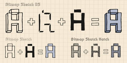 Inspired by early bitmap fonts, hand drawn for a contemporary twist.
 - Grand Canyon by Red Rooster Collection,
$45.00 Based on an early wood type design. An original creation, that kept growing...!


