7,771 search results
(0.022 seconds)
- Ma Braille by Echopraxium,
$5.00 The "Ma" in "Ma Braille" is used as a minimalist way to say "Negative Space". "Ma" in japanese arts is an "esthetical usage of emptiness". Thus this font explicits the negative space around visible braille dots in each glyph. A. Font user guide a.1. Lowercase glyphs { A..Z } In these glyphs, dots are represented as "black squares" while the negative space is displayed as 1 or 2 white filled polygons. a.2. Uppercase glyphs { a..z } In these glyphs, dots are represented as "white squares" while the negative space is displayed as 1 or 2 black filled polygons. a.3. Digits: they are just the same than a..j, but the "North US version" is also provided in ascii codes 0xE0..0xE4 (1..5) and 0xE7..0xEB (6..0). a.5. "Dashed Border": a.5.1. "Black dashed" border glyphs; { £, ¥, µ, Â, Ä, Ê, Ë, Î, Ï, Ô } a.5.2. "White dashed" border glyphs; { Ö, Õ, °, ô, ö, î, ï, û, u, õ } B. Posters Poster 1: "Font Logo" version 1, it displays "Ma Braille" text surrounded by the "black dashed border" glyphs. Poster 2: "Font Logo" version 2, it displays "MA" glyphs in big size and smaller "Braille" glyphs within "M" and within "A" as well. Poster 3: the classical pangram to test a font "The Quick Brown Fox jumps over the Lazy dog". Poster 4: Article 1 of the Human Rights: All human beings are born free and equal in dignity and rights. They are endowed with reason and conscience and should act towards one another in a spirit of brotherhood. Poster 5: the "Glyph set" (Border glyphs not included) with A..Z, a..z, digits and special characters.
 - Nouveau Poster JNL by Jeff Levine,
$29.00 When master letterer Hugh Gordon and his student, Ross F. George developed a set of lettering pens between June 16, 1913 and Sept. 1, 1914, they had no idea that their invention (which they named Speed-Ball®) would still be in use nearly a hundred years later. The C. Howard Hunt pen company [originally of Camden, New Jersey] became the original (and sole) distributor of these pens. By 1915 an instructional booklet entitled "Modern Pen Lettering" was produced, and it was copiously illustrated with examples of layouts, lettering techniques and an assortment of alphabets for the user to learn. Nouveau Poster JNL is Jeff Levine's interpretation of a sanserif design found within the pages of this vintage publication.
 - Barnsley Gothic by Red Rooster Collection,
$60.00 Barnsley Gothic is a condensed sans serif font family. It was designed by Steve Jackaman (ITF) in 2017. It was developed alongside its sister font family, Steelplate Gothic Pro, and includes support for Latin 1 and Central/Eastern European languages. The family is named after the town of Barnsley, a coal mining town in Yorkshire, England. In 1960, there were roughly seventy collieries within a fifteen-mile radius of Barnsley town center, however the last of these closed in 1994. Barnsley Gothic has a straightforward, industrious, no-nonsense feel, much like the town it shares a name with. Always ready to do the heavy lifting in any design project, Barnsley Gothic is the quintessential workhorse font family.
 - Resistance Is Lowered by Comicraft,
$19.00 Lower your shields and surrender your ships. You will talk to your central world authority in upper AND lower case, and order global surrender. Your culture will adapt to serve us in sentence case. You will not shout in UPPER CASE as before. You will be upgraded. You will become like us. Upgrading RESISTANCE IS FUTILE to RESISTANCE IS LOWERED is compulsory. There is no escape. Artwork from Monster Truck by Shaky Kane
 - Gnarly Dude NF by Nick's Fonts,
$10.00Ross F. George, master of the Speedball pen, called this rather rugged typeface "Personality Script", which might be a suitable name if you had the personality of a porcupine. It does grab your attention, though! Both versions of the font include the 1252 Latin and 1250 CE character sets (with localization for Romanian and Moldovan). - Fedorro by Leeza Chepugova,
$13.00 We are proud to present to you our new Latin+Cyrillic font Fedorro! Fedorro typeface is a classy example of a modern Ukrainian style of type design. It is inspired by traditional fonts of the past, but with a strong modern twist to its appearance. The main feature of this font are round and playful letters combined with a relatively tiny negative space, making it unique like no other: many typeface elements were borrowed from historical exemplars of Ukrainian handwritten letters and redesigned with modern trends in mind. Fedorro is perfect for all the situations when you need the text to pop and catch the viewer's eye: posters, books and magazine covers, headlines, banners and ads, logotypes, corporate branding, lables, ads etc.
 - ITC Black Tulip by ITC,
$29.00ITC Black Tulip was designed by Dudley Rees and inspired by the modular simplicity of the Greek fret band, an ancient repeating pattern formed by tracing a line at right angles between two horizontal rules to form an interlocking motif. Rees admired the discipline of the motif, I saw how that simple rigid rectangular network suggested an alphabet that would need little or no kerning," he says. He describes ITC Black Tulip as a "dramatic headline face"." - SlabFace - Unknown license

- Poster by Extratype,
$40.00 The long awaited full version of Poster, a recreation of Bodonian/Didot excess designed by Iñigo Jerez. The family has been finely improved with more styles. The family consists of: Poster and Poster Italic, a bolder version named Poster Monster and Poster Monster Italic– a virtuoso exercise in counter forms and contrast to be used with power unleashed, as the name suggests–; and finally Poster Display, Poster Display Italic, Poster Display Monster and Poster Display Monster Italic: four styles designed for even bigger sizes, with more contrast and splendor.
 - Trek - Unknown license

- Alliance by Degarism Studio,
$40.00 Alliance Update to version 2.0 Alliance™ 28 weights, 14 uprights and matching italics. Each typeface contains over 592 glyphs with extensive Western, Central and Eastern European language support. ALLIANCE NO.1 Inspired by Industrial-era types from the end of the 19th century. Attempts to follow the best traditions of Grotesk typefaces. Features monolinear strokes and a good amount of contrast between the stroke thickness of each weight. With its distinctive inktraps, subtle in light versions and more visible in the black ones, Alliance No.1 was developed with unique glyphs to offer maximum flexibility. An airy metric aids good legibility in short texts. ALLIANCE NO.2 Alliance No.2 is a Display typeface. Developed from the original font family for use in large sizes. Based on the combination of contrasting shapes. This is a set useful for branding and advertising. Symbols for public areas, environment, transportation, digital and urban life. OPENTYPE FEATURES Including tabular figures, alternate characters, ligatures, fractions, case-sensitive forms, superscripts, subscripts etc.
 - Horror Show by TypeArt Foundry,
$45.00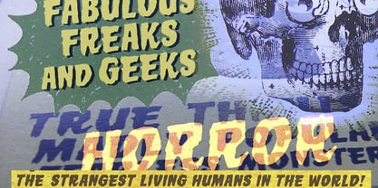 Scary monster font for horror headlines.
 - ZsaZsa Galore by Chank,
$39.95Chank created Zsazsa Galore as a fresh alternative to Mister Frisky, another jerky, hypercaffeinated interpretation of the traditional roman alphabet. The difference this time is that the new font has no descenders. Every letter comes to rest hard on the baseline. It sits there firmly rooted with branches wiggling around in the air. It was released as the Chank Font of the Month in October 1999 and it was named after Zsa Zsa Gabor because she is beautiful. - Nothing by Dharma Type,
$19.99 The real handwriting script. Very powerful impression because of its heavy, wide and speedy shape. Award Winning No. 1 font 2007 at MyFonts and Rising Star. There is one more script designed by in the same concept. -Banana -Nothing
 - Kubrick by Quadrat,
$25.00 Kubrick is an experiment in extremes. The Light font is very tall and slender, the Black font is very massive, and Kubrick's slender counters push some of its glyphs to the edge of recognition. The thin counters and negative spaces also give text set in Kubrick a definite visual sparkle, especially in all-uppercase settings. Because of its extreme letterforms, Kubrick is recommended only for large display use. The default letterspacing is set fairly wide to keep text legible. Kubrick was a double-experiment. One part of it was to see how heavy and massive a typeface I could make while still keeping it legible. The other part was to develop a Multiple Master font. Multiple Master fonts were a format developed by Adobe that allowed the user to change things like the weight and width of a typeface. Monollith started as just such a Multiple Master typeface, but when Adobe discontinued the Multiple Master format, I stopped work on the typeface. Later I decided to continue work on it, but as five separate font weights: Light, Medium, Bold, ExtraBold and Black. Very rectilinear letterforms with extremely narrow counters and negative spaces. The five fonts go from very thin and condensed to very heavy and extended. Use in large display settings where unornamented high visual impact is desired.
 - Monticello by Linotype,
$40.99 Linotype Monticello was designed by C.H. Griffith in 1946. Its design is based on James Ronaldsons Roman No.1 and Oxford Typefaces from American Type Founders and was revised by Matthew Carter while he was working at Linotype between 1965 -1981.
 - Autobahn Std by AVP,
$18.00 Autobahn is a robust masculine sans of near monoline thickness and angular characteristics. Autobahn Std has a full Latin 1 character set but no CE, Cyrillic or Opentype features. For the extended character set and Opentype features, see Autobahn Pro.
 - MoanLisa by JOEBOB graphics,
$9.00 MoanLisa, a font for monster movies. Caps only...
 - Dolina Script by Tour De Force,
$25.00 Ingredients: 1) Dusan's right hand; 2) The eye of the Cobra, leg from the dragon, software from the Bill; 3) Elliott Smith (TM) playing in the background; 4) Old grandmother to tell you not to spice it too much; 5) Empty label for your jar/ box/ product...
 - Gagarin Star Mix Cyrillic - Unknown license

- Anymals by FaceType,
$10.00 Anymals are fictitious monsters from under the sea. BEWARE!!!
 - P Funked Hollow - Unknown license

- SheCreature - Unknown license

- Carl Beck by Monotype,
$29.99Cartographer Carl Beckman was appalled by the low standard of lettering in Sweden during the 18th century. He published an instruction and pattern book with four different letter forms in Stockholm 1794. The Carl Beck font is based on his Cursiv Skriften no. 1. - Shadowlawn JNL by Jeff Levine,
$29.00 If you like a rough-hewn, rugged and vintage typeface, then Shadowlawn JNL will certainly please you. Re-drawn from vintage examples of a hand-cut wood type, the rustic charm of this typeface brings a reminiscence of Old West themes.
 - Bearskin by Hanoded,
$15.00 NO! I don’t have a bearskin rug, nor a fur collar on my jacket. I believe fur should only be worn by its first owner. I have no idea why I called this font Bearskin: maybe I was influenced by one of the Viking novels I am reading - they’re full of Berserkers - but that name was already taken. Anyhoo, Bearskin font is a nice handmade all caps font. A little rough here and there, but with a lot of character as well. Bearskin comes with swashes, so you can have a ball!
 - The Bystander Collection by Uniontype,
$10.00 The Bystander is an original font collection of eleven fonts. Inspired by masters of art photography. It contains eleven typefaces in sans, serif and script styles, which are all works great together or in their own. The script version also combined with ending swashes, use stylistic alternates from 1 to 8 to work with them.
 - Branding Autumn by Rotterlab Studio,
$14.00 Branding Autumn introducing our new "Branding Autumn" Modern Calligraphy Script in Modern Elegant Style perfect for branding, logos, invitations, master heads and more. Branding Autumn Features: - Many languages - Alternative - PUA encoded - Ligature - Very easy to use in any software (Included Instructions) - No special software installation required. Compatible with Windows and Mac OS. Supported by Microsoft Word, Paint, Adobe, Corel draw, Cricut and other applications. Thank you...
 - Ed McGuinness by Comicraft,
$39.00 Fighting American and all around Superman Ed McGuinness joins our Masters of Comic Book Art with a font inspired by his gamma ray saturated handwriting! Ed is officially a friend of Comicraft and a big smile in Hulk form! Now a small slice of this Jolly Green Giant is available as an alphabet waiting for puny humans to arrange in words of no more than two syllables.
 - Jurassic - Unknown license

- LHF Asylum by Letterhead Fonts,
$43.00 A ragged jagged experiment that's sure to fit the needs of any mad scientist or extreme skier dude (you know the type). Features two sets of variations: one set on the uppercase keys and a different set on the lowercase keys. Mix and match them for best effect. No twisted or mangled points in this font. All paths guaranteed technically sound.
 - Flying Sausage by Remedy667,
$18.00 Flying Sausage. From beyond the stars it comes to take over your designs. Perfect for any science fiction or horror inspired comics, books, event flyers, pulps, rags, movies, logos, shirts… no design is safe, even drive-in theatre menus?!? Includes a textured version for additional layered effects that make it jump off the screen! You’ll scream for Flying Sausage. Available now!
 - Alpha One by Wiescher Design,
$18.00 »AlphaOne« is my newest addition to the experimental Alpha-font-collection. I just had to do this one! It is based on Paul Renners fonts, but has got nothing to do with them, I just took the widths and some basic forms. No – or hardly no – optical corrections were made to the glyphs. I wanted the pure geometric forms to come to life. This was a lot of fun to design, I especially like the »Q« with the negative tail. I did make four weights, but nothing is normal with this font, so weight doesn’t really mean anything. Have fun!
 - Naroid Initials JNL by Jeff Levine,
$29.00Naroid Initials JNL is one of the most ultra-compressed sets of initials available in digital type. These twenty-six initials are so narrow that a test print with all of the letters at 2-1/2 inches in height took up no more than about 5 inches in width! - Collected Catchwords JNL by Jeff Levine,
$29.00 For those designers looking for nothing more than a library of familiar catchwords and phrases re-drawn from vintage source material, look no further. Collected Catchwords JNL gathers up ninety-three of them, picked from the dingbat typeface library of Jeff Levine Fonts and placed into one convenient font file. "Free", "Sale", "As Advertised", "Dollar Days", "Look", "New" and dozens of other icons of print advertising are no more than a keystroke away.
 - HighJinkies by Comicraft,
$19.00 It’s jaunty and flaunty and up to no good! It’s a child born of fairly odd parents and always looking for the good kind of trouble. It'll get you out of the red and into the pink like a panther pawning diamonds! Comicraft’s John Roshell has slipped his hands into the gloves of the Phantom Font Finagler and there’s HighJinks ahead to be sure!
 - Quanta by Alphabets,
$17.95Quanta was designed without reference to existing sansserif faces. As an original design, Quanta draws on principles of letterform developed during my studies of lettercarving (in Wales with Ieuan Rees) and Roman proportion. My intention was to produce a highly legible and adaptable sans-serif, initially intended to be a TrueType GX font, then as a Multiple Master font, later as a five weight range from extremely thin to extra black. A related uncial design will be released shortly. - Snow Job JNL by Jeff Levine,
$29.00 Snow Job JNL was inspired by the hand lettered titles for the 1964 Rankin-Bass animated holiday classic "Rudolph the Red Nosed Reindeer". Because of the variable heights of the characters they float about the baseline in a free-form design. Available in both regular and oblique versions, the typeface gets its name from both the winter theme of the TV special along with the old term for deceiving someone with compliments while hiding one's true intent.
 - Rick Veitch by Comicraft,
$39.00 For our latest Master of Comic Book Art, Roarin' Rick Veitch, we've created a Brat Pack of fonts worthy of a Maximortal! This is The One! This will make your Heartburst! If you Can't Get No Rick Veitch between 1941 and 1963, wipe that Swamp Thing off America's Best Greyshirt, because this font is nothing short of A Miracle, Man! It's Epic! Abraxas and the Earthman and your Army @ Love recommend it.
 - WildWest-Normal - Unknown license


