10,000 search results
(0.039 seconds)
- Disposition by PizzaDude.dk,
$15.00 You may not know it, but you've been looking for a font like DISPOSITION! Yeah, it's a font...but it doesn't act or look like one! Why?! Because there are 6 different versions of each letter! Yes, SIX different versions! Enough to make your design look soooo cool and handmade! The font uses "contextual alternates" which makes the font cycle the different versions as you type! What can you use DISPOSITION for? There are almost no limits, but I would suggest designs such as invitations, headlines, posters, signs and other cases where a dry brush look is required.
 - Rolphie by Aah Yes,
$9.95 Rolphie can be your go-to sans-serif, with 16 easy-to-read weights and 10 versions for each weight, and the subtlety of choice that represents. The versions contained in each weight are: Regular; Condensed; Half-Condensed; Expanded; Small Capitals: and their italic counterparts. (At heavier weights particularly it seemed to be justified to have two Condensed versions). Plus there's 20 funky versions with the letters all shook up (that would make a good title for a song), or jumbled around, plus some Shadow, Doubled-Up, College, and other FX versions. In total there's 180 variations, giving a comprehensive selection of both standard and funky fonts, and that subtle degree of choice of weight. To make things easier, the weights are put in ascending numerical order from 01 to 16, and the FX versions have been stuck in the 80s and 90s, (like two musicians I know). There are grouped packages available for certain weights (which have 10 fonts in them) and the complete family package (180 fonts) which represent better value than the individual fonts, and there's a basic package containing the Normal and Italic versions of all 16 weights (32 fonts). A limit of 5 sub-family packages has been imposed, unfortunately, which precludes a more comprehensive selection. To let you know what's in the font that you might otherwise never know about . . . With Discretionary Ligatures on, you get special characters if you type Mc St. Rd. Bd. Ave. c/o No. (p) (P) - include the full-stop/period. With Stylistic Alternates switched on, you get plenty of extra characters - including a WiFi symbol (type Wifi or WiFi) / bullet numbers instead of ordinary numbers / that different U-dieresis / special characters for c/o No. Mc / an upside down ~ / a huge bullet, and different forms for cent, dollar, percent, per-thousand. As you'd expect, there's all the accented characters for all Western European scripts using Latin letters, and standard ligatures, plus other Open Type features including Class Kerning, Slashed-Zero, Historical Forms, Sub- and Superscript numbers, fractions for halves, thirds and quarters, Ornamental forms giving bullet numbers, etc. There's also the main mathematical operators, symbols like card-suits and male/female signs and so on, and some more obscure stuff like schwa and O-horn, U-horn - and there's lots more if you can Access All Alternates. Much will depend on what your software recognises. The Small Caps versions have (intentionally) lost the ligatures for lower case ff, fi, fj, fl, fr, fu, ffi, ffj, ffl, ffr, ffu. The names for the weights are not absolute - we had to make up some names to make them stretch out to sixteen - so rather - see them as relative to each other, being in ascending numerical order by weight.
 - Backyard Bouquet by Rachel White Art,
$16.00 Backyard Bouquet is a breezy hand-lettered caps font. Mix and match caps and lowercase letters to create a hand-lettered look in your designs.
 - The qoestter by Alit Design,
$19.00 Presenting the ✨The Qostter Retro Serif Font✨ by alitdesign. The Qostter Retro Serif font is inspired by stylish designs from the 80s to 90s. At that time the font style like "The Qotter" had a firm and trendy impression. The Qotter retro font has a wide selection of alternative characters and swashes that make it easy to create bold retro-style designs. The Qostter Retro Serif font is very suitable for making designs with retro concepts, simple and playful designs, for example making magazine cover designs, music covers, YouTube thumbs, text headers, logotypes and so on with an elegant retort theme. Besides that this font is very easy to use both in design and non-design programs because everything changes and glyphs are supported by Unicode (PUA). The Qostter Retro Serif font has a total of 758 glyphs including symbol, multilingual and alternative glyphs. We really enjoyed the process of making The Qostter Retro Serif font, we hope you are also happy when using The Qostter Retro Serif font. Language Support : Latin, Basic, Western European, Central European, South European,Vietnamese. In order to use the beautiful swashes, you need a program that supports OpenType features such as Adobe Illustrator CS, Adobe Photoshop CC, Adobe Indesign and Corel Draw. but if your software doesn't have Glyphs panel, you can install additional swashes font files.
 - Yoko Smile - Personal use only

- HeummSwifthongcha142 - Unknown license

- Janda Scrapgirl Dots - Personal use only

- A La Nage - Unknown license

- BROKEN GHOST - Unknown license

- Kings of Pacifica - Personal use only

- AHDN - Unknown license

- Ebola - Unknown license

- Tattoo - Unknown license

- Avain - Personal use only

- Wonton - Unknown license

- MTC Agrinaya by Martype co,
$22.00 Agrinaya is a condensed display font with high contrast and feels like a serif style to make it more stylish and modern, this font is made for logotypes, branding, editorial designs, and more. Thank You & Happy Designing!
 - Sallsa by AEN Creative Studio,
$12.00 Sallsa is a sweet and delicate handwritten font. It looks stunning on wedding invitations, thank you cards, quotes, greeting cards, logos, business cards and every other design which needs a handwritten touch. This font is PUA encoded which means you can access all of the glyphs and swashes with ease!
 - Love Aster by Nahda Creative,
$16.00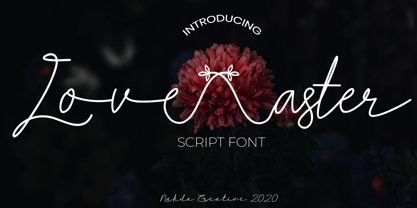 Love aster is a sweet and friendly script font. It looks lovely on wedding invitations, signature, thank you cards, quotes, greeting cards, business cards and every other design which needs a handwritten touch. This font is PUA encoded which means you can access all of the glyphs and swashes with ease!
 - Holina Journey by ahweproject,
$10.00 Holina Journey is a beautiful and romantic handwritten font. It looks amazing on thank you cards, quotes, wedding invitations, greeting cards, business cards, logos and any other design that requires a touch of handwriting. This font is PUA encoded which means you can access all the glyphs and swashes easily!
 - Hello Dove by Beary,
$14.00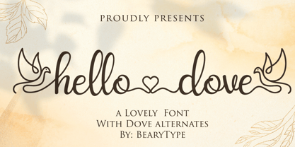 Hello Dove is a sweet and angelic handwritten font. It looks lovely on wedding invitations, thank you cards, quotes, greeting cards, logos, business cards and every other design which needs a handwritten touch. This font is PUA encoded which means you can access all of the glyphs and swashes with ease!
 - Creamy Sugar by Aestherica Studio,
$9.00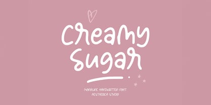 Creamy Sugar is a modern handwritten monoline script. This font looks natural, stylish, and perfect for any extraordinary project that requires a handwritten feel. Its versatile style looks lovely on wedding invitations, thank you cards, quotes, greeting cards, logos, business cards, and every other design which needs a customized touch.
 - Amilionia Calligraphy by Shape Studio,
$14.00 Amilionia is a new modern script calligraphy font with an irregular baseline. Trendy and feminine style.Amilionia Script looks lovely on wedding invitations, thank you cards, quotes, greeting cards, logos, business cards and more. Perfect for using in ink or watercolour. Including initial and terminal letters, alternates, ligatures and multiple language support
 - Chardmilk Script by Ajibatype,
$15.00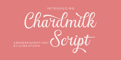 Chardmilk Script is a sleek, refined script font. It looks dazzling on wedding invitations, thank you cards, quotes, greeting cards, logos, business cards, and every other design which needs a customized touch. This font is PUA encoded which means you can access all of the glyphs and swashes with ease
 - Sendertime by Aminmario Studio,
$20.00 Sendertime is a stylish and incredibly elegant handwritten font. It looks stunning on wedding invitations, thank you cards, quotes, greeting cards, logos, business cards and every other design which needs a handwritten touch. This font is PUA encoded which means you can access all of the glyphs and swashes with ease!
 - Sanelya by Niyyos Studio,
$16.00 Falena is a stylish and incredibly elegant script font. It looks stunning on wedding invitations, thank you cards, quotes, greeting cards, logos, business cards and every other design which needs a handwritten touch. This font is PUA encoded which means you can access all of the glyphs and swashes with ease!
 - Ramphox by Atom,
$15.00 RAMPHOX strong display font. With extra attention to fast and straightforward streaks, RAMPHOX is guaranteed to deliver hard and fast messages for logos, clothing, quotes, product packaging, or anything that requires a turbo typographic boost.
 - Neacademia by Rosetta,
$70.00 Neacademia is a Latin and Cyrillic type family inspired by the types cut by 15th century punchcutter Francesco Griffo for Venetian printer Aldus Manutius. Beyond the letterforms themselves, however, the digital fonts themselves are based on the techniques and methods Griffo employed. The family comprises four distinct variants optimised for specific point sizes, as was traditional in metal type. While the display sizes maintain a visual link to calligraphic roots, text sizes exhibit more typographic qualities, following the hand of the carver. Likewise, Neacademia maintains its even colour on the page by carefully employing alternative letterforms, rather than leaning on a multitude of kerning pairs. A geeky little detail you’ll likely need to point out with a magnifying glass to your type friends, but creating a neat texture that works in readers favour nonetheless. Neacademia’s historically sensitive eye is put to work for modern typographers’ needs. It incorporates Griffo’s italic capitals and harmonizes them with the lowercase and the romans — where the original Aldine italics had no capitals of their own and simply re-used the uprights. It was designed with specific allowances for letterpress photopolymer printing. Printed digitally, it can tolerate – and even benefit from – low resolution, rough paper, and low-grade presswork. In many ways, it feels like using metal type again!
 - Go To Town JNL by Jeff Levine,
$29.00 Vintage sheet music for a song from the 1941 animated feature "Mr. Bug Goes to Town" featured a casual, hand-lettered inline type style on its cover page. Recreated as the digital font Go to Town JNL, this design is presented in all the imperfect glory of pen and ink lettering. Go to Town JNL is available in the regular inline version as well as a solid version. A bit about the cartoon: The project was created by the legendary Fleischer Studios in Miami, Florida (they had relocated from New York City), after they could not obtain the rights to adapt Maurice Maeterlinck's "The Life of the Bee". Beset by the expenses of relocating to Florida, growing production costs on the full-length feature cartoon and other problems; mid-way through the making of "Mr. Bug Goes to Town" the Fleischer brothers were forced to sell their studio to their distributor (Paramount Pictures) in order to continue in operation. It was released on Dec. 5, 1941 - just two days before the Japanese attack on Pearl Harbor. The release [and subsequent re-release by Paramount as "Hoppity Goes to Town"] was a disappointing failure, earning [as late as 1946] only $241,000 of the initial cost of $713,511 it took to make the film.
 - Tim Sale by Comicraft,
$39.00 If you're familiar with the work of Eisner Award winning artist Tim Sale, you'll also be familiar with the soft curves and hard edges of the characters he brings so vividly to life in the pages of GRENDEL, BATMAN and SUPERMAN. Now you can get to know a selection of the characters Tim has been working on his whole life, and Comicraft has been kind enough to arrange them in alphabetical order for you! Based on Tim's own hand lettering work in the lost Dark Horse classic, BILLI 99, the Tim Sale font brings together the class and finesse of Hunter Rose, the elegance and charm of Bruce Wayne and the honesty and trustworthiness of Clark Kent. Don't go into the big city alone at night without it. See the families related to Tim Sale: Tim Sale Lower & Tim Sale Brush.
 - Seol Sans Variable by Monotype,
$1,049.99The Seol Sans design offers a fresh palette for designers working with the Korean alphabet, particularly those looking to pair Latin and Korean alphabet (or Hangul) forms without creating typographic friction. The choices for Hangul fonts that work well with humanist Latin typefaces are limited. As Monotype’s first original Korean design, the Seol Sans typeface is a humanist take on the traditional rigid and hard designs of Hangul characters. The Seol Sans design more closely resembles the natural curve of hand-written characters. Seol Sans features Neue Frutiger for its Latin glyphs, and works harmoniously with Neue Frutiger World and Monotype’s CJK typefaces Tazugane Info (Japanese) and M XiangHe Hei (Chinese). Seol Sans is a great choice for global brands using a Sans Serif design looking to maintain their visual identity, and communicate with a consistent tone of voice in the Korean market.¶ - Verse Serif by Hubert Jocham Type,
$39.00 In 2006 the art director of Emotion, a women’s psychology magazine, asked me to design a copy typeface for them. Before I actually got the job I started to work on a serif. I wanted it to be feminine but still clear and modern. On one hand there are the floral round elements and on the other hand the angular serifs. In the composition I wanted the two extremes to work together. All the other elements had to be harmonized. The proportions needed to match the magazine’s requirements. The ascenders and descenders are short enough to work in narrow columns but long enough to work in small sizes. As you can imagine, the emotion-job never happened. Verse is now a serif and a san-serif with 7 weights with italics and smallcaps. In copy you should not get heavier than Heavy. Extrabold and Ultrabold work best in display.
 - Breeder by Scratch Design,
$9.00 Introducing Breeder Font Duo it's a handwritten script. Enjoy this playful font in your designs with Breeder Script & Breeder Small Caps! This playful font consists of a natural handwritten and signature style, so this font is perfect for logos, menu design, social media posts, packaging, poster, name card, birthday card, etc. Breeder Script has a natural flow handwritten signature containing upper & lowercase characters, numerals, and punctuation. This font also has a ligature, stylistic alternate, swashes, multi-languages support, and doodles art for the bonus of this font. Breeder Small Caps comes with a natural & simple handwritten all-caps font. Complete with a-z letters, very charming handwritten font, and perfect for combining with Breeder Script. This font also includes multi-language support. Thank you for checking and visiting our store, and feel free to drop me a message if you had any questions! Visit our Instagram :) www.instagram.com/scratchdesignbali
 - Affair by Sudtipos,
$99.00 Type designers are crazy people. Not crazy in the sense that they think we are Napoleon, but in the sense that the sky can be falling, wars tearing the world apart, disasters splitting the very ground we walk on, plagues circling continents to pick victims randomly, yet we will still perform our ever optimistic task of making some little spot of the world more appealing to the human eye. We ought to be proud of ourselves, I believe. Optimism is hard to come by these days. Regardless of our own personal reasons for doing what we do, the very thing we do is in itself an act of optimism and belief in the inherent beauty that exists within humanity. As recently as ten years ago, I wouldn't have been able to choose the amazing obscure profession I now have, wouldn't have been able to be humbled by the history that falls into my hands and slides in front of my eyes every day, wouldn't have been able to live and work across previously impenetrable cultural lines as I do now, and wouldn't have been able to raise my glass of Malbeck wine to toast every type designer who was before me, is with me, and will be after me. As recently as ten years ago, I wouldn't have been able to mean these words as I wrote them: It’s a small world. Yes, it is a small world, and a wonderfully complex one too. With so much information drowning our senses by the minute, it has become difficult to find clear meaning in almost anything. Something throughout the day is bound to make us feel even smaller in this small world. Most of us find comfort in a routine. Some of us find extended families. But in the end we are all Eleanor Rigbys, lonely on the inside and waiting for a miracle to come. If a miracle can make the world small, another one can perhaps give us meaning. And sometimes a miracle happens for a split second, then gets buried until a crazy type designer finds it. I was on my honeymoon in New York City when I first stumbled upon the letters that eventually started this Affair. A simple, content tourist walking down the streets formerly unknown to me except through pop music and film references. Browsing the shops of the city that made Bob Dylan, Lou Reed, and a thousand other artists. Trying to chase away the tourist mentality, wondering what it would be like to actually live in the city of a billion tiny lights. Tourists don't go to libraries in foreign cities. So I walked into one. Two hours later I wasn't in New York anymore. I wasn't anywhere substantial. I was the crazy type designer at the apex of insanity. La La Land, alphabet heaven, curves and twirls and loops and swashes, ribbons and bows and naked letters. I'm probably not the very first person on this planet to be seduced into starting an Affair while on his honeymoon, but it is something to tease my better half about once in a while. To this day I can't decide if I actually found the worn book, or if the book itself called for me. Its spine was nothing special, sitting on a shelf, tightly flanked by similar spines on either side. Yet it was the only one I picked off that shelf. And I looked at only one page in it before walking to the photocopier and cheating it with an Argentine coin, since I didn't have the American quarter it wanted. That was the beginning. I am now writing this after the Affair is over. And it was an Affair to remember, to pull a phrase. Right now, long after I have drawn and digitized and tested this alphabet, and long after I saw what some of this generation’s type designers saw in it, I have the luxury to speculate on what Affair really is, what made me begin and finish it, what cultural expressions it has, and so on. But in all honesty it wasn't like that. Much like in my Ministry Script experience, I was a driven man, a lover walking the ledge, an infatuated student following the instructions of his teacher while seeing her as a perfect angel. I am not exaggerating when I say that the letters themselves told me how to extend them. I was exploited by an alphabet, and it felt great. Unlike my experience with Ministry Script, where the objective was to push the technology to its limits, this Affair felt like the most natural and casual sequence of processions in the world – my hand following the grid, the grid following what my hand had already done – a circle of creation contained in one square computer cell, then doing it all over again. By contrast, it was the lousiest feeling in the world when I finally reached the conclusion that the Affair was done. What would I do now? Would any commitment I make from now on constitute a betrayal of these past precious months? I'm largely over all that now, of course. I like to think I'm a better man now because of the experience. Affair is an enormous, intricately calligraphic OpenType font based on a 9x9 photocopy of a page from a 1950s lettering book. In any calligraphic font, the global parameters for developing the characters are usually quite volatile and hard to pin down, but in this case it was particularly difficult because the photocopy was too gray and the letters were of different sizes, very intertwined and scan-impossible. So finishing the first few characters in order to establish the global rhythm was quite a long process, after which the work became a unique soothing, numbing routine by which I will always remember this Affair. The result of all the work, at least to the eyes of this crazy designer, is 1950s American lettering with a very Argentine wrapper. My Affair is infused with the spirit of filete, dulce de leche, yerba mate, and Carlos Gardel. Upon finishing the font I was fortunate enough that a few of my colleagues, great type designers and probably much saner than I am, agreed to show me how they envision my Affair in action. The beauty they showed me makes me feel small and yearn for the world to be even smaller now – at least small enough so that my international colleagues and I can meet and exchange stories over a good parrilla. These people, whose kindness is very deserving of my gratitude, and whose beautiful art is very deserving of your appreciation, are in no particular order: Corey Holms, Mariano Lopez Hiriart, Xavier Dupré, Alejandro Ros, Rebecca Alaccari, Laura Meseguer, Neil Summerour, Eduardo Manso, and the Doma group. You can see how they envisioned using Affair in the section of this booklet entitled A Foreign Affair. The rest of this booklet contains all the obligatory technical details that should come with a font this massive. I hope this Affair can bring you as much peace and satisfaction as it brought me, and I hope it can help your imagination soar like mine did when I was doing my duty for beauty.
 - Krooked Teeth by PizzaDude.dk,
$20.00The inspiration of the name of the font comes from a song by Smashing Pumpkins, but the real reason why I named the font "Krooked Teeth" is that the font has got a crooked look to it, almost like crooked teeth! Furthermore I like the handwritten look. It works great in small sizes, but also loveable at large sizes! I replaced the 'C' with a 'K' in order to make it look more Danish. Just like my name: Jakob with a "'k" ! - Sausage by Eclectotype,
$40.00 Sausage is unapologetically bold and bulbous. Influenced by magnetic fridge letters, hot dogs and 70s phototype fonts, it is retro, but not cloyingly so. It was a deliberate plan to make Sausage only a single style typeface. The freedom that not having to think about how the font should relate to other weights allowed me to push the glyphs to places they might not otherwise have been able to go. There isn't a single corner in the entire font, and you'd be hard pushed to find a straight line. This is as soft and friendly as they come, and still equipped with numerous ligatures, alternates and arrows for sophisticated typography.
 - Linotype Schachtelhalm by Linotype,
$29.99Linotype Schachtelhalm is part of the Take Type Library, chosen from the entries of the Linotype-sponsored International Digital Type Design Contests of 1994 and 1997. The inspiration of German designer Ilka Kwiatkowski is not hard to figure out and the font carries the German name of the plant which was its model. The alphabet consists exclusively of capital letters with clear geometric basic forms. The font is meant for headlines in point sizes of 18 and larger. The details which make Linotype Schachtelhalm unique and true to its inspiration are however best seen in large point sizes, such as on posters, and Schachtelhalm is best combined with neutral fonts. - South Island by Rook Supply,
$14.00 The goal with South Island was to make a font that looked authentically handwritten. Each character had to perfectly flow into the next and maintain a nice balance between variation and legibility. The typeface retains all the texture and grit of the original handwritten characters, making it especially powerful when used for large headers. South Island comes in a regular version, and a second version which contains alternate versions of each letter A-Z (both upper and lowercase). Try pairing it up with a more traditional serif or sans serif font for endless possibilities.
 - Guanabara Sans by Plau,
$20.00 Guanabara is the third release of Plau Type Foundry. It started from the need of a wayfinding typeface that had personality enough to be the brand typeface for a city. The city of Rio de Janeiro, with its never-ending curves and all year long summer weather provided the constraints and requirements of this typeface. From there, it evolved to be a workhorse, with 8 weights from Thin to Black and matching true italics. It just had to have the features that all us designers have grown to love, such as alternate letters (a, g and r for the romans), tabular and proportional figures in lining and oldstyle set-ups as well as small caps, fractions and all that jazz (I mean, samba). And it needed to be recognizable and distinct. For that, design features like tapered R legs, capitals with classic proportions and calligraphic finishes on the terminals proved crucial. And last, but not least, like Rio, it had to welcome many cultures. We came to think of it as the “Typeface from Ipanema”, with a classic, timeless look, swinging elegance and joyful attitude.
 - Mantika Informal Paneuropean by Linotype,
$67.99Jürgen Weltin's Mantika Informal is pretty difficult to categorize, but very easy to like. This particularly reader-friendly typeface in regular and bold weights, brings to the table the informal fluidity of a script, the consistency of an inclined italic, and the open and airy forms and contrast of a humanist sans. The result is a warm, approachable, and very legible typeface that is never static and staid, but rather invites an attentive, reading eye. The original idea behind Mantika Informal lay in the challenge to create a typeface for setting children's books. German designer Jürgen Weltin aimed to create a reading typeface for those just starting to learn how to read. On the one hand, it should help create clear word-images; on the other, its letterforms should remain uncomplicated but resist mechanical and industrial sterility. Mantika?s subtle cursive lines stress the printed word's connection with handwriting, in addition to making the transition from school writing exercises to printed texts seamless and effortless. The resulting slightly organic and cursive forms that developed during the design process are so captivating that Mantika Informal may be used for a multitude of unintended applications - anywhere a friendly and informal yet sophisticated character could lend a helping hand, Mantika is there, giving a fresh accent to anything from packaging design to food products. With a broad character set encompassing support for Cyrillic and Green, Mantika Informal's two fonts make for a versatile and dynamic typeface that surely will find its place in a broad range of applications. - Mantika Informal by Linotype,
$50.99 Jürgen Weltin's Mantika Informal is pretty difficult to categorize, but very easy to like. This particularly reader-friendly typeface in regular and bold weights, brings to the table the informal fluidity of a script, the consistency of an inclined italic, and the open and airy forms and contrast of a humanist sans. The result is a warm, approachable, and very legible typeface that is never static and staid, but rather invites an attentive, reading eye. The original idea behind Mantika Informal lay in the challenge to create a typeface for setting children's books. German designer Jürgen Weltin aimed to create a reading typeface for those just starting to learn how to read. On the one hand, it should help create clear word-images; on the other, its letterforms should remain uncomplicated but resist mechanical and industrial sterility. Mantika?s subtle cursive lines stress the printed word's connection with handwriting, in addition to making the transition from school writing exercises to printed texts seamless and effortless. The resulting slightly organic and cursive forms that developed during the design process are so captivating that Mantika Informal may be used for a multitude of unintended applications - anywhere a friendly and informal yet sophisticated character could lend a helping hand, Mantika is there, giving a fresh accent to anything from packaging design to food products. With a broad character set encompassing support for Cyrillic and Green, Mantika Informal's two fonts make for a versatile and dynamic typeface that surely will find its place in a broad range of applications.


