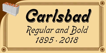
The Carlsbad font family is a bringing together of Regina Cursiv and Hansa Cursiv which both had been released by H. Berthold Messinglinienfabrik und Schriftgiesserei around 1895. Both these beautiful Art Nouveau italic fonts come with the following swash alternatives: D, E, G, H, K, S, T, h, k, m, n, s, and z.
Avenida was created by architect and designer John Chippindale in 1994 and is a constructed typeface that leaves a cool, sophisticated impression. An Art Deco typeface inspired lettering found on buildings constructed in Spain's Andalucian region in the 1930's and 1940's. Avenida is best suited to headlines and short to middle length texts.
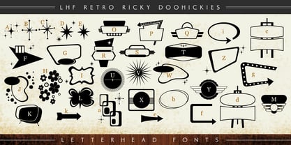
LHF Retro Ricky transports you right into the groovy retro past. These 60’s-era Doohickies set includes over 85 panels and dingbats to enhance your designs. Save time recreating vintage logos and designs. Goes perfect with the LHF Retro Ricky Fonts, only available at Letterhead Fonts.
Between twilight and daybreak it is said that the dark side of the human psyche eclipses the sun that shines from the depths of our souls. Certainty turns to doubt, clarity becomes confusion, man turns into wolf, the dead wake, vampires seduce the young are restless and milk boils over on the stove. Those that seek only to bathe in the light of a romantic new moon often end their tragic lives soaked in nothing other than their own blood, and the milk spilt on the stovetop has no one left to cry over it. There are fifty shades of grey during those hours after sunset and I think just as many in my porridge this morning. Yes, okay, I admit it, I spoiled the milk! This porridge tastes like it was left in a graveyard overnight. Death warmed over. Gothic and lumpy. Just like the Buried weights of this font.
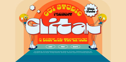
Hello friends! The 'Glitar' font is coming, a modern retro of 70's vibes. Glitar is very inspired by the culture and music artwork from the 70's era. It's perfect for branding, logo, packaging, header, title, t-shirt design, etc. Glitar is great if you pair it with an illustration, it will make the design even more dope.
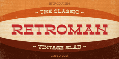
Retroman - Vintage Slab is a inspired by classic fonts with retro style combined with decorative Slab style nuances of western back to the era of the 70's - 80's, a style that is timeless. Retroman is perfect for vintage social media posts, Craft , Product packaging, product designs, label, branding projects, logo, advertisements, watermark, invitation, stationery and any projects .
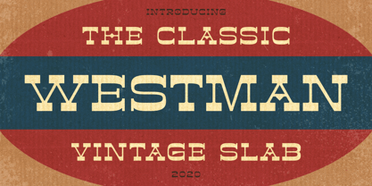
Westman is a inspired by classic fonts with retro style combined with decorative Slab style nuances of western back to the era of the 60’s – 70’s, a style that is timeless. Westman is perfect for vintage,social media posts, Craft , Product packaging, product designs, label, branding projects, logo, advertisements, watermark, invitation, stationery and any projects
The slick and sexy letterforms of Ace ACTION COMICS artist, Pascual Ferry, are the latest to join our MASTERS OF COMIC BOOK ART font line. Pascual's work on the SUPERGIRLS storyline in ACTION made us want to lick each page -- but, y'know, not when anyone was looking... we know they're just comic book characters, they're not REAL and we don't fancy them or anything -- Uhhh... so we were delighted when Pascual invited us to create this stylin' sans souciant family of fonts for him. All we asked for in return was this smokin' alternate cover for the next issue of HIP FLASK... Hey, don't lick your monitor, you might get an electric shock...
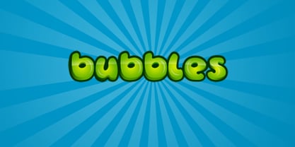
This typeface was inspired by milk sherbet, which is enjoyed cold on a hot summer day. Rounded shapes and soft stroke endings make the typeface look cute. Heavy works great for headlines with its extra-heavy stroke weight and size, while Regular and Light are best for body text.
ITC Photoplay is another gem from Nick Curtis. Unearthed from the 1927 edition of Samuel Welo's Studio Handbook for Artists and Advertisers, the design's original suggested use was for title and caption cards for silent movies. A monoweight design that bridges the gap between turn-of-the-century decorative type and Art Deco, ITC Photoplay is both casual and stylish. And, yes, the cap S" is supposed to look that that. To expand this already handy typeface's versatility, a Black weight has been added to the original design. Curtis has also created an array of alternate characters, a couple of conjunctions, and a handful of "bishop's fingers" to help make your point. ITC Photoplay is eminently suitable for all those occasions when you need to say, "Unhand that fair damsel, you dastardly cad!", and really mean it."
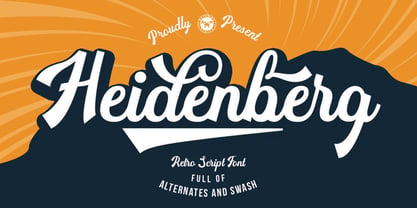
Heidenberg is a hand lettering work with retro style. This well designed font was inspired from classic typography designs in 60's to 80's. Heidenberg was packed with a lot of alternates and swashes (please check preview images), it will give you more choices to custom your words with this OpenType features. It also has multilingual support for standard latin characters.
Acid Squares is a casual ornamental (fun) font. It was inspired by squares, the 70’s, the 90′s, street art and Berlin. Due to its limited readability it is recommended to use it in words that are common and uncomplicated or in logo design. As a decorative element it can be used well if the kerning is adjusted by the user.
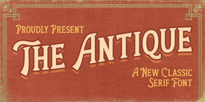
The Antique - Vintage Serif is a inspired by classic fonts with retro style combined with decorative Serif style nuances of western back to the era of the 70's - 80's, a style that is timeless The Antique is perfect for vintage social media posts, Craft , Product packaging, product designs, label, branding projects, logo, advertisements, watermark, invitation, stationery and any projects
This typeface is based on lettering by Carl Marx (1911?1991), designed during his first semester at the Bauhaus in Joost Schmidt?s class, in 1932. Although the letter proportions are based on Schmidt?s teachings, the forms are not constructed from compass and ruler, but drawn with brush and marker, lending the words a warm and lively touch. Hidetaka Yamasaki redrew the letters from scratch and added all missing characters for today?s needs. A set of hanging figures, alternates for some critical letterforms (such as f, r, and t) as well as several ligatures make CarlMarx especially suitable for use in body text. As suggested by Marx, Yamasaki captured two weights from the original drawing and perfectly adjusted light and bold to highlight words and create hierarchy in headlines ? without losing or adding space. True to the original, Yamasaki captured the wobbly contour in CarlMarx, preserving warmth in the condensed geometric style of the early 1930s.
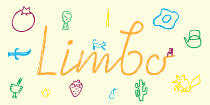
Our main goal was to give the font the feeling of playful joy and genuine hand-lettered appearance which can be added to any of your design projects just as easy as to pick the right font from your collection. And, as we believe, that's exactly what it is about.