10,000 search results
(0.03 seconds)
- Bronx by ITC,
$29.99Bronx is a contemporary, highly stylized script typeface that captures the effect of quickly rendered brush lettering. The capitals are intended only for initialing purposes but may be joined with the lowercase letters, which can be linked together to reproduce the look of handwriting. This design has great potential for use in work associated with the fashion industry. British designer David Quay originally produced Bronx for Letraset in 1986, and it is just one of the many styles of type developed by this talented and renowned designer. - Bountyman by Letterhend,
$14.00 Bountyman is a slab serif typeface with slant version. Perfectly to be applied to the other various formal forms such as invitations, labels, logos, magazines, books, greeting / wedding cards, packaging, fashion, make up, stationery, novels, labels or any type of advertising purpose. Features : Regular & Slant version Uppercase & lowercase Numbers and punctuation Multilingual PUA encoded We highly recommend using a program that supports OpenType features and Glyphs panels like many of Adobe apps and Corel Draw, so you can see and access all Glyph variations.
 - Realitta by Allouse Studio,
$16.00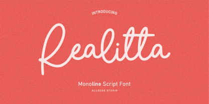 Proudly Presenting, Ralitta a Monoline Script Font. Ralitta is perfect for any tittles, logo, product packaging, branding project, megazine, social media, wedding, or just used to express words above the background. Ralitta also come with Multi-Lingual Support. We highly recommend using a program that supports OpenType features and Glyphs panels like many of Adobe apps and Corel Draw, so you can see and access all Glyph variations. Enjoy the font, feel free to comment or feedback, send me PM or email. Thank You!
 - Klamp 105 Mono by Talbot Type,
$19.50 Talbot Type Klamp 105 Mono is a monospaced variation of Talbot Type Klamp 105. The clean and pure geometry of Klamp 105 makes it highly suitable for adaptation to this monospaced variant. It has an even look and retains its legibility at very small sizes. Klamp 105 Mono is available in a family of four weights and features an extended character set to include accents for Central European languages. Klamp 205 Mono, with some character variations, is also available as a monospaced variant of Klamp 205.
 - Keithey by Enigma Lettering Studio,
$16.00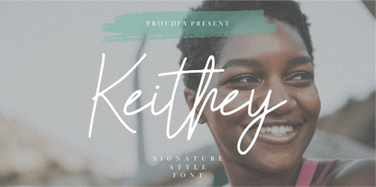 Introducing by Enigma Lettering Studio Proudly Present, Keithey Kithey is a Signature Style Font Keithey is perfect for product packaging, branding project, megazine, social media, wedding, or just used to express words above the background. Keithey also come with Multi-Lingual Support. We highly recommend using a program that supports OpenType features and Glyphs panels like many of Adobe apps and Corel Draw, so you can see and access all Glyph variations. Enjoy the font, feel free to comment or feedback, send me PM or email.
 - Guerrilla Handshake by Hanoded,
$15.00 Shaking hands is quite a complicated process: do it too lightly and you appear weak, grab too hard and you’re too eager. There are also those with a ‘Guerrilla Handshake’ - grabbing your hand unexpectedly, shaking it vigorously and yanking it toward them. Guerrilla Handshake font was actually made by hand, using Chinese ink and a brush. I did use the brush vigorously, but I made sure not to shake or yank it too much! Guerrilla Handshake comes in a slightly backslanted ‘regular’ version and an italic version.
 - Klamp 205 Mono by Talbot Type,
$19.50 Talbot Type Klamp 205 Mono is a monospaced variation of Talbot Type Klamp 205. The clean and pure geometry of Klamp 205 makes it highly suitable for adaptation to this monospaced variant. It has an even look and retains its legibility at very small sizes. Klamp 205 Mono is available in a family of four weights and features an extended character set to include accents for Central European languages. Klamp 105 Mono, with some character variations, is also available as a monospaced variant of Klamp 105.
 - Asher Punk by Allouse Studio,
$16.00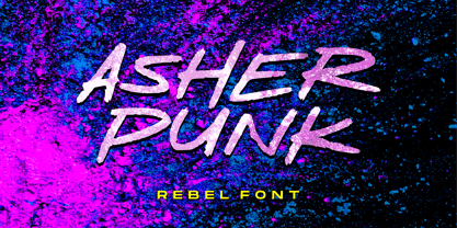 Proudly Presenting, Asher Punk a Rebel Handwritten Font. Asher Punk is perfect for any tittles, logo, product packaging, branding project, megazine, social media, wedding, or just used to express words above the background. Asher Punk also come with Multi-Lingual support. We highly recommend using a program that supports OpenType features and Glyphs panels like many of Adobe apps and Corel Draw, so you can see and access all Glyph variations. Enjoy the font, feel free to comment or feedback, send me PM or email. Thank You!
 - Asteria Royalty by Letterhend,
$19.00 Introducing, Asteria Royalty - A font made by natural handwriting. Perfectly to be applied to the other various formal forms such as invitations, labels, logos, magazines, books, greeting / wedding cards, packaging, fashion, make up, stationery, novels, labels or any type of advertising purpose. Features : uppercase & lowercase numbers and punctuation multilingual alternates, swash & ligatures PUA encoded We highly recommend using a program that supports OpenType features and Glyphs panels like many of Adobe apps and Corel Draw, so you can see and access all Glyph variations.
 - MVB Calliope by MVB,
$39.00Gayle Sato, longtime friend of MVB Fonts, has amazing handwriting. It’s a natural, simple hand, with perfect rhythm. Devoid of flourishes, it doesn’t try to be beautiful. It’s just genuine, quick, and clean — the handwriting we all wish we had. The digitization by Mark van Bronkhorst captures these qualities. Retaining the roughness of a felt pen, MVB Calliope is a handwriting typeface that feels much more authentic than most, highly legible but still raw. The Regular was released in 2005, with the other weights shortly thereafter. - Dehors by Letterhend,
$19.00 Dehors is a western display typeface. It is suitable for design needs with a touch of classic western, especially in logo, and the other various formal forms such as invitations, labels, logos, magazines, books, greeting / wedding cards, packaging, fashion, make up, stationery, novels, labels or any type of advertising purpose. Features : numbers and punctuation multilingual PUA encoded We highly recommend using a program that supports OpenType features and Glyphs panels like many of Adobe apps and Corel Draw, so you can see and access all Glyph variations.
 - Toriga by JAM Type Design,
$12.00 The Toriga typeface was named after the Portuguese grape variant known as Touriga Nacional. This fun typeface boasts the features of a well-balanced, versatile, modern sans which is highly legible as a text font and with a clean, elegant look as a display font at larger sizes. The rounded terminals give it a friendly, approachable look. Comprising 6 weights with equivalent italics, this font family is perfect for your more playful designs. It was created to be enjoyed, so enjoy creating with it!
 - Naofumi by Allouse Studio,
$16.00 Proudly Present, Naoufumi a Rough Brush Font. Naofumi come along with Multi-Lingual Support to fulfill your need. We highly recommend using a program that supports OpenType features and Glyphs panels like many of Adobe apps and Corel Draw, so you can see and access all Glyph variations. Naoufumi is perfect for any tittle, product packaging, branding project, megazine, social media, wedding, or just used to express words above the background. Enjoy the font, feel free to comment or feedback, send me PM or email. Thank You!
 - Khodijah by Arterfak Project,
$20.00 Introducing Khodijah, brand new display font in Arabic style. Designed with a digital flat-pen and gothic typography technique which gives the elegant looks of the letters. This font also adopted from the Hijaiyah letters that highly usable for any Islamic or Mid-east content. Perfect for Book covers, poster, flyer, banner, t-shirt, logo, branding, and other advertising needs. Khodijah has OpenType features such as alternates, swashes, and ligatures that you can access them from the software which has an open-type panel. Happy designing! Ramz.
 - Koi by Talbot Type,
$19.50 Koi is a highly original, outline display font. Each character is represented by a single continuous line to create a fluid and rhythmic look. The result is something of a hybrid, sitting somewhere between an outline and an inline style, and with an asymmetrical look — something quite rare in a typeface. Many of the characters look like ready made logotypes. Further customisation is easily achieved by extending the end strokes of characters, possibly aligning them and joining them to others to create bespoke arrangements.
 - Kiddy Sans by TypoGraphicDesign,
$19.00 CONCEPT/CHARACTERISTICS What is a childlike, naive writing, acting not boring static, has enough personality/character and yet is easy to read? › Oversized points › Slightly curved, warm and friendly bars › Open, friendly forms › Organic, lightly battered forms APPLICATION AREA The friendly, playful and warm character of the font »Kiddy Sans« would look good at display size for party flyer & movie poster, music covers or headlines in magazines or websites… TECHNICAL SPECIFICATIONS Headline Font | Display Font | Sans Serif Font »kiddy Sans« with 8 styles & 366 glyphs, inkl. accents & €
 - Streamers NF by Nick's Fonts,
$10.00This curly, swirly antique offering is based on a Victorian-era typeface called "Fillet". Opening and closing flourishes can be found at the brace and bracket positions, and the ribbon effect can be carried between words by using the underscore character in place of a space. Due to the highly ornate nature of this font, it does not contain math operators, fractions or superior numbers. Both versions of the font include 1252 Latin and 1250 CE (with localization for Romanian and Moldovan) character sets. - Origin Story by Comicraft,
$49.00 Down in his secret underground font laboratory, mild mannered John Roshell was tinkering with his iPad when the Apple Pencil suddenly bit him and he found himself feverishly creating letterforms on the tablet... Before long his hand was burning and glowing with superspeed — his penstrokes were longer than one-eighth of a mile; he was suddenly able to letter a twenty-story omnibus with newfound fontastic strength and could create tremendous weights with more leading than an express train... And thus was born: ORIGIN STORY!
 - Romantic Soulmate by Letterhend,
$17.00 Romantic Soulmate is a sophisticated condensed serif typeface. Perfectly to be applied to the other various formal forms such as invitations, labels, logos, magazines, books, greeting / wedding cards, packaging, fashion, make up, stationery, novels, labels or any type of advertising purpose. Features : Regular & Italic style lowercase uppercase numbers and punctuation multilingual alternates PUA encoded We highly recommend using a program that supports OpenType features and Glyphs panels like many of Adobe apps and Corel Draw, so you can see and access all Glyph variations.
 - Strangelove Next by FaceType,
$16.00 Strangelove Next is inspired by Stanley Kubrick’s movie “Dr. Strangelove”. The original titles were designed by Pablo Ferro, who is one of the most acclaimed film title designers, especially famous for his hand-drawn lettering. The Strangelove Next family contains the highly successfull narrow version, a new expanded version and finally a mix of the first two, which gives it a surprising and unpredictable look. All three styles have more glyphs than the original family. Looking for a serif version? Have a look at Strangelove NextSlab!
 - Block Atella by Scratch Design,
$12.00 Block Atella is a retro, vintage and playful typeface that has a quirky and cute characteristic. This font will be suitable for logos, labels, packaging, invitations, branding, advertising and other designs that need stand-out typeface for the design. What you'll get: Uppercase and lowercase Numbers and punctuation Multilingual support Unique Ligatures We highly recommend using a program that supports OpenType features and Glyphs panels like many Adobe apps so that you can see and access all Glyph variations. We hope you enjoy our font!
 - Shinkoya by Arterfak Project,
$18.00 Shinkoya is a vintage font inspired by retro signage, carefully designed with 'one stroke brush' in all-caps letterforms, highly recommended for display. Shinkoya is a versatile font that you can use for many categories such as automotive, urban, sport, food, fashion, drinks, and more. Shinkoya has smooth round forms and natural touch that suitable for logo, apparel, logotype, retro poster, labels, signage, menu design, books, and much more! Equipped with OpenType features that you can mix and match to gives your design more playfully!
 - Alison Phillips by Letterhend,
$16.00 Introducing Alison Phillips, a Casual handwritten font designed to bring a touch of authenticity and personal flair to your projects. With its textured brush look, this font exudes an organic and intimate feel, allowing your designs to evoke a sense of uniqueness and character. Features : Uppercase & lowercase Numbers and punctuation Alternates & Ligatures Multilingual PUA encoded We highly recommend using a program that supports OpenType features and Glyphs panels like many of Adobe apps and Corel Draw, so you can see and access all Glyph variations.
 - Vintage Waves by Raditya Type,
$16.00 Introducing Vintage Waves. A retro bold serif which will bring you back to 60s feel. This font perfectly made to be applied especially in logo, and the other various formal forms such as invitations, labels, logos, magazines, books, greeting / wedding cards, packaging, fashion, make up, stationery, novels, labels or any type of advertising purpose. We highly recommend using a program that supports OpenType features and Glyphs panels like many of Adobe apps and Corel Draw, so you can see and access all Glyph variations.
 - The Spongy font, crafted by the renowned typeface designer Ray Larabie, is a testament to creativity and playful design in typography. Known for his extensive portfolio of unique and highly functiona...
- As of my last update in April 2023, HEX Font may refer to a specific typeface design or could be a general reference to a font that is stylized in a way that aligns with the aesthetic or functionalit...
- Averta Standard by Intelligent Design,
$10.00 Averta Standard is the basic version of Averta. Bringing together features from early European grotesques and American gothics, Kostas Bartokas’ (Greek: ‘αβέρτα’ – to act or speak openly, bluntly or without moderation, without hiding) Averta is a geometric sans serif family with a simple, yet appealing, personality. The purely geometric rounds, open apertures, and its low contrast strokes manage to express an unmoderated, straightforward tone resulting in a modernist, neutral and friendly typeface. Averta Standard is intended for use in a variety of media. The central styles (Light through Bold) are drawn to perform at text sizes, while the extremes are spaced tighter to form more coherent headlines. The dynamism of the true italics adds a complementary touch to the whole family and provides extra versatility, making Averta Standard an excellent tool for a range of uses, from signage to branding and editorial design. Averta Standard comes with alternate glyphs, case sensitive forms and contextual alternates, in eight weights with matching italics and supports over two hundred languages with an extended Latin, Cyrillic (Russian, Bulgarian, and Serbian/Macedonian alternates), Greek and Vietnamese character set. It ships in three different packages offering different script coverage according to your needs: Averta Standard PE (Pan-European: Latin, Cyrillic, Greek), Averta Standard CY (Latin and Cyrillic), and Averta Standard (Latin and Greek). Averta's Cyrillic have received the 3rd Prize in the 2017 Granshan Awards in the Cyrillic Category.
 - Quercus 10 by Storm Type Foundry,
$69.00 Quercus is characterised by open, yet a little bit condensed drawing with sufficient spacing so that the neighbouring letters never touch. It has eight interpolated weights with respective italics. Their fine gradation allows to find an exact valeur for any kind of design, especially on the web. Quercus serif styles took inspiration from classicistic typefaces with vertical shadows, ball terminals and thin serifs. The italics have the same width proportion as upright styles. This “modern” attitude is applied to both families and calls for use on the same page, e g in dictionaries and cultural programmes. Serif styles marked by “10” are dedicated to textual point sizes and long reading. The sans-serif principle is rather minimalistic, with subtle shadows and thinned joints between curved shapes and stems. Quercus family comprises of the usual functionality such as Small Caps, Cyrillics, diacritics, ligatures, scientific and aesthetic variants, swashes, and other bells & whistles. It excels in informational and magazine design, corporate identity and branding, but it’s very well suited for book covers, catalogues and posters as well. When choosing a name for this typeface I've been staring out from my studio window, thinking helplessly without any idea in sight. Suddenly I realised that all I can see is a spectacular alley of oaks (Quercus in Latin) surrounding my house. These oaks were planted by the builders of local ponds under the leadership of Jakub Krčín in the fifteenth century.
 - Quercus Whiteline by Storm Type Foundry,
$69.00 Quercus is characterised by open, yet a little bit condensed drawing with sufficient spacing so that the neighbouring letters never touch. It has eight interpolated weights with respective italics. Their fine gradation allows to find an exact valeur for any kind of design, especially on the web. Quercus serif styles took inspiration from classicistic typefaces with vertical shadows, ball terminals and thin serifs. The italics have the same width proportion as upright styles. This “modern” attitude is applied to both families and calls for use on the same page, e g in dictionaries and cultural programmes. Serif styles marked by “10” are dedicated to textual point sizes and long reading. The sans-serif principle is rather minimalistic, with subtle shadows and thinned joints between curved shapes and stems. Quercus family comprises of the usual functionality such as Small Caps, Cyrillics, diacritics, ligatures, scientific and aesthetic variants, swashes, and other bells & whistles. It excels in informational and magazine design, corporate identity and branding, but it’s very well suited for book covers, catalogues and posters as well. When choosing a name for this typeface I've been staring out from my studio window, thinking helplessly without any idea in sight. Suddenly I realised that all I can see is a spectacular alley of oaks (Quercus in Latin) surrounding my house. These oaks were planted by the builders of local ponds under the leadership of Jakub Krčín in the fifteenth century.
 - Benguiat Caslon by House Industries,
$33.00 Designed to be set in big, large and huge sizes in classic TNT (tight-not-touching) style, Benguiat Caslon is dynamite for a wide range of display demands. We also included outline and drop-shadow versions as well as numerous swash caps, ligatures, contextual alternates and automatically-shifting punctuation. Ed Benguiat originally designed this alphabet for the Photo-Lettering library during his tenure as the legendary type house’s art director. When we purchased Photo-Lettering in 2003, one of the first things we did was start picking some of our favorite films to digitize as fonts. Photo-Lettering partner Christian Schwartz chose this expressive serif specimen for its high contrast strokes that stand up to the most vigorous display typography demands without withering against pesky design limitations like screen resolution, ink spread and dot gain. FEATURES: Alternate characters, ligatures and contextual substitutions add an unexpected flair to words and phrases. We also provided a drop shadow to add depth and dimension. Shifting punctuation marks take care of those optical tricks so you don't have to. A delicately expressive outline version adds color even in black and white. BENGUIAT CASLON CREDITS: Typeface Design: Ed Benguiat Typeface Digitization: Christian Schwartz, Bas Smidt Typeface Production: Ben Kiel, Jason Campbell Like all good subversives, House Industries hides in plain sight while amplifying the look, feel and style of the world’s most interesting brands, products and people. Based in Delaware, visually influencing the world.
 - Quercus Serif by Storm Type Foundry,
$69.00 Quercus is characterised by open, yet a little bit condensed drawing with sufficient spacing so that the neighbouring letters never touch. It has eight interpolated weights with respective italics. Their fine gradation allows to find an exact valeur for any kind of design, especially on the web. Quercus serif styles took inspiration from classicistic typefaces with vertical shadows, ball terminals and thin serifs. The italics have the same width proportion as upright styles. This “modern” attitude is applied to both families and calls for use on the same page, e g in dictionaries and cultural programmes. Serif styles marked by “10” are dedicated to textual point sizes and long reading. The sans-serif principle is rather minimalistic, with subtle shadows and thinned joints between curved shapes and stems. Quercus family comprises of the usual functionality such as Small Caps, Cyrillics, diacritics, ligatures, scientific and aesthetic variants, swashes, and other bells & whistles. It excels in informational and magazine design, corporate identity and branding, but it’s very well suited for book covers, catalogues and posters as well. When choosing a name for this typeface I've been staring out from my studio window, thinking helplessly without any idea in sight. Suddenly I realised that all I can see is a spectacular alley of oaks (Quercus in Latin) surrounding my house. These oaks were planted by the builders of local ponds under the leadership of Jakub Krčín in the fifteenth century.
 - Quercus Sans by Storm Type Foundry,
$69.00 “Quercus” is characterised by open, yet a little bit condensed drawing with sufficient spacing so that the neighbouring letters never touch. It has eight interpolated weights with respective italics. Their fine gradation allows to find an exact valeur for any kind of design, especially on the web. Quercus serif styles took inspiration from classicistic typefaces with vertical shadows, ball terminals and thin serifs. The italics have the same width proportion as upright styles. This “modern” attitude is applied to both families and calls for use on the same page, e g in dictionaries and cultural programmes. Serif styles marked by “10” are dedicated to textual point sizes and long reading. The sans-serif principle is rather minimalistic, with subtle shadows and thinned joints between curved shapes and stems. Quercus family comprises of the usual functionality such as Small Caps, Cyrillics, diacritics, ligatures, scientific and aesthetic variants, swashes, and other bells & whistles. It excels in informational and magazine design, corporate identity and branding, but it’s very well suited for book covers, catalogues and posters as well. When choosing a name for this typeface I've been staring out from my studio window, thinking helplessly without any idea in sight. Suddenly I realised that all I can see is a spectacular alley of oaks (Quercus in Latin) surrounding my house. These oaks were planted by the builders of local ponds under the leadership of Jakub Krčín in the fifteenth century.
 - Lux by URW Type Foundry,
$35.99 Many times, when a new creative process is starting, it is triggered by an everyday action or item. In this case, the looks of a lady’s watch inspired Michael Herold to create his new typeface LUX. The sight of the chronograph sparked associations of the 1950s in Mr. Herold: While this decade was predominantly dominated by brush and feather scripts, there was also a bloom of strict and modern architecture. This special mix of strength and retro style is exactly what Michael Herold is trying to capture in his LUX. The result is a typeface which is perfectly suitable for use on book covers, posters and claims – thanks to its striking impression. The name LUX, Latin for light, is inspired by the high bright-dark contrast within the individual characters. Oft sind es alltägliche Gegenstände, die das Bestreben eines neuen kreativen Prozesses auslösen. So entspringt auch die Inspiration zur Erschaffung der LUX von Michael Herold dem Anblick einer Damenuhr. Der Chronograph löste bei Herrn Herold Assoziationen zu den 1950er Jahren aus: Während diese Zeit hauptsächlich von Schreibschriften aus Federn und Pinseln beherrscht wurde, nahm auch die streng und modern anmutende Architektur starken Einfluss auf die Epoche. Diese Mischung aus Strenge und 50er Jahre Retro-Stil soll in der LUX zum Ausdruck kommen. Das Ergebnis ist eine Schrift, die sich mit ihrer plakativen Wirkung perfekt für Buchumschläge, Poster und Claims eignet. Namensgebend war der starke hell-dunkel Kontrast innerhalb der Schrift – festgehalten in dem lateinischen Wort für Licht.
 - The "CrazyZoo" font, imagined as a spirited creation by an artist named Chloe, is a vibrant and captivating typeface that instantly transports its viewer into a whimsical world of imagination and cre...
- Font aficionados and design enthusiasts will find it a pleasure to explore "DesignPartsOne" by the seasoned and inventive type designer, Manfred Klein. This distinctive font is less about letters and...
- Sure! The New Alphabet font is an intriguing and avant-garde typeface with a fascinating history and purpose behind its design. Created in 1967 by Wim Crouwel, a notable figure in the Dutch graphic d...
- Manualito-Flo, envisioned and created by Florin Florea, stands as a distinctive typographic achievement in the realm of digital font design, though please note, as of my last update in early 2023, an...
- The "Bamf" font, created by the prolific Iconian Fonts, is an intriguing typeface that embodies a striking blend of contemporary boldness and a playful, somewhat nostalgic essence. Iconian Fonts, kno...
- The VINTAGE COLLEGE DEPT_DEMO_worn font by Fontsandfashion is a distinctive typeface that embodies the spirit of classic collegiate and varsity aesthetics, with a distinctly retro feel that harks bac...
- Imagine a font that captures the spirit of creativity and rebellion, all while paying homage to one of the most iconic bands in music history. That's where AbbeyRoad by Flop Design steps into the spo...