10,000 search results
(0.305 seconds)
- DS Stain - Unknown license
- HVD Rowdy - 100% free
- DS Narrow - Unknown license
- Selectric - Unknown license
- Tiki Tooka BV - Unknown license
- DS ShowBill - Unknown license
- DS Note - Unknown license
- HVD Bodedo - Unknown license
- Elastik by bb-bureau,
$65.00 - JFJungleRock - Unknown license
- Cursivo Saxonio by Intellecta Design,
$21.90 - Amazónica - Personal use only
- Typography times - 100% free
- Isfahan Demo - Unknown license
- Samarkan - Unknown license
- DS UstavHand - Unknown license
- Textan - Unknown license
- Def Writer | BASE Cyr - Unknown license
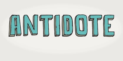
- Antidote by Hanoded,
$15.00 - Textan - Square - Unknown license
- Pasquale by Monotype,
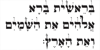
$39.00 - OL Hebrew Formal Script With Tagin by Dennis Ortiz-Lopez,
$30.00 - Bravado NF by Nick's Fonts,
$10.00 - Mas dAzil Symbol by ParaType,
$25.00 - yatsutko_glagolitsa - Unknown license
- NewDeli - Unknown license
- Scrawl - Unknown license
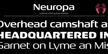
- Neuropa by Device,
$39.00 - Serif Medium - Unknown license
- Alhambra - Unknown license
- DS StandartCyr - Unknown license
- PenPalOne1 - Unknown license
- Mirisch - Personal use only
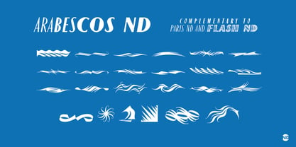
- Arabescos ND by Neufville Digital,
$29.60 - Hancock - Unknown license
- Improvisation - Unknown license
- Cottonwood-Thin - Unknown license
- SchwarzWald - Unknown license
- Camberic - Unknown license
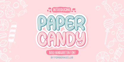
- Paper Candy by Forberas Club,
$16.00


