10,000 search results
(0.14 seconds)
- Gwen by Fontfabric,
$35.00Gwen is a variable type system in 7 weights. The complete font family consists of two subfamilies: the highly characteristic Display Serif family which shows its full potential and beauty in big sizes and a more subtle Text variation appropriate for smaller sizes. The variable font combines the best of both worlds and provides unique flexibility to switch between all of the font weights and the text and display style at the same time. The font supports Extended Latin and Cyrillic scripts and its main purpose is to be used in editorials, although it may find good implications in headlines, impactful landing pages, posters, and packaging. - Tadashi Faux by Twinletter,
$15.00 TADASHI is our newest display font, which was created with the goal of enhancing the appearance of your project in terms of theme harmony, distinctiveness, and differentiation, in order to produce an appealing and targeted look. This typeface is the solution to everything you’ve been searching for and needing. Logotypes, food banners, branding, brochure, posters, movie titles, book titles, quotes, and more may all benefit from this font. Of course, using this font in your various design projects will make them excellent and outstanding; many viewers are drawn to the striking and unusual graphic display. Start utilizing this typeface in your projects to make them stand out.
 - Mistral by URW Type Foundry,
$89.99 Named after the strong cold winds on Southern France, the Mistral font family is another original creation displaying the panache of the French graphic artist Roger Excoffon. Mistral is an informal script in which all letters link up in vigorous strokes. First issued in 1953, its brush-like stems look spontaneous and fresh. The descenders are fairly long and the whole alphabet has a distinctive and unforgettable effect on the page. Mistral is a good complement to sans serif typefaces. Mistral is a trademark of Heidelberger Druckmaschinen AG, which may be registered in certain jurisdictions, exclusively licensed through Linotype Library GmbH, a wholly owned subsidiary of Heidelberger Druckmaschinen AG.
 - Castellar MT by Monotype,
$29.99 Castellar is a capital letter typeface from John Peters, named after a location in the Alps. It first appeared in 1957 with Monotype. Peters modelled the design on the Roman script Scriptura Quadrata as it was used in the first two centuries of the Roman Empire. One distinguishing characteristic is the quadratic proportions of many letters, which are however mixed with circular and narrow forms. The original script was called Scriptura Quadrata because the ancient engravers used rectangular stone plates for their work. Castellar is a typical title typeface and is best used in large and very large point sizes to highlight its classic elegance.
 - Handcraft by Artcity,
$19.00 Handcraft is a handwritten script font. This font is ideal for any design project that needs a more handmade look. Handcraft is a great way to add a touch of handcrafted charm to your next project. Central Europe is supported in the extended glyph set. Font contains 346 glyphs and includes some alternates, as well as others, all accessible via OpenType features. Remember to turn on contextual alternates and ligatures for the best experience. Handcraft /ˈhænd.krɑːft/ A skilled activity in which something is made in a traditional way with the hands rather than being produced by machines in a factory, or an object made by such an activity.
 - The Ralston by Gloow Studio,
$13.00 Introducing The Ralston, A Retro Bold Script font. It was inspired by retro typography designs in 70's. There are more than 432 glyphs in this font including Multilanguage Support. OpenType features with Stylistic Alternates, Contextual Alternate and ligatures in some characters that allows you to mix and match pairs of letters to fit your design. The Ralston is perfectly suitable for made to be applied especially in logo, and the other various formal forms such as invitations, labels, logos, magazines, books, greeting / wedding cards, packaging, fashion, make up, stationery, novels, labels or any type of advertising purpose. Files Include: Multilanguage Support Thank You very much, hope you enjoy this fonts !
 - Yom Tov by Jonahfonts,
$42.00 YomTov is a whimsical hebrew font. Traditional in design with a free spirit and slightly bounced. Hebrew alphabets contain 22 Hebrew letters along with five final letters which are automatically activated when used in Applications such as Apple Pages® and MicroSoft Word®. The Hebrew Letters do not contain cantillation marks very much used in everyday modern Hebrew. Designed with acomplete latin font that mirror the Hebrew letterforms. Latin lower-case letters have been replaced with smaller caps. You may also be interested in my other Hebrew fonts, NEWMARK Hebrew, HEBRON Hebrew, PAGEANTRY Hebrew and a Hebrew Script font KOMUNIDAD Script. YomTov requires OpenType-aware software.
 - BOMADHA by Twinletter,
$15.00 Bomadha is a one-of-a-kind display font with Asian elements. The typeface, which has been built with remarkable harmony in every phrase structure that arises, makes your complete project look luxury and gorgeous, causing your entire audience to fall in love with it. Logotypes, food banners, branding, brochure, posters, movie titles, book titles, quotes, and more may all benefit from this font. Of course, using this font in your various design projects will make them excellent and outstanding; many viewers are drawn to the striking and unusual graphic display. Start utilizing this typeface in your projects to make them stand out.Caps only fonts.
 - ITC Einhorn by ITC,
$29.99Einhorn is a peculiar typeface. Difficult to classify, this upright, bold, script-like semi serif typeface was designed in 1980 by Alan Meeks. Meeks was inspired by the art nouveau period, and may have been trying to liven up the design scene. In 1980, typefaces like Helvetica and Univers were ubiquitous, and the digital revolution was still years away. Experimental faces like Einhorn helped fill the gap for creative designers looking for untraditional choices in which to set headlines and advertising work. The merit of pioneer display faces like Einhorn have never lessened; Einhorn still sets a mean display text, and works great in logos and other corporate ID solutions. - Bangkokean by Cadson Demak,
$29.00 This font was originally designed side by side with my first attempt at a semi serif typeface in 1997. The design made it through to full development only a couple years ago when our studio decided to complete the regular weight for a local project here in Bangkok. The face is a traditional serif with narrow stem (somewhat like sans serif) and industrial stroke. A good mix of Bangkok character where you can find Wat (old buddhist temple) next to futuristic high rise. This font was shown in Klingspor-Museum Offenbach, Germany, at a Typographic & Type Design exhibition Schrift in Form 3-26 September 2008.
 - Blackness by Letterara,
$12.00 Blackness is a strong original handwritten font with a unique feel. Natural and elegant, cursive, legible script font which can be used on a wide variety of designs such as headlines, titles, headings, logos, branding, posters, books, and any other creative design. It will add a unique spark to any design project that you wish to create! This font is PUA encoded which means you can access all of the amazing glyphs and ligatures with ease!
 - Chuglet by Maulana Creative,
$14.00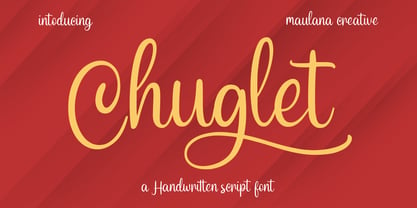 Chuglet is a cursive script font. With bold contrast stroke, fun character with a bit of ligatures and alternates. To give you an extra creative work. Chuglet font support multilingual more than 100+ language. This font is good for logo design, Social media, Movie Titles, Books Titles, a short text even a long text letter and good for your secondary text font with sans or serif. Make a stunning work with Chuglet font. Cheers, Maulana Creative
 - Dancing Brush by Letterara,
$16.00 Dancing Brush is a strong original handwritten font with a unique feel. Natural and elegant, cursive, legible script font which can be used on a wide variety of designs such as headlines, titles, headings, logos, branding, posters, books, and any other creative design. It will add a unique spark to any design project that you wish to create! This font is PUA encoded which means you can access all of the amazing glyphs and ligatures with ease!
 - Hollyfur by Maulana Creative,
$11.00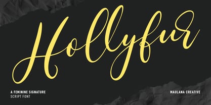 Hollyfur is a cursive beauty and feminine script font. With high contrast stroke, fun character with a bit of ligatures and alternates. To give you an extra creative work. Hollyfur font support multilingual more than 100+ language. This font is good for logo design, Social media, Movie Titles, Books Titles, a short text even a long text letter and good for your secondary text font with sans or serif. Make a stunning work with Hollyfur font. Cheers, MaulanaCreative
 - Hindyloft by Maulana Creative,
$12.00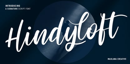 Hindyloft is a modern cursive script font. With high contrast stroke, fun character with a bit of ligatures and alternates. To give you an extra creative work. Hindyloft font support multilingual more than 100+ language. This font is good for logo design, Social media, Movie Titles, Books Titles, a short text even a long text letter and good for your secondary text font with sans or serif. Make a stunning work with Hindyloft font. Cheers, MaulanaCreative
 - Asutenan by Letterara,
$12.00 Asutenan is a strong original handwritten font with a unique feel. Natural and elegant, cursive, legible script font which can be used on a wide variety of designs such as headlines, titles, headings, logos, branding, posters, invitations, books, and any other creative design. It will add a unique spark to any design project that you wish to create! This font is PUA encoded which means you can access all of the amazing glyphs and ligatures with ease!
 - Australia Handwritten by Letterara,
$14.00 Australia Handwritten is a strong original handwritten font with a unique feel. Natural and elegant, cursive, legible script font which can be used on a wide variety of designs such as headlines, titles, headings, logos, branding, posters, invitations, books, and any other creative design. It will add a unique spark to any design project that you wish to create! This font is PUA encoded which means you can access all of the amazing glyphs and ligatures with ease!
 - Castilock by Maulana Creative,
$14.00 Castilock is a casual cursive script font. With regular mono-line consist stroke, fun character with a bit of ligatures and alternates. To give you an extra creative work. Castilock font support multilingual more than 100+ language. This font is good for logo design, Social media, Movie Titles, Books Titles, a short text even a long text letter and good for your secondary text font with sans or serif. Make a stunning work with Castilock font. Cheers, Maulana Creative
 - Merick by Eurotypo,
$28.00 Merick is a modern and slightly condensed cursive, carefully drawn to obtain a very readable font. This font is a versatile and elegant script, based on the author’s calligraphy, the lower cases are connecting with lots of dynamic and vivacious swashes, ligatures and alternates. Merick is perfect for logotypes, posters, cards, menus, product packaging and other printables, as well as web applications.The swashes, tails and alternate letters will add a finishing touch to every logo or headline.
 - Boyflare by Maulana Creative,
$12.00 Boyflare is a cursive handwritten script font. With bold mono-line stroke, fun character with a bit of ligatures and alternates. To give you an extra creative work. Boyflare font support multilingual more than 100+ language. This font is good for logo design, Social media, Movie Titles, Books Titles, a short text even a long text letter and good for your secondary text font with sans or serif. Make a stunning work with Boyflare font. Cheers, Maulana Creative
 - Anabella by RNS Fonts,
$33.00 Anabella is a typeface made for the Master’s Degree in Typography at the University of Buenos Aires. It is inspired by the posters of pizzerias located in Naples, Italy; in order to be used in the pizza franchise Giuseppe in Buenos Aires, Argentina. The font preserves and rescues gestural features of these posters, adding a vertical axis and high contrast, typical of the Italian types that arrived in the city product of the immigration. The stroke with brush provides a more organic quality to the sign and provides connotative features. The family has three variables for the different applications that may be required in a pizza place: Italic for bodies greater than 16 pt, Roman for short texts up to 14 pt, and Stencil for use in brands and titles. Anabella was selected to participate in the eighth typography biennial Tipos Latinos.
 - Blue Sugar by Aah Yes,
$5.95Blue Sugar is a grunge font which has one letter-shape in white set within a different grunge letter-shape in black. The Regular and Dirty versions have their characters in conventionally upright positions; and there are 3 varieties with the characters in various states of disorder and at slightly varied angles and sizes - called Twirled and Whirled. The Mixed Caps version introduces no new characters, but combines straight capitals and jumbled capitals in the same font, for convenience, in which Upper Case A-Z displays conventional upright Capitals, and lower case a-z displays jumbled Capitals. The package contains both OTF and TTF versions - install either OTF or TTF, not both versions of a font on the same machine. - Cervo Neue Condensed by Typoforge Studio,
$29.00 Cervo Neue Condensed is the new perfected and Condensed version of Cervo Neue, containing 18 variants. It differs from the previous version of Cervo with the higher accents over glyphs, enlarged punctuation, old-style numerals and the newly added varieties Semi Bold, Bold, Extra Bold and Black. Additionally, there is the variety of grotesque. Font Cervo is inspired by a “You And Me Monthly” published by National Magazines Publisher RSW „Prasa” that appeared from Mai 1960 till December 1973 in Poland. Recently, Cervo Neue Condensed has started being used as a display text in „Przekrój Magazine” which was published in years 1945–2013 in Krakow (2002–2009 in Warsaw) as a weekly and again from 2016 as a quarterly journal in Warsaw.
 - Elizabeth by ParaType,
$30.00 The hand composition typeface was developed at the Ossip Lehmann type foundry (St. Petersburg) in 1904-07 (after designs by Alexander Leo?). It was redeveloped at Polygraphmash in 1960s for slugcasting composition. Named after Russian Empress Elizabeth I (1709-61). Based on typefaces of George Revillon type foundry of 1840s, though some characters’ shapes were redrawn similar to Russian Academy of Sciences typefaces (mid-18th century). Sharp contrast, strong weight Modern Serif with archaic flavor. The typeface is useful in text and display composition, in fiction, historical, and art books, especially connected to the 18th or 19th centuries. It looks great in Russian classical literature such as Pushkin and Gogol works. The revised, improved and completed digital version was designed at ParaType in 2001 by Lyubov Kuznetsova.
 - Railroad Gothic by Linotype,
$29.99Railroad Gothic was originally designed in 1906 for ATF (American Type Founders). This uppercase-only typeface is very condensed and also heavy, giving it a distinct 19th American wood type feeling. Like those 19th Century classics, Railroad Gothic is best used when set really big. Originally designed for use in railroad signage, Railroad Gothic has since been adapted for use in many American tabloid journals, which employ it in screaming headlines. When you need to set something large and loud for the whole world to see, this old ATF classic may be right for you. Railroad Gothic is an all caps font, and is available in digital format exclusively from Linotype. The typeface is included in the Take Type 4 collection from Linotype GmbH." - Droid Serif - 100% free

- Retroxoid by PizzaDude.dk,
$20.00 You may recognize the looks of Retroxoid - if not, then let me help you out: Retroxoid is actually a font I made back in 2007. I ran prints of the font, through a very bad copymachine, used a wet cloth to make the print look worn, scanned the prints and voila! Retrozoid, my very first Open Type font, was born! Now in 2010, Retroxoid has risen from the past, and is ready to burst your designs with clean, round and futuristic shapes!
 - HGB Info OSF by HGB fonts,
$20.00 It's nice when a font provides old style figures, small caps and alternate letters. But what to do if my typesetting program doesn't support Open Type features? The solution may be old-fashioned, but it's effective: the variants are placed in separate font families: Standard, Old Style Figures (OSF), and Small Caps (SC). Any word processor can handle it. As a special feature, my OSF fonts also contain alternative letters such as a looped g or descenders in the italic f.
 - Positive Feature by PizzaDude.dk,
$15.00 Positive Feature is a handmade, layered font. All layers come with contextual alternates, which means you have 4 different versions of each lowercase letter to play around with. What's cool about the two layer versions is that they mix in a lovely way! Try typing your text with layer 1, copy/paste layer 2 on top in a different color - perhaps even alter the transparency a bit...and all of a sudden a nice effect sees the light of day!
 - Hockeynight Sans by XTOPH,
$20.00 Hockeynight Sans with its round corners is the smoothest sports-font you will find. Its the helvetica under the college fonts. Spice it up and mix some of the alternative glyphs in! Hockeynight comes in 7 Weights and each one available as an Italic. Use it big and bold on your sports-poster, space it up to get that dirty look or use some alternate glyphs for your logodesign. Look out for the Brush Versions and the Slab Version of Hockeynight
 - Flamingo Plush by PizzaDude.dk,
$20.00 Flamingo Plush is something you want to use when you need your statement shouted out! The large, rough and worn letters will do the job for you - all you need to do is write your message! There is a slight difference in upper- and lowercase in a kind of unicase way. Some of the lowercase letters looks a bit more worn, when mixed with uppercase makes the handmade look really stand out! Go for something big, go for Flamingo Plush!
 - Gloversville AOE by Astigmatic,
$19.95 Gloversville is a casual marker handwritten style font. Originating from some turn of the century letters to a defunct blinds and shutters company in Gloversville, NY, what began as a limited reference of Capitals, lowercase, numbers and punctuation was expanded to a full typeface with an expanded language glyph set. It contains a unique mixing of capitals and lowercase in the lowercase glyph slots to create a unique typesetting feel. Perfect for a range of designs that require a heavy handed personal touch.
 - VT Redzone Classic by VarsityType,
$18.00 Raw and uncut, this sharp square sans is ready to rip. Originally released in October 2017, VTF Redzone Classic is the first published typeface by CJ Zilligen. It’s raw and uncut — built with sharp terminals and spur serifs that give off an aggressive appearance. VTF Redzone Classic was refreshed in May 2020 to include nearly 200 new characters, extensive language support, and a sleek and long-anticipated Oblique version. This titlecase display typeface is tooled to give any project a competitive edge.
 - Thei by Andfonts,
$29.00 Thei is a calligraphy font that helps designers to create beautiful compositions. It looks stunning on wedding invitations, cards, quotes, greeting cards, logos, business cards and every other design which needs a customized touch. How quickly to create main decor element: 1.Type == (equal signs). Or type any Text========== Then move decor elements in the right position. ***Don’t change size of text during this process, because it may not create decor elements (ligatures). Or choose the décor element in Glyphs category.
 - Peanut Slap by PizzaDude.dk,
$16.00 I love peanuts! Actually I eat peanuts every day, in the shape of Peanut Butter ... and it kind of slaps me in the face with energy and good taste! What a good way to start the day! The same thing could fit to this font: a good way to start your day is with a good design ... using my Peanut Slap font: Mix the 3 versions with your favourite colorscheme, play around with the transparency...and voila! Great results awaits you!
 - Anko by Eko Bimantara,
$22.00 Anko is a mix of Old Style Roman Serif styles. The glyphs are formed in extend width, smooth strokes, moderate stem contrast and soft edges to pursue clarity, quick recognizable text and warm personality. The italics style is 8 degree low slanted with redrawned lowercase which shown in more organic and flowy forms. Anko contains 8 weights with more than 450 glyphs that support extended latin language and opentype features such as standard and discretionary ligature and a variation of numeral figures.
 - Montheim by Arterfak Project,
$24.00 Introducing Montheim, a vintage script font with medium weight. Inspired by modern retro movement and brush calligraphy, Montheim has many variations of alternates characters that you can mix and match, also with custom swashes (ligature) in the middle text and end swashes. Montheim complete with stylistic set gives more options to the layout. Montheim looks good in layout, vertical or horizontal and is the perfect choice for posters, logos, logotypes, insignia, storefronts, t-shirt designs, labels, flags, magazines, and other vintage design needs.
 - Boldina by DSType,
$19.00Boldina consists of 18 fonts with a lot of personality. This is a font to be mixed. That’s its purpose and that’s why it's designed as one single weight in so many different styles. My intent was to give designers a chance to use the same typeface in many different ways, putting together sans and serif, lots of italics and even Greek, Cyrillic and CE characters. The Ligatures and the Script versions give a more poetic and more accurate feeling to the text. - Keymer Radius by Talbot Type,
$19.50Talbot Type Keymer Radius is related to Talbot Type Keymer ; where Keymer is square-edged, Keymer Radius is subtly rounded for a softer look. Keymer Radius mixes geometric and humanist traits to achieve a modern, clean, elegant appearance. It is a legible and versatile text and display face available in six weights. Keymer Radius features an extended character set to include old style numerals, accented characters for Central European languages and bespoke characters in the italic for a more flowing look. - Narziss Text by Hubert Jocham Type,
$39.00 Narziss is a very popular display typeface. People really love the thin hairlines and the swirls. But the basic idea is so strong that I decided to create a text version. The swirls of the display do not work in small sizes but the alternative drops do. So for each weight of Narziss Text, there is a Regular, an Italic and a Drops version. Narziss Text is ideal for fashion magazines, Jewelry or perfumes and may be used in conjunction with Narziss.
