10,000 search results
(0.023 seconds)
- Ghosttown BC - Personal use only
- Fiddums Family - Unknown license
- Dearest Friend - Unknown license
- Poseidon - Unknown license
- The·Fire - Personal use only
- Mellogothic - Personal use only
- Steelplate Textura - Personal use only
- Ardenwood Demo - Unknown license
- KaiserRotbartOneCaps - 100% free
- Pillbox Opaque - Unknown license
- Rediviva - Unknown license
- Screw DSG - Unknown license
- StageCoach - Unknown license
- Dearest Friend lite - Unknown license
- Göt - Unknown license
- Bill Hicks - Unknown license
- KaiserzeitGotisch - Personal use only
- Medici Text - Personal use only
- Parigee Initials Simple - Unknown license
- CantzleyAD1600 - 100% free
- Gothic Flames - Personal use only
- MCF bad manners ww - 100% free
- Victorian Orchid by Dharma Type,
$19.99Victorian Orchid is a gorgeous vintage flower. Victorian Orchid is a beautiful, organic serif font family available for both text and display. Its bizarre serifs for A and other diagonal letterforms came from decorative types and letterings in old Victorian era. These unusual serifs support and enhance the horizontal flow of the eyes and vertical alignments. Very eye-catching lowercase g also came from the Victorian era and this is one of the most dramatic letterform of this font. Lowercase such like n and d also have horizontal serifs which designed in the same theory. Victorian Orchid is somewhat organic, humanistic and soft-impression font like Transitional Serif as typified by Times New Roman. But at the same time, this font has horizontal serif and vertical stressed letterform like Modern Serif. They make this font sharp, handsome and neat. In addition, Victorian Orchid has low contrast and the serifs are not too flat and not too coved. By them, Victorian Orchid create strong and casual impression like Slab Serif fonts. Victorian Orchid family consist of 5 weights from Light to Bold including about 500 glyphs, international accented letters, some OpenType features. Italics are "True" italics which designed very carefully to match Romans. - Oakland by Greater Albion Typefounders,
$9.50Oakland is a Streamline era design inspired by some hand-drawn lettering on a 1930's French poster advertising a certain brand of Car (Automobile for our American cousins). It's ideal for giving poster and design work that late 1930s to mid 1950s feel. Make a bold statement with this all capitals typeface! - Vendetta by Emigre,
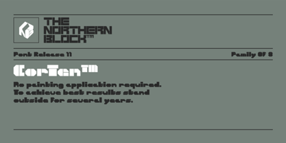
$69.00The famous roman type cut in Venice by Nicolas Jenson, and used in 1470 for his printing of the tract, De Evangelica Praeparatione, Eusebius, has usually been declared the seminal and definitive representative of a class of types known as Venetian Old Style. The Jenson type is thought to have been the primary model for types that immediately followed. Subsequent 15th-century Venetian Old Style types, cut by other punchcutters in Venice and elsewhere in Italy, are also worthy of study, but have been largely neglected by 20th-century type designers. There were many versions of Venetian Old Style types produced in the final quarter of the quattrocento. The exact number is unknown, but numerous printed examples survive, though the actual types, matrices, and punches are long gone. All these types are not, however, conspicuously Jensonian in character. Each shows a liberal amount of individuality, inconsistency, and eccentricity. My fascination with these historical types began in the 1970s and eventually led to the production of my first text typeface, Iowan Old Style (Bitstream, 1991). Sometime in the early 1990s, I started doodling letters for another Venetian typeface. The letters were pieced together from sections of circles and squares. The n, a standard lowercase control character in a text typeface, came first. Its most unusual feature was its head serif, a bisected quadrant of a circle. My aim was to see if its sharp beak would work with blunt, rectangular, foot serifs. Next, I wanted to see if I could construct a set of capital letters by following a similar design system. Rectangular serifs, or what we today call "slab serifs," were common in early roman printing types, particularly text types cut in Italy before 1500. Slab serifs are evident on both lowercase and uppercase characters in roman types of the Incunabula period, but they are seen mainly at the feet of the lowercase letters. The head serifs on lowercase letters of early roman types were usually angled. They were not arched, like mine. Oddly, there seems to be no actual historical precedent for my approach. Another characteristic of my arched serif is that the side opposite the arch is flat, not concave. Arched, concave serifs were used extensively in early italic types, a genre which first appeared more than a quarter century after roman types. Their forms followed humanistic cursive writing, common in Italy since before movable type was used there. Initially, italic characters were all lowercase, set with upright capitals (a practice I much admire and would like to see revived). Sloped italic capitals were not introduced until the middle of the sixteenth century, and they have very little to do with the evolution of humanist scripts. In contrast to the cursive writing on which italic types were based, formal book hands used by humanist scholars to transcribe classical texts served as a source of inspiration for the lowercase letters of the first roman types cut in Italy. While book hands were not as informal as cursive scripts, they still had features which could be said to be more calligraphic than geometric in detail. Over time, though, the copied vestiges of calligraphy virtually disappeared from roman fonts, and type became more rational. This profound change in the way type developed was also due in part to popular interest in the classical inscriptions of Roman antiquity. Imperial Roman letters, or majuscules, became models for the capital letters in nearly all early roman printing types. So it was, that the first letters in my typeface arose from pondering how shapes of lowercase letters and capital letters relate to one another in terms of classical ideals and geometric proportions, two pinnacles in a range of artistic notions which emerged during the Italian Renaissance. Indeed, such ideas are interesting to explore, but in the field of type design they often lead to dead ends. It is generally acknowledged, for instance, that pure geometry, as a strict approach to type design, has limitations. No roman alphabet, based solely on the circle and square, has ever been ideal for continuous reading. This much, I knew from the start. In the course of developing my typeface for text, innumerable compromises were made. Even though the finished letterforms retain a measure of geometric structure, they were modified again and again to improve their performance en masse. Each modification caused further deviation from my original scheme, and gave every font a slightly different direction. In the lower case letters especially, I made countless variations, and diverged significantly from my original plan. For example, not all the arcs remained radial, and they were designed to vary from font to font. Such variety added to the individuality of each style. The counters of many letters are described by intersecting arcs or angled facets, and the bowls are not round. In the capitals, angular bracketing was used practically everywhere stems and serifs meet, accentuating the terseness of the characters. As a result of all my tinkering, the entire family took on a kind of rich, familiar, coarseness - akin to roman types of the late 1400s. In his book, Printing Types D. B. Updike wrote: "Almost all Italian roman fonts in the last half of the fifteenth century had an air of "security" and generous ease extremely agreeable to the eye. Indeed, there is nothing better than fine Italian roman type in the whole history of typography." It does seem a shame that only in the 20th century have revivals of these beautiful types found acceptance in the English language. For four centuries (circa 1500 - circa 1900) Venetian Old Style faces were definitely not in favor in any living language. Recently, though, reinterpretations of early Italian printing types have been returning with a vengeance. The name Vendetta, which as an Italian sound I like, struck me as being a word that could be taken to signifiy a comeback of types designed in the Venetian style. In closing, I should add that a large measure of Vendetta's overall character comes from a synthesis of ideas, old and new. Hallmarks of roman type design from the Incunabula period are blended with contemporary concerns for the optimal display of letterforms on computer screens. Vendetta is thus not a historical revival. It is instead an indirect but personal digital homage to the roman types of punchcutters whose work was influenced by the example Jenson set in 1470. John Downer. - CorTen by The Northern Block,
$12.80 - Orlando by Tim Rolands,
$-Orlando is a quirky display face inspired by Art Nouveau metal types. - Bronto Burger by Comicraft,
$19.00 - Straider by Hikhcreative,
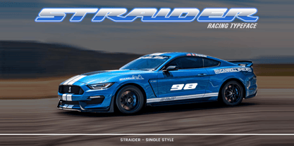
$23.00Specialized for the "speed typeface" and "adrenaline seeker" soul, we got you packed up. A nitro boost for your visual needs. Please welcome, STRAIDER. The racing typeface. Inspired by the mid era of vintage and modern automotive visual branding. We build the bold and strong font with total aim to the speed, cars, vehicles, and automotive vibes. Will be a perfect match for the automotive events, branding, logo, cars and motorcycle posters, advertising, anytime you want some more "speed" in your visual project. FEATURES : Uppercase & Lowercase letters Numbers & Punctuation Ligatures Multilanguage Support Thank you. - Ugly Face - Unknown license
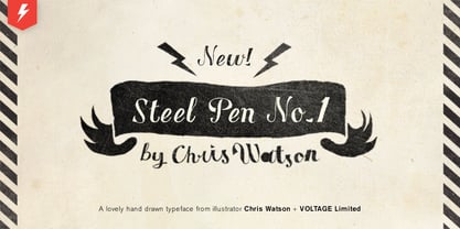
- VTG Watson Steel Pen by Voltage Ltd,
$35.00 - Oz Handicraft BT WGL by Bitstream,
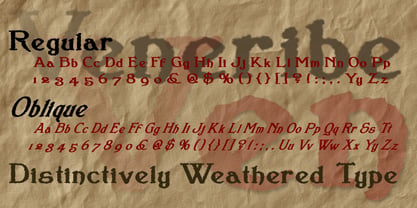
$50.99Oswald Cooper is best known for his emblematic Cooper Black™ typeface. Although he was responsible for several other fonts of roman design, Cooper never drew a sans serif typeface. But that didn’t stop George Ryan from creating one. Ryan saw a sans serif example of Cooper’s lettering in an old book and decided that it deserved to be made into a typeface. Ryan’s initial plan was to make a single-weight typeface that closely matched the slender and condensed proportions of the original lettering. While the resulting Oz Handicraft™ typeface proved to be very popular, Ryan was not satisfied with the limited offering. So, between other projects – and over many years – Ryan worked on expanding the design’s range. The completed family includes light, semi bold and bold weights to complement the original design, plus a matching suite of four “wide” designs, which are closer to normal proportions. Fonts of Oz Handicraft include a Pan-European character set that supports most Central European and many Eastern European languages. - Veneribe by Greater Albion Typefounders,
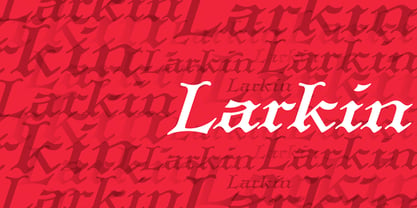
$10.95Veneribe -the Venerable face- is an experiment in what many today might call 'grunge', though we at Greater Albion would probably prefer to talk of rustic (or if we're feeling really old-fashioned rustick) charm. It's a derivative of our Clementhorpe family, and aims to combine a battered antique look with the charm of that decorative Roman family. Regular and oblique forms are offered. - P22 Larkin by IHOF,
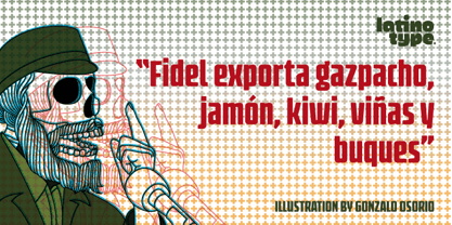
$24.95This lettering style is unusual in that combines aspects of several lettering styles. It is essentially a Germanic Blackletter but with many romanized capital letters and also features an italic slant along with some italic lower case traits. It is evocative of “old world” craftsmanship and early 20th century romanticism. The font was developed based on the logo of the Lakin Company of Buffalo, NY circa 1900. - Fidel by Latinotype,
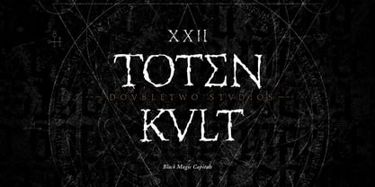
$25.00Fidel Black Essential is a heavily weighted, condensed, sans-serif typeface with a large x-height. Ideal for short, high-impact headlines, its design is inspired by Russian Constructivism and old Cuban communist posters. Variants include Fidel Black, Fidel Black Italic and Fidel Black Stencil. Fidel Black Essential is an excellent choice for headlines, subheadings, posters and logotypes. Languages: Basic Latin, Euro, Mac OS Roman. - XXII Totenkult by Doubletwo Studios,
$21.99The “XXII Totenkult” is inspired by the classical letterforms of old roman/renaissance typefaces and an ode to the decay. This is an allCapitals-font and the lowercase glyphs contain a variation of the uppercase. With activated “calt”-feature every second lowercase will be replaced by an alternate, this will give the font a more natural look. Detailed information here: XXII Totenkult on Behance. - P22 Avocet by IHOF,
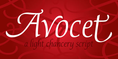
$29.95 - Cringe by Aiyari,
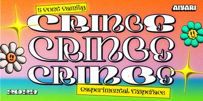
$25.00Introducing "Cringe": a captivating typeface that draws inspiration from the mesmerizing world of psychedelic pop culture and combining it with a uncial letter form and calligraphy approach. Each character exudes a sense of whimsy and free-spiritedness. Cringe Font Family contains 5 style regular, medium, semi bold, bold, & Expanded. It comes with Stylistic set & ligatures. Ayr Cringe Font Family is best used for headings, logotype, quotes, apparel design, invitation, poster, flyers, greeting cards, packaging, book cover, printed quotes, cover album, movie, & etc - Matricule 59 by designdefontes,
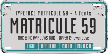
$24.00Matricule 59 is a typeface whose design is inspired by license plates and by the deformations due to the stamping in the metal plates. These deformations give a very specific style, especially concerning the hairlines. It is the Ultra Condensed version of Matricule, a Typeface designed by Loïc Choquet. It consists of 4 fonts : Light, regular, bold and black. For Mac or PC. Well-suited for edition, logotypes, posters, etc. Each font contains 359 glyphs and supports up to 89 different languages. - Matricule 57 by designdefontes,
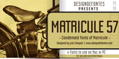
$24.00Matricule 57 is a typeface whose design is inspired by license plates and by the deformations due to the stamping in the metal plates. These deformations give a very specific style, especially concerning the hairlines. It is the Condensed version of Matricule, a Typeface designed by Loïc Choquet. It consists of 4 fonts : Light, regular, bold and black. For Mac or PC. Well-suited for edition, logotypes, posters, etc. Each font contains 359 glyphs and supports up to 89 different languages.


