10,000 search results
(0.021 seconds)
- Lina by Roy Cole,
$34.00 The Lina typeface family was designed by Roy Cole and completed in 2003. The roman font, Lina 30, was drawn originally by hand and later its character set extended and digitally redrawn with the aid of Fontographer. The five additional fonts, 60, 90, and the italics 33, 66, 99 followed and were all produced digitally from scratch. Lina is characterized by economy, lightness and evenness of weight. The capitals and figures are not as tall as the lower-case but retain the latter’s weight, and the figures are designed to provide enhanced recognition. The characters are relatively large on the body and text and benefit from additional leading. Lina is essentially a typeface for text composition. Roy Cole's other typeface families are Zeta, Colophon and Coleface.
 - Joane by W Type Foundry,
$25.00 Joane mixes the elegancy of French didones, calligraphic endings and glyphic serifs, thus its features convey a warm unique style. Moreover, its curves have been beautifully designed, and it also comes with both and engraved and deco versions, which add more versatility to the way it can be used. Joanes is perfectly suited for magazines, branding, advertising, labels, web and packaging. Joane is my first typeface to be published worldwide. To achieve this goal, I received essential help from W team and friends. I personally want to say thanks to Diego Aravena for the patience, good will and learning; for the friendship and support to Franco Jonas and Raúl Meza. Because of their help I could find the treasures at the end of the process. Ale Navarro
 - Akwe Pro by ROHH,
$40.00 Akwe Pro™ is a professional, ultra versatile sans serif typeface characterized by excellent legibility and modern design perfect for all design purposes. It is designed for use in long and short paragraphs of text, headlines and user interfaces. Its distinctive character and carefully crafted proportions make it a great option for brand identification and logo design. Akwe Pro™ mega family consists of 164 fonts - each weight in uprights, italics and small caps versions. It has extended language support and true italics, as well as broad number of OpenType features, such as small caps, case sensitive forms, standard and discretionary ligatures, stylistic sets, contextual alternates, lining, old style, tabular and small cap figures, slashed zero, fractions, superscript and subscript, ordinals, currencies and symbols.
 - Privilege Sign JNL by Jeff Levine,
$29.00 The above-the-store signage for many newspaper stands, soda shops, candy stores, luncheonettes and pharmacies of the 1950s and early 1960s were what was referred to as “privilege signs” provided by one of the major cola brands. Consisting of the brand’s emblems on the left and right, the remainder of the sign would carry the desired message of the storekeeper (such as “Candy – Soda – Newspapers”) in prismatic, embossed metal letters. Inspired by these vintage signs, Privilege Sign JNL recreates the condensed sans serif lettering style in both regular and oblique versions. The typefaces are solid black, but adding a selected color and a prismatic effect from your favorite graphics program can reproduce the look and feel of those old businesses.
 - Takox by John Moore Type Foundry,
$7.00 Takox is a display typeface based on a synthesis of righteousness extreme, futuristic spirit leads us to a way of plotting the words in a new way and in line with trends and technology synthesis century. Extreme music. Takox is provided with style forms to small caps, in both Regular and Italic. What was the inspiration for designing the font? Takox is the result of my own research in finding straight shapes of great simplicity. What are its main characteristics and features? Display font witn straight shapes of great simplicity. Usage recommendations: This letter design is ideal for use 3D extrusions, ideal to represent natural forms of cristals, metal or mechanical things. Fits indiustriales representations and aerospace, also for extreme music and avant garde.
 - FF Bauer Grotesk by FontFont,
$50.99 FF Bauer Grotesk is a revival of the metal type Friedrich Bauer Grotesk, released between 1933 and 1934 by the foundry Trennert & Sohn in Hamburg Altona, Germany. The geometric construction of the typeface, infused with the art déco zeitgeist of that era, is closely related to such famous German designs as Futura, Erbar, Kabel and Super Grotesk that debuted a few years earlier. However, Bauer Grotesk stands out for not being so dogmatic with the geometry, lending the design a warmer, more homogenous feeling. The oval “O” is a good example of that, as well as characteristic shapes like the capital M or the unconventionally differing endings of “c” and “s” which make for a less constructed look. Watch the FF Bauer Grotesk introduction video on Vimeo
 - Künstlerschreibschrift by URW Type Foundry,
$35.99 After inventing a new metal typecasting procedure that allowed for the production of more detailed typefaces, the famous German typefoundry D. Stempel AG developed Kuenstler Script in 1902 - 1903. Originally called Kunstlerschreibschrift (artistic handwriting), this design was based on English copperplate script styles from the late 1800s. In 1957, Hans Bohn added the heavy Kuenstler Script Black weight to the family. Like intricate handwriting put to paper with a feather and an inkwell, Kuenstler Script makes almost any text look distinguished and elegant. Kuenstler Script is a joining script; and because of its fine hairlines and small x-height, it is best used at sizes above 12 pt. The typeface works well in advertising work and on invitations, greetings cards, business cards, and certificates.
 - Grange Rough by Device,
$39.00 Grange Rough is an inky, distressed version of Grange that mimics the effects of vintage hot-metal type on rougher paper. Grange is the Device interpretation of the classic “Grot” thick/thin sans style. Unlike the traditional models on which it is based, Grange takes a rational, consistent approach across wide range of weights and widths for contemporary use. The font includes alternative curved and straighter versions of key characters, most obviously the lower-case ‘g' and capital ‘R', allowing the font to take on either a sharper or warmer, more playful appearance. These can be toggled on or off using the ‘Alts' feature in Illustrator, or ‘Stylistc Sets’ in Indesign. Contains proportional, lining and tabular numerals. Perfect for both headline and text.
 - Weiss by Linotype,
$29.99The German poet, painter, calligrapher and type designer Emil Rudolf Weiß originally created this eponymous typeface for the Bauer Foundry of Frankfurt. Long known and loved by metal type enthusiasts under the name "Weiss Antiqua," this design was inspired by typefaces from the Italian Renaissance while still distinctly reflecting the artistic and poetic personality of its twentieth-century designer. Weiss has tall ascenders, sharp apex points, and a low-slung midsection on the caps. The italic moves like a classical ballerina. Weiss is one of the earliest contemporary serif types to have italics based on the chancery style of writing. The Weiss family works well for warmly legible text typography; and it's also an original choice for refined headline and display graphics." - Petras Script EF by Elsner+Flake,
$35.00 Petras Script, the first digital script font created by the calligrapher Petra Beiße, has, for many years, met with worldwide success. Now the font is complemented with an alternate character set, which gives designers more flexibility and adds a personal touch to the font. Petra Beiße has resided for a long time in Wiesbaden, Germany, where she is working as a renowned calligrapher. It is rare that any of her scripts are transferred into digital format and sold worldwide as fonts. Because Petras Script became such a huge success, she decided to release Casanova Script Pro.
 - Palatino Nova Paneuropean by Linotype,
$67.99Palatino® Nova is Prof. Hermann Zapf's redesign of his own masterpiece, Palatino. The original Palatino was cut in metal by August Rosenberger at D. Stempel AG typefoundry in Frankfurt, and released in 1950. Palatino was later adapted for mechanical composition on the Linotype machine, and became one of the most-used typefaces of the 20th Century. Palatino was designed for legibility, and has open counters and carefully weighted strokes. The type was named after Giambattista Palatino, a master of calligraphy from the time of Leonardo da Vinci. Palatino is a typeface based on classical Italian Renaissance forms. A modern classic in its own right, Palatino is popular among professional graphic designers and amateurs alike, working well for both text and display typography. Hermann Zapf and Akira Kobayashi redeveloped Palatino for the 21st Century, creating Palatino Nova. Released by Linotype in 2005, the Palatino Nova family is part of Linotype's Platinum Collection. Palatino Nova includes several weights (Light, Regular, Medium, and Bold), each with companion italics. Four styles (Regular, Italic, Bold, and Bold Italic) have Greek and Cyrillic glyphs built into their character sets. The Palatino Nova family also includes revised versions of Aldus (now called Aldus Nova), as well as two titling weights. The first titling weight, Palatino Nova Titling, is based on Hermann Zapf's metal typeface Michelangelo, including Greek glyphs from Phidias Greek. The heavier titling weight, Palatino Nova Imperial, is based on Sistina. The fonts in the Palatino Nova family support all 48 Western, Central, and Eastern European languages. Additional features: ligatures and historical ligatures, Small Caps, ornaments, and a range of numerals (proportional & tabular width lining and Old style Figures, fractions, inferiors, and superiors)." - Palatino Nova by Linotype,
$50.99 Palatino® Nova is Prof. Hermann Zapf's redesign of his own masterpiece, Palatino. The original Palatino was cut in metal by August Rosenberger at D. Stempel AG typefoundry in Frankfurt, and released in 1950. Palatino was later adapted for mechanical composition on the Linotype machine, and became one of the most-used typefaces of the 20th Century. Palatino was designed for legibility, and has open counters and carefully weighted strokes. The type was named after Giambattista Palatino, a master of calligraphy from the time of Leonardo da Vinci. Palatino is a typeface based on classical Italian Renaissance forms. A modern classic in its own right, Palatino is popular among professional graphic designers and amateurs alike, working well for both text and display typography. Hermann Zapf and Akira Kobayashi redeveloped Palatino for the 21st Century, creating Palatino Nova. Released by Linotype in 2005, the Palatino Nova family is part of Linotype's Platinum Collection. Palatino Nova includes several weights (Light, Regular, Medium, and Bold), each with companion italics. Four styles (Regular, Italic, Bold, and Bold Italic) have Greek and Cyrillic glyphs built into their character sets. The Palatino Nova family also includes revised versions of Aldus (now called Aldus Nova), as well as two titling weights. The first titling weight, Palatino Nova Titling, is based on Hermann Zapf's metal typeface Michelangelo, including Greek glyphs from Phidias Greek. The heavier titling weight, Palatino Nova Imperial, is based on Sistina. The fonts in the Palatino Nova family support all 48 Western, Central, and Eastern European languages. Additional features: ligatures and historical ligatures, Small Caps, ornaments, and a range of numerals (proportional & tabular width lining and Old style Figures, fractions, inferiors, and superiors)."
 - Diotima Classic by Linotype,
$29.99Diotima Classic is a total upheaval for the 21st century of Gudrun Zapf von Hesse's mid-20th-century Diotima, one of the most beautiful types ever cast in metal. Its roots lay in a calligraphic sheet written by Gudrun Zapf von Hesse. The text was the Hyperion to Diotima" by Friedrich Hölderlin; Diotima is the name of a Greek priestess in Plato's dialogue about love. In the philosopher's imagination, she should appear slim and beautiful. In 1948, Gudrun Zapf von Hesse finished the typeface's Roman. The Diotima family was released as a metal typeface for hand setting by D. Stempel AG in 1951-53. This original Diotima is a festive design particularly suited to invitations, programs, and poems. The delicate Italic drew attention to text passages that should be emphasized. Linotype's previous digital Diotima only had one weight, which looked great in display sizes, but was too thin for text setting. Diotima Classic has four weights. The new Regular has more robust serifs and thicker hairlines, making it more appropriate for text sizes. The Diotima variation with finer serif remains under the name Light. Gudrun Zapf von Hesse also took the opportunity in 2008 to add an extremely heavy weight to the family. In comparison to the old Diotima, letterforms of the Diotima Classic are more harmonious and balanced. The rhythm of the Italic letters in Diotima Classic is more consistent. The lining figures of the Diotima Classic align with caps, and the letter spacing of the tabular lining figures in Diotima Classic is significantly better. The forms of the figures have been improved as well." - Neue Haas Grotesk Display by Linotype,
$33.99 The first weights of Neue Haas Grotesk were designed in 1957-1958 by Max Miedinger for the Haas’sche Schriftgiesserei in Switzerland, with art direction by the company’s principal, Eduard Hoffmann. Neue Haas Grotesk was to be the answer to the British and German grotesques that had become hugely popular thanks to the success of functionalist Swiss typography. The typeface was soon revised and released as Helvetica by Linotype AG. As Neue Haas Grotesk had to be adapted to work on Linotype’s hot metal linecasters, Linotype Helvetica was in some ways a radically transformed version of the original. For instance, the matrices for Regular and Bold had to be of equal widths, and therefore the Bold was redrawn at a considerably narrower proportion. During the transition from metal to phototypesetting, Helvetica underwent additional modifications. In the 1980s Neue Helvetica was produced as a rationalized, standardized version. For Christian Schwartz, the assignment to design a digital revival of Neue Haas Grotesk was an occasion to set history straight. “Much of the warm personality of Miedinger’s shapes was lost along the way. So rather than trying to rethink Helvetica or improve on current digital versions, this was more of a restoration project: bringing Miedinger’s original Neue Haas Grotesk back to life with as much fidelity to his original shapes and spacing as possible (albeit with the addition of kerning, an expensive luxury in handset type).” Schwartz’s revival was originally commissioned in 2004 by Mark Porter for the redesign of The Guardian, but not used. Schwartz completed the family in 2010 for Richard Turley at Bloomberg Businessweek. Its thinnest weight was designed by Berton Hasebe.
 - Skjald by Monotype,
$29.99Skjald is a decorative typeface for use on posters and in books where an elaborate face enhances the mood. The Skjald font is an excellent choice for book covers and posters. - Tes by Alien,
$60.00 The Tes family was designed specially for a limited-edition book about Nikola Tesla and Resonance Waves. It needed to be modern and complete for a multilingual version of the book.
 - Bursa MF by Masterfont,
$59.00 Geometric shapes are the building blocks the construct these 2 fonts.
 - Lazy Morning by Hanoded,
$15.00 I can’t remember when I had a true lazy morning.. I was a looong time ago, before I had children! Even now, when I’m down with the flu, I can’t stay in bed for too long - it really seems like a waste of time! Lazy Morning is a nice handwritten font. I made it with a Sharpie pen. It comes with all diacritics and double letter ligatures for you to play with.
 - Odisseia by Plau,
$20.00 Odisseia: Monospaced Typeface Made on Earth by Plau. Plau presents Odisseia, a monospace type family in 8 styles designed with simplicity of shapes and a humanist touch. We’ve ventured into monospace territory, where all letters must occupy the same amount of space. This style is usually associated with typewriters and computer terminal fonts. Like all monospaced fonts, every letter align vertically in a multi-line setting. The rhythm created is peculiar, since large letters such as m and w occupy the same space as narrow ones like i. Because we have 4 different weights: light, regular, bold and black the design of some characters have to be adapted to fit the same width and achieve a constant light/dark value throughout. These features make Odisseia suitable for a specific yet considerable range of uses, from computer coding to systemized communication such as brand identities. This style has been used from high-end brand identity to cutting edge digital applications. Odisseia sets a little shorter in comparison with other monospaced fonts, and bears a large x-height.
 - LHF Birgitta by Letterhead Fonts,
$43.00 This beautiful roman style typeface is inspired from an E.C. Matthews book. Although the book we have is dated 1967, the style appears to have been created in the 1920s or 30s.
 - WildWords by Comicraft,
$49.00 Created for Jim Lee's Wildstorm books, WildWords has proved to be one of our most popular fonts and has been featured in TIME magazine and the LEGO catalog, as well as used to letter thousands of Manga pages. Comicraft fonts are created BY comic book letterers FOR lettering comic books. Accept no substitutes! See this family related to WildWords: Wild Words Lower
 - Classic Clips JNL by Jeff Levine,
$29.00 During the years of physically doing camera-ready paste-up work before the advent of the digital age, clip art books dominated the way stock art was added to a print project. Clip art books were eventually replaced by clip art CDs, DVDs and online download sites, just as the books themselves had replaced the stock photo engravings of the letterpress era. With the kind permission of Graphic Products Corporation, Jeff Levine Fonts offers up a sampling of images found within the pages of Graphic Source clip art books; aptly entitled Classic Clips JNL.
 - Charpentier Sans Pro by Ingo,
$41.00 A humanistic sans serif The first version of this font was created in 1994 within the framework of the bid placed by the city of Graz to become the location for the Winter Olympics in 2006. Appropriately, its original name was ”Olympia.“ The font is intended to embody classic ideals as well as to meet modern demands. The proportions of Charpentier Sans are directly derived from Roman capitals and the humanistic book-face. The contrast between strokes and thin strokes is based on medieval uncial script. And thus, a modern serif sans was created emphasizing thick and thin strokes together. Thanks to its traditional form language, Charpentier Sans is very legible, adapts to various forms of content and expresses a kind of calmness and certainty. Details resulting from writing with the quill guarantee that the font doesn’t appear too rough and unemotional. Even the tiny, pointed mini serifs contribute to the unmistakable appearance of the font. They create an exciting contrast to the soft flowing forms of the letters and are, to a great extent, conducive to the legibility. Consequently Charpentier Sans always appears with an extremely sharp and clear outline. Charpentier Sans Italique has an even more distinct ductus derived from writing. Especially the rounded forms from a, e, f, g and y reflect the handwritten humanistic cursive. Charpentier Sans is comprised of many ligatures, including discretional ones, plus proportional medieval and capital figures for the normal type as well as disproportional tabular figures with a consistent width. Above and beyond the ”normal“ Latin typeface system, small caps are available as an especially elegant form of distinction.
 - Incy Wincy Spider by Comicraft,
$19.00 Spun with webs in mind for the letters pages of the SPIDER-MAN books, INCYWINCYSPIDER is probably one of the World's CREEPIEST Comic Book Fonts! Handle with care - some letters may stick together!
 - The Black Shapes by Intellecta Design,
$15.90 The Black Shapes" are a collection of decorative single forms good to use as background of graphic design projects, like covers of books, headpieces at books and magazines, cd-covers, and many others.
 - Karela by Blancoletters,
$39.00 English description Karela is a humanist slab serif family. Karela is also the Basque word for gunwale, this is, the widened edge at the top of the side of a boat, where the edge is reinforced with wood or other material and to which the thwarts are attached. Gunwales resemble the way slab serifs reinforce vertical stems giving a more robust appearance to the letters. The sturdy, solid and often mechanical structure that is customary in slab serif or mechanistic typefaces is softened in Karela applying subtle tweaks as: humanist proportions, slightly curved endings in ascenders, and curved edges in serifs. The influence of calligraphy is noticeable all over the character set, especially in counters and letters with instrokes like “m”, “n” and “r”, and it becomes explicit in the italics. On the other hand, its low contrast, generous x-height and the constant width of characters across weights makes it very convenient for editorial uses when low resolution is a concern. Karela pursues to give a human touch to a strong and highly functional structure. It seeks for the ideal combination of strength, precision and warmth of the wooden parts painstackingly handcrafted by ancient boat builders. Besides its 12 standard styles, Karela offers also four additional fonts called "grades". Grades are subtle changes in stroke weight in order to compensate for differences in printing media or display conditions of text layouts. To minimize these subtle changes without a reflow of the text they have to be designed with the same character width of the base style. Karela offers 4 grades for its Regular weight: Grade Minus 5, Grade Minus 5 Italic, Grade Plus 5 and Grade Plus 5 Italic. This makes possible to counteract the effect of changes in paper, temperature, paper, background color… In addition, Karela takes this no‑reflowing idea from grades and extends it to the whole range of styles, allowing to play with any of its weights without undesirable text reflows. Enjoy the layout stability while you experiment and play with variations! Karela presents also a wide range of Opentype features for a professional text layout.
 - Asterisk Sans Pro by Eclectotype,
$45.00 The market for humanistic sans serif type families is saturated, so what can a new release add, and what does it take to stand out from the crowd? Asterisk Sans Pro (named after my favourite glyph to make) aims to be a highly versatile type family; massively useful due to its pan-European language support and bounty of OpenType features which make it the ideal choice for demanding typography. The look is contemporary; details which give the fonts character at large sizes all but disappear when small, making the middle weights suitable for large chunks of text. The family ranges from a hairline ultra light to a pretty weighty black – a must in a new typeface. Asterisk Sans Pro supports Latin, modern Greek and Cyrillic, with localized forms for Bulgarian, Serbian and Macedonian to boot. This is rare enough, but to have small caps for all these scripts in both upright and italic fonts is a big plus. Your client may not need all this language support right now, but this typeface gives them the option to grow while keeping a consistent look, and at a similar price point to families with a much narrower scope. The ability to customize Asterisk Sans Pro through the use of Stylistic Sets in OpenType savvy layout programs means you are really in control. Want more italic forms in the uprights? Go for it. A more Roman italic? Easy! The spurless m, n, r and u, accessible through SS13 give a graphic, almost bauhaus feel. The Dutch IJ glyph can be changed to a much cooler thing using SS14, and the family even supports ij-acute. Other OpenType features include a wealth of numeral styles (tabular and proportional, lining and oldstyle, plus small cap figures, numerators, denominators, subscript and superscript) and automatic fractions. There are also case-sensitive forms for all caps settings, a bunch of useful arrows, and superscript lower case Latin letters. All in, there are well over 1200 glyphs per font, making Asterisk Sans Pro an invaluable tool in your typeface arsenal, great for everything from corporate identities to editorial work, apps to cookbooks.
 - ITC Ellipse Script by Typorium,
$30.00 The Typorium presents a new optimized and enriched version of ITC Ellipse which first appeared in 1996 in the International Typeface Corporation typeface library. ITC Ellipse Script is a complementary typeface to ITC Ellipse Neo, designed a very legible handwriting style. ITC Ellipse Script is both modern and classic. Modern in the unusual shape based on the geometric ellipse form. And classic in the structure of some letters like the lower cases c, e, g, o, s. These letters alone could come from a traditional typeface, but they fit perfectly with the atypical rest of the alphabet giving it a present-day and traditional mix. Furthermore, the ellipse shape fits naturally in the italic styles, giving the font an organic and fluid feeling. ITC Ellipse Script offers OpenType features such as alternate characters for upper and lower case, and an extended accented character set to support many languages. Five weights have been created for each style to offer a wide range of graphic possibilities in a tidy digital footprint. Designer: Jean-Renaud Cuaz Publisher: Typorium MyFonts debut: Nov 1, 2020 Le Typorium présente une nouvelle version optimisée et enrichie d'ITC Ellipse qui est apparue pour la première fois en 1996 dans la bibliothèque de caractères de l'International Typeface Corporation. ITC Ellipse Script est une police complémentaire à ITC Ellipse Neo, conçue dans un style d'écriture très lisible. ITC Ellipse Script est à la fois moderne et classique. Moderne dans le dessin inhabituel basé sur la forme géométrique de l’ellipse. Et classique dans la structure de certaines lettres comme les minuscules c, e, g, o, s. Ces lettres pourraient provenir d'une police de caractères traditionnelle, mais elles s'intègrent parfaitement avec le reste de l'alphabet plus insolite en lui donnant un mélange de modernité et de tradition. De plus, la forme de l'ellipse s'intègre naturellement dans les styles italiques, donnant à la police une sensation organique et fluide. ITC Ellipse Script offre des fonctionnalités OpenType telles que des caractères alternatifs pour les capitales et les bas de casse, et un jeu de caractères accentués étendu pour prendre en charge de nombreuses langues. Cinq graisses ont été créés pour chaque style afin d'offrir un large éventail de possibilités graphiques pour une empreinte numérique rigoureuse.
 - Rocket Space by Fargun Studio,
$13.00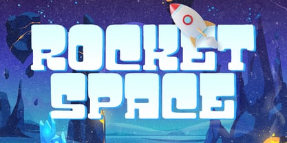 Rocket Space is unique and fun display font, It embodies playfulness and authenticity and is the perfect choice for a label, book cover, children’s book, comic, poster, banner, packaging, merchandise, logotype, and much more.
 - Bang Zoom by Midwest Type,
$29.00 Bang-Zoom! is a traditional comic book font based on lettering by award-winning illustrator and letterer Galen Showman. Its five weights and styles and smart OpenType features allow for professional comic book typesetting.
 - Section by Monotype,
$29.99The Section Bold Condensed font is patterned with lines dividing each letter into small sections. Section Bold Condensed is a headline face with uses ranging from book titles on technological subjects to embroidery books. - Jungle Bones by Phat Phonts,
$10.00Fun font suitable for children's books. - Black Palm by Just Lett,
$17.50 Black Palm is handwritten font. Black Palm will be perfect for greeting cards, story books, posters, child books, handwritten notes, stand out brandings, and others. FEATURES: UPPERCASE lowercase Numeral and Puncuation Multilingual Accent Happy creating...
 - Scriptonite by Jonahfonts,
$30.00 A freehand OpenType face, including 20 ligatures as well as the most popular discretionary ligatures. (ft, ct and st) Usage recommendations: Posters, titles, book covers, books, greeting cards, packaging, invitations, magazine articles, titling and advertising.
 - Sky Clipper JNL by Jeff Levine,
$29.00 Sky Clipper JNL is a bold, Art Deco sans serif typeface derived from the hand lettered title on a 1940s-era “Big Little Book” entitled “Flying the Sky Clipper with Winsie Atkins”. The design is available in both regular and oblique versions. “Big Little Books” were published by the Whitman Publishing company and featured short stories printed in a tiny sized book format for young children.
 - LT Soul - 100% free

- LT Hoop - 100% free

- Hirosaki by Ardyanatypes,
$15.00 Introducing Hirosaki Japanese Typeface Style inspired by Japanese letters, which have uniqueness and very thick characteristics that make all designs look unique and have a modern Japanese feel. Hirosaki has its charm, so it will be very suitable to be combined with any style. Have ligatures to add an excellent interactive feel to each design. Hirosaki is also equipped with multilingual support and is very easy to use. Hirosaki is exciting to use in formats such as books, film posters, logos, branding, business cards, and many more that can be combined with Hirosaki. Supports languages: Afrikaans, Albanian, Asu, Azerbaijani, Basque, Bemba, Bena, Bosnian, Breton, Catalan, Chiga, Colognian, Cornish, Croatian, Czech, Danish, Dutch, Embu, English, Estonian, Faroese, Filipino, Finnish, French, Friulian, Galician, Ganda, German, Gusii, Hungarian, Icelandic, Igbo, Inari Sami, Indonesian, Irish, Italian, Jola-Fonyi, Kabuverdianu, Kalaallisut, Kalenjin, Kamba, Kikuyu, Kinyarwanda, Latvian, Lithuanian, Low German, Lower Sorbian, Luo, Luxembourgish, Luyia, Machame, Makhuwa-Meetto, Makonde, Malagasy, Malay, Maltese, Manx, Meru, Metaʼ, Morisyen, North Ndebele, Northern Sami, Norwegian Bokmål, Norwegian Nynorsk, Nyankole, Oromo, Polish, Portuguese, Quechua, Romanian, Romansh, Rombo, Rundi, Rwa, Samburu, Sango, Sangu, Scottish Gaelic, Sena, Shambala, Shona, Slovak, Slovenian, Soga, Somali, Spanish, Swahili, Swedish, Swiss German, Taita, Teso, Thai, Turkish, Turkmen, Upper Sorbian, Vietnamese, Vunjo, Walser, Welsh, Western Frisian, Wolof, Yoruba, Zulu Features: A – Z Character Set a – z Characters set Numerals & Punctuations (OpenType Standard) Multilingual Thank you, and have a nice day
 - Technotyp by URW Type Foundry,
$39.99 The digital font Technotyp is based on the hot metal typeface created by the German typographer and type designer Herbert Thannhaeuser (1898-1963) for the former East German type foundry Typoart in Dresden. In the typography book ‘Der Schriftsetzer’ (Fachbuchverlag, Leipzig, 1952), by Paul Fritzsche, this absolutely beautiful slab serif design is presented in all its variations. Fritzsche remarked that – because of its rather condensed form and its relatively long ascenders – the 'Werkschrift' of the Technotyp (comparable with our 'Regular') seemed to be very well suited to serve as a text face, and recommended for this purpose that the face be cut for the composing machine. However, this never happened and the entire Technotyp family was made available for hand composition only. This is finally changing and being remedied for good now: URW++ proudly presents the new digital version of this really charming font family with its distinct flavor of the 1950s, adding it to the other digital renditions of Herbert Thannhaeuser fonts at URW++, namely Garamond No. 4 and Magna. The original Typoart family had an italic style for the light version only. The new digital version of Technotyp includes italic styles for the regular, medium and bold weights as well, enhancing the family to meet today’s standards and requirements for professional type setting. To further increase its usefulness, Cyrillic faces were created, too. True to the standard for all digital fonts at URW++, the character set for Technotyp covers all West- and East European languages.
 - Confitería by Sudtipos,
$39.00 Confitería is the Spanish word for a shop where sweets and chocolates are made and sold, which sometimes has a tea room. And now Confitería is also a font that brings to mind lettering piped on delicate cakes ... sweet but never sickly. This font captures something of that simple and innocent beauty of traditional confiterías, where good manners will never go out of fashion, menus are elegant and time comes to a standstill to make way for life’s little pleasures. A confitería is a perfect place to share sweet tidbits with a friend or date, eavesdrop on the conversation at the next table, read a book, or just people-watch from the window. I celebrated my last birthday at one. There is one iconic confitería in Buenos Aires that I love more than the rest because, some 60 years ago, it put up its marvellous sign and never took it down. Walking by it is sure to bring a smile to your face. It’s big. Very big. And the lettering in its name is written in a timelessly beautiful vertical script – the most attractive I have ever seen. I joined forces with Sol Matas – who worked with me to update the Montserrat font –to design this geometrical connected font with pleasant, even strokes. It is elegant and saccharine-free. And to top it off, it comes in several flavors. Welcome! What can we get you?

