10,000 search results
(0.03 seconds)
- Horror Story by Vozzy,
$10.00 Introducing a hand crafted label font named Horror Story. All available characters you can see at the screenshot. This font will good viewed on any Halloween theme designs like posters, t-shirts, labels, logos, etc.
 - Speedster by Vozzy,
$10.00 Introducing a vintage label font named Speedster. This strong typeface is perfect for lettering on vintage style posters, t-shirts, greeting cards, logo etc. All available characters and styles you can see at the preview.
 - Acumin by Adobe,
$35.00Acumin is a versatile sans serif intended for a balanced and rational quality. Solidly neo-grotesque, it not only performs beautifully at display sizes, but also maintains an exceptional degree of sensitivity for text sizes. - Richfont BT by Bitstream,
$50.99Based on Mr. Hubbard's own hand printing, Richfont Medium is an extremely casual design. Actually light in weight, it renders best at 14 point and above. Richfont Light and Bold are available from the designer. - DinoTracks by Ingrimayne Type,
$9.00 DinoTracks is a novelty or letterbox font in which the letters are formed with dinosaur footprints. It is readable at small point sizes, but then one cannot see that the letters are made from footprints
 - Lunarmod by MADType,
$21.00 Lunarmod is an attempt at creating a full font from a single basic shape, a box with oval ends. It ended up being very modular and looks slightly alien or spacey, hence the name Lunarmod.
 - Text Book by ParaType,
$30.00 Designed at Polygraphmash in 1958 by Elena Tsaregorodtseva; Latin characters and italic were added in 1987 by Emma Zakharova. An early sans serif ('Grotesque'), it was developed for primers and the first level school textbooks.
 - Theatrics JNL by Jeff Levine,
$29.00Theatrics JNL gives a rounded corner treatment to Prismatiq JNL; which in turn was modeled from lettering found in an early 1900s French lettering book displayed at an online image sharing site. Limited character set. - Big Dreams by Twinletter,
$12.00 Introducing the Big Dreams font. As the name implies, this font will give an extraordinary impression and an experience that will never be forgotten, if you use this font in your design. We designed this font with thorough attention to each letter so that it has the right portion if it is arranged in a word or title and if it is made into a sentence it will be easy to remember and pleasing to the eye. Not limited to that, the bold calligraphy font is designed to keep paying attention to the beauty of each letter, there are alternate options for the letters which are certainly easy for you to access, so you can automatically customize the letters you want to enhance the visual appearance of your design project. This charming font also offers the beauty of abstract typography harmony for a wide variety of design projects, including digital natural handwriting for designs, quote designs, for social media business designs, advertisements, trademarks, food and beverage promotion banners, text, posters, a signature, and all designs require handwriting or whatever design you want. ============================================================================================================ What’s Included : File font Web Fonts Standard glyphs Ligature Works on PC & Mac Simple installations Accessible in Adobe Illustrator, Adobe Photoshop, Adobe InDesign, even work on Microsoft Word. PUA Encoded Characters – Fully accessible without additional design software. Fonts include multilingual support for; Afrikaans, Albanian, Croatian, Czech, Danish, Dutch, English, Estonian, Finnish, French, German, Hungarian, Italian, Norwegian, Polish, Portuguese, Slovak, Slovenian, Spanish, Swedish Thank you for your purchase! Hope you enjoy our font!
 - Classical Calligraphy by HKL Studio,
$19.00 Classical Calligraphy Script With Ornament Is a calligraphy Vintage script font that comes with beautiful alternate characters. copper plate mix calligraphy with handlettering style. to show its performance. Classical Calligraphy is attractive as a typeface that is smooth, clean, feminine, sensual, glamorous, simple and very easy to read. Classical Calligraphy Script comes with a Clean and Aged version, beautifully binding upper and lower case, binding and loved by many finishes. It has Multilingual support (Western European characters) and works with the following languages: English, Danish, Dutch, Estonian, Finnish, French, German, Hungarian, Icelandic, Norwegian, Polish, Portuguese, Spanish, Swedish. In my example I show how this script can be used. It's perfect for logos, wedding invitations, alcohol labels, romantic cards, and more. Products include: Classical Calligraphy Script, Classical Calligraphy Extras Ornament Alternate Upper & Lower Case Style Binding, as well as a touch of ornament make this font look elegant. Recommended for use in Adobe Illustrator or Photoshop. Special features don't work in Microsoft Word. How to access all alternative characters using Adobe Illustrator: https://www.youtube.com/watch?v=XzwjMkbB-wQ How to use font style set in Microsoft Word 2010 or later version: https://www.youtube.com/watch?v=NVJlZQ3EZU0 There are additional ways to access the alternative/swash, using the Character Map (Windows), Nexus Font (Windows) Font Book (Mac) or a software program such as PopChar (for Windows and Mac). How to access all alternative characters, using Windows Character Map with Photoshop: https://www.youtube.com/watch?v=Go9vacoYmBw If you need any help or suggestions please contact me via email: creativescaleup@gmail.com
 - Able by T-26,
$39.00The history of Able’s connection with the Harry Potter phenomenon is really up in the air. It’s a catch-22 in this business - you either promote your own work and negotiate expensive exclusive licenses, or you work with a promoter and sell your designs to anyone and everyone. It could have been an in-house designer at Rowling’s publisher, Scholastic, or a freelancer who proposed Able for the headings and such. The responsible party licensed it from T26, and JK Rowling’s storytelling made it a star. (I suppose it’s ironic that there’s a whole lot of unwritten history in the typography business.) Able’s rise to fame really is a classic love story between reading and type design. If the books weren’t so popular, Able might still be waiting for some Mexican fast food chain to pick it up for packaging design. The movie deal certainly made the font all the more recognizable, what with its merchandising campaign. Popularity can also cripple a great decorative face. It’s always being recognized as “The Harry Potter Font.” It might just have to wait a few decades for the Potter phenomenon to subside to be freed from the “Chamber of Pigeonholed Fonts.” In the meantime, I’m sure that a lot of fledgling graphic design apprentices are reading their new Potter books, being charmed by the idea of type design when they’re not turning the pages too fast to notice. - Cloister Open Face LT by Linotype,
$29.99Cloister Open Face was designed in 1929 by Morris Fuller Benton as one weight of the Cloister Old Style family. Cloister itself appeared from 1897 with American Type Founders, and later for the typesetting machines of the Linotype, Intertype and Monotype companies. At that time, it was the truest modern industrial revival of the Jensonian Roman. Benton stayed close to the style of his model in both design and spacing. Cloister Open Face has an old-world elegance, and it works well for titling in books and magazines. In 1458, Charles VII sent the Frenchman Nicolas Jenson to learn the craft of movable type in Mainz, the city where Gutenberg was working. Jenson was supposed to return to France with his newly learned skills, but instead he traveled to Italy, as did other itinerant printers of the time. From 1468 on, he was in Venice, where he flourished as a punchcutter, printer and publisher. He was probably the first non-German printer of movable type, and he produced about 150 editions. Though his punches have vanished, his books have not, and those produced from about 1470 until his death in 1480 have served as a source of inspiration for type designers over centuries. His Roman type is often called the first true Roman." Notable in almost all Jensonian Romans is the angled crossbar on the lowercase e, which is known as the "Venetian Oldstyle e."" - Avenir Next Paneuropean by Linotype,
$99.00 Avenir Next Paneuropean is a new take on a classic face—it’s the result of a project whose goal was to take a beautifully designed sans and update it so that its technical standards surpass the status quo, leaving us with a truly superior sans family. This family is not only an update though, in fact it is the expansion of the original concept that takes the Avenir Next design to the next level. In addition to the standard styles ranging from UltraLight to Heavy, this 56-font collection offers condensed and semi condensed faces that rival any other sans on the market in on and off—screen readability at any size alongside heavy weights that would make excellent display faces in their own right and have the ability to pair well with so many contemporary serif body types. Overall, the family’s design is clean, straightforward and works brilliantly for blocks of copy and headlines alike. Akira Kobayashi worked alongside Avenir’s esteemed creator Adrian Frutiger to bring Avenir Next Pro to life. It was Akira’s ability to bring his own finesse and ideas for expansion into the project while remaining true to Frutiger’s original intent, that makes this not just a modern typeface, but one ahead of its time. Complete your designs with these perfect pairings: Dante™, Joanna® Nova, Kairos™, Menhart™, Soho® and ITC New Veljovic®.
 - ITC Don't Panic by ITC,
$29.99ITC Don't Panic's distressed shapes and craggy outlines evoke the feeling you get when you're just barely in control of a situation. This is type design on the edge. ITC Panic is further down the emotional track, when you've actually lost control and there is no hope in sight. Thompson says the inspiration for these faces arrived one day in the mail. I received an envelope that looked like it had a rough trip; the type that was stamped on it had a tired, ragged appearance. Ironically, the haggard envelope woke me up. I got excited and wanted to replicate the look as a font of type." Thompson designed ITC Don't Panic, then stood back and looked at it and decided it cried out for a more agitated companion. ITC Don't Panic gave birth to the positively psychotic offspring, ITC Panic. Both are all-cap designs with alternate characters in the unshift position. Creating an authentically disturbed appearance proved to be a challenge for Thompson. "I tried to design agitated characters, but they looked staged. So I tried multiple photocopies, but that didn't work. Eventually, I laser-printed the basic characters, wadded up the lasers, then flattened them out and stomped on them with heavy boots. The end result was scanned and used as the basis for the rest of the design." Thompson's work on web sites and multimedia has influenced his interest in type and typography that transcends the cool, unemotional nature of the computer." - ITC Panic by ITC,
$29.99ITC Don't Panic 's distressed shapes and craggy outlines evoke the feeling you get when you're just barely in control of a situation. This is type design on the edge. ITC Panic is further down the emotional track, when you've actually lost control and there is no hope in sight. Thompson says the inspiration for these faces arrived one day in the mail. I received an envelope that looked like it had a rough trip; the type that was stamped on it had a tired, ragged appearance. Ironically, the haggard envelope woke me up. I got excited and wanted to replicate the look as a font of type." Thompson designed ITC Don't Panic, then stood back and looked at it and decided it cried out for a more agitated companion. ITC Don't Panic gave birth to the positively psychotic offspring, ITC Panic. Both are all-cap designs with alternate characters in the unshift position. Creating an authentically disturbed appearance proved to be a challenge for Thompson. "I tried to design agitated characters, but they looked staged. So I tried multiple photocopies, but that didn't work. Eventually, I laser-printed the basic characters, wadded up the lasers, then flattened them out and stomped on them with heavy boots. The end result was scanned and used as the basis for the rest of the design." Thompson's work on web sites and multimedia has influenced his interest in type and typography that transcends the cool, unemotional nature of the computer." - Soho by Monotype,
$29.99 Soho is the latest addition to the growing range of typefaces from Sebastian Lester. This grand opus of a project resulted in a typeface that comprises nine weights and five widths of precision engineered OpenType. 40 fonts, 32,668 characters and 24 OpenType features. Hot on the heels of the popular Neo Sans and Neo Tech range, and his first typeface release Scene, Soho represents three years of work by Lester. As a type designer I'm preoccupied with finding ways in which I can address modern problems like good legibility in modern media, and create fonts that work precisely and efficiently in the most technically demanding of corporate and publishing environments." Slab serif typefaces are enjoying something of a renaissance, offering versatility whether for corporate identity, product branding, text or display use. With 40 weights to choose from Soho gives designers endless possibilities from the ultra chic lines conveyed by the lighter weights to the rock solid statement made by the heavier weights. Soho is cross-platform compatible. The Pro version provides extended language support for Central European languages. Used in conjunction with software applications that support OpenType many useful features like "stylistic sets" can be leveraged -- in which a wide variety of alternative characters can be introduced at the click of a mouse button giving one font several "tones of voice" from conservative to cutting edge. The wide range of glyphs includes ligatures and small caps."
 - We The People by K-Type,
$20.00 This typeface is extrapolated from the ‘We the People’ calligraphy of the handwritten US Constitution Preamble which employed a style based on German Text and Square Text exemplars from George Bickham’s penmanship copy-books, the most celebrated being The Universal Penman published in 1743. The original Constitution document was transcribed onto parchment by Jacob Shallus, a Pennsylvania Assistant Clerk, over a weekend in 1787. Shallus’s biographer, Arthur Plotnik (The Man Behind the Quill, 1987), notes that he was paid $30, a modest monthly wage at the time. He also suggests that the calligraphic headings, ‘We the People’ and ‘Article’, may have been inserted by Shallus’s 14 year old trainee son, Francis, “The manner in which the ‘Article’ headings are squeezed into the space Shallus allowed for them suggests a second hand—and perhaps not a very experienced one.” The unconventional backslant of the headings would seem to support this contention, and at the end of the document there is perhaps a novice’s inconsistency in the structure of the letter n between that used for ‘done’ and those used for ‘In Witness’. However, one has to admire the elegant swagger of the wavy t, h and l which the K-Type font extends to the b, f and k. Also, the simpler, Schwabacher-style W, an enlarged version of the lowercase w, is a little less flamboyant than the capital W from the German and Square texts in Bickham’s manuals. For designers using OpenType-aware applications, the typeface includes some Alternates, including a Bickham-style W, the letters t, h and n with added flourishes, two simpler forms of the A, and a few roman numerals for numbering articles. Also some ornamental flourishes and a round middle dot/decimal point. Punctuation marks are drawn in square, calligraphic style, but an alternative round period/full stop, for use with currency and numerals, is available at the period centered position (though placed on the baseline), accessed by Shift Option 9 on a Mac, or Alt 0183 on Windows. The full phrase, ‘We the People’, has been placed at the trademark keystroke and can be accessed by Option 2 (or Shift Option 2) on a Mac, or Alt 0153 on Windows. For designers who find the backslant awkward or unpleasant, the licensed typeface also includes two additional fonts which have a vertical aspect that may be more conducive to graphic design layouts. ‘We The People Upright’ and ‘We The People Upright Bold’ both retain the distinctive style, and the heavier weight is only slightly emboldened, just enough to add some punch.
 - Midnight Edition by Up Up Creative,
$15.00 Midnight Edition is a stylish, modern serif font family that gives traditional serif design elements a modern feel, making it ideal for body text, headlines, and calls to action. Its clean lines, generous curves, and crisp details make it suitable for a wide range of design projects. The Midnight Edition complete font family includes 14 fonts (7 weights, each with an upright and an italic version). Each weight and style includes over 400 glyphs — including 10 standard ligatures and a smattering of character variants — and supports over 200 languages. The OpenType features can be very easily accessed by using OpenType-savvy programs such as Adobe Illustrator and Adobe InDesign. (To access these features in Microsoft Word, you'll need to get comfortable with the advanced tab of Word's font menu.)
 - Bundt Cake by Up Up Creative,
$29.00 Introducing Bundt Cake, a sweet, modern mono-line script display font with tons of OpenType features. Bundt Cake comes with more than eleven hundred glyphs! Specific OpenType features include contextual alternates, swash forms, stylistic alternates, initial and final forms, multiple alternate glyphs for each letter (accessed through the glyphs panel), multilingual support (including multiple currency symbols), two ampersands, ninety standard and discretionary ligatures, a bunch of hearts and arrows, and standard numbers, oldstyle figures, and fractions. The OpenType features can be very easily accessed by using OpenType-savvy programs such as Adobe Illustrator and Adobe InDesign. (To access these awesome features in Microsoft Word, you'll need to get comfortable with the advanced tab of Word's font menu. If you need help with this, ask me!) Perfect for: logos, wedding invitations, photo overlays, and more.
 - Idealist models by Zaki Creative,
$14.00 Idealist Models - a stylish OpenType rich serif with letters that seem to dance and twist harmoniously together - to form unique & elegant typography designs. A large selection of interwoven Opentype ligatures and alternates means ample selection and variety in your finished look. To access these OpenType features, you will need Opentype capable software such as : Corel Draw(priority), Word, Textedit, Photoshop, Sketch, Pages, Keynote, Numbers, iBooks Author, QuarkXPress, Indesign and Illustrator. A wide range of useful glyphs are included - see preview image of all glyphs. Language support is included for the following : Danish, English, Estonian, Filipino, Finnish, French, Friulian, Galician, German, German (Switzerland), Irish, Italian, Low German, Luo, Luxembourgish, Norwegian Bokmål, Norwegian Nynorsk, Portuguese, Spanish, Swedish, Swiss German If you require a Webfont License and webfonts - please get in touch :)
 - Boundar by Huruforia,
$8.00 Boundar is a sans serif font with a Geometric style, this font consists of 6 Weights and 208 Glyph. Boundar is taken from the Indonesian word "Bundar" which means circle because in this font there are so many circle elements in the manufacturing process. And I (Grapya) as the designer in this font hope, Boundar Typeface can be useful for you. If there is an error or anything that is less pleasing, you can contact us via our email, we will be happy to receive a review from you so that my team and I can be better in the future. and please note that every font that we upload in front of your monitor screen must have been tested by the curator of MyFonts. Thank You, Grapya & Suratoria Team
 - The Bouquet List by Nasir Udin,
$16.00 Introducing the Bouquet List - an ultimate handwriting script font. Inspired by the beauty of flower bouquets and the aesthetic of handwriting when you write some bucket list or itinerary on your journal while you travel. The Bouquet List is a handwritten font featuring 70+ ligatures that gives you beautiful typographic in organic, authentic, and natural handwriting style. Perfect for magazines, social media posts, travel blog, travel vlog, signatures, sticky notes, journal, quotes, restaurant menus, websites, women products, calendar marks, book covers, advertisements, wedding designs, even for a logo and branding! Its OpenType Features provides you an easy swash and magic underline (please see the instruction in the last two preview images). • How to add swash easily: type space three times after the word. • How to add underline: type underscore 2 or 3 or 4 times.
 - Tipo Movin CDMX by Ixipcalli,
$- La versión propuesta por la SEMOVI (Secretaria de Movilidad) es un estilo más angosto y ortográfico, creadó con la finalidad de aligerar las aplicaciones tipográficas del sistema. Se emplea oficialmente en todas las aplicaciones del sistema de Movilidad Integrada de la Ciudad de México. El creador de la tipografía es Lance Wyman. En esta edición, los tipos minúsculas son una adaptación “no oficial” para el Tipo Movin CDMX, enriqueciendo la tipografía a un estilo visual de altas y bajas, por lo que se prescinde del diseño base como trabajo propio para enfatizar los tipos minúsculas exclusivamente, además de que se han añadido algunos caracteres de acentuación extendiendo su uso a otros lenguajes. Los tipos son una nueva propuesta por Ixipcalli en el presente año 2023. The version proposed by SEMOVI (Secretary of Mobility) is a narrower and more orthographic style, created with the purpose of lightening the typographic applications of the system. It is officially used in all the applications of the Integrated Mobility system of Mexico City. The creator of the typeface is Lance Wyman. In this edition, the lowercase types are an “unofficial” adaptation for the Tipo Movin CDMX, enriching the typography to a visual style of highs and lows, so the base design is dispensed with as my own work to emphasize the lowercase types exclusively, In addition, some accentuation characters have been added, extending their use to other languages. The types are a new proposal by Ixipcalli in the current year 2023.
 - Brother Bear - 100% free

- Aircloud - Personal use only

- Gavin - Personal use only

- Dwarven Runes - Unknown license

- Eldar Runes - Unknown license

- Royal Kingdom by Crumphand,
$16.00 Royal Kingdom is regular fonts. The font can be useful for Product Packaging, Menu, Book Cover, Logo Brand/Personal, Quotes Typography and Etc. What's Include inside Royal Kingdom ? Uppercase Lowercase Numerals & Punctuation Multilingual Support Stylistic Alternates Ligatures
 - Caster by Mans Greback,
$59.00 Caster is a thick poster script, created by Måns Grebäck during 2019. It is a high quality typeface and has energetic, drama-filled letter forms. It contains all necessary symbols and supports a wide range of languages.
 - The Glasten by TM Type,
$12.00 The Glasten is a distinct and graceful script font. Fall for its ravishing style and use it to create gorgeous designs. This font is PUA encoded which means you can access all glyphs and swashes with ease!
 - Vlinder by Hanoded,
$10.00 Vlinder means butterfly in Dutch. Vlinder font is a cute and curly typeface with fluttering glyphs and an overall happy feel to it. Use it for childrens books, posters and invites. Comes with flowery fields of diacritics.
 - Caramel Sky by Melonaqua,
$8.00 Caramel Sky is a naturally handwritten font that comes with 5 different styles. This design was inspired by blackboard menu penmanships found on coffee shops. A fun and spontaneous typeface suitable for various home or business projects.
 - Marigold Butterfly by WNGSTD,
$15.00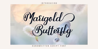 Marigold Butterfly is a unique and elegant handwritten font. It looks beautiful on a variety of designs requiring a personalized style. This font is PUA encoded which means you can access all glyphs and swashes with ease!
 - Watten by Muksal Creatives,
$12.00 Watten is a script with Handwritten Style. It is made with digital brush pen strokes that making this font look authentic. This font is perfect for fashion brands, wedding invitations, business cards, logos, signatures, calligraphy and more.
 - Anttariksa by Stringlabs Creative Studio,
$25.00 Anttariksa is a casual, fun script font, created by using a brush pen. Clean and a little bit quirky, this font is the perfect fit for all of your logos, branding, social media, and crafty DIY projects.
 - Rosha Keylin by Letterena Studios,
$17.00 Rosha Keylin is a stylish and elegant serif font. It is PUA encoded which means you can access all of the glyphs and swashes with ease! Add it to any of your designs, and enjoy the results!
 - Blackink by Juncreative,
$19.00 Blackink is a delicate and elegant handwritten font. Its distinct and well balanced letters make this font a masterpiece. This font is PUA encoded which means you can access all of the glyphs and swashes with ease!
 - Ashgabat by GlyphStyle,
$16.00 Ashgabat is a signature style font that looks natural with a pen stroke-like texture. A bold and elegant looking font like the original signature style. Font feature Uppercase, Lowercase, Numerals & Punctuations, Stylistic Alt, Swash Ligature, Multilanguage
 - Kallio Brush by Fenotype,
$19.00 Kallio is a Bold Brush Script with roots in American sign painting culture. Kallio is Finnish and means rock or cliff. Kallio is equipped with Contextual Alternates for smooth connections and Swash Alternates for every standard letter.


