10,000 search results
(0.045 seconds)
- DeiGratia - Unknown license

- Savia Filled Shadow - Personal use only

- Legitimate Crystal Display - Personal use only

- Culita - Personal use only

- La Rosa Muerta - Unknown license

- XiparosLombard - Unknown license

- Tasmin Ref - Unknown license

- TagettesPlus - Personal use only

- Kremlin Minister - Unknown license

- a picture alphabet - Unknown license

- Anderson The Mysterons - Unknown license

- PeggyFont - Unknown license

- faucet - Personal use only

- Kaku Dingbats One Piece Art One Piece Area - Personal use only

- Charriot Deluxe - Unknown license

- JaneAusten - Unknown license

- Six Feet Over by Brad Mead,
$10.00
- Eureka Antique by Solotype,
$19.95 - Disquete by Tipos do aCASO,
$23.90 - Railyard Stencil JNL by Jeff Levine,
$29.00 - Florensa by Variatype,
$16.00
- Behrens Schrift by Solotype,
$19.95 - Toxic Brew by PizzaDude.dk,
$15.00
- Industria Serif by Resistenza,
$39.00
- Chamfer Serif JNL by Jeff Levine,
$29.00
- Home Address JNL by Jeff Levine,
$29.00
- Life Cinema Screen by Andrey Ukhanev,
$-
- Brittwey by Balevgraph Studio,
$12.00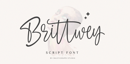
- Ratatouille by Jonahfonts,
$40.00
- Nest by Khalid Jassim,
$27.00
- Lazy Monk by Mirco Zett,
$18.00
- Crayon Crumble by Hanoded,
$15.00
- Hey Comrade by Hanoded,
$15.00
- Magellan by Monotype,
$29.99 - Beverage Stencil JNL by Jeff Levine,
$29.00
- Eagle by Monotype,
$29.99 - Syntax by Linotype,
$29.99
- Love Princes by Sulthan Studio,
$10.00
- Matinee Stencil JNL by Jeff Levine,
$29.00
- Chamfer Engraved JNL by Jeff Levine,
$29.00


