10,000 search results
(0.161 seconds)
- Avondale SC Shaded - Unknown license

- MONACO - Personal use only

- MythBusters - Personal use only

- Covington Cond - Unknown license

- Covington SC Shadow - Unknown license

- Promenadenmischung - Personal use only

- Covington SC Exp - Unknown license

- Covington SC Cond - Unknown license

- Covington SC Exp - Unknown license

- Covington SC Cond - Unknown license

- Covington Exp - Unknown license

- Covington SC Rev - Unknown license

- Covington SC - Unknown license

- Avondale SC Outline - Unknown license

- Avondale SC Cond - Unknown license

- Plasmatica Rev - Unknown license

- Covington Rev - Unknown license

- Avondale SC Inline - Unknown license

- MCF bad manners ww - 100% free

- Fine Dining JNL by Jeff Levine,
$29.00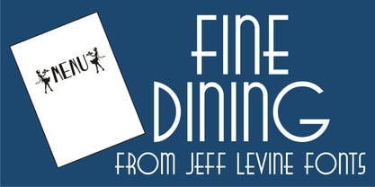 The lettering for Fine Dining JNL was inspired by the opening titles for the 1940 Barbara Stanwyck-Fred MacMurray film "Remember the Night". A stylized Art Deco sans, the typeface conjures up images of elegant dining, being out on the town and all we warmly associate with the night life of the 1930s and 1940s.
 - Fontazia Insomnia by Deniart Systems,
$15.00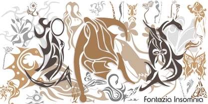 Let your night images come to life! The Fontazia Insomnia set features a strange and unusual assortment of surrealistic hand-drawn images - a tribute to the nocturnal spirits that seem to come to life during those hot sleepless summer nights. These characters are sure to add a little fun and mystery to any project.
 - LT Leap Medium - 100% free

- LT Shortcake Medium - 100% free

- LT Bread Medium - 100% free

- Sweetgentle by Fontdroe,
$15.00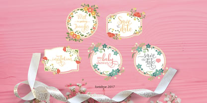 Sweetgentle is a new modern calligraphy typeface containing 750 glyphs. It has OpenType features and PUA encoded. Of course this is a smart font that works with popular design software like Photoshop, Coreldraw, Illustrator, Microsoft Office, ect. This Modern Calligraphy typeface welcomes you to use it for various purposes such as logos, cards, wedding invitations, headings, signatures, t-shirts, letterheads, cutting, hot stamping, signage, labels, posters and more. It's craft friendly!!!! OPENTYPE TECHNOLOGY: - Stylistic alternate - Contextual alternates - Standard Ligatures - Discretionary Ligatures - Contextual Ligatures - Initial Letter - Medial Letter - Terminal Letter - Numerals - Punctuations
 - Zially by Fontdroe,
$17.00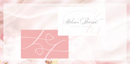 Zially is a new handwriting typeface built with modern OpenType features with PUA encoded glyphs. This is a smart font that works with popular design software like Photoshop, Coreldraw, Illustrator, Microsoft Office, Cricut, Surecut even Silhoutte software, and more. This freehand typeface welcomes you to use it for various purposes such as logos, cards, wedding invitations, headings, signatures, t-shirts, letterheads, cutting stickers, hot stamping, signage, labels, posters and more. It's craft friendly!!!! OPENTYPE TECHNOLOGY: - Stylistic alternate - Standard Ligatures - Discretionary Ligatures - Initial form - Medial form - Terminal form - Numerals - Punctuations
 - Kantata Aksara by IKIIKOWRK,
$17.00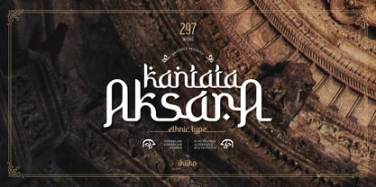 Introducing Kantata Aksara - Ethnic Type, created by ikiiko. Kantata Aksara inspired by indian culture has beautiful gestures, with a touch of tradition. Kantata Aksara is a display typeface with unique shape and stylistic. This typeface is perfect for an cultural logo, ethnic stuff, yoga & meditation stuff, beauty product, packaging product , magazine, quotes, or simply as a stylish text overlay to any background image. What's included? Uppercase & Lowercase Number & Punctuation Alternates Multilingual Support Works on PC & Mac Enjoy our font and if you have any questions, you can contact us by email : ikiikowrk@gmail.com
 - Sketchley BT by Bitstream,
$50.99Ronna Penner's Sketchley is a 2001 winner of ATypI's bukva:raz! design competition, held recently in Moscow. Inspired by handwriting samples and unable to find a typeface to satisfy her needs, Ms. Penner decided to create her own. The result is this warm, casual script. The compliment of characters demanded the creation of two fonts. Sketchley is considered the base font and should be used for basic layouts. Sketchley Swash has numerous initial, medial and final swash characters that, when used thoughtfully with Sketchley, can recreate the look of hand drawn calligraphy. - Namaste by Latinotype,
$49.00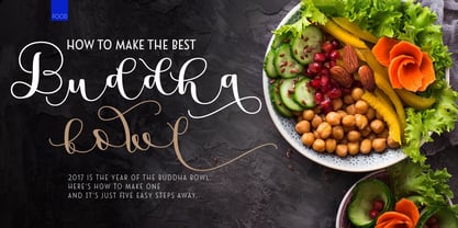 With open palms, place your hands together at the center of your chest, close your eyes and bow the head slightly. Namaste! Welcome to a beautiful spiritual journey. Namaste is a font collection, designed by Coto Mendoza, consisting of two variants: a capital sans and a script font (based on watercolor calligraphy strokes). Each variant comes in 5 weights—Thin, Light, Regular, Bold and Black—and 2 versions: Essential and Pro. The script font, in its Pro version, provides a wide range of OpenType features such as swashes, alternates, ligatures and different stylistic sets. The Namaste family also includes a set of ornaments inspired by Hindu and Buddhist symbols—that Coto Mendoza saw virtually everywhere on her trip to India—like Mandalas and Yantras, and others found in textiles and monuments. Namaste is the perfect choice for wellness, healing and therapy oriented products. Its smooth shape and soft curves allow the user to create beautiful designs for essential oils, bath salts, quartz crystals, mindfoodness, candles, incense and aromatherapy products packaging. The font is well-suited for publishing design (short text); self-help and healing handbooks; tarot and divination cards; and women’s empowerment and spirituality publications. Namaste is an ideal typeface for yoga (and other body disciplines) center branding; holistic centers; and group meditation, womb blessing and circle of women invitations. Namaste is a beautiful journey full of love and inspiration. Namaste: a spiritual journey.
 - Teimer Std by Suitcase Type Foundry,
$75.00Typographer and graphic designer Pavel Teimer (1935-1970) designed a modern serif roman with italics in 1967. For the drawing of Teimer he found inspiration in the types of Walbaum and Didot, rather than Bodoni. He re-evaluated these archetypes in an individual way, adjusting both height and width proportions and modifying details in the strokes, thus effectively breaking away from the historical models he used as a starting point. Teimer's antiqua has less contrast; the overall construction of the characters is softer and more lively. The proportions of the italics are rather wide, making them stand out by their calm and measured rhythm. This was defined by the purpose of the typeface, as it was to be utilised for two-character matrices. The long serifs are a typical feature noticeable throughout the complete family of fonts. In 1967, a full set of basic glyphs, numerals and diacritics of Teimer's antiqua was submitted to the Czechoslovak Grafotechna type foundry. However, the face was never cast. At the beginning of 2005 we decided to rehabilitate this hidden gem of Czech typography. We used the booklet "Teimer's antiqua - a design of modern type roman and italics", written by Jan Solpera and Kl‡ra Kv’zov‡ in 1992, as a template for digitisation. The specimen contains an elementary set of roman and italics, including numerals and ampersands. After studying the specimen, we decided to make certain adjustments to the construction of the character shapes. We slightly corrected the proportions of the typeface, cut and broadened the serifs, and slightly strengthened the hair strokes. In the upper case we made some significant changes in the end serifs of round strokes in C, G and S, and the J was redrawn from the scratch. The top diagonal arm of the K was made to connect with the vertical stem, while the tail of Q has received a more expressive tail. The stronger hairlines are yet more apparent in the lower case, which is why we needed to further intervene in the construction of the actual character shapes. The drawing of the f is new, with more tension at the top of the character, and the overall shape of the g is better balanced. We also added an ear to the j, and curves in the r have become more fluent. To emphasise the compact character of the family, the lining numerals were thoroughly redrawn, with the finials being replaced by vertical serifs. The original character of the numerals was preserved in the new set of old-style figures. To make the uppercase italics as compact as possible, they were based on the roman cut rather than on the original design. The slope of lowercase italics needed to be harmonised. The actual letter forms are still broader than the characters in the original design, and the changes in construction are more noticeable. The lower case b gained a bottom serif, the f has a more traditional shape as it is no longer constricted by the demands of two-matrice casting, the g was redrawn and is a single storey design now. The serifs on one side of the descenders of the p and q were removed, the r is broader and more open. The construction of s, v, w, x, y, and z is now more compact and better balanced. Because Teimer was designed to make optimal use of the OpenType format, it was deemed necessary to add a significant amount of new glyphs. The present character set of one font comprisess over 780 glyphs, including accented characters for typesetting of common Latin script languages, small caps and a set of ligatures, tabular, proportional, old style and lining, superscript and fraction numerals. It also contains a number of special characters, such as arrows, circles, squares, boxed numerals, and ornaments. Because of its fine and light construction, the original digitised design remained the lightest of the family. Several heavier weights were added, with the family now comprising Light, Light Italic, Medium, Medium Italic, Semibold, Semibold Italic, Bold, and Bold Italic. - NorB Type Writer Roughen by NorFonts,
$25.00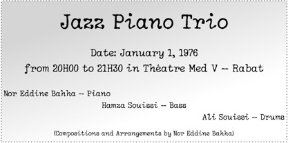 NorB TypeWriter Roughen is the roughen version of my NorB TypeWriter typeface witch's my emulation of the IBM Selectric 'Light Italic' ball witch was used by my grand-brother for his correspondance during the 70’s and 80’s. It's however a slanted mono-spaced looking typewriter font. You may want to use this font with any word processing program for text and display use, print and web projects, apps and ePub, comic books, graphic identities, branding, editorial, advertising, scrapbooking, cards and invitations and any casual lettering purpose… or even just for fun! NorB TypeWriter Roughen features 677 glyphs, OpenType features and comes in 6 weights each with their matching italics and in a Light, Normal and Bold version.
 - Mister Earl by Bitstream,
$29.99Mister Earl, released by Bitstream in 1991, was designed by Jennifer Maestre. Inspiration came from a page in a ‘how-to’ book published in the 1930s. Later versions of Extra Light, Light and Bold were added by Jim Lyles, with the help of Wally Petty. Mister Earl is named in honor of Earl Biscoe, a Bitstream designer who retired in the mid-1980s because of illness. In the winter of 1994–1995, Richard Stetler accidentally left a copy of Mister Earl outside his Alaska home... In the spring, amazed to discover the unfortunate font was still just about alive, he decided to release the result to a wider public as Snow Cap. - Nightales by Trim Studio,
$15.00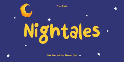 Introducing Nightales a simple, bold and light font style perfect for kids' books! With a playful and rounded design, this font is both whimsical and fun, making it perfect for capturing the imagination of young readers. The brush pressure adds a touch of creativity and charm, while still being easy to read and understand. The bold and light variations provide versatility for different design elements, and the rounded edges make it safe and friendly for kids. Let Nightales bring joy and excitement to your next kids' book project! even so contains All Standard glyphs and punctuations Thank you for let us be your design partner, If you have any questions please don't hesitate to drop me a message
 - Caniste by Ilham Herry,
$20.00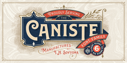 The vintage typeface returns with the Caniste typeface family. My passion for something with a vintage aesthetic is one reason I created Caniste. Inspired by antique ephemera such as cigar box labels that were common in the 19th century, it harkens back to the beauty of typographic design at that time. The Caniste font family is an all-caps serif font with uppercase titling. It comes in 6 weights: Extra Light, Light, Regular, Semibold, Bold, and Ultra Bold. It also has very user-friendly Extras, such as scrolls, ornaments, and panels, and allows you to create beautiful ornamentation to suit your needs. I hope you enjoy using the Caniste fonts. Thank you!
 - Gradia by Attract Studio,
$20.00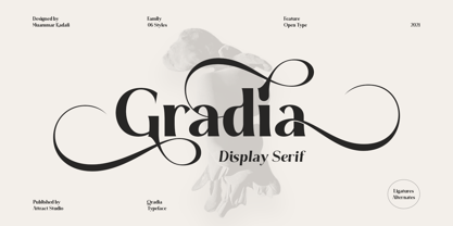 Gradia is a serif font in the form of a unique & elegant typographic design. very suitable for making your choice of design work from invitation cards to magazines, logos, branding, signage and many other creative projects. Gradia features OpenType 765+ glyphs, also has 270 character Alternates, 116 Ligatures that are perfect for various uses, and is also equipped with multiple language support. What is included: Gradia Regular Gradia Regular Italic Gradia Light Gradia Light Italic Gradia Bold Gradia Bold Italic To access these OpenType features, you will need Opentype-enabled software such as: Adobe Illustrator, Word, CorelDraw, Photoshop, Indesign and many more. Check out Bagoni Type which is a great pair for Gradia.
 - Core Rhino by S-Core,
$29.00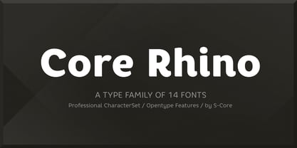 Core Rhino is a contemporary typefamily designed by S-Core. The fonts have the mood of brushed feeling and come across as soft and gentle. Core Rhino displays warmth through its roundness and curved letterforms. Also it is legible in prints and on screens. The Core Rhino family consists of 7weights (Thin, Extra Light, Light, Regular, Bold, Heavy, Black) plus matching italics. The OpenType fonts contain complete Latin 1252, Cyrillic, Central European 1250, Turkish 1254 character sets. Each font includes proportional figures, tabular figures, numerators, denominators, superscript, scientific inferiors, subscript, fractions. If you are looking for a sans serif style font which is practical and friendly, get this family and save your time.
 - Fermo TRF by TipografiaRamis,
$20.00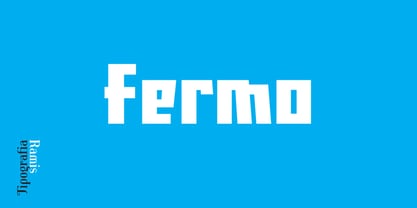 Taking into consideration some complaints about lack of capital letters and deficiency of heavier weight styles, the Fermo typeface was redesigned to replace the existing font, dated 2002. New Fermo includes two subfamilies—Fermo TRF and Fermo-Uni TRF. Both fonts now consist of three weight styles—light, regular and bold—with significant contrast. During the updating process some minor glyph shape adjustments and changes have been made. Fermo TRF's main distinctions from the previous font are the new capital letters and additional weight (light) style. Fermo-Uni TRF is a unicase font with an additional lightweight style. Fermo is recommended for use as a display font. In large size settings negative tracking is recommended.
 - Målestok by Wilton Foundry,
$39.00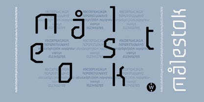 The Målestok family (Light, Light Italic, Bold, Bold Italic) is an eclectic solution for a broad range of applications. The rounded outer corners combined with select stencil effects makes for an interesting and friendly face. In large sizes, the bold version is strong and engaging, while the lighter weights are stylish and friendly. Thanks to its distinctive slightly technical style, both print and interactive designers will find that Målestok provides a multitude creative options with the perfect solution to draw attention with style. Målestok family his ideal for branding, collateral, advertising and packaging design. Målestok also fits comfortably in fashion , retail and sport related categories. Målestok family was designed in Norway, The Netherlands and USA.
 - VLNL Decks by VetteLetters,
$35.00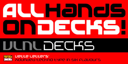 Donald DBXL Beekman lives on a ship in Amsterdam’s waters (well, the Amstel river, actually). Living on the water inspired him to design this ‘cruise ship’ typeface VLNL Decks. Available in several variations, it’s a fabulous cocktail of freshly caught fish typography. Decks is recommended for seafood restaurants, speed boats as well as slick city boys wearing overly expensive sunglasses or Ibiza sunset parties. Decks is the tiger prawn amidst sea foods. VLNL Decks has a distinct modern techno look but the rounded corners give it a warm and human feel. It is available in 3 monolinear weights (Light, Medium, Bold) and 3 weights with contrast between horizontals and verticals (Different Light, Different Medium, Different Bold).
 - Kropotkin Std by sugargliderz,
$30.00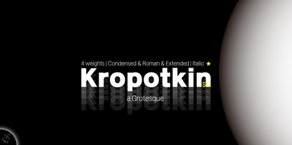 This typeface design was influenced by the British Rail corporate type introduced in an old lettering instruction book published in Japan. Of course, the only clue to this typeface is the lettering instruction book at hand. Therefore, this typeface is based on the British Rail corporate type introduced in an old lettering instruction book published in Japan, and I have expanded the design variations. I started with the Bold design first. Then I designed Light, Regular, and Black in that order. Light and Regular are intended to be used as the text type, while Bold and Black are intended to be used as the base for logotypes, headlines, and other eye-catchers.


