10,000 search results
(0.088 seconds)
- Koning Display by LucasFonts,
$49.00 Koning transports high-contrast sans serifs into the present. Koning is the Dutch for king. Given the design’s elegance, this name should come as no surprise. It has been recognized with numerous awards: TDC Certificate of Typographic Excellence and Award of Excellence from Communication Arts both in 2018, and Gold from German Design Awards in 2020.
 - Parfum De Paris JNL by Jeff Levine,
$29.00 Parfum de Paris JNL is an all lower case Art Deco-inspired design that features counterless letters in a thick-and-thin style reminiscent of 1930s text styles. Casual and at the same time elegant, this font is perfect for perfume labels, menu headings and other 'stylish' titling evoking the look and feel of the 'Streamline Era'.
 - Vidalia Sunshine NF by Nick's Fonts,
$10.00A single line of type, identified as "Ornamented No. 5" and spelling out "ROPE ONIONS", from the 1888 MacKellar, Smiths & Jordan specimen book provided the pattern for this whimsical face. Offbeat yet elegant, graceful yet bold, it’s a natural choice for distinctive headlines. Both versions of the font include 1252 Latin, 1250 CE (with localization for Romanian and Moldovan). - Music Lesson JNL by Jeff Levine,
$29.00 During the 1940s and 1950s, the Miller Music Corporation issued a number of its songs with a stock cover design for their “Miller Series of Piano Solos” but the song titles were hand lettered in an Art Deco dual line design. Recreated digitally as Music Lesson JNL, this type design is available in both regular and oblique versions.
 - El Franco by Fonthead Design,
$19.00El Franco is a family designed by Ethan Dunham that represents what Roman lettering looked like in the 16th century. Derived from a typographic sample of Francisco Lucas, 1577, this font captures the feeling of rustic times. It comes in two versions regular and distressed. The distressed version has been weathered to appear old and worn. - Deco Semi Serif JNL by Jeff Levine,
$29.00 Deco Semi Serif JNL was modeled from the hand lettered title on the sheet music cover for the 1933 song "Another Perfect Day Has Passed Away". This interesting design blend of serif, sans serif and partial-serif characters commands attention with its eccentric mix of letter forms, and is available in both regular and oblique versions.
 - Movie Producer JNL by Jeff Levine,
$29.00 The Nov. 13, 1915 and Nov. 27, 1915 issues of Moving Picture World carried ads for Jesse L. Lasky Productions in which the titles of the upcoming films were hand lettered in an elegant Art Nouveau spurred serif style. This stylish alphabet is now available digitally as Movie Producer JNL in both regular and oblique versions.
 - Spirrevip by Bogstav,
$18.00 Spirrevip is for that moment when you need something legible, organic and obviously handmade at the same time. The letters are straightforward, yet variable in thickness of strokes, height and width. Spirrevip is definitely playful and serious at the same time. I have added 5 slightly different versions of each letter, and they automatically changes as you type!
 - Paper Caper NF by Nick's Fonts,
$10.00This typeface is an amalgam of two cut-paper typefaces, as presented by Margaret Shepherd in her book, Calligraphic Alphabets Made Easy. Also included are a glue bottle at the bar position, and round-edge scissors at the dagger and double-dagger positions. Both versions of the font include 1252 Latin, 1250 CE (with localization for Romanian and Moldovan). - Keepon Truckin NF by Nick's Fonts,
$10.00Baby Fat, designed by Milton Glaser in 1964, saw a lot of action during the psychedelic poster phase. This little dumpling is based on that workhorse, and takes its name from a phrase that also got around a lot in the 60s. Both versions of the font include 1252 Latin, 1250 CE (with localization for Romanian and Moldovan). - P22 Da Vinci by P22 Type Foundry,
$24.95 The great Italian artist, inventor, and visionary Leonardo da Vinci created an extraordinary variety of work which continues to amaze those who study it. This set faithfully captures Leonardo's remarkable imagination and includes an exclusive Da Vinci Backwards font (reflecting the artist's own unique style of handwriting). The 72 extras included are drawn from Leonardo's sketchbooks and journals.
 - Pen Lettering Sans JNL by Jeff Levine,
$29.00 A 1935 song with the unusual title of "Dinner for One Please, James" had its title hand lettered on the cover of the sheet music with simple, condensed letters made by a round point dip pen. This has been reproduced in a digital font as Pen Lettering Sans JNL, and is available in both regular and oblique versions.
 - Pabean Market by Nasir Udin,
$24.00 Pabean Market is an interpretation of the incription on the oldest market in Surabaya, Indonesia, which was established on 1849. The unique character inspired me to make a complete set of typeface. It’s a retro typeface but has a futuristic aura yet a festive vibes. This font comes in single style and has several Discretional Ligatures. -- Uppercase
 - LTC Cloister by Lanston Type Co.,
$24.95Designed by Morris Fuller Benton 1913-15, this Oldstyle family was digitized by Jim Rimmer in the early 2000's. It is a roman face closely styled to that of Nicholas Jensen's with a companion italic in the style of Aldus Manutius. Benton considered Cloister the ideal typeface and it does indeed lend itself to many uses. - Eat More Fruit JNL by Jeff Levine,
$29.00 Eat More Fruit JNL is an odd name for a typeface, but then again the lettering style of the font is just as unusual. Named for a 1940s-era poster espousing "Put more pep in your step... eat more fruit", the lettering (although Art Deco in nature) also evokes images of 1960s and 1970s hippie-era concert posters.
 - Okay Crayon by Okaycat,
$29.95 One waxy black crayon was used up, entirely down to the tiniest nub, by the making of this font. It’s fun! Perfect for creating crayon written text, or to get the look of chalk-board writing, conte, or charcoal. Okay Crayon is extended, containing West European diacritics & ligatures, making it also suitable for multilingual environments & publications.
 - Neo Contact by Linotype,
$40.99Neo Contact is the typeface used on the packaging of Marlboro cigarettes (Marlboro “Reds,” the main line of the brand). The typeface is bold and condensed, designed in the Egyptienne style. Egyptienne types were first designed in the 1800s, as type founders - especially in the westward-expanding United States - began to dream up newer, bolder styles of letters for advertising usage. During the 1800s, it became increasingly important for businesses to set themselves, and their products, apart from competitors. This desire has remained with corporations, as well as with advertisers and designers, into the 21st century. In addition to cigarette packaging, Neo Contact (as part of Marlboro’s branding efforts) can be seen on numerous items, including Ferrari’s F1 racers, and at Formula 1 race tracks. The letters in Neo Contact are filled with personality. Their forms display two distinct weights of line, and the serifs are made up of tiny, strict slabs. Ball terminals round out the design. Neo Contact is a complete font, with a complete western character set. Typefaces in the Egyptienne style preceded the development and distribution of larger, crazier wood typefaces, but also share many similarities with these descendents. More traditional, text faces in the Egyptienne manner are also available from Linotype GmbH (e.g., Adrian Frutiger’s Egyptienne F). On the opposite end of the spectrum, we offer interesting, personality-filled wood display types, like Ponderosa as well. - PharmaCare - Unknown license

- Gaulois by Canada Type,
$24.95 A couple of years before the second World War, Marcel Jacno, the popular French graphic designer who in the 1930s designed iconic posters for Gaumont and Paramount and famously illustrated the Gaulish helmet that first adorned the Gauloises cigarette packs in 1936, was asked by Deberny & Peignot to design a calligraphic typeface for the advertising market. Jacno's Scribe design, billed by D&P as a "virile ad writing" typeface, was released to some great fanfare in 1937, enjoyed some time of French spotlight, and was ready to make waves in the rest of Europe before the war broke out and snuffed its chances at international recognition. However, samples of it can still be found in some specialty post-war publications as an example of a trend that lasted a couple of decades, when Western European type manufacturers commissioned famous visual artists to design typefaces in order to capitalize on the artists' fame - the trend that brought us standards like Futura and the long list of Lucien Bernhard and Imre Reiner faces. This exclusive digital version of Jacno's design expands on the original concept with a large character set that includes plenty of alternates, a couple of different ways for seamless lowercase connections, three sets of figures, and extended Latin language support, adding up to over 540 characters in a one big, contextually-programmed font.
 - General Chang JNL by Jeff Levine,
$29.00General Chang JNL is one of a number of fonts redrawn by Jeff Levine from the creative output of the late Alf R. Becker. Becker's alphabets were a monthly feature of Signs of the Times Magazine from the 1930s through the 1950s. Thanks to Tod Swormstedt of ST Media (who also is the curator of the American Sign Museum in Cincinnati, Ohio) for the resource material. - Neue Haas Grotesk Text by Linotype,
$33.99The original metal Neue Haas Grotesk™ would, in the late 1950s become Helvetica®. But, over the years, Helvetica would move away from its roots. Some of the features that made Neue Haas Grotesk so good were expunged or altered owing to comprimises dictated by technological changes. Christian Schwartz says Neue Haas Grotesk was originally produced for typesetting by hand in a range of sizes from 5 to 72 points, but digital Helvetica has always been one-size-fits-all, which leads to unfortunate compromises."""" Schwartz's digital revival sets the record straight, so to speak. What was lost in Neue Haas Grotesk's transition to the digital Helvetica of today, has been resurrected in this faithful digital revival. The Regular and Bold weights of Helvetica were redesigned for the Linotype machine; those alterations remained when Helvetica was adapted for phototypesetting. During the 1980s, the family was redrawn and released as Neue Helvetica. Schwartz's revival of the original Helvetica, his new Neue Haas Grotesk, comes complete with a number of Max Miedinger's alternates, including a flat-legged R. Eight display weights, from Thin to Black, plus a further three weights drawn specifically for text make this much more than a revival - it's a versatile, well-drawn grot with all the right ingredients. The Thin weight (originally requested by Bloomberg Businessweek) is very fine, very thin indeed, and reveals the true skeleton of these iconic letterforms. Available as a family of OpenType fonts with a very large Pro character set, Neue Haas Grotesk supports most Central European and many Eastern European languages. - Throws by Tomatstudio,
$10.00 This is not an ordinary fonts, this is how the real throw up graffiti come into fontype! if you want real throw ups style graffiti fonts, this is the answer! because this is pure from my real graffiti eperiences around the streets. Kerning, spacing i adjust more tight, similar with the real throw up in the streets. The intersection between letter also you can erase it or leave it collide, depends of whats your styles, see our tutorial in the picture slides. I hope you guys like it, cheers!
 - Arabetics Harfi by Arabetics,
$59.00 Arabetics Harfi is a Latin Serif typeface with a comprehensive support for the Arabetic scripts, including Quranic texts. Careful spacing and kerning was used to enhance resulting text legibility both scripts. Arabetics Harfi fully supports MS 1252 Western and 1256 Arabic code pages, in addition to all transliteration characters required by the ALA-LC Romanization tables. Users can either select an accented character directly or form it by keying the desired combining diacritic mark following an unaccented character. For Arabic, it fully supports Unicode 6.1, and the latest Arabic Supplement and Extended-A Unicode blocks. The Arabic design of this font family follows the Mutamathil Taqlidi type style with connected glyphs, but it emphasizes a horizontal look and feel rather than verticalone, utilizing slightly varying x-heights. The Mutamathil Taqlidi type style uses one glyph per every basic Arabic Unicode character or letter, as defined by the Unicode Standards, and one additional final form glyph, for each freely-connecting letter of the Arabic cursive text. Arabetics Harfi includes the required Lam-Alif ligatures in addition to all vowel diacritic ligatures. Soft-vowel diacritic marks (harakat) are selectively positioned with most of them appearing on similar high and low levels—top left corner—, to clearly distinguish them from the letters. Tatweel is a zero-width glyph. Arabetics Harfi includes both Arabic and Arabic-Indic numerals, in addition to generous number of punctuation and mathematical symbols. It includes two weights, regular and bold, each of which has normal, right slanted Italic, and left-slanted styles.
 - Bolster by Denis Masharov,
$25.00 The font extra bold slab serif with reverse contrast, he refers to the “Italian” or “wood types”. This decorative display font is designed for use in large sizes, suitable for the lettering, the major labels, headers, logotypes. Ideal for embedding images. It's an all-caps font, but there are biform variants of a, e, m, n and u, so you can mix things up to create more interesting headlines. This font contains the complete Latin language character set (Unicode 1252) plus support for Cyrillic (Unicode 1251), Central/Eastern Europe (Unicode 1250), Baltic (Unicode 1257) and Turkish (Unicode 1254) languages as well.
 - Printers Lot JNL by Jeff Levine,
$29.00 Printers Lot JNL is another eclectic mix of cartoons, ornaments, catch words, decorations and embellishments re-drawn from vintage source material used in the days of letterpress printing. For those who like to assemble their own larger borders, a set of elements is on the 2-9 keystrokes, but it must be noted that some manual adjustment is necessary to line up all of the parts in a complete border pattern. From a Happy New Year greeting to whimsical cartoon characters; from singular ornamental design elements to beautiful brackets, this mix of subjects is a great overview of the kinds of cuts found in printers' job case drawers in years gone by.
 - AMA by Nantia.co,
$16.00 AMA Greek and Latin Font is a hand-made display font. Of course, the font supports a full set of Greek chars and an extended Latin character set with diacritics. Τhis typeface can be a mighty companion to your next graphic design project. From “hand-written” quotes to product packaging, merchandise, and branding projects, this font is so versatile that it can cover them all.
 - Something Fishy by Kate Brankin,
$17.00 A recent walk down memory lane through old college sketchbooks revealed a collection of caricature fish doodles. Then the sketches were discovered by my son who, being a marine life enthusiast, promptly demanded that I draw more fish. Thus, a collection of 71 fish-inspired drawings and bubbly numbers was born. There is even a lemon, since no fish is really complete without one.
 - Fastest by Letterara,
$16.00 Fastest is a unique and modern sans serif font, specially designed for headlines, big text, branding, logotypes, marketing graphics, banners, posters, signage, and display usage. It can easily be matched to an incredibly large set of projects, so add it to your creative ideas and notice how it makes them stand out! This font is PUA encoded which means you can access all of the amazing glyphs.
 - Bandiera Del Legno NF by Nick's Fonts,
$10.00 This typeface appeared in the William H. Page Woodtype specimen book as Gothic Tuscan Condensed Reversed—quite a mouthful. Banner elements appear in the brace and bracket positions, and reversed spaces can be found in the underscore and bar positions. Both versions of this font support the Latin 1252, Central European 1250, Turkish 1254 and Baltic 1257 codepages.
 - P22 Pop Art by P22 Type Foundry,
$24.95 This font set was developed for the Albright-Knox Art Gallery and is inspired by their collection of Pop Art. Artists such as Warhol, Lichtenstein, and Rauchenberg sought to blur the lines between high and low art as well as the boundaries between art and everyday life. The alphabets and extras in this set reflect that spirit.
 - Kharon Ultra NF by Nick's Fonts,
$10.00A fine, fat Deco face named Ludlow Stygian provided the basis for this delightful typeface. Although generally formal in character, the font shows a hint of playfulness in the distinctive “humpback” h and n characters. This font contains the complete Latin language character set (Unicode 1252) plus support for Central European (Unicode 1250) languages as well. - Quella Amber by Create Big Supply,
$15.00 Quella Amber is a remarkable signature handwriting font that brings a touch of elegance and sophistication to your design projects. With its unique and authentic style, this font captures the essence of handwritten script with graceful curves and smooth strokes, making it the perfect choice for adding a personal and intimate feel to your creations. Crafted with meticulous attention to detail, Quella Amber showcases a seamless blend of uppercase and lowercase characters, allowing for versatile typography options. Whether you're designing a logo, creating invitations, or working on brand identity materials, this font will elevate your work and leave a lasting impression on your audience. One of the standout features of Quella Amber is its extensive language support. With multilingual capabilities, this font ensures that you can express your creativity in various languages and cater to a global audience. From English to Spanish, French to German, Quella Amber enables seamless communication and allows you to deliver your message effectively. In addition to its aesthetic appeal, Quella Amber is also equipped with practical features that enhance its usability. With a wide range of numbers and punctuations, you can easily incorporate numerical information into your designs. The font also supports PUA (Private Use Area) encoding, which provides access to special characters, ligatures, and alternate letterforms, allowing you to customize and tailor your typography to suit your specific needs. Quella Amber is a downloadable font that empowers you to unleash your creativity and bring your vision to life. By incorporating this exquisite signature handwriting font into your projects, you can infuse a sense of personality and warmth into your designs, making them truly unique and captivating. With Quella Amber, you can create stunning visuals that resonate with your audience, leaving a lasting impression and setting yourself apart from the competition. Experience the beauty and versatility of Quella Amber by downloading it today and embark on a journey of creativity and self-expression with this exceptional signature handwriting font.
 - Isfahan by Scriptorium,
$18.00Isfahan is based on the middle-eastern style decorative initials Willy Pogany drew for his edition of The Rubaiyat of Omar Khayaam. This font has both full-size capitals and reduced size small-caps versions of each letter, but although it could be used as a titling font, it is really intended more for decorative character placement. - Formosa by Hanoded,
$15.00 Formosa is the old, colonial name for Taiwan. Formosa means beautiful in Portuguese and I think this handwritten typeface has a certain beauty itself. It comes in three styles, all of which make extensive use of ligatures, to give the font an authentic, handwritten feel. Like most of my fonts, Formosa comes with Babylonian language support.
 - Tourette by Barnbrook Fonts,
$30.00 Tourette draws inspiration from 19th century French light slab serifs. This area of typography is relatively unexplored in contemporary design. Tourette includes two versions, Normal and Extreme. Normal is simple, delicate and legible, whereas Extreme is full of little flourishes that grant an exquisite, slightly frivolous, feel to the weight. Tourette is a progression of the Expletive Script family.
 - Gyftype Bones by giftype,
$20.00 This font is based on the different bones of an skeleton , it is ideal To make a clear an original text , designed to make a very special gift !. On the other hand it has a multitude of use both in posters and in documents of differents Kind , parties , invitations ...finally , it includes Greek and Cyrilic characters.
 - Fontazia Stiletto by Deniart Systems,
$20.00 The Fontazia Stiletto font was inspired by my personal obsession with shoes. This is a stylized version of some of the lovely footwear found in my personal closet as well as some of my equally obsessed friends. You'll find 52 assorted shoe illustrations ranging from sandals to boots, some a little strange, but all in good fun.
 - Romantica Vibes by Letterara,
$17.00 Indulge in the romantic allure of Romantica Vibes, a captivating script font that weaves passion and sophistication into your designs. Infuse your projects with the timeless charm of love, as this font adds a touch of grace and warmth. With PUA encoding, explore its versatile features effortlessly, ensuring your Valentine's creations are both enchanting and memorable
 - Hai Brush by Sabrcreative,
$30.00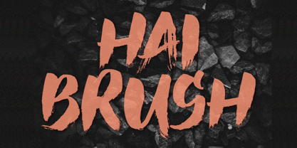 Unleash your creativity with the all-caps captivating Hai Brush Font. This unique typeface effortlessly combines the raw energy of hand brush strokes with a touch of elegance, making it an exceptional choice for a variety of design endeavors. Whether you're crafting logos, posters, or branding materials, Hai Brush Font adds an authentic, artistic flair to your projects.
 - Steppin Out by Bitstream,
$50.99Nick Curtis has created this stylish, Deco inspired design, packed full of quirky features and characters. Some of the letterforms, like the uppercase K, appear to be walking. And dig that lowercase ‘g’! There is a lot of lively design happening here, so much so that its a battle not to be stylish when you are Steppin Out.
