10,000 search results
(0.03 seconds)
- Million Dreams by Sansakerta,
$13.00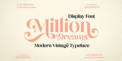 Million Dreams is an elegant and bold display font. Unique, playful and versatile serif Fot that you can combine to get curves and beautiful shapes just in seconds. Play with the ornaments to create a more stunning display. This font is suitable for use in many design forms, for example magazines, postcards, logos, vintage look, old classic ,60s, 70s, 80s era, wedding projects and many more. We recommend using Adobe Illustrator or Photoshop. Fall in love with its incredibly versatile style and use it to create gorgeous wedding invitations, beautiful stationary art, eye-catching social media posts, and much more! Cheers! Sansakerta
 - Chromosome by Three Islands Press,
$19.00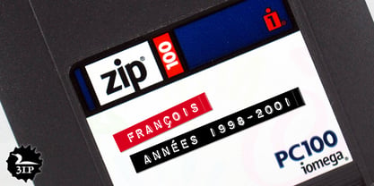 It hit me one day that the '60s-vintage labelmaker I had lying around might make an interesting display face. I began playing with it -- clicking out letters at various pressures, scanning the results, going over the scans in a vector-graphics program. Looked pretty good. To my chagrin, however, I soon afterward got a glimpse of someone else's label-tape font. Though modeled after a more modern device, its rocketing popularity prompted me to set Chromosome aside for a year or so. Finally finished it up in late-1995. Full release has light and heavy weights, regular and reversed styles.
 - Barchowsky Fluent Hand by Swansbury,
$24.00Swansbury, Inc. provides handwriting instruction to all ages, accompanied by two exemplar fonts, Barchowsky Fluent Hand.otf and Barchowsky Dot.otf. The basis for the design of the characters is the italic of the Renaissance. With the advantage of contextual alternates, Barchowsky Fluent Hand automatically joins lowercase letters so it can be used in any venue where a clean and elegant appearance of handwriting is desired. The fonts allow maximum instructional flexibility. Aside from their use in lesson plans, educators can customize pages for specific student interests, studies and needs. Included are all math symbols that one typically encounters in school curricula. Nan Jay Barchowsky, designer of this font, believes that children should hone their handwriting skills as they learn all subjects, reading, math, history and foreign languages. Both fonts support all Western European languages and Turkish. Barchowsky Dot is for young children or others who need remediation. The letterforms are identical to those in Barchowsky Fluent Hand. Used at a large point size open dots appear within the lines that form the characters indicating where one should start each stroke in a letter or number. Once formations are learned Barchowsky Fluent Hand can be used with the contextual alternates turned off until students are ready to write in the joined-up manner of a true cursive. Specifications: The technology for fonts that automatically join letters, or allow them to be unjoined is relatively new. At present, both fonts work on Windows XP with Service Pack 1 or later (or Vista), using AbiWord, a free word processor (go to abisource.com). They also work well with InDesign 2. Currently there is an unknown factor in later versions of InDesign for Windows that disallows joining. Macs completely support the fonts using InDesign 2 and later, PhotoshopCS and IllustratorCS. If you do not have these applications, there is an inexpensive word processor for Macs. - Barchowsky Dot by Swansbury,
$17.00Swansbury, Inc. provides handwriting instruction to all ages, accompanied by two exemplar fonts, Barchowsky Fluent Hand.otf and Barchowsky Dot.otf. The basis for the design of the characters is the italic of the Renaissance. With the advantage of contextual alternates, Barchowsky Fluent Hand automatically joins lowercase letters so it can be used in any venue where a clean and elegant appearance of handwriting is desired. The fonts allow maximum instructional flexibility. Aside from their use in lesson plans, educators can customize pages for specific student interests, studies and needs. Included are all math symbols that one typically encounters in school curricula. Nan Jay Barchowsky, designer of this font, believes that children should hone their handwriting skills as they learn all subjects, reading, math, history and foreign languages. Both fonts support all Western European languages and Turkish. Barchowsky Dot is for young children or others who need remediation. The letterforms are identical to those in Barchowsky Fluent Hand. Used at a large point size open dots appear within the lines that form the characters indicating where one should start each stroke in a letter or number. Once formations are learned Barchowsky Fluent Hand can be used with the contextual alternates turned off until students are ready to write in the joined-up manner of a true cursive. Specifications: The technology for fonts that automatically join letters, or allow them to be unjoined is relatively new. At present, both fonts work on Windows XP with Service Pack 1 or later (or Vista), using AbiWord, a free word processor (go to abisource.com). They also work well with InDesign 2. Currently there is an unknown factor in later versions of InDesign for Windows that disallows joining. Macs completely support the fonts using InDesign 2 and later, PhotoshopCS and IllustratorCS. If you do not have these applications, there is an inexpensive word processor for Macs. - Venacti by Typodermic,
$11.95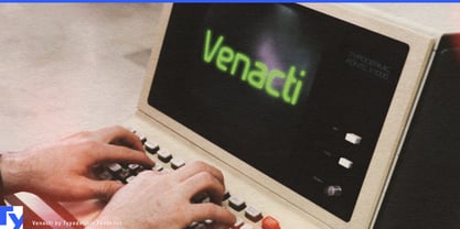 Introducing Venacti, the typeface that embodies the spirit of the industrial era. Inspired by the bold and powerful logotypes of the 1970s, Venacti is a typeface designed for the modern age. Featuring a robust and futuristic style, Venacti’s square letterforms and sleek corners exude a distinct scientific vibe, making it the perfect choice for any project that demands a technical and industrial edge. With three weights and italics, Venacti offers versatility and flexibility that makes it ideal for a wide range of applications, from branding and marketing to editorial and packaging design. Venacti’s bold and confident appearance is perfect for making a statement, while its clean lines and geometric shapes give it a timeless quality that will never go out of style. Whether you’re designing a cutting-edge tech startup or a retro-inspired brand, Venacti is the typeface that will help you stand out from the crowd. So why settle for anything less than the best? Choose Venacti and let your creativity take flight. Most Latin-based European writing systems are supported, including the following languages. Afaan Oromo, Afar, Afrikaans, Albanian, Alsatian, Aromanian, Aymara, Bashkir (Latin), Basque, Belarusian (Latin), Bemba, Bikol, Bosnian, Breton, Cape Verdean, Creole, Catalan, Cebuano, Chamorro, Chavacano, Chichewa, Crimean Tatar (Latin), Croatian, Czech, Danish, Dawan, Dholuo, Dutch, English, Estonian, Faroese, Fijian, Filipino, Finnish, French, Frisian, Friulian, Gagauz (Latin), Galician, Ganda, Genoese, German, Greenlandic, Guadeloupean Creole, Haitian Creole, Hawaiian, Hiligaynon, Hungarian, Icelandic, Ilocano, Indonesian, Irish, Italian, Jamaican, Kaqchikel, Karakalpak (Latin), Kashubian, Kikongo, Kinyarwanda, Kirundi, Kurdish (Latin), Latvian, Lithuanian, Lombard, Low Saxon, Luxembourgish, Maasai, Makhuwa, Malay, Maltese, Māori, Moldovan, Montenegrin, Ndebele, Neapolitan, Norwegian, Novial, Occitan, Ossetian (Latin), Papiamento, Piedmontese, Polish, Portuguese, Quechua, Rarotongan, Romanian, Romansh, Sami, Sango, Saramaccan, Sardinian, Scottish Gaelic, Serbian (Latin), Shona, Sicilian, Silesian, Slovak, Slovenian, Somali, Sorbian, Sotho, Spanish, Swahili, Swazi, Swedish, Tagalog, Tahitian, Tetum, Tongan, Tshiluba, Tsonga, Tswana, Tumbuka, Turkish, Turkmen (Latin), Tuvaluan, Uzbek (Latin), Venetian, Vepsian, Võro, Walloon, Waray-Waray, Wayuu, Welsh, Wolof, Xhosa, Yapese, Zapotec Zulu and Zuni.
 - Syntachron by Mofr24,
$11.00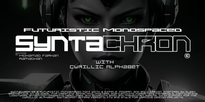 Syntachron is an extraordinary monospaced font that stands out with its futuristic and mecha-inspired design. What sets this font apart is its unique ability to combine simplicity, modernity, and boldness, resulting in a visually captivating typeface. It is the perfect choice for those seeking to create impactful posters, eye-catching marketing materials, captivating logos, attention-grabbing headlines, and engaging book and magazine layouts. One of the distinguishing features of Syntachron is its compatibility with the Cyrillic alphabet, offering versatility and style for a wide range of design projects. Whether you're working on international branding campaigns or multi-language publications, this font seamlessly integrates with the Cyrillic characters, ensuring consistency and cohesiveness across different languages. In terms of typeface pairing, Syntachron harmonizes exceptionally well with related families and typefaces that share its sleek aesthetics and futuristic vibe. It complements and enhances other fonts, enabling designers to create stunning combinations that amplify the impact of their designs. Beyond its striking appearance, Syntachron excels in its functional aspects. The font comes in a variety of styles, allowing for versatility in design choices. Its monospaced nature ensures consistent character widths, making it ideal for code snippets, technical documentation, and typewriter-style layouts. Furthermore, Syntachron offers a comprehensive character set with special features, enabling the seamless creation of diverse and engaging designs. The design concept behind Syntachron was to capture the essence of a futuristic world and merge it with the mechanical elements of mecha-inspired aesthetics. The result is a font that exudes a sense of cutting-edge technology and boldness, empowering designers to create visually striking and impactful designs that captivate their audience. Syntachron was meticulously created to fulfill the need for a font that seamlessly merges modern simplicity with futuristic design elements. Its purpose is to provide designers with a versatile tool that sparks creativity and enables them to craft stunning visual experiences. With its sleek aesthetics, support for the Cyrillic alphabet, and functional aspects, Syntachron is an indispensable asset for any design project seeking to embrace the future.
 - Lievin by Mofr24,
$11.00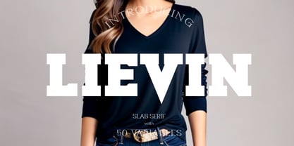 Lievin is an exceptional slab serif font that stands out for its simplicity, clean lines, and captivating elegance. What sets it apart is its unique ability to effortlessly adapt to diverse design needs, making it a versatile choice for any project. With an impressive range of 50 variable styles, ranging from delicate thin to bold and massive black, Lievin caters to a wide array of typographic demands. Its versatility makes it perfect for various applications such as posters, marketing materials, logotypes, headlines, books, magazines, and more. One of the defining features of Lievin is its impeccable balance of classic charm and contemporary appeal. Its sleek and refined aesthetic adds a touch of sophistication to any design. The font's exceptional legibility ensures that the message is conveyed with clarity and impact. Lievin pairs harmoniously with a range of typefaces, making it an ideal choice for combination and layering. It complements sans-serif fonts, such as Helvetica or Futura, creating a visually dynamic and engaging typographic composition. Beyond its visual appeal, Lievin boasts an extensive character set, providing support for multiple languages and typographic features. This allows designers to express their creativity and accommodate different linguistic requirements. The design concept of Lievin is rooted in the desire to create a timeless and versatile slab serif font that would seamlessly integrate into modern design practices. Its clean lines and balanced proportions ensure legibility across various media and sizes, while its elegant charm adds a touch of sophistication. Lievin is the result of a meticulous creative process aimed at delivering a font that captures attention and makes a lasting impression. It combines the best of traditional and contemporary design elements, offering a fresh take on slab serif typography. As a modern typeface, Lievin is an original creation, not based on any historical design or revival. It embodies a contemporary interpretation of slab serif fonts while incorporating functional aspects that cater to the needs of today's designers.
 - Drummer by Harvester Type,
$20.00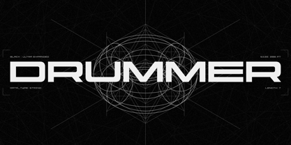 Drummer is a large futuristic font family inspired by the Expansion TV series, old science fiction book covers and Honda Prelude and Porsche logos. The family contains a large number of styles and a lot of language support. 54 styles, 6 in width (Ultra Condensed, Condensed, Normal, Expanded, Extra Expanded, Ultra Expanded) and 9 in weight (Thin, Extra Light, Light, Regular, Medium, Semi Bold, Bold, ExtraBold, Black). The font also has a variable version. 573 glyphs, including 40 alternate characters. A lot of work has been done on the font. The fillets on the symbols have been well worked out and tested for a better visual and practical experience. The font combines the monospacing of many characters combined with kerning, which makes it very convenient for many purposes, such as vertical typography. The font is good in all sizes, both small and large, which makes it possible to use it anywhere. Branding, logos, titles, posters, texts, covers, merch, prints, web, titles, banners, games and design in games and much more. In the near future, it is planned to add another axis of variability - the slant. Consequently, the family itself will increase. It is also planned to add a small case (capital). If you want to say something about the font or get a font in other formats, then write to the mail: bunineugene@gmail.com .
 - AtomBomb - Unknown license

- Stylette JNL by Jeff Levine,
$29.00Stylette JNL is a new treatment for Jeff Levine's popular Stylor JNL. In this instance, a heavier stroke was applied to the left side of each character, giving an Art Deco touch to the original monoline design. - Milescut by Tipos Pereira,
$14.00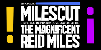 Milescut is a display typeface inspired by some seminal covers the graphic designer and photographer Reid Miles created for the Blue Note Records between the 1950s and 1960s. Miles made almost 500 covers for Blue Note in this period, including some using the hand-cut technique that consists basically in doing vertical cuts in capital letters and numerals to create a unique style within the universe he created for Blue Note. Milescut is a tribute to this small “cut” 😬 in his trajectory within the greatest record label of all time. This idea came about while I was working on what will become soon a revival of a wood type that I fell in love with when flipping through a Specimen of the MACHINE CUT WOOD TYPE manufactured by The WM. H. Page Wood Type Co. Milescut has two extra sets of alternates that work cyclically when activated in your OpenType menu and lots of ligatures, pretty cool :)
 - ITC Adderville by ITC,
$29.99On a cold winter's night, George Ryan, of Galápagos Design Group, began musing on the possibilities for a “truly original” sans serif typeface. What came out of his musing, and his always-present sketchpad, was ITC Adderville, a typeface whose visual impact is immediate and strong. Ryan explains how he did it: “The rounded ends of its strokes and their skewed baseline contact create an illusion of dancing feet. The tops of lowercase stems emit serif buds, suggesting transition into or out of the serifed form. The spear-like lowercase stroke terminators, along with other distinctive elements such as the stylized reticulation of the lowercase 'g' segments, the salute of that same character's spur, and the bold, non-self-conscious 'i' and 'j' dots, all contribute to the playful and unique nature of this design.” The result is a friendly, lively type family whose graduated weights -- book, medium, and heavy -- lend themselves especially well to use at small display sizes and in short blocks of text. - ITC Abaton by ITC,
$29.00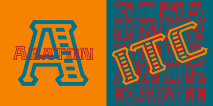 ITC Abaton, by Argentinian designer Luis Siquot, is an exercise in geometry and simplification. “It is done,” says Siquot, “with few elements, with modules of only straight lines (horizontals, verticals and diagonals of almost 45 degrees). Drawing the I and the O, I got the basic elements, and so started the fight between strict geometry and optical impression, until I obtained the rest of the characters.” The basic rectangular form is characterized by wedge-shaped serifs, almost like caps on the heads and feet of the letters. “Abaton has the 'spirit' of 19th-century faces used on money bills or postage stamps, but the realization is totally different,” Siquot explains. Abaton is a “shaded” typeface of caps and slightly smaller caps, upright and slightly condensed in form. Although the letterforms are legible at small sizes, the shading tends to clog up if it gets too small, so Abaton is happiest as a distinctive display face.
 - The DIN 1451 fette Breitschrift 1936, crafted by Peter Wiegel, is a typeface steeped in historical significance and functional aesthetics. A revival of the classic industrial typeface initially devis...
- Pseudonym by Monotype,
$20.99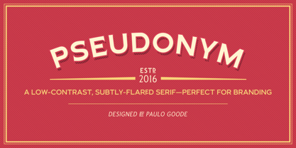 Pseudonym is a low-contrast, subtly-flared serif available in four weights across three styles in both roman and italic. As with all of my typeface designs, I am creating fonts that I would use myself for branding purposes—typefaces with style and purpose that are intended for use in creating logos and distinctive branding typography. I wanted to create a typeface that had incisive flared serifs combined with the strength and solidity of modern grotesque faces. The result is Pseudonym, which I feel has great presence, style and legibility. Although I must admit, I had to tone down the flared serifs during the design process in order to achieve that :) I’m sure you will have great fun playing with some of the Open Type features that I’ve added to Pseudonym. There’s a full set of true small caps with their corresponding diacritics and figures. There are also a number of discretionary ligatures, these are chosen from the glyphs palette in your layout app to replace pairs of standard characters. You’ll also enjoy making use of the catchwords – these have been created to harmonise with each style, again, giving you more flexibility and scope to create some innovative typography. Finally, there are some alternate characters for /C/D/O/. You may wish to use these when creating logos that include standard contractions for limited, number, incorporated, etc. Key features: • Pseudonym is a low-contrast, subtly-flared serif that has great presence, style and legibility • 3 styles – Narrow, Regular and Wide • 4 weights in roman and italic: • Light | Regular | Medium | Bold • Full set of small caps with diacritics and figures • 30+ discretionary ligatures, catchwords and alternate characters • Full European character set • 600 glyphs per font
 - Fluire by Lián Types,
$37.00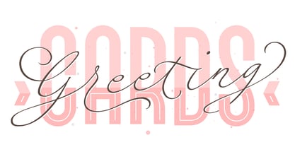 MAS AMOR POR FAVOR (1) (more love, please) Fluire means -to flow- in Italian and that’s what this font is all about. The story began when a friend of mine asked for a tattoo with the word -Fluir- (to flow in Spanish). She didn't want a tattoo full of swashes and swirls, like I'm used to doing, but something more fluent, soft and minimal. My very first attempts were more related to copperplate calligraphy but I wasn't even close: I discovered that I needed to forget a little bit about the classic contrast and speed of the engrosser's nib and started playing with a tiny flat metal nib. Letters started to flow, and I immediately thought of turning them into a font. Inspired by the tattoo I created and by other tattoos I saw, I started the journey of what would be a very fun process. The result is a very cute, almost monoline font with a wide range of uses. USES If not used for a tattoo (my first ‘target’), the font delivers amazing results in combination with Fluire Caps: These two need each other, they go together, they talk. I designed Fluire Caps Down and Fluire Caps Up so it’s easier to manage their colors. Also there’s Fluire Caps Down Lines, which has a decorative thin line to add yet another dimension. Use the fonts in magazines, book covers, posters, greeting cards, weddings, lettered walls, storefronts! TIPS Since the font is Open-Type programmed, I strongly recommend using it in applications that support that feature. Also, the font looks way better when -contextual alternates- are activated, but it’s your choice :) Try Fluire, and keep flowing. NOTES (1) The phrase alludes to maybe the most tattooed phrase in Latin America.
 - Oh, "Heartfont," the name alone conjures images of love letters penned in the wee hours, secret admirers typing away on their vintage typewriters, and the digital equivalent of a heart-shaped box of ...
- Meramint by Aiquitype,
$15.00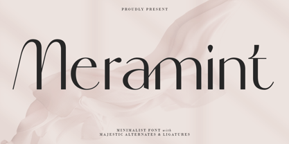 Introducing our Minimalist Font, Meramint Font is a meticulously crafted minimalist typeface designed to elevate your visual communication with simplicity and sophistication. This font seamlessly blends clean lines and contemporary aesthetics, making it the perfect choice for a wide range of applications, including logos, magazine covers, headings, and beauty product branding. Will you get : 1. Uppercase, Lowercase, Numerals, Symbol or Punctuation 2. Ready Majestic Ligature and Alternate 3. Multilingual Support 4. Installed on Mac and Windows 5. PUA Encode Thank you, and Enjor our Font.
 - Eymen Pro by Arodora Type,
$50.00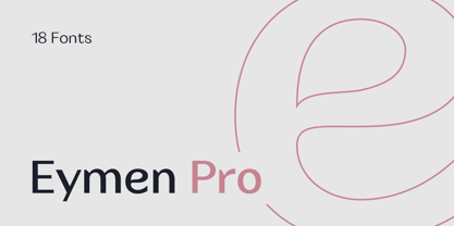 Eymen is a font that has both hard and fun dynamics. In fact, it was primarily dedicated to cool magazine paragraphs and content in the textile industry. But thanks to its large family structure, it can be used easily in many sectors and products. In addition, Eymen can be your companion in your heavy, aesthetic logo designs. In addition, the Eymen Pro family offers you alternative glyphs, ligarutes and more. Thanks to its wide character structure, it supports you for all kinds of languages.
 - Futura ND by Neufville Digital,
$45.25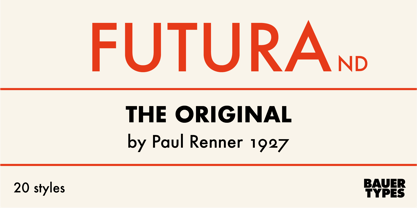 Futura is one of the best known and most widely used of modern typefaces. Designed by Paul Renner between 1924-1927 for the Bauersche Giesserei, it remains today one of the most successful typefaces due to its simplicity of features, perfect legibility, and meticulous finish of each of its letters. Its great variety of styles and weights makes Futura particularly fit for distinguished user interfaces, information displays, smart watches, e-readers, television apps, technical appliances, and internet-related uses. Futura is a Trademark of BauerTypes SL
 - HK Modular by Hanken Design Co.,
$45.00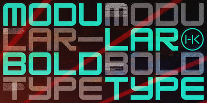 HK Modular stands out as a versatile and adaptable typeface that finds its strength in serving as an impactful display, title, or poster font. Its design allows for effective use in spanning entire pages, highlighting article titles, and designing logos. With a regular cut and rounded-corner design, HK Modular strikes a harmonious balance between sleekness and approachability. This dual nature of the typeface allows it to seamlessly blend sharp, defined edges with a touch of softness, making it suitable for a wide range of design contexts.
 - Bradley Jermaine by Grezline Studio,
$23.00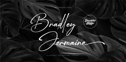 Bradley Jermaine is a modern handwritten script font with an elegant touch. This font is perfect use for fashion-related design. Bradley Jermaine font is also usable in a wide range of works such as website banner, greeting cards, wedding stationery, modern logo/personal branding, social media quotes, and much more! Feature : - Alternate and Ligature Set - Multilingual Language - Works on PC & Mac - Simple installations - Accessible in the Adobe Illustrator, Adobe Photoshop, Adobe InDesign, even works on Microsoft Word. Thank you! Grezline Studio - Akhmad Reza Fauzi
 - Filler Variable by CarnokyType,
$80.00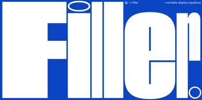 Filler is a display variable font that allows you to flexibly change the width ratio of font characters from extra narrow to extremely wide shapes. The typeface includes complete Latin language support with contrasting drawing of accents and punctuation. The character set includes special symbols, such as a set of emoticons or arrows that support OpenType features. In addition to the variable font, Filler also offers five width styles – Compressed, Condensed, Medium, Extended, Expanded. The font is intended primarily for strong display use in large proportions.
 - Skillet by Fenotype,
$19.00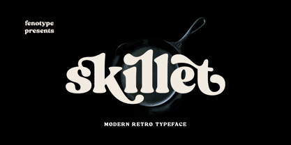 Skillet is a bold vintage style serif font full of hedonism and joie de vivre. Skillet has strong character and extremely smooth features and self-confidence that springs from within. Skillet comes in two weights: Regular and Condensed. Even though the difference is small, Regular takes over the space while Condensed gives a more intimate impression. Skillet comes with a wide range of OpenType -features. Keep Standard Ligatures on in normal use. Try Discretionary Ligatures, Swash, Stylistic or Titling Alternates for custom headlines or logos.
 - Urfa by Ahmet Altun,
$19.00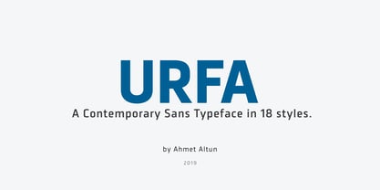 The Urfa font family comes in nine weights of Normal and Italic. In addition, all weights contain small caps in both italic and normal. With the Urfa font family, you can create beautiful works for the web, including logos, banners, body copy, and presentations. Urfa typeface also works nicely in print formats such as posters, T-shirts, magazines, and affiches. Because of its eye-pleasing style, this font is both effective and versatile. It supports a wide range of languages, including Extended Latin and Cyrillic.
 - Option by Vladimir Likh,
$10.00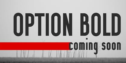 Option is a modern condensed sans serif. Inspired by geometric architectural fonts. But despite the geometric construction every single letter was build based on optical evaluation. This approach makes Option more organic and lively in a text line. Option was created for wide spaces. Condensed and thin, but extremely sweeping vertically font makes your massage elegance and strong. The font functions great in many sizes and surroundings. The family comes in one weights plus italics. Creating of bold weight is underway. Options supports Cyrillic as well.
 - Epitet by Tour De Force,
$25.00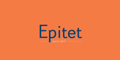 Epitet, a subtle compact type family with a modern mixture of geometrical and simple shapes, comes in 6 weights, from Thin to Bold. It is a clean elegant sans serif typeface, with a small x-height. Epitet is highly legible in all sizes. Very versatile and easy to use, Epitet can be used in a wide range of corporate and editorial applications. I'm sure Epitet could get even more epitets, but the appropriate use of Epitet would be the biggest one it could get.
 - Heshanty by Adam Azura,
$10.00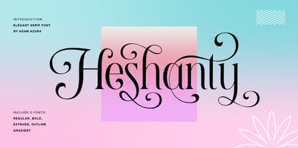 Heshanty Typeface is a luxurious display serif font with classic forms and modern style. Perfect for a wide range of uses. From greeting cards to magazines, wedding invitations, logos to website etc. Elegant and sensuality didone serif enhanced by ligatures, alternates and swashes. Heshanty Typeface makes it easier for the user to generate different levels/layers of communication thanks to its variety of styles. With this font you can solve entire decorative pieces of design with just one font, and that was the aim of it.
 - Quador Display by Fontador,
$24.99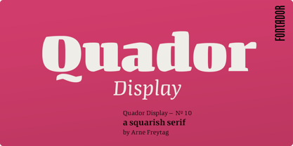 Quador Display is a serif, especially designed for contemporary typography on print and screen. The superellipse-based forms and high x-height allow large and open letterforms, perfectly adapted to the pixel grid on screen. The font contains 6 weights from light to ultrabold plus true italics. 1.049 glyphs include 282 ligatures, tabular, old style, fractions …, and a wide range of flexibility for latin language support for every typographical needs. Quador Display is a contemporary serif typeface, special for logotypes, brands, magazines and editorial.
 - Aluniea by IbraCreative,
$17.00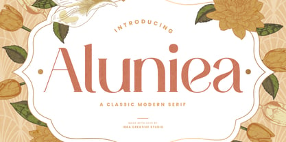 Aluniea is a classic modern serif typeface that effortlessly marries timeless elegance with contemporary design sensibilities. With its balanced letterforms, graceful strokes, and refined details, Aluniea exudes sophistication and versatility, making it a quintessential choice for a wide range of design applications. The typeface’s subtly flared serifs and harmonious proportions lend it a sense of balance and readability, while its clean lines and distinct character variations provide a distinctive, yet approachable, aesthetic that is perfect for conveying a sense of tradition and refinement in a modern context.
 - Retro Goldy by Nirmana Visual,
$22.00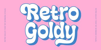 Introducing our new retro style font, designed to take you back to the good old days. With its bold and playful design, this font is perfect for creating eye-catching designs that evoke nostalgia and fun. Inspired by the groovy typography of the 60s and 70s, this font features thick and rounded letterforms, playful curves, and a distinct retro feel. Its versatility and legibility make it a great choice for a wide range of projects, from branding and packaging to posters and social media graphics.
 - Couple Vol1 by Fontforecast,
$34.99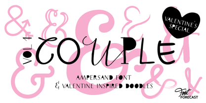 Couple vol1 is an extensive ampersand font with 230 glyphs and Valentine inspired doodles. Handmade with love. To accentuate two words or names in your text we designed these fun expressive ampersands. Couple vol1 contains a wide variety of styles, some glyphs can even be layered. You will surely find the perfect match for your Valentine project, wedding invite, logo design, etc. Everything is better together! Note: The font used in the presentation text is our Salt and Spices Pro SC2 (not included in Couple vol1)
 - The West Forest by Hustle Supply Co,
$14.00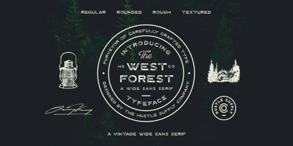 The West Forest The West Forest is a strong, bold all-caps Wide Sans Serif Typeface. Included are 8 font files ranging from clean to Textured, Rounded & Rough with Oblique options for each. The West Forest is sure to be a work horse typeface that is continually used within many of your projects. This typeface has the potential to fill many different needs for a range of different aesthetics. What's Included? Regular, Textured, Rough & Rounded Versions Oblique (Italic) Versions of each Western European Characters
 - Raphael by Monotype,
$29.99Originally drawn in the style of 19th-century woodcut types with interior shading and ornate English swashes, Raphael was updated in 1974, and the interior shading was removed. It now exhibits modern design elements - very wide letter strokes offset by hairlines - and is easily identified by the swashes that curve over the tops of the capitals, turning into crossbars on the A, E, F, and R. Used sparingly, Raphael adds flash to advertisements, announcements, stationery, notices, and business cards. Featured in: Best Fonts for Logos - Arcas by Austin Stahl,
$13.00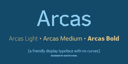 Arcas is a display sans with no curves — straight lines only. Unlike many other typefaces with this characteristic, however, it’s built with some asymmetry, which helps it expand beyond the “sports” or “tech” feel that many of those fonts have. Instead, it’s a surprisingly warm and friendly family, ready to lend a unique personality to headlines, posters, and packaging. Supports a wide array of Latin-script languages. OpenType features include ordinals, arbitrary fractions, and case-sensitive punctuation. A set of catchwords is also included.
 - Clover by KA Designs,
$12.00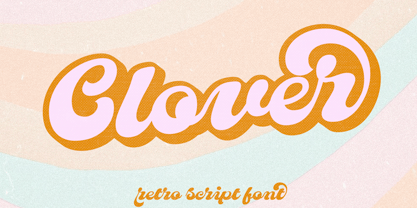 Clover is a modern retro font with a light, bubbly feel! This font is perfect if you are after a fun script font that has a lot of edge! The versatility of this font reaches wide. Use this one for branding, logos, advertisements, shirts, stickers, social media, invitations and more! The complete package includes a complimentary shadow version for easy and perfect layering every time! Clover will take you right back to the 70's but still provide a fresh look to your designs!
 - Miss Christine by Letterara,
$12.00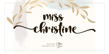 Miss Christine is a beautiful script font with lots of authenticities!. It has beautiful and well-balanced characters and as a result, it matches a wide pool of designs. It will turn any design project into a true stand-out. Add it to your most creative ideas and notice how it makes them come alive! This font is PUA encoded which means you can access all of the amazing glyphs and swashes with ease! It also features a wealth of special features including alternate glyphs and ligatures.
 - Brolian by Ekahermawan,
$23.00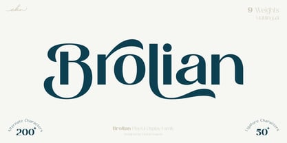 Brolian is playful and stylish designed font for any display use with 9 weights from Thin to Black. Brolian also includes with more than 200+ alternates characters (PUA Encoded) and 50+ ligatures to give you a wide range for create a beautiful typographic design results. Brolian is versatile font for many different projects such as logo, branding, poster, magazines, labels, merchandise, invitation, presentation, advertising, quotes and so much more! FEATURES: OpenType support Playfull to use (with ligatures and alternates options) Multilingual support PUA Encoded
 - Beit El MF by Masterfont,
$59.00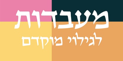 Inspired by old letter engraving and tombstones, his font is unique by its flow and contrast, enabling traditional typeface gain a new and clear flow and rhythm. OpenType Pro fonts- Excellent support for Niqqud (Vowels). All marks are programmed to fit each glyph's shape and width. OpenType Pro includes new advanced features like Dagesh Hazak, ShevaNa, Qamatz Katan, Holm Haser and wide letters. Best used with Adobe InDesign CC that support complex Hebrew text. Please check these advanced features in this link: https://tinyurl.com/ybgdsxme
 - Magnitudes by DuoType,
$29.00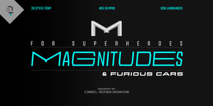 Magnitude is a font inspired by classics like Eurostyle and Bank Gothic, with geometric characteristics and dynamics style. Designed to be used in a wide variety of applications such as advertising, corporate projects, branding and retail product design. The font is well-suited for headings, display use and short text. The Magnitudes family is available in 36 weights, ranging from Extra light to heavy, to condensed and expanded with matching italics . The font contains a character set of 401 characters supporting 206 different languages.
