915 search results
(0.018 seconds)
- Fifth Avenue Salon NF by Nick's Fonts,
$10.00A quirky semiscript, derived from lettering in an 1930 ad for the beauty salon of Kathleen Mary Quinlan on New York's Fifth Avenue. The Opentype version of this font supports Unicode 1250 (Central European) languages, as well as Unicode 1252 (Latin) languages. - Aerobic by Wildan Type,
$10.00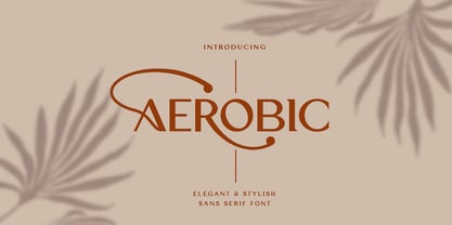 Aerobic is a Modern Elegant font with special alternative glyphs and multilingual support. It's a very versatile font that works great in large and small sizes. Classy Marisa is perfect for branding projects, Logo design, Clothing Branding, product packaging, magazine headers, or simply as a stylish text overlay to any background image
 - Trencher JNL by Jeff Levine,
$29.00 Trencher JNL is based on hand-cut stencils spray-painted onto a vintage 1947 Cleveland Trencher acquired by the Marine Corps Mechanized Museum at Camp Pendleton, California. Restoration volunteer Brian Platzer supplied to Jeff Levine the images of the stencil markings - and they were quickly re-drawn and turned into a digital type face.
 - Konscript by Michael Browers,
$25.00Konscript is a distressed typewriter face developed from analog samples from papers Mary Browers typed in the 1950s for her high school coursework. The model and age of the typewriter are not known. Additional characters were developed based on the analog samples to complete the character set. - P22 Ridley by IHOF,
$24.95 Ridley is a calligraphic-influenced, decorative, medieval font combining Roman and Gothic forms. It is named for Nicholas Ridley and similar in style to Staunton’s Latimer font. Ridley and Latimer were protestants burned together at the stake in 1555 during the reign of Queen “Bloody” Mary.
 - Barely Legal by Vozzy,
$10.00 Introducing a vintage font named Barely Legal. This font was inspired by bootleggers in the 1930s. All available characters you can see at the screenshots. This font has six styles: Regular, Shadow, Texture, Rough, Shadow FX and Texture FX. This font will look good on any retro and mafia styled designs like a poster, T-shirt, label, logo, etc.
 - Mechanized JNL by Jeff Levine,
$29.00 Mechanized JNL is a solid interpretation of Jeff Levine's stencil font Trencher JNL. Both fonts were based on a photo of hand-cut stencils found on a 1940's trenching machine in the collection of the Marine Corps Mechanized Museum at Camp Pendleton, California. Thanks to restoration volunteer Brian Platzer for providing the images of those stencils.
 - Ida by ParaType,
$30.00 Ida is a simple and utilitarian typeface reminiscent of late 19th/early 20th Century grotesques, yet having a warm and friendly nature. Closed apertures and low contrast combined with elegant skeleton of individual characters create an impression of both rationality and comfort. Technically the font is modern and functional but still calls forth the emotion of a valve radio. Ida comes in 18 styles – 6 roman weights with companion italics and 6 narrow widths. One can also benefit from the use of small caps, alternate characters and indices. The typeface was designed by Maria Kharlamova (Selezeneva) and released by ParaType in 2017.
 - Grunge - Unknown license

- Knife Fight - Personal use only

- Dead World - Unknown license

- Chutz by Michael Rafailyk,
$9.00 Chutz is an audacious slanted typeface with horizontal contrast and horizontally oriented strokes developed for Jewish brand Chutzpah of the Feisty Foods company based in Brooklyn, New York. Scripts: Latin, Greek, Cyrillic, Hebrew Languages: 480+ Hinting: TrueType autohint for static fonts. Variable font is unhinted. The promo images used photos of Ola Rafailyk, and photos of Marta Dzedyshko, Josh Sorenson from Pexels.
 - True Sage by Creativemedialab,
$20.00 True Sage is a pretty decorative serif family. Contains Eight weights from thin to black. Vintage retro style dressed with pretty swirly alternates makes the lettering look pretty and unique, perfect for your heading, title, or branding projects.
 - Cumbanchera by JVB Fonts,
$5.00CUMBANCHERA, inspired by the old albums cover art of Latino music. Cumbanchera reminds of the iconic, classic, and recognized musical theme «El Cumbanchero» composed by Rafael Hernández Marín «El Jibarito». CUMBANCHERA can be used mainly in titles, display and short texts. Supports East Europe languages. Includes standard and discretionary ligatures, alternative style of upper and lowercase, fractions, numerators and denominators, and other OpenType features. - Something Fishy by Kate Brankin,
$17.00 A recent walk down memory lane through old college sketchbooks revealed a collection of caricature fish doodles. Then the sketches were discovered by my son who, being a marine life enthusiast, promptly demanded that I draw more fish. Thus, a collection of 71 fish-inspired drawings and bubbly numbers was born. There is even a lemon, since no fish is really complete without one.
 - Reprise Stamp - Unknown license

- Dirty Ames - Unknown license

- Pendleton JNL by Jeff Levine,
$29.00 Pendleton JNL was created from some scant images found on military machinery housed at the Marine Corps Mechanized Museum at Camp Pendleton, California. The photos were provided by Brian Platzer, a volunteer at the base who specializes in equipment restoration. Having used other stencil fonts by Jeff Levine, Brian thought the design of these hand-crafted markings might make another addition to Jeff's vast library of vintage stencil alphabets.
 - Swanstone by Zetafonts,
$51.00 Mario De Libero designed Swanstone while investigating XIX Century Old Style typefaces. Designs like Theophile Beaudoire’s Romana (1860) or Miller & Richard’s Modernized Old Style, that re-imagined the classical “Venetian” letterforms adding flared serifs and early Art Nouveau influences. In Italy, one of these fonts was Raffaello Bertieri’s Raffaello, which De Libero used as the starting point of his research in a contemporary retelling of these exuberant and sexily unsettling letterforms.
 - Airam by Linotype,
$29.99 Maria Martina Schmitt was born in Vienna, Austria in 1950. Since 1998, she has been working as a freelance designer, focusing on cultural collateral, economic publications, illustration, type design, and logo design. Airam blends contemporary legibility with historic blackletter forms, creating a contemporary text face that speaks to the old European past. Airam certainly appears darker than most other contemporary text faces. Airam’s letterforms are slightly broken, too. They display angled joints in lieu of smooth curves. This “broken” aspect actually aids legibility at smaller point sizes. While Airam may not be suitable for setting whole books or newspapers, this font will add a splendid touch to short tracts of small text. Additionally, Airam looks superb in large headlines.
 - Dreamland by Comicraft,
$19.00Ring-bearers across Middle Earth will be kissing their Sorceror's Stones, when they hear the news of the debut of this magickal collection of fonts, suitable for Incantations, Faerie talk, Books of Magic and fantastickal Arias. Coincidentally the official font of Scott Sava's DREAMLAND CHRONICLES (how didja guess?), Dreamland is also suitable for any chronicles you may have of your own. - Dolphus Mieg Alphabet Three by Intellecta Design,
$14.00 The Dollfus Mieg Company was founded in 1800 by Daniel Dollfus (1769-1818) and Anne-Marie Mieg (1770-1852). In the 1890s and again in 1901 it published Monograms and Alphabets for Combination, a book with alphabets and monograms for cross-stitching. This book served as example for several digital fonts by Paulo W. Here you can get one of them,
 - Dreamland Int'l by Comicraft,
$19.00 Ring-bearers across Middle Earth will be kissing their Sorceror's Stones, when they hear the news of the debut of this magickal collection of fonts, suitable for Incantations, Faerie talk, Books of Magic and fantastickal Arias. Coincidentally the official font of Scott Sava's DREAMLAND CHRONICLES (how didja guess?), Dreamland is also suitable for any chronicles you may have of your own.
 - Hollywood 69 by Fonts of Chaos,
$10.00 This is not Hollywood. You may be surprised but I am not inspired by the famous Hollywood sign for this type but a grid on a roof of Barcelona. I walked down the street observing the architecture of buildings in the area of the Marina when I saw a grid on a roof. One of the workers put a board on them and the magic happen. Hollywood 69 is now free with 99 !
 - Parallel by Typedepot,
$19.00 Parallel is unique quite thin and pretty "expressive" typeface, designed in order to serve the fashion industry. It also works pretty well as a typeface for print, headlines and identity issues.
 - MB-Real Grinder - Personal use only

- Graffiti - Unknown license

- Angryblue - Unknown license

- Kaybuts by sugargliderz,
$44.00 Kaybuts consists of three styles: sans-serif, serif, and semi-serif, each of which includes italic typefaces. Thinner and thicker weights look best when handled in relatively large font sizes, such as eye catchers and headlines. The middle weight is best suited for smaller text. Incidentally, this typeface was designed under the influence of, or with Mary Shelley's novel Frankenstein: or The Modern Prometheus in mind.
 - Full Moon BT by Bitstream,
$50.99A collaboration based on lettering by Vermont illustrator/artist Mary Trafton and brought to typographic life by Charles Gibbons, the Full Moon Suite is a collection of casual typefaces called after folk names for full moons. A winner of the TDC2 2003 Type Design Competition. Family members include: Falling Leaves, Rustling Branches, Black Cherry, Black Cherry Alternate, Black Cherry Ligatures and Black Cherry Doubles. - Abitare Sans by FSD,
$60.27 Abitare Sans was originally commissioned by the group Rizzoli Corriere della Sera. It’s a typeface of 30 weights designed to be used in Abitare magazine. The request of the president Mario Piazza was a new CP Company with some redesigned glyphs, but the result is a radical evolution of its concept being intended to be used as a font for text far more readable. In Abitare Sans the geometric structure was kept without neglecting the numerous editorial requirements.
 - KG Eyes Wide Open by Kimberly Geswein,
$5.00 Legible, pretty, neat, connected cursive handwriting.
 - Janda Everyday Casual by Kimberly Geswein,
$5.00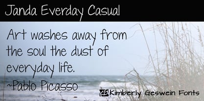 Neat, pretty feminine handwriting for everyday usage.
 - Louise by Hanoded,
$15.00 Louise font was based on the art of Louise Marie (lou) Loeber, a Dutch painter. She was born in Amsterdam in 1894 and flirted with several styles like De Stijl, Cubism and Bauhaus. Her artworks are characterized by a sober use of geometric shapes; lines, rectangles and triangles. Louise font consists of Caps, but the lower and upper case glyphs are quite different. Louise comes with extensive language support.
 - HWT Bernice by Hamilton Wood Type Collection,
$24.95 HWT Bernice is an ornament font system designed by Marian Bantjes. The basic shapes were designed by Bantjes for the Hamilton Wood Type Museum's border stamping machine as a contemporary application for this 150 year old machine, which punches shapes into end grain wood to form continuous border patterns. The digital version expands a bit beyond the punch machine and allows designers to assemble a multitude of options using flipped and rotated variations of these 6 basic shape sets using simple keystrokes.
 - Natuna by Nirmalagraphics,
$14.00 Natuna is named after the ocean which is rich in marine ecosystems and the region where I live in Indonesia. For this font, I retained my handwriting style, but I combine it with a touch of modern calligraphy. It is seen with the tail of each letter the same length. The upper and lower case letters all have the same tail. This font is perfect for many creative needs and can be for marriage invitations, greetings, business cards, and more.
 - KG Eliza Schuyler Script by Kimberly Geswein,
$5.00 A pretty, upright handwritten script that is highly legible.
 - Blumen by Kaer,
$21.00 This font family based on vintage German book called “Der Raupen wunderbare Verwandlung und sonderbare Blumennahrung.” by Merian, Maria Sibylla and printed in Frankfurt am Mayn in 1683. I manually redesign initials and regular style fonts from this folio. Also, I’ve added some modern symbols. I'm happy to present to you my new font family. Blumen font family has Initials and Regular styles. It's all you need to precisely imitate medieval style text. Use Drop cap style as a decorative element at the beginning of a paragraph or section, other part of the paragraph should be in Regular style. You’ll get: * Initials & Regular styles * Uppercase and lowercase * Multilingual support * Numbers * Symbols * Punctuation * Ligatures Please feel free to request any help you need: kaer.pro@gmail.com Best, Roman. Thank you!
 - Circe by ParaType,
$50.00 Circe™ is a geometric sans-serif with some humanist qualities. It consists of seven weights from Thin to Extra Bold in both Normal and Italic styles. Circe, like the Greek goddess it is named after, is capable of metamorphosis. While being clean and simple in its basic form, Circe can become intricate and fancy with its numerous decorative glyph variations. The extensive character set provides support for almost all European languages based on Latin and Cyrillic scripts. Abundant alternates and swash variants organized in stylistic sets inspire creative design options. Circe is good for small point size paragraphs as well as for headlines and posters. The typeface was designed by Alexandra Korolkova and released by Paratype in 2011. The Italic styles were added in 2018 by Alexandra Korolkova and Maria Kharlamova (Selezeneva).
 - Journal Sans New by ParaType,
$40.00 The Journal Sans typeface was developed in the Type Design Department of SPA of Printing Machinery in Moscow in 1940–1956 by the group of designers under Anatoly Schukin. It was based on Erbar Grotesk by Jacob Erbar and Metro Sans by William A. Dwiggins, the geometric sans-serifs of the 1920s with the pronounced industrial spirit. Journal Sans, Rublenaya (Sans-Serif), and Textbook typefaces were the main Soviet sans-serifs. So no wonder that it was digitized quite early, in the first half of 1990s. Until recently, Journal Sans consisted of three faces and retained all the problems of early digitization, such as inaccurate curves or side-bearings copied straight from metal-type version. The years of 2013 and 2014 made «irregular» geometric sans-serifs trendy, and that fact affected Journal Sans. In the old version curves were corrected and the character set was expanded by Olexa Volochay. In the new release, besides minor improvements, a substantial work has been carried out to make the old typeface work better in digital typography and contemporary design practice. Maria Selezeneva significantly worked over the design of some glyphs, expanded the character set, added some alternatives, completely changed the side-bearings and kerning. Also, the Journal Sans New has several new faces, such as true italic (the older font had slanted version for the italic), an Inline face based on the Bold, and the Display face with proportions close to the original Erbar Grotesk. The new version of Journal Sans, while keeping all peculiarities and the industrial spirit of 1920s-1950s, is indeed fully adapted to the modern digital reality. It can be useful either for bringing historical spirit into design or for modern and trendy typography, both in print and on screen. Designed by Maria Selezeneva with the participation of Alexandra Korolkova. Released by ParaType in 2014.


