5,166 search results
(0.012 seconds)
- Cindy FA by Fontarte,
$39.00 Imelda Marcos, Cinderella - welcome to the club ... A picture font containing over sixty shoes, slippers and boots, fashionable yesterday, today and maybe tomorrow. Hand drawn by a designer Magdalena Frankowska. Not only for fetishists.
 - Fabrizio by ARTypes,
$60.00 The new Fabrizio™ types, designed by Ari Rafaeli, have made their first appearance in Saggi di Letteratura Italiana: Da Dante per Pirandello a Orazio Costa, by Lucilla Bonavita, printed at Pisa in March 2016 by Fabrizio Serra Editore for whom the type was specially designed. The types are now offered for general sale. Each style (roman, small capitals, italic, semi-bold, bold) contains Cyrillic and ‘polytonic’ Greek letters and letters for many European languages (Czech, Hungarian, Icelandic, Lettish, Polish, Romanian, Serbian, Ukrainian, Welsh etc.), non-kerning fs, long ſ, ligatures and fractions. Alternative forms are supplied in ‘B’ versions of each style. A set of swash letters and sets of superiors, inferiors, fractions and phonetic letters are also offered. Two ‘Special’ fonts (roman and italic) containing special accents, letters for transliteration, Vietnamese letters, mathematics signs and symbols, arrows, commercial signs, pictograms, figures in circles, scansion marks, braces & benzene rings and the Rafaeli-Meruba Hebrew letters, as well as Latin, Cyrillic and Greek letters, are included in the Fabrizio family.
 - We The People by K-Type,
$20.00 This typeface is extrapolated from the ‘We the People’ calligraphy of the handwritten US Constitution Preamble which employed a style based on German Text and Square Text exemplars from George Bickham’s penmanship copy-books, the most celebrated being The Universal Penman published in 1743. The original Constitution document was transcribed onto parchment by Jacob Shallus, a Pennsylvania Assistant Clerk, over a weekend in 1787. Shallus’s biographer, Arthur Plotnik (The Man Behind the Quill, 1987), notes that he was paid $30, a modest monthly wage at the time. He also suggests that the calligraphic headings, ‘We the People’ and ‘Article’, may have been inserted by Shallus’s 14 year old trainee son, Francis, “The manner in which the ‘Article’ headings are squeezed into the space Shallus allowed for them suggests a second hand—and perhaps not a very experienced one.” The unconventional backslant of the headings would seem to support this contention, and at the end of the document there is perhaps a novice’s inconsistency in the structure of the letter n between that used for ‘done’ and those used for ‘In Witness’. However, one has to admire the elegant swagger of the wavy t, h and l which the K-Type font extends to the b, f and k. Also, the simpler, Schwabacher-style W, an enlarged version of the lowercase w, is a little less flamboyant than the capital W from the German and Square texts in Bickham’s manuals. For designers using OpenType-aware applications, the typeface includes some Alternates, including a Bickham-style W, the letters t, h and n with added flourishes, two simpler forms of the A, and a few roman numerals for numbering articles. Also some ornamental flourishes and a round middle dot/decimal point. Punctuation marks are drawn in square, calligraphic style, but an alternative round period/full stop, for use with currency and numerals, is available at the period centered position (though placed on the baseline), accessed by Shift Option 9 on a Mac, or Alt 0183 on Windows. The full phrase, ‘We the People’, has been placed at the trademark keystroke and can be accessed by Option 2 (or Shift Option 2) on a Mac, or Alt 0153 on Windows. For designers who find the backslant awkward or unpleasant, the licensed typeface also includes two additional fonts which have a vertical aspect that may be more conducive to graphic design layouts. ‘We The People Upright’ and ‘We The People Upright Bold’ both retain the distinctive style, and the heavier weight is only slightly emboldened, just enough to add some punch.
 - NATOKit - Unknown license

- BurntMF - Unknown license

- Plastic Tomato - Unknown license

- SexyMF - Unknown license

- Bikambone - Personal use only

- Flame on! - Personal use only

- Culia / ANTIPIXEL.COM.AR - Personal use only

- Patient Paige - Personal use only

- Patient Paige - Personal use only

- MicroTech - Unknown license

- The Last Soundtrack - Unknown license

- Amanda's Script - Unknown license

- Stencil Set JNL by Jeff Levine,
$29.00 Stencil Set JNL takes the 2011 release of Stencil Mark JNL (a spur-serif letter based on a vintage set of brass stencils) and transitions it to the design of a clean, bold sans typeface.
 - Riverside JNL by Jeff Levine,
$29.00 The Art Deco design of Riverside JNL was based on the hand lettered title found on the 1932 sheet music for "By the River Sainte Marie", and is available in both regular and oblique versions.
 - Black Beer by Fractal Font Factory,
$10.00 Black beer, strong Gothic. It is designed for logos, prints, headlines and more. The font has 4 styles, base, blurred, outlined, and aged. Contains basic characters and punctuation marks as well as extended multilingual characters.
 - Hookshot by Callout,
$19.00 Hookshot is a quirky serif font font with a retro touch, inspired by an old Canon Word-mark. Hookshot works great for headlines, callouts, and illustrations. It is perfect for short words and even sentences!
 - Scarlett Busiat_Demo - Personal use only

- Austin Antique by HiH,
$10.00 “More is better” may have been the motto of Richard Austin of Austin and Son’s Imperial Letter-Foundry on Worship Street at Finsbury Square in London when he designed and cut his Antique typeface. The year it was created is uncertain, but it is known to have appeared in a specimen book produced in 1827. At first glance, the upper case letters of Austin Antique look very much like Figgins Antique. But, upon examination, one will note that the Austin face is much darker. In general, the letters designed and cut by Richard Austin have fatter strokes, larger serifs and smaller counters -- more metal and less daylight. The premise was that the darker the letter, the more attention an ad using the typeface would receive. In old pictures of London and Paris one may see walls crowded with posters and “bills” -- competing for the attention of the passerby. Morris and Updike aside, the early nineteenth century marked the beginning of a commercial as well as industrial revolution. Patterns of commerce were changing. With new methods of marketing came the need for new typefaces to support the new methods. Foundries found the display types were very profitable and competed most energetically and creatively for the trade. There was a lot of trial-and-error. Some ideas faded away. Others, like the Antiques or Egyptians, were refined and developed. From them came the Clarendons that were to prove both popular and long lasting -- because they worked. Their job was to sell goods, not please the aesthetic sensibilities of the critics. They did their job well. Austin Antique has a full Western European character set, plus the following ligatures: ct, st, fi, fl, ff, ffi and ffl. Tabular numbers. Surprisingly readable.
 - Black Bruno by Subectype,
$18.00 Black Bruno is a supercharged, street-wise brush font bursting with energy. It includes extra attention to quick strokes and sharp details. This font is perfect for challenging jobs, titles, t-shirts, websites, hoodies, clothing, headline, logotype, branding, advertising, event and various print and digital media with energy.
 - Well Done by Letterara,
$16.00 Well Done is a flower calligraphy font with an incredibly luxurious feel. It will add a romantic touch to any crafting project! Get inspired by its unique look! To stay up to date for my latest job, follow me and let’s be friends because there will be many promos.
 - Kitty Sweet by Zamjump,
$11.00 Introducing my new monoline handwriting font = Kitty Sweet = It's perfect for creating quotes, logos, or just adding a handmade touch to any project. Equipped with ligatures and alternatives for uppercase letters, made especially for those of you who want to be simple and make every simple job easier.
 - Gummi by Anastasia Kuznetsova,
$22.00 I present to you a fascinating contrasting font system, Gummi! Modern development of 3 fonts, each of which is designed to complement each other in a natural way. This is an extremely versatile font collection, ideal for experimenting with vibrant and modern typographic designs in any modern design. This product includes 3 font files containing uppercase and lowercase characters, numbers and a large set of punctuation marks. Font Features * A-Z; a-z character set; * 1 language (English); * numbers and punctuation marks, symbols A font containing uppercase and lowercase letters, numbers, and a wide range of punctuation marks. Fonts can be opened and used in any software that can read standard fonts, even in MS Word. No special software is required, and to get started. It is recommended to use it in Adobe Illustrator or Adobe Photoshop Made with love ♡ Thanks for checking it out, and feel free to drop me a message if you had any queries! ~ Anastasia
 - Kalender Serif by Gurup Stüdyo,
$10.00 ∙Kalender is designed as a high-contrast modern serif for display use. Kalender is provides you an elegant and luxurious typographic colour. ∙When Kalender's lines invisible at small sizes you can use Kalender No 2 which have thicker lines and serifs to assist readability. ∙Kalender Blok is arranged for situations which are diacritical marks overflow to leadings of the headline and headline typographical color is affected negatively from this situation. For this purpose, majiscule diacritical letters are resolved within the letter height. However, when this is done, new forms are obtained by integrated diacritical marks with letters instead of directly merging them. The idea behind this approach is to preserve the typographic value of diacritical marks and emphasize the semantic value of diacritical letters. 68 letters have been redesigned in this way. And also Kalender have different meanings in Turkish: large, humble etc. I considered this name appropriate because it described the structure of this font well.
 - Olympus Mount - Personal use only

- the haine au carre ! - Personal use only

- Spongebob Dingpants - Unknown license

- fragments of eter - Unknown license

- Hebrew Sevilha Tanach by Samtype,
$149.00 This is Classic Hebrew Sefardi Font. This is a beautiful typeface to invitations, posters, cover books and small texts. All diacritic marks for vocalization are present (Nikud), including shevana, kamats katan, cholam chaser and dagesh hazak.
 - Kally Dreams by Hishand Studio,
$14.00 Kally dreams is a beautiful monoline font with signature style that really good for water mark, logotype, advertisement, social media posts, product packaging, clothing design and more. complete with uppercase lowercase ligatures swashes alternates multilingual support
 - Hebrew Sevilha Std by Samtype,
$49.00 This is Classic Hebrew Sefardi Font. This is a beautiful typeface to invitations, posters, cover books and small texts. All diacritic marks for vocalization are present (Nikud), including shevana, kamats katan, cholam chaser and dagesh hazak.
 - Elastik by bb-bureau,
$65.00 Grotesk typeface with elastic punctuation & diacritical mark. in 4 weights: Light, regular, Medium and Bold by 4 styles: A (small diacritical), B (normal diacritical), C (hight diacritical) and D (very hight diacritical) language: all latin glyphs
 - Industrial Stencil JNL by Jeff Levine,
$29.00 Samples of vintage machine-punched stencils used for marking crates and cartons were spotted in an online auction. These served as the basis for Industrial Stencil JNL, which is available in both regular and oblique versions.
 - Deskmark Pro Slab by Alexey Makarov,
$14.00 Hi! Introducing Deskmark Slab Pro Typefamily. Original and soft version. 3 weight for each version, bold, regular and light. Language support: Contains full set of Latin alphabet, including diacritical marks for European languages and Cyrillic alphabets.
 - Stencil Plate JNL by Jeff Levine,
$29.00 A brass stencil hand cut to mark the tops of oil drums yielded the lettering for Stencil Plate JNL. The font emulates the retro feel of the unique letter forms found in the original antique design.
 - Monster DD by Doffdog,
$14.00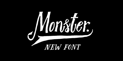 Monster DD is a decorative vintage font in modern performance. It is perfect for: Logos Posters Labels Headlines Apparel Tattoo & more Monster DD comes with upper and lowercase characters, numbers, marks and punctuation. Multilingual support Enjoy!
 - TypeMyMusic Notation - 100% free

- Child's Play - Unknown license


