10,000 search results (0.021 seconds)
  1. Cabrito Sans by insigne, $24.99
    It's time to kick off your shoes and feel the "sans" between your toes. Like Cabrito Inverto , its stress-reversing cousin, the new Cabrito Sans serves up something nice and cool in the heat of the project. A quick recap: the original Cabrito is an insigne Design slab serif produced for the kid's book The Clothes Letters Wear. It's been pretty well-received--even more than I expected. I promised to grow the family with a free-standing inverted style that could pair well with Cabrito. (See Cabrito Inverto.) Now, I'm rounding out the family with this well-crafted sans. And so now, Sans is where it's at. Strip away the serifs of Cabrito, and you have a laid back, rounded sans serif alternative served up over easy. This handwriting-inspired creation--like its relatives--is definitely not uptight about its forms (though not afraid to show them off a little). Cabrito Sans' whole pack of alternates is accessible in any OpenType-enabled program. This kiddo consists of a workforce of alternates, swashes, and alternate titling caps to give the font a little extra sweetener to its flavor. Also bundled are swash alternates, old style figures, and compact caps. Check out the interactive PDF brochure to test out each these options. This font family members also consists of the glyphs for 72 various languages. Cabrito Inverto and Cabrito do pair nicely with Cabrito Sans (in case you doubted). Use Sans--or all three of these amigos--to express friendliness on just about anything: food, candy, toys, cars (if you're feeling bold). Don't wait, though. Purchase Cabrito Sans today, and bring a one-of-a-kind look to whatever your computer's next design party is.
  2. Nomos Sans by Identity Letters, $45.00
    What is a brutalist typeface? The exact definition is anyone’s guess. Regardless, the Nomos superfamily is our take on the genre. Like the eponymous architectural style, Nomos is raw, direct, and honest. Its unrefined aesthetics reveal an orderly construction that is as firmly rooted in classic modernism as in the internet age—with simple, functional letterforms and the blunt convergence of diagonal and vertical stems. The Nomos Sans subfamily is a low-contrast neogrotesk with 18 styles and a set of 1000+ characters. A confident choice for fashion and finance, for apps and advertising: humble and expedient in body text, vigorous in display sizes. Has extra poise when paired with Nomos Slab.
  3. Mawns Rock by Mans Greback, $59.00
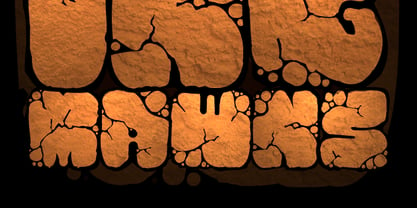
  4. Garota Sans - Personal use only
  5. FF Mab - Personal use only
  6. Unava by Myristica, $15.00
    The font is inspired by the history of the native land - a city that blossoms on a high mountain, surrounded by the blue ribbon of the Unava River. The swift rapidity of the river, the important slow flow of its reservoirs, golden beaches and steep banks of which remember the glorious times of Cossack glory. Times when bright flags flew over the Cossack army, which swiftly swept the green meadows with lightning cavalry, and dusty paths under the scorching sun. To go out to defend their homes, to cross the cold steel of ringing sabers with the enemy, and, bravely going into battle, to fight back the invaders. The font combines the straight lines of sharp steel sweeps, the broken lines of jousting blows, and the refinement of the accent of undulating flag lines.
  7. DeerUp Shouttap Sans - Personal use only
  8. Resavska BG Sans - 100% free
  9. Obti Sans Neue - 100% free
  10. DejaVu Sans Condensed - Unknown license
  11. Osaka-Sans Serif - Unknown license
  12. Romance Fatal Sans - Personal use only
  13. pulse sans virgin - Unknown license
  14. Andreas Sans Cnd - Unknown license
  15. DejaVu Sans Mono - Unknown license
  16. COM4t Sans Medium - Unknown license
  17. SF Diego Sans - Unknown license
  18. Bitstream Vera Sans - Unknown license
  19. MAWNS' Graffiti Filled - Personal use only
  20. Am Sans light - Unknown license
  21. Mad a Fraf - Unknown license
  22. JAMON del MAR - Unknown license
  23. Treasure Map Deadhand - Personal use only
  24. Times Sans Serif - Unknown license
  25. Vazari Sans Serif - Unknown license
  26. Romance Fatal Sans - Personal use only
  27. SF Diego Sans - Unknown license
  28. Too Many Secrets - Unknown license
  29. Starlight Sans JL - Unknown license
  30. Sans I Am - 100% free
  31. C Dans L'air - Unknown license
  32. !Futurelic Sans Souci - Unknown license
  33. Mac and Sidney - Unknown license
  34. Dogs on Mars? - Unknown license
  35. Sans Serif Shaded - Unknown license
  36. Raketta From Mars - Unknown license
  37. BN M@TAN - Unknown license
  38. Aurulent Sans Mono - Unknown license
  39. 101! Mad Hatter - Unknown license
  40. FS Silas Sans by Fontsmith, $80.00
    The great enigma There are hidden depths to FS Silas Sans. First impressions are of a functional, multi-purpose typeface with a cool, edgy, angular character. Gaze into its eyes a little longer, though, and you'll detect a more nuanced, colourful personality, with full, open, satisfyingly squarish forms balancing the abruptness of the sharply-angled terminals and ascenders. Authoritative, official and stern on the outside; amiable and welcoming on the inside. You’re so Dane The designers, led by Phil Garnham, were trying to capture something straight-talking, authentic, and a little... Scandinavian. ‘We were thinking about some of the characters in Danish dramas that were on in the early stages of the font’s development, like The Killing and The Bridge,’ says Phil. ‘The police officers, that is, not the psychopathic killers. Smart and a bit cool, but with a warm heart.’ For a good Danish name, we settled on Silas. It was that or Hans-Christian. The finer points Silas Sans rewards close inspection. Study, if you will, its amply squarish forms, the roomy ‘o’ and ‘e’, in particular. Observe the angular ascenders and terminals of, for example, the ‘L’, ‘I’, ‘d’ and ‘i’, inferring the movement and lift of a pen. Consider the cuts to the ‘A’ and ‘v’ that create harmony with adjacent letters. And scrutinise the subtle ink traps set within the ‘A’ and ‘Y’ for reproduction at small sizes. A fine subject, we think you’ll agree, and available in a versatile range of weights to make (with FS Silas Slab) a typographic system with a comprehensive hierarchy.
Looking for more fonts? Check out our New, Sans, Script, Handwriting fonts or Categories
abstract fontscontact usprivacy policyweb font generator
Processing